Bridge Builder
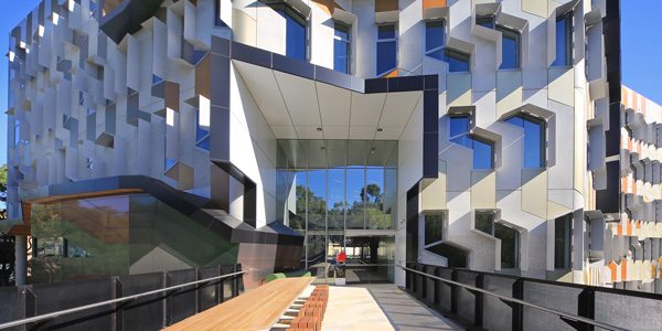
La Trobe Universities newest addition – the Sylvia Walton Building – happens to be one of its best. A star-quality glazing program is key to the relationship between new building and old landscape.
An understanding of light and flexible, adaptable spaces define a building of real magnetism. Honouring its former Chancellor, The Sylvia Walton Building may be in the campus epicentre, but the precinct feels distinctly pastoral, predominantly water, bush and low-rise buildings from the 1960s and 70s. The university’s master-plan of ring-road and satellite car-parks has led to a pedestrian friendly, botanically driven landscape. Only 14 kms. from Melbourne’s CBD and with 19,000 students, such tranquillity doesn’t occur by accident. Project architect James Wilson, principal at Lyons, provided Vision an insight into the design decisions.

How do you know a good university building when you see one?
That’s a good question. I look for something that’s engaging and stimulating – which is what universities strive to be as they openly compete for students. They need to stand out as open, connected to student activities and learning, with real life and colour. Its use of colour and play of light is quite exuberant. Highlighting key views and social spaces through uses of formed expanses of glass and highlights of colour help to portray the ambitions and ideas of the building. In Sylvia Walton, we wanted to generate a building that created anticipation and excitement as a backdrop to better learning. Hopefully that’s how most people will experience it.
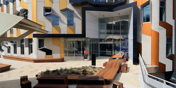
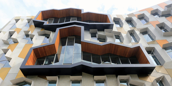
There is an organic quality that avoids the standard rectangular rigidity we see in a great deal of modern architecture. Your facades are very activated and operable with a fully three-dimensional quality. How do you typically design these?
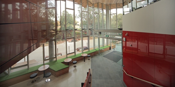
We always make sure we sit down with manufacturers and suppliers very early on in the design stage and involve them and ask what’s possible. We always look at involving contractors and then there are fewer surprises with cost or delivery blow-outs. We said we want to ‘push’ the outside of this building and so we sat down with the panelling pre-casters and Viridian and they were both on-board in the first phase of design. With the glass we definitely wanted to achieve a transparency in the double height spaces, which had varied levels of sun-shading and solar performance. It had to be 5-Star GBCA rating and it’s incredibly hard nowadays to maintain clear glazing with Section J requirements so we stressed the importance of glass specification from day one. Con Kantis from Viridian was very supportive. He provided a range of glass samples in those early project stages and it gave everyone involved much more confidence and understanding of specific glazing types. We considered issues such as clarity, thermal performance and natural ventilation. Colour tint is incredibly important.
Sustainability has been on everyone’s lips for a long time. How do you work that here?
We wanted to make it a breathable building. Every one of the major areas in the building can open up and be naturally ventilated. It’s almost like digging back into the past to imagine the future. Operable facades were very big in the ’60s and ’70s before they became fully sealed by the ’80s. Glass technology is changing. It seems to be more affordable than ever and allows for very beautiful expanses. The glazed treatments throughout the building elicit a fantastic response for our client.
To download the full article and interview click here.
Photography by Peter and Jennifer Hyatt. For more images, please follow ViridianGlass on Pinterest.
