The Block 2014
Prahran, Victoria
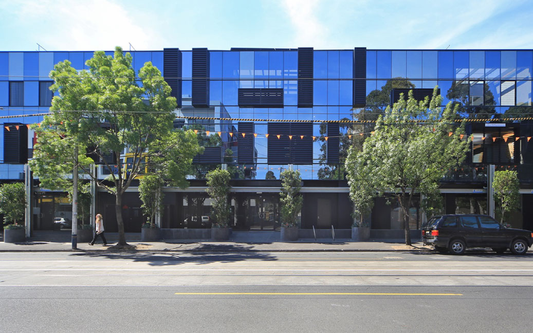
Using a suite of contemporary Viridian glazing, the project underwent a major weight loss program to become an enlightened version of its predecessors. Subtraction of concrete flooring and brick walls along with old roofing, delivers a far less ponderous, far more appealing, open building.
Television is endlessly shaping and influencing our lives – few programs more so than the renovation hit series, The Block. It’s frenetic pace, tears, triumphs and pressure-cooker deadlines have led to a ratings bonanza since the program’s launch in 2003. Eleven years and more than 300 programs later, the series remains a juggernaut in large part due to savvy property selections.
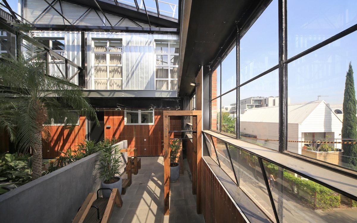
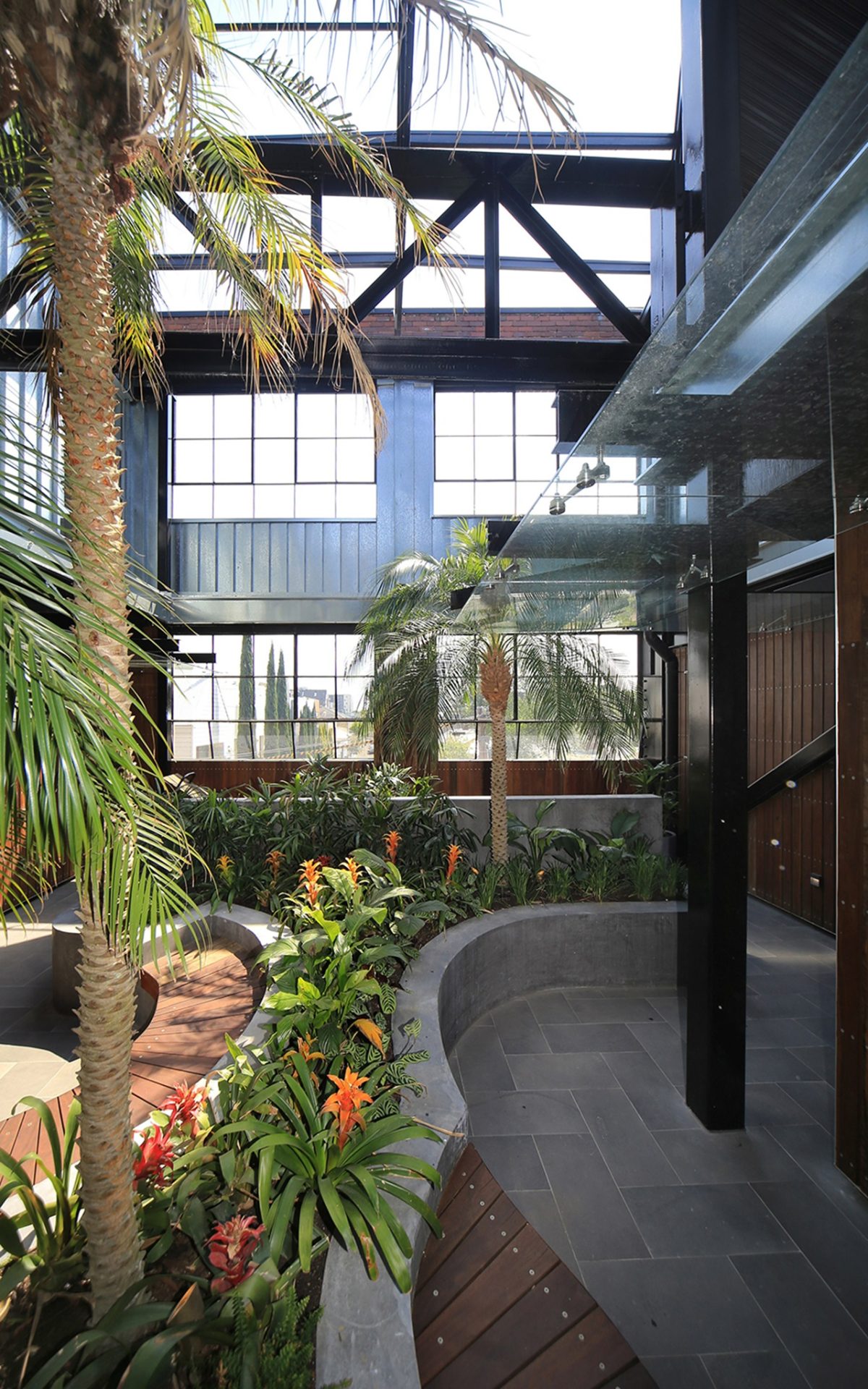
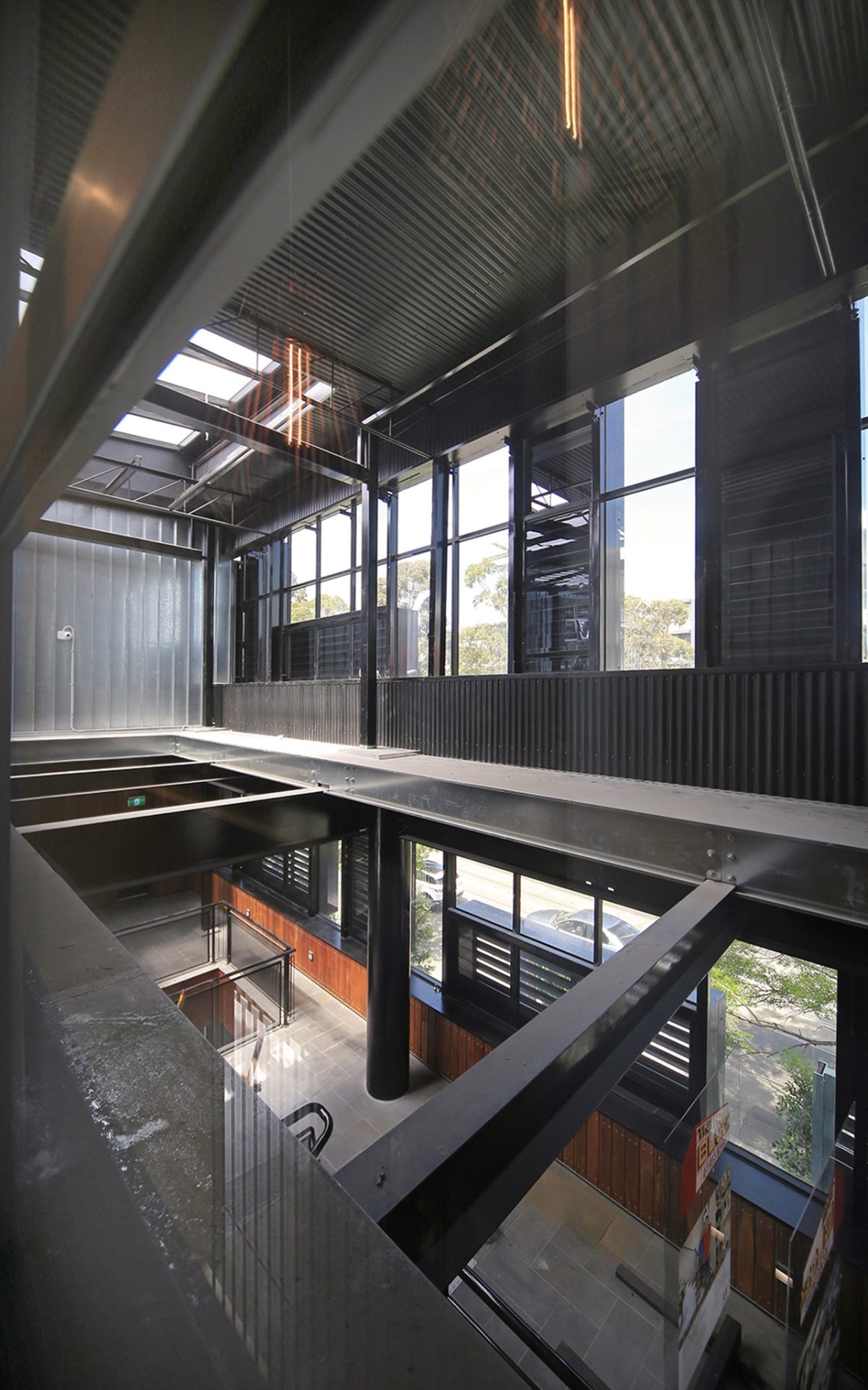
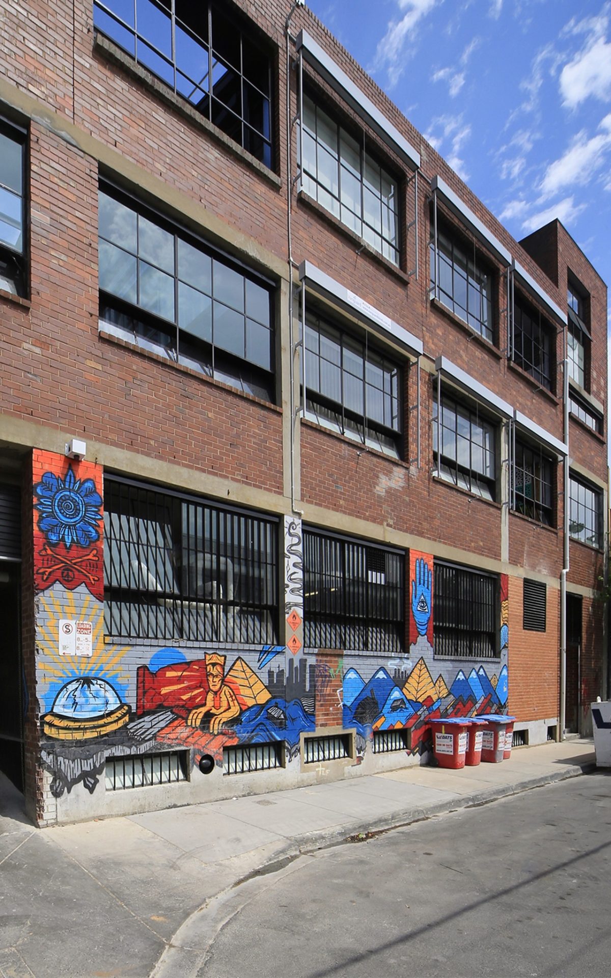
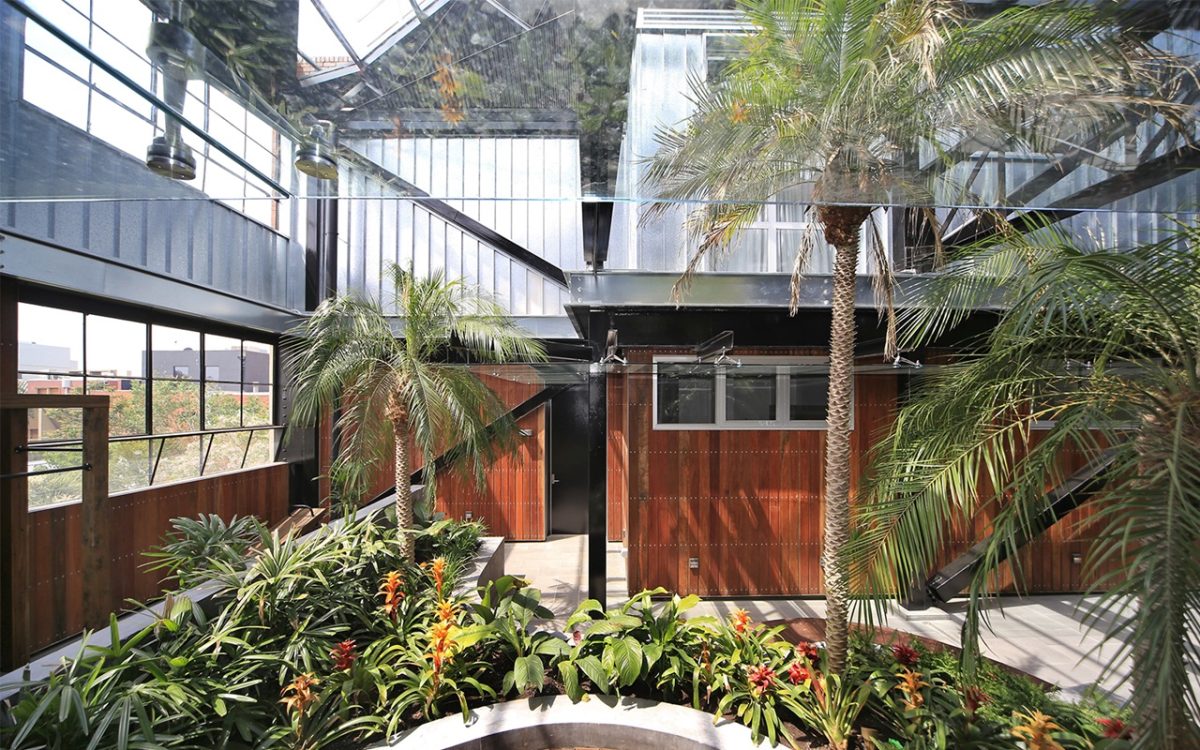
Melbourne’s inner-urban Prahran is the backdrop for the latest series, headlined ‘The Glasshouse’. Viridian glass proved invaluable in taking a 1980s office block to celebrate its 19th century origins in 21st century style. The Block’s creators, Julian Cress and David Barbour, and program architect since inception, Julian Brenchley, recognised the building’s lost promise. Brenchley’s masterstroke saw the return of the industrial vernacular including a saw-tooth iron roof converted from iron sheeting to glass. The result is a lofty, central atrium formed by glass walls north and south that lightly enclose a light-filled botanical Centrepiece.
The broad, interior avenue of the first floor entrance foyer is highlighted by lush, serpentine semi-tropical planting – with cleverly integrated seating. A small, communal exercise area is created along the north elevation. A total of six apartments catch daylight and breeze, courtesy of Brenchley’s penchant for open planning, flexible window/wall openings and ingenious courtyard gardens – a touch of Paxton perhaps?Six apartments – three along the east wing and three on the west, are principally of two levels. Brenchley describes his role as ensuring project integrity and ‘value insurance’.
_
Peter Hyatt spoke with Julian Brenchley to discover the challenges of recycling old buildings and the pleasures of an enduring, often surprising career in television:
Is there a single recurring question fans and contemporaries want to know when they learn
of your role on The Block?
JB: The conversation normally goes along the line of: ‘But you’re not involved with any of the fit-out of the units’. I explain my role as designer of the base building to ensure the overall concept will work and that it will look half decent at the end of the day.
You must feel like The Invisible Man.
JB: Not really. The Block is essentially about a TV series, it’s not about my role as architect.
You describe architecture as the program’s ‘value insurance’.
JB: The advantages of having a strong plan is that no matter how well or questionably contestants might pick say, paint colours in an apartment, at least the building is going to appear decent when it’s filmed. My role really involves a lot of the unseen coordination work in the six months to a year prior to filming, before cameras and contestants show up.
So it’s really that effort and flurry of activity and sweat that makes it all appear relatively effortless for television?
JB: That’s it. The great saying is, “I was not here.” It applies to producers, builders, architects and engineers. That sums up our modus operandi.
It demonstrates sustainability as intrinsic and ‘quiet’ rather than loud.
JB: The Glasshouse is fully double-glazed. The role of glass can’t be disregarded or under-appreciated for its capacity to deal with draughty, thermal leaks, typical of old buildings. High-performance Viridian glass helps overcome those issues and transforms Victorian-era spaces into the modern, thermally efficient context.
How else has glass assisted that transition?
JB: Old buildings require clever technologies and solid design principles. We haven’t simply added sliding glass windows and doors. We wanted to ensure this century-plus old building had a really decent future. We essentially conceived a shell within the shell to provide a fantastic environment.
What else was the appeal of glass?
JB: Clear glass means maximum light transmission into areas that might otherwise feel gloomy. You will notice that use of internal courtyards and large sliding glass doors and those really bring a huge play of daylight into the core of each apartment.We were also able to select from a wide suite of Viridian products that offered terrific effects and texture throughout the apartments.
Had the building always been known as The Glasshouse?
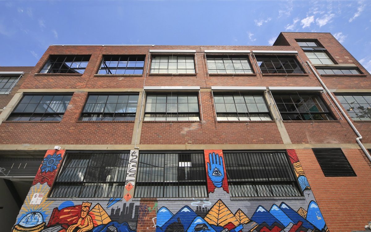
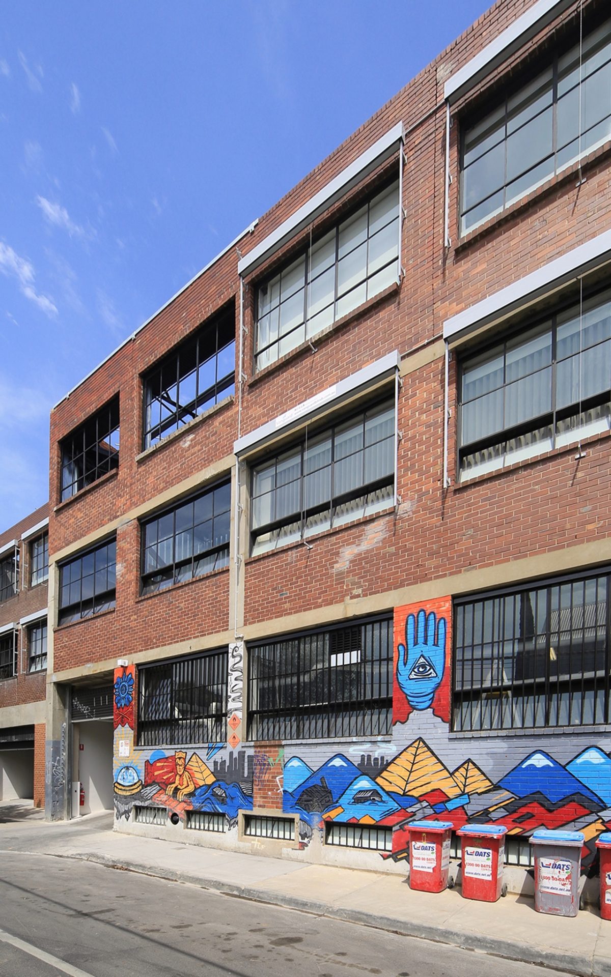
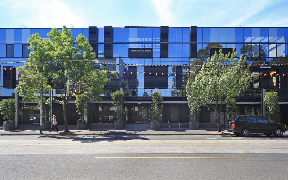
JB: The term was coined for the show and hinged on adaptive re-use. Over the life of the building when it was used for millinery, it didn’t have a glass facade. That occurred in the 1980s when it was converted to an office building with a pretty standard curtain wall facade. We decided to keep that for the show and, of course, we took advantage of those elements and called it ‘The Glasshouse’ because with the addition of the new, that’s what it literally is: A Glasshouse.
What structural work was required?
JB: We punched plenty of new holes to create some radical openings. The project’s vertical components are double-glazed for increased thermal and acoustic performance. There’s plenty of Viridian glass – from canopies through to the double-glazing in the industrial type windows to the north, which is quite extraordinary in itself.
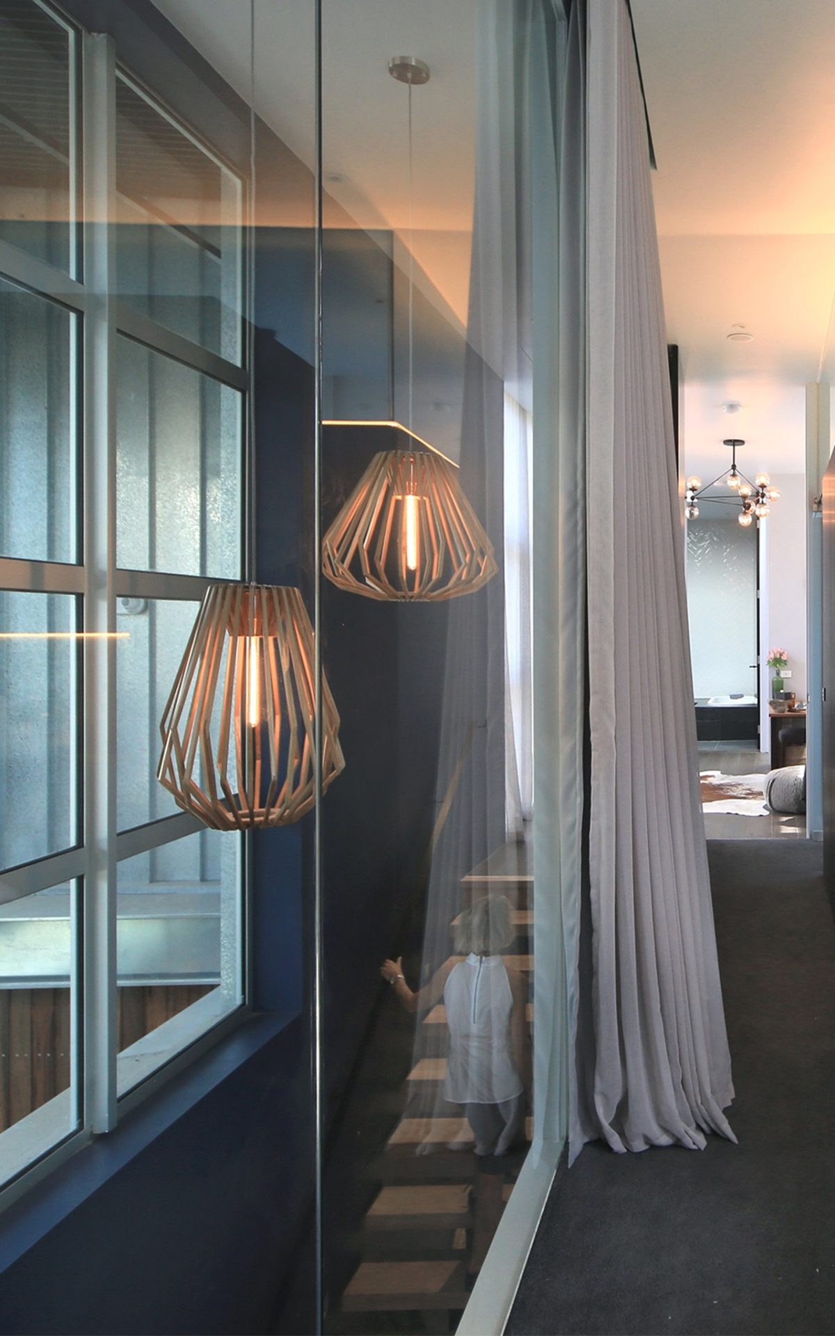
It appears playful and yet, quite controlled. There is an irony with the charcoal finishes that elsewhere might suggest a rather gloomy result, but there is such a play of natural light as to really counter the subdued charcoal paintwork.
JB: We were always going to paint the structure black and have grey floors, but I agree that the interior especially, does retain a certain playful quality. There is also a deliberate sense of theatre. We really wanted to expose and use the existing structure as a defining feature from a visual point of view.
How difficult is it to imagine the possibilities when you’re confronted with such a patchwork of the old and cluttered?
JB: I knew that concealed behind the old walls, false ceilings and plasterboard was this quite incredible, industrial structure. We have free reign with these buildings, so we really have to visualize an end-product that will work.
Was there a specific challenge that caused you concern about how it meshed?
JB: We used quite a robust, design typology so that wasn’t the challenge. There’s always the micro-detail to deal with. The real challenge was the building methodology because we were filming with up to 100 plus people working inside at once, when we’re basically chopping up the middle of the building at the same time. Then there’s retro-engineering every slab, to make sure it holds up with penetrations everywhere.
It must be difficult to manage such complex sequences?
JB: The logistics were quite insane. The light-bulb moment came when we decided to quarantine the whole centre of the building. Until that occurred, trades people couldn’t get access because there was such heavy machinery there. You can just imagine the difficulty in removing large slabs of concrete from the building that is two floors high. It was quite horrific until that light-bulb moment. Then it became quite a smooth process.
While recycling old buildings might make plenty of sustainable sense, they can also be a nightmare to bring up to current performance standards. Isn’t it like taking a vintage car and retro-fitting it to perform like a new one?
JB: Probably not so much any more, because an old building hasn’t all the services, but the bones of the structure can be quite adequate. So to use the car analogy, it’s like taking an old car, throwing the engine out, putting a new engine in and then driving off. You’re not really relying on anything that was used in the past, other than say, the structure, so everything’s new inside the old building. I look at it as almost like my grandfather’s favourite axe analogy, where he’s had his axe for 30 years but it’s had five new handles and three new heads, but it’s still his favourite axe.
“The role of glass can’t be disregarded or under-appreciated for its capacity to deal with draughty, thermal leaks, typical of old buildings.” Julian Brenchley, Brenchley Architects
So adaptive re-use isn’t always efficient or economical in your experience?
JB: The whole concept of adaptive reuse is, from an environmental point of view, a big question mark that I haven’t resolved yet in my professional life. It can be, providing you’re not spending extra resources just for the sake of reusing something.It’s quite often the case that a new building is infinitely more efficient from a structure and a services point of view, than some old building held together with sticky tape and band-aids. There’s something “feel good” about adaptive reuse and I understand that and I can use an old factory, but it’s really on a case-by-case basis. So old made new isn’t always the most efficient way to go.
You must be pleased with the sense of cohesion achieved and yet, of course, the program is really about encouraging different solutions from contestants.
JB: I think that is probably what my role really comes down to, and that is to provide these spaces where contestants can carry out their fit-out, yet the overall result is hopefully cohesive. We term it ‘value insurance’ and this is to your point exactly. You wouldn’t want to buy a unit in a building where every single unit is completely different in a building with no unified aesthetic appeal, or overall character. The amazing fit-out in a beige block of units is still going to be a unit in a beige block of units irrespective of the fit-out quality. So we go to a lotof trouble to ensure that the building externally and that includes the common spaces, hangs together quite well, so there’s this harmonious product.
Courtyards are an essential part of the design rather than simply relying on the balcony to bring in daylight.
JB: Privatizing space is critical for any Australian residence. It speaks true internationally, to a point, depending on the climate, of course. It is really critical to use the courtyard as a private space in what generally tends to be a multi-unit environment. I pretty well detest balconies, when they’re used as the primary open space because really, there’s zero privacy. They are a real conundrum from an architectural point of view. What kind of amenity are you offering, if there is no way of occupants using their space and enjoying it with any real sense of privacy?
It’s more of a European model that brings daylight and life to those spaces. The stackable doors and extensive use of glass, plays a really vital role.
JB: There’s the opportunity to see out through those beautiful Viridian stackable glass doors to the courtyard, or conversely, bring that courtyard into the living space. Those spaces almost become indistinguishable, depending on the success of the individual design. The courtyard and perimeter spaces offer an adaptable response to climate variation. The idea is really not one or the other, but the pleasure of both.
The industrial vocabulary of steel and glass is a quality you’ve brought back to life here. You acknowledge the past especially via the saw-tooth glass roof that celebrates much of that existing typology.
JB: When we first visited the building I managed to poke my head up through an old ceiling tile and I could see the saw-tooth roof above me and it was like Christmas. We were lucky enough to be able to re-use that industrial expression of the existing structure.
The industrial window frames on the north elevation provide a quite beautiful light. Your solution really has this absence of fear that this large area of glazing isn’t going to produce something uncontrollable. It embraces daylight and reinforces Sir Norman Foster’s observation about light as the great informer.
JB: Northern light is such a positive benefit for the two end units and the common space. Seeing it through the aperture of the old steel window frames really gives those rooms a structural quality. As the sun tracks across the sky, of course it tracks across the walls and you see how it enlivens the spaces and reveals a real character in those rooms. We use Viridian double-glazing and curtains as well, and together they are very efficient at dealing with thermal loads.
That generosity of volume and space is something to experience and is so contrary to what most apartments offer.
JB: That’s it. The developers who missed out on this building were absolutely turned inside out when they learned we were only making what were essentially two-storey apartments. We could have quite easily made three-storey apartments there and tripled the size and doubled the number. Instead we elected to create these massively generous internal volumes.
Did you learn anything specifically from this to take to future projects?
JB: There is some quite clever retro-engineering that enabled such a large central void. Even though we had to use some mass construction and a robust structural language, there is a softness afforded by the glass canopy that trails around the void. There is a lot of layering of elements and they hold together as a strong idea going forward.
It’s a very imprecise science that leads to the best auction price.
JB: My view is that the best design won the day and then following it was the biggest unit. The others did well and sold and on the day we would have hoped more for each contestant.
Do you feel stereotyped or typecast by the program’s success, or is it liberating and brings other opportunities?
JB: I don’t feel typecast, because every time I do one of these, it’s working on a different building, and a different building typology. We try really, really hard to make that the case so the show doesn’t stagnate and is exciting.
The series longevity is a testament to that.
JB: We gave up long ago thinking about what’s expected or assumed. That doesn’t happen in the real world. We’re buying property in the real world and selling it in the real world, so we have to take what we can find and not put up with second-best, to really make the most of what we’ve got.
Do the program’s pressure cooker deadlines ultimately work for, or against, the best results?
JB: We don’t cut corners in terms of quality, so if a certain building requires a lead time we just have to work backwards from that time rather than work forwards and compromise quality.
What about the glazing program and working to those deadlines? Aren’t there ever issues with lead times?
JB: Getting toughened glass within short periods of time isn’t the issue it once was. Glass fabrication facilities are now so much more advanced. We can receive orders in time frames that would have been inconceivable 10 years ago. The production lines are that much more efficient. We can have glass staircases if we want. Twenty years ago you would wait six months for those. It’s only a matter of weeks now provided it’s all well planned. It’s a very different ball-game.
Is there anything else you learn from The Glasshouse experience?
JB: Well I’m the first to say I don’t know everything, which is different from never being wrong. I learn on the job. When I start a project I’m one of the dumbest, by the time I finish, at least I’ve got some idea, but there is always plenty to learn. I enjoy that process. I really do. That’s part of the excitement of these projects. Glass especially is one of those materials evolving rapidly and revealing new possibilities. Glass is so often the key to unlocking a really beautiful space. It wouldn’t matter how gorgeous the brick walls were, we couldn’t do it without that quality glazing and window frames.
