Standing Ovation
Geelong, Victoria
Living up to its title of ‘performing arts and creativity’ Geelong Grammar’s newest asset is a slick design with an ensemble material line-up including Viridian Profolit™, Seraphic™ and SolTech™ to deliver a virtuoso performance.
A performing arts centre has quite a head start over most building types. It should be beautiful and inspired and quite unlike a dressed up warehouse, or apartment block. The grand gesture too, often heralds disappointment with interiors that fail to match first impressions. Raised expectations and actual delivery is a rare achievement, yet this is precisely what occurs in the traditional, Geelong Grammar School’s Corio campus, an hour south of Melbourne.
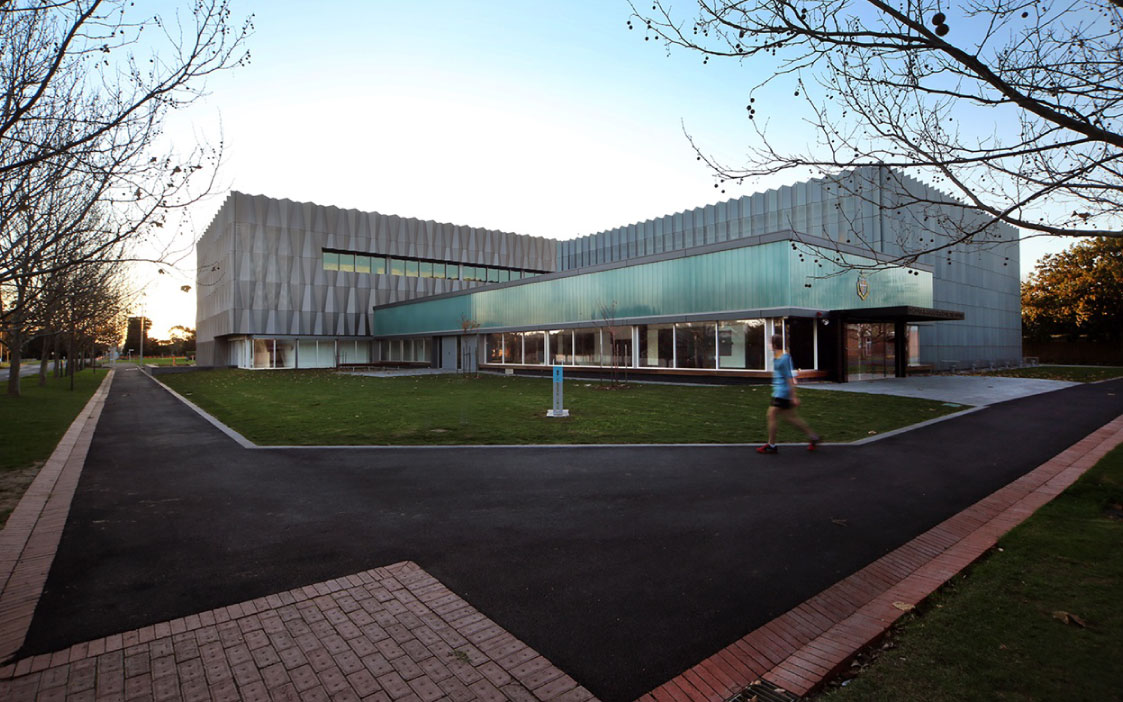
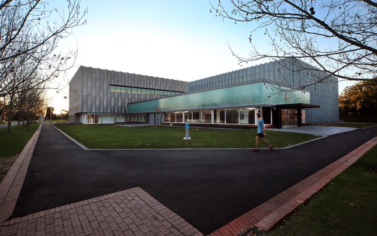
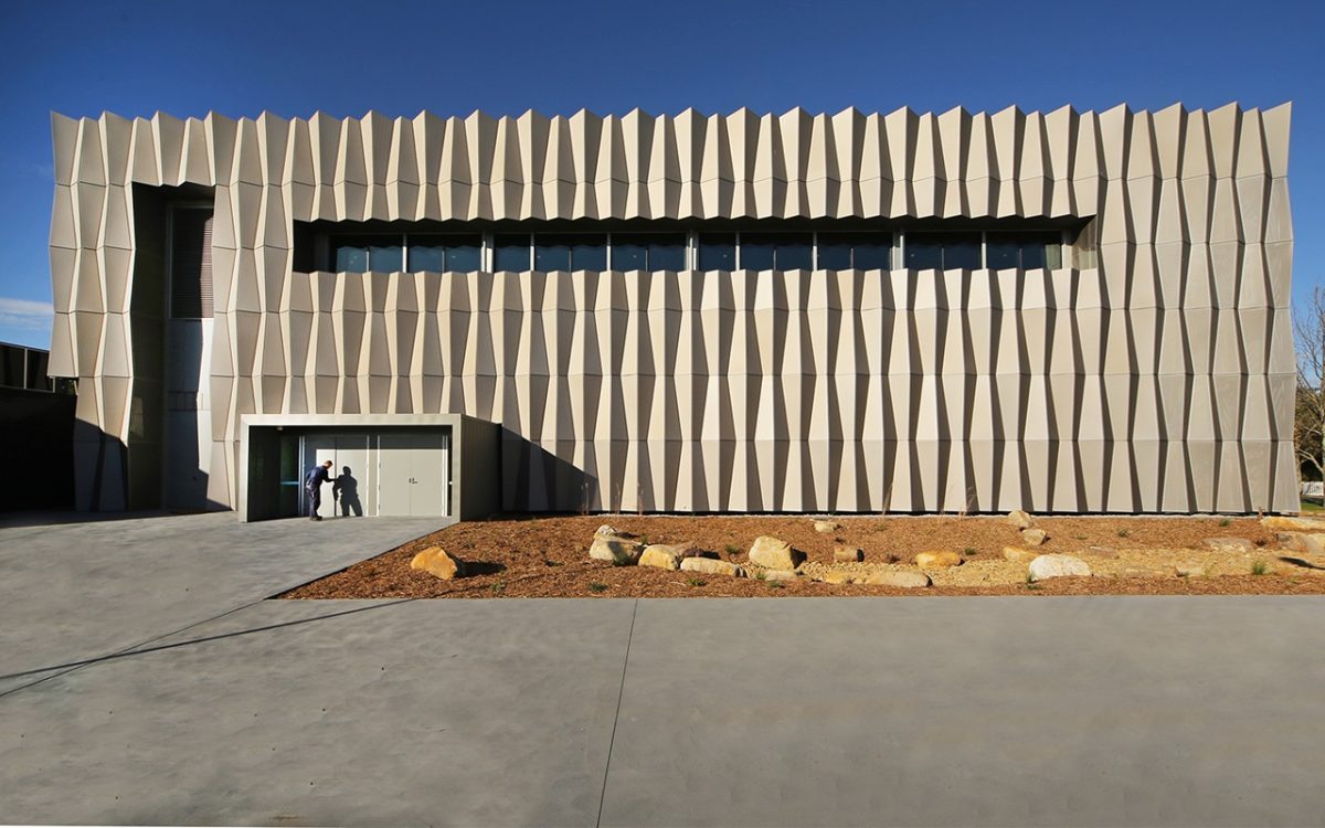
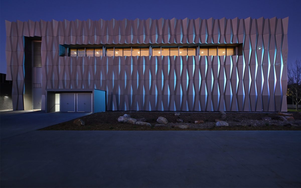
Peter Elliott’s uplifting vision extends throughout. Its folded metal skin and array of glazing contribute to a dynamic form and ever-changing skin, depending upon the time and subtlest inflections of light. Interior planning and finishes maintain the groove.
Considering such facilities deserve a special heartbeat for school and community groups, this brilliantly aligns a taut exterior with a high performance interior. Within
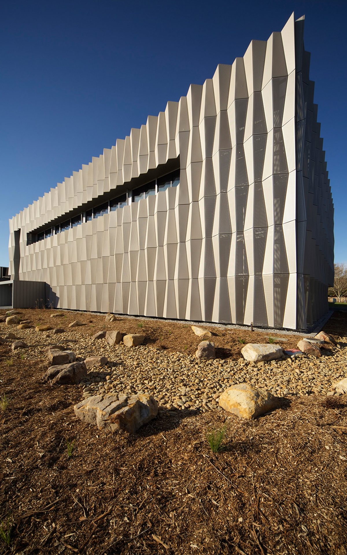
the school’s village landscape, Corio Bay is a painterly blue strip at the end of the tree-lined avenue. The project appears the work of an origami master with a crisply folded skin and rhythmic glazing for a convincing, if not theatrical, resonance.
Vision’s Peter Hyatt spoke with Peter Elliott about a project that reflects its place and echoes to this architect’s abiding interests:
What was your initial focus once you understood the brief?
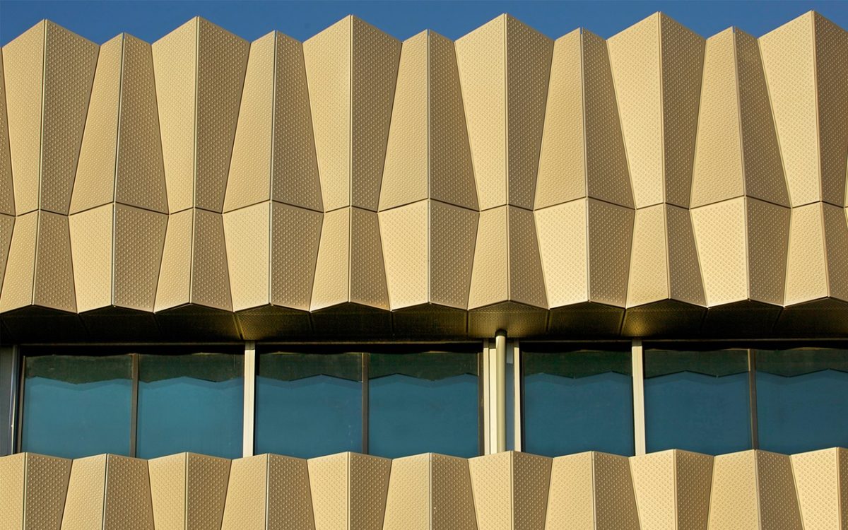
How we would integrate a number of large boxes to make them look less ponderous than they might otherwise be. There’s really an element of disguise in creating the necessary dimension and sculptural qualities to a building that performs its role, suits its place and attracts students, staff and community. We see the two boxes as sister and brother. Rather than identical, there’s more of a family resemblance. The smaller box has a regular creased perimeter and the big box, because of its sheer size, appears more crumpled.
Your beautiful Robert Clark conservatory in Ballarat from the late 1980s that comprises a folded glass skin, appears to be an early example of your fascination with origami as form and skin?
That DNA is there because I have a real interest in folded shapes. Those qualities help bring alive what are really a few black boxes. One is glass, the other aluminium and glass, but there are quite a few similarities.
What are some of the qualities that make it successful?
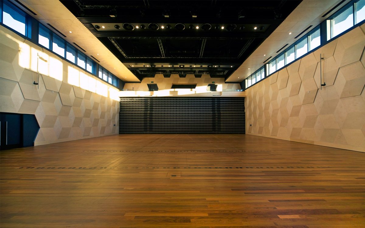
The Play House has a huge floor on one level within that big box with retractable seating for 800. Press a button and the seating disappears into the wall in around 15 seconds. If you need seating for say, 300, just press a button and suddenly there is your seating. It’s brilliant. The great advantage of a flat floor is its flexibility in any mode. It can adapt to all kinds of performances. It’s set up as a large theatre format for everything from large musicals to smaller productions. There’s a bunch of typical back-of-house spaces including change-rooms and toilets.
And the smaller rooms and performance spaces?
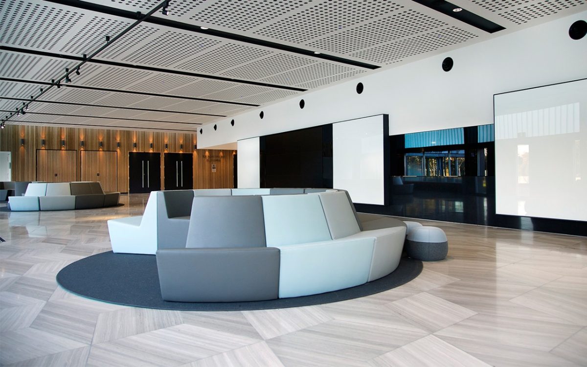
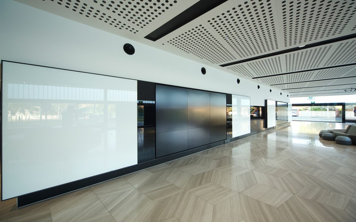
Drama-school classrooms double as green rooms. There are also multi-purpose drama spaces, a rehearsal room and ballet warm-up. Typically in a school, you use these teaching components as the back of house to economize on floorspace. The foyer is designed as a student active space. It’s actually a classroom.
And the foyer’s role?
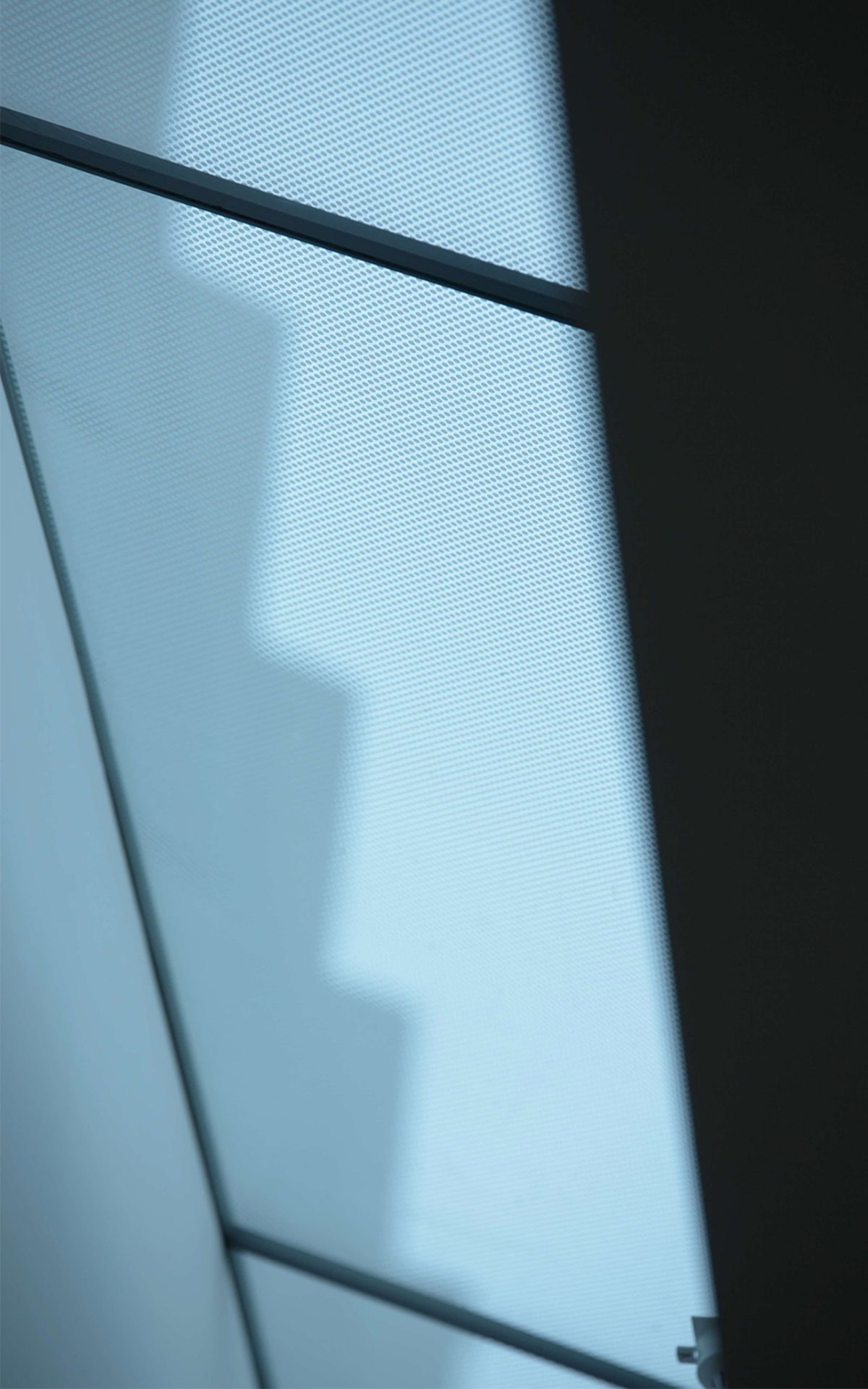
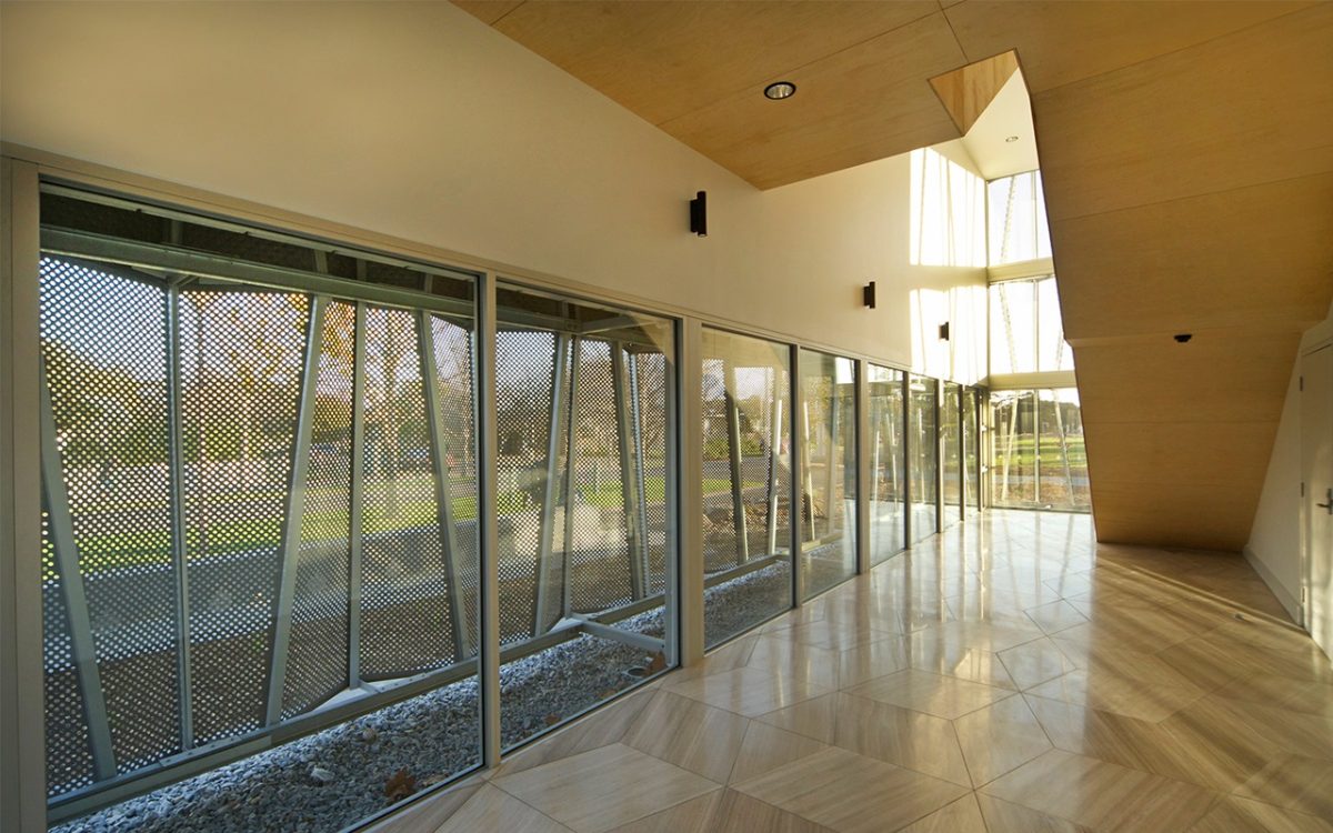
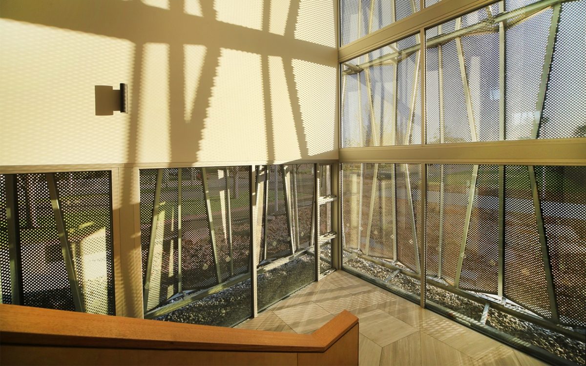
The founding idea is this open, welcoming glazed corner. Its glass prism shape adjoins two very strong tectonic boxes clad in a gleaming skin. The skins are anodized aluminium with embossing and a number of perforations for a shimmering surface effect. It’s amazing how strong that is in all forms of light.
And you avoid any appearance of educational warehouse.
It was vital to reflect its function yet be stylish rather than produce a basic box, or aspire to appear extravagant. These are a highly sophisticated set of buildings and very complex in design and operation. They also tend to be the heart of the school community because it’s a centerpiece for special occasions, celebrations and events. These facilities are crucial to the school’s cultural life. It has been invested in heavily by the school for almost a generation of deep conversation about the need and form of this project.
How do you find just the right balance between those extremes of warehouse dull and grand posture?
There’s an inference that it should be a building of high quality without appearing to try too hard. This is the balancing act for the architect, to guide a building that doesn’t posture. It is an interesting conversation for schools, because many have high ambitions in this area. There’s also the sophistication of many students whose engagement with the creative arts is inspiring.
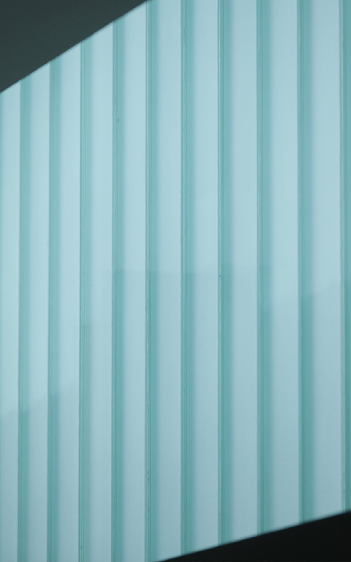
“This installation is perfect. It’s an interlocking, double-plank system with excellent thermal performance with a very soft, diffused light.” Peter Elliot, Architect
The experience of place is obviously key.
This isn’t the Arts Centre in St Kilda Road and isn’t the local hall. It has to find itself somewhere in the middle. It still needs a sense of occasion. When visitors arrive at this building as a parent or a student, they experience a certain “wow”. It’s not overcooked, but it does give a sense that this building treats the idea of dramatic events as part of its assemblage.
Glass has an important role because it’s much more than a game of appearances or performance. It has to meet environmental and aesthetic standards in one sweep.
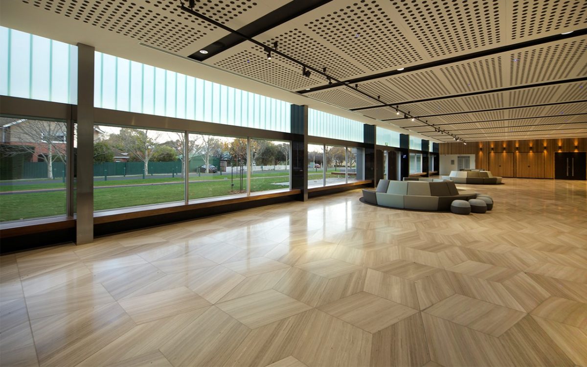
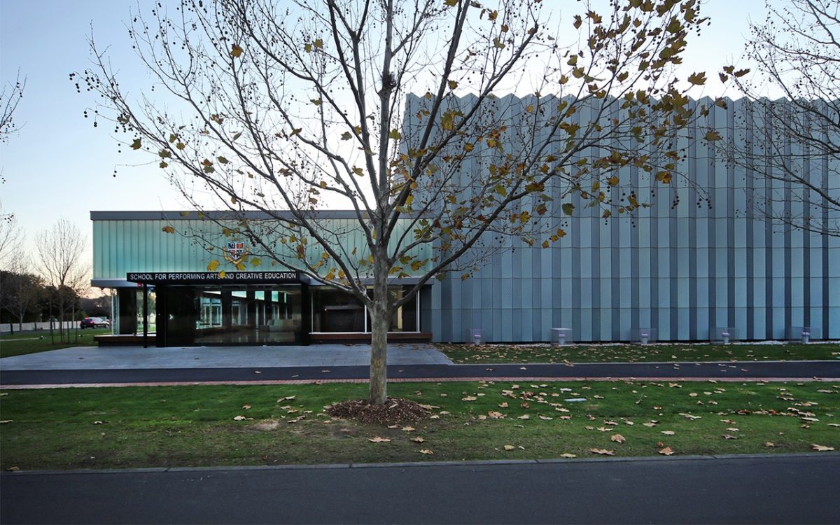
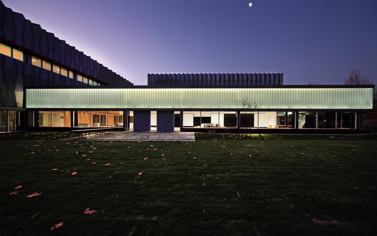
That’s true. The south-facing foyer has a significant advantage because it means glass has a reduced heat load problem. Southerly light is much softer and very suited to this large interior volume. We devoted a lot of time to the foyer glazing which is really a very long, linear, wrapping element linking the two main performance boxes.
Did the school have a point of view about your use of glass here?
We were very keen, and the school was enthusiastic about glass because these gathering spaces are used so extensively during the day and shouldn’t need lighting to enter that foyer space. I think they were willing to see what we could achieve with the material and were convinced of the benefits.
Profilittm is a very distinctive product and treatment.
It Is beautiful. We have tried to use it on other occasions and so are very pleased to finally do so. This installation is perfect. It’s an interlocking, double-plank system with excellent thermal performance with a very soft, diffused light. The idea is a low-level viewing window with a continuous seat inside and out. People typically gravitate to the edges and here they are really beautiful. The foyer links to the landscape which is a sea of green. The LED back-lighting to the ProfilitTM makes the floor and ceiling appear to hover.
Builders often treat glazing as the left-over space in the wall while architects are inclined to see glazing as an opportunity to invest in the building. Is that your take on it?
Even though it’s a facility that fundamentally requires enclosure, we definitely recognized the importance of glass. Our large foyer is a delightful space that glows during the day without the need for artificial lighting. On an evening it glows like a jewel. From the top of the theater there are glimpses into the landscape and the glazing allows a diffused light throughout. It’s quite a dramatic space even without a performance underway. Viewing windows to the north and highlight windows to the south permit natural ventilation through the space.
Did Viridian provide helpful technical support?
Typically we involve them for their expertise with glass specification and supply because, frankly, there’s so much to go wrong with any building—especially with one so complicated. Viridian was in a position to deliver and it’s an exceptionally pleasing result. We were really reassured by their level of service. We always insist on samples because with a specialized glass there’s a level of anxiety, but they definitely facilitated Profilit™ and their other products as part of a very smooth chain of events.
What are the other key glazing strategies?
The Viridian VFloat™ double-glazed units to the foyer glazing under the Profilit™ and the classroom and the backstage glazing. That’s the typical default glazing and then there’s triple glazing in the Play House and Studio windows and Profilit™ along with Viridian’s Colour-back glass range in the foyer that add subtly to that experience of reflected light. The glazing isn’t vast in relation to the overall project, but what we have is highly effective in shaping the way key spaces feel. The Play House and Studio windows are triple glazed with Viridian SolTech™ Clear and Viridian VFloat™. The Viridian VFloat™ is a toughened laminated third skin to essentially stop noise penetration.
Any moments of fear, or high anxiety?
When the first concrete panels went up there was a sort of sigh of horror around the school. The general sentiment was: “Is that what we’re getting, a factory?” But once the outer skin went on, everyone was just delighted. It demonstrates how you can transform a dumb concrete box into a shimmering delight. It’s typical of the work of our practice. It’s disciplined and nuanced, rather than appearing to be try-hard. There’s a lot of sampling and trialing with all of our materials.
Any other influences of note?
What influenced this almost more than those earlier projects is our freeway work. We’ve done a lot of very large-scale walls in a freeway setting and to hold one idea effectively and powerfully is quite exciting.
