Playhouse
Mulgrave, Victoria
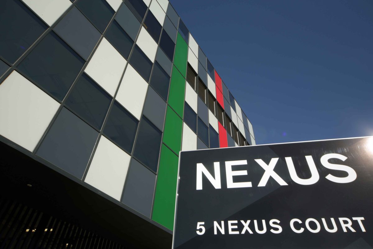
Business park developments rarely win plaudits for their aesthetics or design credentials, but Nexus Park, in Melbourne’s Mulgrave, is among the exceptions.
Among its fleet of low-rise, high-achievers, 5 Nexus Court offers intrigue and delight.
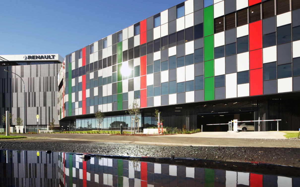
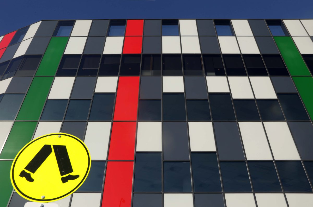
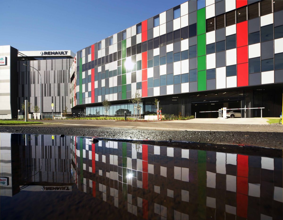
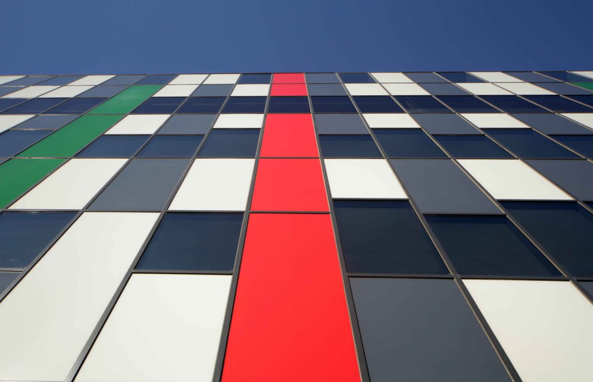
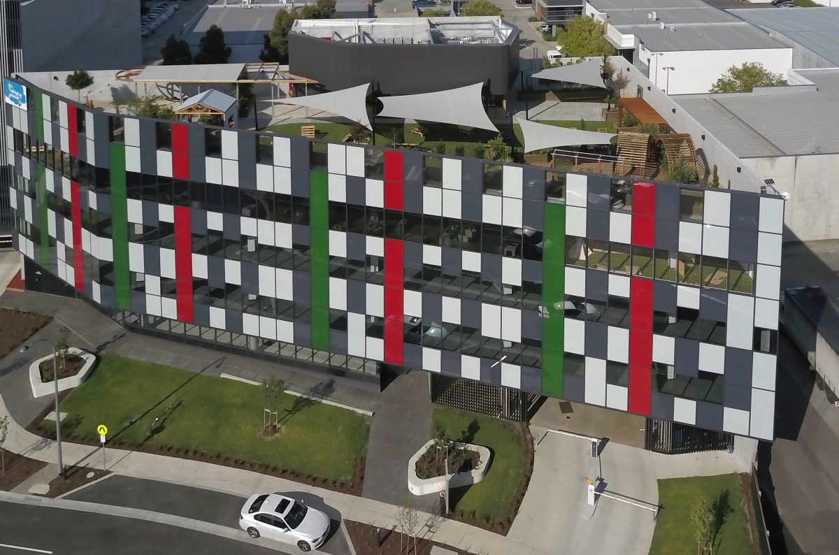
Two standout features deserve praise – the first is the staggered, abstract façade, the second, an exemplar in how to convert rooftops into works of functional beauty rather than lazy utility.
Occupying a tight triangular site, 5 Nexus Court makes much from little, by extracting every ounce from limited opportunities. Its heroic frontage more than compensates for its restricted ‘rear’. Katz Architecture has done some fine juggling to provide a childcare facility not as gesture, but pivotal to project.
With upper tenancy levels exceeding maximum lettable area, a recessed lower level articulates and enables the bulk of the building to ‘float’.
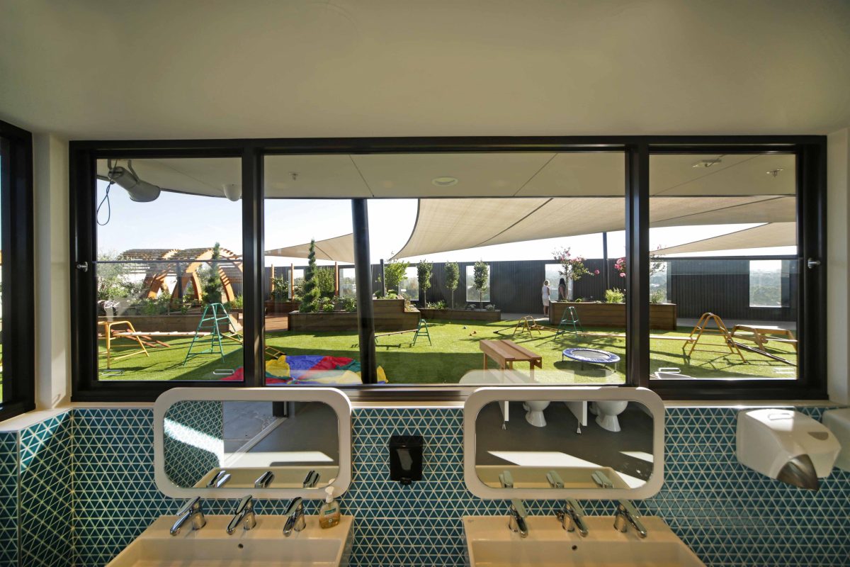
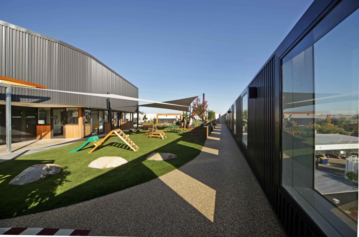
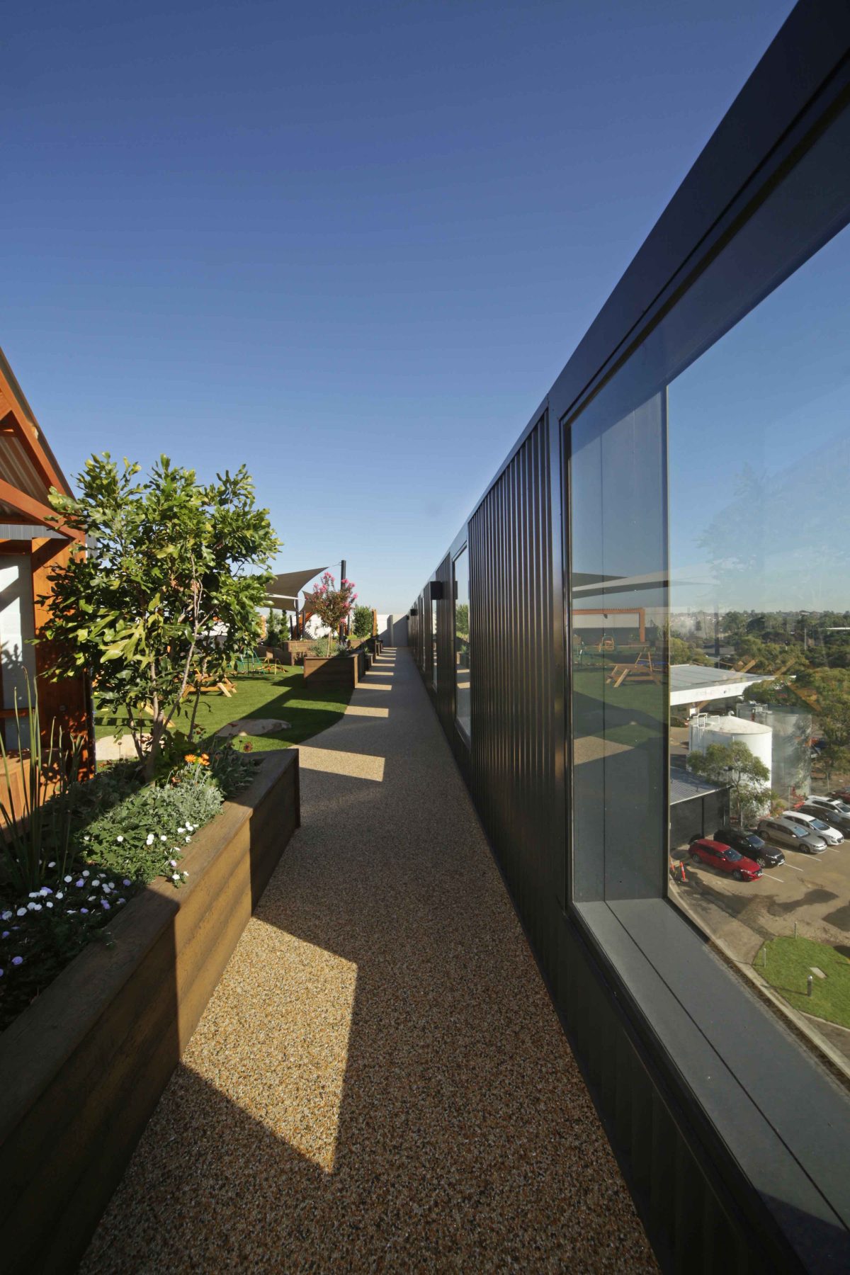
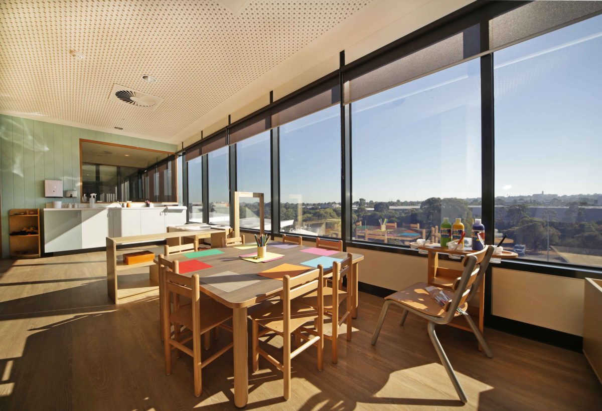
A top-level roof deck introduces valuable outdoor space, satisfying the requirements of the new Platypus Junction, an early learning centre and kindergarten located on level three of the development. It also provides a unique cap to signify the special social function.
Since its opening 5 Nexus Court has become a social hub of the park. Its mixed-use development over 3,500 sqm. includes two levels of commercial office space, gymnasium, a pre-school centre for 96 children, outdoor rooftop deck play-space, car parking and retail.
Paul Katz of Katz Architecture discusses a dynamic glass façade and building bristling with flexibility:
VIRIDIAN What are the main reasons behind such a bespoke façade?
PAUL KATZ By saving on the two solid façades on boundaries we had the opportunity to really take full advantage of the remaining façade and so we used a very good material. It gave a great, strong presence. This building has an articulated façade that floats above the ground, has a sense of fun with the colour, stripes and animation.
What other aspects of the development resonate with the occupants and passersby?
It’s meant to be a playful façade. The first tenant is pre-school centre and while primarily an office building, it can contain other social functions used by the estate. We wanted to provide a playful nature to the building, something a bit different to a normal commercial building. Its articulated façade floats above the ground and has a sense of fun with the colour and the undulations… The way the glass façade is detached from the core masonry elements, means that it floats and gives a very articulated result.
Did you meet any client resistance when you proposed this alternative to the more conventional façade system?
They eventually embraced the idea of doing something different. The commercial realities in terms of what people expect in a commercial building also tempered the result. And so we might have had an even more undulating façade and undulating glass lines in terms of sill heights and head heights of windows. They became a bit more standardized in the sense of corporate reality.
Was the building considered specifically with the pre-school centre facility in mind as the anchor tenant?
The building was always considered as a primary social building for the estate – not only a pre-school centre, but also gymnasiums, pharmacies and other community services. It’s a smaller footprint than a typical commercial building and so it was always focused on the more social functions. Once a business estate reaches a certain size, it lends itself to other social functions.
Have you incurred any greater costs in striving for difference?
Well we certainly tried to detail it architecturally in a way that’s unique and so whilst it’s using all the standard corporate technologies in terms of precast and glaze façades, curtain wall systems, it’s the way they’re articulated and integrated that gives it an improved sense of being, if you like without any cost penalties. So, for instance, the way the glass façade’s detached from the core masonry elements means it floats and gives it a very articulated response.
Was the rooftop always considered a crowning feature, or an idea you helped to shape?
From day one we did anticipate childcare on the top facility and the easiest way to get their requirement for open space was to have a rooftop deck. The initial solution actually incorporated decks on the lower levels as well, so I had some deck space at their active level together with some enclosed space on the roof deck level, but it was part of the feature.
So where are all the non-services that are just tucked away?
They’re tucked away on top of the building, but in a plant room as knuckle at the top of the building. It’s a deep, tucked away footprint.
How challenging was it to marry this kind of unusual faced coat-of-arms with an unusual and conspicuous tenant such as a pre-school centre?
Well that’s where a simple response was required and part of that was in response to the adjacent building we also designed, which has an abstract façade. We wanted to continue that articulated façade and introduce colour because most of the estate buildings are black and white.
How did your choice of Viridian’s Seraphic™ range come about?
Viridian tend to be involved with most of our projects. Glass is always an important element. We immediately discussed how we could incorporate different colours to really help create a special identity and finish. We also had to consider glass in terms of energy efficiency requirements and type of framing system to complement the glass. We use spandrel glass on lots of buildings but in terms of the scale and range of colours required, this is the first time we have used their Seraphic™ range.
It’s the first time you have used this type of glazing on a building façade?
Well, in this sort of way, it is. We certainly use spandrel glass on lots of buildings. But in terms of the style and the range of colours, this is the first time we’ve really used Viridian’s range. We looked at about 25 different options, probably. That final colour combination happens to relate to the owners’ corporate colour scheme. Salter properties are red and green, and they preferred that and it saves putting a sign on the building.
Is this a one-off experience or have you previously worked with Viridian?
We utilise Viridian on most of our projects. They assist us with energy rating calculations, with glass options and how to resolve those important components in building. So pretty much every building, we’re talking to Viridian.
How else does glass contribute to the project’s success?
It gives us a really high quality façade, particularly when we look at the neighbouring buildings and the types of façades they have, this is actually a pretty high spec façade and we’re using one curtain wall system, one material that stays pristine and clean and is easily maintained. I think it adds great value for the long-term.
What about feedback?
Very positive and well received. People have picked up on where the colour combination comes from. It gives it that sense of flavour, which you can even see from the freeway when you drive past and you get a very strong presence of the Salta brand. We’ve been delighted with the result and by incorporating the façade we streamlined the construction process, so we’d certainly use it again. We’re particularly delighted with this façade that we have been able to create. It really makes a contribution to the unity and aesthetic of the business estate.
Is this the first childcare facility you’ve been involved in?
No, we’ve done a number of them. Most facilities are typically on the ground and so it’s unusual to have them held up in the air. That brings a whole other element to the design and – how to make them safe. So that was the bigger challenge here of how to make sure parents felt their kids are in a safe environment. I think we succeeded with the way we detailed the façades and the screens to do just that.
Were there any problems or challenges with the job you didn’t fully expect?
We anticipated most issues. An exact finish was required and tolerances between levels had to be quite accurate to line the glass up in that way. That certainly required finessing in the final construction sequence and was well worth it. We ended up with a beautiful façade that floats above the ground and is elevated with a very strong presence.
