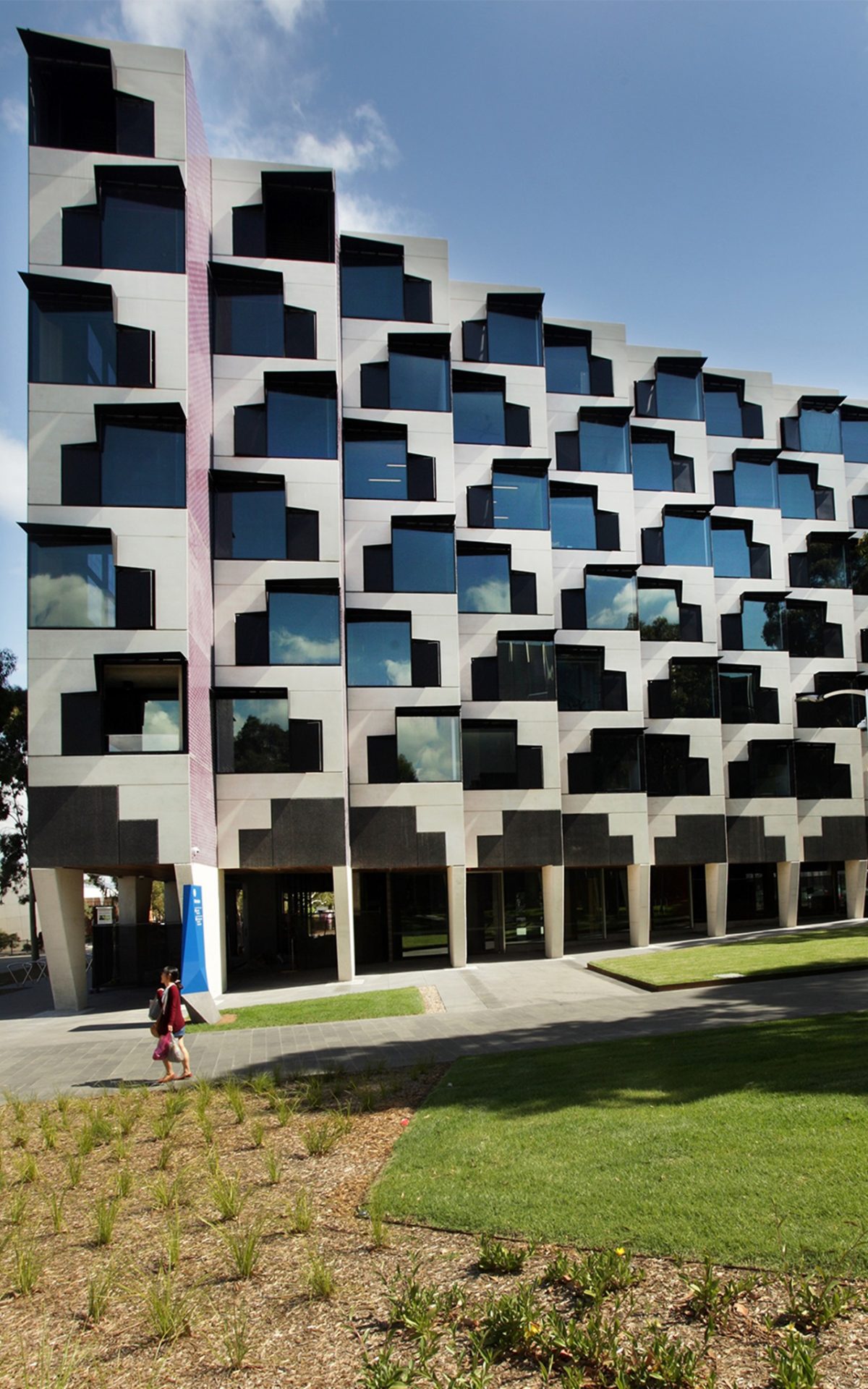
Logan Hall
Clayton, Victoria
Monash University’s Clayton campus is a story much less of student revolt than sustained evolution. Melbourne’s new population epicentre 25 kilometres to the CBD’s south-east, the 100 hectare paddock of diesel and dust, circa 1962 has been digested into the city’s sprawl, not as featureless ‘same old’ but cosmopolitan campus distinguished by tracts of stellar landscape and clusters of heady architecture.
Monash University’s four bold new halls of residence are an impressive investment in education here and now, rather than the virtual experience tethered via cyberspace.
Four design practices teamed to produce site-specific buildings right in the heart of campus—possibly to the surprise of some who view such real estate as the province of more strictly academic pursuits. Without any hint of competing ‘styles’, each practice contributes a convincing, compatible vision:
Hayball and Richard Middleton Architects (RMA), McBride Charles Ryan (MCR) and Jackson Clements Burrows Architects (JCBA) were given one building each (two for the joint Hayball and RMA team) and briefed to deliver common areas, landscaped spaces and residential areas all under the now familiar umbrella of a 5-Star Green Star rating.
An ensemble of Viridian Low-E performance glazing stars in the delivery of these enlivened, distinguished designs full of light and life. Rather than inert skins, glass walls and windows-as-gills create a mellifluous environmental dialogue.
With more than 20,000 students on this single campus alone, the university shows no signs of relaxing its ambition to perform as a global player. And here inclusiveness, rather than the cellular silo variety rules.
At first glance it might appear old-fashioned to create student housing in the Age of the Internet and on-line education and yet this counter-intuitive approach has been quickly adopted. As a substantial bonus, on-site living promises a livelier learning environment than blistering download speeds. This cultural attitude to align learning with living is central to a long-term strategy above and beyond cyberspace. In a relative eye-blink Monash University can now accommodate an additional 1,000 students on campus.
Successive Vice-Chancellors with an interest in the natural and built environment have contributed to the dynamic, uplifting and contemplative. Student housing is a newer chapter and an imperative commercial consideration in the age of shrinking government funding.
The university’s four newly-minted halls of residence – Turner, Holman, Logan and Campbell – testify to the power of architecture as stylish flagship rather than inflated folly. And rather than the austere, discounted and side-lined types across general residential developments, these are centrally located – right in the heart of campus.
Their location improves relevance and design that deftly handles the potentially conflicting needs of privacy and connection – achieved with clever footprints, spatial flow as way-finding and strategic universal/communal spaces.
It’s no coincidence that Monash University drew on the expertise of its Faculty of Art, Design and Architecture in developing the halls of residence competition process. The benefits of their input from conception to completion are apparent throughout. Faculty Dean, Prof. Shane Murray advises the university’s Estates Committee on consultant selection and together with invited external senior architects and the university senior management, designs were reviewed throughout their development. He cites Monash as the city’s leader in campus living with these new halls of residence. He was also determined that the results would set new benchmarks for housing students who in turn will activate the campus much more fully than the usual tidal flow of students. Prof.Murray says the result of these residential buildings is as animated ‘contributors’ to their settings. “A couple of these projects are really in the epicentre of the university and fully part of the operation of the campus. There’s a type of fluidity between the life of learning and living and there is seamless interconnection. That works both for the residents and most importantly it enriches the life of everyone on the campus which is the other great benefit of living in a more integrated way.”
“These buildings are obviously residential colleges and the most important thing about a student residence is that you have a lot of windows. It’s their most enduring characteristic and these buildings are a fantastic catalogue of different approaches to glazing in building.
“Monash has a very deep commitment to sustainability. The combination of very high performance solar glass with large expanses of glazing relative to environmental constraints is challenging. Combining different approaches to the proportion of the glazing and the way the skin of the building and other solar treatments shield the glass, particularly when facing east or west, has been a key element in animating these buildings Repeated glazing elements are a fundamental characteristic of student residences; they are collections of little dwellings and glass is the connection of each dwelling to the world and it’s very important to get that right.”
These projects cater for some 1,000 new students-in-residence and are centrally sited – alongside sports fields and established leafy avenues for instance – rather than marginalised to the edge of campus or worse, off campus altogether. The whole project mounts a brilliant case for architecture allowed to perform at its budgetary best rather than value-managed and finally discounted into oblivion.
Glass rather than pre-cast, provides crucial legibility and amenity for all buildings in addition to highlighting circulation zones from staircases through to shared social spaces and studio apartments.
Each project reveals a convincing sustainability position – starting with the easily forgotten, yet crucial, saved daily student commute. Various energy saving strategies include the absence of air-conditioning, thermal stacking, passive ventilation and window/wall shading in combination with performance glazing.
The use by each practice of Viridian performance glass expresses and translates designs that comply with the university’s preference for locally sourced and manufactured materials to more authentically demonstrate origin as key within the sustainability chain.
Jackson Clements Burrows’ five storey ‘Turner Hall’ offers elegance and exuberance with technicolour window fenestration. A cranked plan to its slender, linear form helps eliminate deep, daylight deprived floor-plates. Generous glazing throughout goes well beyond symbolism or gesture to ensure multiple apertures for a response not merely to light, but views to playing fields to the south and north towards a blend of verdant new and old landscape.
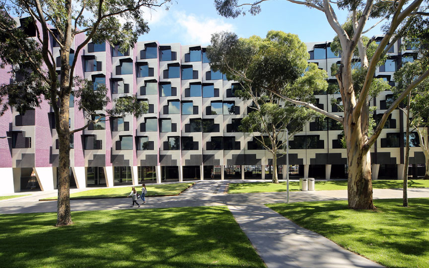
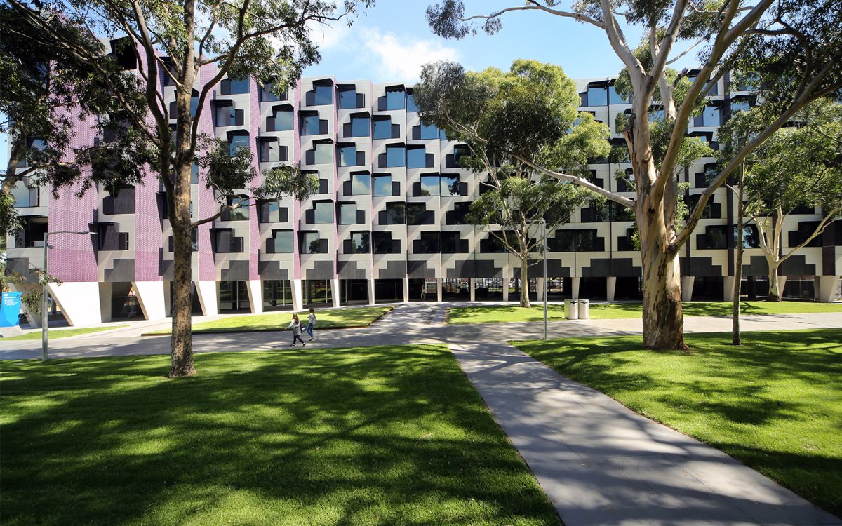
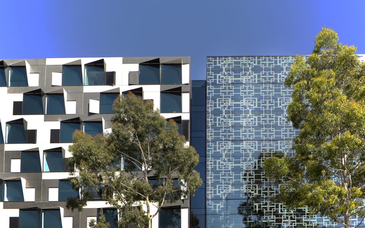
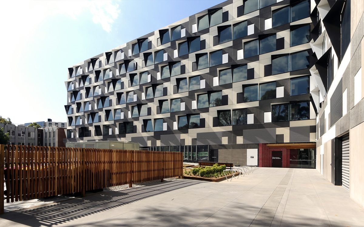
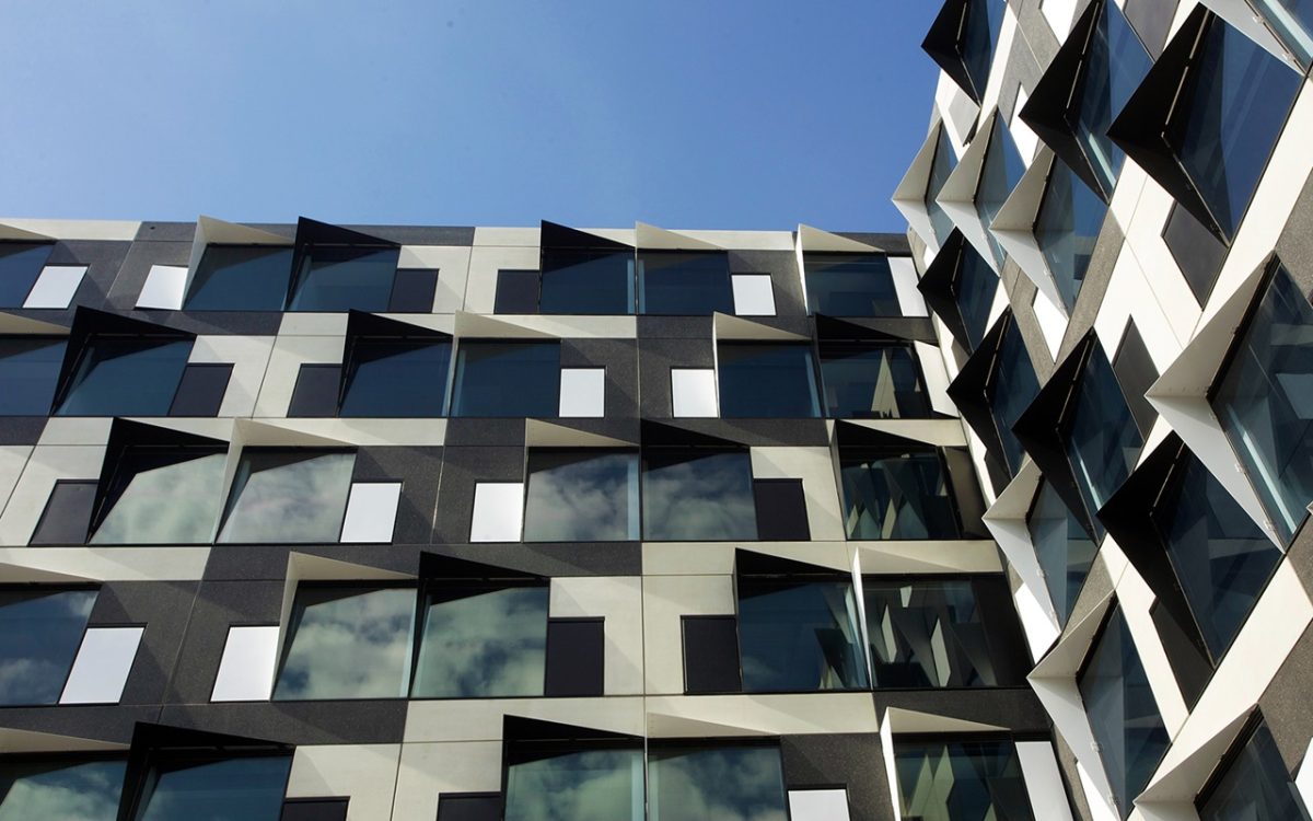
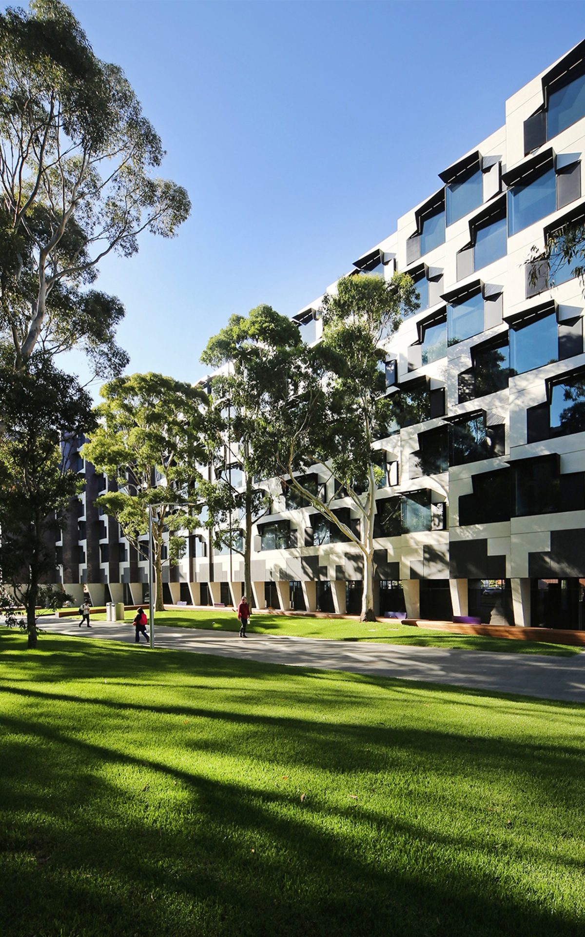
McBride Charles Ryan’s (MCR) Logan Hall is an eight-storey precast structure that wraps with the suns orientation on its east-north elevation and a monochromatic L-shape plan to the south-west with a distinctively rhythmic window geometry. MCR’s fixed shading, high performance glazing, thermal mass and insulation contribute to a design highly-tuned to its assorted elevations – most notably the leafy avenue known as Sports Walk and its fritted billboard wall to the east. Partially hooded glazing and glass on the east elevation present interactive billboards of hyper-art.
Hayball and Richard Middleton Architects’, six storey ‘Holman Hall’ and ‘Campbell Hall’ alternate between opening boldly to the south and of necessity, a more conservative counterpoint to the north and west. Internal and external glazing is nuanced to better bridge the adjacent elysian fields and tree-lined canopy with living zones. Working in association, Hayball and Middleton refer to circulation ‘knuckles’ where students filter, gather or pass throughout their buildings with such a highly integrated subtext.
All practices demonstrate the value of what might be termed ‘democratic design’. Students separated from family and friends, often by great distance, now have every opportunity to fully assimilate with university life.
The image of the disconnected, soulless ‘dorm’ is nowhere to be seen at Monash. Life, light and colour all contribute to completion of the missing link of the university’s more than half century of achievement. Finally students have a place to call home. Right where it matters – in the heart of campus.
“Windows were integrated as part of the design pattern along with maximising views and daylight into the accommodation.” Macbride Charles, Architect
McBride Charles Ryan
Carefully selected materials and maximised standard window shapes assist in developing a playful façade of repetitive elements. Student housing should feel playful and vibrant. Colour, form and generous communal spaces imbue a sense of joy. And there are surprises including the fire stair which is probably the most lively and vibrant kaleidoscope of colour of any fire stair in the world.
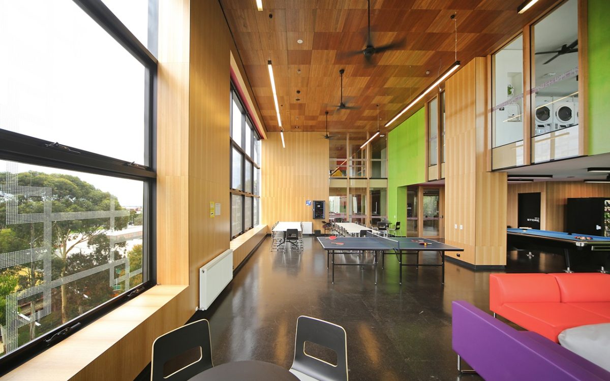
Feeling connection as a student really underlines our design approach. There is a small communal space for around every 25 students to help build a sense of connection. Many of the students here are a long way from their families and need a place that has some of the intimacy and connectedness of home. Life is not hopeless if you have companionship and a wonderful environment.
All of the housing has wonderful views and daylight. Views through eucalyptus trees on the Sports Walk, to The Dandenongs and over newly landscaped student gardens and the main campus. Corridors were planned to open up to views and daylight – the faceted curvature aids this ambition.
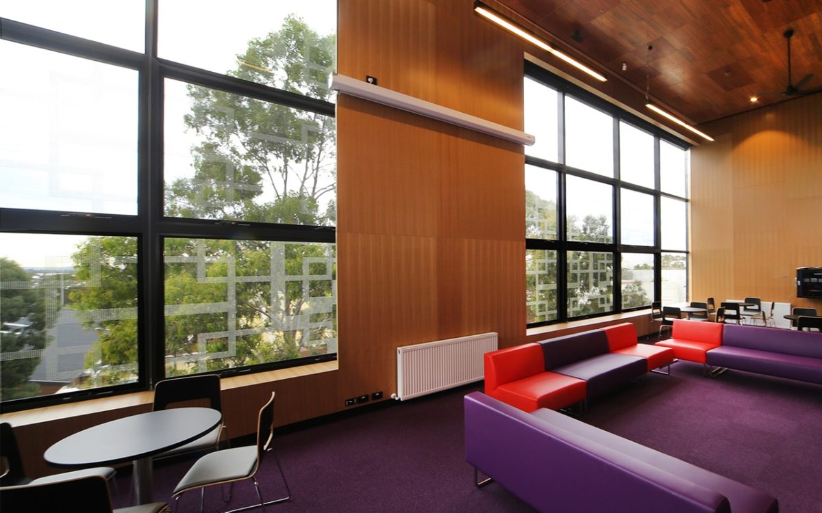
The larger communal spaces are more about larger gatherings or activity-based gathering. To enliven the façade, this skin is integrated with the function and construction technique.
Our building is on a more restricted site on the academic campus. This is the first time residences have had such close proximity to the academic campus. We felt the weight of this. What is academic institution and what is student accommodation? How could they co-exist?
With this design, accommodation is arranged to all parameters of the building. The rooms and windows are repetitive and accommodate all different orientations and conditions based around a confined corner site.
Viridian SolTech™ double glazing unit was used to achieve the ESD aspiration. Its reflection and transparency enhances the façade by balancing precast concrete’s solidity. Windows were integrated as part of the design pattern along with maximising views and daylight into the accommodation.
We used modularity to create the significant formal architectural gesture to the north. This highlighted the significance of the Sports Walk and referenced the early Brutalist campus architecture. This gesture also created the opportunity to provide a pedestrian colonnade and generally open up the internal public spaces.
Externally we were careful with detailing of this gesture to give it a type of anti-structural aesthetic, as if perhaps it had simply and effortlessly, slipped. For the remainder of the facades, we wanted to be rectilinear, as a foil to the expression to the north elevation. On the sides we used the modularity of panel construction techniques in combination with the sun-shades, windows and natural ventilation.
