Skywalker
Sydney, New South Wales
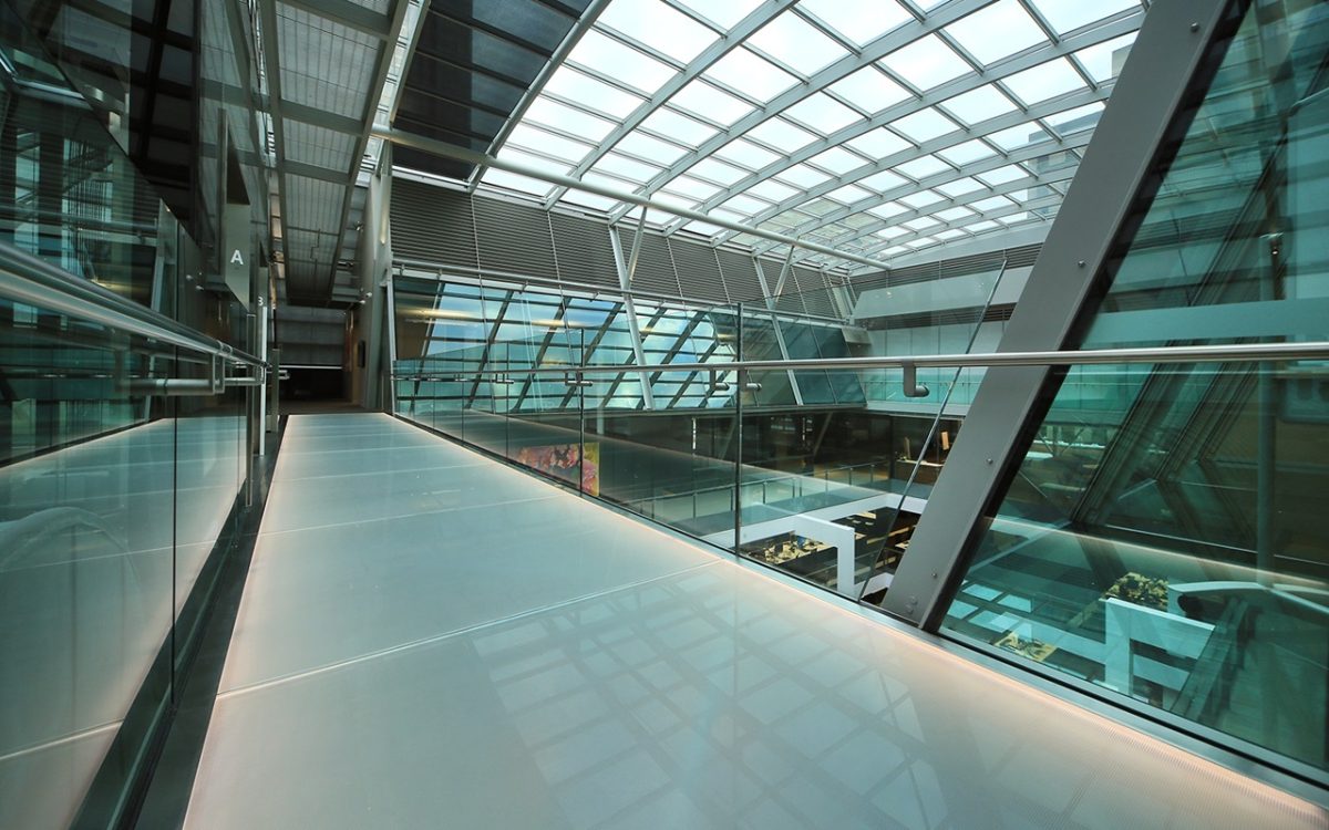
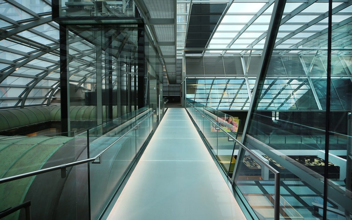
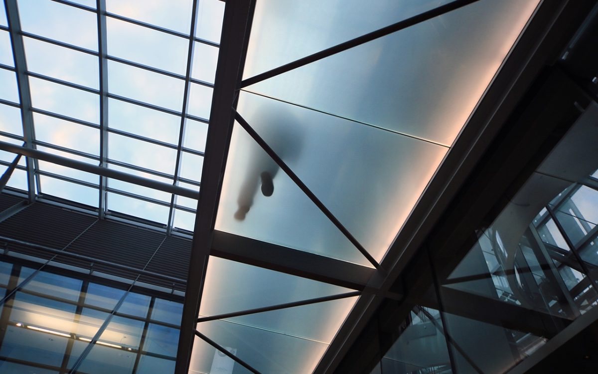
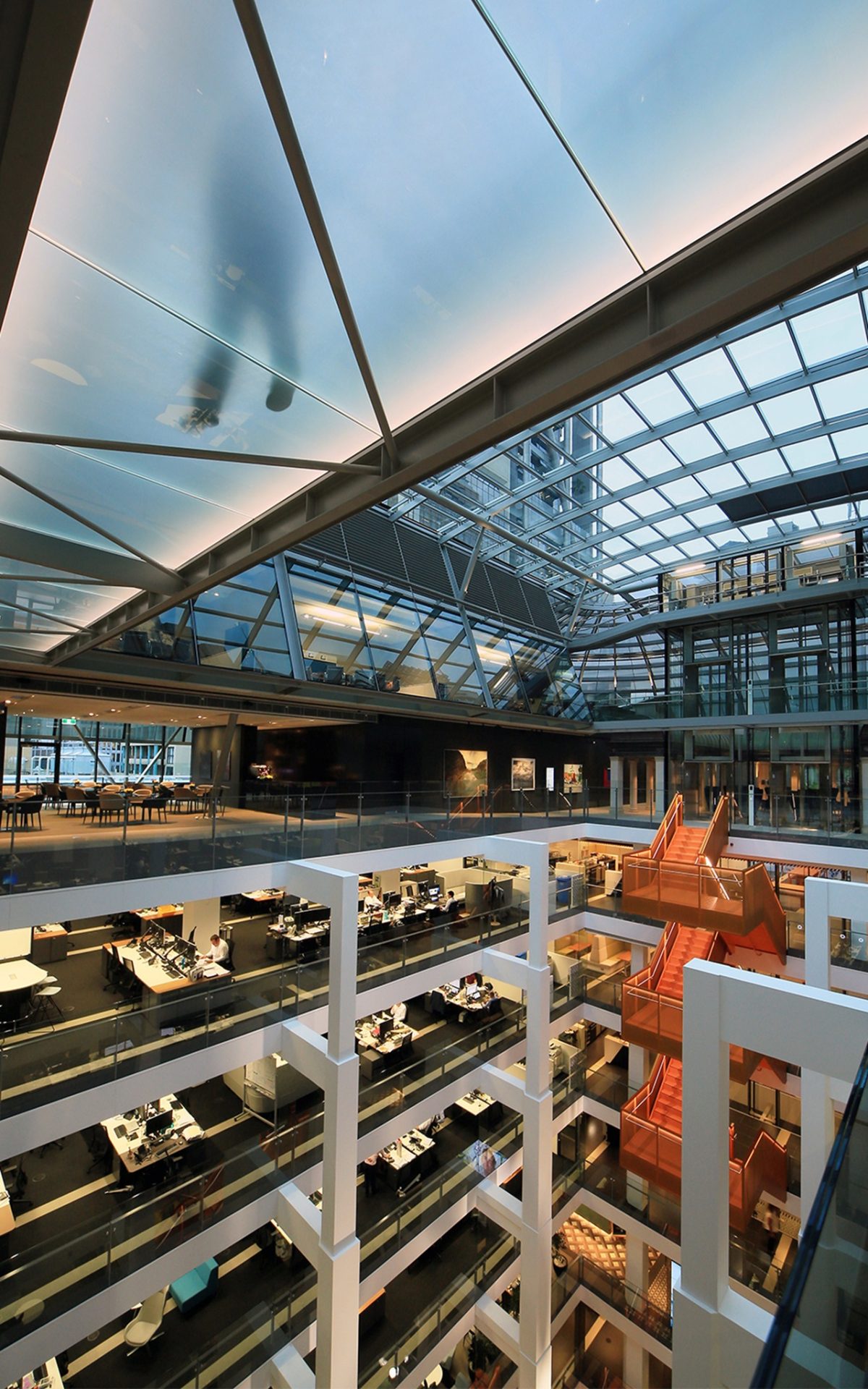
Inspired glazing sets the tone for the interior of Macquarie Group global headquarters. Skybridges star amongst the feature elements of a re-working of this aged, former bank that is now not only high-tech but fully considerate to the well-being and outlook of its employees.
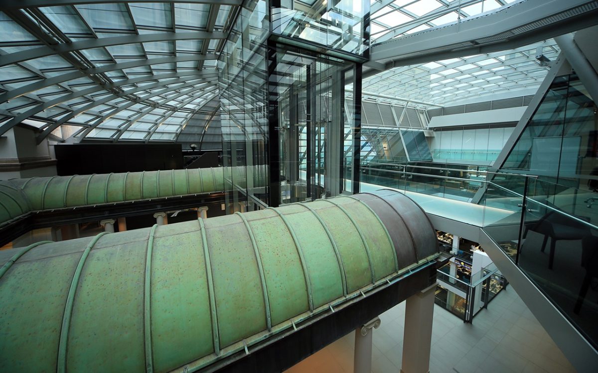
A futuristic vision and grand heritage might appear an unlikely marriage, but Macquarie Group’s global headquarters in Sydney’s historic Martin Place sparkles with authenticity and relationship to place. Glass and steel deliver a lustrous counterpoint to this grand former Savings Bank. A new glass bonnet and Viridian glass footbridges are among the jewels that transform a jaded, 20th century classic into a 21st century masterpiece.
At a mere 12-storeys, it should barely register amongst the corporate strut and muscle on almost every corner of Sydney’s financial hub. But star it does. The bank’s new home at 50 Martin Place, near the avenue’s eastern edge, exhibits a subdued, calm brilliance. Outwardly almost unchanged since its opening in 1928 as the Government Savings Bank, only a new roof hints at the liberation within.
The result is a tour de force of glass, steel and structural clarity. Architects Johnson Pilton Walker’s design is a stellar blend of new and old, light and shadow. Its vision, along with a receptive client/build team adds a human modernity to the gravity of banker’s marble. Such reinvention sees daylight wash throughout its broad floor-plates with the rejuvenating qualities of a crystal spring. For the building’s workers, this converts to a workplace like few others.
Project precedents include Foster Associates’ Reichstag Parliament in Berlin, the École des Beaux-Arts and Grand Palais in Paris.
_
Project architects Matthew Morel and Walter Brindle of JPW speak with Vision editor Peter Hyatt about the transformation of a grand design into a great one:
PH What attracted Macquarie to this, of all the city’s buildings?
MM Macquarie had a clear commitment to the CBD and Martin Place. They view it as the financial heart of Sydney and recognized how this heritage building had all of the right bones with such big floor plates, the side core and the central atrium. They came to us with a very exciting vision for the building based on their reputation for workplace innovation.
PH How quickly did the concept materialize?
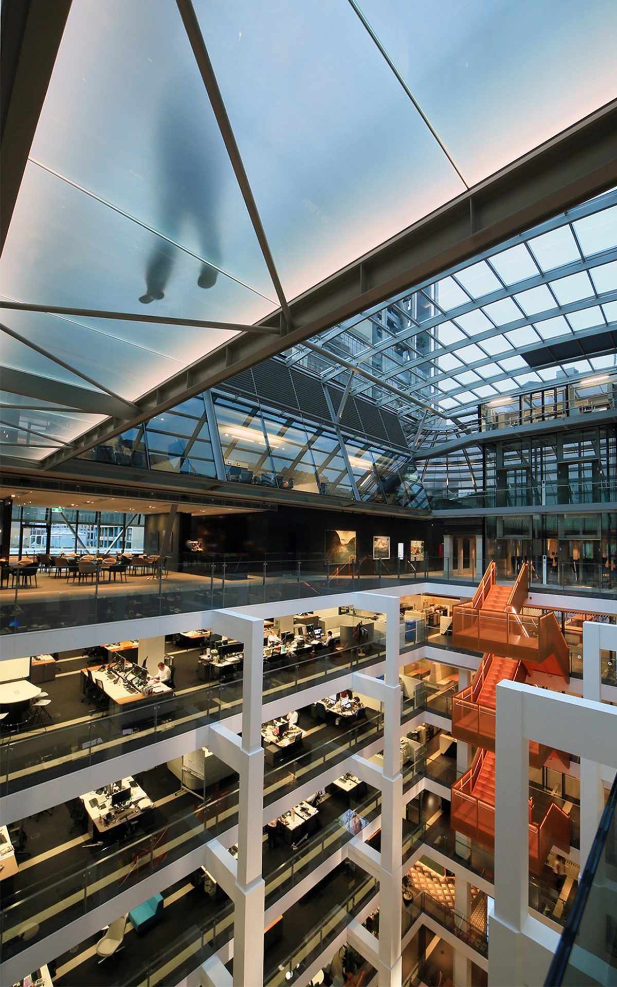
MM The bones of the scheme emerged quite quickly. We wanted to maximise the experience of that wonderful heritage banking chamber, as a reception and entry area. The nine levels within the existing building are cutting-edge offices around a central atrium. It was important to Macquarie that the roof make a statement and express itself to the surrounding city.
PH It’s quite an achievement to bring such an old building up to current day performance standards.
WB The project is a 6 Star Green Star building and a great example of converting a building almost 100 years old to demonstrate design leadership and sustainability. The glass footbridges are a part of that equation of bringing daylight into the building.
MM When opened in the 1920s, this was one of Australia’s most expensive buildings. The Government Savings Bank was the second-largest bank in the British Empire and it was one of the world’s largest banking chambers. The architects used an historical style, but in many ways they were very innovative. It was among the first reinforced concrete buildings in Australia to that height and the terracotta tiles are integral form-work for the structural walls. There is a lot of innovation in servicing the building. I hope we have continued that tradition.
PH Were you concerned your design might test Macquarie’s budget?
MM The building was delivered for a very reasonable budget and very tight time-frame. That is due to a very experienced, talented and collaborative team including Macquarie, Savills, TKD Architects, TTW, ourselves and Multiplex of course.
PH The glass footbridges encapsulate a futuristic workplace. Are they people friendly in daily use?
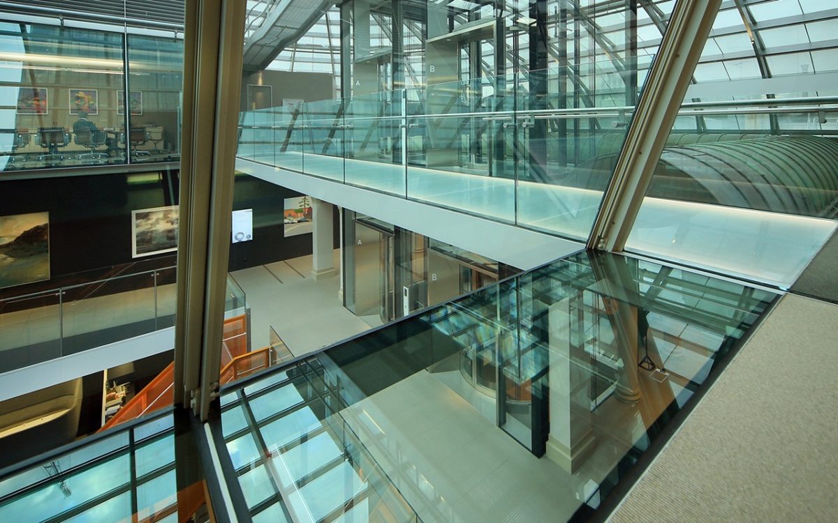
MM They’re very important and an exciting part of the atrium. The original building had at its centre a light-well and was open to the weather with a glass cover at the bottom over a stained glass roof to the banking chamber. When the building was refurbished in the 1990s, that light-well was turned into an atrium. You only have to see them in use to appreciate how important they are to circulation.
PH And the atrium really is the new building core rather than the usual lifts shaft, fire stairs and services?
MM Macquarie felt the building was ideal for them in terms of floor plate size, natural light and outlook on three sides, a side core and a central atrium. They felt the atrium needed to be wider to bring in more natural light and improve workplace connectivity. The atrium is now really the workplace heart.
PH How important is the strength and delicacy of the footbridges?
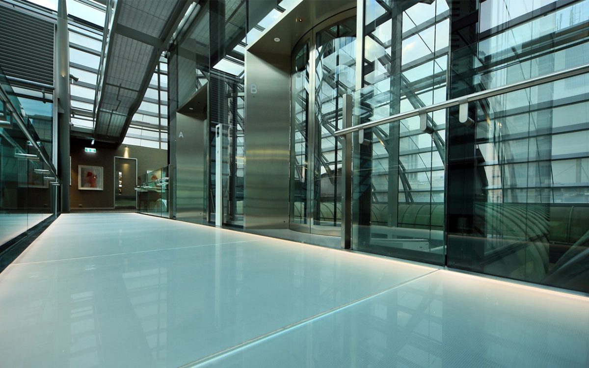
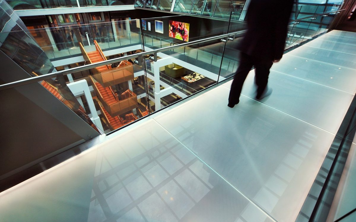
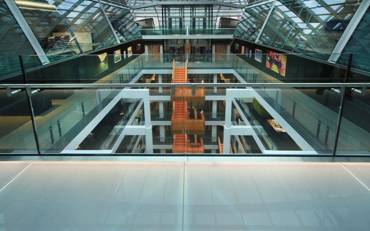
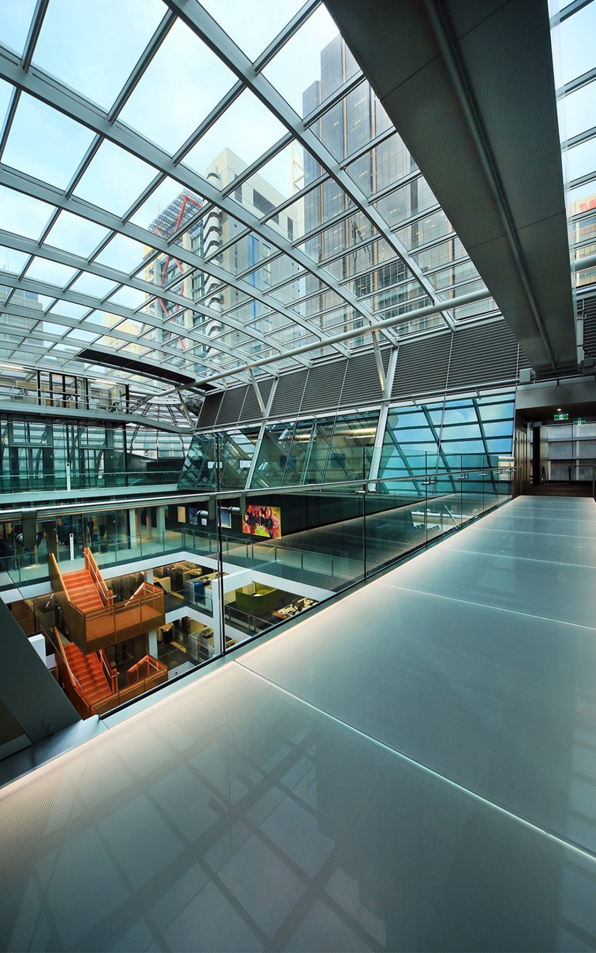
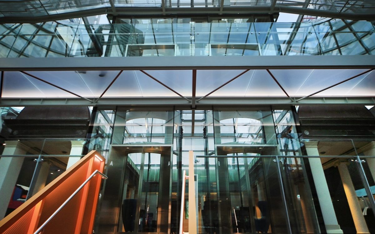
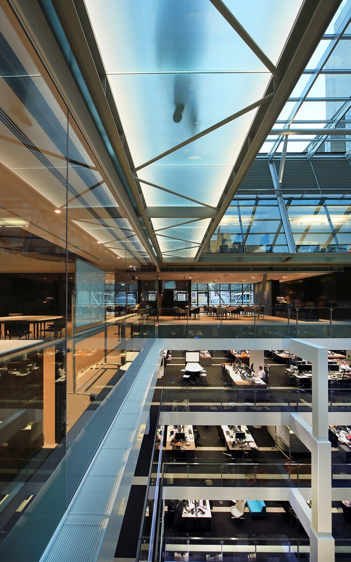
MM On the upper levels, the client and conference spaces within the roof and foot-bridges form an important part of the circulation pattern and arrival sequence. Visitors arrive from the glass lifts onto the glass bridges. There they look into the atrium and can see the way the whole organization fills the building. Those footbridges needed to be designed in a way that minimized their impact on natural light falling down into the atrium.
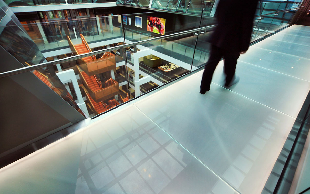
“You can see that at different times of the day glass becomes this wonderful, luminous surface that you either walk under, or on.” Matthew Morel, JPW Architect
PH Those footbridges are expressed as a pair of translucent glass bands as opposed to clear glazing. Was vertigo an issue in that choice?
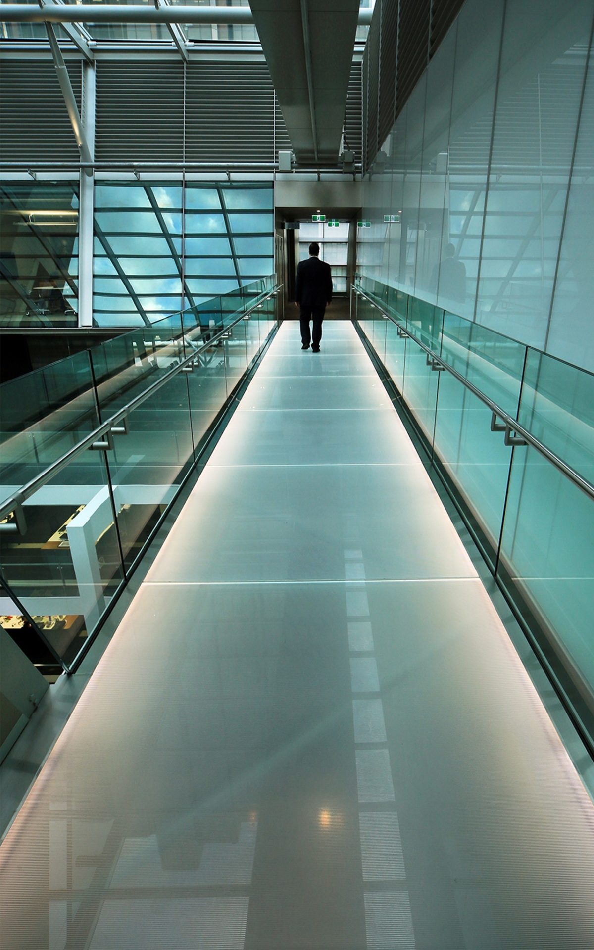
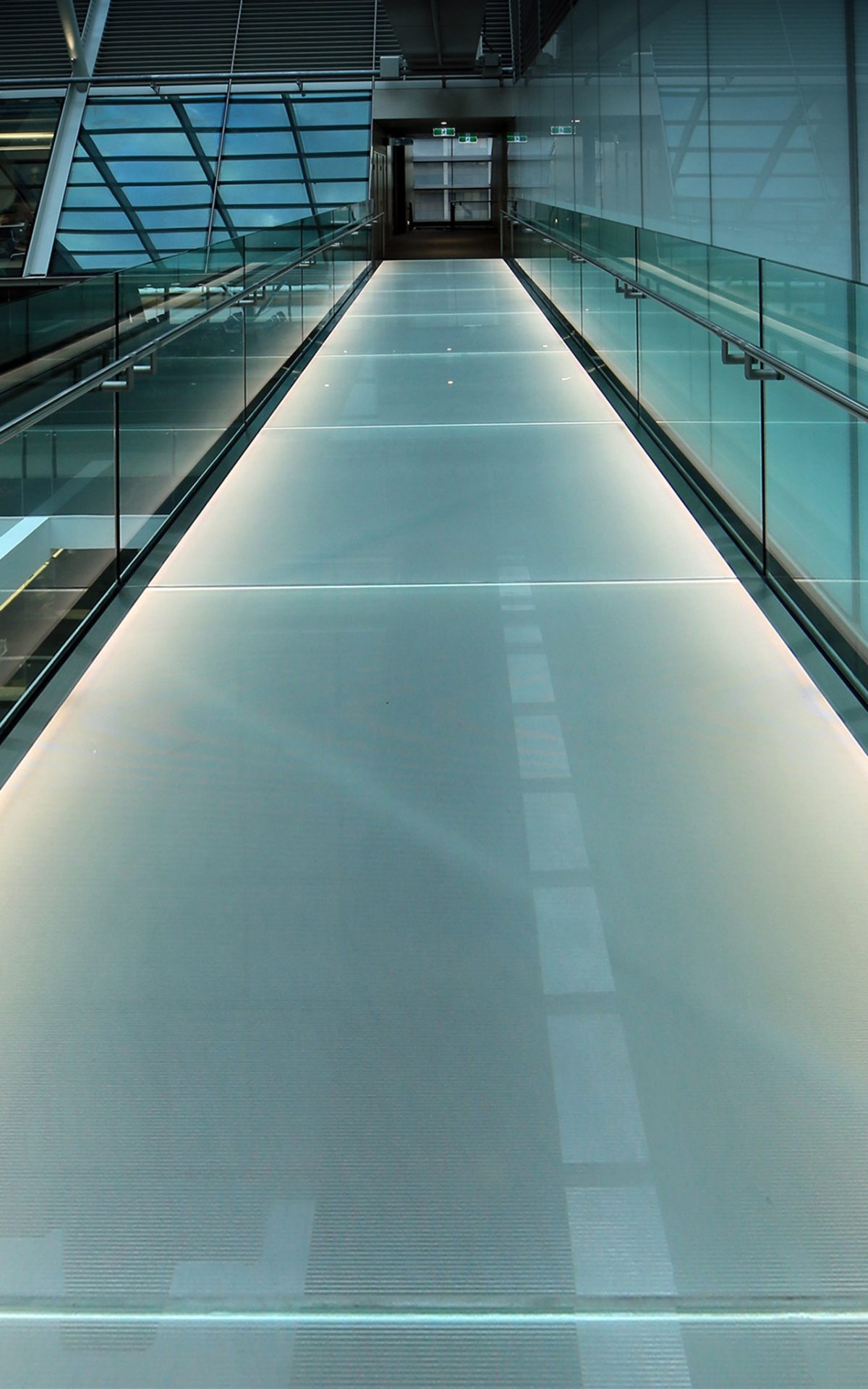
MM There were a lot of considerations in selecting Viridian translucent glass. Vertigo was one, but also visual privacy for people standing on the bridges. Slip resistance and ease of cleaning influenced the decision. We also wanted large sections of glass to minimize joints and to edge-light the glass. All of those parts required extensive testing.
PH Because you’re not always certain how it will appear or perform when installed?
WB Their position in the atrium means they very strongly dictate the character of the atrium. Light transmission, clarity and color transmission become very important. You can see how critical that beautifully light, crystalline bridge exists at the end of everyone’s atrium vista.
PH How did Viridian contribute to the process?
MM Viridian was very cooperative with all of the product samples needed; all the different types of frits, build-ups, types of glass. I believe in the end we selected a frit for the top surface that was a combination of two different patterns and thicknesses.
WB The glass testing was absolutely fantastic to the point where we were able to test a vast array of frits and finishes. There is a significant amount of testing required for frit, light transmission, side-lighting and so on. The list of samples were quite exhaustive, and these aren’t small squares either. We’re talking 12 mm. thick sheets and up to 300 x 300 mm. Viridian was a very obliging, willing supplier. The overall glass bridge build-up required a custom laminate make up.
PH The footbridges contribute to a feathering of the interior edges and become a transition zone.
MM The glass bridges are part of the roof structure that uses the existing building rooftop as its base. We wanted the roof to sit quietly and to use unified steel and glass.
PH Were there moments in the project where the glazing presented Herculean problems?
MM There’s a long process starting with design drawings. There are a lot of people involved. Steel specialists, glass specialists, structural and façade engineers. There are a lot of people bringing their skills and experience and ability to the design. There were a lot of vigorous discussions along the way, but I think the process was good.
WB There’s a certain inevitability about the need for glass for this particular use that helped people to get on board very easily. Our team really supported this idea right from the beginning.
PH Glass can create many incidental moments that no amount of CAD drawing, or computer renderings anticipate. Have you experienced those?
MM You’re right. These types of glass types respond in really interesting ways to changing light. You can see that at different times of the day glass becomes this wonderful, luminous surface that you either walk under, or on. It creates unexpected light and shadow.
PH While this appears simple, it’s incredibly sophisticated with all of that faceting and chiseling to achieve such apparent simplicity.
MM They’re very spare footbridges. The structural steel is exposed of course. and the surface is glass. There’s no lining. Nothing’s concealed. Glass balustrades, stainless steel handrails. They’re not just visually light, but physically light and spare. Less obvious during the day is the edge lighting in the evening. They change character from catching sunlight and become an illuminated surface within the larger scheme of the roof. That’s another great aspect of the bridges.
PH Technology is changing and the new work environment is encouraging greater physical interaction and to use our legs more than the desk-bound workforce of even a generation ago.
WBThat’s right. Aside from those informal elements that relate to the workplace, the bridges are also an essential part of the arrival sequence. Glass lifts deliver staff and visitors from the atrium. They place you out on this bridge. You’ve toured your way up through the building from the glass lifts and from the most original and precious heritage jewel downstairs and then arrive in a place that is innately forward-looking. It’s very delicate but it’s incredibly strong, and that’s your arrival moment. That’s not just about expressing the honesty of the materials and methods of construction, but also to a certain extent, the outlook of the organization that occupies the building.
PH Was the project an especially demanding one?
MM I can recognize where everybody was pushed to try something new, to innovate, to find a challenging, clever solution to difficult problems. It’s not about opulent or expensive solutions, but clever, innovative solutions. That’s true of the steel, that’s true of the lifts, it’s true of the services, it’s true of the structure, and it’s definitely true everywhere in the glass.
PH Do you have a project highlight?
WB When the big reveal happened; when the protective plywood was removed and the quality of the space emerged underneath, particularly in the lift lobby on level 10 and the atrium fell away below. When we finally unveiled the entire roof and entire interior in place, that real jewel sparkle and special quality of light was absolutely magnificent.
