In search of a Community Vibe
Melbourne, Victoria
All pop-up cities and overnight urban precincts experience growth pains. Not even Dubai and its mega-rich sister cities can entirely buy their way out of trouble. Speedy growth, just like speedy driving, brings big risks. True diversity and smaller mixed-uses are often overlooked in the rush to embrace the big end of town.
Melbourne’s Docklands has experienced an unprecedented make-over since 2000. Not all of it winning the public’s hearts and minds. More recent developments—a library of considerable note and new community centre/boating hub—are finally invigorating the water end of Bourke and Collins Streets.
Such projects, rather than wham-bam towers are vital set pieces in rounding out the true experience of place. A comparatively modest Community and Boating Hub may just signal a shift of gear from the rows of transplanted high-rise.
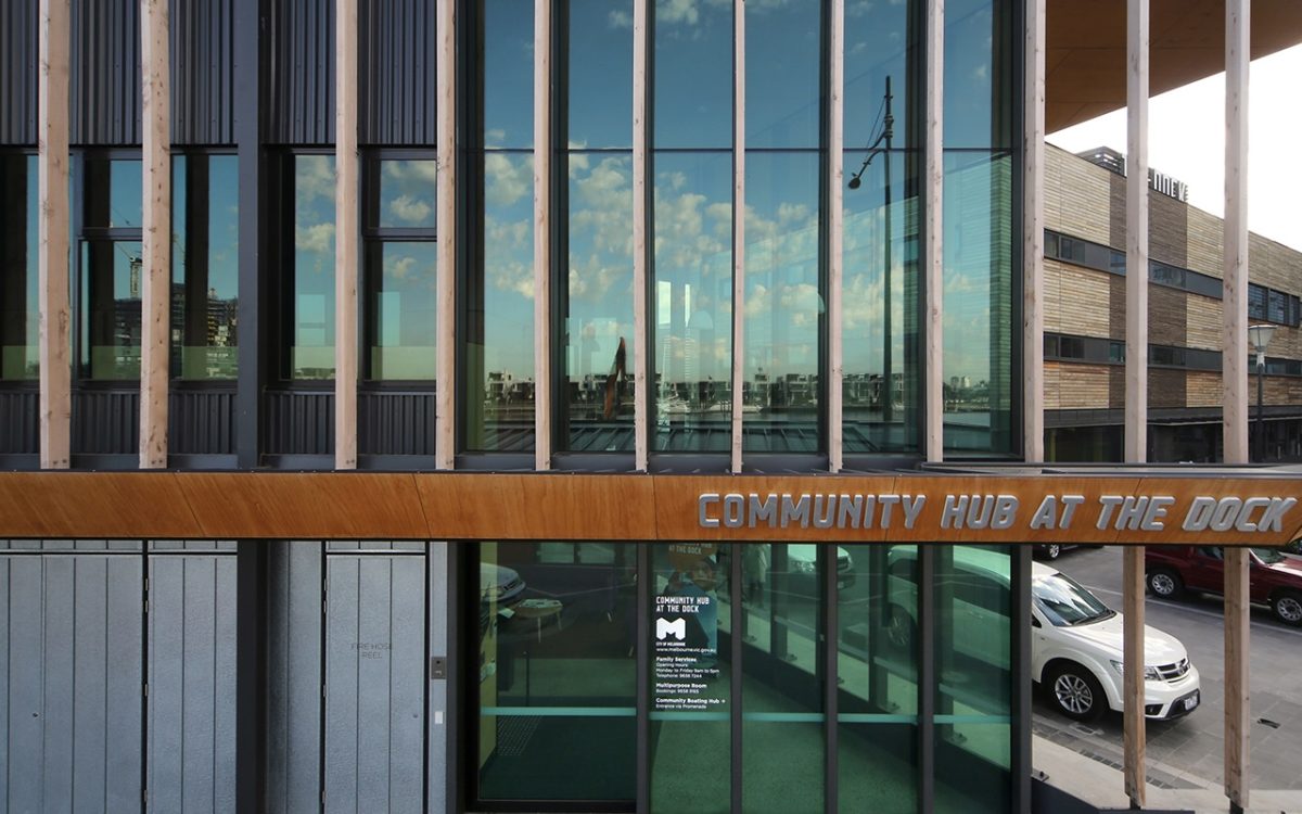
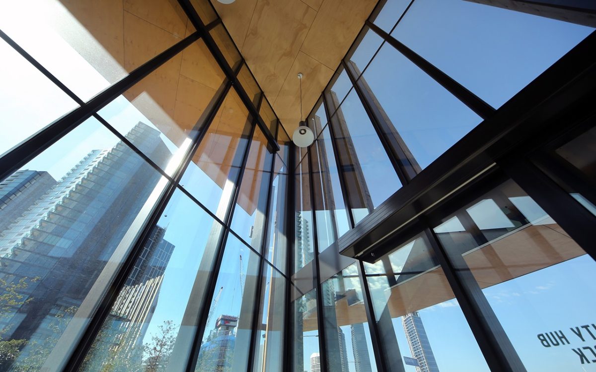
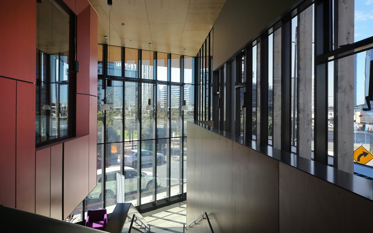
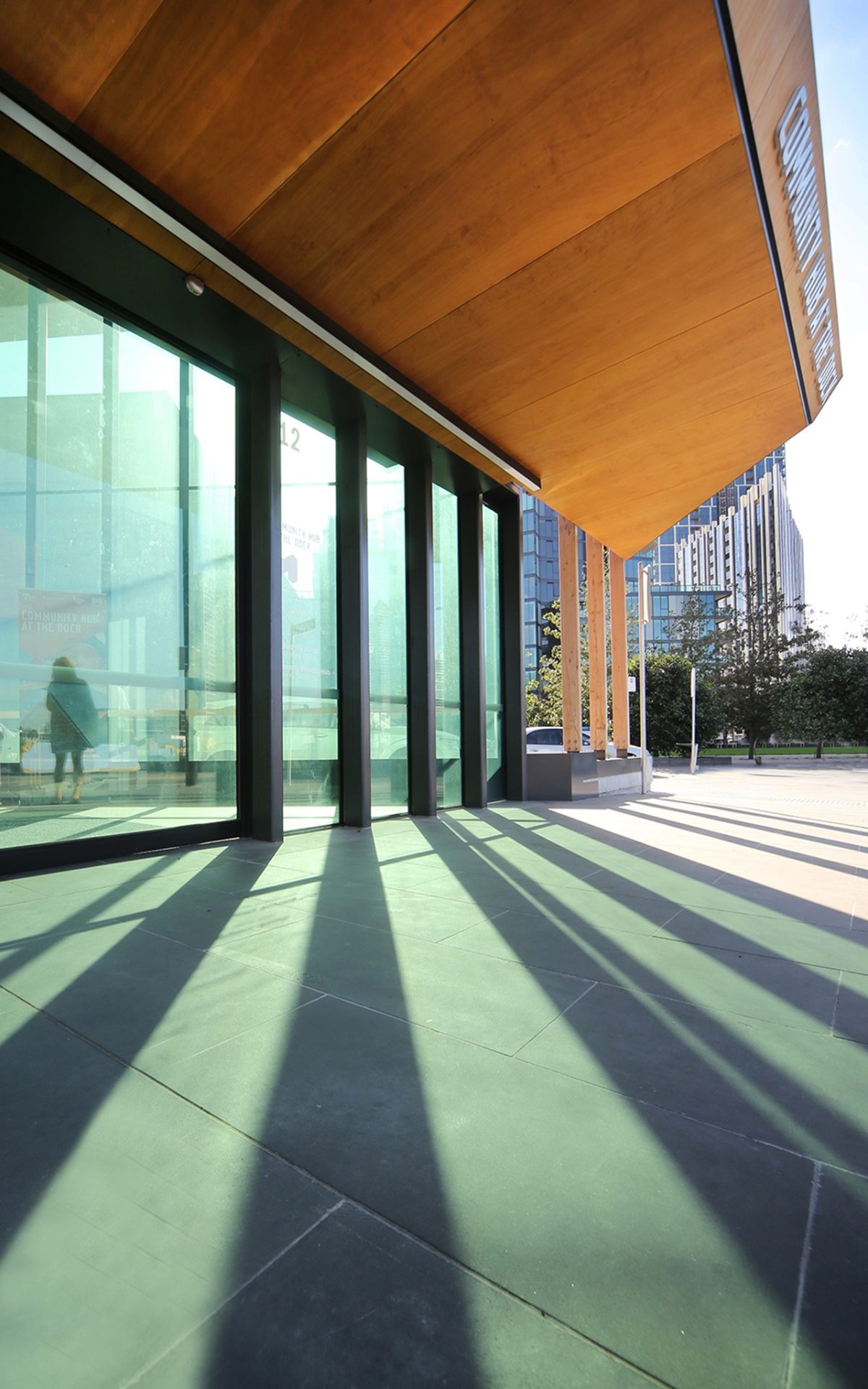
Central to this small, vibrant project is Viridian’s performance glass to better bring the waterfront within reach of the everyday visitor.
This partially explains why community facilities and attractions such as libraries, art galleries, green wedges, community centres and playgrounds appear if ever, or merely as add-ons, rather than intrinsic to the mix.
The matter of a Dockland’s Library was addressed with Clare Design and Hayball’s handsome $15 million project finally opening last year. Talk about ‘bang for the buck’. The whole precinct has been conspicuous by, and the poorer for, such absences. This modest, community-based project sits right alongside the library on Victoria Harbour Promenade adding much needed dimension.
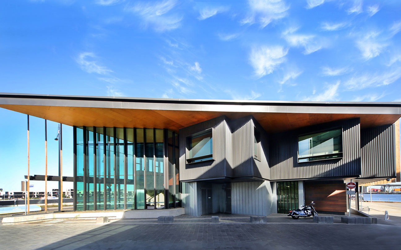
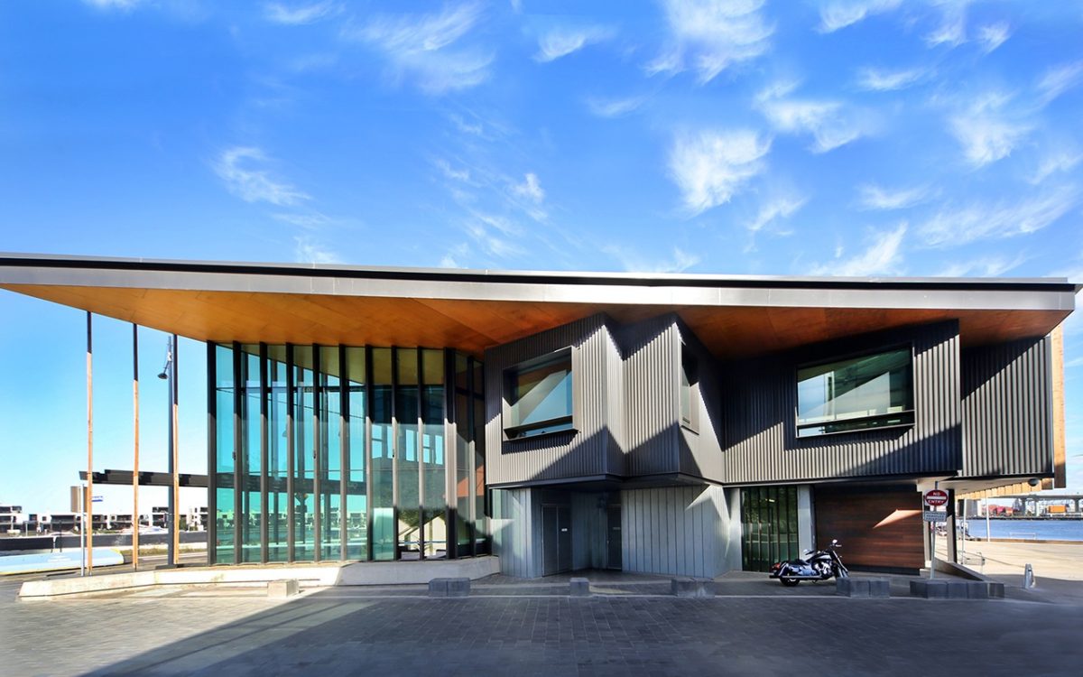
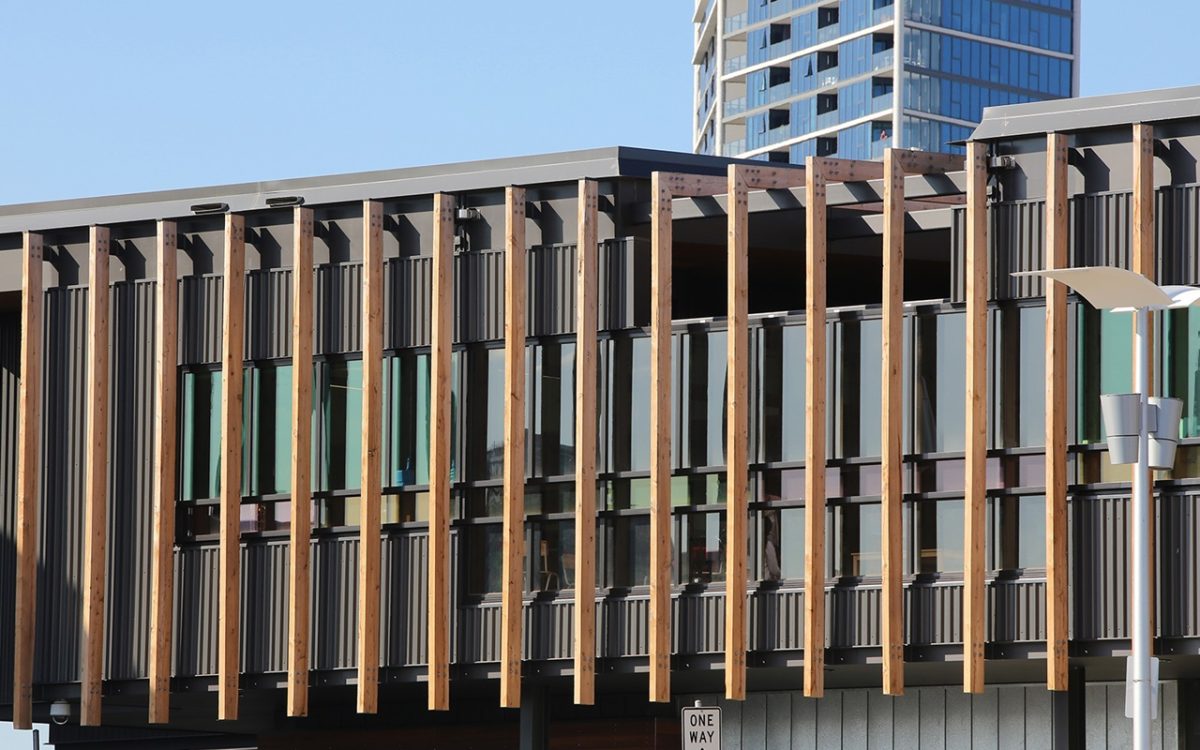
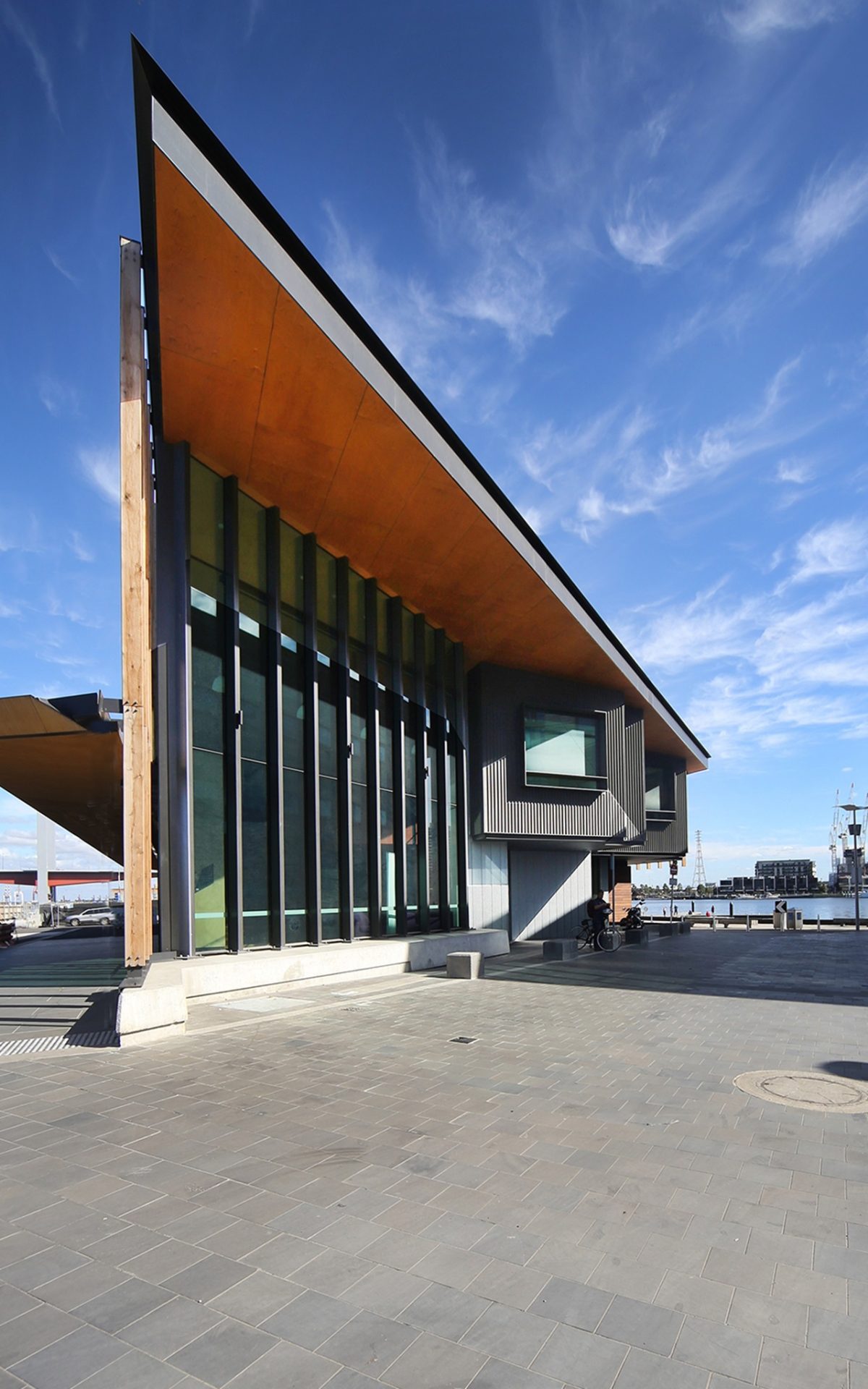
In truth it echoes the library, not so much eyeball snapping, as a project of cool restraint rather than design antics. A charcoal-toned metal cladding punctuated with Viridian glazing in critical areas of public access and operation, reprises a welcome waterfront design vocabulary.
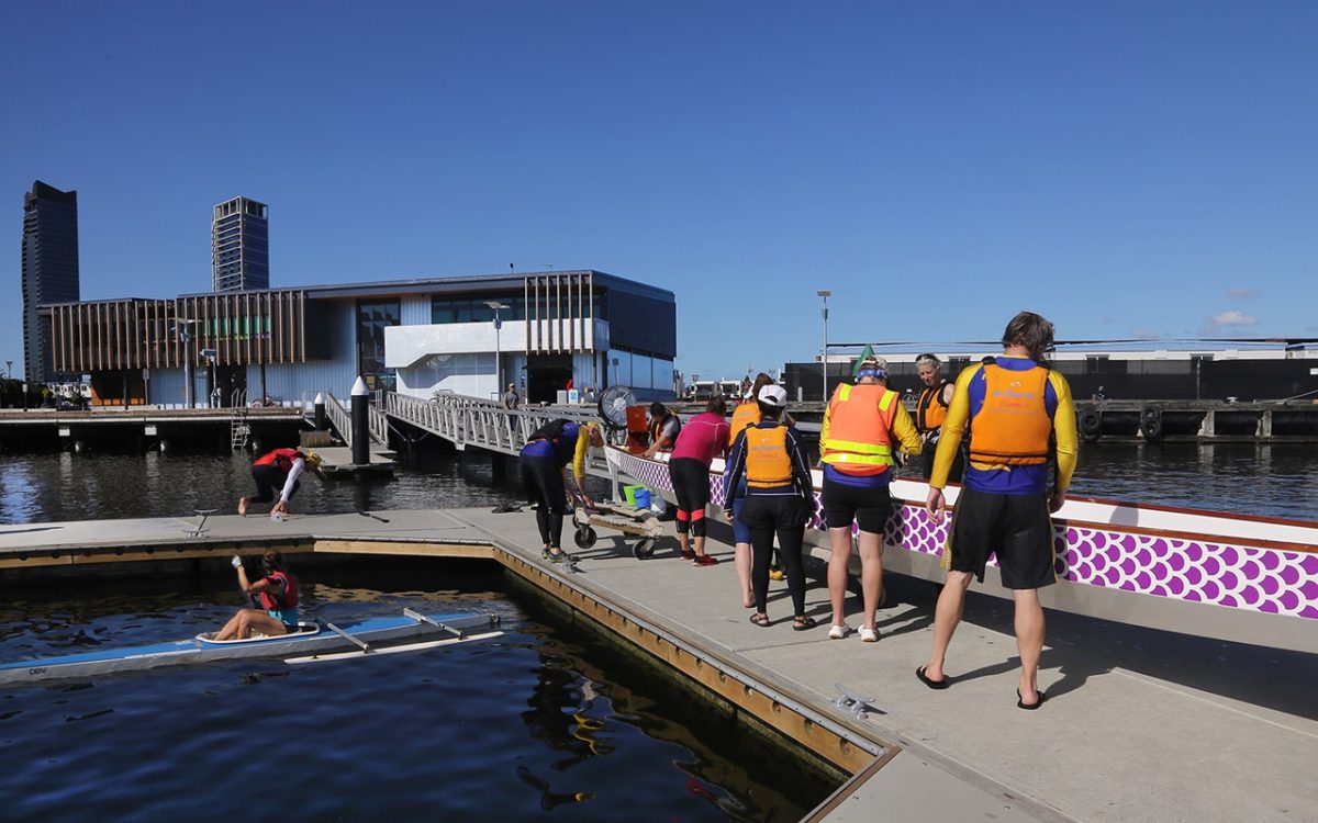
Known as ‘Community Hub at the Dock’, the $8.5 million project is at first glance an unlikely hybrid of family centre and boating facility. The 1600 sq.m. building delivers 46m of lively waterfront façade.
Vision’s Peter Hyatt discusses the project with Robert Stent of Hayball about a long, low-rise building with sky-high ambitions for Melbourne’s waterfront:
PH It’s one of the smallest waterfront structures, if not the smallest on Victoria Harbour, yet distills more into it than its much larger neighbours.
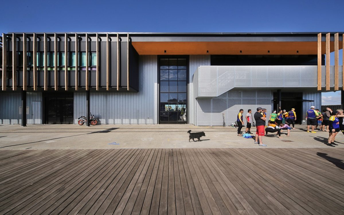
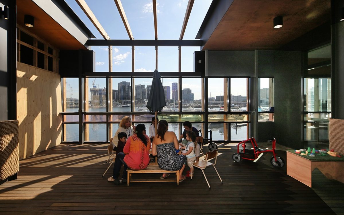
RS That’s an interesting observation given that there are so many inert large-scale residential buildings. Then you have large, campus style office buildings with their own inner life and urban environment where people spend most of their time. Our little building is alive seven days a week and six of those days are about providing community services. On the weekend, it comes alive in another way with boating activity. It really spills out onto the wharf and down to the water between the dock square and the dock. It creates a small intimate space for boating and children.
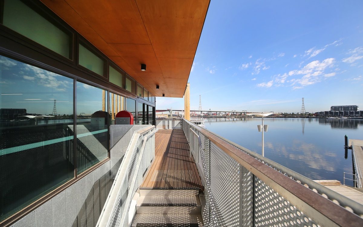
But this almost has an umbilical cord to the water with its permeable façade and that long ramp to the water.
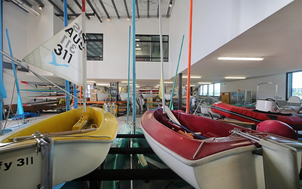
It’s part community building and part multi-faceted clubhouse. This is a little more ad hoc and shed-like than say, the library building with its flexibility of use.
Aren’t they rather strange bedfellows—a community boating harbor and family services operating out of the same building?
It is, but it provides a strong community focus. Its intensity is about community.
What were the key ambitions of your client and practice?
To provide an intense community focus on the intersection of Collins and Bourke Streets. Therein lies a question how it addresses that intersection on dock square. It’s a pioneer for the narrow, wharf-like part of Victoria Harbor. It’s really built on the wharf and marks a transition in scale. It’s meant to be used extensively around the clock to activate the park and present itself as an accessible, inviting community building.
This lightweight form along with the new library you designed with the Clares, rather than the monumental type transplanted from the CBD, appears so much more successful and appropriate.
It is a shed that speaks of the Mechanics Institute and Country Women’s Association. It’s the type you find in small towns or around Melbourne such as scout halls where people gather. It comes from humble origins.
“We would much prefer to use local products for that reason but also for the reason that we know what they are. You know there are people who will support it. Builders often substitute much of what we have specified. This means we can’t be so sure about quality or their appropriateness and capabilities.That's a serious issue in itself.” Robert Stent, Architect
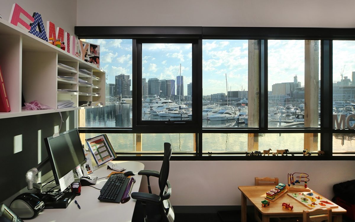
There’s a real permeability to the building that permits it to readily open, close and adapt. Its openings, even to the sky in the children’s play area, are all consistent with that permeable nature.
It opens and shuts right along that water edge almost as an extension of the Collins Street retail experience. This invites people to participate and better experience boating activity and community services.
The boating activity isn’t to do with luxury yachts or motor-cruisers but canoes, paddle and dragon boats.
It is very much volunteer-based. It’s that social capital of people coming together for a shared, not-for-profit purpose. It’s often spontaneous and about the volunteers. It provides some of that important social capital settings by which people value each other and form healthy communities.
And it’s really quite a utilitarian building that doesn’t require marble, exotic finishes, or huge signage.
That’s true. It’s simply a shed.
As a practice do you have a preference, or philosophy, for utilizing local suppliers and materials in your pursuit of sustainability?
Of course we do.
But many don’t.
As you know, it’s something we do rely on when specifying products that we know. We want to ensure that there is as much local content as possible. Glass is certainly high on the list. We would much prefer to use local products for that reason but also for the reason that we know what they are. You know there are people who will support it. Builders often substitute much of what we have specified. This means we can’t be so sure about quality or their appropriateness and capabilities. That’s a serious issue in itself.
What about public liability issues once inferior plastics, glass or steel fails?
It’s unconscionable behavior. There can be significant cost-savings in substituting materials and I’m sure the proprietor and client are not benefiting from the full savings, nor are they getting a material they can count on. The public will, down the track, eventually pay for it.
How important is the glazing to delivering a performance product that opens up to this setting, yet is so instrumental in meeting tough Green-Star ratings.
Of course. In every building glass is a very significant component of sustainability and where we endeavour to provide visual permeability to invite and engage the public.
What level of assistance did Viridian provide by way of samples, expertise or advice?
We rely on Viridian for all of this and they provide a great service in that respect. The technical aspects of glass have grown exponentially in terms of performance and types of glazing relative to use in recent years. It requires more assistance through the design phase to ensure that we use the glass most appropriate for the energy and sustainability standards, as well as providing the right type of glass to complement the design intent.
In so many magazine articles, often in the awards, everything from paint colour to tap-fittings are listed. When it comes to the glass, no reference is made. This treating it as a hole in the wall, left over by the builder that could be clad in cellophane is a consistent oversight.
It’s a good observation and one I can’t really answer. It could be that a lot of the glass selected is on a technical issue and involves a series of calculations performed by specialist façade engineers, or by people such as those from Viridian. There can be a whole raft of people who will influence that, whereas most architects would be over the detail of selecting a tap or tile themselves, or through people within their office. They might rely on all of the above to advise them on the glass. That might be part of that issue.
Do you have a standout, or project highlight?
Being down there on a Sunday and seeing it in full swing. It’s fantastic with that bustle of people everywhere using and enjoying the building just as we hoped they would.
