Rising Star
Sydney, New South Wales
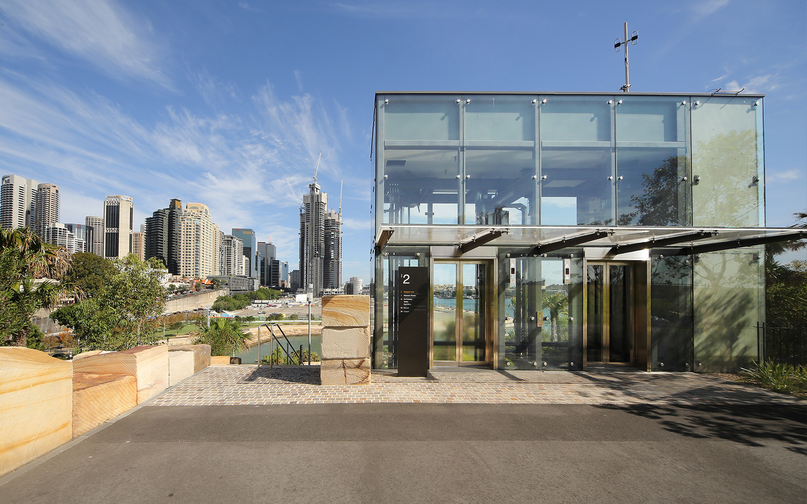
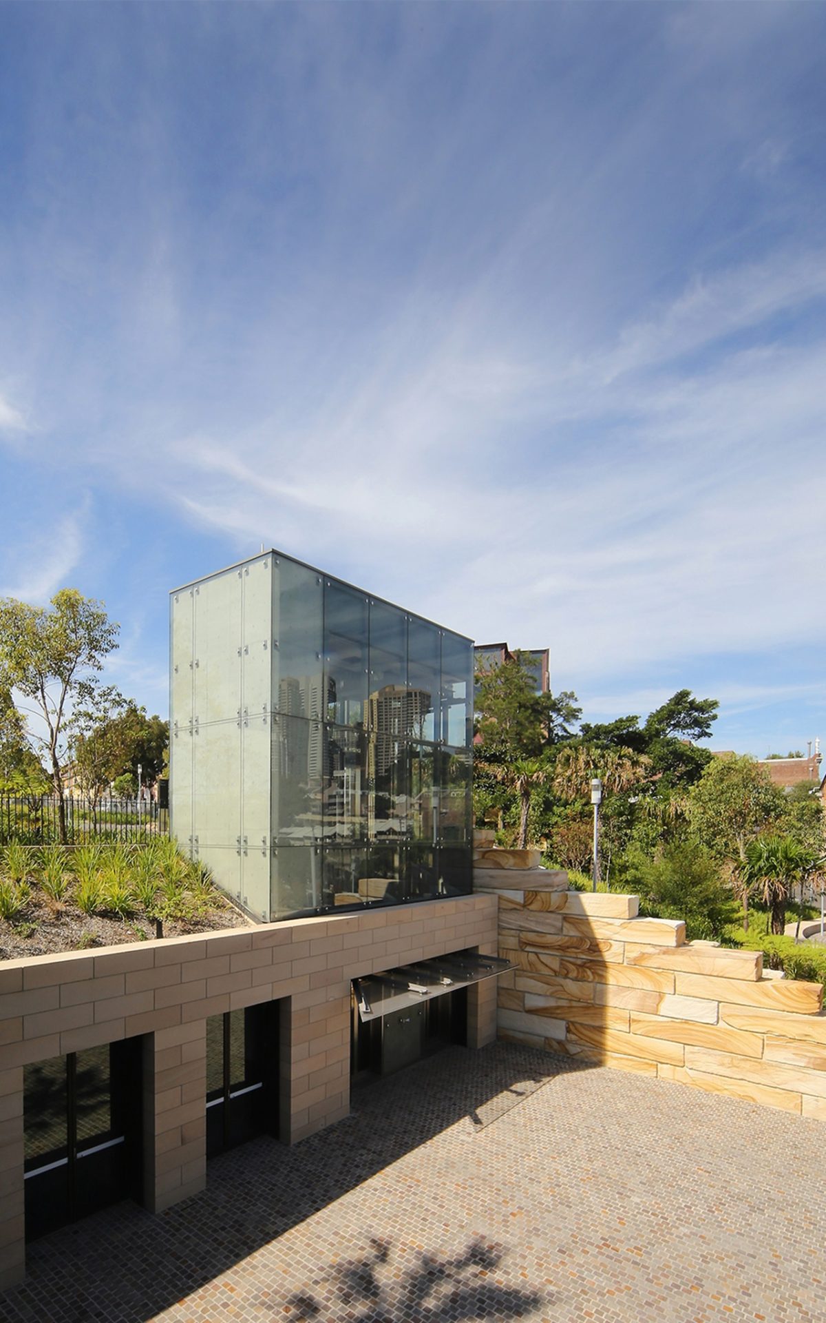
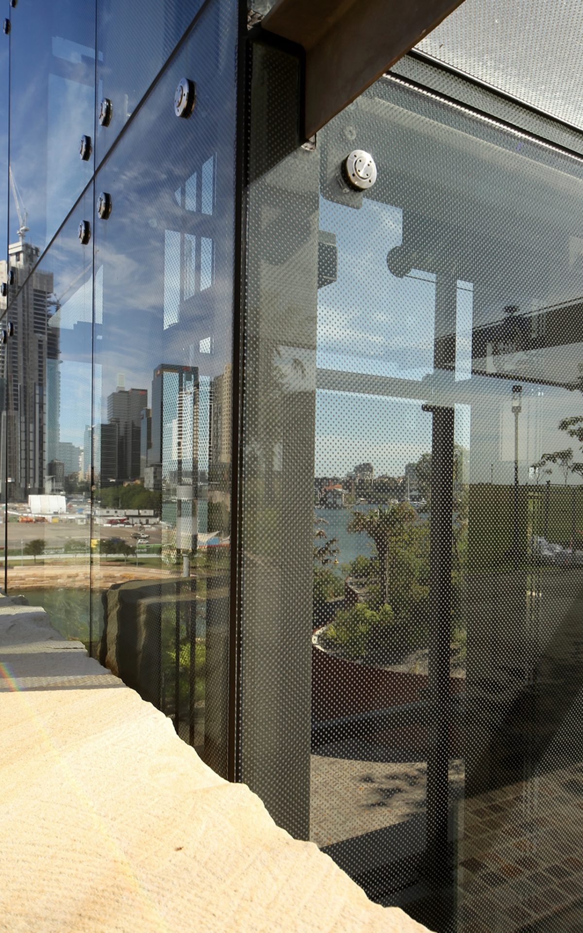
A simple glass and steel lift-shaft atop a re-created headland may appear unremarkable on paper, but in a high visibility setting at Sydney’s Barangaroo, WMK Architecture’s answer is a big design deal.
Sydney’s Barangaroo parkland spears north and folds into its Harbour promising to become the project’s crowning glory. It’s already the parkland that is a songline of rich rhythms rather than the cluster of concrete and marble, closer to the commercial hustle of Darling Harbour.
In an age of intense commercial imperatives, it will surprise some that the most precious of urban resources—green open space—should deliver redemption. And ironically it’s the North American landscape design stars, PWP Landscape Architecture in association with Sydney’s Johnson Pilton Walker who deliver a contemporary park as garden that is so convincing and true to place.
If the southern end of the $6 billion development is contentious in some circles, the 6 hectare, re-created headland park, is quietly stupendous. Responsible for the Sydney Olympic’s Millennium Parklands, among a host of global landscaping treasures, Peter Walker’s Barangaroo Reserve for the Barangaroo Delivery Authority—opened in August last year—is well on the way to ripening into the grandest of civic gardens.
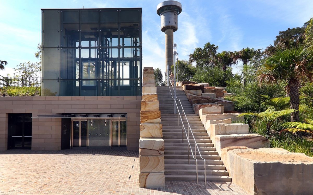
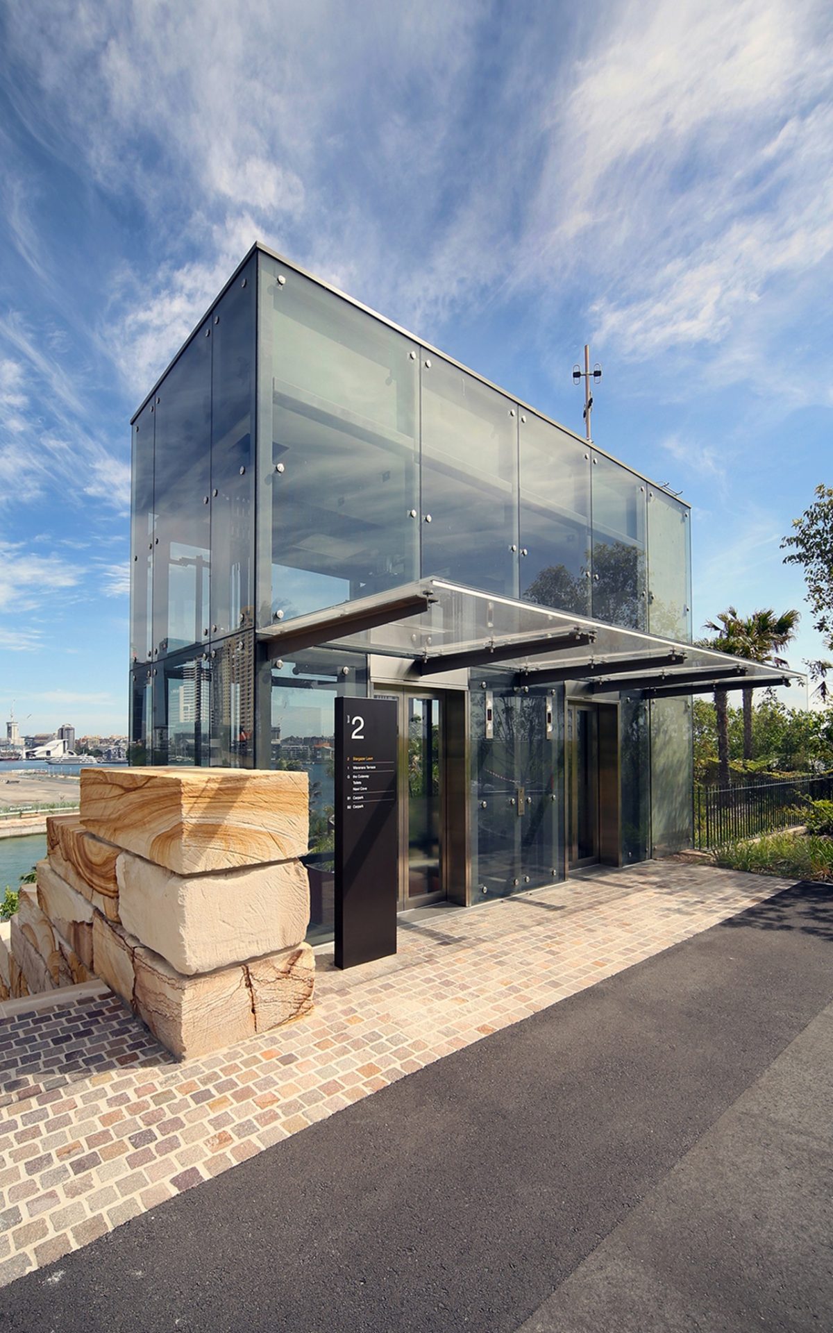
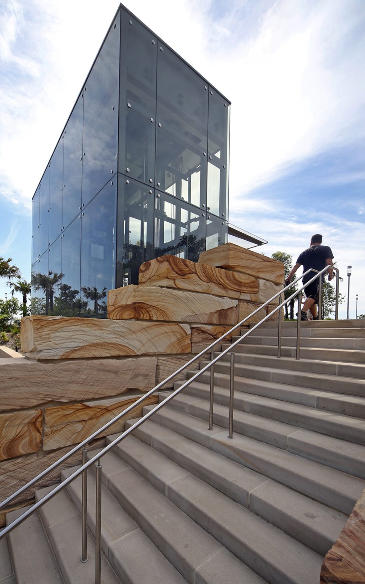
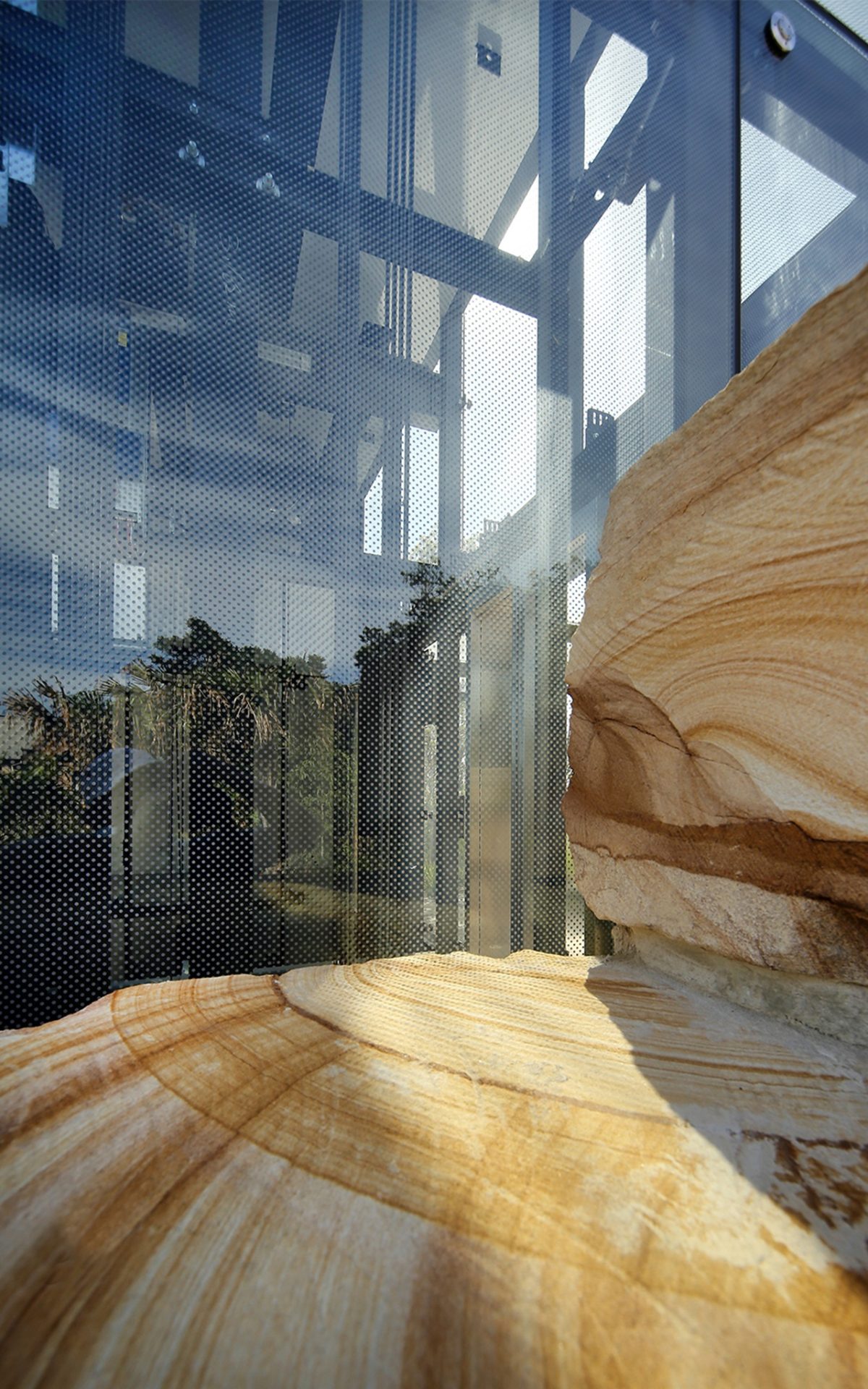
Sydney’s WMK Architects is a local architecture practice which contributed directly towards this parkland precinct with a glass sheathed, steel rimmed and sandstone edged lift-shaft, leading to a multi-event space and a 300 vehicle car-park sitting directly underneath Peter Walker’s landscaping masterwork. What could have easily projected as over-wrought structure and eye-sore, dissolves into a quietly totemic gesture, highly respectful of the landscape fluency.
Vision’s Peter Hyatt met with WMK’s project team leader Cecelia Wells to discuss the importance of this small, but jewel-like infrastructure within the parkland precinct:
PH Small projects usually demand a disproportionate and intense effort.
CW Yes, it is quite a complex project with a lot of stakeholder needs to balance. This project took many years to design, document and construct.
Is there a gold standard template for the design of this type of glass lift?
I wish there was a textbook to turn to. It is absolutely tailor made for the circumstances and offers extremely good value for what is really a little jewel.
How big a task is it to resist the architectural temptation for high-viz. design to overwhelm the practical need?
The original intent was for a glass box to sit harmoniously in context with the landscape. One of the paramount drivers of the design and build in the parklands was that the building should blend and connect very strongly with its setting.
What changed?
The design treatment changed—its permeability became the major focus. Its transparency became a critical attribute of the design.
We could almost equate your little steel and glass lift with a miniature skyscraper. It could have been cumbersome but you have stripped it back and it excels.
I’m pleased you think that because it was quite intentional to emerge out of the landscape and yet be its own object.
We didn’t want to make it appear like we’re trying to just replicate rock. We needed it to have a sense of formality and degree of timelessness. The rough, quarry sawn sandstone and the refined technicality of the lift make for a heightened contrast in the landscape.
How do you future-proof such design?
We were designing for flexibility as its ultimate use was in development. The most likely use at the time, for which we were designing, was for a multi-event space and possible future cultural space and café. Everything had to be built to accommodate these best efforts, including the lift.
A virtual iceberg with nine-tenths below the surface?
The lift goes down to car park basement level two, and is designed to connect with the ground level, multi-event space, mid terrace level and the roof top park. The flexible design has provision to connect with a possible mid-level if a future use dictates the construction of a new floor through the space. Structurally the whole building is ready for that. There’s an incredible amount that goes on in the building and incorporated into the design that you never see.
This is a very complicated project.
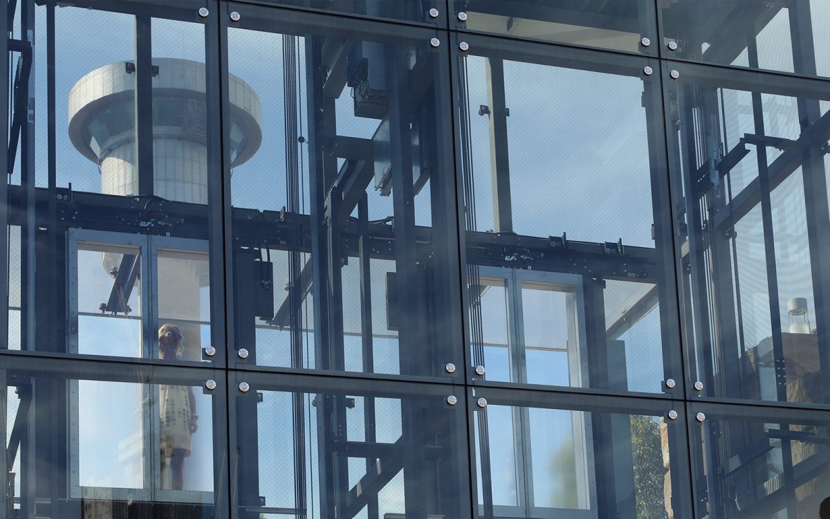
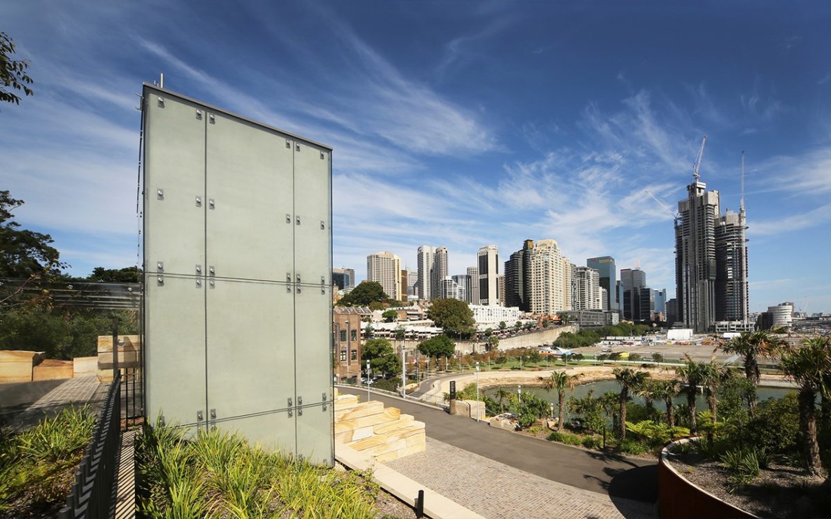
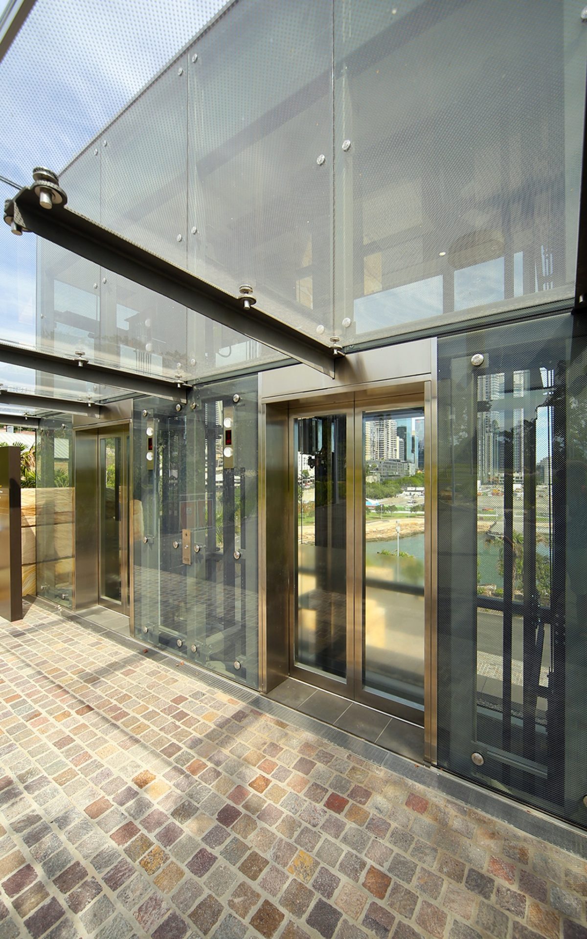
Elements of the lift core had to work super hard. The core incorporates space for future servicing, the café exhaust systems, all waste and vent pipes up and down the building are all reticulated through a side services core. All of this is wrapped as delicately as possible. The frit pattern on the glass helped dissolve the glazing into the landscape.
And yet you would hardly want this camouflaged.
No, but we were also concerned it would be quite dominant. The ceramic frit pattern glass layered over steel and concrete, really helps reduce its effect on the landscape by reducing its intensity a few notches and really contributes to its delicacy.
“What could have easily projected as oveer-wrought structure and eye-sore, dissolves into a quietly totemic gesture, highly respectful of the landscape fluency.” Peter Hyatt
What about the glazing? There’s nothing off-the-shelf about this is there?
It’s a laminated glass system. We wanted as low an iron content glass that we could and that is why we chose Viridian SuperClear™. We solved this with a double-layered system of SuperClear™ and tough fritted laminate interlayer for extra strength. The frit is encapsulated between those two layers—the frit is thus protected.
What was the major reason for sourcing your glass through Viridian?
We turned to Viridian for glass reliability and quality. Nickel sulphide failure is always uppermost in our minds. I’m not so sure it’s such a big issue now with glass quality improving worldwide. We did look at using cheaper overseas alternatives. It became a huge challenge to test that and arrange for proven functioning assemblies, all installed on time. Viridian really had all of that expertise right here.
What about solar loads?
We had to develop the design specifically to suit the site and climatic considerations. There were also safety considerations about how breakable or prone to impact the glass may be. Then there are cleaning and shading aspects. The solar shading co-efficient is a very important consideration, so the frit was a very important aspect of the design to reduce the lift-car heat load.
Does such an exposed site present any other challenges?
A significant rooftop passive ventilation system draws in cool air from the main cultural space, as well as mechanical fans to provide back-up on very hot days. It’s not air-conditioned, but the modeling shows it should perform well with the selected glazing providing a high shading co-efficient.
Any other climatic issues?
The prime challenge is keeping water out, so we came up with a complicated series of channels, drains, overhangs and systems to help slow down water as it approaches the lift.
It’s an interesting marriage of art, technology and environment. How do you integrate all of those aspects? Are you thinking like an architect, a landscape architect or an engineer?
That’s an interesting question. As an architect you’re always looking for a way to elevate the design and to exceed expectations. We always try to inject an element of poetry. For us it was trying to enhance the experience of visitors as they rise up through this lift and expand their perception of the landscape. Then there are the technical challenges.
So there is also the diplomat’s role required with your various masters?
There were multiple stakeholders involved and you have to balance the needs of all those involved for an economical, high performance project that also returns something to the public as a lovely little, surprising element in the landscape.
How difficult is it to remain true to your ideals and the public benefit rather than client pragmatism?
There can be pressure to bend a design or to be more cost effective or easier to build. But, if you work as a team towards a common vision, it’s surprising what can be pulled off.
The role of materials can’t be underplayed here when you have to balance and synthesize glass, steel and sandstone.
You have to develop a language of separation about planes, texture and light. Light is incredibly important by day of course and of an evening as night falls, through dusk, there is this incredible contrast of texture between the glazing and sandstone.
It’s really about a heightened sense of place, light, textures and the split-second moment. That’s a heady cocktail for those awake to such things.
That is absolutely true. I think that’s what architecture at its best is all about. It is the alchemy of those ingredients such as the beautifully cut stone, the delicate transparency of the glass—bringing these elements to life.
There are so many disparate component parts that all have to work together. When do you know where to stop; when it’s sufficiently pared and yet enriched with ideas?
It’s a little like a Rubik’s Cube—you pull one piece one way and something else doesn’t work. Everything has a reason. One of the functions that doesn’t sound very poetic, but had to considered, was how to cut the rock, how to ensure easy maintenance—these such considerations. From experience we have found that separation of elements with perfectly defined gaps is very important. We also put a lot of work into the integration and concealment of services. The glass is very neatly detailed, glazing terminations, spacing and scaling are all important. And lifts are notoriously very low in height which affects scale. You very rarely find a tall lift.
This feels larger than normal. Is that because of its transparency?
Dealing with a project the size of Barangaroo, you’re going from an absolutely enormous scale down to the tiny scale of this lift. How do you break down that scale? We spent a lot of time looking at the jointing and different sized glass paneling in each plane. The net effect is that you’re totally aware of coming from a large scale to a smaller, more intimate human scale. At all times the aim was to bring it back down to a scale comfortable for the visitor and for an inviting space.
Any disappointments?
Only that the lift travels so fast, you don’t really get to appreciate what you’re seeing through the frit as you’re rising up and looking out across to the skyline!
Your project moment?
On opening day a number of us from the practice walked around the site retaining our anonymity and asked others what they liked most of all. They kept telling us: “We love the lift.” That was unexpected… and immensely pleasing.
