A Chip Off The Block
Sydney, New South Wales
Townhouses as medium density development bridge the extremes of the single dwelling and residential tower. Done well they offer the amenity of a house and economy of the tower. At Clovelly, one of Sydney’s lesser-known boutique, beachside suburbs, the demands for smaller rather than taller is resulting in neighbourhood-friendly developments.
One of the more recent – a set of five townhouses – designed by The Block architect Julian Brenchley is neighbourly in more ways than most. While the project doesn’t have the same profile or delivery pressures as the television series, with his name attached, it needed to be good.
Brenchley’s offering here, free of large personalities, on-air contestant spats and triumphs, displays ideas rippling with light and shade. Embracing the elements might appear logical, but modern housing so often fails to connect. Brenchley’s experience with the high-pressure and harrowing deadlines of commercial television proves the master of restrained control at Clovelly.
Starring quietly, Viridian EVantage glazing helps unlock the project’s potential. Even without ocean views the result is compelling. “Being a good neighbour,” enthuses Brenchley, “is all important.”
In his other life, away from the world of television, Brenchley heads a small, pulsating practice applying many of the lessons learned across a variety of design fields. His work with Viridian Lightbridge™ during the past couple of seasons has helped to deliver some masterstrokes of sustainable design without any hint of anguish.
He met with Vision’s Peter Hyatt to discuss design opportunities and problem solving away from the spotlight.
Here we are at Clovelly. It’s a long way from the hustle and bustle of The Block. Did you miss the absence of adrenaline?
Well, The Block’s hard and fast. It’s very concentric around the TV show, of course, that’s the nature of the beast. Now how we approach other projects, it’s a case by case basis. It’s looking at context. It’s looking at sense of place and the outcome. This is a townhouse development for a developer, so there’s a certain outcome required.
This sort of project must feel like slow-motion.
Look, I suppose in essence, it’s no different to The Block. This has a longer gestation period. As does the real world as opposed to the reality TV show, which is a condensed microcosm of the real world, if you like.
There’s a general philosophical approach and of course the commonly observed pragmatic approach to such projects.
There’s a pragmatic approach to looking at developments such as this. I really come at it from the point of view that I’m designing for a house that I’d want to live in. That’s the end of the story. I look for amenity. I look for sources of natural light. I look for cross ventilation. I look for features. I look for a sense of play, a sense of arrival.
And the representation of the design is surely important?
Yes, there’s theatre of architecture. Obviously, within a budget, that’s another consideration. Generally, it boils down to, at the end of the day, what would I be happy coming home to, and what would I be happy raising my children in.
For many architects site is one of the great drivers of their design. In a suburban setting, it becomes a little trickier. You’ve got to consider the interior amenity as much as the outward amenity and opportunity. How do you balance all that on such a site?
Site and the site context are among the most fundamental things you have to deal with. Particularly in this sort of suburban setting and urban environment where everyone is virtually on top of each other. I take the viewpoint that a building has to be a good neighbour. And you have to be a good neighbour. Inward, outward amenity, all these considerations come into the play. Are you looking at someone’s swimming pool? Do you want to be looking at someone’s swimming pool? Do you want them looking at your swimming pool?
You have always championed the idea of neighbourly consideration when in close proximity to others.
Privacy and acoustic amenity, these things are real issues, especially in a built up area. Where can you push things? Where you can pull things? Where can you go crazy? Where shouldn’t you be allowed to go crazy? But again, it’s about a polite response to a built up environment. At the end of the day, you’ll be putting your garbage out with the neighbours, so you’ve got to be able to nod and get on with them. I think that’s a critical part of being a human in a human environment.
In essence what is the design approach here?
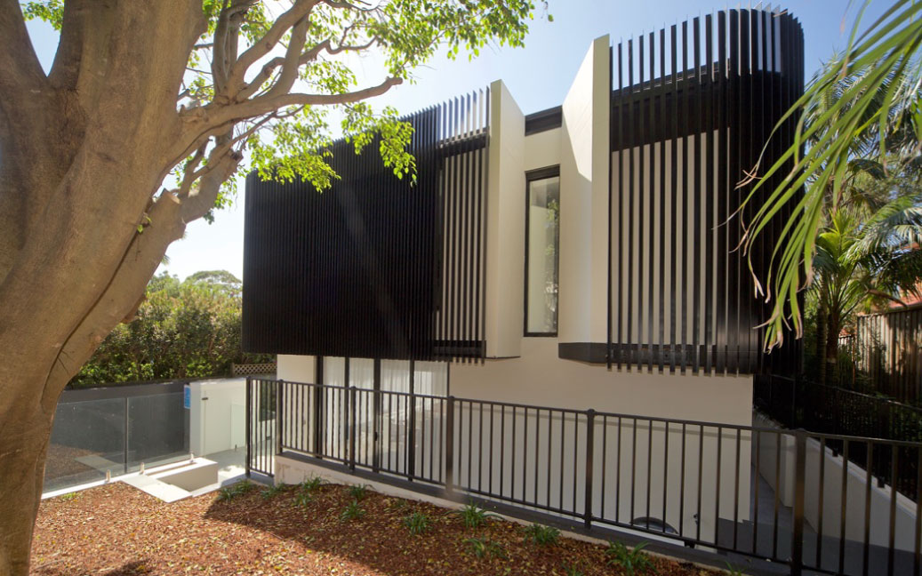
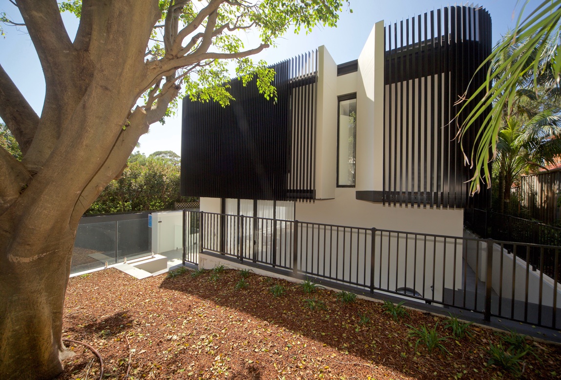
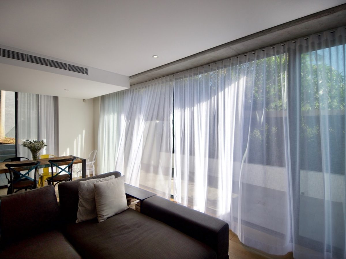
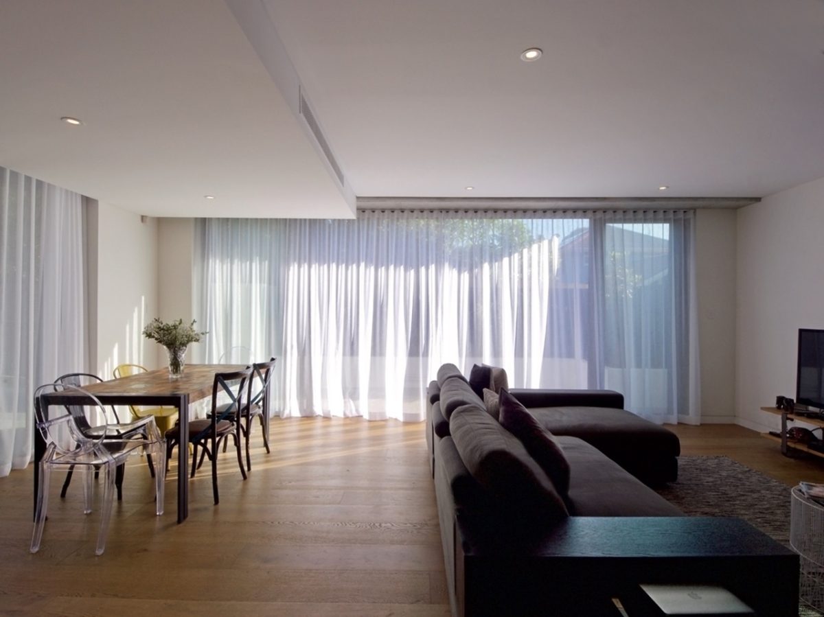
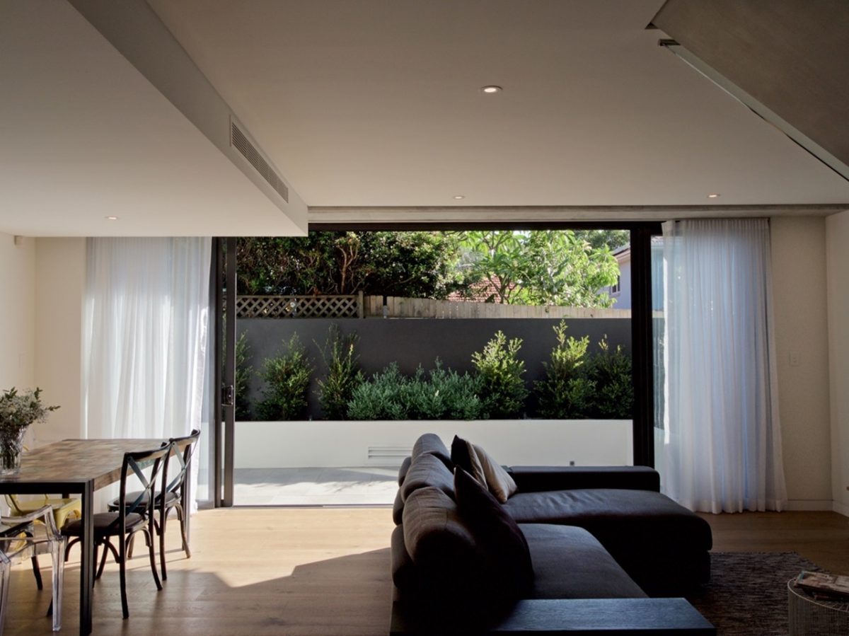
We’ve been able to achieve a lovely northwest facing row of terraces. Glass is a great tool there. The sliding doors are great. That affords acoustic and visual privacy. On the top level we’ve explored the idea of general privacy with this veil or this second skin. Two components of this building are the northwest aspect and the terrace. It’s working really well with the glass. The idea is it’s an indoor/outdoor living environment. It’s a quite strong response, and Viridian’s product works fabulously for that particular area.
And the interior?
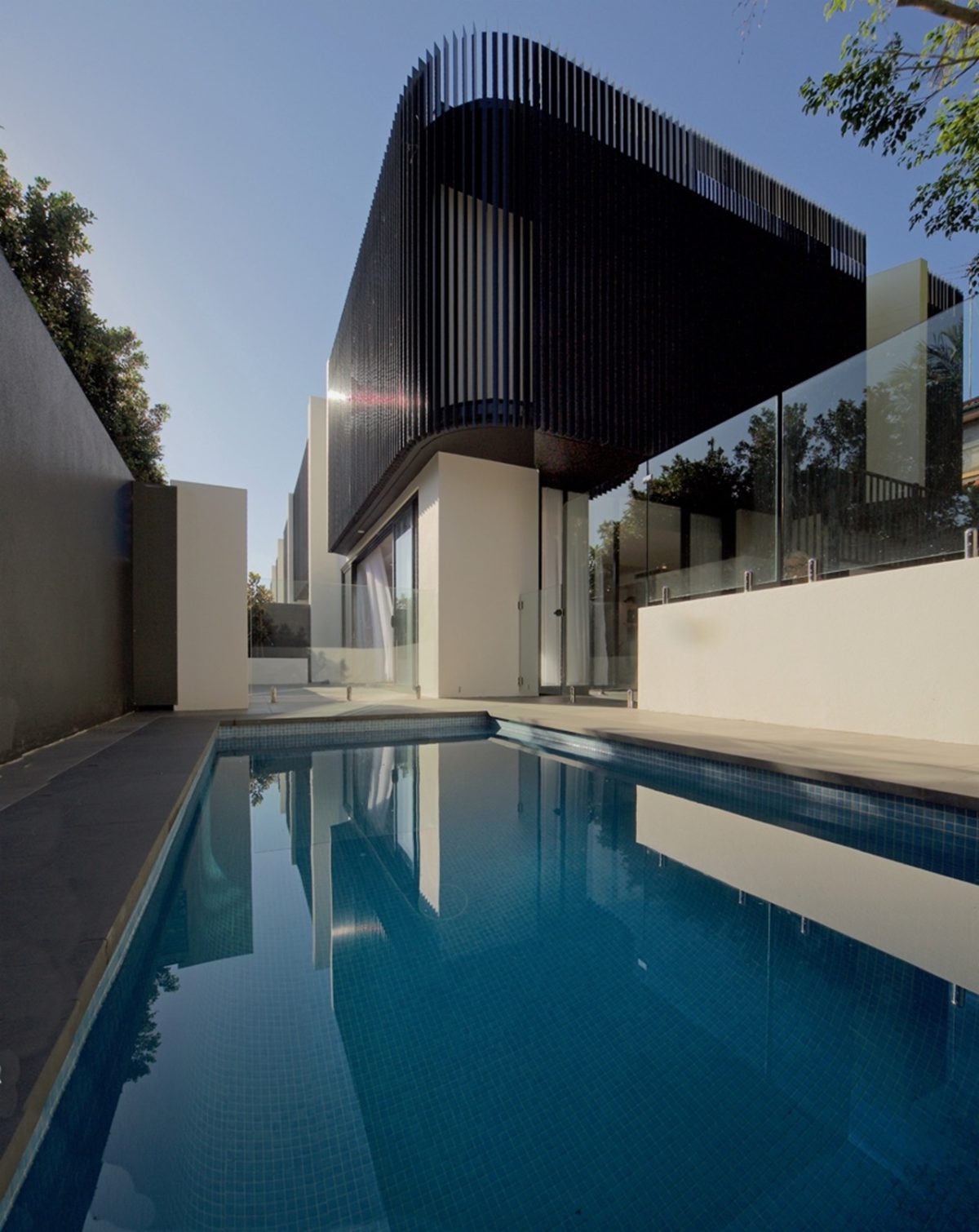
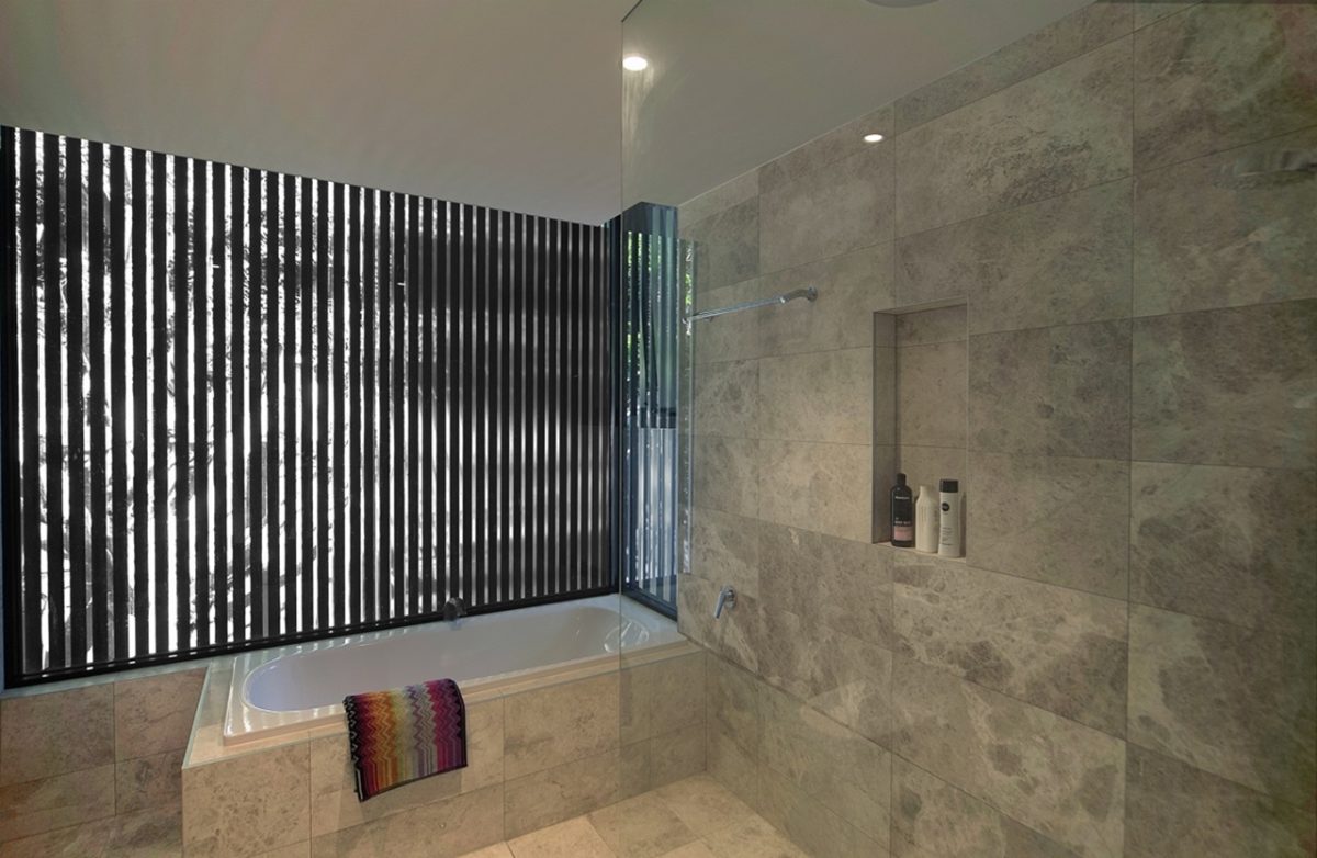
The second component, of course, is the private zone veiled by the exterior screen of vertical blades. This acts in two ways. It gives partial visual privacy, but the real reason is environmental, to boost its sustainability. There’s less sun-load and heat loss on the glass façade upstairs. In a nutshell it’s a dual environmental response of screens and effectively cutting direct heat loads while retaining tremendous clarity. On the lower level glass accentuates the indoor outdoor feel.
These aren’t the old-fashioned enclosed townhouses. Here doorways open up far and wide.
What it comes down to, it’s selling the concept to my client in the outset. I really fall back on my first principles, if you like and that is it’s a house I want to live in, and I’m happy to present it. I present a townhouse not so much as a series of five in a row. I present them as homes, individual homes, and each one has its attributes. The front one and the end one both have these magnificent gardens.
Feeling connected to your work, believing in it is clearly important.
That’s absolutely true. The middle townhouses for example have their own character and their own courtyards. I’m happy to present it that way. Each one is a home. I looked at how to elaborate those in terms of their access to the amenity that I’m talking about. So that’s sliding doors, and not just one or two, but the whole expanse of the terrace. It’s about coming home to something you love, but then also having that wow moment. It’s quite a special place for that reason. I feel confident when I’m presenting that to a client and quite happy about the outcome.
Glass isn’t always the obvious way to create a wall, or complete a space.
Glass is an amazing tool in a building project, but you have to know how and where to use it. The devil’s in the detail here, they’re not houses on top of each other, they’re houses next to each other. Designing houses on top of each other means there are limitations on how you can use glass to deal with fire separation. These are technical issues.
The result appears uncommonly lightweight.
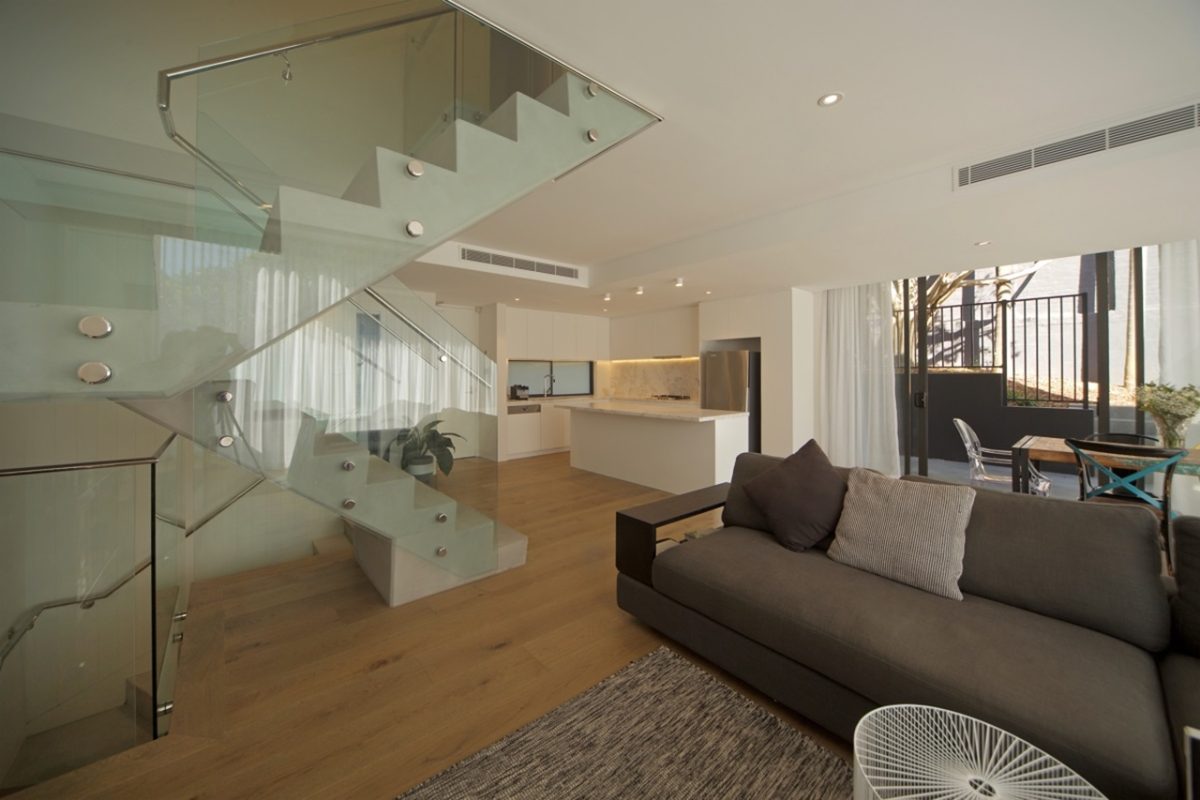
When you are dealing with houses next to each other, you can more easily use floor to ceiling glass because you have no vertical separation issues from a building code point of view. It opens up plenty of design opportunities. It’s part of the dualistic approach to this building. Glass below, a veiled glass event upstairs, and then upstairs again for attics. Upstairs the bedrooms have floor to ceiling glass so you don’t feel like you’re sleeping in a state school classroom. As a designer you can often be playful and provide a bit more theatre and sense of humour in architecture – if there’s such a thing. We use screens on the outside that fold back. This permits a really interesting control and playful use of light. Very rarely do you get to do that in stacked consideration or stacked typology of architecture. So that’s been a lot of fun in this building.
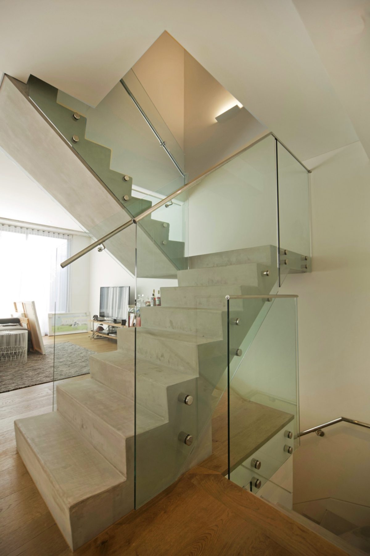
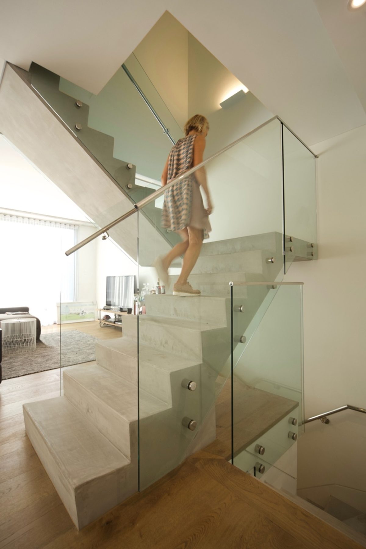
Your glass balustrade staircase exemplifies material consistency and minimal material palette throughout.
We followed through with the interior so that the handrails for the staircase are a frameless glass event. It looks like a folded glass sculpture on the lower level. The complexities of the planes and how that works and the simple finishes of formed concrete with the glass, and chrome patch fittings all come together into something were quite proud of.
