Flying High
Adelaide, South Australia
What better way to help celebrate and promote new headquarters for the Royal Flying Doctor Service than to improve public visibility and workplace in a single sweep? With a fleet of high performance aircraft and staff at its disposal, the aero-medical service required a new more efficient and streamlined base to conduct service operations.
Architecture is one standout way for an organisation to create or confirm public presence. The Royal Flying Doctor Service’s (RFDS) new national headquarters in Adelaide is a millennial update for a history-steeped organisation.
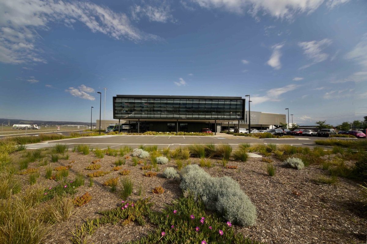
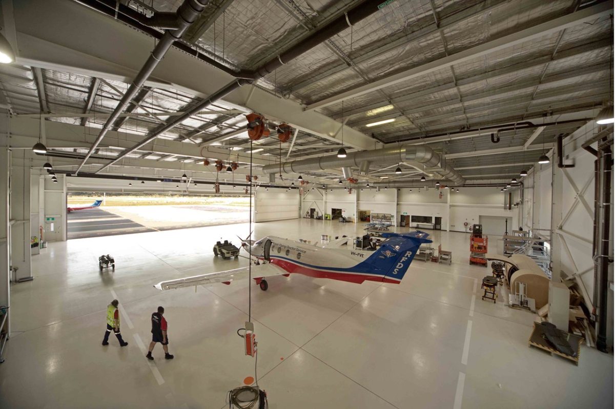
And it’s one that cures old accommodation ailments where corporate services and emergency crews functioned separately. Designed by Walter Brooke architects, the new facility is nerve centre and mother ship for the RFDS’s entire aero-medical fleet. Separate from the main airport infrastructure, many of the RFDS’s fleet of jet and propeller craft are housed, maintained and operated here.
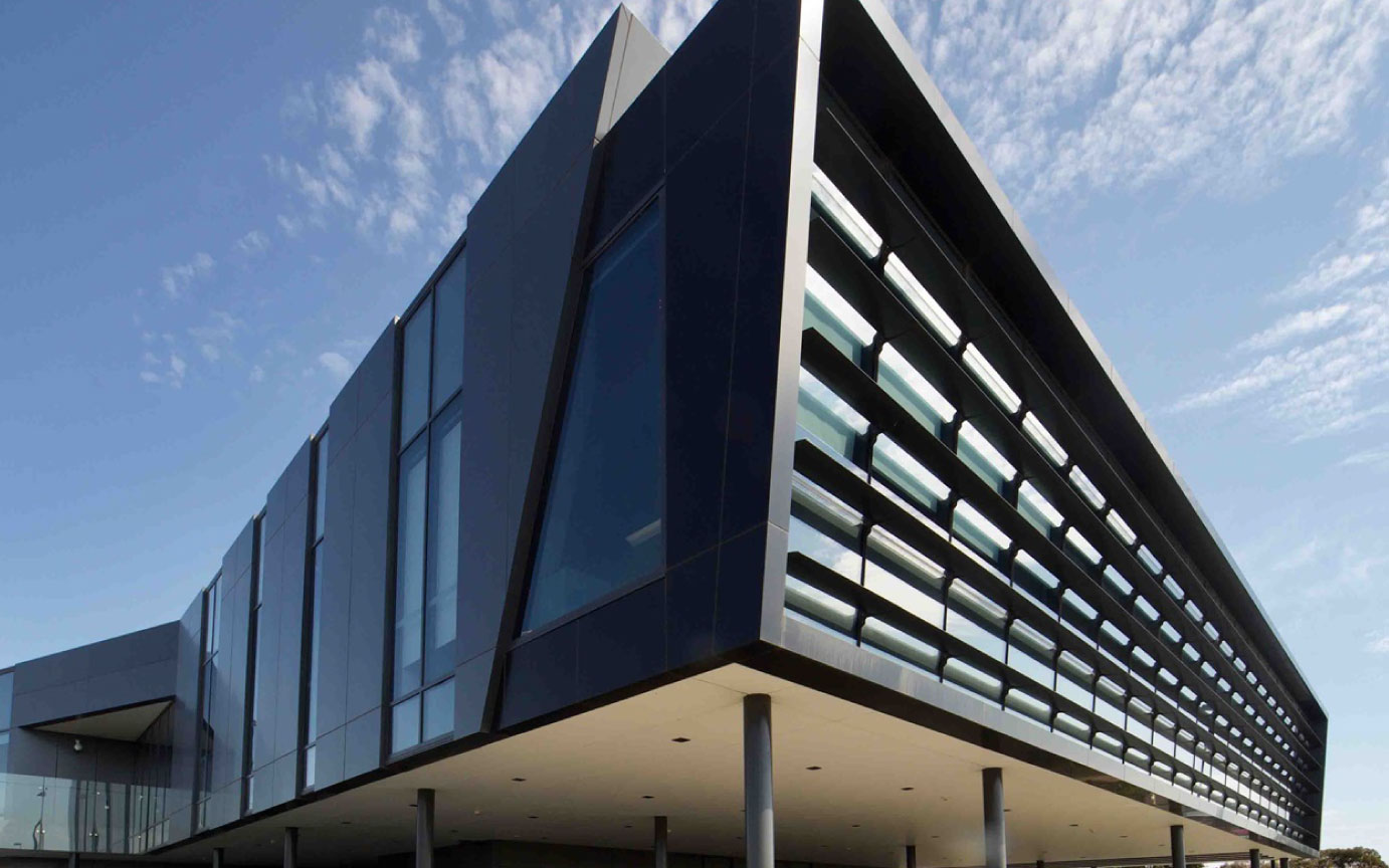
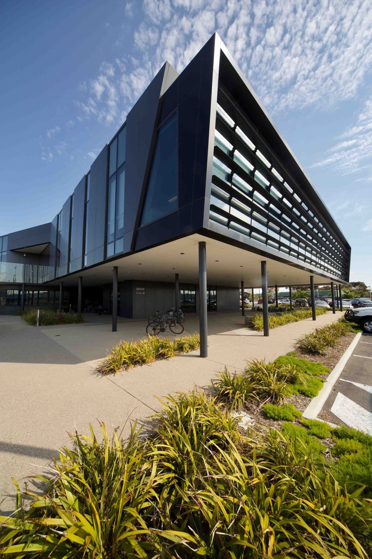
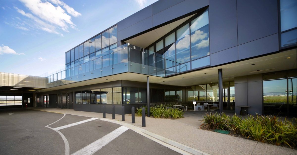
While so many airport structures are little more than utilitarian boxes, or acrobatic geometry, the RFDS’s home of steel and glass is all faceted, crisp necessity. Contributing hugely to its form and function, Viridian double glazed units provide deft connection to place in ways large and small.
Rather than squeeze occupancy into a pre-determined flighty form, the design is shaped by a practical, disciplined program. And instead of antiseptic, astringent spaces, interiors offer generosity with full height central atrium, clerestory, glass-walled meeting rooms and timber lined voids.
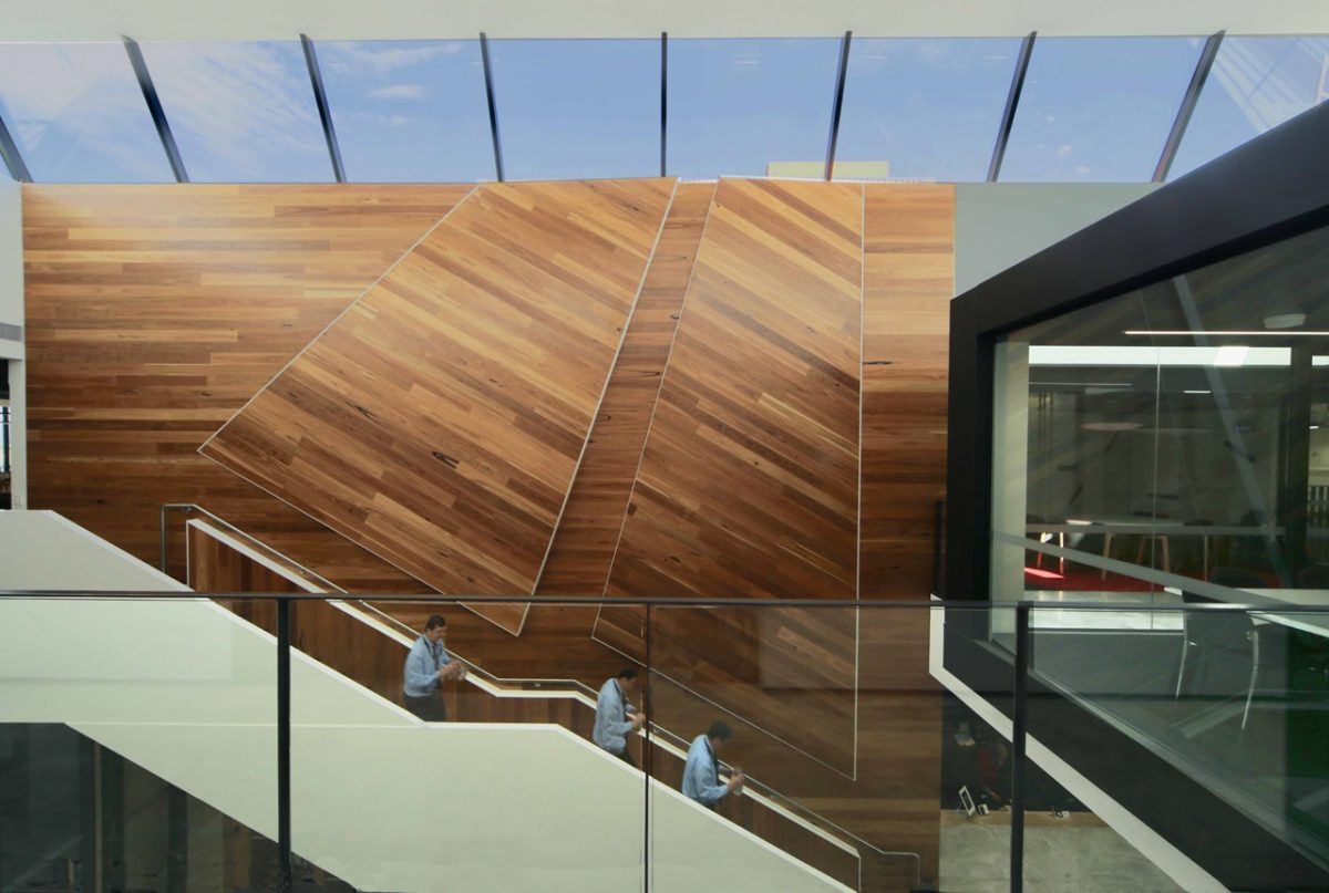
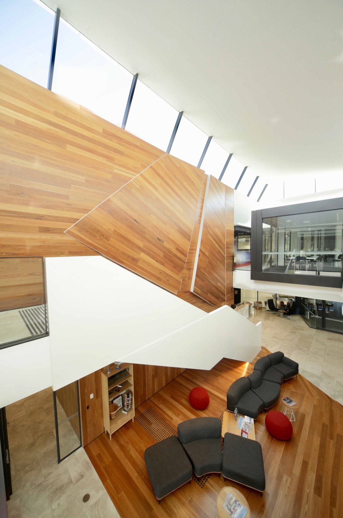
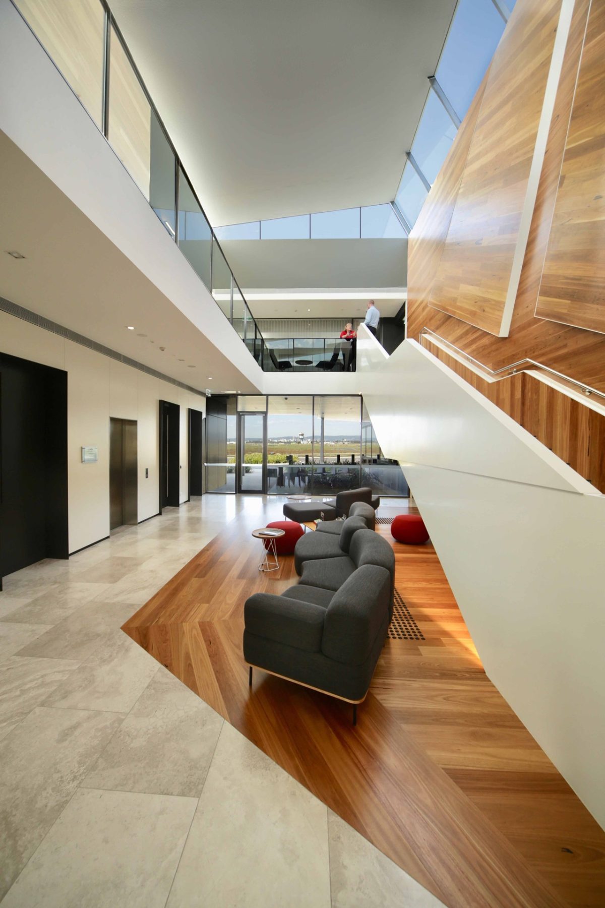
The foyer/atrium space encourages visitors to engage with, and be educated about, RFDS culture and operations. Glimpses of aircraft in the hangar or flying in and out, ambulances driving by, and an architectural connection to the sky and land through the floating glass skylight over the atrium stairs, are all vital components of this connective and cohesive aspect of design.
Vision’s Peter Hyatt met with project architect Andrew Frazer of Walter Brooke to discuss a project requiring technical excellence and empathy.
Read the interview below or watch Andrew talk about this impressive and functional building design on the Viridian YouTube channel.
A project highlight?
ANDREW FRAZER One is the main entry foyer viewed from the ground floor. There was a focus on giving visitors an impression of what RFDS was all about just by entering the building.
There is a work-in-progress quality with such high visibility throughout.
You walk in and see everything. You see the RFDS aircraft and staff at work. You can look out to the apron and the main Adelaide airport control tower. You can also look up through the atrium and see the sky. They are the main three aspects and it was about selling RFDS.
A regular challenge for architects is to prioritise levels of transparency.
That was a key aspect here. The organisation was previously split into different building sites. There was a cultural shift in bringing people together. While there’s a slight disconnect between operations and administration, visitors can see through the hangar what the operational people are doing – and vice versa. It was all about transparency and making the building visually open.
This even flows through to the large screens throughout that inform everyone exactly where aircraft are right across Australia at any given point.
That’s right, those screens show every aircraft in position in Australia real time and there are countdown clocks when there’s an emergency and response time. This design was all about patient care. That was the key driver. Anything the building could do to facilitate patient care and make that operation happen as quickly as possible, letting people do their jobs as well as possible was key.
Has working on this project made you a better architect?
It’s given me an appreciation of so many different operations and combining those areas of expertise in one building. You learn something new on every project and this was unique where you have aircraft, engineers, nurses, doctors and administration in one facility all working together.
Is there a parallel in the architecture as a healthy, stimulating environment produced by an uplifting building and workplace?
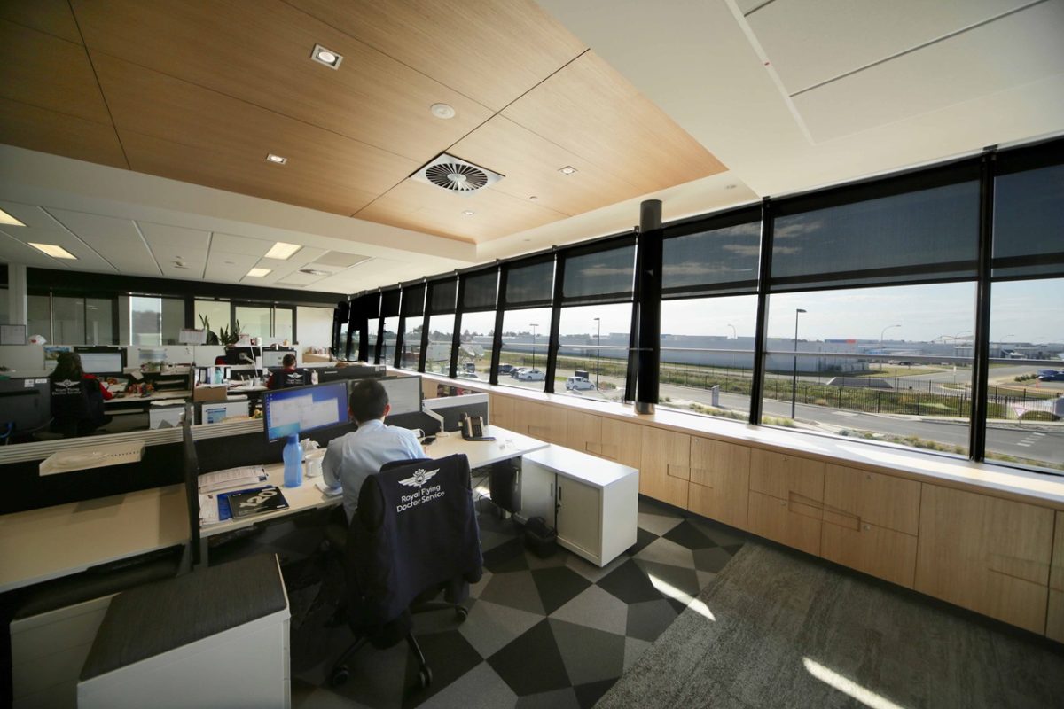
There’s distant views and a lot of natural light falling into the building. Most staff have that view whether they’re in an office or open plan environment. Even the centrally located meeting room offers views towards the airport apron.
What were the big questions posed to you as architect?
Patient care. The focus from the CEO, John Lynch was “How can we get an emergency patient to a hospital and then back to their home as quickly and as comfortably as possible?” It was all about avoiding bad patient circulation from that moment of arrival.
This is way beyond most airport boxes.
It is and that was based on patient care and staff being able to move from one part of the building to the other in a seamless manner. You will see circulation is quite prominent in the building, with a lot of natural light and the relationship of space. Everything is really trying to be as transparent and open as possible with good circulation where people can get from A to B very quickly. That was a huge focus.
“Visitors can see through the hangar what the operational people are doing – and vice versa. It was all about transparency and making the building visually open.” Andrew Frazer, Architect
How does glass help achieve your objectives of public interface – between city and outback?
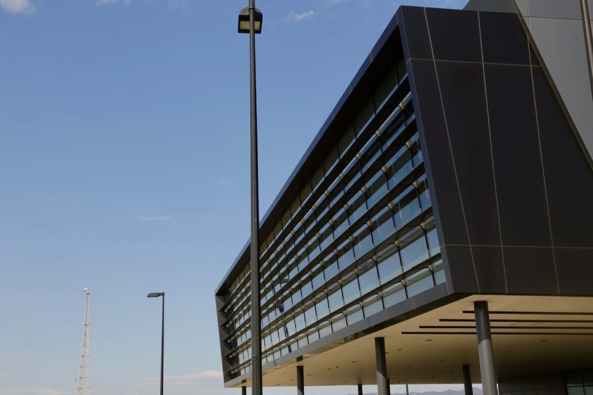
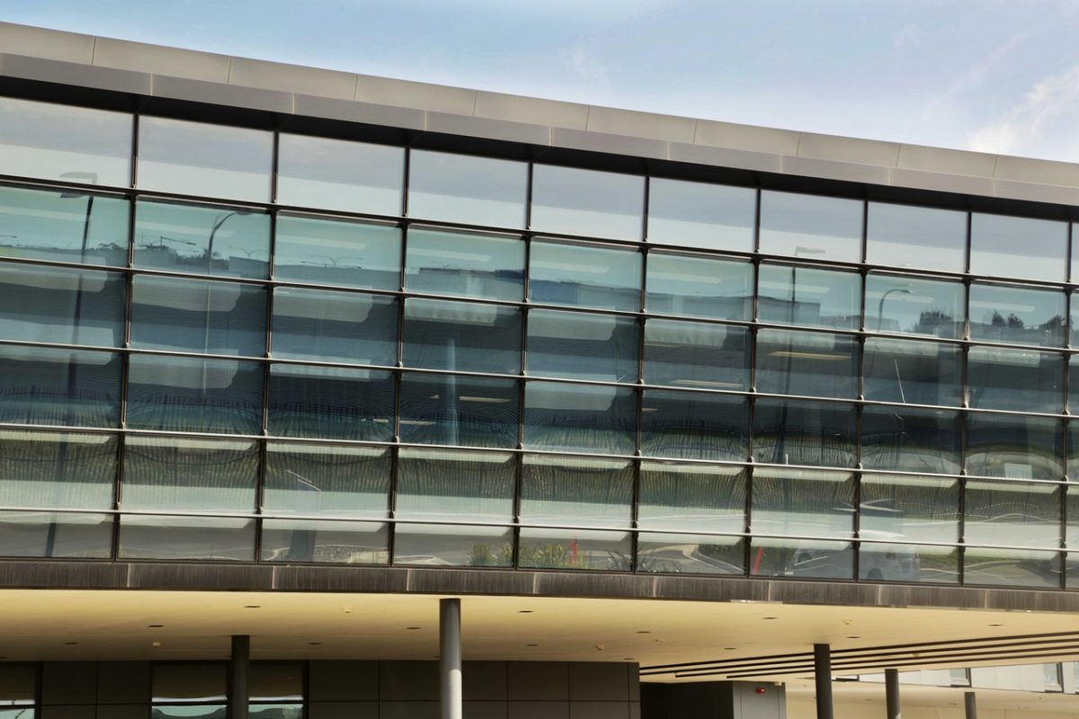
Administrative staff who overlook the apron have a 180 degree view for visual awareness when a plane’s arriving or leaving. It’s the same at ground floor from the nurse stations and patient care area. Double-glazing is strategically placed to allow that to happen. It forms the main, north-facing curtain wall on a slight incline with shading devices every 500 mm. There are slot windows on the west and they’re made more prominent on the east and south. These are also double-glazed for thermal and acoustic reasons, given it’s part of an airport.
That’s the envelope…what about internally?
Glazing quite dramatically de-materialises your interiors. Internal glass makes the building as transparent as possible. In this meeting room all four walls are glass with views to the apron and beyond. The policy here is open doors so it was really important that we sort of break down those barriers between open plan work-stations and offices. Most of the main rooms are surrounded by glass to keep that transparency.
Were discussions held with Viridian about how and where glass might be used?
They were really involved in understanding the structural glass makeup – especially where we used toughened and laminate on that front elevation. There was involvement as to how we did the spandrel zones. Where colour-backed glass is used we’ve done so behind double-glazed units for as much transparency even where there are spandrels. There was input for sure even to the glass that’s above us here, we had to use a particular tough laminate glass given it’s a roof skylight.
What are the main technical issues and achievements?
Finding glass that achieved both thermal requirements and the acoustic requirements is always a balance. The team got that right from the input that’s been received, so that was an important aspect. The main curtain wall is on a 10 degree incline and part of the glazing make-up, but one of the key issues is the challenges of transparency and acoustics.
If it’s not the door handle, or hand- rail, it’s the slot window that can make a difference. Those details are what form the big picture.
That’s true and for instance glazing in the main meeting rooms has no joins. It was important to keep that glass as one large piece. It was done to keep the integrity of the outlook towards the Adelaide control tower, main runway and the ambulance space. This meant the glass had a particular focus and prominence in this respect and outlay.
What if your client had been an IT company for instance. How would that design have differed?
The RFDS had a lot to do with the design by giving the architect that sense of flexibility. And they had trust in us to do something that achieves their outcomes. You definitely don’t see atrium spaces with big volumes in the center of most buildings, but that’s been done to connect ground and upper floor with an interconnecting stair. It’s part of that visual awareness of everyone around you within the organisation.
