St John of God Hospital
Berwick, Victoria
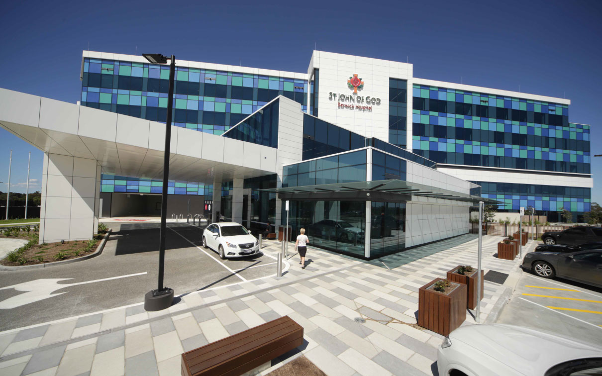
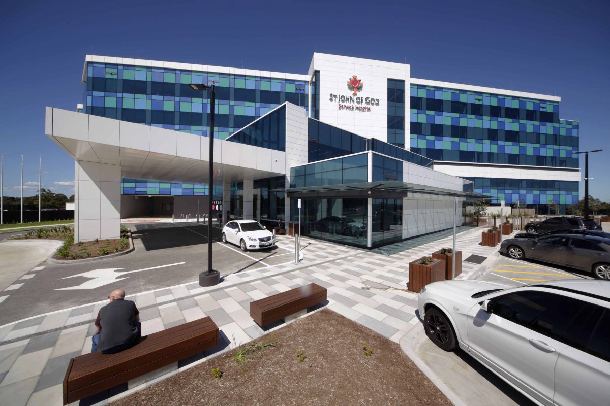
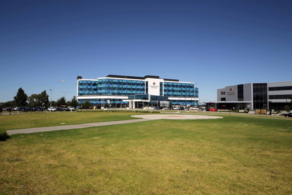
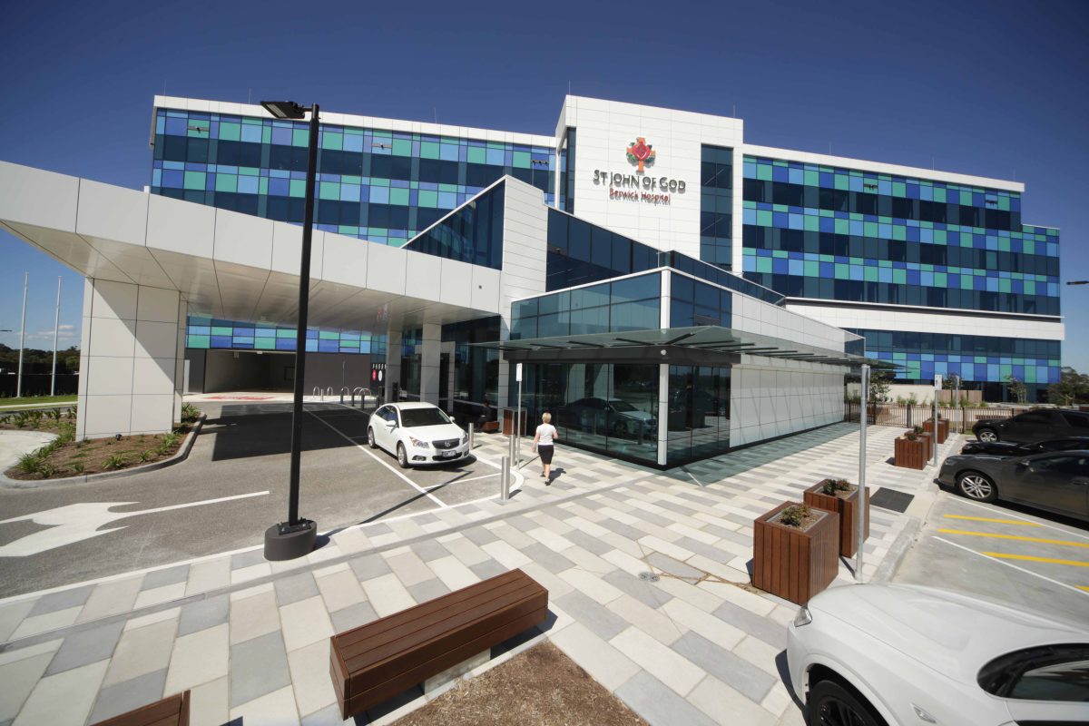
The St John of God Hospital in Melbourne’s outer-suburban Berwick displays a friendly presence and scale. A light, sky reflecting envelope offers a landmark presence and flowing interior daylight. Scroll down to read more, view videos and see the picture gallery.
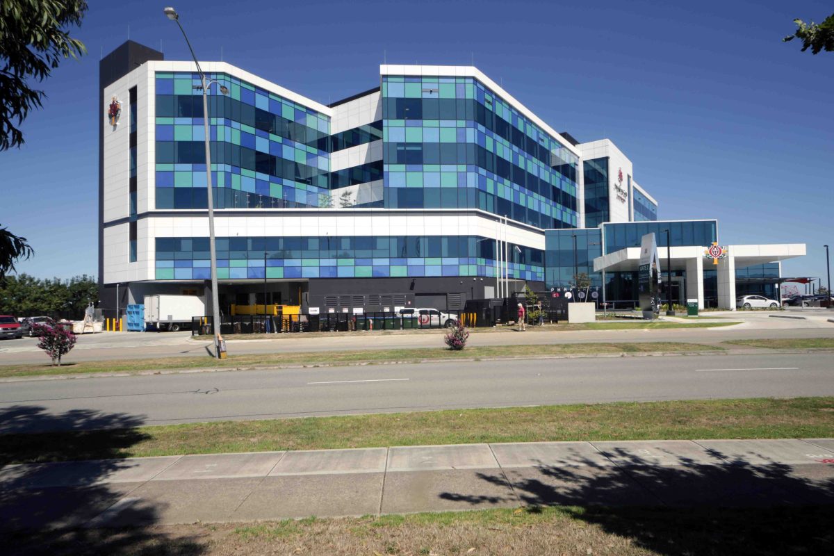
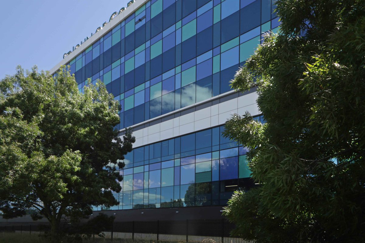
Overlooking Melbourne’s high volume Princes Freeway, the facility illuminates patient care and the workplace. Wrapped in an array of Viridian EVantage™ SuperBlue™ Double Glazed Units, the St John of God Hospital is as artful on the outside as it is fully functional and highly specified inside.
Medical services are just as easily made, as broken, by design. Quality patient care inevitably makes the link between good healthcare delivery and an uplifting, smooth running facility. Berwick’s newest hospital for this rapid population growth corridor demonstrates a design DNA integral to the entire patient experience. For passers-by and local community, the result is confidence-building. Daylight and amenity are among the now well-understood factors in operating conditions, patient recovery and visitor/staff morale.
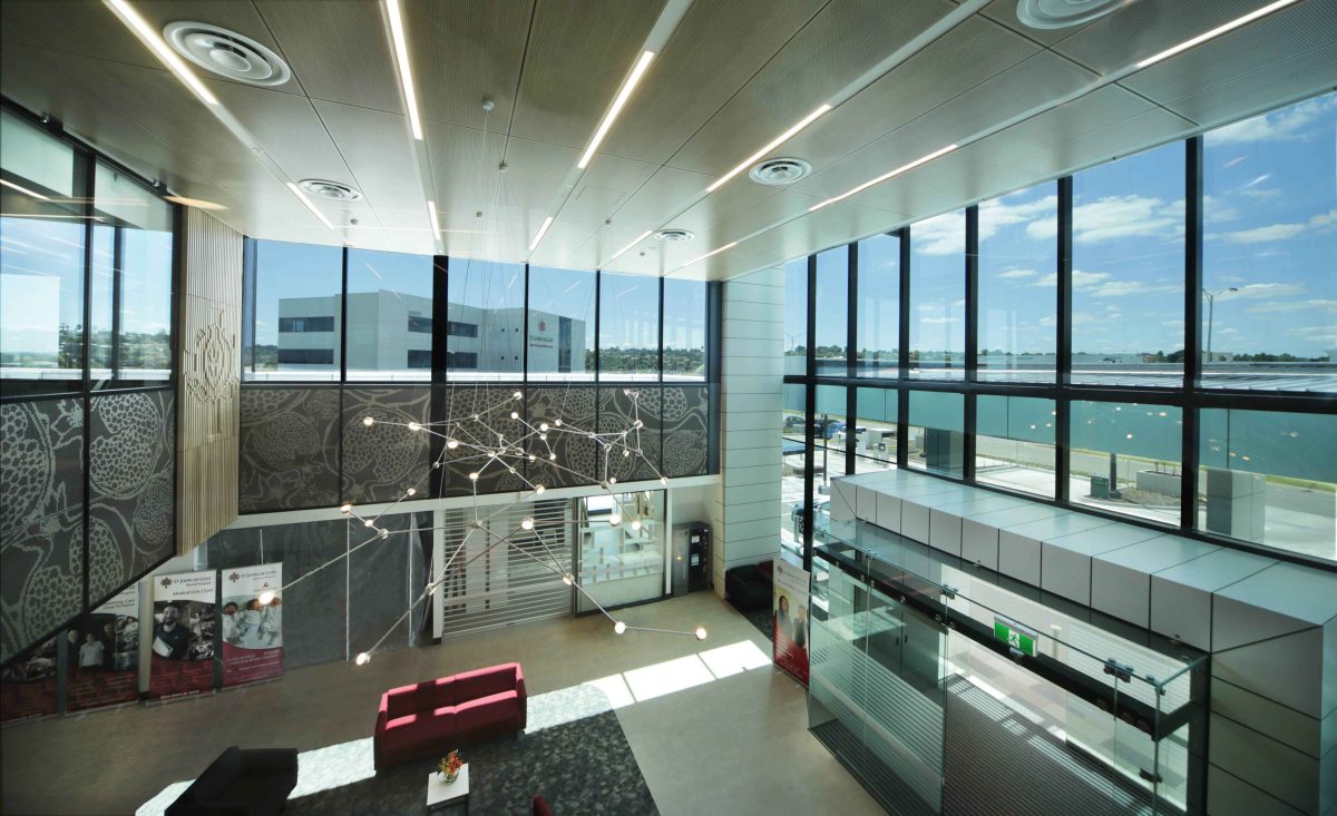
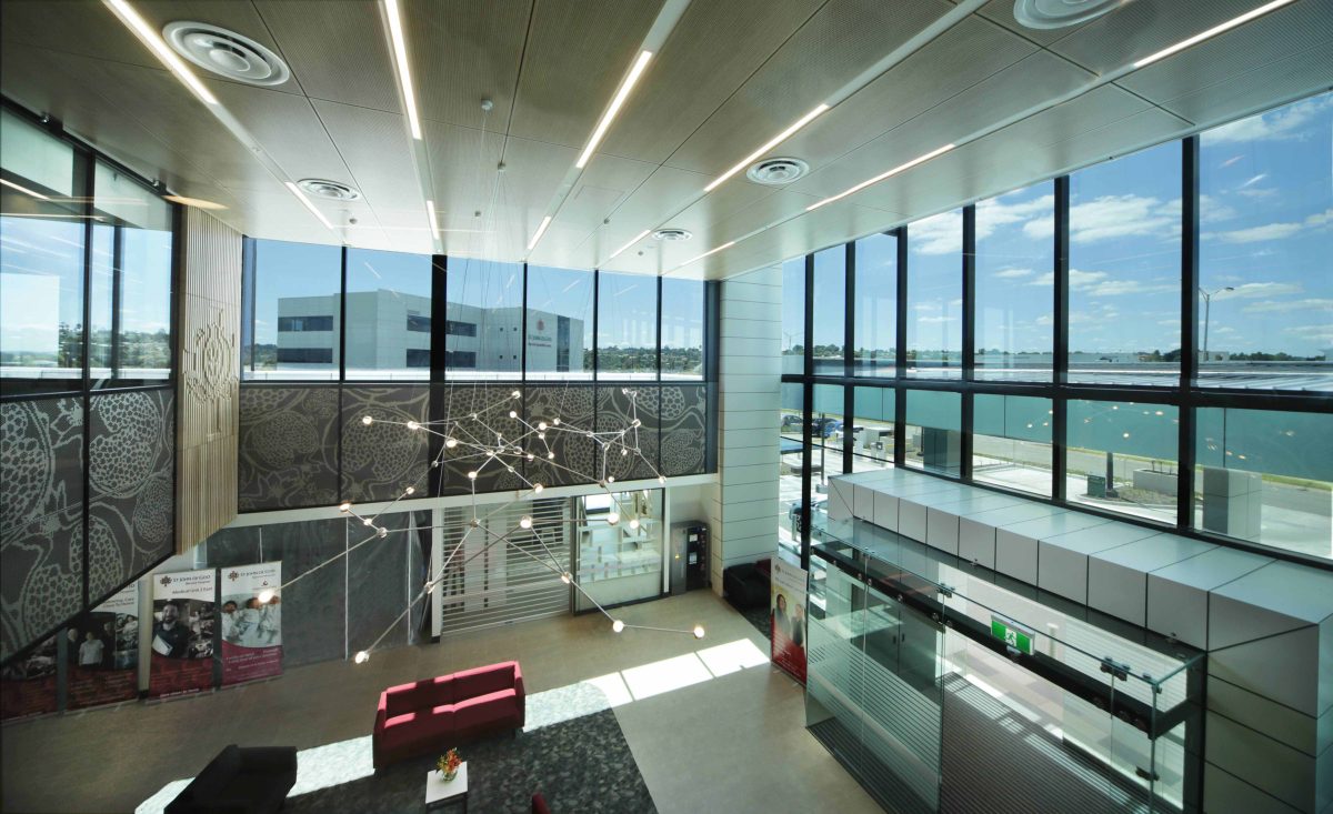
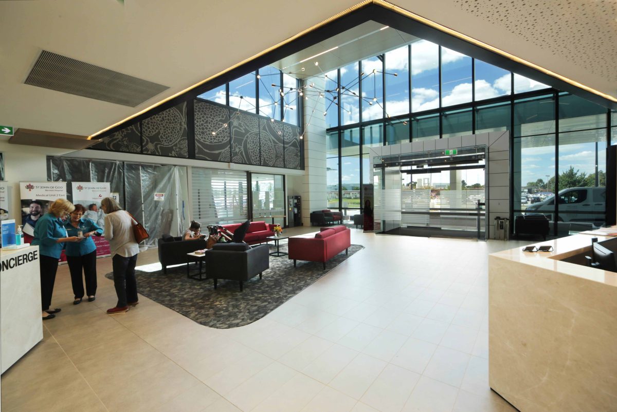
The result is purposeful, imaginative delivery – crisp outside, streamlined inside. Wiser minds appreciate how buildings are key to whether the people and equipment housed within merely exist, or prosper. Reception areas are a good guide as to whether the architects and hospitals have got it right. A rabbit-warren of pharmacies, assorted retail and coloured floor strips, speak of the wayward rather than way-finding. Here the double-height atrium as entry feels generous, open and leads to the first level day-care reception area. It’s an approach repeated throughout and the result is an easy calm. Interior fit-out and furnishings prefer natural materials wherever possible. Jittery noisy visuals are excluded from a setting where patients, family and friends can otherwise feel anxious.
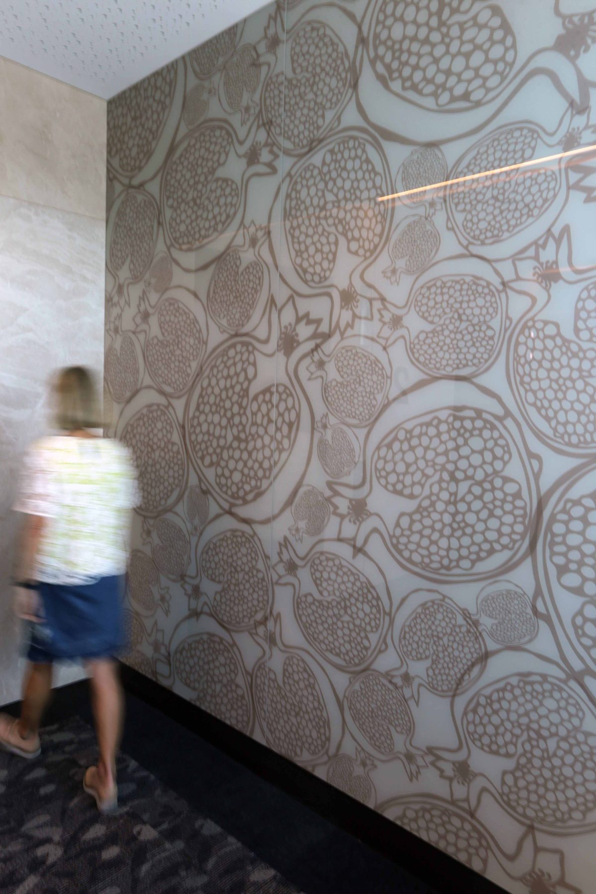
Beyond front-of-house the theme of transparency and clarity continues in ways small and large – from the infill glazing in the staircases, especially popular with staff, to the nuanced artwork of pomegranate motif as Viridian’s digitised PixaGraphic™ feature glazing.
If nothing else, the hospital is a reminder that such facilities can be uplifting rather than antiseptic or coldly utilitarian. Project architect Silver Thomas Hanley’s work is uniform in elevation and plan. Slice it like a cake and its consistency is evident throughout – always a good sign.Most conspicuous is the graphic glazing-as-envelope that yields identity and, most significantly, daylight filled interiors. Good architecture feels spacious. It’s less a result of size than spatial economy whereby the absence of solid walls and cluttered joinery make occupancy a pleasure, rather than pain. Think easy circulation zones, slender parts, clear way-finding and an overall clarity of experience.
“The healing benefits of daylight for patients can’t be underestimated. The glazing selection plays a key part in delivering this intent.” Ian Wong, Architect
Viridian’s Vision magazine team spoke with project architect Ian Wong of Silver Thomas Hanley about the graphic energy and interior calm of this project.
VISION What are the key qualities you wanted to invest here?
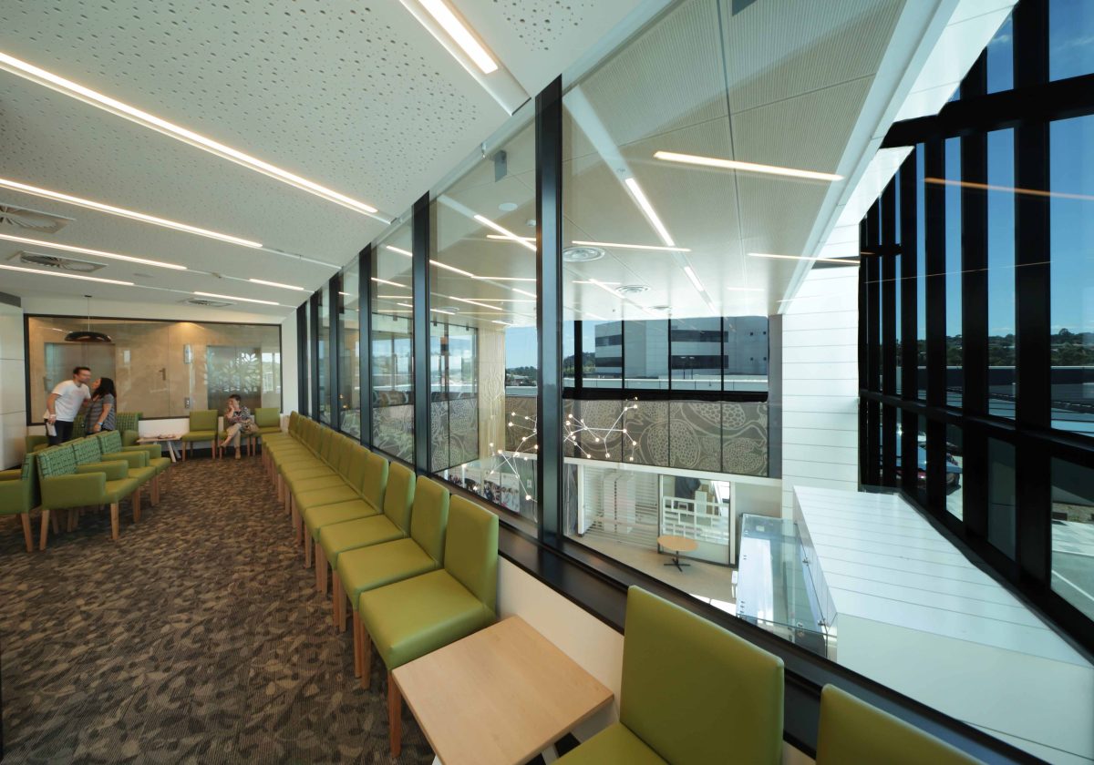
IAN WONG With 80% single patient bedrooms, the hospital required a large extent of perimeter glazing. Hospital corridors are often single loaded and devoid of natural light. By placing large windows and day rooms at the end of each corridor ‘wing’, patients and care-givers benefit from orientation and proximity to daylight around the building’s ‘edge’.
How does your glazing strategy form a synergy with the hospital’s aims?
All bedrooms maximise full-width windows, taking advantage of the magnificent views, especially south across the Princes Freeway and beyond across treetops. The healing benefits of daylight for patients can’t be underestimated. The glazing selection plays a key part in delivering this intent. This is demonstrated in the southern facade where triple-glazed window units were specified to address both thermal requirements and acoustics issues associated with the Princes Freeway. In all instances maximum views are maintained from patients bedrooms.
Your upper level breakout areas – or decks – for palliative care and new mothers is something of a sanctuary. Glazing doesn’t automatically come to mind where intense privacy is often needed.
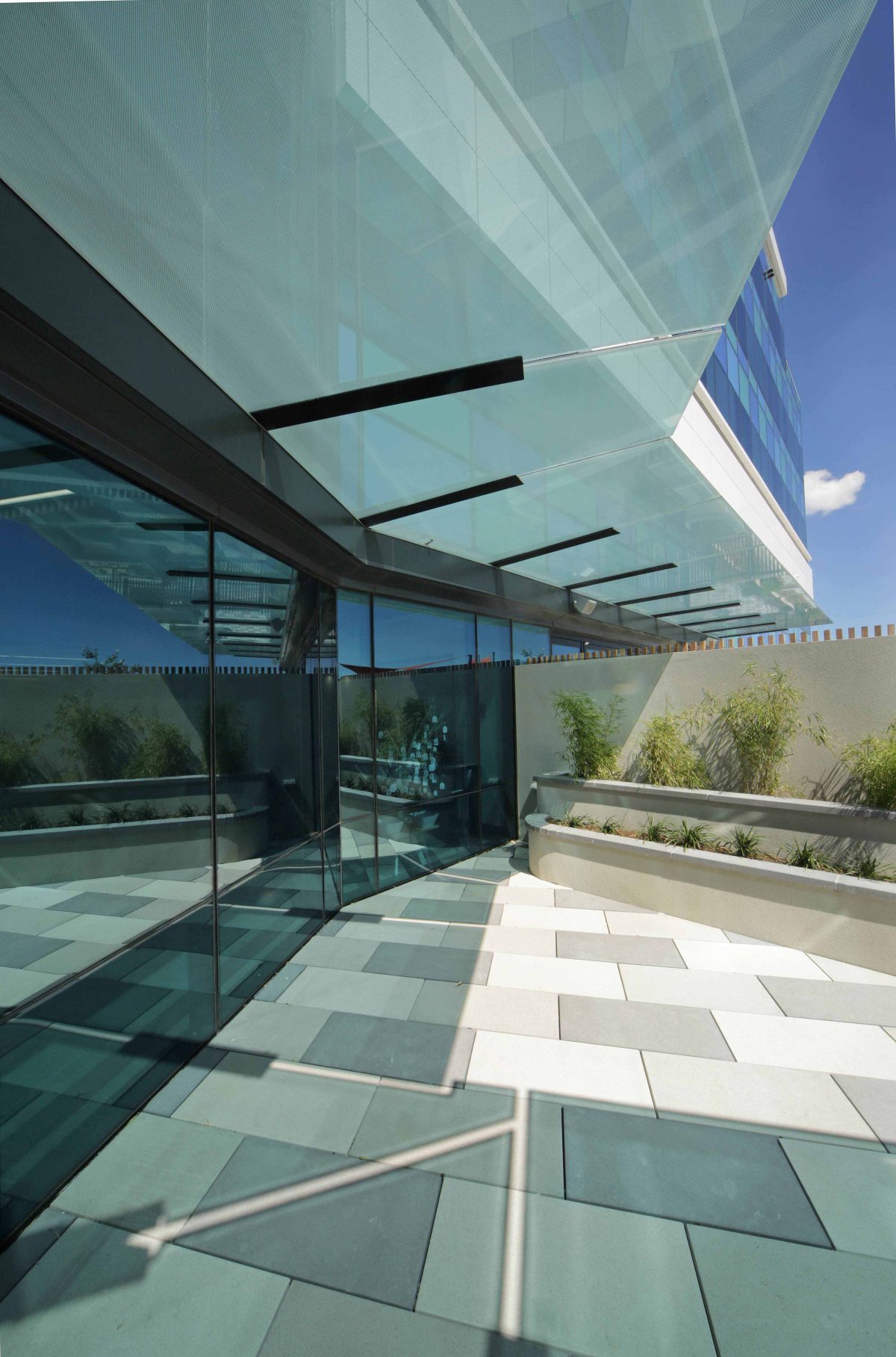
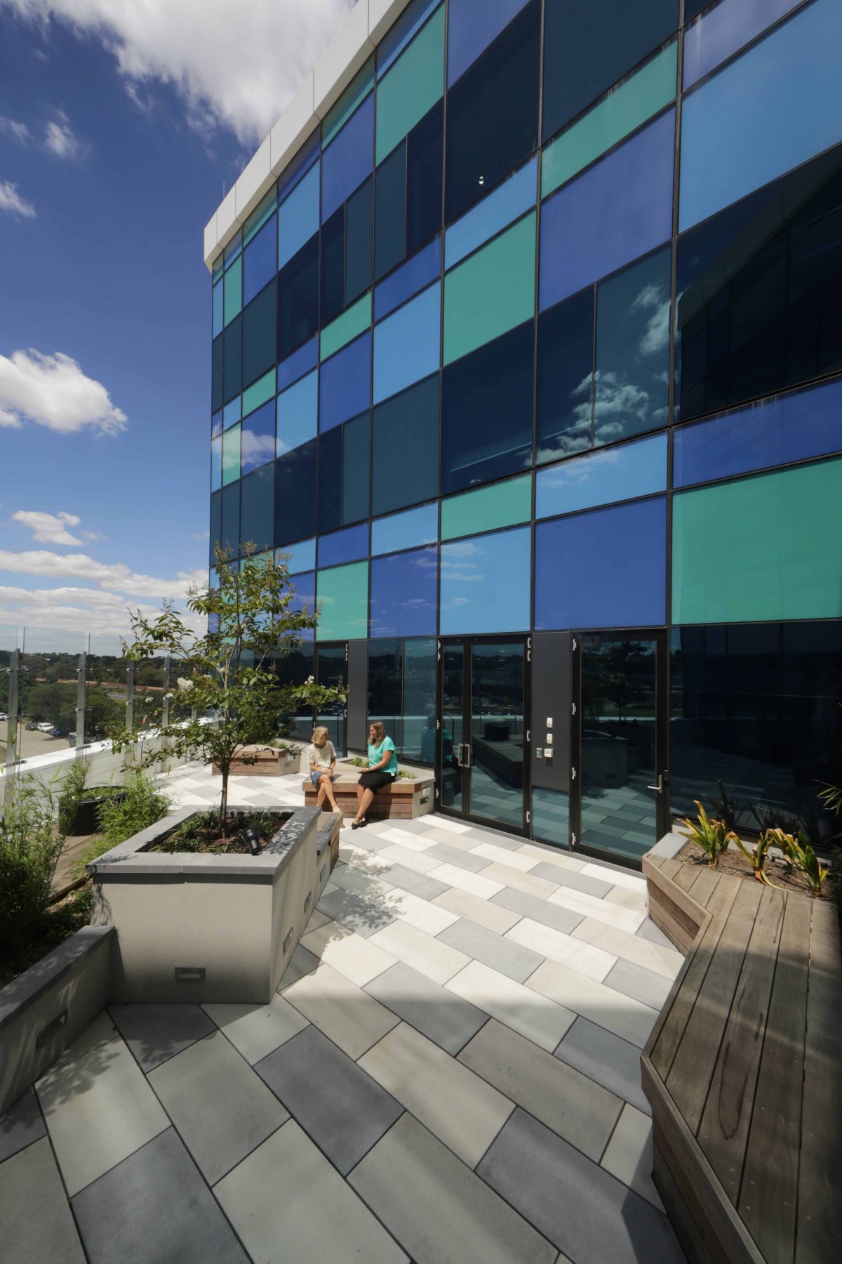
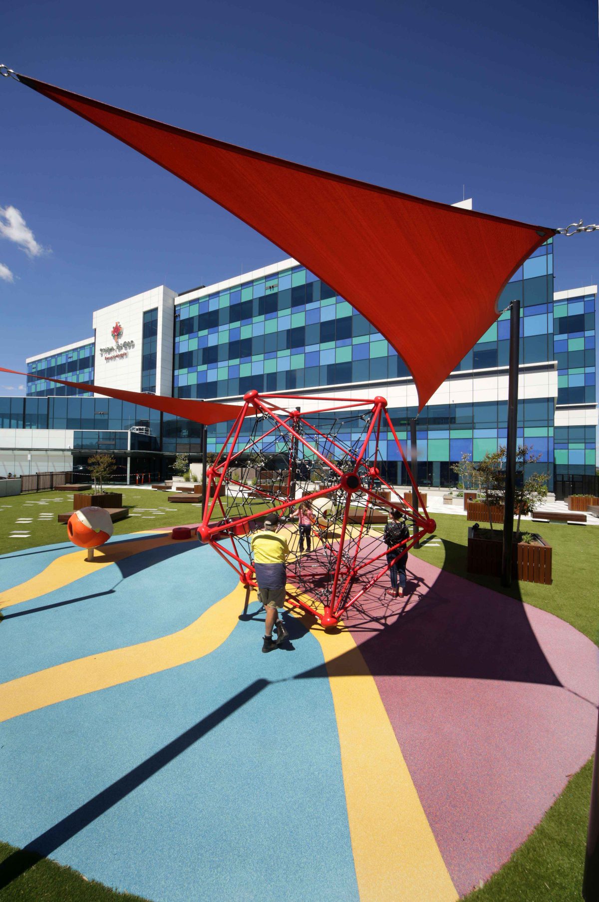
The internal spaces optimise the use of natural light and landscaping with the aim of accelerating the healing process through provision of therapeutic terraces, together with a combination of colours and acoustics. The therapeutic terraces located on the upper levels comprise timber, concrete pavers and soft, colourful landscaping, which balance against the glazing panels that mirror subtle sky reflections.
The reflectivity of the EVantage™ SuperBlue™ also ensures the privacy you mention so that patients have this wonderful vista but at the same time know that no one outside can see in.
How have you tried to shape a building as professional yet approachable as possible?
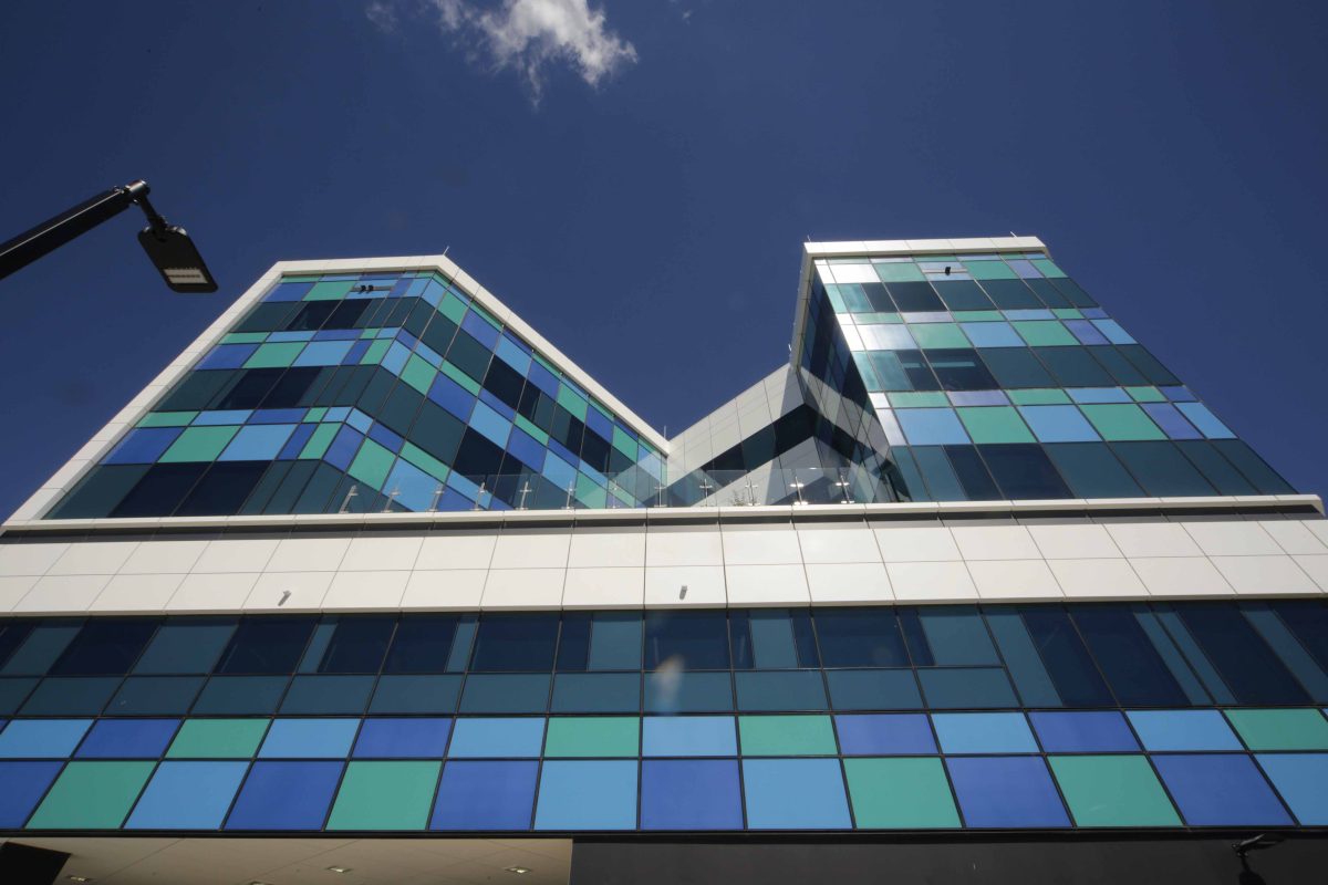
While large for the region, the hospital is separated into distinct parts that give it an overall logic and help reduce its scale. The ground and first level forms the podium which contains all acute and ambulatory care. This is wrapped with white aluminium panels, indented with a feature dark, metallic band. This treatment of the facade breaks down the scale of the building, offering a more intimate approach at the ground level. Perched above the podium is the in-patient unit tower, where the white aluminium panels are repeated as a picture frame around an intricate mosaic of clear glass and green-blue, colour-backed Viridian Seraphic™ glass panels. The horizontality of the building is book-ended on both ends by twin dark-charcoal precast stairs, with a slit of vertical windows running parallel through the podium, puncturing the mass of the structure. Internally, these windows at the end of the corridor presents a ‘rest’ stop with views outwards
Catering for one key group – patients – really means there is a huge flow-on benefit to everyone who occupies or visits the hospital.
That’s true. I think views from within and beyond really are indicative of the way this hospital connects patients and staff and, more broadly, to its setting. Light-filled dining rooms and lounges, wonderful views from operating theatres and careful positioning of courtyards and terraces. Despite the deep and complex planning, patients, visitors and caregivers are rarely far from a view of the outside, be it greenery, wide aerial views of Berwick, vistas or sky.
How does glazing contribute to the quality of the first – and lasting – impression. T
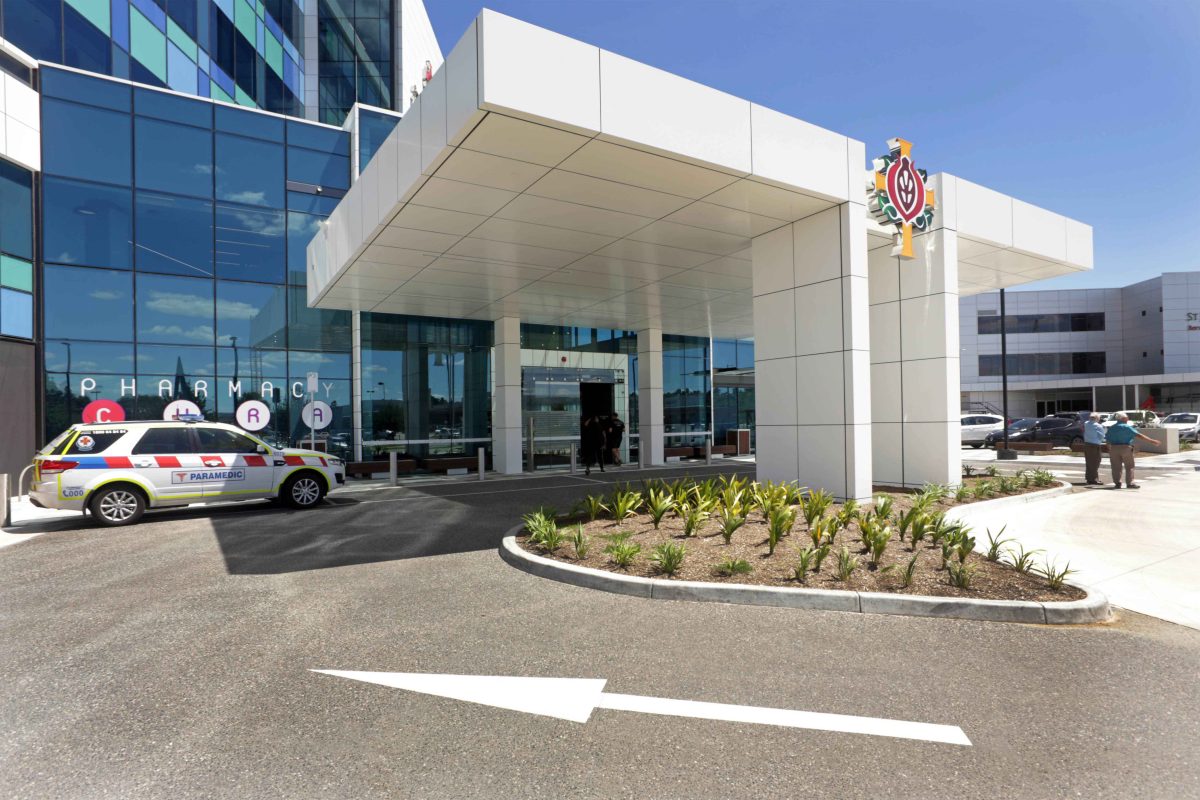
The new main porte cochere is identified by a cantilevered canopy with a central column and large, double-height clad in EVantage™ SuperBlue™ glazing. It delivers quite a wonderful sense of arrival and occasion. A similar glass box within the large front facade glass box forms the airlock and main entry into the building and main foyer. Within the highly intimate foyer, a myriad of textures and materials provide a stark contrast against the large expanse of glass and aluminium panels of the sleek facade. Full height glazing provides ample light into the foyer, highlighting the range of other finishes including the perforated metal screens with the SJOG’s signature Pomegranate theme which is also incorporated on other levels with Viridian’s digitally printed feature glazing. The arrival on Level 1 into the day procedures area more resembles a lounge than hospital waiting room.
What about some of the less immediately obvious parts of the hospital?
There’s eight operating theatres, a cardiac/vascular catheter laboratory, six birthing suites, 17 consulting rooms, chapel and pastoral care and education and research facilities. Just to challenge ourselves there’s also a 350 vehicle basement car park.
Want to know more? See video interviews below.
