St Michael's Parish School
Ashburton, Victoria
Even junior schools are seeing the light with architecture as instrumental in the delivery of education. The newest ‘wing’ at St. Michael’s Parish School by Y2 Architecture is a case in point. A taut material palette highlighted by Viridian performance and coloured glass, communicates vista and a beguiling array of internal lighting effects. Scroll down to read more, watch the video and see the picture gallery.
‘Optimistic’ architecture is a subjective quality but one worth pursuing when it comes to education. Feelings of connectedness, opportunity and hope are all possible in an atmosphere where design does its job.
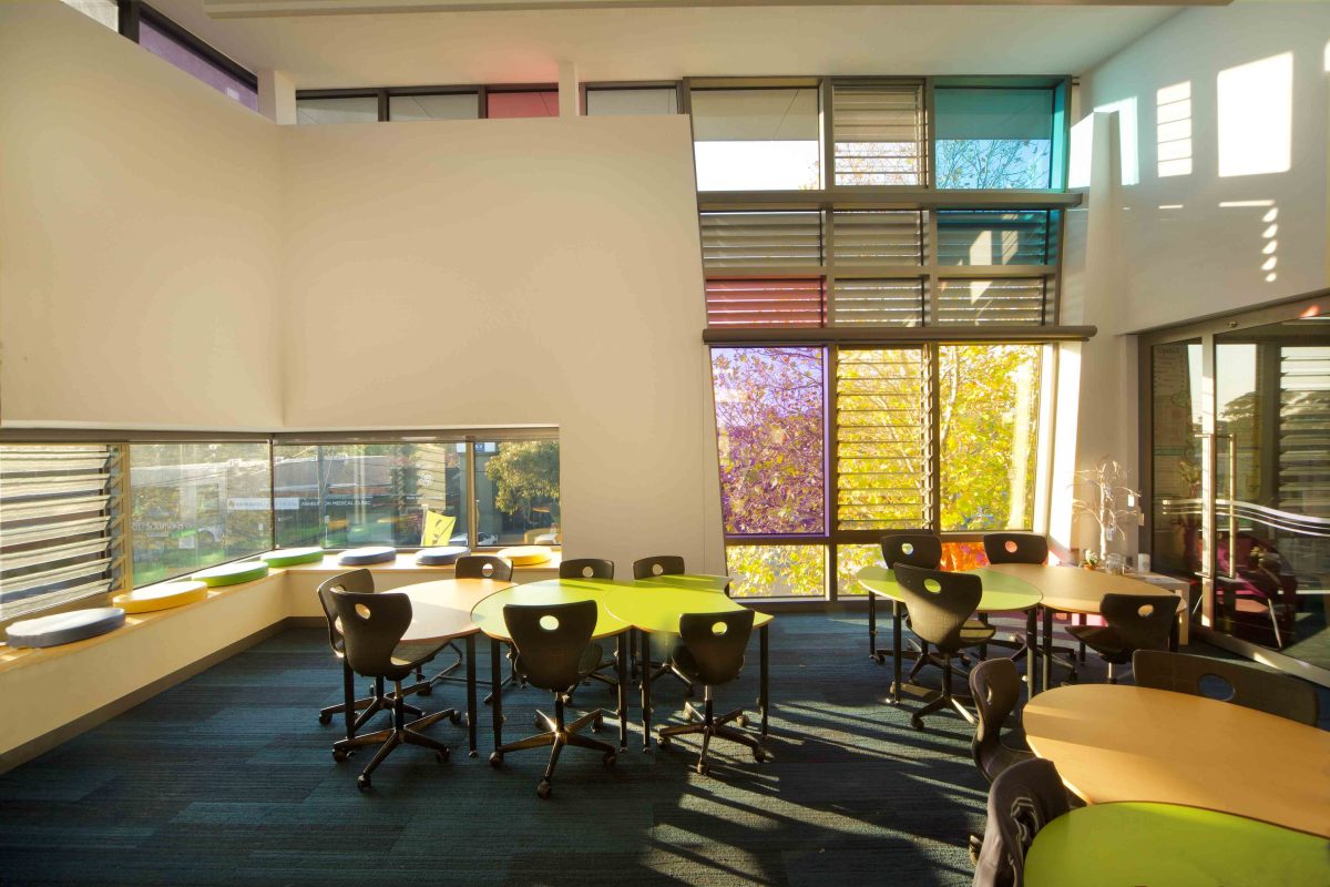
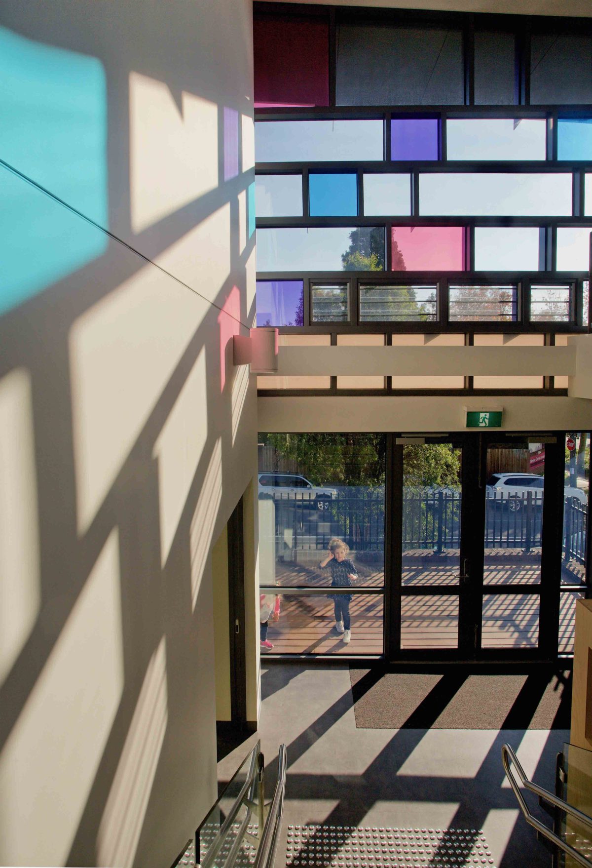
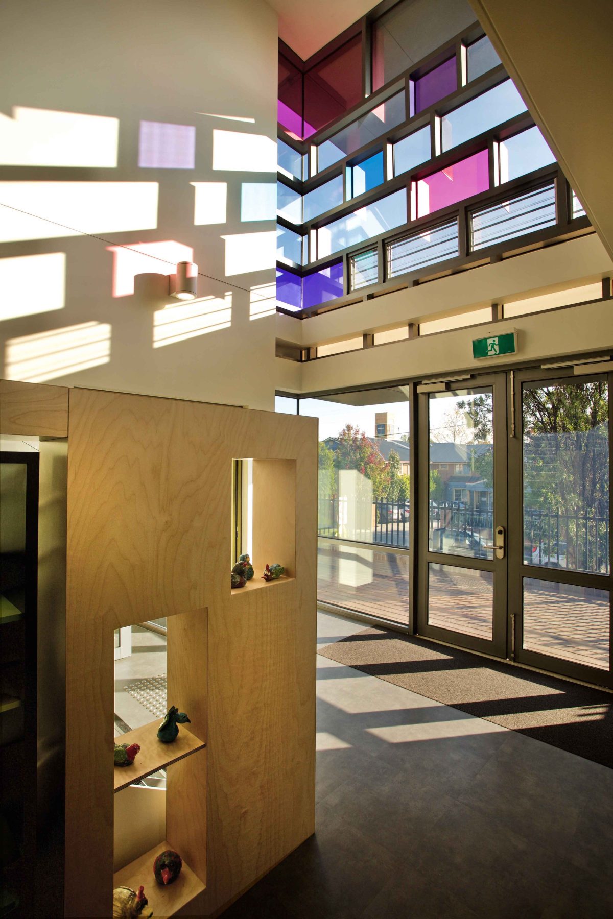
St. Michael’s Primary reveals jewel-like elements in its glittering, light-filled addition to this school of 240 students. Y2 Architecture’s homage to Corbusier’s best-ever building, pays off handsomely with this multi-faceted learning wing. An understanding of daylight as a sculptural element is key to the serious business of playful design.
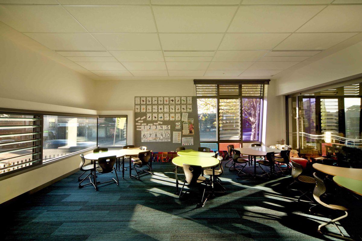
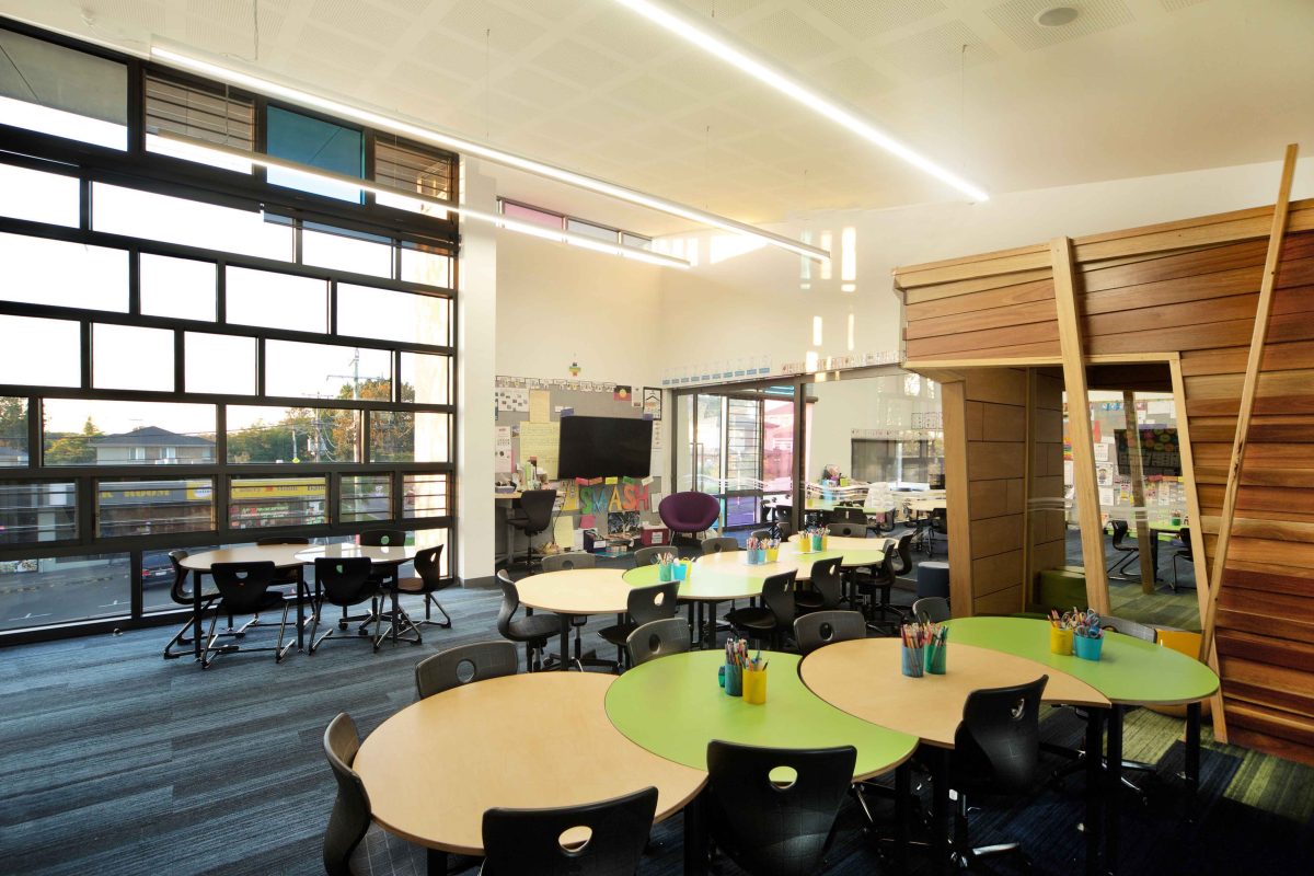
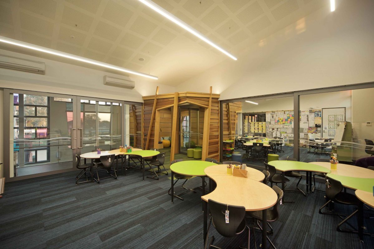
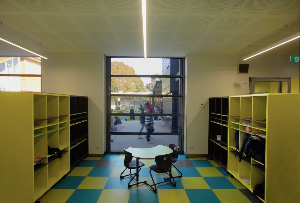
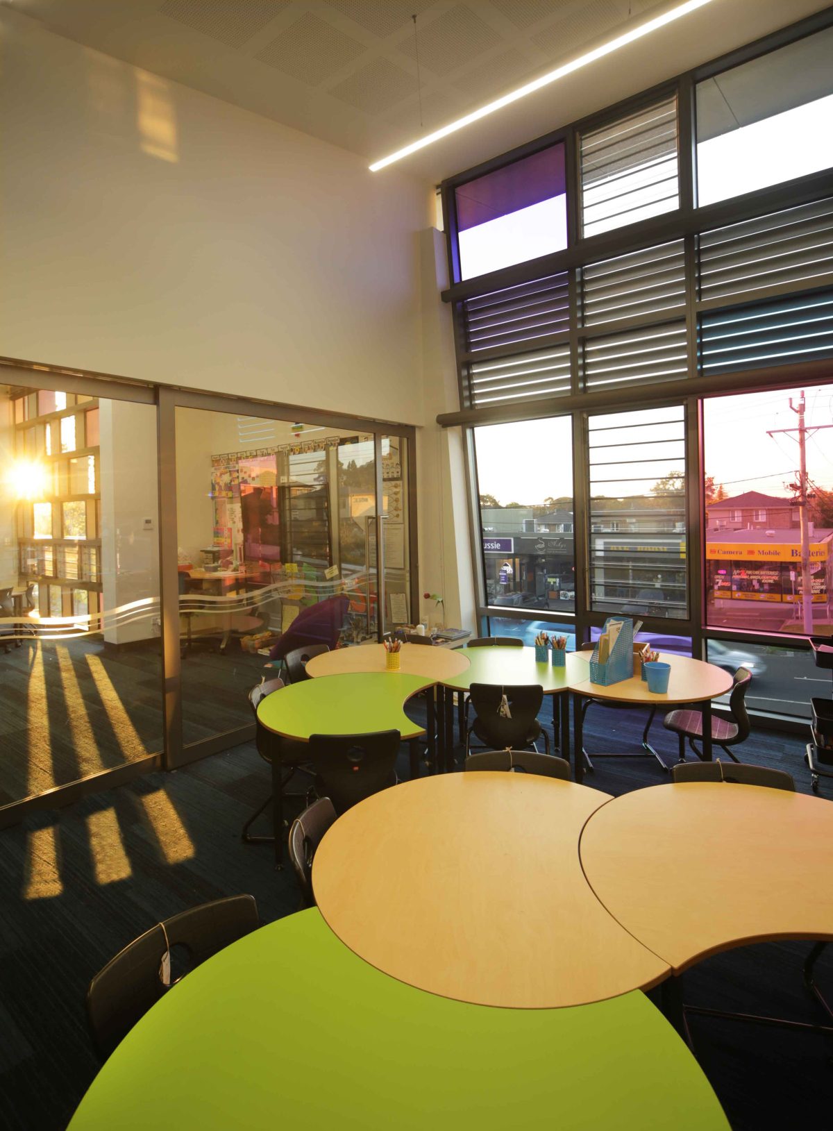
In an era of open and kinder education this new building opens to the outside world but, equally, is fully connected within. Large sliding glass doors between classrooms across two levels and adjustable, operable windows are distinct clues to this new teaching and learning model.
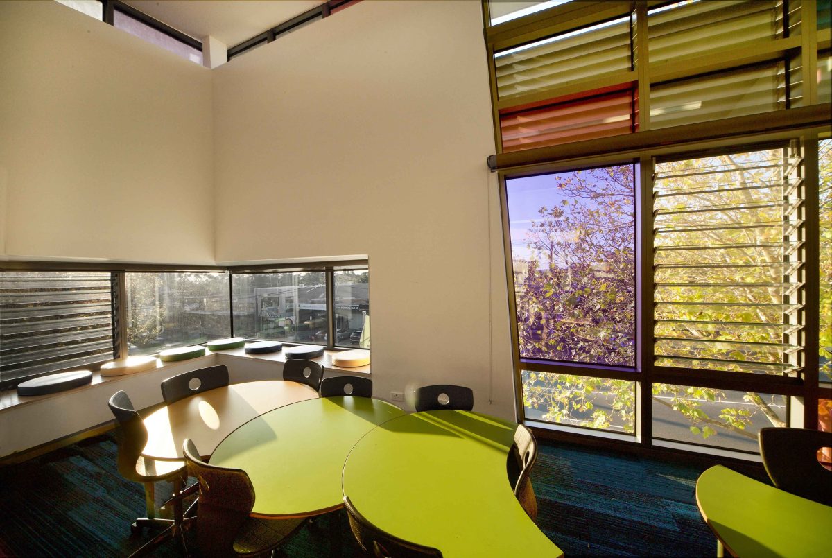
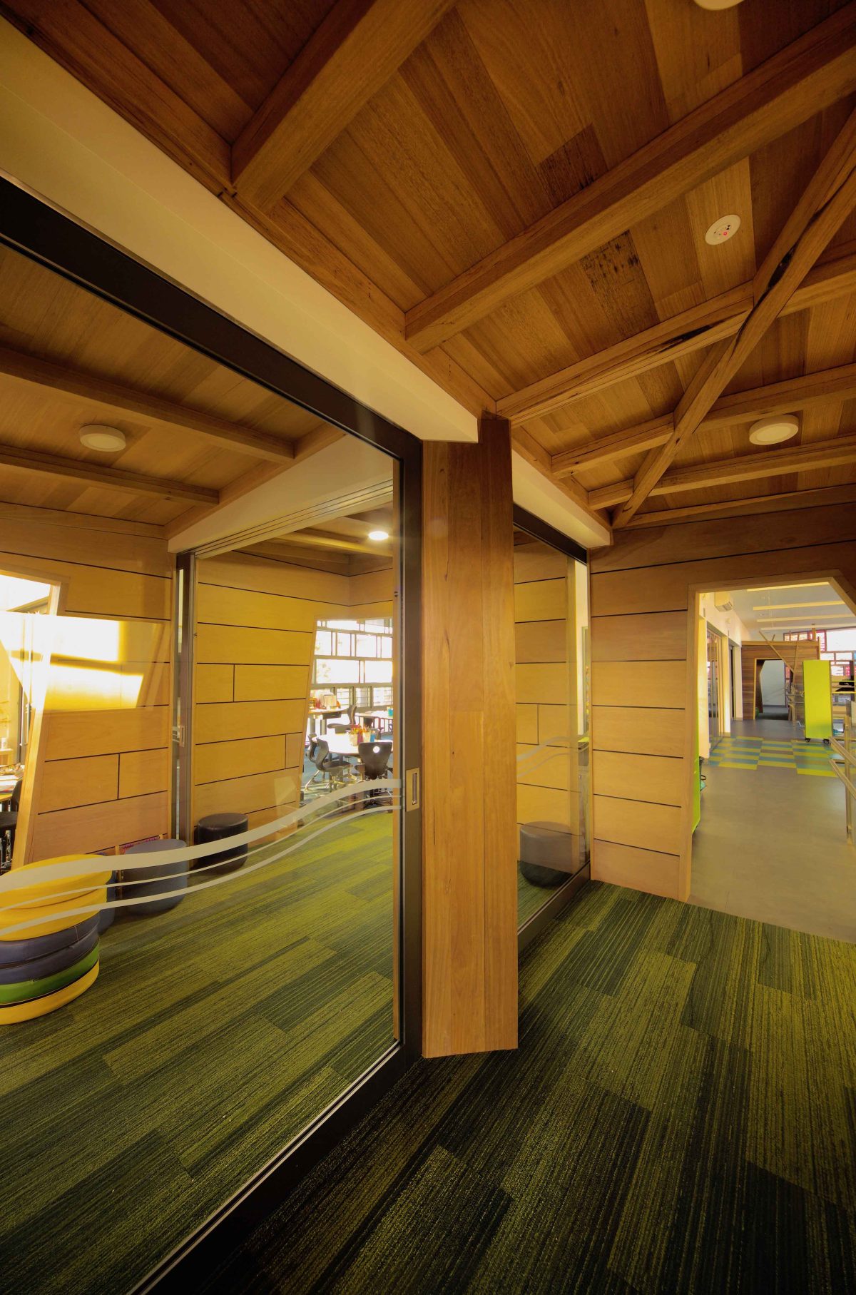
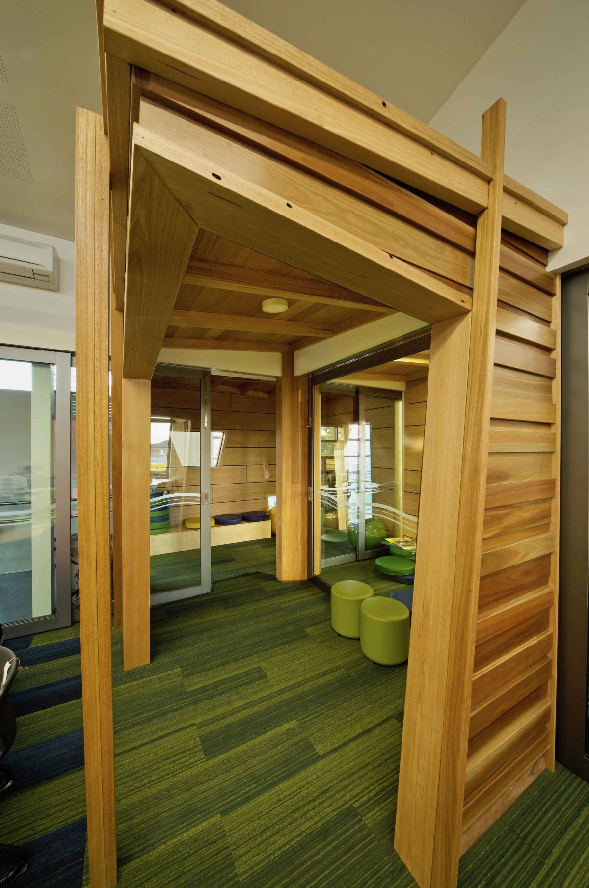
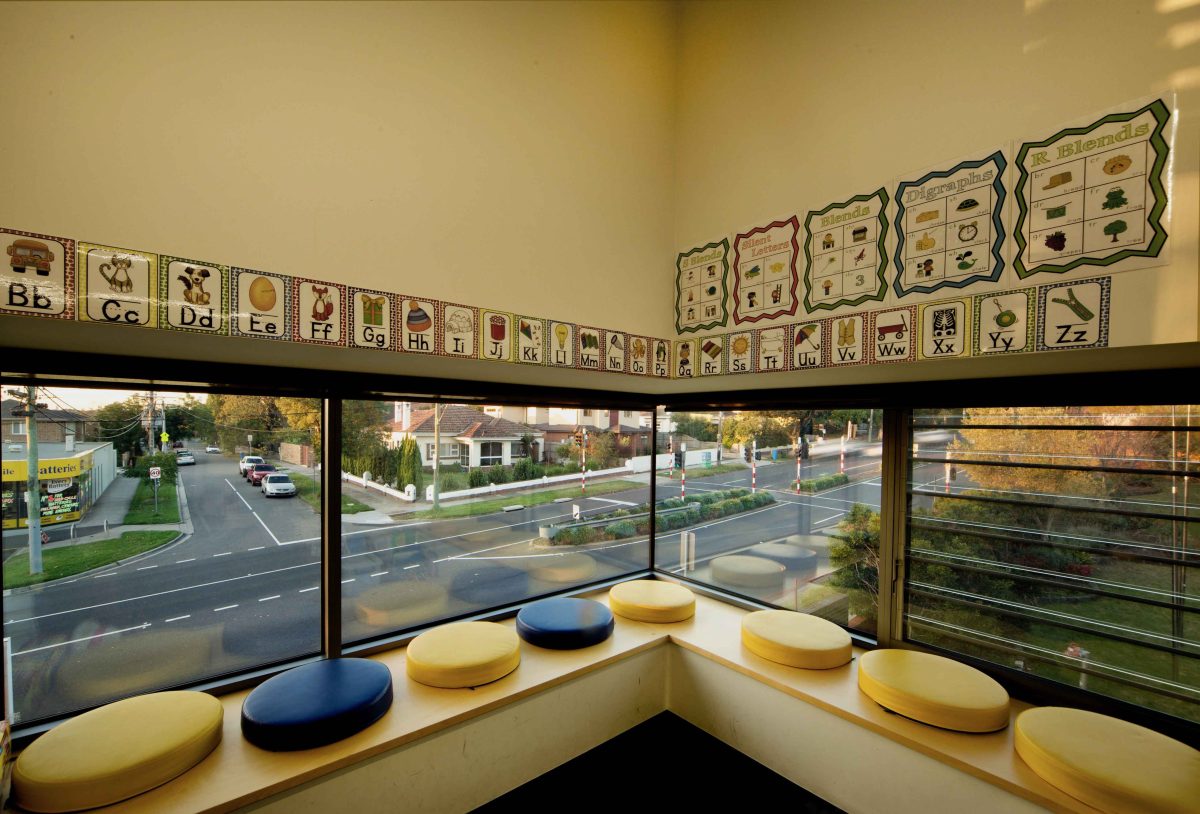
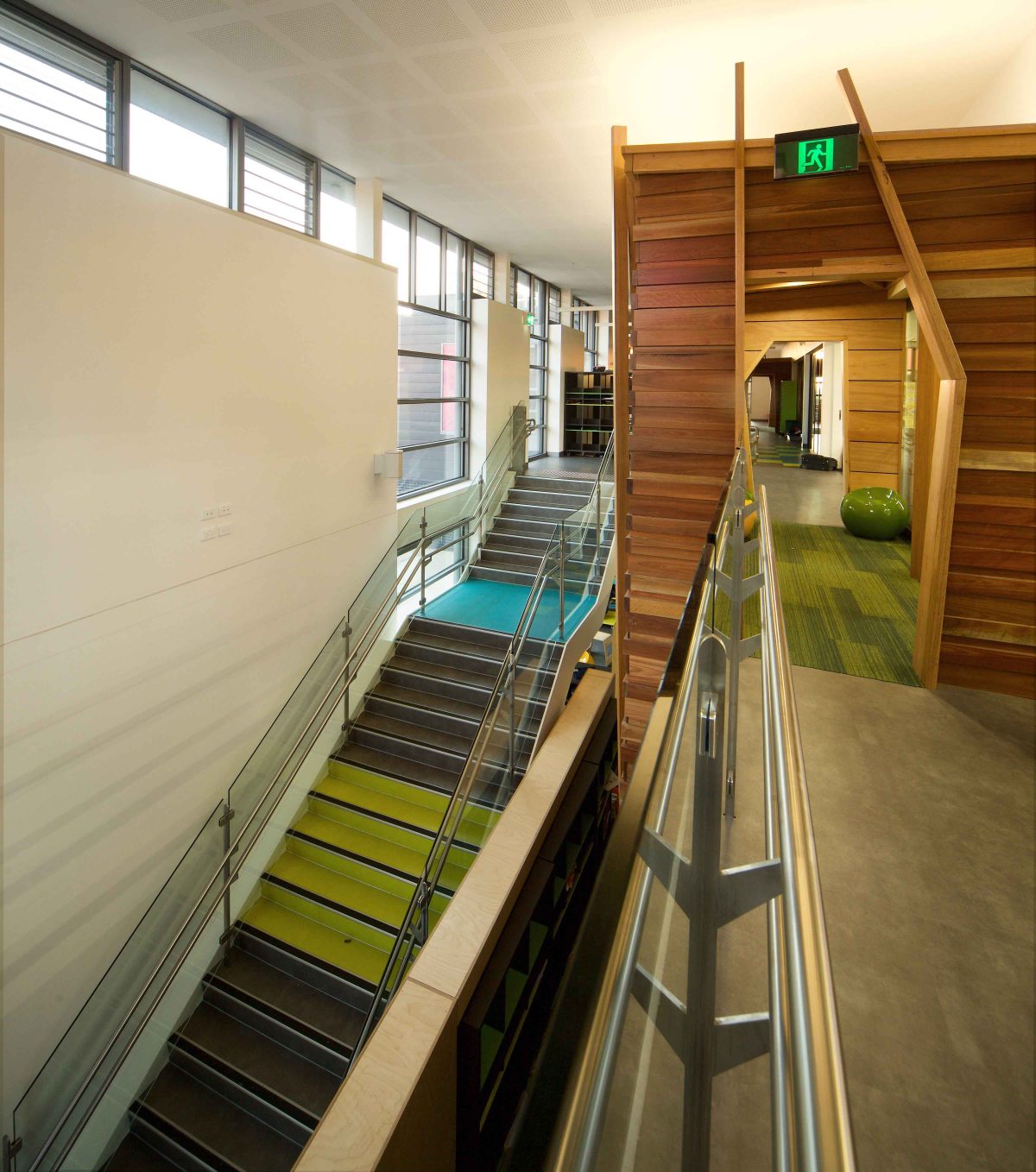
Fully flexible and light-filled, Y2‘s design isn’t all expanse or revelation. There’s also enclosure with areas for retreat and rest via a series of study pods or perches. Modelled on the idea of the tree-house, the building provides eight classrooms – theoretically expandable into two huge single volumes – or the more commonly used separate rooms. A circulation zone and locker area on the south runs across two levels and is serviced by a staircase at either end.
“...the play of the light through the windows and the coloured glass is really how the building connects to the outside.” Garry Thompson, Architect
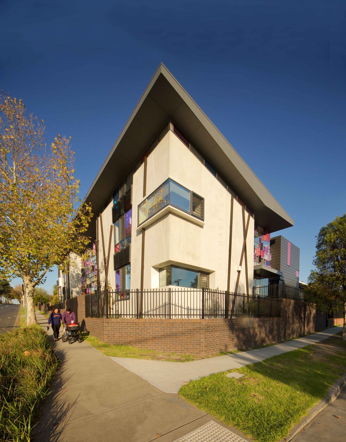
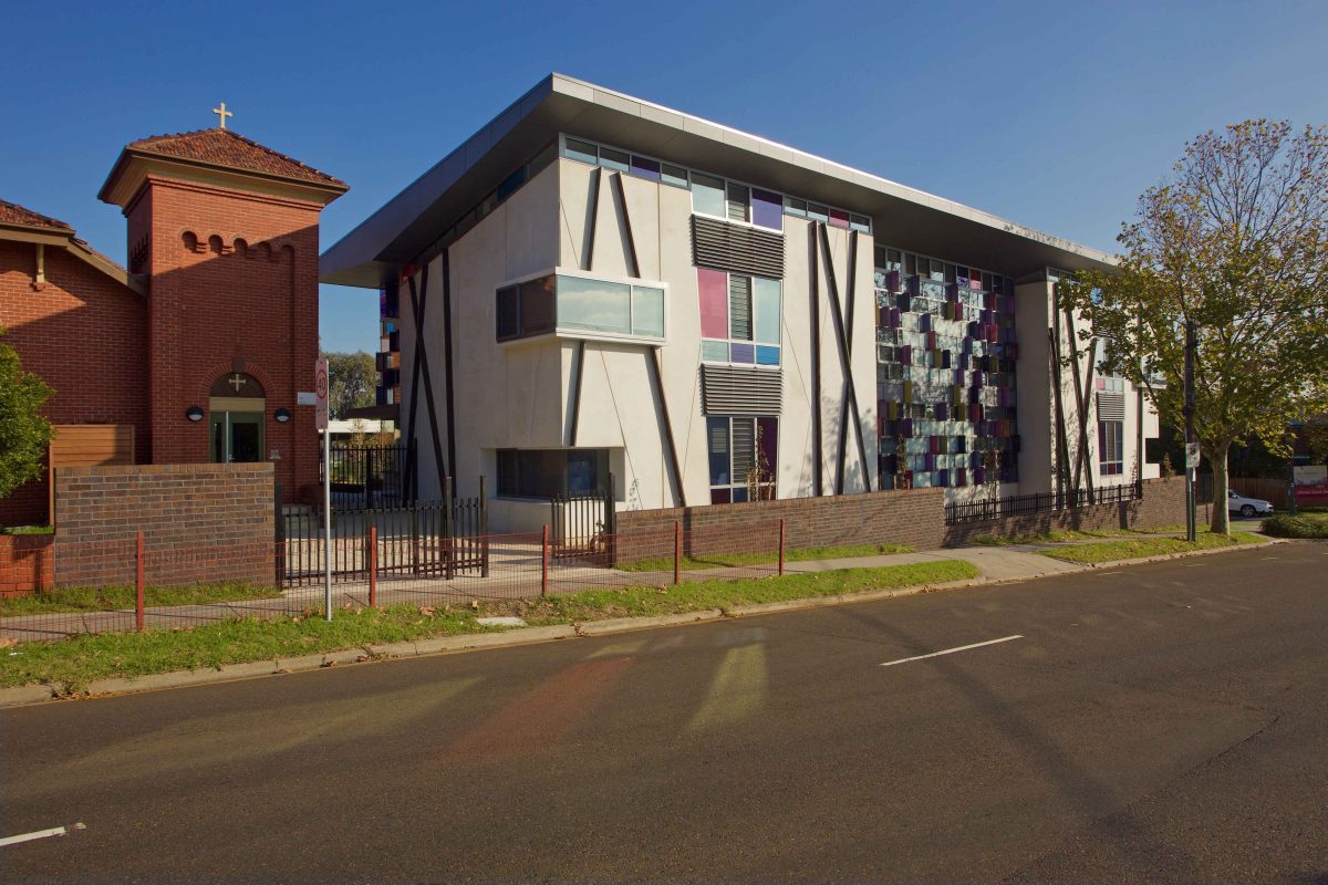
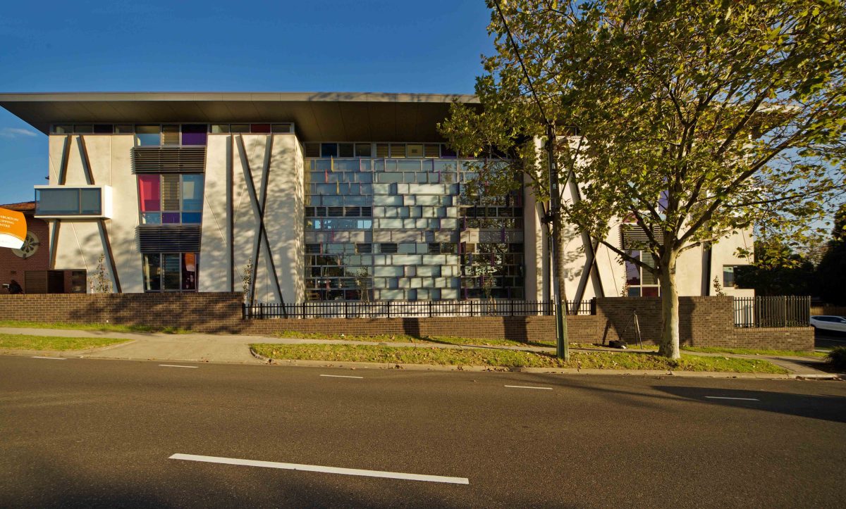
L-shaped in plan, the building runs parallel with busy High Street on the north with a return on Morotai Ave. To the west with its frontage on busy High Street, this small school suddenly has a much bigger presence by
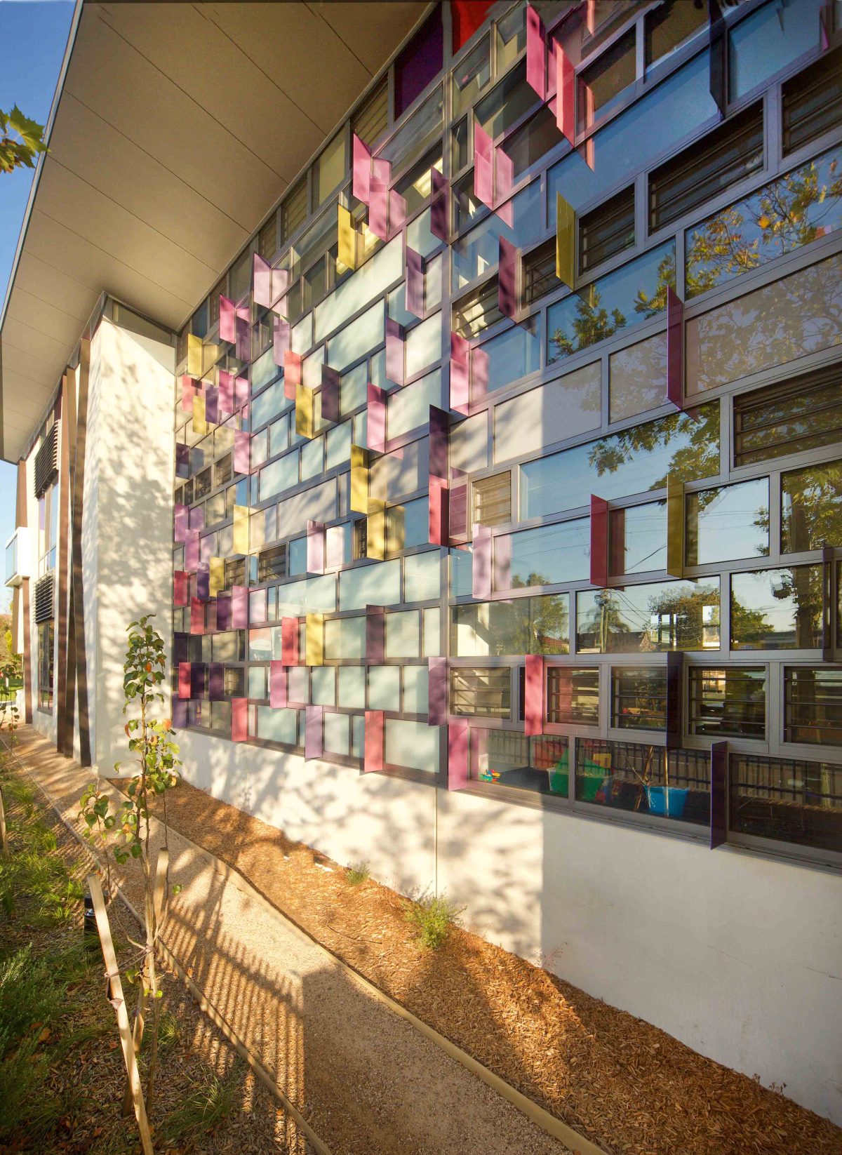
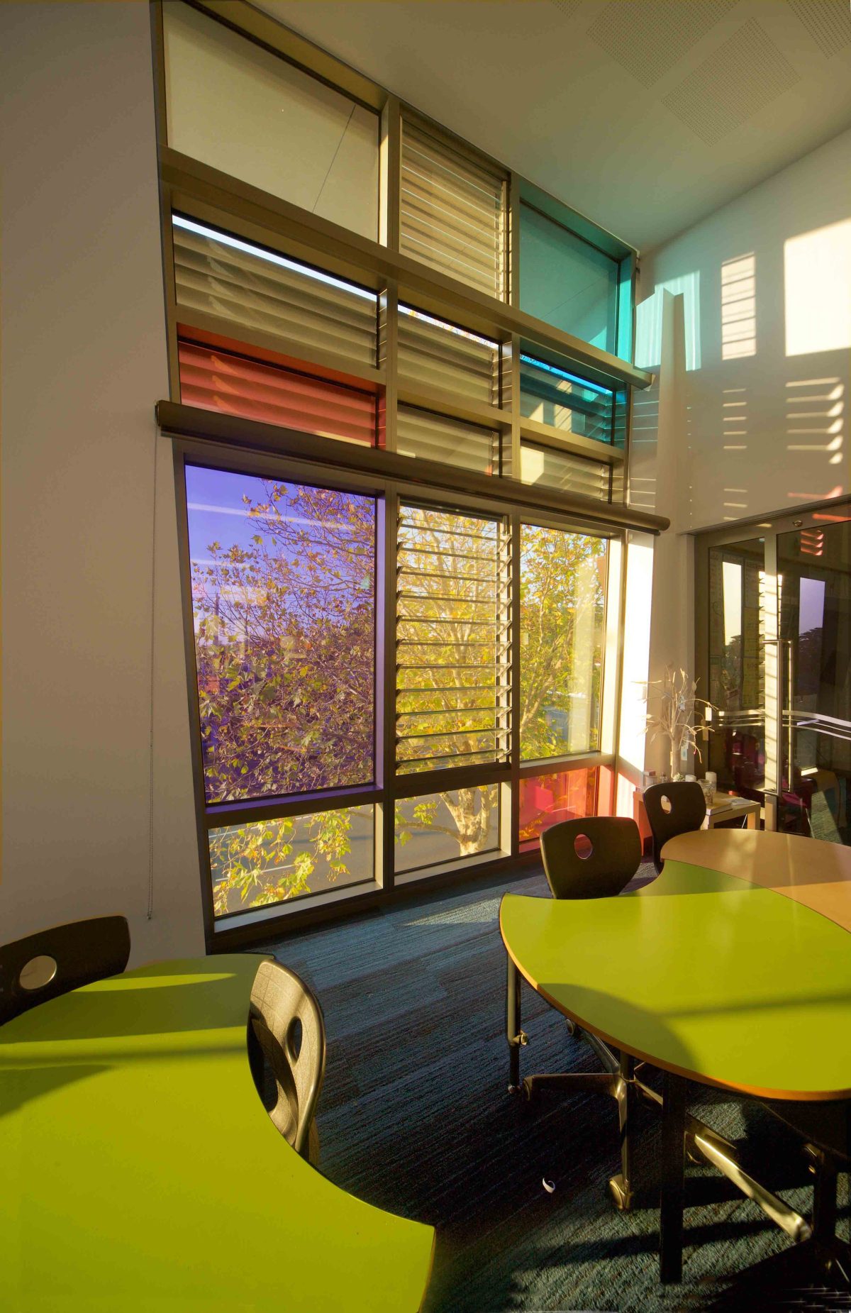
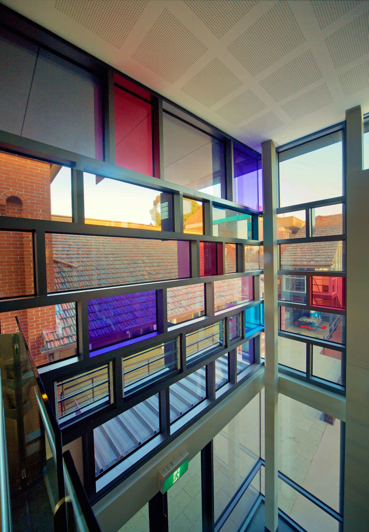
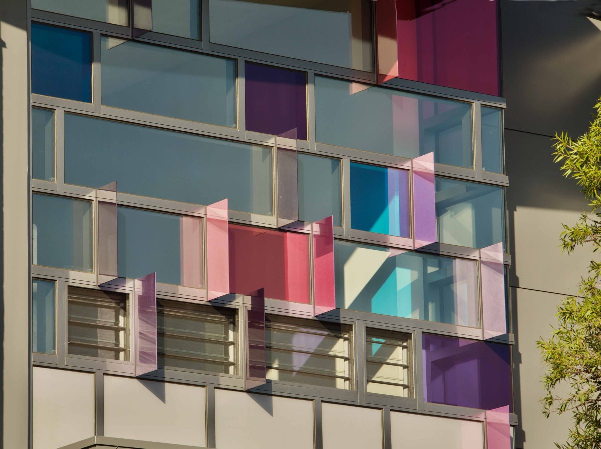
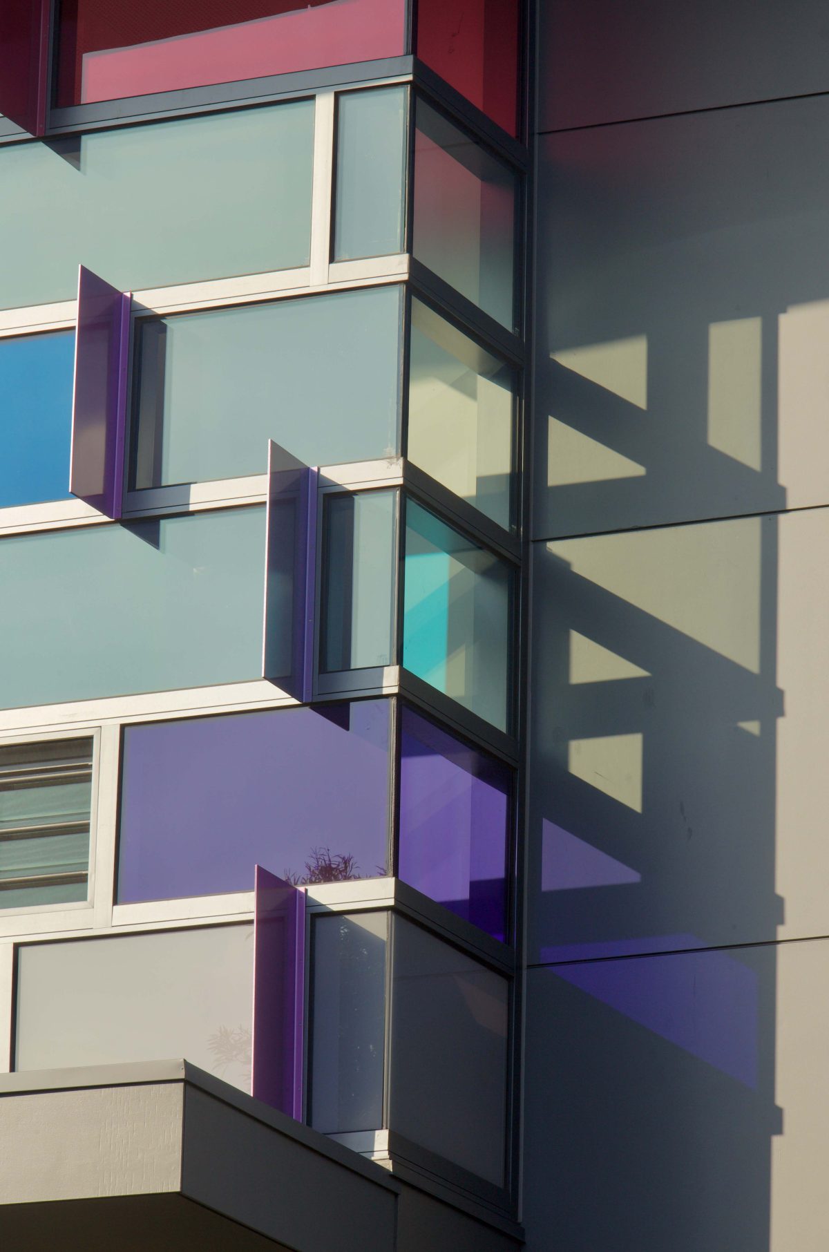
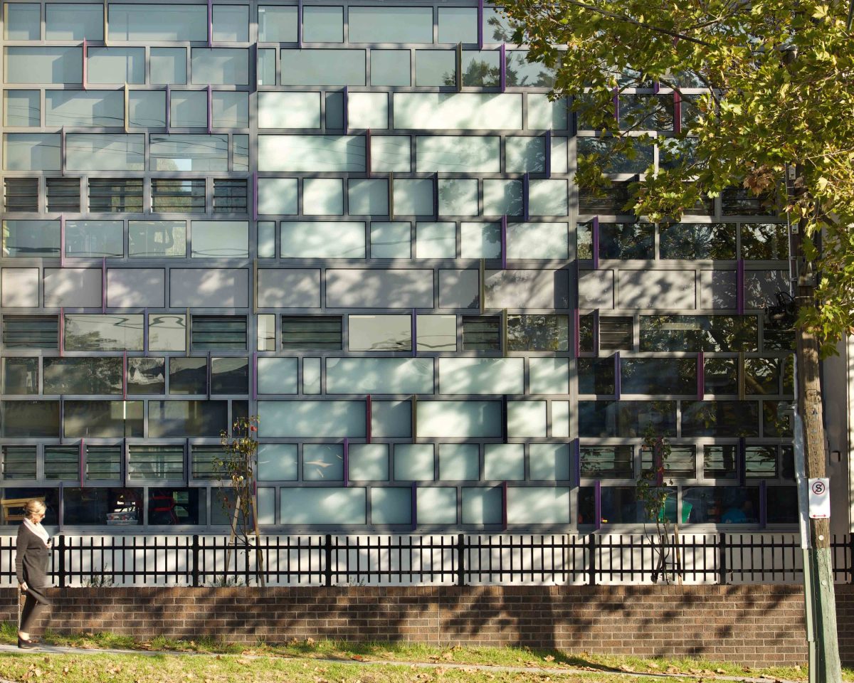
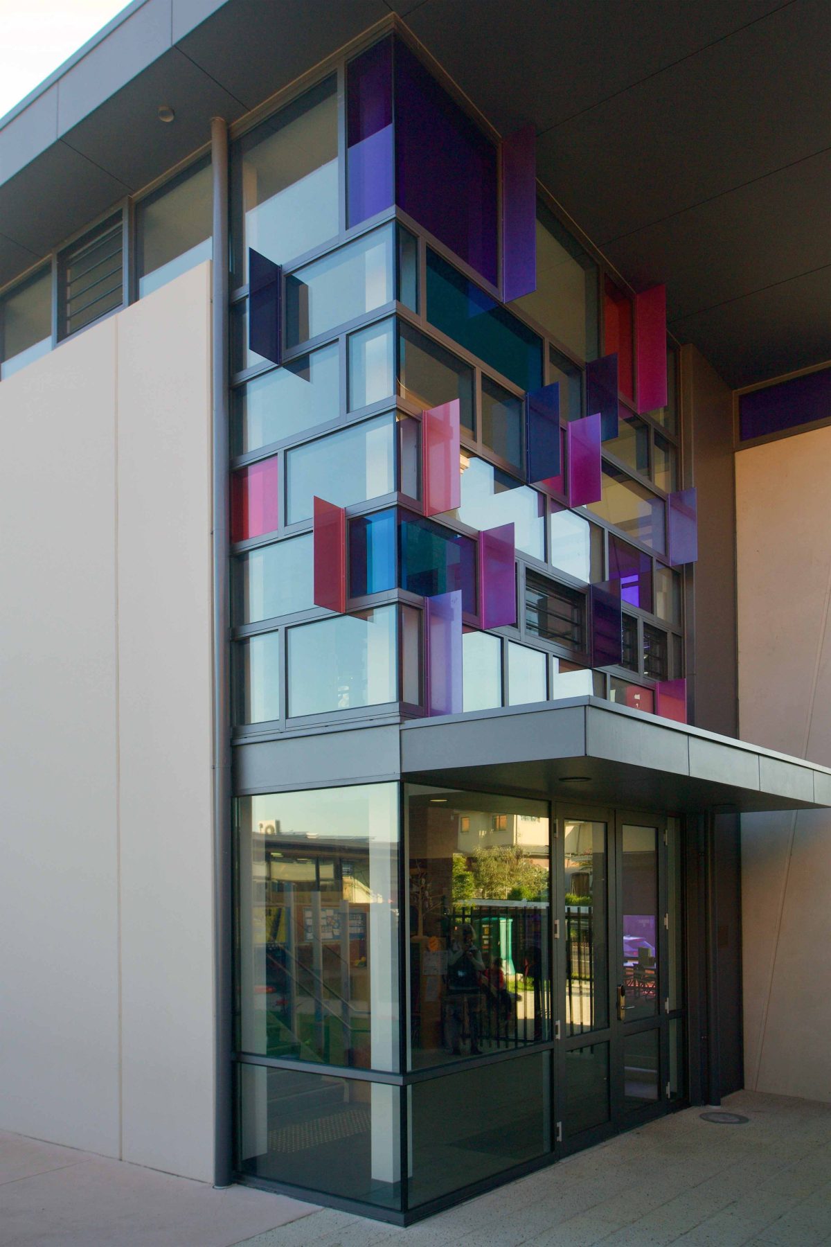
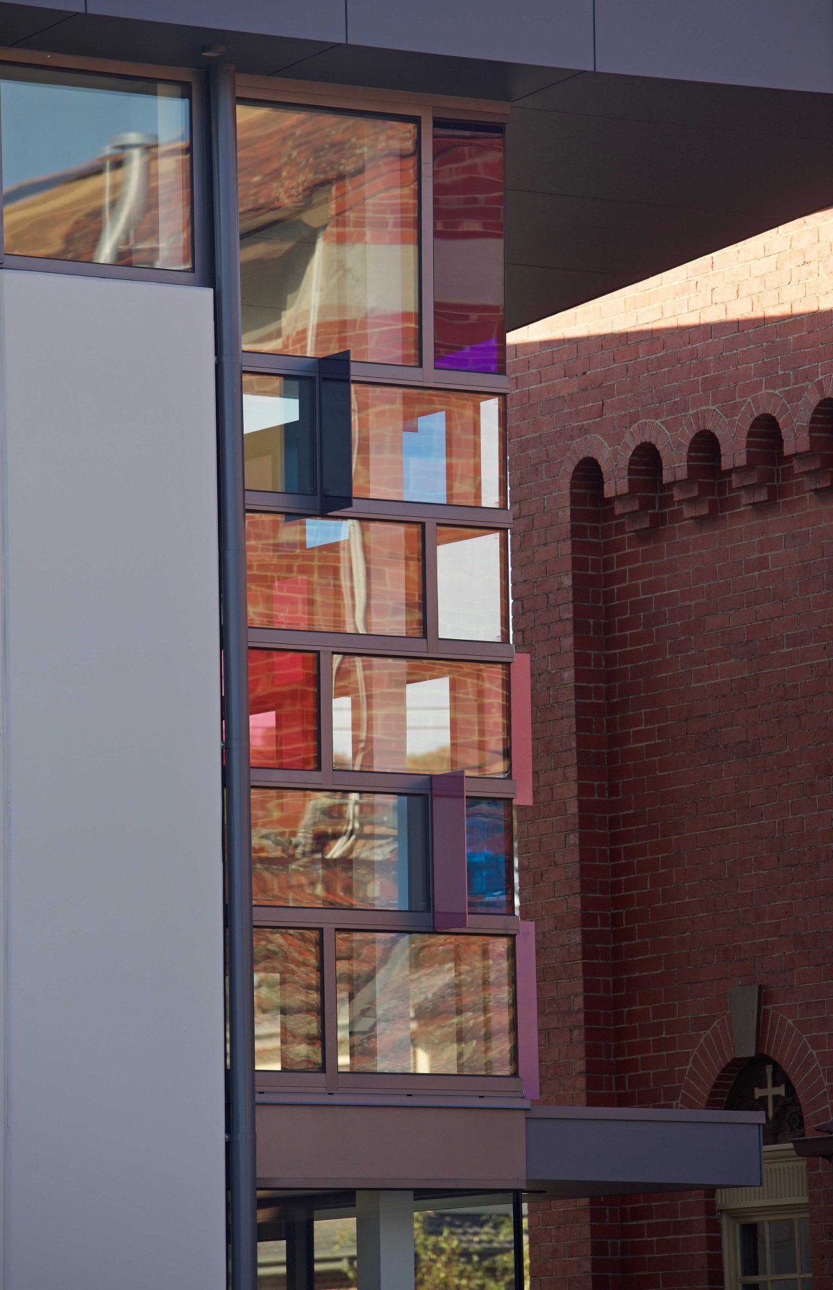
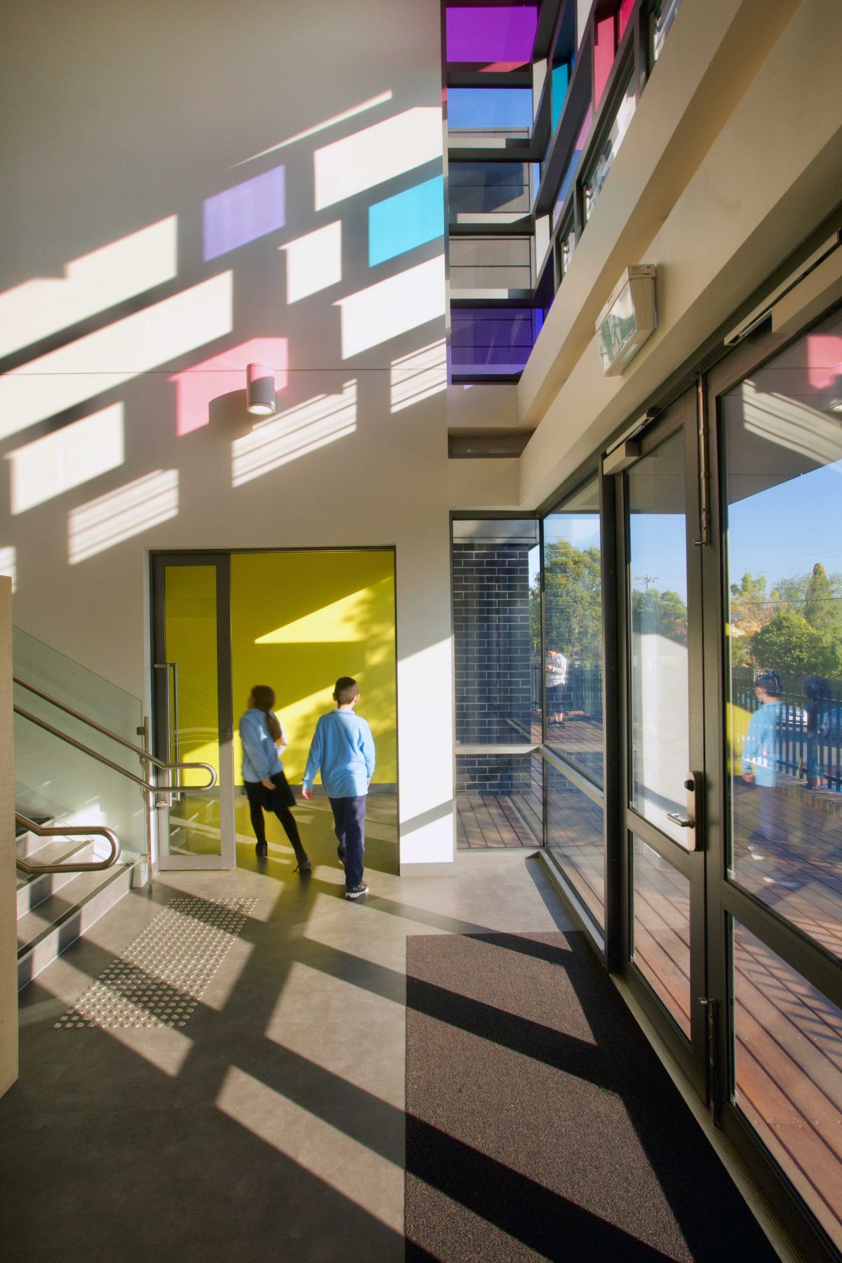
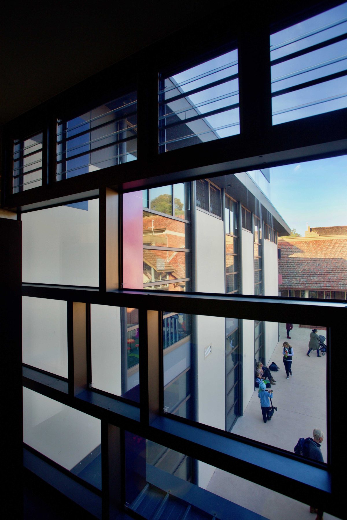
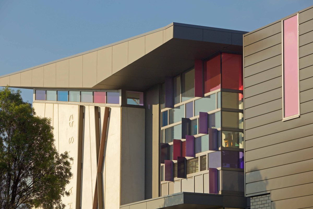
means of quality rather than quantity. A full-height grillage of clear and coloured panels forms the centrepiece of the main, north-facing, street elevation. The use of multi-hued lozenges is repeated on the east and west ends with the motif of divine light as playful, animating gesture.
Panelised walls of Viridian performance glass and DecorColour™ result in a facade of enriched detail and interior effect.
Viridian spoke with Y2 project director Garry Thompson to discuss the rise of the classroom as tree house.
Viridian: Is there a memorable project moment?
Garry Thompson: Walking with the community at the opening and experiencing the space that has taken years for them to envisage. All of a sudden it was tangible, that’s the most memorable moment.
For a school that’s always dreamt of something better, the roll-out must have been a most remarkable gift.
It was an epoch moment for the school in the way that their education is shifting. The leadership of the school
changed. This was really a delivery to bring the school and Parish community together in a succinct project.
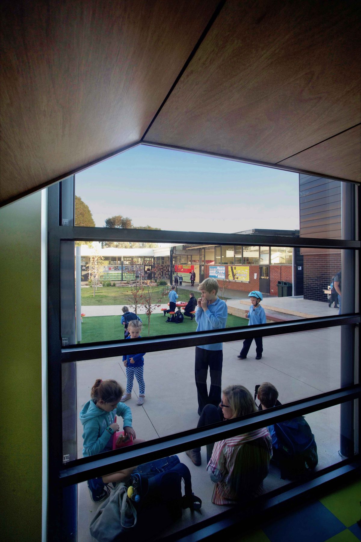
There is a cellophane wrapped quality where we see the ‘gift’ within. We see children playing and learning inside and out.
The building is obviously just bricks, mortar and glass, but it really provides a wonderful place for learning and for aspiration. It’s light filled, it’s contemporary. It’s engaging with the teachers, the students and the community.
Does the school represent the wider transformational shift in the way education is delivered?
It’s a paradigm shift. What we’re seeing at this school now is that we’ve moved away from teacher centred
learning to student self directed learning. It’s about offering flexible teaching skills and the ability to cater for all students of different abilities, class groups and environments. This is a parallel world now compared to where we were at the start of this project.
Were there challenges that tested your resolve and creativity?
The challenge was not to do with the briefing or anything like that. It was a really challenging site to build on. It is sited close to a main road and we weren’t allowed to close that road that happens to be right up against the school boundary. That provided many challenges for the construction sequence. We earned our fees definitely in delivering that on site, as the builder did. We had to close the school a few times to lift concrete panels across existing buildings. It was a challenging one to build, but it’s there now.
What conversations did you have with the staff and students?
Preparation extended for a number of years before we had the funds to develop the school. The conversations
were not only with the teachers and the students, but the parish. This is a parish project. It’s greater than just the school. It entwines all of those aspects and involved parents as well.
The conversations were around what this school meant to the parish. We had to provide some tangible links to what that was and it was around the idea of the village that raises a child. That grew into a tree and a seedling that you nurtured and that becomes a tree.
There’s some really lovely playful elements within the building that are sophisticated. They cater for the child,
but they’re not child-like. They’re quite lovely. So we’ve got tree houses that you can learn in. There’s a tree
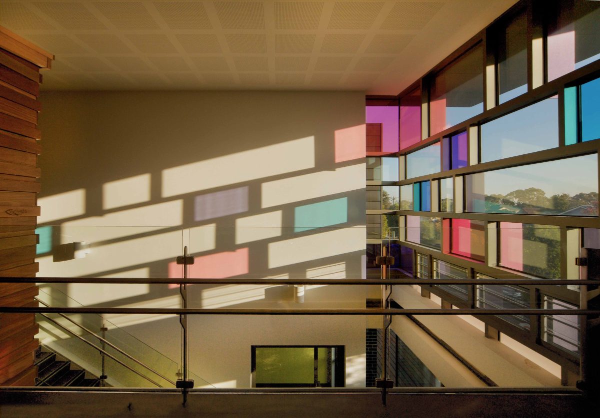
structure in the building. There are some other aspects, obviously it’s a Catholic school, so we had to make some tangible links to the Christian faith and did so through the use of coloured glass. We took some cues from Corbusier’s Ronchamp with the beautiful natural play of light within the internal spaces. The coloured glazing links back to the stained glass of the chapel.
Any other design drivers?
We identified the school’s needs to deliver spaces that told a story. It’s not just a space for learning, it’s a story about the school, the building, the way the building works and an example of a tree-house. Seated within a tree that envelops the double-story volume. There are little, nest-like, spaces for quiet reading and another area to perch, break out and enjoy collaborative learning with small groups of students.
The results through using glass are impressive. You could have simply had solid walls and inserted conventional windows as little rectangles.
There is a wide variety of glass used here. All of the north facing glass is the high energy efficiency variety. There’s a lot of curtain wall glass, but the double glazed units while providing acoustic benefits from passing traffic also provided absolutely beautiful light control throughout all learning spaces.
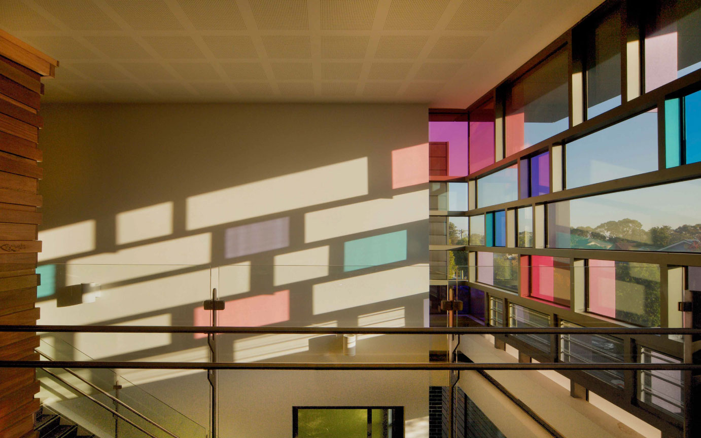
We are literally without need for artificial lighting throughout the building. It’s got an abundant and lovely natural light. In addition to that connection with the stained glass windows in the chapel. We’ve got coloured glass panels that provide a journey of colour throughout the learning spaces during the day.
And the influences here are much more residential than institutional.
Schools historically have been institutional, but are no longer like that. There is that homely environment because the way teaching and learning has changed. It’s no longer a teacher at the front of the classroom and 50 students, all seated in rows. We provide a tree house setting with warm hues of timber, soft furnishings and a lovely homelike environment.
A quality offering is less likely to be abused, trashed or prematurely worn out.
That’s certainly the case. Not only the teachers are respectful of their environment, but students are engaged with the building. There is ownership, there’s no doubt about that ownership. Historically schools are messy environments with paper everywhere. This is actually quite ordered and that is the way it’s maintained.
How happy have you been with the use of Viridian’s DecorColour™ range.
It’s just a wonderful glass panel and we’ve got the availability of multiple colours and from that we selected a very sophisticated, but inviting and energetic colour range. It worked in the colour glass panels with the timber warm hues that are in the tree houses and gallery type environment. So the rest of the play of the light through the windows and the coloured glass is really how the building connects to the outside. It’s that
awareness of connection internally and externally with the natural light.
It’s not just a building about looking out or in. It’s the magic that’s often difficult to design by numbers or computers.
The really interesting thing about this learning environment is that it’s a space for all seasons of the day. From the early sunrise, the colour comes through, and at midday the glass panels change to something quite
sharp, bright, more intense. As the sun goes down of an evening, all those warmer glass colours are revealed
in another light.
What about thermal control and glare for example?
We worked very closely with Viridian throughout the design process in terms of the glazing colours and final efficiency. They knew our design intent. The thermal efficiency of the glazing and the double-glazing provided
our acoustics and thermal controls while the DecorColour™ glazing contributed to the ambiance. There were no issues or hesitations from Viridian in helping us achieve our design brief. It was challenging forthem as the client challenged us with the design brief.
While real sustainability goes well beyond Green Star ratings you have put great emphasis on locally-sourced materials in that supply chain life, from cradle to grave.
We were very, very, focused on Australian suppliers and even closer, local suppliers such as Viridian. We selected materials with low embodied energy in their production, with a long lifespan and so the whole life cycle costing. The building itself is designed around sustainable design practices. The orientation, overhangs, natural cross ventilation and so on. It was designed from the ground up on passive design principles and from the design and supply-chain of sustainable products.
How do you hope it will be experienced by the passing parade of motorists and pedestrians?
We had a very challenging brief needing to distil three aspects into the brief, but at the forefront was the need
to deliver upon good urban design principles. We needed robustness in the public realm fronting onto a main and side road. We need to engage motorists in a different way to pedestrians. The transparency at that pedestrian level is also wonderful because you actually engage directly with the teaching and learning.
Some projects are torturous, others occur organically. How was the experience with this project?
The design process was quite cathartic. The school was so engaged with design ownership from the start. We
knew we were going to deliver and we knew the success from the first time we rolled out our drawings from the first sketch. It’s one of those lovely projects that every architect experiences. Every five or six projects one of these come along and you just know it was meant to be how it ends up, because it actually distils everything we envisaged. It’s testament to the strong bonds in the relationships formed at the start of a project.
