Project: Cardinia Shire Offices
Architect: DesignInc. Melbourne
Project Team: Stephen Webb, Sonna Montgomerie, Emma Denneny, Aphrodite Moviatsiotis
Builders: Watpac
Structural Engineer: Bonacci
Principal Glazing: EVantage™ SuperBlue, ThermoTech™ E Double Glazed Units incorporating SolTech™ Grey
Central Atrium Glazing: ComfortPlus™ Clear
Spandrel Glazing: Seraphic™ Standard custom colours
Inspired by the great iron-framed and glass railway stations, this new administrative headquarters makes a grand appearance adjacent to a busy outer-suburban rail line. Its crystalline form and detailing anticipates the inevitable urban spread with quality and conviction.
A new home on Melbourne’s outskirts, suddenly brings Cardinia Shire Council into the city’s design epicenter. We could be excused for wondering how such serious design takes root in pastures, until recently, almost exclusively agricultural.Council’s new home, some 50 kms from Melbourne’s CBD, has a buzz well beyond its proximity to the Pakenham rail-line with a station virtually at its front door. The design of this sleek, streamlined administration is bound to turn heads. Architects DesignInc, demonstrate a certainty of touch with their capture of light and air.Historic rail terminals were referenced in design for the new administration and municipal chambers. Glass and steel informs the interior, reminiscent of grand central station. Viridian performance glass is key in the revelation that meets rail commuters, passers-by and ratepayers.
DesignInc’s design director Stephen Webb discusses the council’s search for a strong identity and functional home to take it well into the future:
You must have been thrilled with the opportunity to create the modernist ideal of the stand-alone structure on a grassy knoll?
Stephen Webb: In theory yes, in practice, much less so. We’d really prefer refurbishment of an existing building. As a culture we should invest in regenerating our existing stock. It is always a challenge to work in a Greenfields setting because we actually relish an existing fabric. The true test will be when more buildings rise nearby. It’s not designed as a stand-alone object with a singular feel because of that inevitable future change.
Do you test the status quo here?
SW: The most compelling aspect is its big step to create an innovative building on farmland. The area was planned as one of the most sustainable new neighborhoods. This is a huge advance for Cardinia to position its headquarters here. We never really predicted that sense of an isolated building when finished. There are other things planned of course, but it remains an open site.
You are right on a major rail line.
SW: That relationship is probably the most interesting design aspect. The main facade has its origin in the movement of a really large picture window experienced at speed from a passing train. That will be the experience for many commuters
and it influenced the design.
How do you prepare for the eventual development of unknown shape and size?
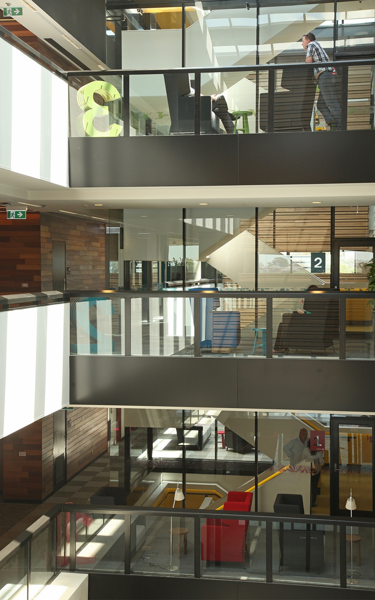
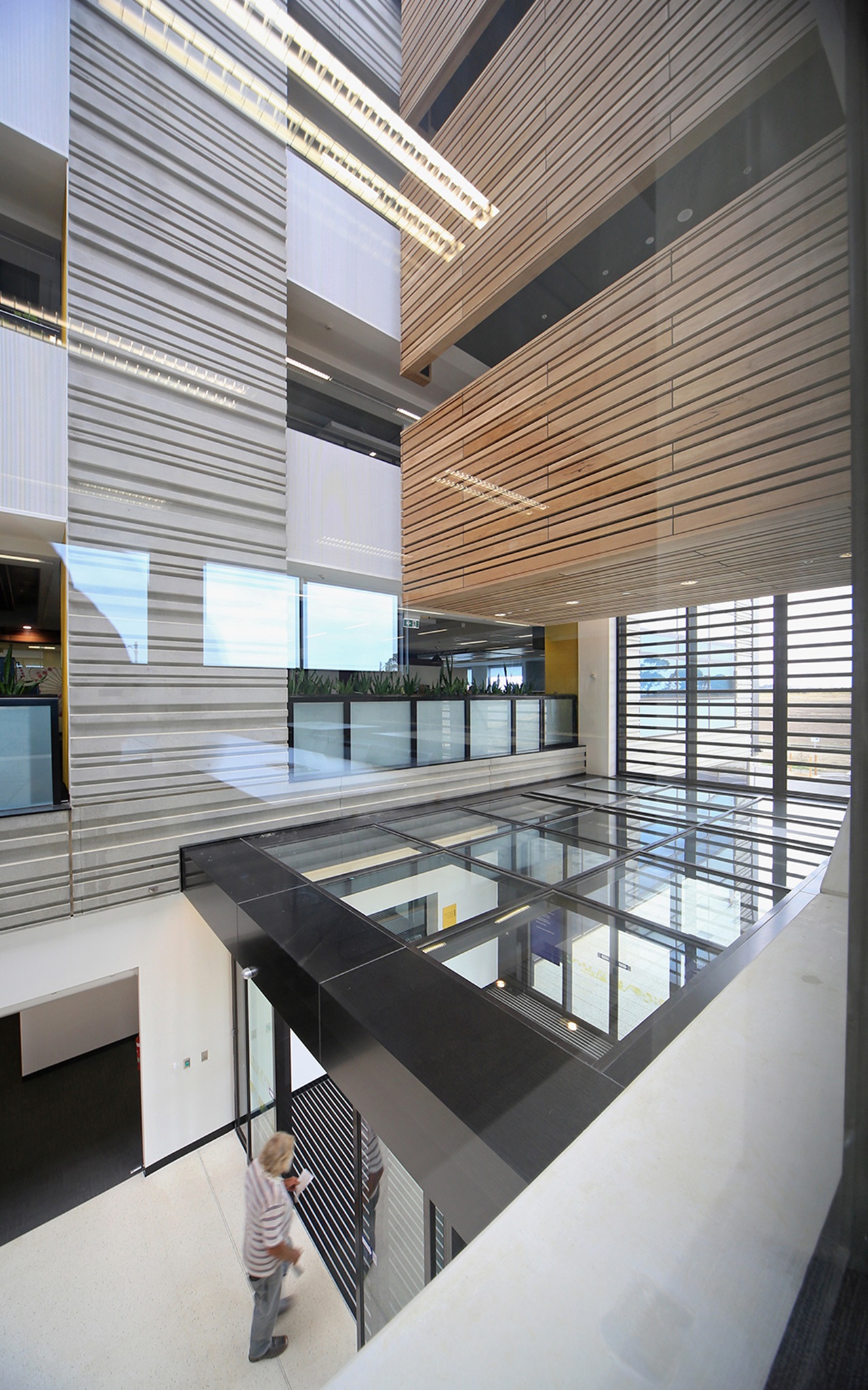
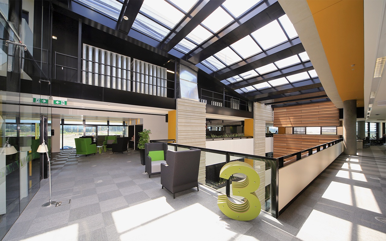
SW: We have an internal street atrium between the two wings to link with the future town centre. This will become the public interface between the rail and plaza. Most of the design and environmental ideas are about how to really integrate ideas within that space.
What about the cranked plan on the eastern end where you have a large window hanging off the end?
SW: It acknowledges the context of the main street. It’s a signature element that says: ‘Yes, we’re part of this civic precinct and as headquarters, are quite special. That slightly cranked plan highlights key meeting spaces, with a nice shift in perspective. It has high exposure to the east and north.
Was there a best and worst project moment?
SW: The best is definitely client feedback. Of course most people aren’t trained in built environment so there’s nothing like starting to see a project take form. That is especially true of the atrium space. We pride ourselves on this as it was not in the brief, yet it has multiple functions the client now really values. And it’s part of the environmental strategy from a light and airflow/ventilation point of view. From asocial viewpoint it really has the potential to change the way council works.
What is your signature or calling card here?
SW: It’s about offering more for less. As a design it’s not really about the envelope, or appearance. As architects we need to demonstrate amazing design where every component has multiple benefits. Important questions have to be addressed and include: “How do we learn from energy and water usage, and waste disposal?” There’s an important link in our experience between nature and aesthetics. That’s really architecture’s Holy Grail and where we should be looking to nature for inspiration and ideas.
Is the aim here innovation or refinement?
SW: It’s more one of refinement. A commercial project that integrates a mixed mode energy system, or a purge system really demonstrates to broader industry that business as usual is no longer good enough. This applies to local and state government and corporations. We shouldn’t have to rely on cultural buildings to break down that barrier between inside and outside, or to fear innovation in embracing intelligent building systems and work practices
It’s also about accessible and friendly spaces rather than being confronted by grand or oppressive buildings.
SW: We were encouraged by council from the outset to have their name and meeting chambers right on the street at ground level with lots of transparency. Visitors literally arrive in the lobby. They experience and see the council above. There’s no entering through a door then walking up the stairs, it’s all there once they enter.
Footbridges have become flavour of the month haven’t they?
SW: Probably for good reason. They encourage staff to move about the workplace rather than remain holed up at their desk or traveling by lift. These footbridges are wide enough for staff to connect and move around, rather than squeeze past each other. As circulation zones they should encourage that easy interaction and count as another breakout space or hub.
What are some of the considerations regarding glass that influenced your design?
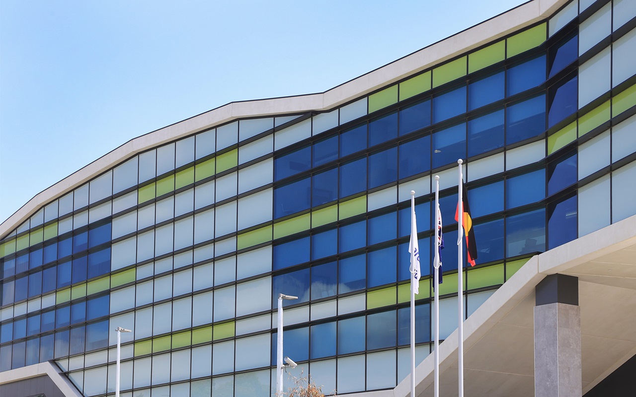
SW: The rail and passing train analogy is relevant because it wasn’t just that idea of movement and speed that inspired us, we also took inspiration from the great steel and glass halls of traditional railway stations. They inform that analogy with this atrium space. We really picked up that it wasn’t just about large areas of glass. It’s actually about that relationship of glass with the filigree of shadows and steel. We took inspiration in the feeling of blurred movement that passengers experience from a passing train. That didn’t require a solid wall of glass. We probably have a 60/40 split of glass that with movement, resembles a bar-code. Our material is a combination of spandrel and vision glass.
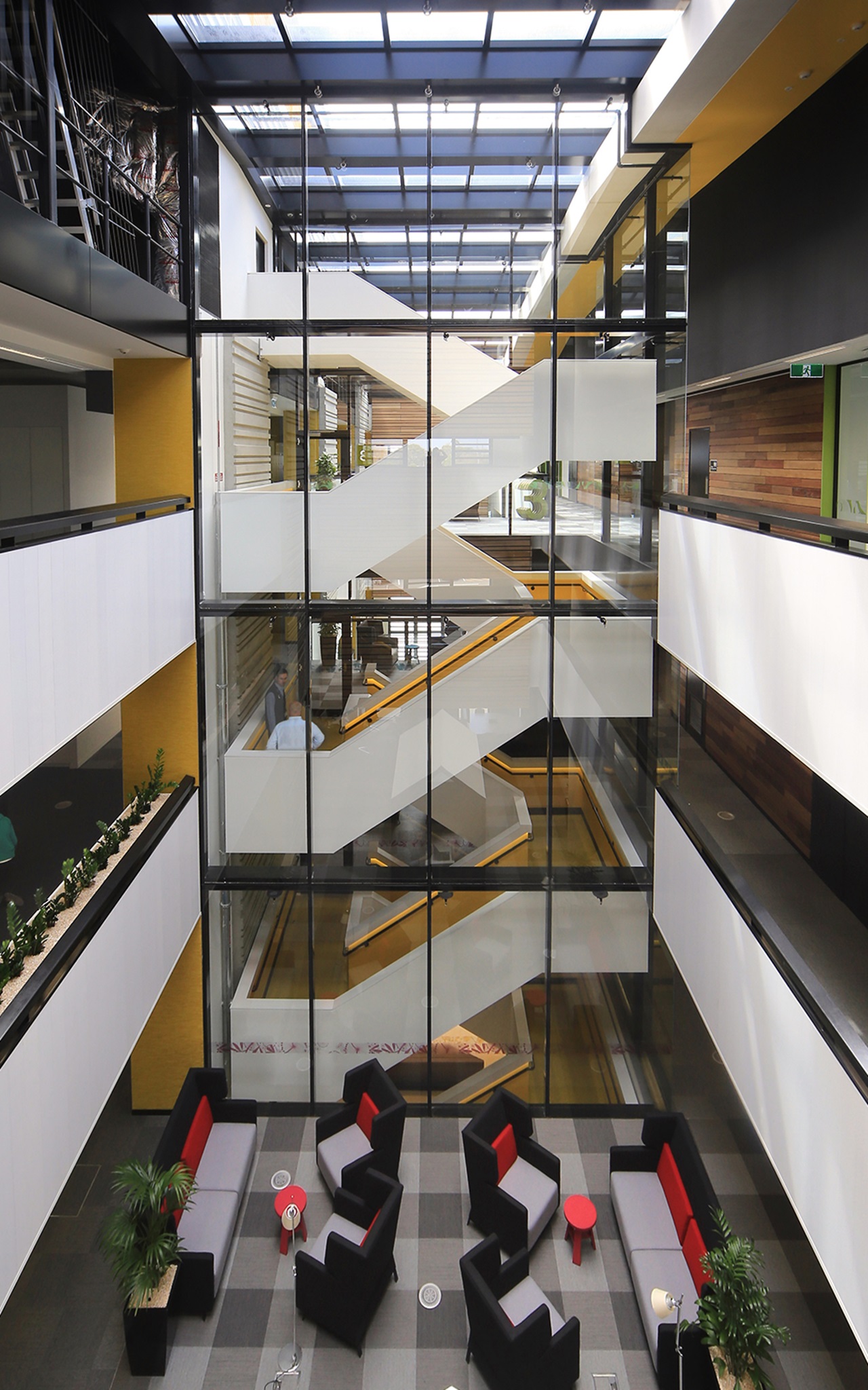
“The heart of the building is where the glass staircase acts as a conduit for staff movement and circulation. That’s a special space with beautiful light and you can see how staff are drawn to that area ” Stephen Webb, DesignInc Design Director
Did Viridian provide technical assistance?
SW: We received considerable pre-site consultation and advice from them to achieve the right level of light transmission, clarity and privacy in our choice of glass. So, yes, there were glass samples and on-site checking for all of the issues and questions we had about cladding and internal fit-out.
What about the other use of glass?
SW: Glass is very much about each elevation and orientation. To the east, the windows are quite sculptural and punched. On the north, it’s around 70 percent glass with a lot of horizontal and vertical shading to help minimize sun-glare in workspaces.
Do you succeed in making your work enduring and fashion resistant?
SW: Our design needs to pass the test of multiple functions. A design element or feature has to have more than one purpose. It must have two and hopefully more. This applies to material selection. We also try to imagine how a project would have appeared 10 years ago, not just in 10 years time. We look back and look forward.
Do you see the headquarters more than an administrative anchor that might inspire a higher quality of development?
SW: That is definitely something we would hope for. We have been helping Cardinia on guidelines for this precinct. A major concern is how you can preserve some of the memory and culture of that original landscape pattern. A lot of the master plan draws on the strong linear lines of wind-breaks, fences, and roads that contrast the more natural water bodies. That was used as inspiration for this linear, stretched out element in the landscape.
Is transparency a key to understanding its function.
SW: The new range of performance glass along the north allows a tremendous transparency that doesn’t need to be reflective, or heavily tinted. Transparency is really valued to reveal and highlight those areas such as the plaza where people meet. You could say it reveals something about the culture of the council to be clear and open in its processes and for visitors and passers-by to recognize that quality.
Can you elaborate on the internal planning and circulation zones? Isn’t the intention to encourage interaction and connection between staff and visitors, yet avoid that Blade Runner scenario of high-tech indifference to each other?
SW: From a public point of view there is no need to ascend beyond the first floor into the main staff hub. But yes, this is definitely a place about visibility and eliminating walls where possible and to encourage interaction between staff and public. The midleveland main circulation staircase is where staff most commonly gather for coffee. It’s a chance to have lunch and use the break-out spaces. The floor-plan is almost an onion-skin in terms of how the floor plate works. The most active, collaborative spaces are located in the middle. Progressively and further out are other meeting areas. It was a really big step for the team and client to accept that this is open to all staff and focus work areas.
Is there a particular part of the project where you feel it really all comes together?
SW: The heart of the building is where the glass staircase acts as a conduit for staff movement and circulation. That’s a special space with beautiful light and you can see how staff are drawn to that area.
The building’s summit isn’t necessarily its top, but a particular point in the building where you really feel you’re in that epicentre.
SW: We were quite conscious with this stair that there’s some tight restrictions around fire-proofing. A third stair was outside of budget, but this had to be a fire and smoke isolated stair. It also had to feel intuitive and interactive. Everyone uses those stairs rather than the lift. It’s very transparent and open. We have tried to keep the stair very glazed and balustrades highly transparent. It’s probably my favorite place in the project in terms of really giving that clear gravity point to people
Is too much glass ever a problem?
SW: The solid surface allows glass to perform its function. Glass on glass often means there’s nothing to see, so you need a solid somewhere to create light and shadow where one assists the other. We have these amazing shadows from the glass that drapes onto the stairs from the roof and walls.
‘Ticking of the boxes’ is often code for base denominator, but what are some of its main green features?
SW: You can’t avoid Green Star, but we now look beyond that and I think we’re much better for it. Especially for a local government point of view it’s important that they have a level of quantitative assessment to show leadership for the municipality. It was important for them to be able to formally write it.
Does architecture become easier with practice?
SW: What becomes easier are those problems you have previously encountered and can draw on to better lead discussion. It probably is as much about giving confidence to the client and then you can move on more quickly.
Has that humanizing process been assisted with glass?
SW: I hope so. Much of this boils down to how staff embrace their workplace. The atrium is the heart of dynamic, fluid work-spaces. I’m looking forward to seeing how staff adopt the anchor points around lockers, the forum and shared spaces. We wanted to humanize spaces and volumes throughout, while managing glare and optimizing all of the benefits that flow from such an extraordinary use of daylight.
Gallery List