GlassTalk – Sliding Walls
Melbourne architect Andrew Maynard was a finalist in Viridian’s 2011 Vision Award for Residential Energy Efficiency for the ‘Mash House’.
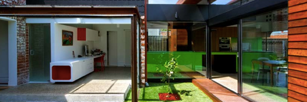
Maynard’s work is enough to make Austin Powers shriek ‘Groovy Baby’. Super transparency, vibrant colours, organic forms and shagpile carpet are all part of the design equation. Fragmented, discrete zones allow the Mash house to effortlessly open or close down. Colour and light are central to this assembly of dynamic living spaces and Viridian double-glazed units are the key to removing the usual barriers between inside and out.

Breaking New Ground
“The biggest test was coaching an enthusiastic builder through the process of working quite differently from standard practice” explains Architect Andrew Maynard. “You’re very confident in front of a client but you’re also hoping this works out as you want it to. It wasn’t until we sat down in the pavilion and slid the walls away and the kids were running through the spaces that you realise that you got it right. That was the clients’ view too by the way”.
Light and Glass
“Australians are very privileged because of our amazing light. You can play with that with screens for instance but here the negative space and shade has been carved out. That was my preference to loading it up with timber screens. Recessed glazing and roller blinds close off and shade spaces as needed”, adds Andrew. The new living spaces of the project are like the California Case Study Houses of the 1950s, the glass allows the outdoor spaces to float through and the glass passageway is reprised from earlier work by the Architect, such as the Vader House.

Design Process
“When I start a design it’s a very rigorous process. The fact behind the playfulness is a planning regime in the Mash House that converts the outside green space to create living areas with passive solar gain. You can experience both of those benefits” explains Andrew. “The design basically addresses issues that are consistent in many other projects. We push that concept even harder here, where we pull the new further away from the old to capture green space. The principles are definitely the transportable idea”. “The design process is not linear for me. I always call it ‘grinding’. If my work is any good it’s because I’ve done about ten designs that are largely rubbish. Like anyone else I go through the stock standard response where I do a lot of very quick drawing and a lot of it’s awful. I’ll have a lot of ideas that seem unrelated and when I start to marry those that’s when the design begins to work. When it comes to presenting the ideas to clients that’s when it starts to be put into a linear process so that they understand the process”.

Project Objectives
The aim was to capture the green space. “My clients loved the existing house but they didn’t want an extension that was too masculine or ‘heavy’. They were very accepting of a softer, lighter, friendlier set of spaces”, concludes Andrew. Viridian congratulates Andrew on another great project and worthy finalist in the 2011 Vision Awards. The full case study will be published on the www.viridianglass.com website.
