High Visibility Architecture
Providing shelter for more than 10,000 animals in the past year, the East Burwood RSPCA facility is the largest of 13 centres in Victoria. It provides for adoption, shelter, clinical and training in addition to a range of retail, community and inspectorate activities.

The move from agricultural to a contemporary urban presence was seen as a vital part for the RSPCA’s growing community relevance. Viridian glazing is key to much of the architectural achievement – which meets a demanding range of climatic and visual requirements. Barbara Bamford, Principal of Bamford Architects discusses the background to the bold public face of an organisation supported almost entirely from public donation:
It’s a very high visibility project on a busy arterial. How deliberate was the move from impoverished and nondescript to statement structure?
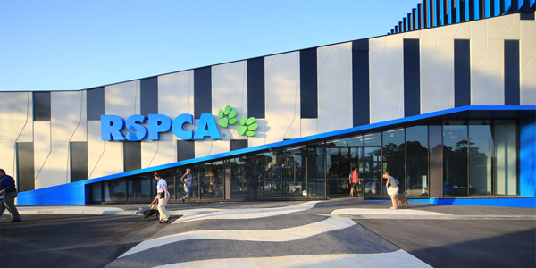
A major focus of the brief was to be viewed, if not as landmark, then as having a really major civic presence. The building has a quite dramatic graphic element that reinforces the RSPCA brand and also reflects the organisation’s leadership role within animal welfare. We visited a number of animal welfare facilities and looked at the idea of biomorphic architecture for instance. In the end we settled on something we believe is an honest, open expression rather than adopting the over-sized animal sculptures, or novelty form. Everyone agreed that the architecture should define the centre and contribute towards its credentials, and so it is very purpose designed rather than clever form that then shoehorned in floor-space.

What was the standout out test, or difficulty?
Our experience in healthcare projects was invaluable because many of the same issues and stringent standards needed to apply for infection control and circulation flows. It’s a project every bit as complex as hospitals because of the stringent need for infection control, quarantine and the interface with people. We had to weigh up such matters as the degree of privacy required, floor area, spatial relationship and so on while always working to a fairly lean budget. In terms of design efficiency the main street elevation faces south and this allowed us to be fairly open in our expression to the street and passing traffic.
You’re glazing program really seems to reflect the interplay between celebration and need for privacy.
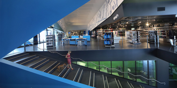
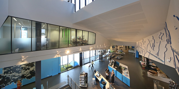
Yes it does. The glazing at the main entry sweeps down as a diagonal and meets the floor at the clinic waiting area and opens up in the more public area. In other areas such as the clinic it’s quite constrained. At the higher level of the administration buildings, EVantageTM SuperBlue glass is used less for transparency than as branding gesture. It also provides a degree of privacy. In the dog adoption and dog day care areas below the administration area, EVantage Grey is used mainly for thermal performance. We could have used clear glass, but it can be confronting for the dogs. People can still see what’s going on, but it’s slightly obscured for pet welfare. Of an evening, passing traffic gets good views of animal training or exhibitions. In sensitive areas – the clinic for instance is potentially sensitive – translucent glazing ensures natural light and privacy. We layered glass just like clothing for comfort and specific needs. There’s no doubt Viridian’s SuperBlueTM is a key here and being present to watch its installation was tremendously satisfying. We had confidence that it would work well and we weren’t disappointed.

