Revisiting Melbourne Grammar School
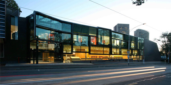
The Nigel Peck Centre for Learning and Leadership at Melbourne Grammar School, covered by Vision in 2008, is virtually ageless with its fusion of technology and art to create an inspirational education environment. The centre’s virtuoso glazing, folded brickwork and deft building-as-landscape, produces a project of exceptional elegance.
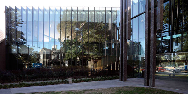
John Wardle Architects demonstrates scrupulous care to ensure the firm’s design narrative remains intact to create thrilling volumes, airy staircases, masterful brickwork and sublime glazing. The result of an international design competition, its enduring modernity is testament to emphasis placed on poetic function.

“It’s a good time to be doing architecture in that there are unprecedented possibilities. The two main glass panels that frame the year 12 area are huge. They weigh around 700kgs each and I understand they are among the largest, single panes of glass on any project in Australia,” Stefan Mees, Principal Architect.
“It starts with the massive glass entry and the way in which it aligns with the two points of the western facade of the quadrangle building. The moment you step into the portal it immediately pays reference to that historic heart of the campus. The massive façade along Domain Road is ashlar in its composition referring to the irregular geometrical composition of the Victorian-era ashlar bluestone walls on campus and translated as contemporary interpretation rendered in glass and steel,” John Wardle, Principal Architect.

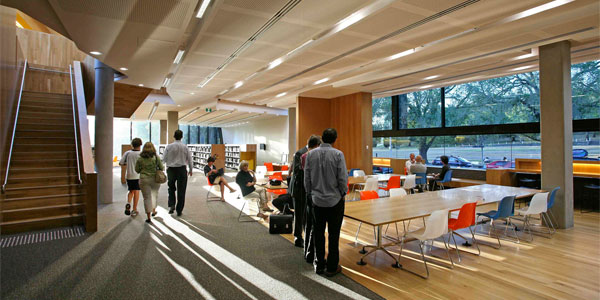
Over three levels, it incorporates a basement/theatre, administrative offices, numerous meeting and classrooms and a vast library that un-scrolls across two levels. A series of mezzanine spaces and crystalline edges divine a whole new attitude and outlook to the olde-world view of academia.
Architect’s Statement
This expansive centre presents a public face for an esteemed private school. It invites the community, reveals the learning activities of students and expresses a collaborative experience. A series of variously glazed and linked pavilions run adjacent to a main thoroughfare and extend the existing heritage listed 19th century blue stone elevation to embody our central design idea of a transparent campus wall. Our design creates a new campus entry, consolidates the school’s library facilities and provides supporting lecture theatre and seminar rooms that create a learning focused campus centre. This building is open to its surrounding environment, exposing the process of learning to the community whilst establishing visual and physical connection to the existing campus buildings, adjacent park and gardens, and an enormous historic elm tree. By contrast, the western most end is abstract and monumental, a solid but delicately detailed brick facade that symbolizes the collection of books it encloses.

Behind this edge building, an auditorium is pulled out from the plan so that the roof for this space becomes an external amphitheatre – a sporting pavilion – that faces onto one of the ovals. Inside the main library building and against the glazed facade, a massive linear plank shifts alignment and size to become seating and desks, group learning zones and then a new collections area. Revealing the learning environment, these series of choreographed activities transform the building threshold to become dynamic and permeable. This building curates a journey of learning and discovery revealing the architecture and the surrounds to both the students and community alike.
To download the full article and interview click here. Photography by Peter Hyatt.
