Special Delivery
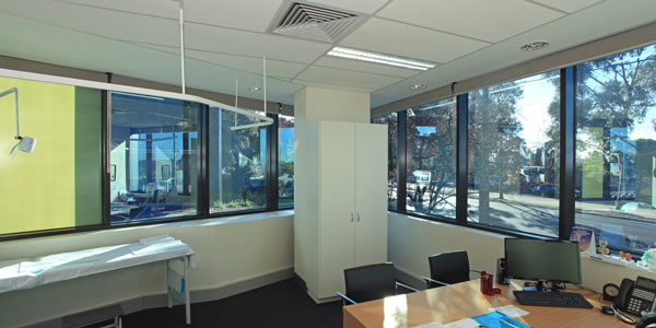
Healthscope’s Northpark Private Hospital in Melbourne’s leafy Bundoora recently experienced a ‘birth’ all of its own. While maternity is a critical part of the hospital’s range of services, its very own delivery involved a $35 million expansion that includes stand-out consulting suites.

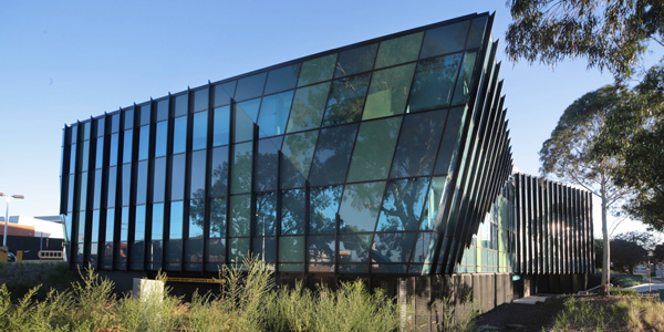
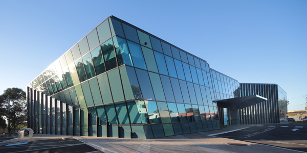
HSPC Architects solution goes well beyond mere geometry with a deftly cranked and folded envelope of Viridian EVantageTM SuperBlue and SuperGreen performance glazing. The result exhibits a real awareness of natural light and outlook as partner to modern medical practice. The hospital now has 153-bed capacity – boosted by 42 beds – five new operating theatres and new consulting suites with capacity for more than 100 healthcare specialists. A striking, curtain glazed façade contrasts the straight-forward, regular geometry of the existing hospital. Aged river red gums reflect in the fractured angles of its azure hued glass. HSPC associate director and designer Askolds Peterson spoke with Vision about the designer’s role in shaping an ultra-cool aesthetic attuned to medical care and modern ideas about ‘wellness’. The high visibility site and spectacular river red gums were pretty central to our ideas. The corners are tapered to reduce its bulk. And it has a lively presence and surface which glass delivered. That mapping of its ‘skin’ with a banded, folded glass facade really responds to the bark pattern of the trees. That unbroken link to the tree trunks, canopies and beyond plays a big part. We experimented with surfaces and tried to create a really responsive form to the site and also to staff/patient use. There is a diagonal cut across the building on the east and north elevation where it appears to cascade out while the eastern facade has subtle banding.

Was there any client concern about the ambitious use and expression of the glass envelope?
Yes, initially. Builders occasionally want to cut-corners and it would have been easy for them to say ‘look, we don’t have the funds to do such complex glazing,’ and for the design to be simplified. Fortunately the glazing contractor wanted to work with our design. By the time we had prepared our documentation and it hit the shop-drawing stage it was pretty well worked out.
Your use of glass as a subtly patterned envelope is a real key as expression and experience from within.
It’s first and foremost a glass building that has a certain scale, form and interest. Like any material, glass needs to be specifically interpreted for the task and that is what occurred here. That envelope uses a coloured band on the western elevation which facets the building’s scale, links the sky and sunset and helps to make the most of its site. Our facade engineers determined Viridian’s EVantageTM met and exceeded section J requirements. In the end there’s nothing especially complicated about the product. It was economical and handled all of the key performance criteria. The building’s orientation to the north-east means that the main thermal loads are restricted to the afternoon. [Glass] is critical to the chameleon affect you see. Of an evening it reads as a very horizontal object, while during the day the roof-top ribs lend a more vertical expression. There are other abstracted elements that contribute a certain sculptural quality. Our choice of glazing also offers this very deep contrast of blue and a subtle yellow tone.

To download the full article and interview click here. Photography by Peter and Jennifer Hyatt. For more images, please follow ViridianGlass on Pinterest.
