Why full transparency was chosen in the design of Mazda Australia’s new base
When designing the new Australian premises for a big international company – what are the key considerations to ensure that the design and architecture is not only on-brand with their global partners but also making a mark in its own right?
Situated on a high-visibility site on busy Wellington Road, Mulgrave, Mazda Australia’s new home is as grand as it is practical. Opting to keep their focus on functionality, open spaces and workplace culture,Cox Architecture’s principal director Patrick Ness discusses the reasons behind their execution.
The design of Mazda Australia’s new base needed to embody simplicity – in light of this, a decision was made to abandon the bells and whistles of mainstream architecture and focus on high visibility, transparency and letting the natural environment speak for itself.

“I think what’s so pleasing about this is we’ve reinvented what it means to work in a location like this, with highly flexible buildings filled with delight and light. It changes the culture of an organisation. That’s really for me the key thing that’s happened here,” says Ness.
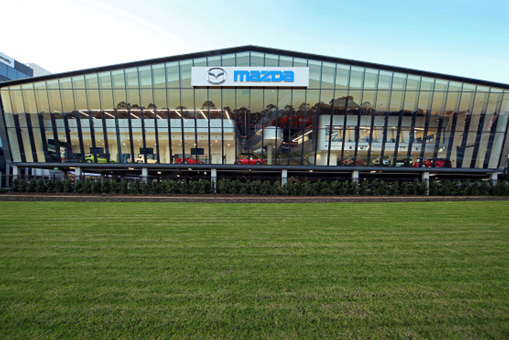
To help Cox Architects achieve a sense of openness and continue their strong desire to get rid of all the ‘stuff’, Viridian was enlisted to supply and install super-sized sheets of Viridian’s SuperClear™ glass, featuring as a heroic inclined windscreen. The building itself is revolved purely around light penetration, the environment and the way people interact. The inclusion of glass in the design is regarded with the same importance as the glass used in a Mazda vehicle.
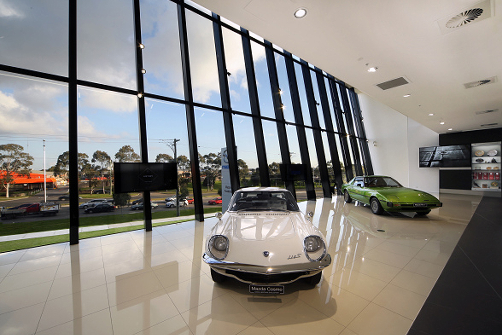
“The glass at the front of the building is very deliberate. It’s the windscreen to Mazda, for want of a better expression. It performs an environmental function of letting lots of light into workplaces. It also says of the organisation, “We’re open, we’re transparent. Real people are doing this. They’re not some idea of a corporate remove.” It’s really performing two roles — one is technical and environmental — the other is cultural, in the way they’re perceived,” Ness explains.

Opting to use Super-size panels with minimal framing was absolutely intentional and imperative to the over-arching design, again keeping with the theme of full disclosure – at Mazda everything and everyone is transparent and connected. Rather than closed off or sectioned meeting rooms, there are glazed ‘cubes’ perched as floating spaces, steering away from the usual open plan.
“The major glass panels on the front façade are big. That’s one of their heroic qualities. They’re greater spans than you normally have and that’s technically what we had to solve. The reason for that is trying to keep it as transparent as possible,” expressed Ness.
Creating a building that was ‘normal’ was not an option, wanting to lead the way with timeless and innovative design, Ness steered away from “decoration” – with a distinct awareness on the importance of designing something that would still resonate in years to come. Mazda vehicles consist of sharp, purposeful automotive design so the design of their building should follow suit.

“There’s certainly no decoration at Mazda. In many ways that is what makes an ideal car – its shape, form, environmental and technical response. There’s very little decoration, everything has a reason for being there. It carries no more weight than it needs to and I think it’s the same about this building. The palette’s reduced, not as an aesthetic, it’s because it doesn’t need any more than that. It’s doing its job well and then we let the people become the delight in it. When you do that, when you focus on timeless points about light penetration and environment and the way people connect, I think you’ve got a project. In the end it’s life span will be much long.”
For more incredible design stories subscribe to our Vision magazine now: http://bit.ly/1UJfGpx
