Civic Star
Adelaide, South Australia
Convention Centres are among the big markers of civic pride and standing. Without the capacity to host events grand and small – in real style – cities lose out on untold income and information sharing. With such fierce global competition for the lucrative convention/tourism dollar, it’s an all out battle to be highly visible and desirable. And in the age of information access, comparisons and user experiences, endorse the better and brave.
Visibility isn’t simply about project size or prominence, but relationship to place. Project architect Simon Tothill of Woods Bagot Adelaide describes the firm’s $397 million baby as “transformative”. He argues the end game of convention centres is no longer the mega sized variety to “shock and awe” but that they need to engage on a deeper personal and public level.
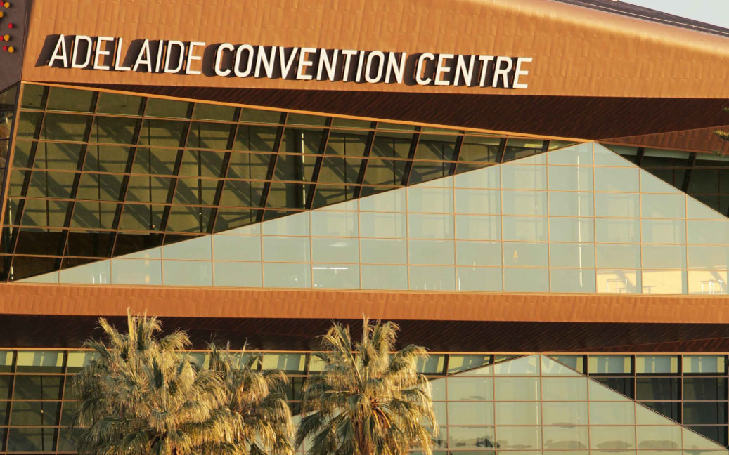
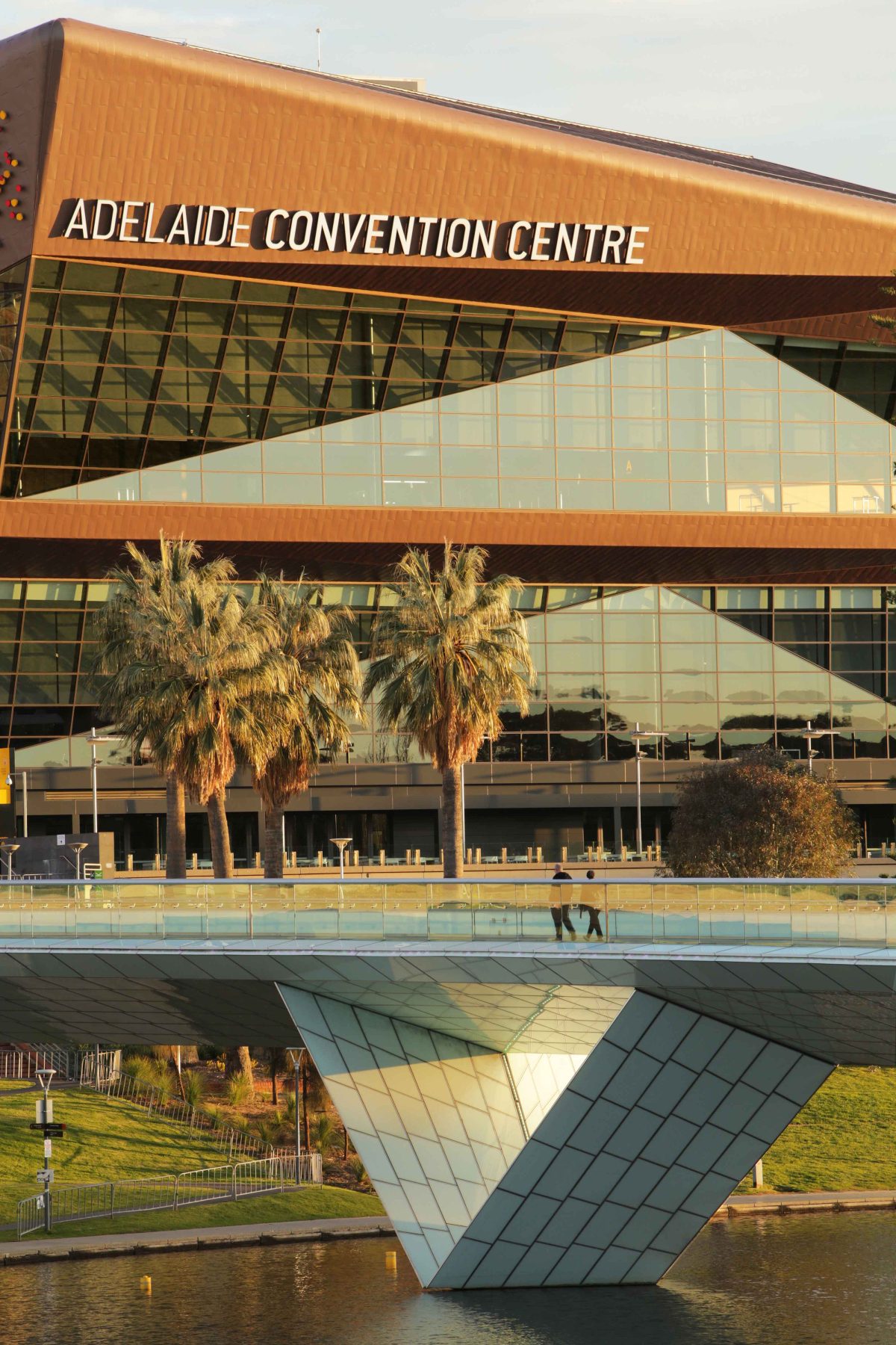
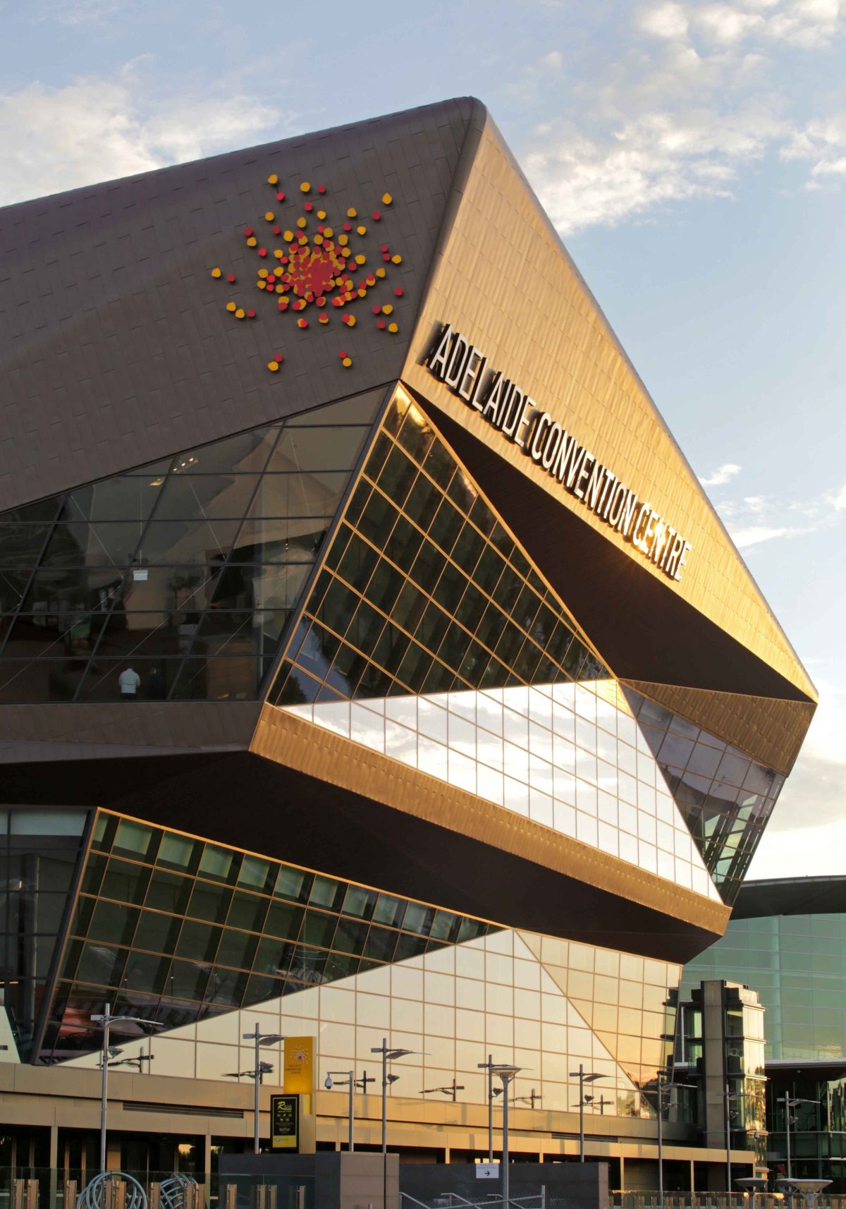
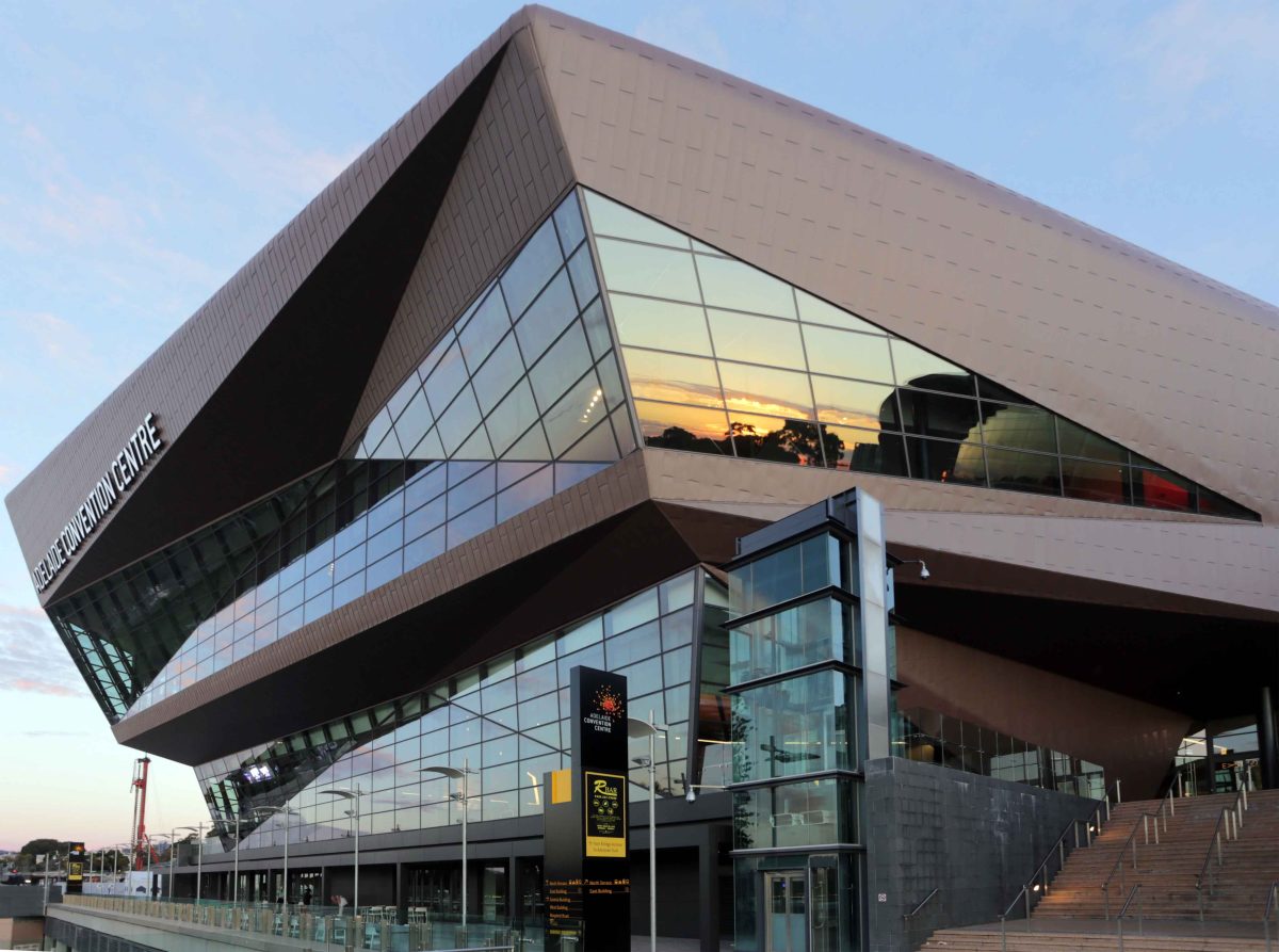
Simon Tothill discusses the Adelaide Convention Centre East Building and the trials and triumphs of a project that celebrates its site and sublime setting. Scroll down to see the image gallery.
VIRIDIAN How important is this site to your design?
SIMON TOTHILL This site is brilliant. It is right in the hallmark of Adelaide, the buildings around it are champions of the creative spirit of Adelaide. Ours is right in the middle of all of those. It’s also a public and civic building. It has brilliant views out, but also has brilliant views towards it. We needed to create a building with a great feel from the inside that would also appeal to its neighbours.
How relevant is appearing genuinely visitor friendly?
The shaping of this building was a very long, crafting exercise of getting to know the site and also producing a building of the right scale. When you walk around it, it has to feel comfortable as you approach and that you’re not going towards a great monolith. A lot of convention and exhibition buildings have shock and awe as their main design criteria. This is an Adelaide convention centre and It has that sense of scale we’re trying to achieve.
There’s quite a history of Adelaide’s Arts precinct here.
Adelaide has a proud tradition of punching above its weight in the creative arts. This was a difficult site, we wish that the centre had more land around it, and we wish that the centre was able to accommodate more and more, but we answered that challenge with creative design solutions and I think Adelaide does that really well. I think we’re a city that recognises that we’re not the biggest, but we just want to be the best.
The architecture is really an assembly of remarkable parts – the seating flexibility for instance.
There are so many moving parts within this building. I’ve never see it anywhere else. We’ve spring-boarded off this project with projects in New Zealand, Dubai and we’re looking at North America and Asia. They’ve never seen buildings quite like this with seating that lifts up, theatres that rotate and ceilings that move and all the adaption between meeting room to exhibition space we can create in this building. I haven’t seen it anywhere else in the world. The sleeping giant of this building is the story that we’ll tell over the next couple of years as people start to discover how flexible and how unique this building is. Each of the rooms has a triple bottom line. It needs to be an exhibition space, auditorium and meeting room all in one and so this centre works exceptionally hard.
The client, Adelaide Convention Centre, was very specific in their requirements for flexibility and recognised the advantages that both the rotating drum concept and the hinged seating provided. Our challenge was to combine these together on a difficult site. The East Building is the first building in the world to combine hinged seating, operable walls and rotating drums, making the ACC truly one of the world’s most flexible convention centres.
Did the project give you sleepless nights?
The most difficult component was replacing a building that was 30 years old and sitting on top of a 30 year-old car park and Adelaide Central Railway Station. There are platforms with trains on them still running during the construction process while you’re trying to build a building. We couldn’t shut them down. You can’t shut down the entire city’s transport network. There were sleepless nights about how we were going to do it safely and how we were going to get this built on time and not disrupt everyone else’s lives.
Your billboard-scale inclined glazing is pretty much the climax of your composition.
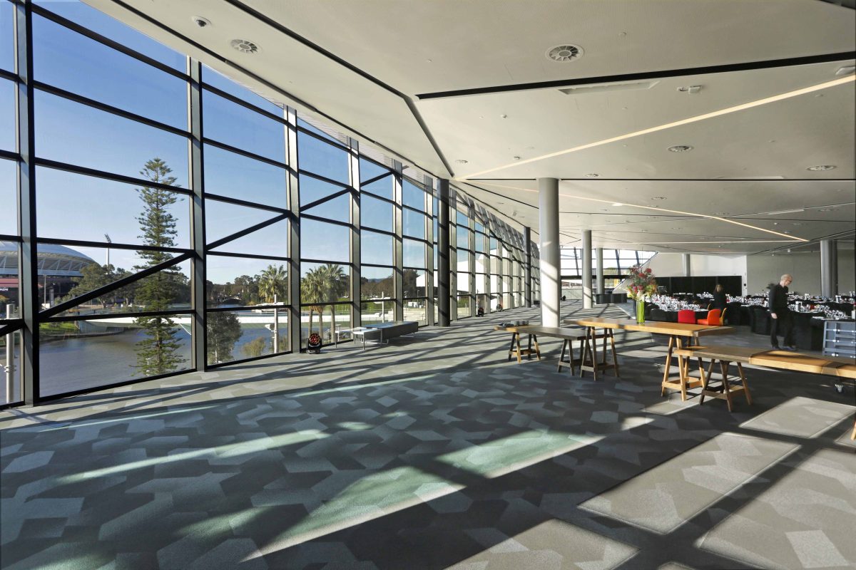
The days of creating civic or entertainment facilities where you can’t get that sense of excitement or interest about what’s occurring inside are over. We have a higher expectation for knowing there’s entertainment and excitement going on in our most exciting buildings, so this facade and the glazing was critical to get right, and that visibility in both directions.
How was your experience with Viridian?
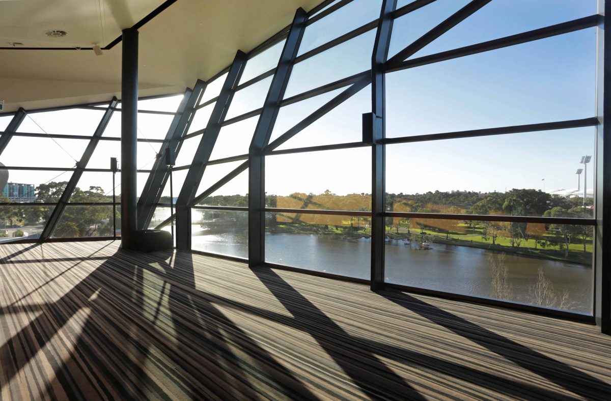
Viridian’s glass was a natural fit for the design with such a large expanse of glass facing a public foyer. It matched our desire for natural light and the right blend of visibility and reflection of the riverbank environment with outstanding thermal performance. One of the great accomplishments here is an enormous glass wall that draws visitors’ attention to a beautiful view, something that only the latest and best high performance glazing systems can achieve.
Imagine if the glass was terrible? It would be a blight and wreck the entire experience of being in this wonderful space. Working with Viridian was reassuring. We knew that we would get a quality product. We knew that the promises made right at the very start of the project would appear on our building. We’ve got the software and technology to generate really exciting shaped buildings, but where it all comes to fruition is right at the back end, “Will the thing we’ve placed on this building perform in the way that we expected it to?”
What about clarity, transparency?
The tricky component with the facade is that the glass leans out and you look through it at an angle, so things like roller marks from the toughening process, or getting the Low E-coating right on the inside of the glass unit all became absolutely essential to the quality and consistency of the project.
What about sourcing local products?
We tried to use as much Australian content and local production as possible. When outsourcing product from overseas, a reliable supply chain and guarantee of quality is critical to the success of the project. When it came to the glass, when it came to the technical aspects of it, we had a very specific set of criteria to deliver. It was a very tight window, we wanted a glass that was as clear as possible. We had a huge expanse so we needed performance to be exceptional. We had to build a product profile that we could deliver the building in the right way, and the Viridian product ticked all the boxes.
The geometric, pleated facade really produces a faceted, light responsive result.
The inclined glass gave us an opportunity to control the amount of light coming in the building by carefully selecting the angle of the facade. Convention and exhibition centres have generally always been about how big can you make it, how much stuff can you put into it?
This centre is unique because we don’t have that space, so each of the rooms works harder. This centre works exceptionally hard to deliver value and capability to the Adelaide community. The weight of the building is a huge factor – four stories of car park have been down there for 30 years and we have some very heavy pieces of kit right at the top of the building. We have seats and seating bays that lift up and transform into a flat fall. We’ve got rotating drums, and they’re all heavy objects, and they’re a long way up off the ground so the design and the strengthening of all the structure below became paramount.
Connecting to the river seems so obvious now, but this isn’t the history of the city.
This building is actually a transformative project. For years this has been a back face of the city. All of a sudden we’ve got these great buildings that address this beautiful riverbank precinct and each of the buildings speak to its scale. Being in this building is absolutely like you’re part of Adelaide’s landscape. The light-bulb moment on this project was how we were going to get these buildings to contribute to the city fabric. This is the doorstep of Adelaide, and there is no back door to this building, this is all on show. The light-bulb moment for this project was to say: ‘Well everything that we do in this project needs to show what we’re most proud about the city, this precinct and what it can become. It was a really proud moment when this building opened. I grew up here and now we’re delivering convention centres all over the world and so it’s great seeing how this works and now we’re taking this to the world.
