Buckley Street Apartments
Essendon, Victoria
Inner-city and outer-suburban apartment towers are sprouting across Australia like spring growth. Density is the new planning mantra and vision of most urban planners and governments to utilize vital space for population growth.
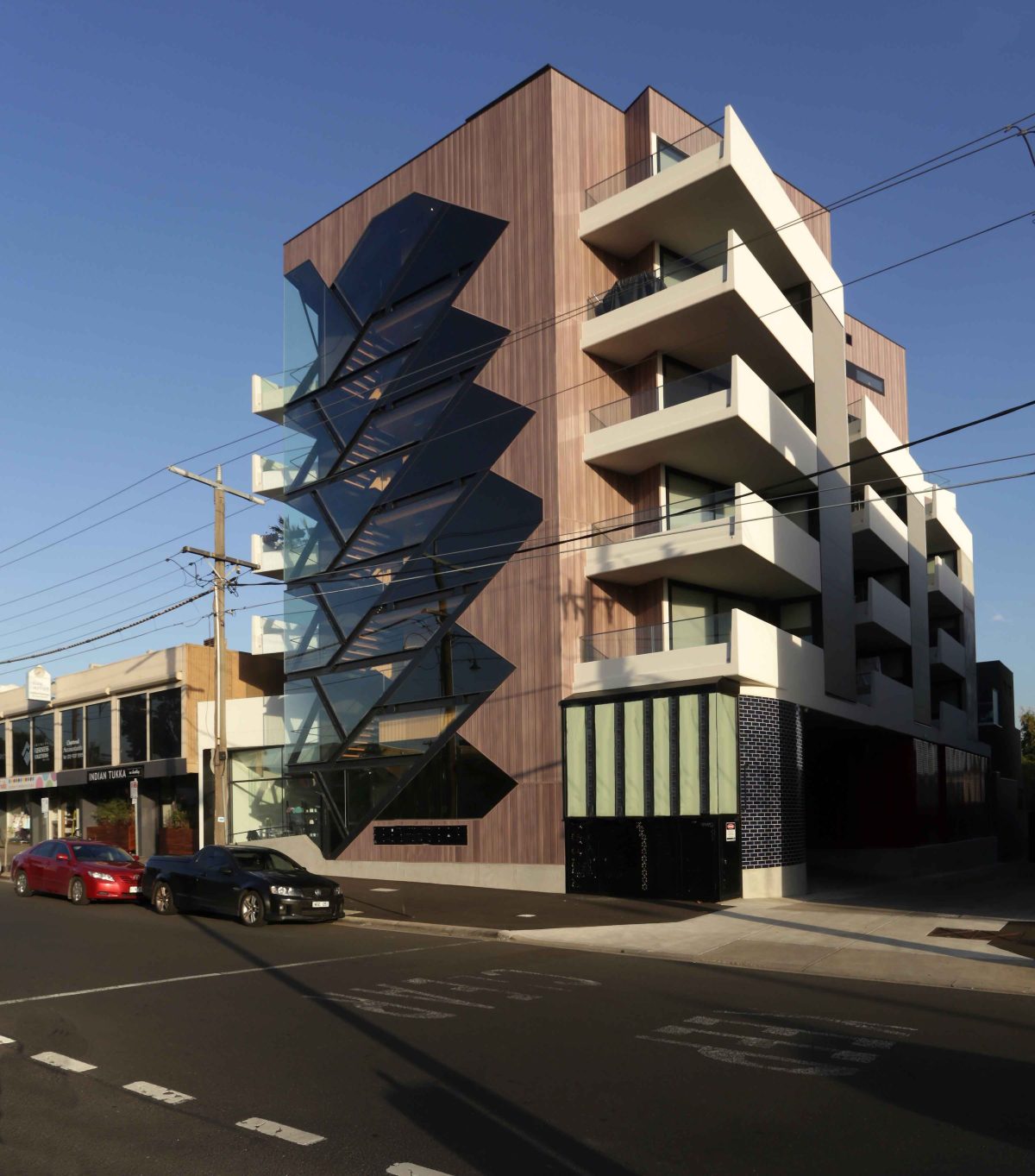
Rather than replicate the more introverted tilt-slab build, Melbourne architect Demos advocated an open expression and design generosity. Well removed from the bleak and the bland, his six-level apartment ‘block’ is a model of design compression and occupant release.
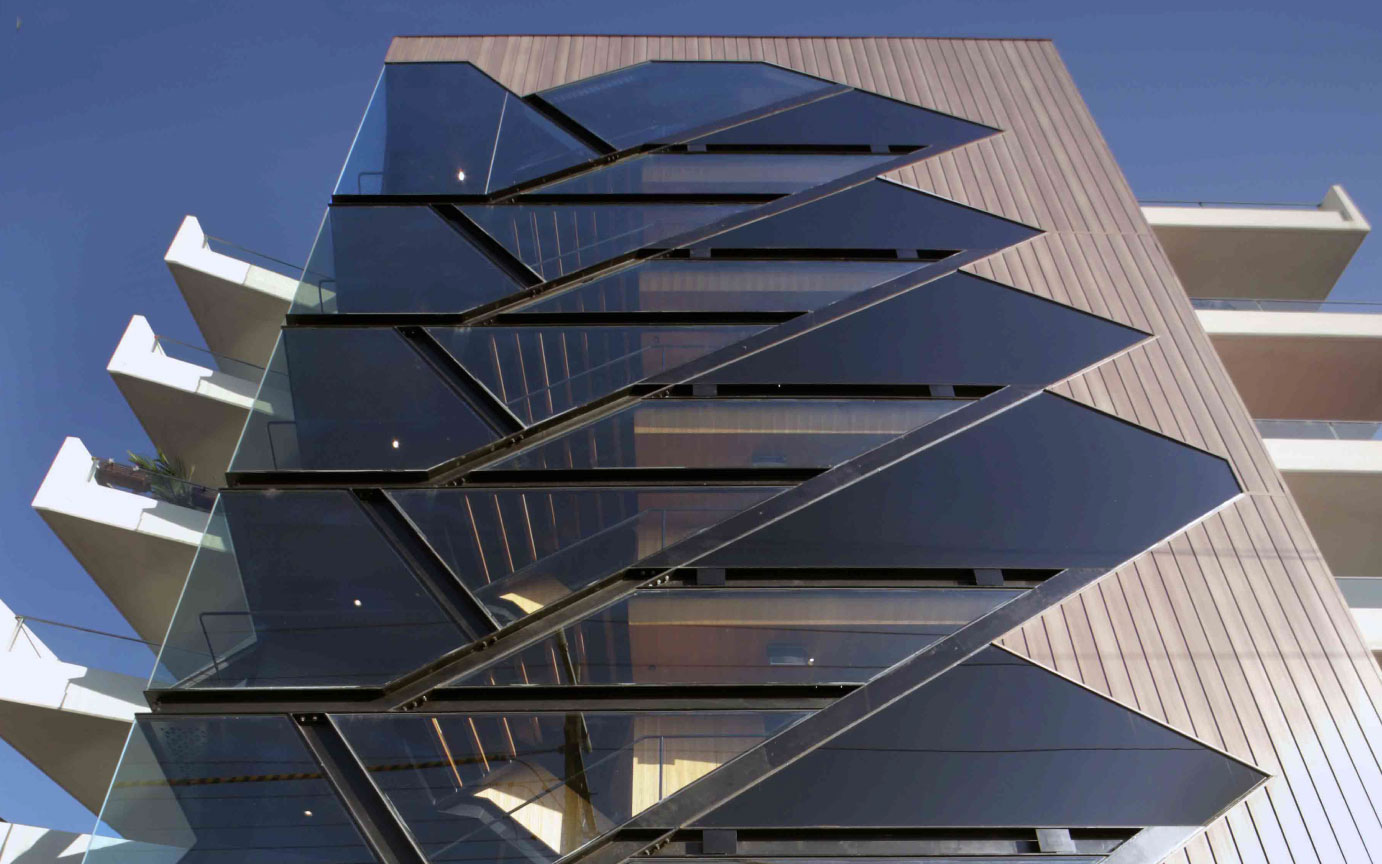
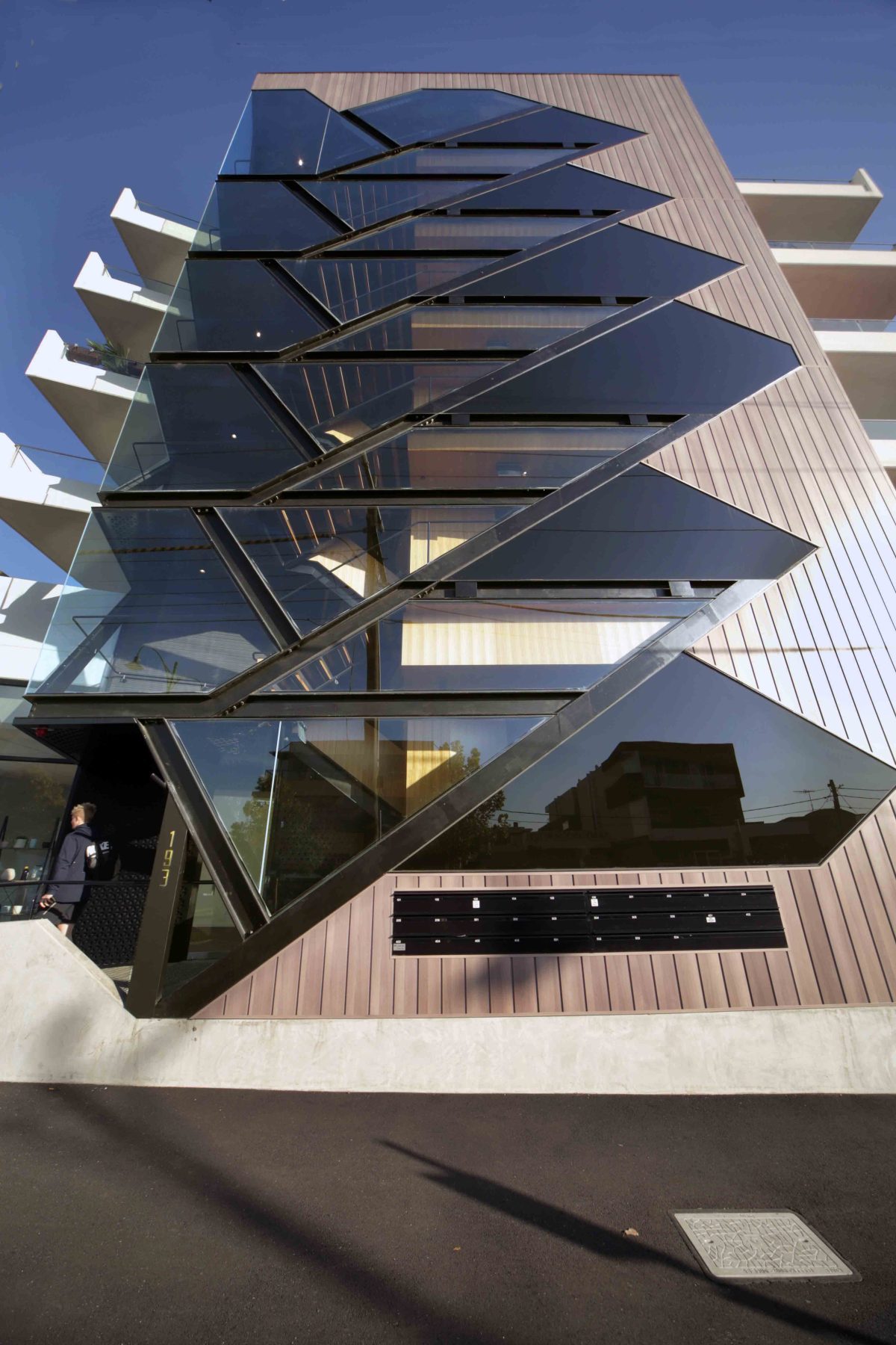
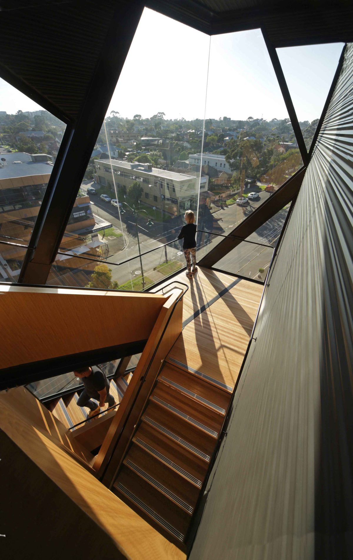
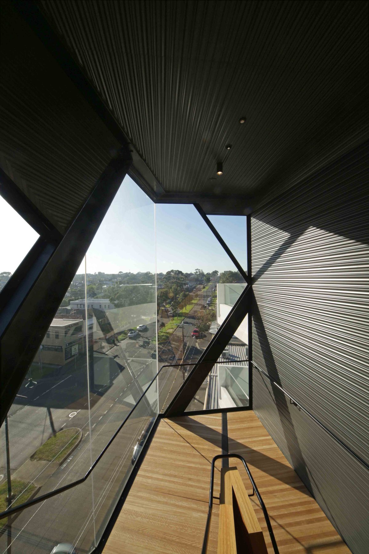
The result is a showcase of geometric glazing that frees occupants and building users from a lifts-only policy.
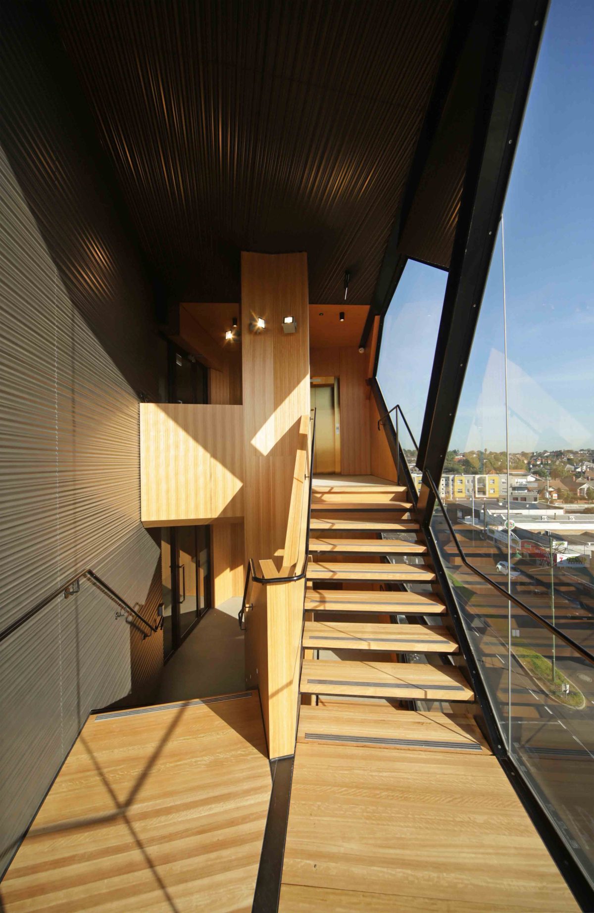
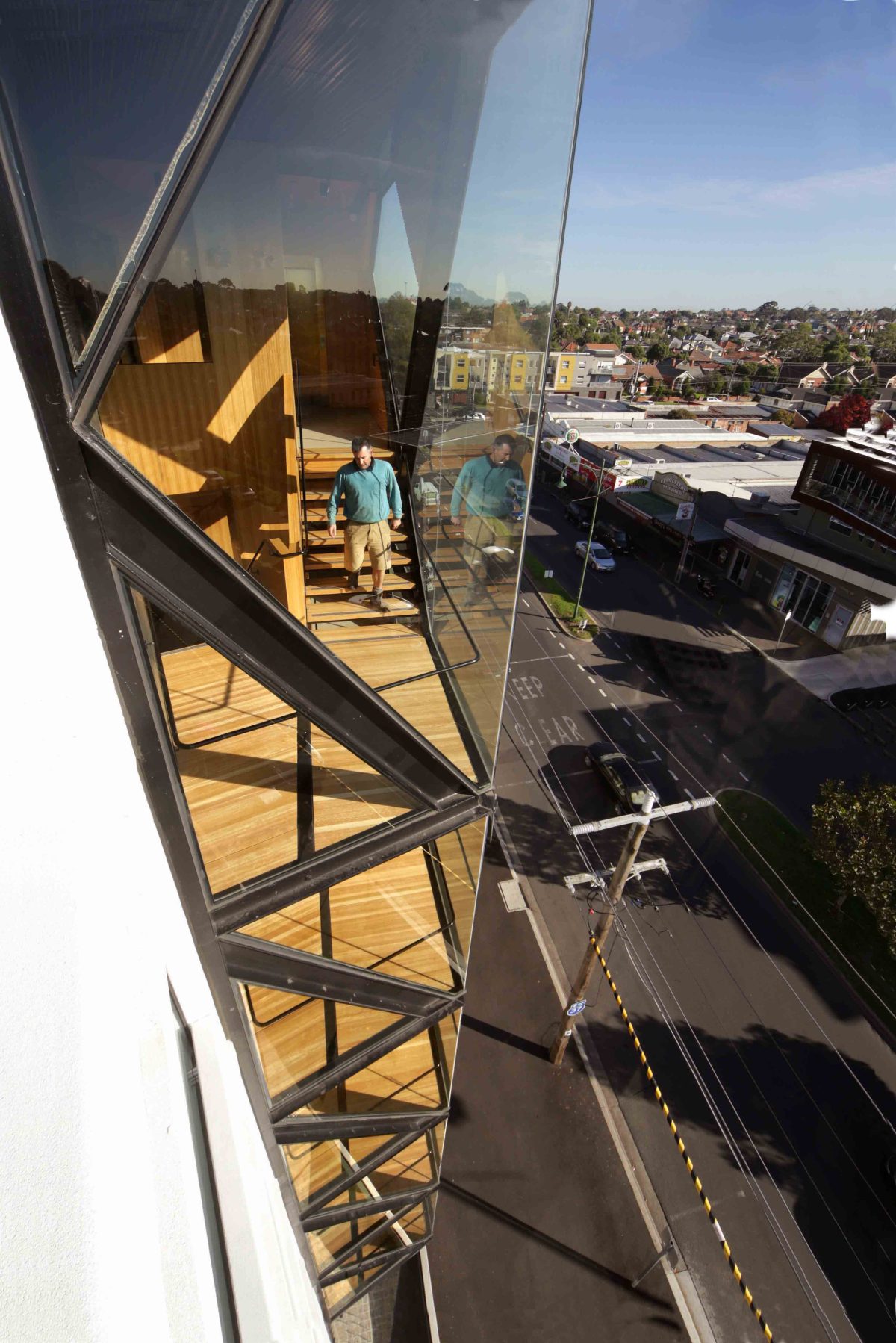
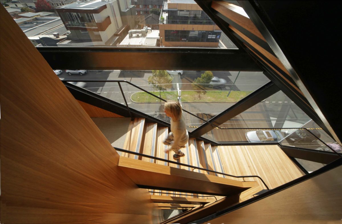
Here ‘fire-stairs’ comprising Viridian ThermoTech™ double glazing invites and defines occupant circulation.
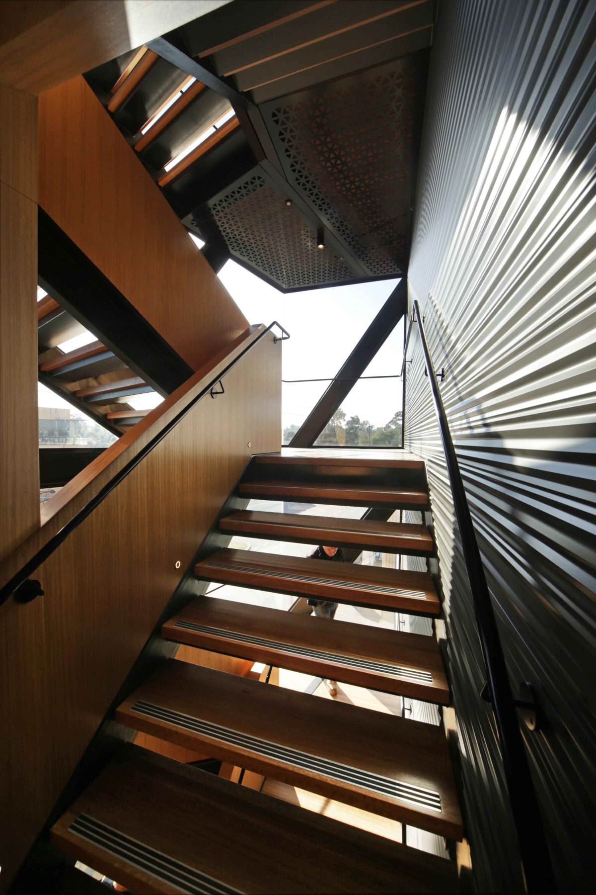
“The views from that staircase are elevated right across to the horizon or down into the street. That’s a nice way to start the day. There is a choice between waiting for the lift or taking the stairs, which physically, is easy. And there was that extra incentive that it could be a very nice experience as you just wind down that staircase.” John Demos, Architect
For this architect it was an opportunity to visually layer the project while connecting with the neighborhood and busy Buckley Street in particular. John Demos guides us through the evolution of a mini-max tower where performance glazing guides the eye towards building-as-diagram.
Viridian What did you aspire to create with this development?
JOHN DEMOS A very efficient use of the allotment. The building stands head and shoulders above its neighbours. There was no mandatory height control so we pushed it to the limit by firstly maximising the car parking capacity of the site at the requisite ratio of cars to units which in turn translated to a six-storey, 28 apartment building, well above the prevailing three to four storey context.
What about the other qualities you look for such as experience of place?
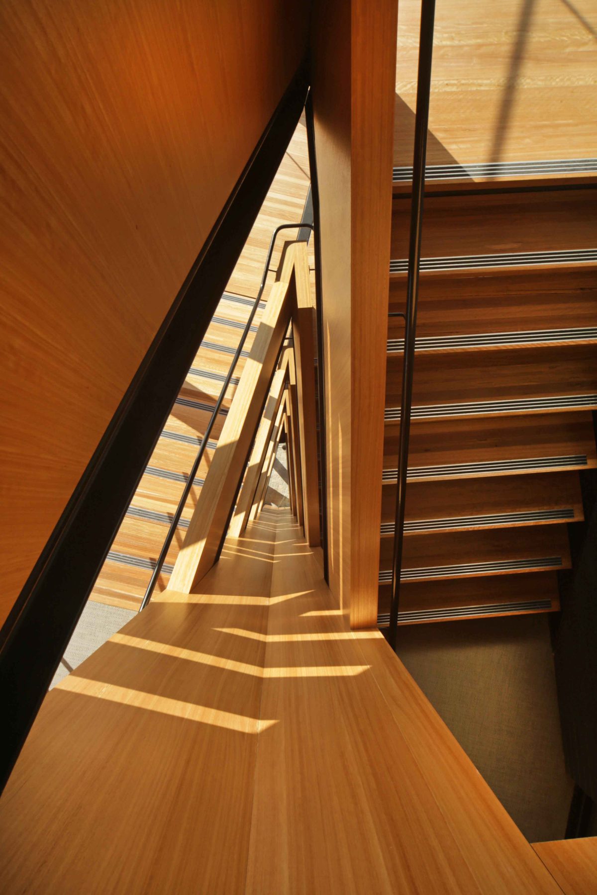
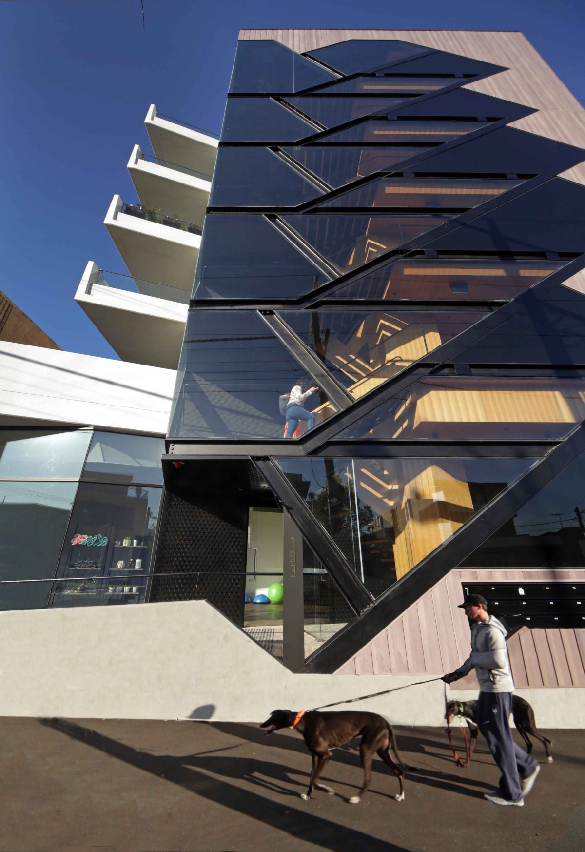
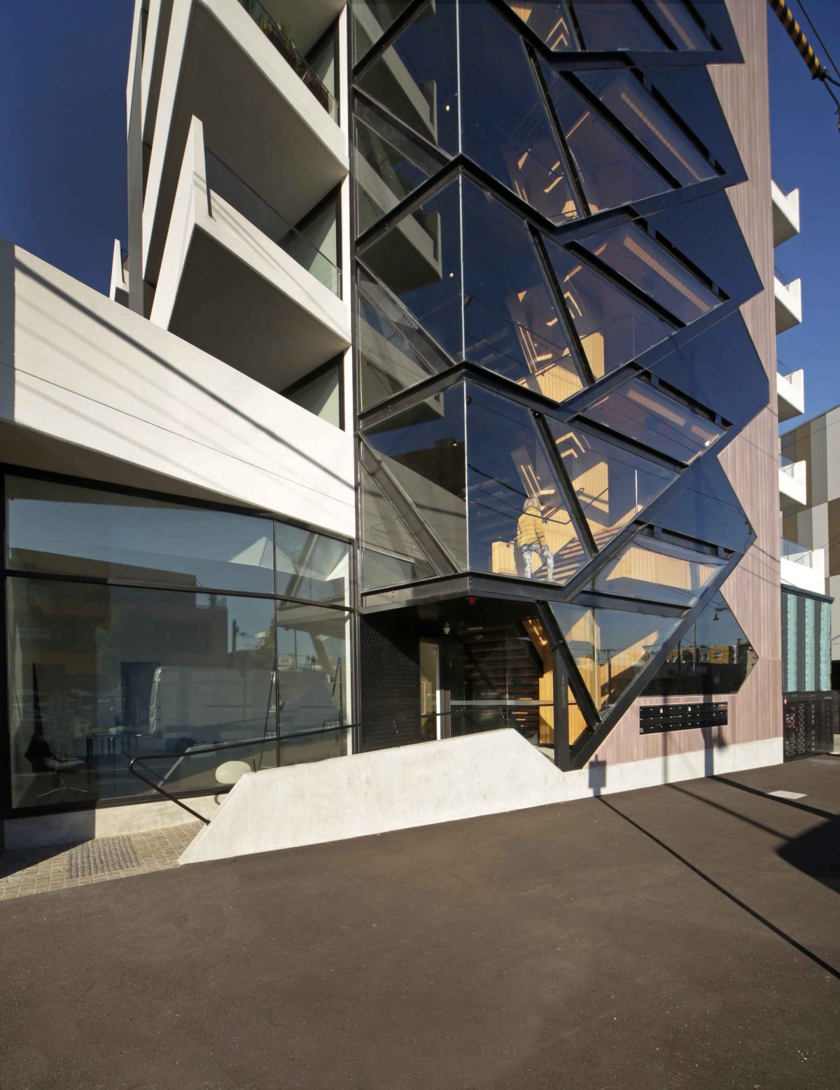
Vertical circulation elements like the lift and particularly the stair, are expressed overtly to promote an understanding of how the building works. So in this case, stair and lift are juxtaposed and with a common glazed foyer and landings results in an atrium form that extends up the building. This creates a dominant central element in the building’s composition emphasised by a strong pattern of the diagonal and horizontal steel framing that grounds the facade and expresses the entrance. The steel frame supporting the atrium resonates with the structural form of the staircase thus promoting an awareness of that embedded element and its purpose.
What do you hope the project says to the passerby?
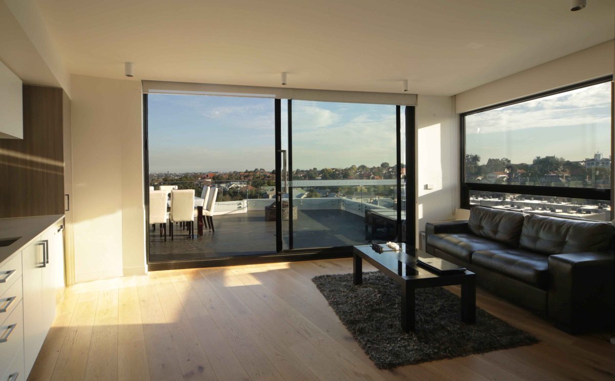
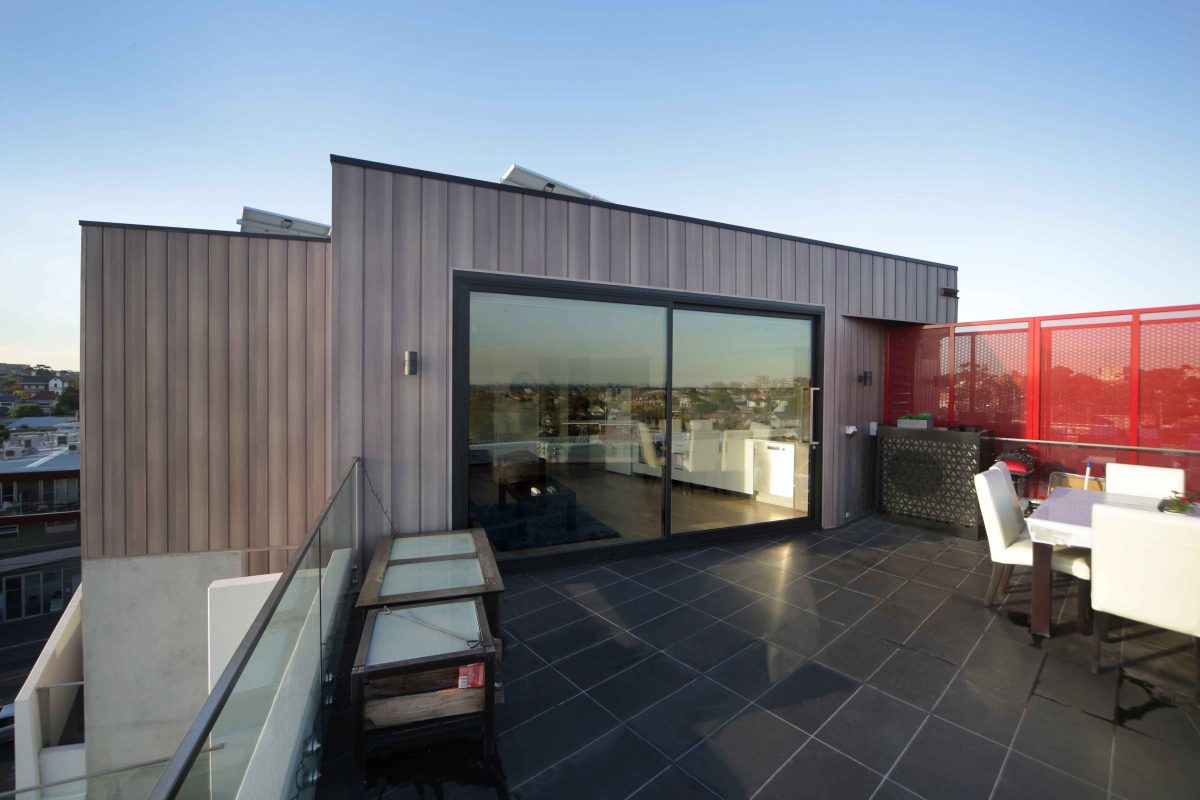
In a subtle but nevertheless overt way it is designed to be noticed. Hopefully this engagement will be positive and promote an understanding that the building introduces a new and progressive element into the streetscape. A building which consolidates existing neighbourhood characteristics revolving around a sense of security and amenity and moderate controlled growth as opposed to stagnation. The building must also express its primary purpose as a residential apartment that exists in balance with commercial and other similar buildings within the wider predominately suburban residential setting. This is achieved by emphasising flanking balconies as the street-wards oriented extension of individual apartments.
Common elements such as the atrium entry and the circulation combined with the patterned repetition of individual units collectively represent the idea of the building. At street level a small café and personal training business completes the impression by servicing directly the neighbourhood at large.
There’s often a theatrical quality wherever you have a large ratio of glass and there’s a certain level of activity and people circulation/gathering occurring.
Using glass can be a direct invitation for people to look into the building. For residential buildings, which are essentially private the number of spaces that bear that sort of scrutiny are limited. The prime example is, quite naturally, the entrance foyer. In this case the foyer and the ascending staircase, essentially the atrium structure are a single element that also includes views of the lift doors and the framed smoke doors leading to the inner sanctum of private apartments. The view into the stairwell/atrium is rewarded by the application of textured and coloured wall finishes and timber veneers that compliment the steel and timber treads of the staircase. In this way an outside observer is deliberately drawn into the building and its workings. This is a gesture of welcome by way of revealing as far as is practically acceptable to the tenants of the building. By identifying parts of the building within the spectrum of public to private spaces and making deliberate and considered choices about what and how to draw attention to you reveal more of the purpose of the building and make stronger albeit qualified connections to the social context in which it exists. I believe that this cannot be overstated in its importance in an age when a concern for privacy has become an unnatural and usually unnecessary obsession within our community. The use of glass to make such connections also allows the building to communicate via a wider palate of materials, textures, shapes and colours.
Why does glass figure so prominently in this project?
Glass has the potential to draw us visually deeper into the building to reveal its purpose, an understanding of how it functions physically, to display more rather than less of itself and to allow an expression of form, pattern colour and texture as phenomenon. Glass along with voids acts as the counterpoint to surface and the two juxtaposed substantially modulate degrees of revealing and obscuring as appropriate. Glass is the facilitator of natural light. It’s also a very easy material to maintain over time. Durability is a very important consideration for all buildings and glass is one of the materials I think of first.
Do you have contact with Viridian’s technical resource team when you develop a project?
Yes we do. They’re very important. Viridian has been very helpful in providing its expertise on this project. Our relationship with suppliers and contractors is very strong. Viridian is particularly valued by me because of my propensity to use glass rather expansively. Viridian have always and over many years assisted with the realisation of projects and I think those projects have been better realised for that involvement and contribution. Viridian back their products and it’s always a pleasure to work with them.
Are there other qualities to glass beyond light transmission and transparency? Aren’t we sometimes forgetful of the capacity to be beautifully layered like a veil or series of veils in a building to create intrigue or spatial depth.
Glass has the potential to create various effects literally as different as day to night. Quite apart from the various forms it can take as a material from clear to translucent to opaque, from being a light transmitter to a light reflector and all the grades between it is a material that can be used to create effects like no other and of course it can be coloured intrinsically. Glass technology has advanced so much and continues to advance ensuring that it will always have a pre-eminent place in the palette of materials at architects’ disposal. At 193 Buckley Street the use of glass especially in the atrium element creates a depth to the facade by permitting layered views into the interior and the elements arranged within.
How difficult was it to resolve that façade system when you could have easily opted for a standard system?
A standard system implies that it stands alone. I attempt to fuse systems together in a way that allows one to abet another whilst retaining the performance required of each system or element. I regard this as potentially more efficient and certainly more interesting architecturally. Building formed that way possess greater potency due to the multi-valent idea that characterises each element of the composition derived as it is a composite of differing demands. In this case the atrium and stair supports and the idea of a patterned frame defining a super-scaled lantern-like element are all combined as a single structural system. This system takes into account the spanning capacity of glass no less than the deflection limits of the steel and the performance aspects of other components all of which have a critical inter-dependence. And that brings us back to the level of technical advice and assistance offered by companies like Viridian: it’s their expertise that is invaluable when materials are subjected to the demands of architectural expression over and above conventional applications.
How do you know your design limitations?
You don’t until you test them rigorously and often on a single project. Design is not just an individual exercise. Designing and constructing buildings is a team effort and one which increasingly is best done as an integrated exercise. The team provides expertise across multiple disciplines allowing designers to test their limits. it is therefore imperative that as much expertise as possible resides within the group of experts that collectively create a building. A team approach rather than diluting the architecture actually allows it to flourish to a maximum by virtue of the problem solving capacity of the participants. Architects should be aware that they are usually the ones who are most demanding in that respect and therefore should be the first to appreciate the invaluable assistance that experts, like Viridian, bring to the possibility of stretching
the limits of design.
Anything else about the design and glazing in particular that stands out for you?
Yes, it is the inescapable view from each level of the building as one enters the atrium structure when exiting the building. One can greet the day so to speak by observing the near and distant view and the sky from a glass bubble. There is a choice between waiting for the lift or taking the stairs down to the exit and car-park observing the view as you go and “acclimatising” to the day ahead. Given that the stair, beyond its mandatory existence use as an escape, is given over as an integral element of the architecture of the building it may just entice one to use it, at least downwards, instead of the lift and hopefully enjoy the journey.
