Labour of Love
Burleigh Heads, Queensland
The opportunity for profound and intimate architecture can occur at home. In suburban Burleigh Heads, not far from the rolling surf, the Clares’ remind us of this skill to make a large statement with modest means. Aspect, prospect and privacy are all artfully composed in a suburban street not known for such quiet innovation.
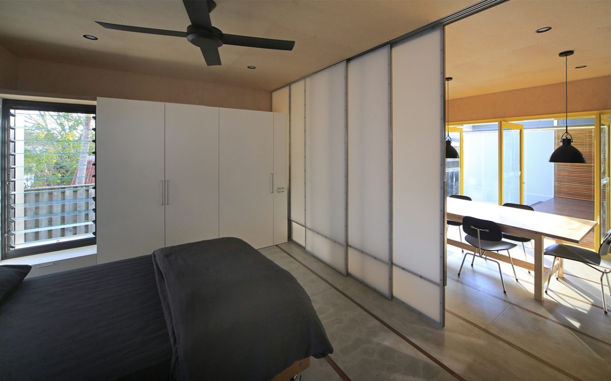
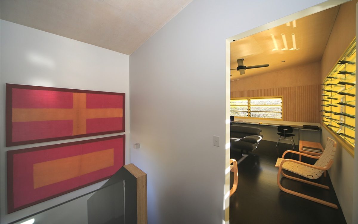
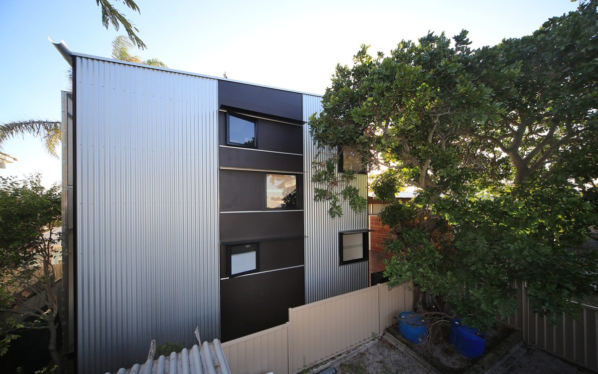
Returning to the project type upon which they built their reputation, Kerry and Lindsay Clare recently completed a granny flat as suburban pavilion. It might seem a long way from their more recent, award-winning, public projects, but this modest structure of plywood, steel and Viridian glass encapsulates an all-too-rare spirit of environmental connection.
Architecture is all about fingerprints. Not the type often found on windows and walls, but those that shape, pattern and forge their designers’ legacy. These unique characteristics are the giveaway of their creators. This is apparent in the latest work by husband and wife team Lindsay and Kerry Clare with a small suburban granny flat at Burleigh Heads.
It all seems a world away from the hustle and bustle of the Gold Coast high-rise just 15 kms. to the north. Architecture is less an occupation than pre-occupation. It’s why the Clares’ can be considered
in a similar light to the mid-20th century husband and wife team of Charles and Ray Eames whose craft had such far-reaching consequences. While the Clares haven’t explored furniture-making like the Eames’, their design rigour and enduring partnership have a similar conviction.
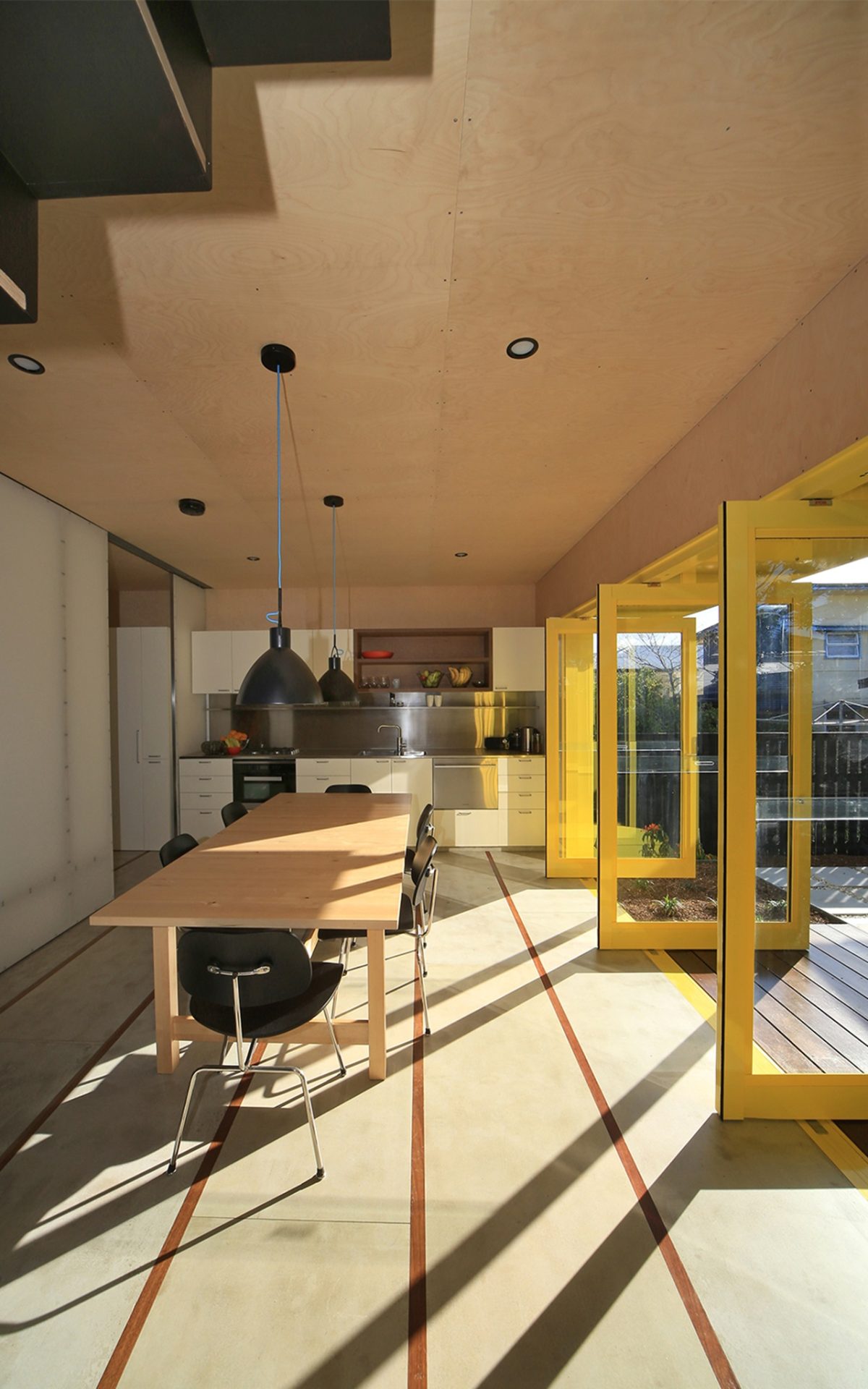
Gold medalists of the Australian Institute of Architects in 2010, their Queensland Gallery of Modern Art (2006) stands as a bravura work of elegant understatement. More recently Melbourne’s design-challenged Dockland’s precinct, benefited from the opening of the Clare designed city library. Despite the usual commercial buffeting, it attains its gravity not with leaden mass but subtraction and refinement. More reminiscent of early Wright Brothers’ flying machines, the library contradicts its more ponderous neighbours as if in levitation. Their latest project is comprised principally of corrugated steel, laminated timber and Viridian glass. It virtually turns back the calendar to the ’80s and ’90s when they were based on the Sunshine Coast and among the leaders in environmental place-making along with Gabriel Poole and John Mainwaring. Lightweight, filleted and layered, their designs speak of the authentic rather than generic.
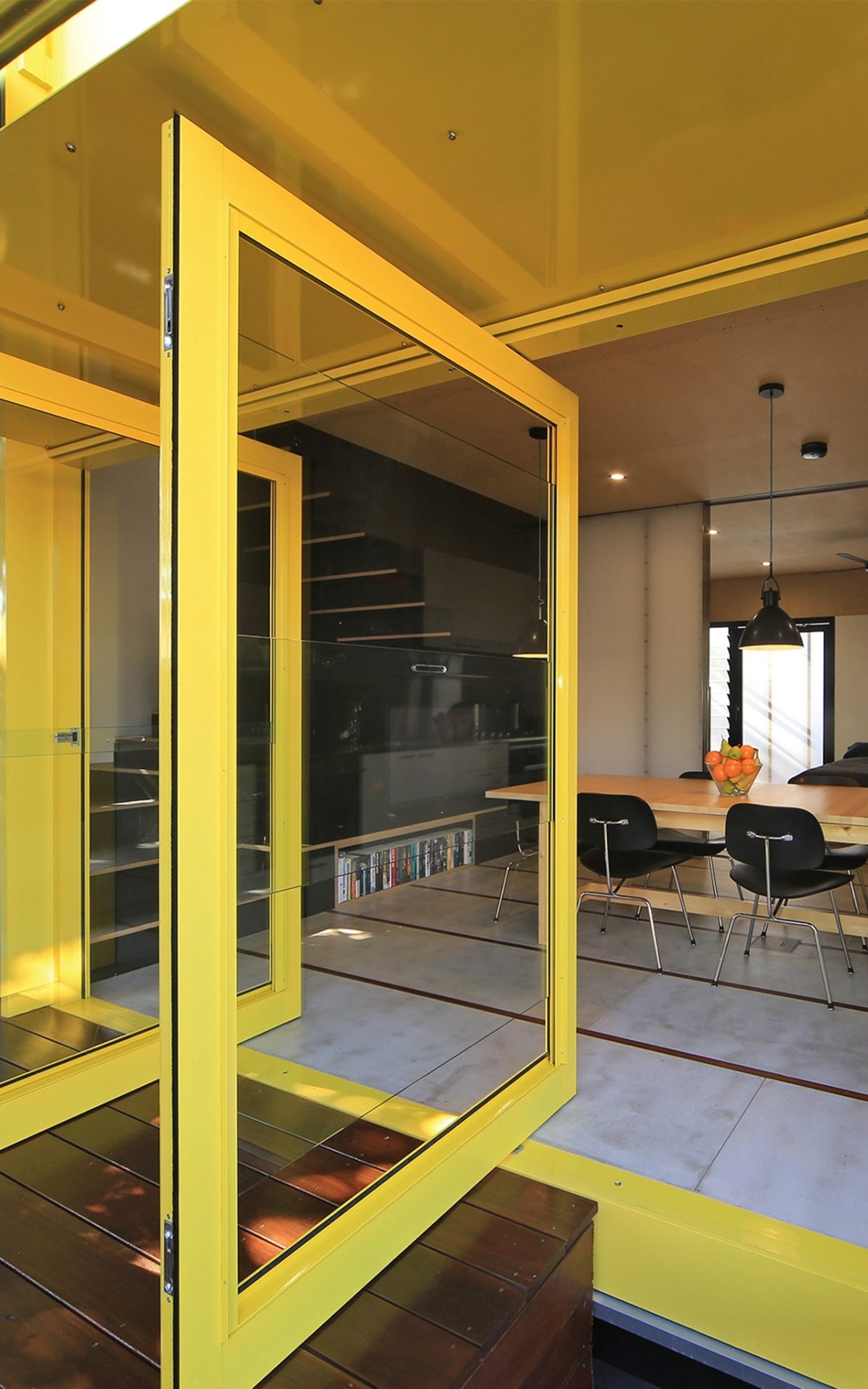
The granny flat is one of their smallest projects in a long time, yet loses nothing in the DNA transfer from grand public to modest private. Its planar qualities and broad-bladed pivot doors for instance, borrow from those at GoMA that so effortlessly link to its shaded riverfront. The opportunity for profound and intimate architecture can occur at home. In suburban Burleigh Heads, not far from the rolling surf, the Clares remind us of this skill to make a large statement with modest means. Aspect, prospect and privacy are all artfully composed in a suburban street not known for such quiet innovation.
_
Peter Hyatt, author of two books on the Clares’
– Local Heroes, Architects of Australia’s Sunshine Coast and Art House – Queensland Gallery of Modern Art, visited the project to investigate a granny flat with a difference:
How would you summarize the project:
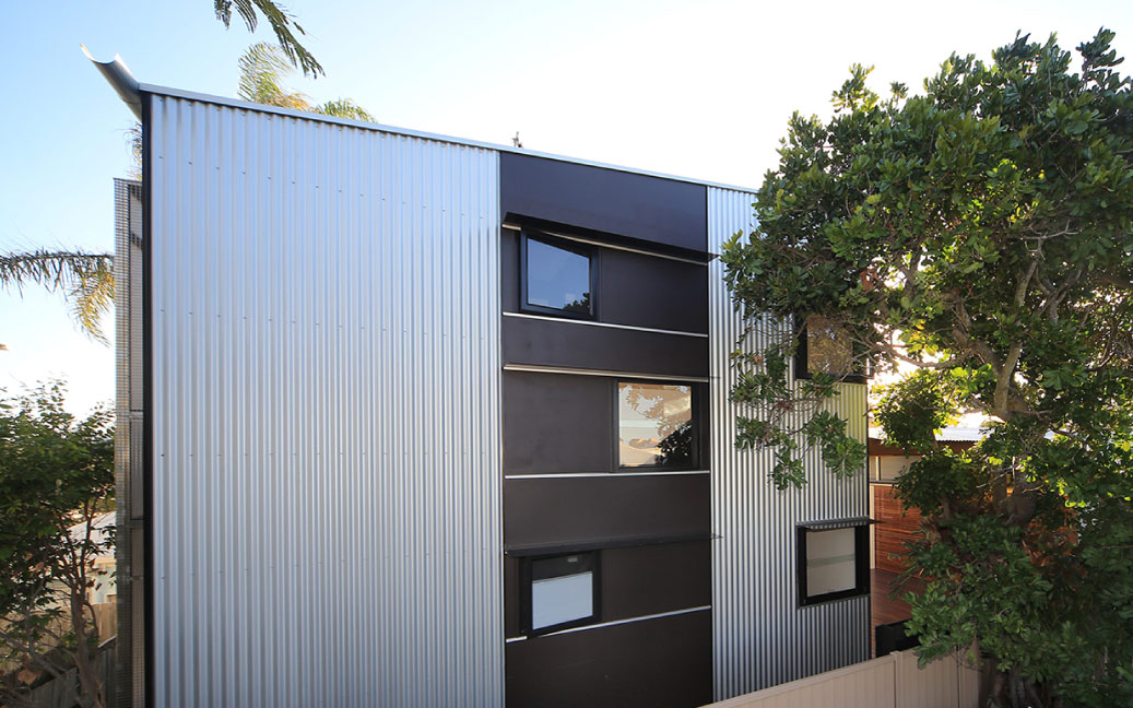
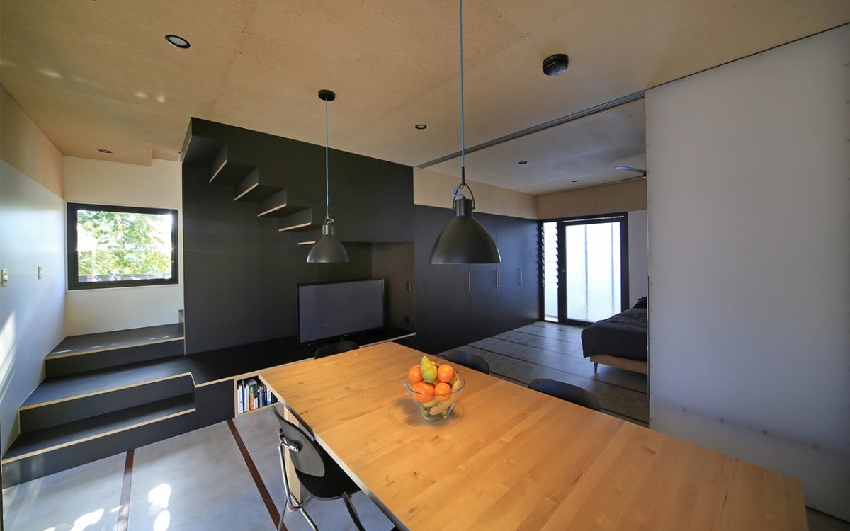
Lindsay Clare: It’s essentially a two-storey box
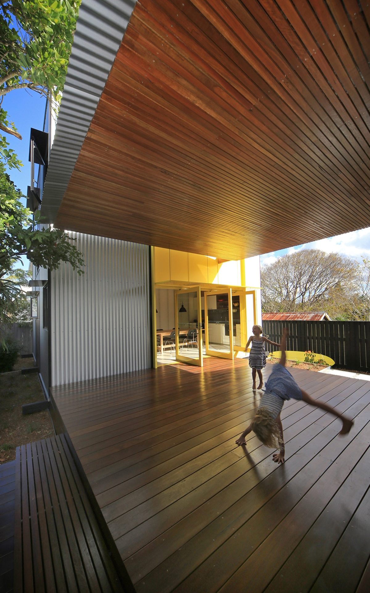
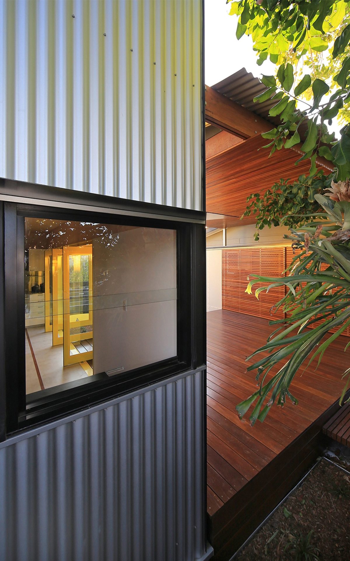
placed six metres behind a 1950s fibro-shack on a long, narrow site. The two buildings are connected by a roofed-deck that allow occupants to come together, or retreat, as required.
It’s an unconventional flat. More of a pavilion in many ways isn’t it?
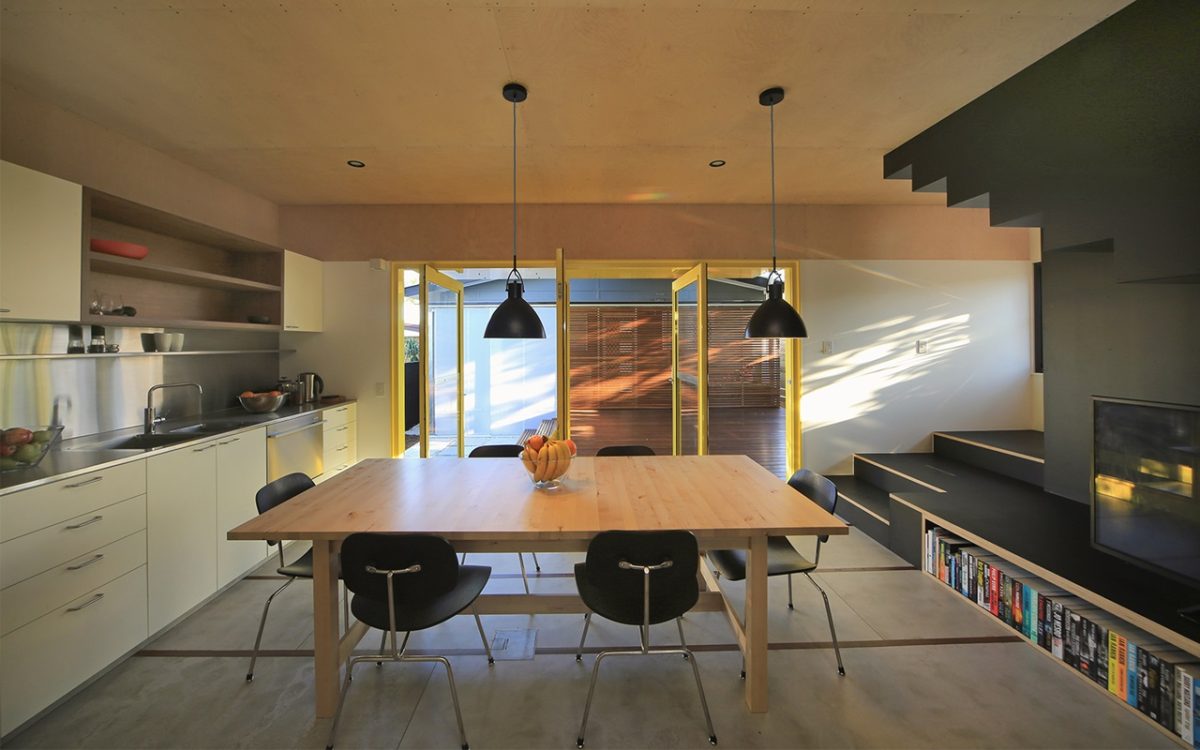
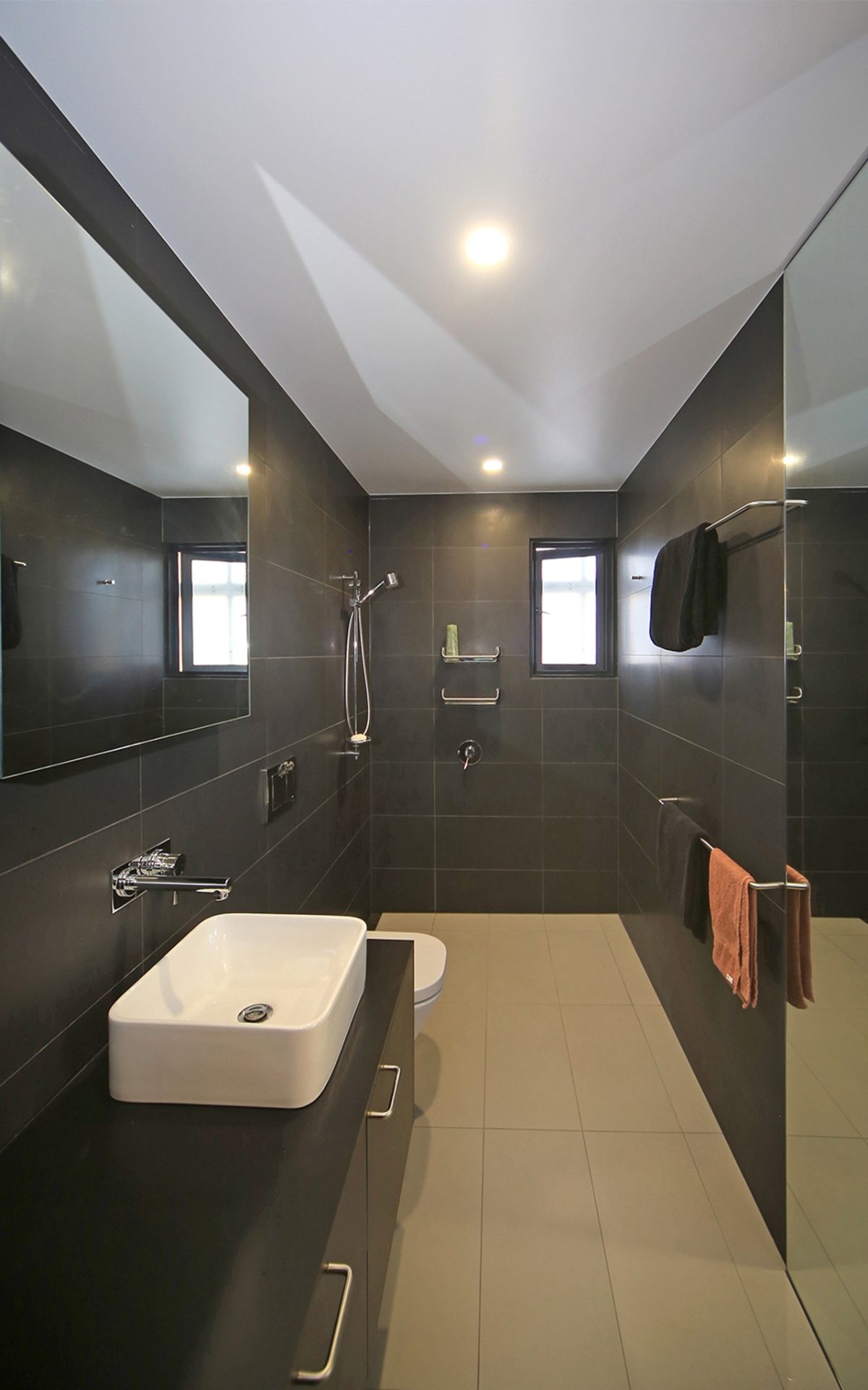
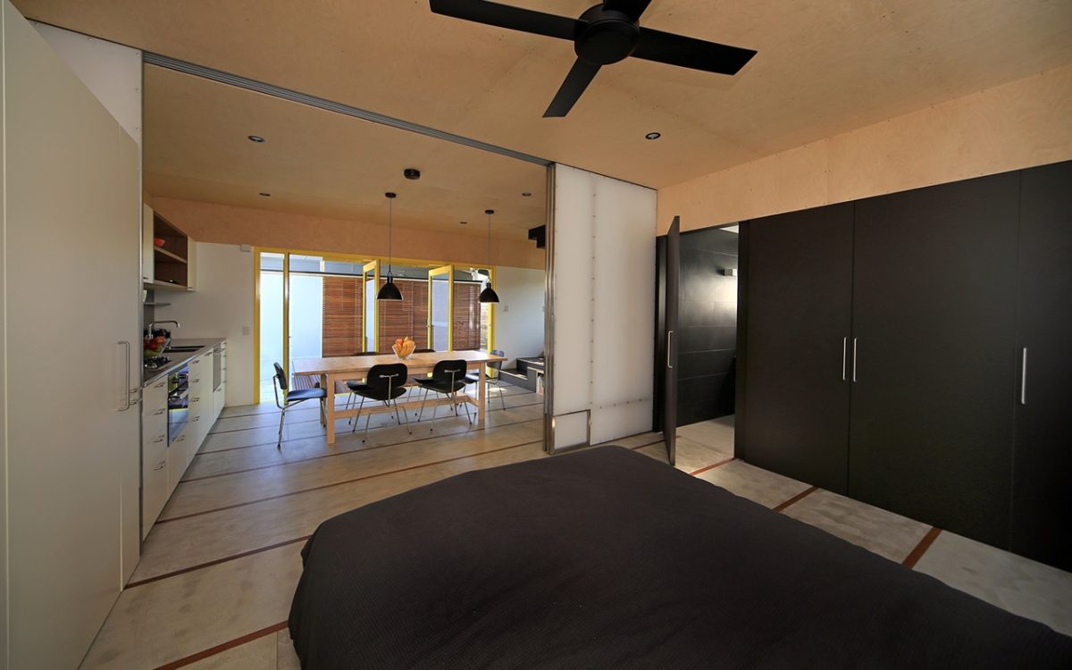
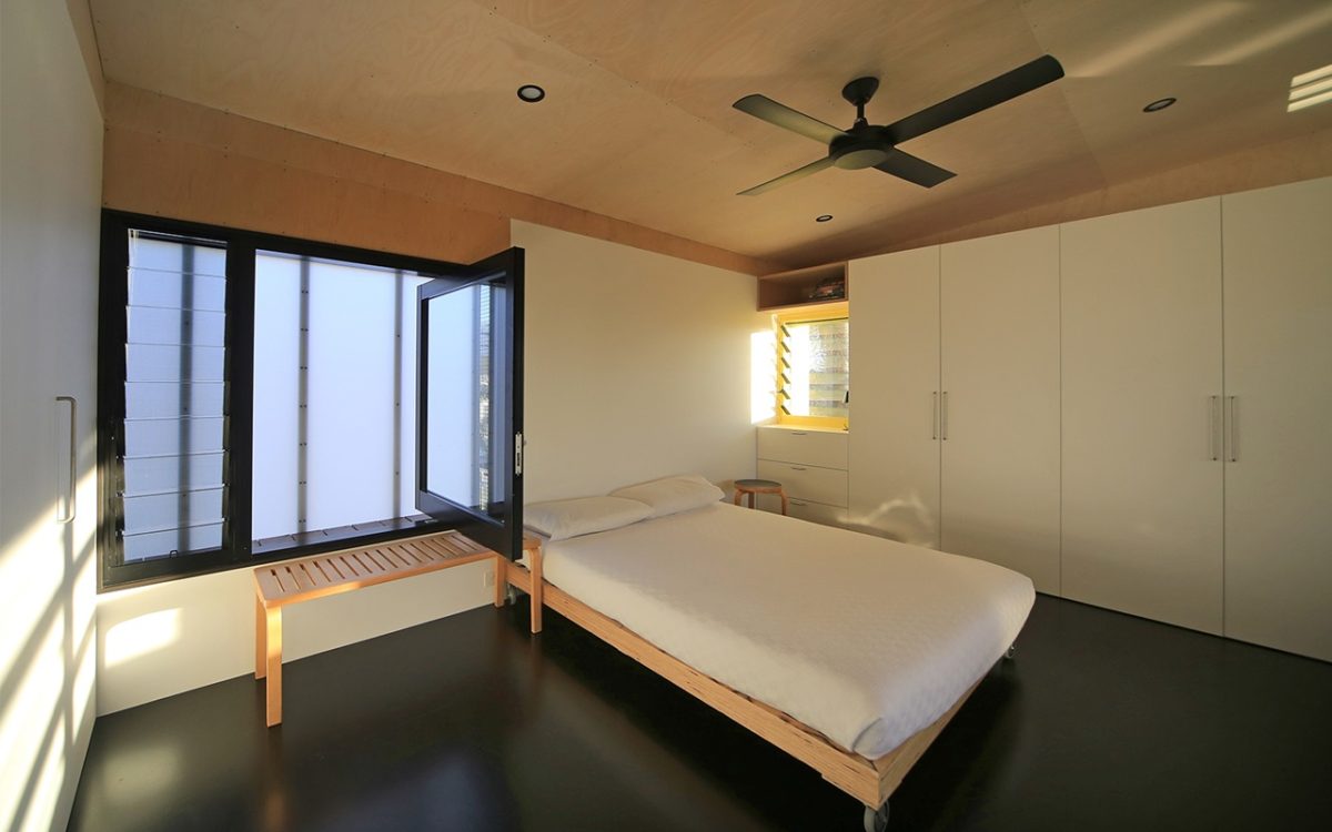
Kerry Clare: It’s about providing uncomplicated, flexible planning across two levels. Each level has an open studio space that can be sub-divided by sliding screens for living and sleeping and both have attached bathrooms. It also explores the idea of the intergenerational house for an extended family of grandparents, married children and grand-children to co-habitate within the two dwellings on a 400m2 suburban lot.
What are the benefits of this type of dual occupancy?
KC: Environmental with the better use of resources, cost effectiveness and better social outcomes from increased density and mutual family support.
How much of this pavilion is prototype rather than stereotype?
KC: Mostly prototype. It’s always nice to approach these projects with a willingness for experimentation.
Such as?
KC: The compressed fibre-cement floors and timber strips for instance. We hadn’t done that before but tried it on a small project. Even if it wasn’t entirely successful, it works well and is something we might re-visit in the future.
LC: It’s definitely about searching for those prototype qualities. On the other hand the box shape we use is a stereotype. There’s nothing wrong with that because it’s a shape that provides such great economy.
Is there an element of your workplace that’s like a laboratory to really see what you can push and develop next?
KC: That’s true. We like to experiment with materials. I think we got that from Gabriel Poole.
But there’s an underlying philosophy there too.
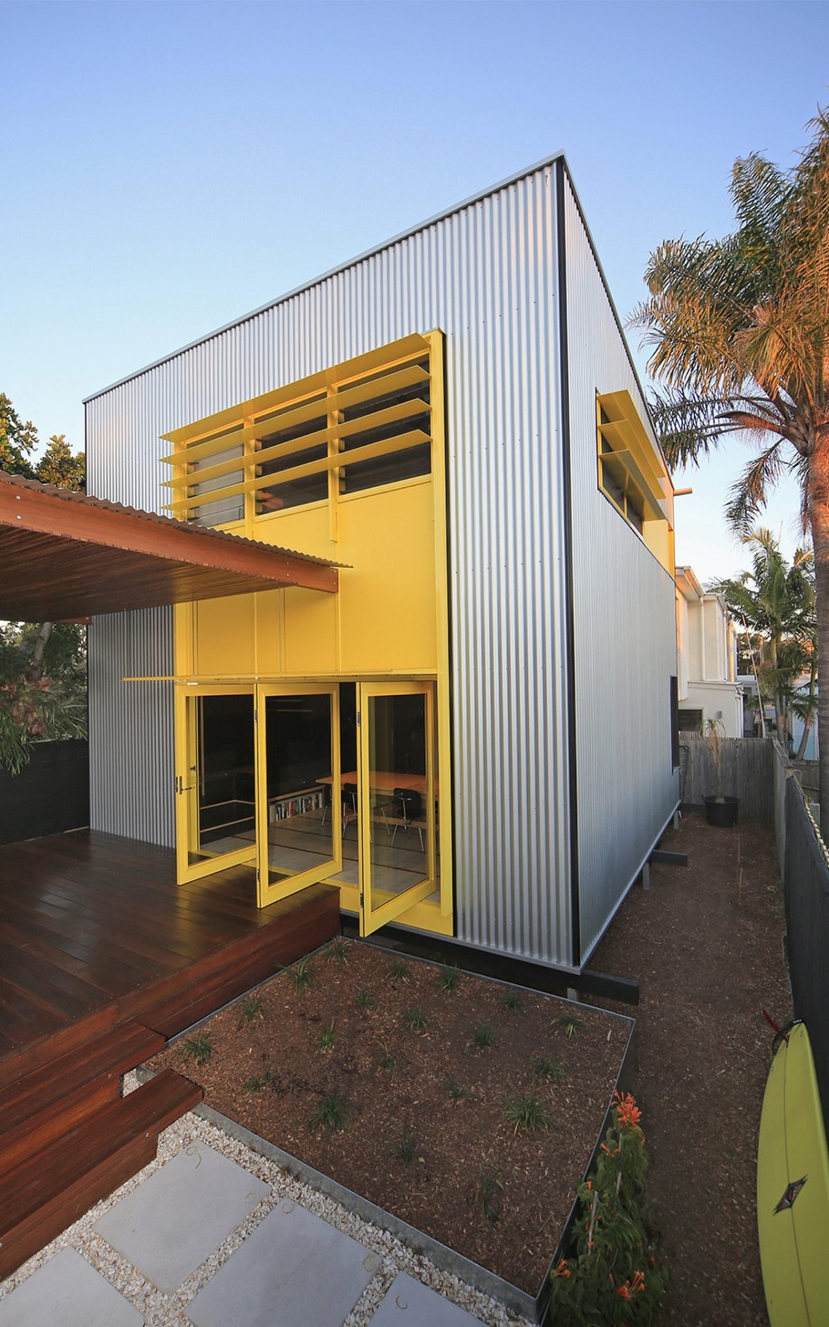
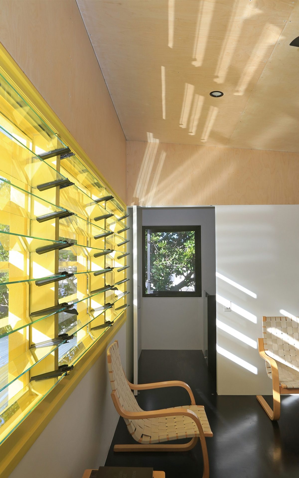
LC: While you want innovation, there is also the need to utilize standard elements for economies. This project involved fast construction. We’ve developed all these details around standard elements and standard sections for speed and economy. You can see evidence of that in the window details. We had to really manipulate those to add effective weather protection hoods that worked with the window type and aesthetic we tried to achieve.
How easy, or rather, difficult is it, to jump between projects of such different scale?
LC: We’ve nearly always had a housing project underway. Projects of different scale occurring simultaneously tend to complement one another.
KC: The small works can be more experimental, while the larger projects can often benefit from that experimentation.
What about the pivoting doors to the deck?
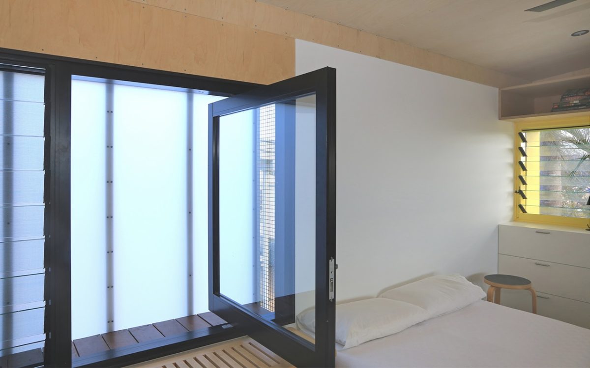
LC: They’re not just about the way you see out. They really represent a tremendous flexibility and way of seeing doors not simply as an in and out. These doors are also windows and provide a whole other dimension to how that deck as the outdoor room is viewed and used.
“He was also very knowledgeable about Viridian glass. Wayne was really on the case. The other thing to say is that his people were craftsmen and were interested to find solutions for this small project.” Lindsay Clare, Project Team
Are they standard?
LC: There are two different window types within the pivoting doors. They have sliding sashes and fly screens within them and also act like casements where you can direct or control the amount of breeze. You can have daylight and ventilation,
with security.
How much of a lineage is there to your Gallery of Modern Art in Brisbane?
LC: You could say it’s a powerful lineage, because I think we have been very consistent applying certain principles over the years. They’re also ideas of habit. The pivot doors are interesting because when they’re open, they don’t simply steer breezes. They act as a baffle in higher winds. Rather than have just a huge opening, we have a large opening with these blade doors that stop air from just rushing in. This way air-flow is much more modulated and directed.
Your work is renowned for its climatic and environmental fit. Is that your signature?
KC: It’s our starting point.
The term ‘granny-flat’ suggests a rather dowdy, dreary space. This is much more isn’t it?
LC: It’s a fairly universal design. It could be clothed differently. You might shape it differently, but really, the idea can have a much wider application in this climate and environment.
What motivated your client to occupy this part of the allotment in this way?
KC: It was an exposed backyard overlooked by neighbours and as soon as the pavilion was built, it just became the centre of gravity for the whole house.
There is a distinctly crafted, honed quality – not exactly something the neighborhood, or Gold Coast, has really discovered.
KC: There are well-known gems around, but the Gold Coast has been more of a brash tourist town and the housing stock takes more of the mansion approach. There is a growing appreciation for design and gradually we’ll see a lot of the old housing stock regenerated. It’s at a turning point now.
Have tight budgets made you better architects, or simply forced you to better disguise where cuts have been made?
KC: You have to understand where to direct the budget. You might perform to a very low cost, but it’s important how to assemble those parts to realize the whole.
There are testing issues of privacy and daylight. You’ve obviously considered those issues thoroughly. Have you been successful?
LC: Privacy is difficult when you have this density. One reason the pavilion is there is because to the south a neighbour had views into the backyard. The pavilion increased their privacy and our client’s.
Given your work is so collaborative, how do you assign roles? Do you design half each and meet up in the middle, or does one handle interiors and the other the exterior?
LC: We work over each others’ drawings and quite often forget who initiated the first one, so it’s all quite seamless.
KC: Having run a small practice for so long, we
work as general practitioners and our skills are inter-changeable. There’s not much we disagree on, really.
What was the main attraction of Viridian glass?
KC: An architect needs to understand their materials whatever those happen to be. In this instance we were lucky to have such an informed and helpful window manufacturer. Wayne Burt from Window Makers visited the site a number of times. We discussed glazing details and he provided window and door section samples. That was a very positive experience and so we look forward to working with him on other projects because of his enthusiasm and knowledge.
LC: He was also very knowledgeable about Viridian glass. Wayne was really on the case. The other thing to say is that his people were craftsmen and were interested to find solutions for this small project.
Are you surprised at how many architects and building designers appear to be quite so unaware about the glass that winds up in their projects?
KC: Glass technology is changing so rapidly that it can take a lot of time for an architect to stay abreast of up-to-date information. A good fabricator who is prepared to sit down and discuss the issues and glazing demands is invaluable.
How important are the pivoting bedroom windows to the overall design?
KC: They’re fundamental. Certainly in summer the slightest air-flow is important. Rather than rely on mechanical cooling this design optimizes breezes and comfort levels. The big pivot doors offer a whole other freedom channeling air into the house. A big issue in Queensland is insect protection. You can’t just have vast, unprotected open spaces up here and expect to use them without being carried away by mosquitoes.
LC: Of an evening those windows lock for security, but provide ventilation. That’s quite a critical detail to ensure you have both.
The best advice for architects working on a modest residential scale and budget where clients expect blockbuster results?
KC: Work with the potential of the site and climate. Window design is fundamental to this approach.
