Frank Bartlett Library and Moe Service Centre
Moe, Victoria
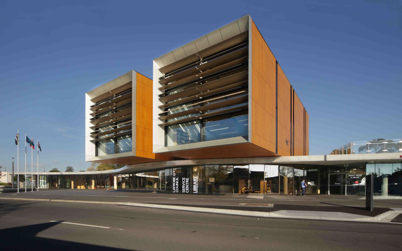
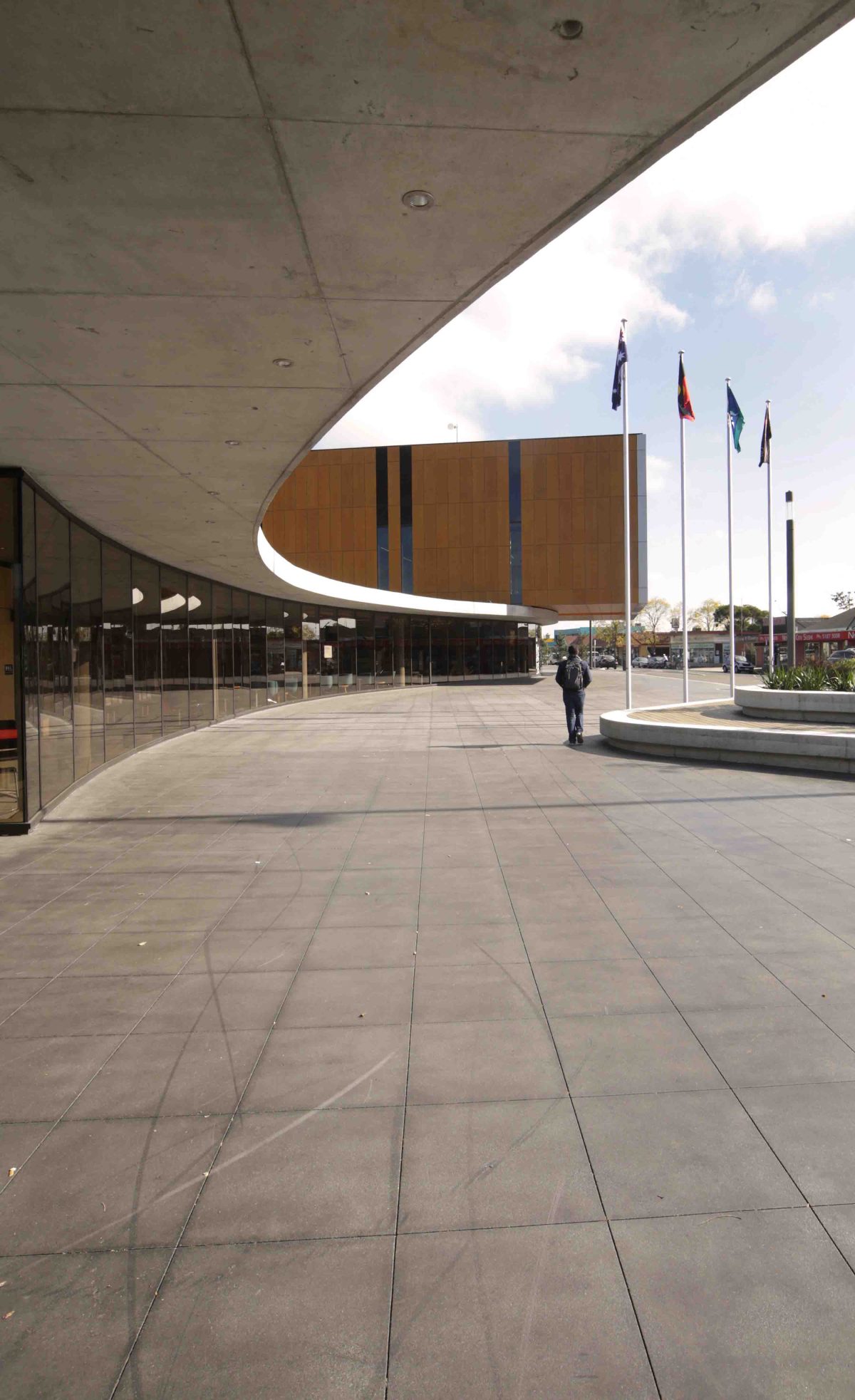
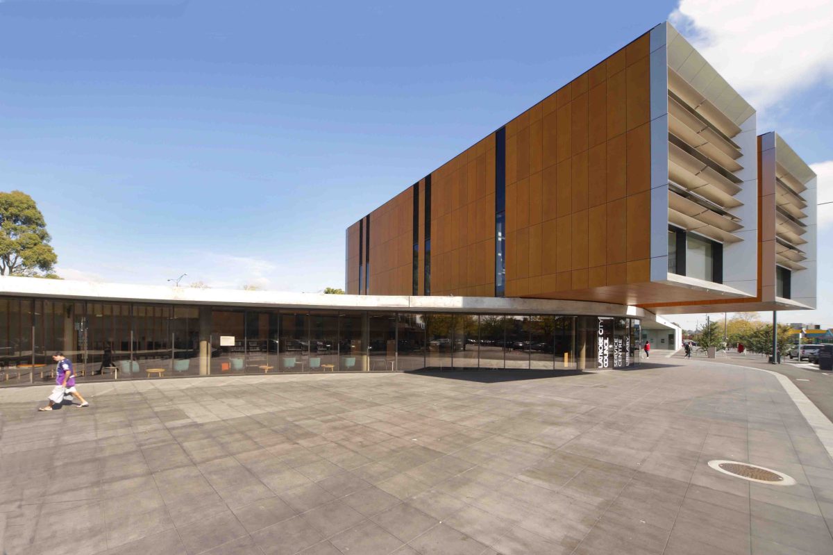
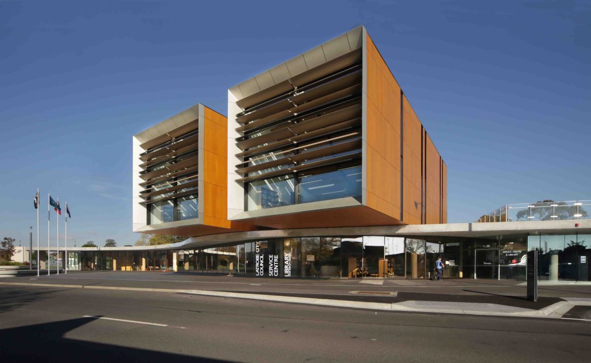
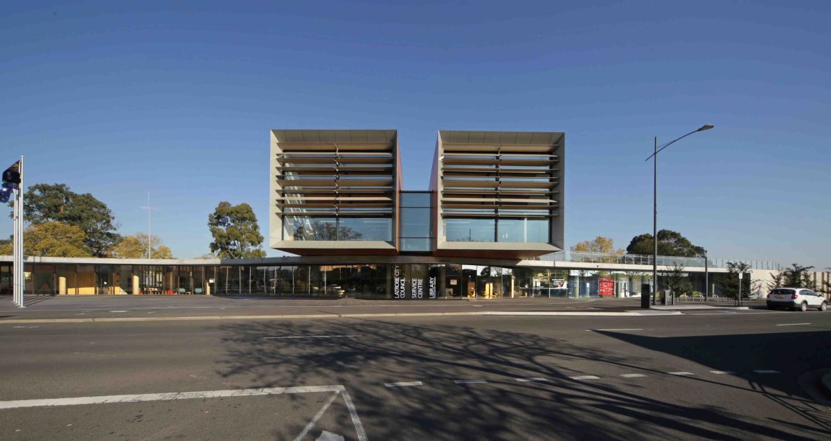
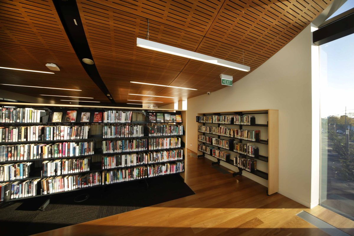
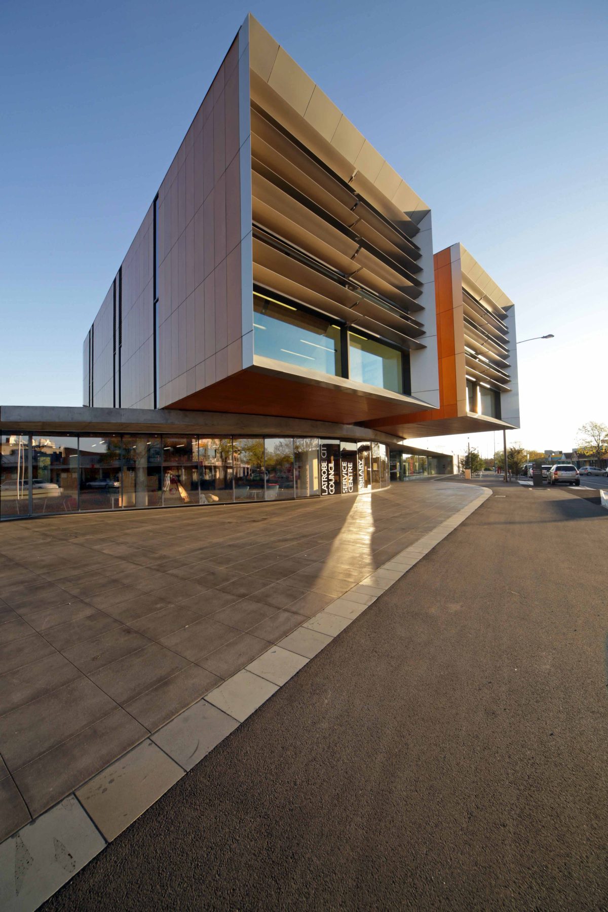
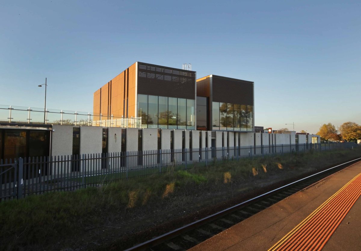
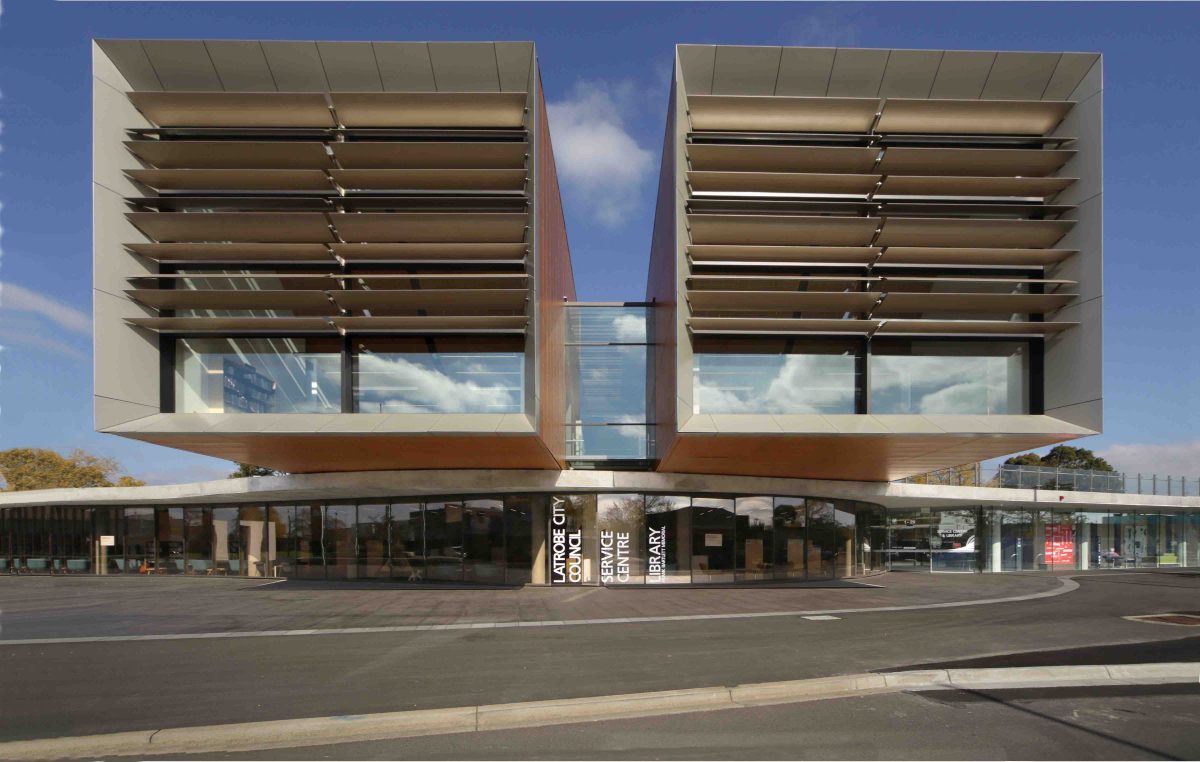
Architects FJMT have delivered a grand civic building of enticing legibility and fine human scale. Slender in plan and open in section, a deft glazing program flows along its length in a way that gently woos and invites the passerby.
Previously split by the rail line, the city of some 16,000 lacked a central community space. Dedicated to learning, leisure, scholarship and play, the Frank Bartlett Library and Moe Service Centre connects once dislocated town precincts. The intersection of new technologies and sharp architecture are showing the way. And not just with rows of old books and hand-me-down buildings, but places that celebrate local identity in unexpected ways. Viridian spoke with Geoff Croker of FJMT about how this project first raised a city’s hopes, and then delivered.
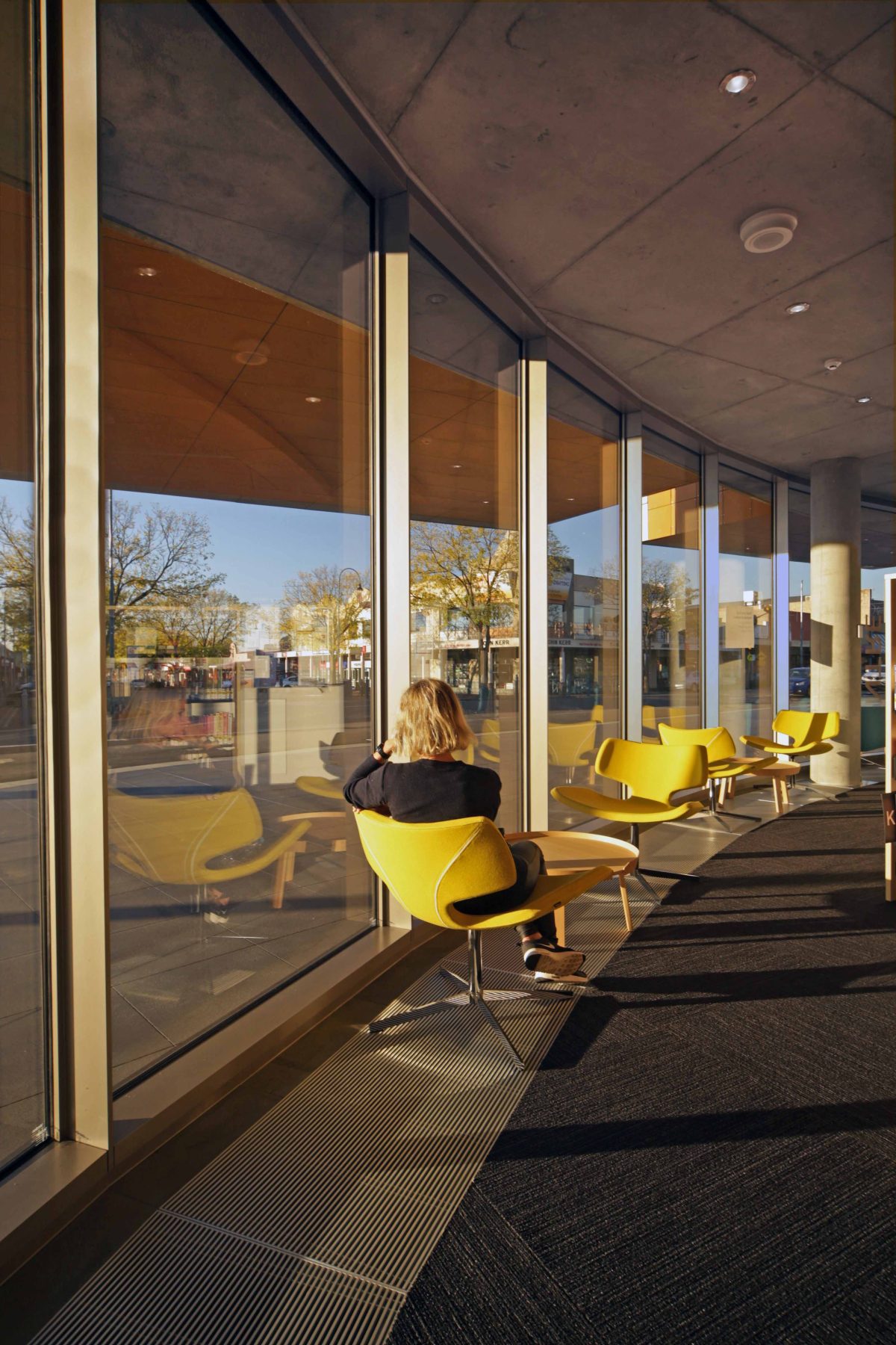
“It’s about people seeing more than just books but a whole range of activities. It’s a safe, welcoming place that’s light-filled, and you can see the community passing by on a daily basis.” Geoff Croker
Viridian: What’s the secret to its success?
Geoff Croker: It’s very bold, but appropriate. The nice thing is it’s community driven.
Why a library in this place?
We wanted to create a new heart and focal point for Moe. The city was divided by the train line into a north
and south. This building aims to bridge both sides of the city while creating a new civic hub. The north-facing
plaza fronting the main street really emphasizes the location and reveals views across the mountains to the north and south.
Was there ever any discussion about whether the city needed a library, cinema, shopping centre, or some other focus?
No, it was always going to be a library, but it’s also a community building. There are also community meeting
and consultation rooms and community kitchen for cooking classes. There’s a green roof as public plaza.
There’s the main street plaza for community markets and activities and a café on the eastern end for train
commuters. That’s all part of a vision which we also participated in for the whole strip, so it’s stage one.
Then there’s a park which includes potentially a skate park, playgrounds and community barbecue areas.
It’s a very pivotal site in a master planning, central town sense.
It’s an exciting site. We studied the whole linear strip and were very keen to engage in a crucifix plan, along
the main rail line and retail strip. We wanted the building to be engaging across 360 degrees. There’s no real
front and back. You can view and enjoy the building from many angles.
Moe is an unexpected location to find remarkable architecture.
It’s a bold move. The town and community was a little down and lost. We felt this was an opportunity to really
do something quite strong and for the people to feel very proud of this new building. And people do. We read about the local community bringing visitors from neighbouring areas in to stay, to see this building. We felt that it was needed and it is very bold and iconic. Architecturally it’s hopefully the start of a whole new
renaissance of contemporary buildings in the town itself.
These types of buildings can be viewed by the community as a great showcase for the architect with their big presence and yet disconnect entirely at pavement level.
Moe sits within the Latrobe Valley and a lot of people forget that it is literally a valley. This building does two
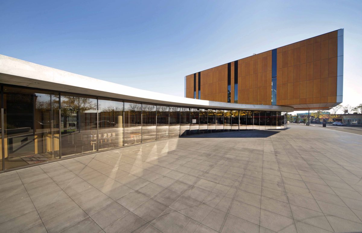
things; at a lower level it gently does represent the movement of a river. It’s a very subtle, low form, the
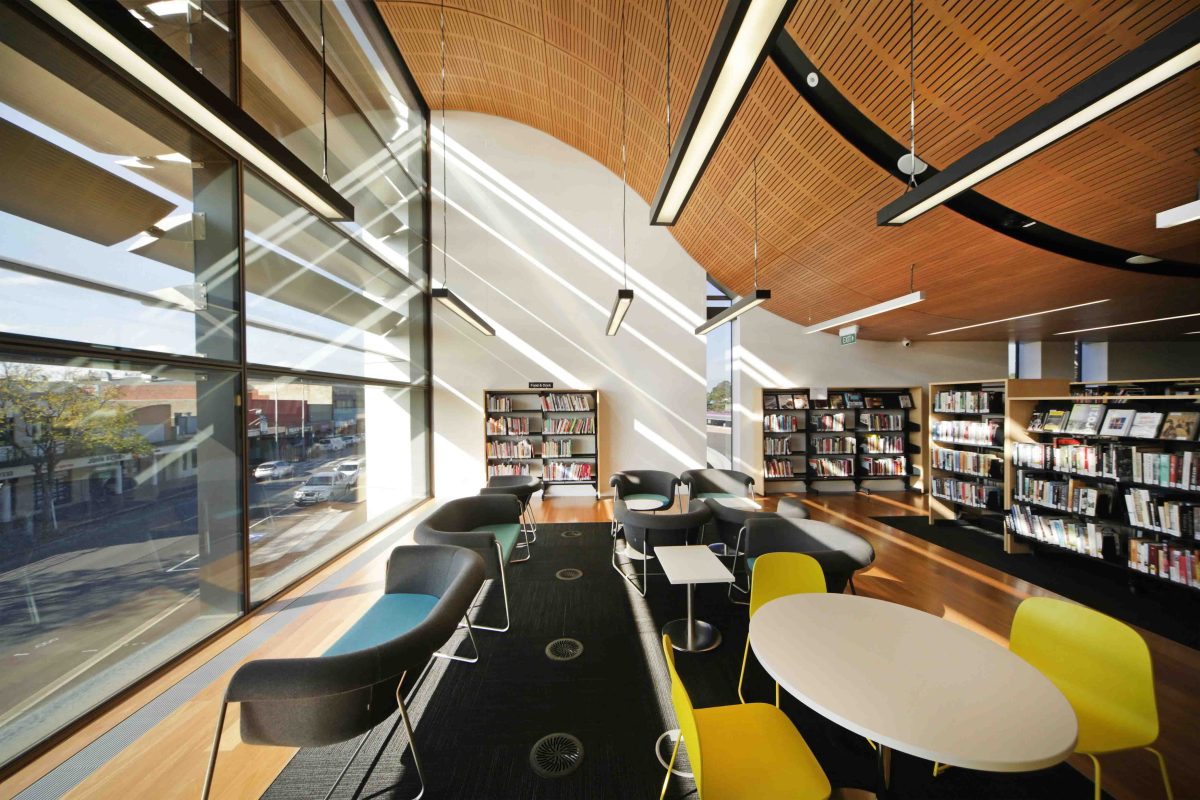
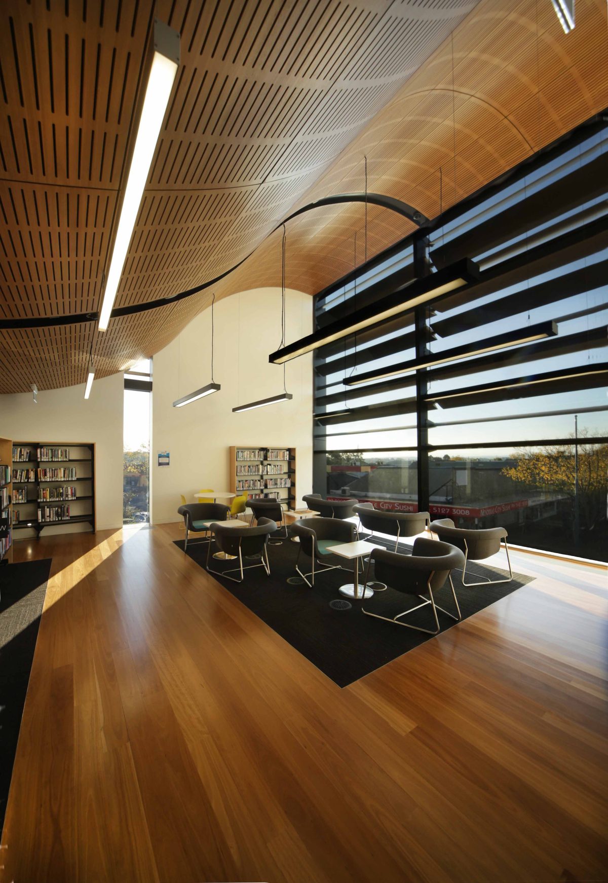
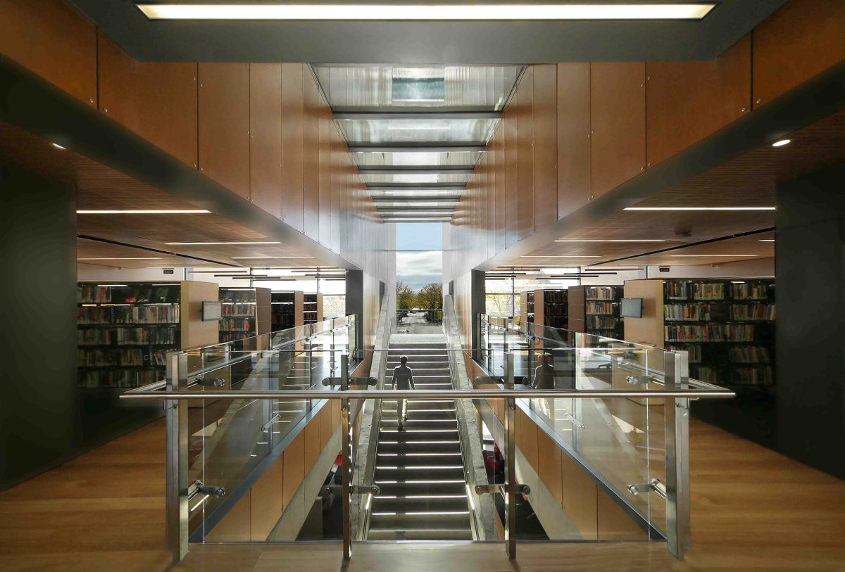
single lower level stretches out to maximise viewing into and out of the spaces. The upper level reading rooms are on axis with Mount Baw Baw so you can be in those spaces and see the mountains.
Was this one of those ‘Ahaah’ moments, to discover that the city hadn’t really connected with the bigger picture?
Many people forgot about Moe’s physical attractions. In the building you hear people saying, “Whoa, what a fantastic view!” So, it was quite deliberate in its form and it does respond, I believe, to its context. It was also
deliberately formed onto the main street, and the plaza wraps nicely into the train station connection. It is bold but some areas are very gentle.
This could easily pass as the very grand, modern residence rather than civic building.
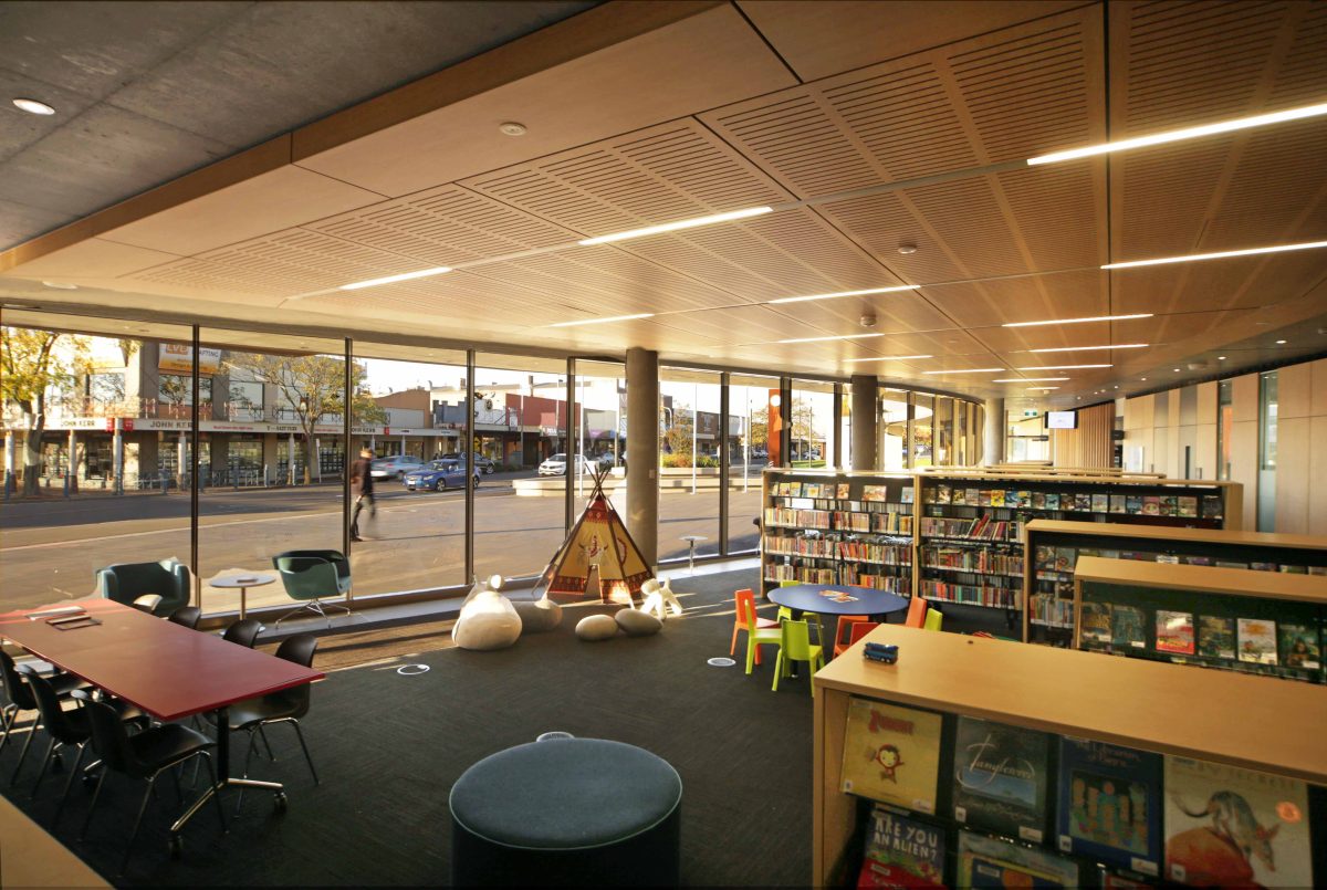
That’s to do with scale. We were very keen to spread the butter thinly on the toast at ground level. We could
have had a more compact square, or form but it wouldn’t have engaged as well with a broader community and city, so the ground floor is deliberately stretched to have maximum interaction with the shops on both sides. The upper level is pushed to a more volumetric feel for a broader visual impact. Those two approaches
hopefully make it feel like a very comfortable building.
It’s obviously quite a task getting user circulation zones right because you don’t want to dominate, protrude or exclude building functions.
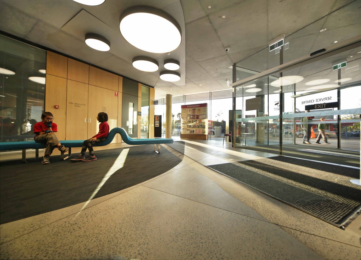
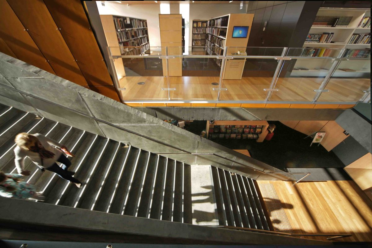
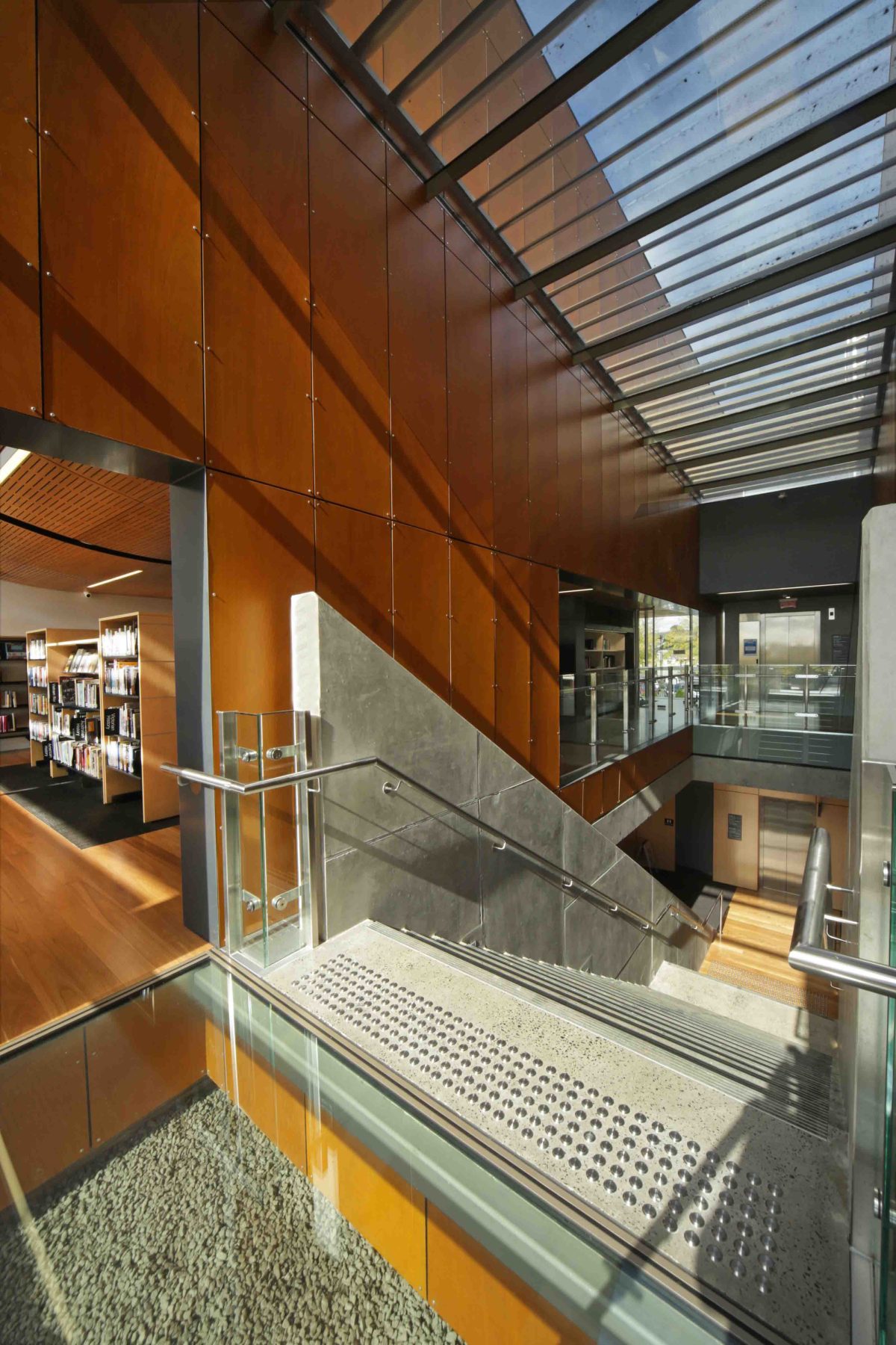
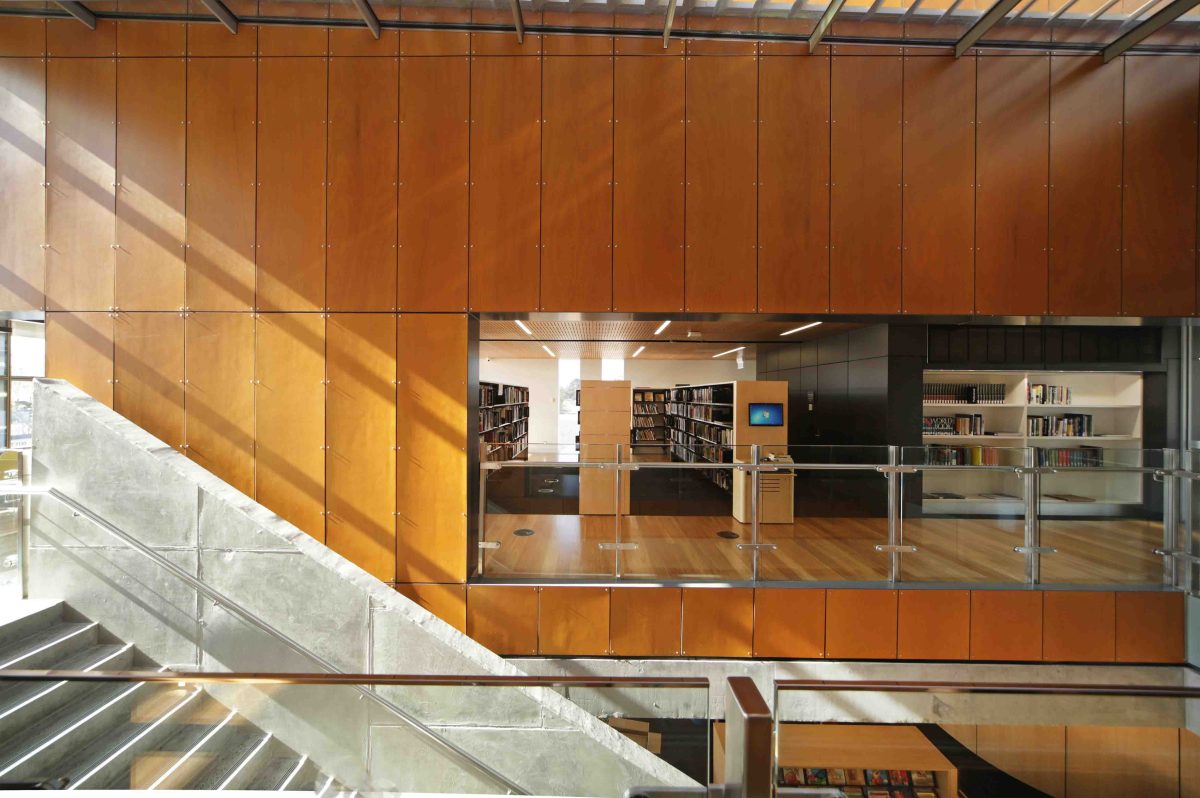
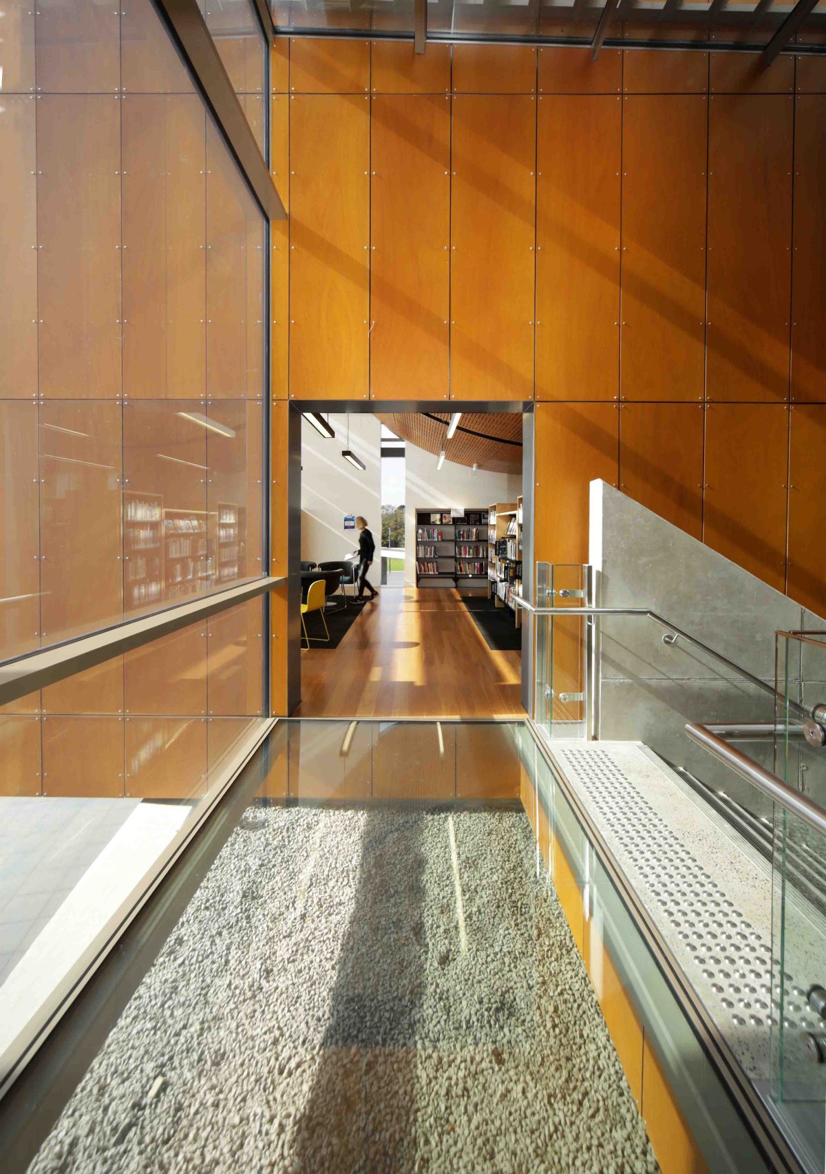
We’re not ones for great, long corridors, for example, with lots of little rooms off them. We prefer to blend
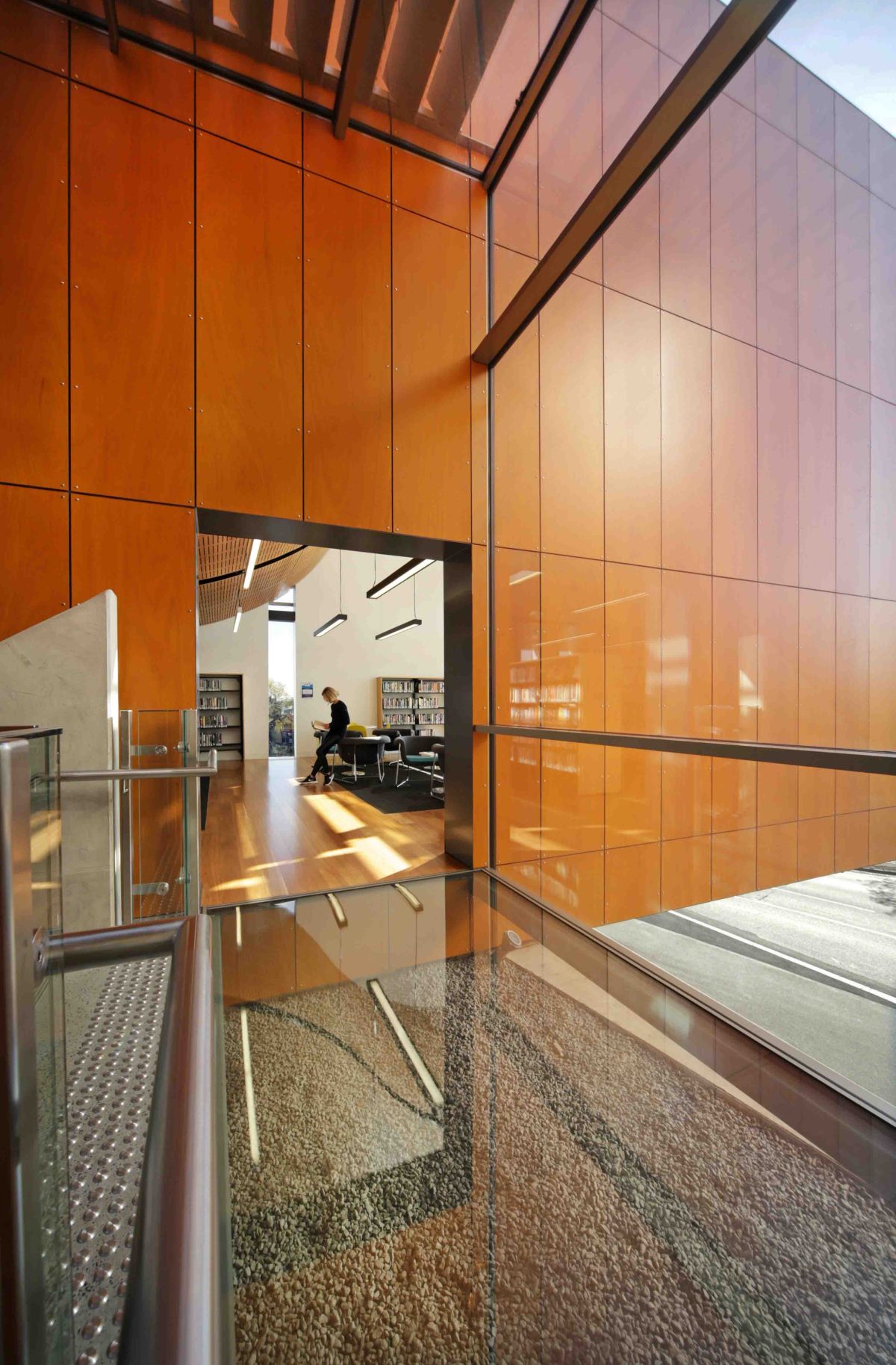
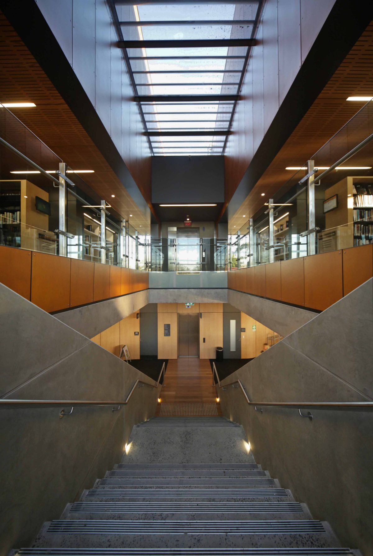
break-out spaces, circulation and functional space into the one zone. The stairs, for example, are directly in axis with the main street to Mount Baw Baw, so every time visitors use those stairs, they look through those windows and in winter see a snow capped mountain. In a library, in a community building, you want to feel comfortable and say to yourself “I can go into that space. I don’t have to ask permission.”
How do you assess whether this type of project is truly successful?
You know they’re successful when the community takes ownership. It has become their building and from
day one we’ve picked that up when people walk around and enthuse about their building. So, a successful
community building is not about winning architectural awards, it’s really about people having a legacy, which
they’re proud of and they enjoy using.
There’s quite a range of glass types that’s central to the vocabulary and ingenuity of the building.
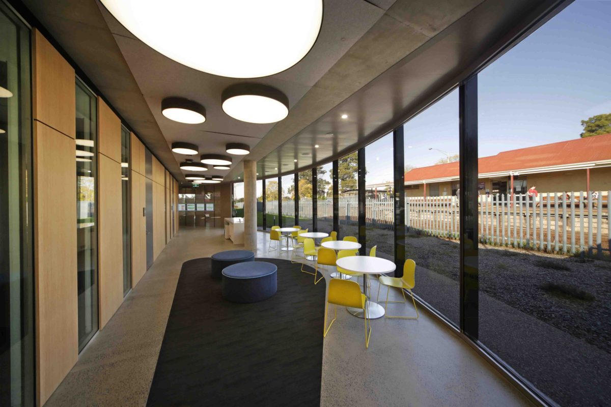
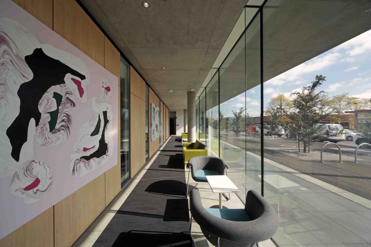
The whole success of this building is its transparency. People want an outlook from the building, but in a community library, you want to attract the public that may not have visited a library for 20 years, or more. It’s about people seeing more than just books but a whole range of activities. It’s a safe, welcoming place
that’s light-filled, and you can see the community passing by on a daily basis.
There’s a wide variety of glass used for specific tasks.
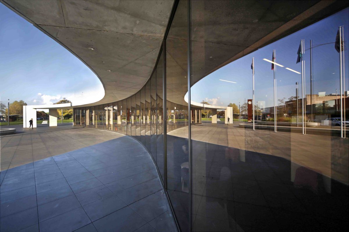
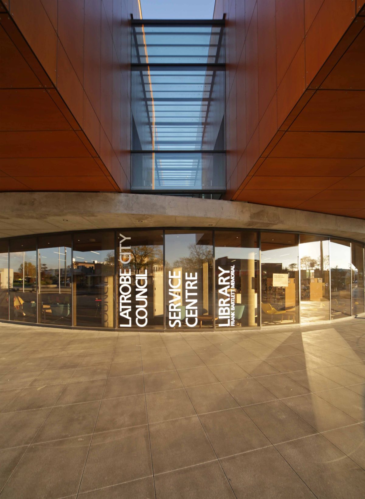
The selection of glass is interesting. We wanted it to be as seamless as possible and there’s a lot of care that’s
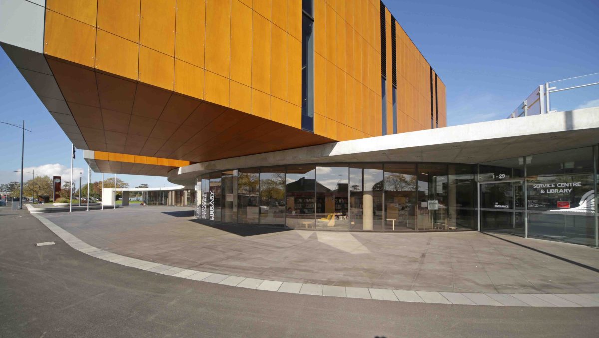
gone into the detailing on ground level. On the curve of faces we’ve used a bronze tinted glass to really emphasise the curve, then it becomes clearer when it moves into the library itself. Then, the reading rooms,
which are double and triple height spaces, really rely on transparency but also high performance because they’re facing north. There’s a lot of glass around the building and while it’s all quite different, it all performs
in a very positive way.
Was there much discussion about suppliers, such as Viridian for example, in terms of specifying the glass beforehand?
We worked closely with the technical team at Viridian. There was an emphasis on using local trades but the glass is important. You need to get it right and we spent a lot of time finessing the glass because we like the material but it does need to be treated properly.
Have you a prime spot in the project where you like to spend an hour?
I really enjoy the view towards Mount Baw Baw. When we first went to the site it was a piece of asphalt. We
hired a cherry-picker and I stood on that platform and delighted at the views. It still puts a smile on my face
to go back and share that aspect with the broader community. That’s a lovely aspect of the building. It’s a very warm space to be in, to sit in the sun and just quietly reflect, or read.
Were there specific site challenges?
You need to be across all buildings, so it meant people in the office made lots of trips to Moe. The old site infrastructure was a challenge and involved early works such as optic-fibre and underground power-lines. There’s lots of challenges building next to a train station, vibrations, noise. The glass was supplied locally, so that was probably one of the easier aspects, if there is such a thing as an easy aspect in a very complex building.
Did the site and setting generate most of the design?
It was really about understanding the context and site. When we first looked at it, it was the back of shops facing a train line. We thought, “What are we going to do here?” Once we elevated ourselves a level and thought a little broader about this valley and mountains, it really started to fall into place. That’s really when a project gets exciting.
Has there been any un-anticipated success?
Well, perhaps it’s not a complete surprise but we’re delighted that the community is really embracing it. The nice part about it is that people feel uplifted about being in the town. The community has produced lovely
blogs writing about it. There were kids on open day, very excited about the new building and being able to watch trains come and go. It has genuinely given a true focalpoint to a city, so it’s got a much broader appeal than just as a library. It’s quite an iconic, very dramatic building that cantilevers over the street by about seven metres. It has been exciting to see how people engage with it. We hoped it would happen but to actually be there to see it succeed like that is really a lovely thing.
