Home Town Hero
Traralgon, Victoria
Suburban and commercial shopping strips are realising the benefits where the legacy of built form is an inheritance rather than penalty. A few hours drive east of Melbourne, Traralgon is a thriving regional town with a population of 24,000 and spread of Victorian-era civic highlights—its 130 year-old Post Office for instance is a show-stopper.
Much more recent development however, is nothing if not pragmatic. This makes the addition of new offices by local architect, Gerhard Giedrojc all the more notable and the result of the considered, rather than hurried, discounted hand.
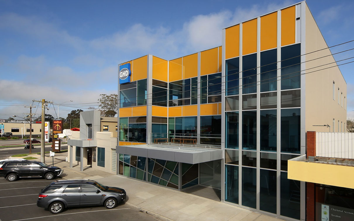
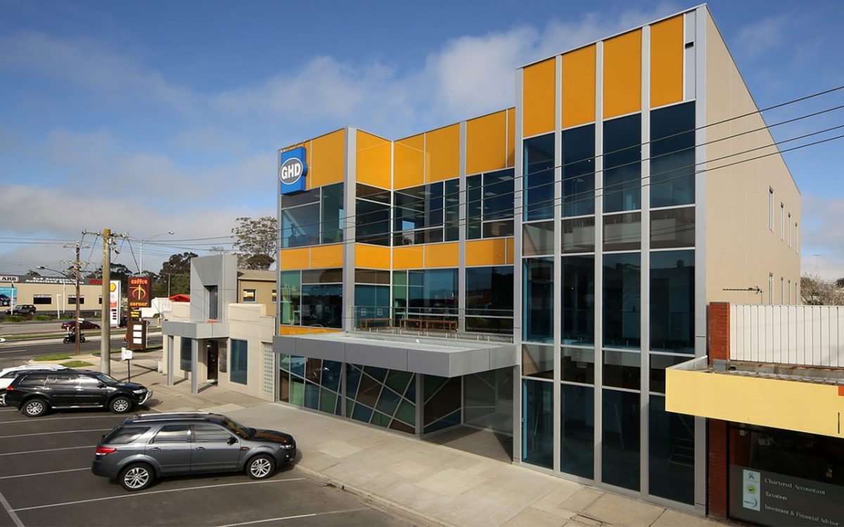
The result blends aesthetics and function and returns to the street, rather than drain it of interest. A multi-hued Viridian sourced glass façade has nothing to do with the one-trick, 1980s mirrored boxes. Instead the coloured performance glazing, central set-back and pavement connections all speak of a lively interaction. If only the metal entrance canopy was a more sympathetic fit—a fritted glass projection perhaps?
Global architects GHD were in need of a new regional home and went with this high-visibility low-rise to craft and office fit-out of transparency and vibrancy.
The firm required an energy efficient tenancy to reduce operating costs and also allow GHD to structure more functional staff workspaces. The developer worked with GHD to ensure that the building was the best fit possible.
Project architect Gerhard Giedrojc spoke with Peter Hyatt about a design that adds to the community’s sense of self.
PH What did your client want when they approached you?
GG The basic brief for this building was to construct the building on a budget commensurate with the leasing rates available for other office buildings in Traralgon. That’s the first criteria. After that the developer/client wants what looks reasonably attractive to the market. My job is to be as persuasive as possible and to say, “Look, we can make it better than reasonable. You can value add to that building.” The whole role of an architect in these processes is to value add for the client while considering the building, its context and surroundings, to deliver the client something unexpectedly good and better than their baseline.
So you’re helping them to re-imagine the possibilities?
Exactly, and it’s an educative process, as well. The more you work with certain people, the more comfortable they become with you and your visions for them.
A comfortable, easy solution isn’t necessarily the best solution?
When you consider the longevity of the buildings, people spend more on servicing their cars and consumables. In some instances, they don’t consider cost in use in the longer term, whether that’s simply cleaning, maintenance, materials or retrofitting. That’s often quite strange, and I try and convey that to them. My advice is that they should care, because it value-adds to their building. The bottom line is increased goodwill and community benefit, a well designed and maintained building delivers. It can be a juggling act to convince people that this is actually good for them.
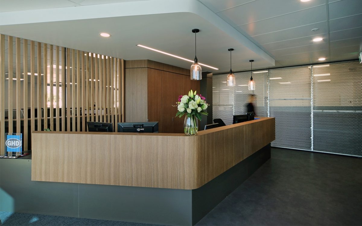
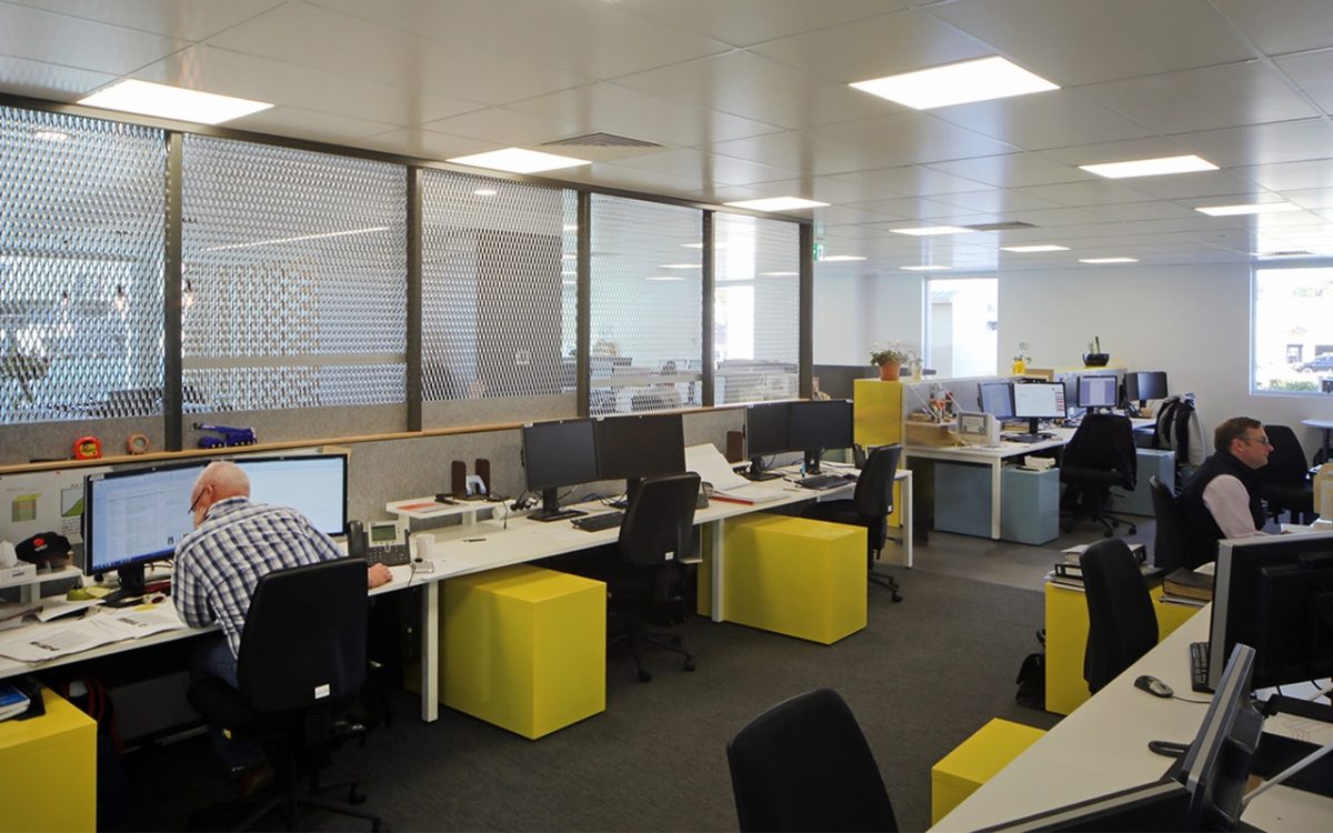
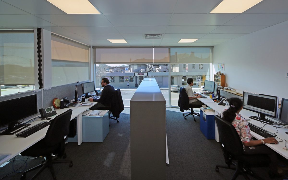
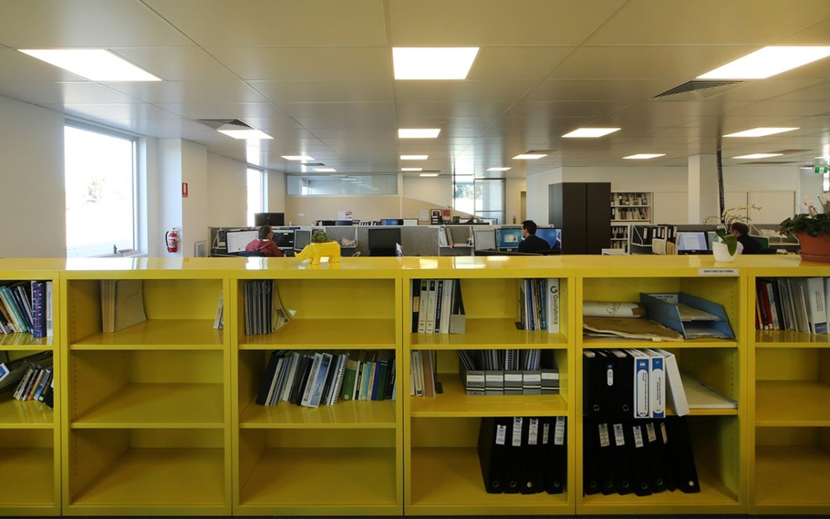
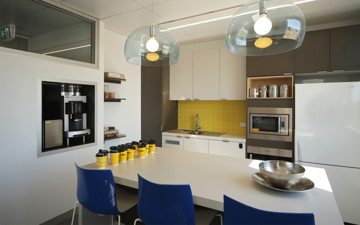
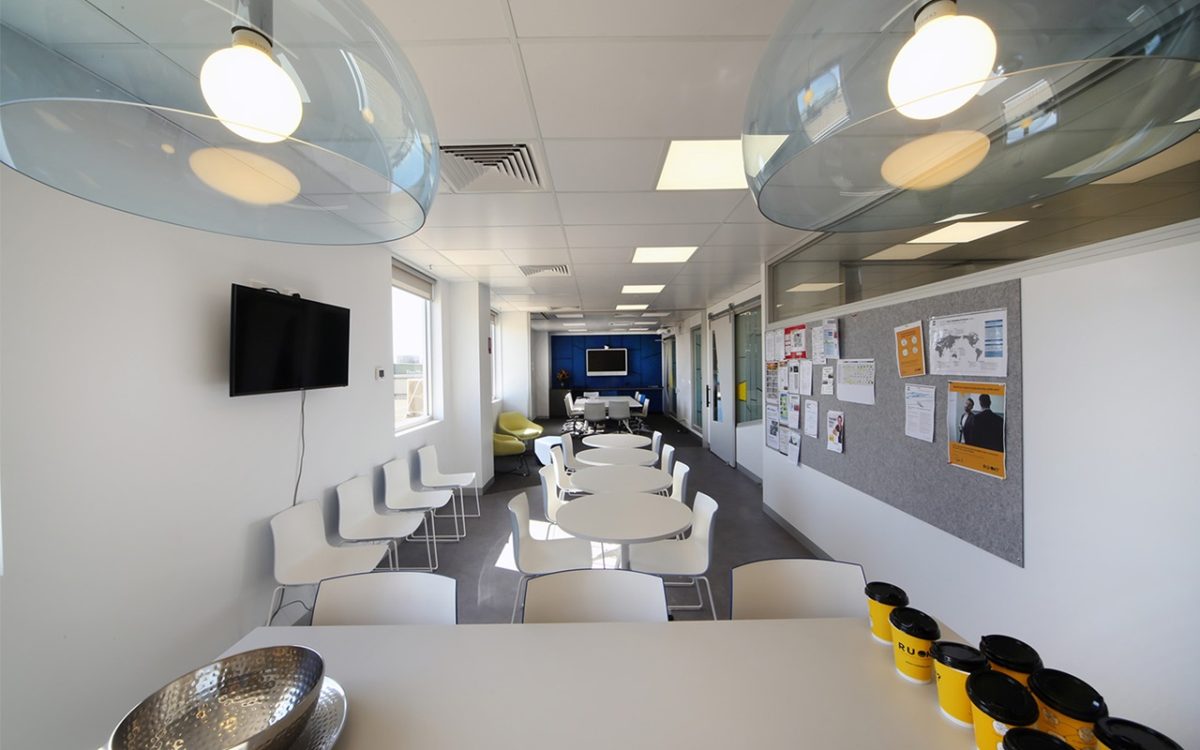
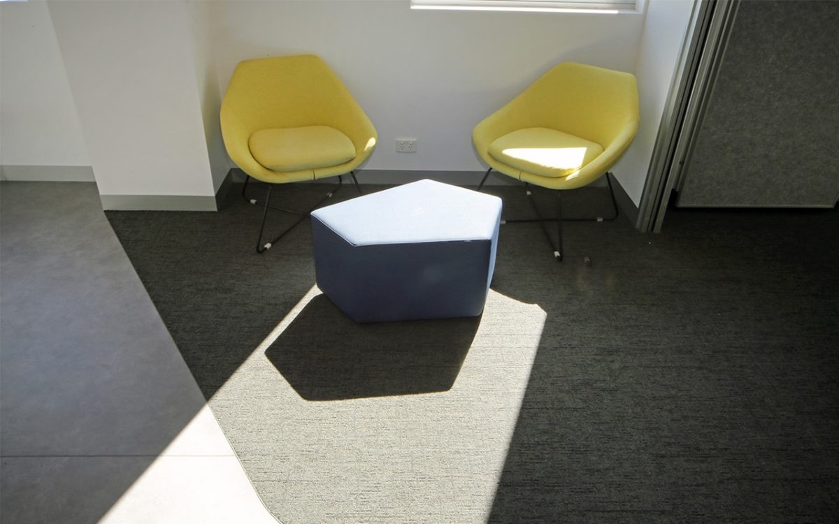
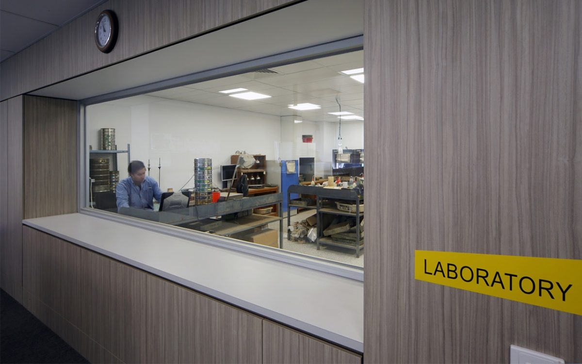
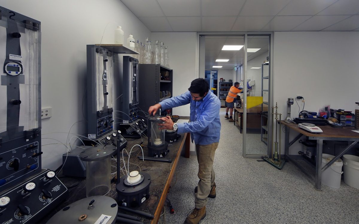
GHD has produced very pleasing, functional interiors for its offices and laboratory and coincidentally complements the spirit of your glass streetscape elevation.
Yes. GHD looked to create a workshop and offices that reflects the group’s philosophy. The most important building element is the street façade and as such that front envelope went through quite a few iterations, but the basic objective was to avoid a linear shopfront streetscape. There is a bigger set-back than most neighbouring frontages. In other words a simple U-shape was created. Rather than to continue the facade as a horizontal skin, those corner elements create opportunity and excitement inside. Staff in those corner areas, transitioning from the lobbies and office spaces obtain fractured views, using different directions, rather than just one view straight out of a window. Those are the subtle opportunities.
It’s a strong glass façade not at all contextual or a reflection of the streetscape. It’s mural –like or a mosaic with jigsaw glass panels.
Yes. It’s asking about the focus. Obviously the focus from cars travelling by at say 60 kilometres an hour on that road, requires that the eye captures something instantly. It doesn’t have time to stop and look. That’s the reason for yellow and some of the stronger horizontal banding. From the pedestrian viewpoint traveling at 4 to 6 kilometres an hour there is more time to appreciate the building skin and your eye can then work its way around that. As the light changes during the day it offers up different perspectives. When you visit many cities and towns a lot of modern buildings are so dark, they’re almost like prisons, and reflect, I suppose, the economic mind-set at the time. People aren’t scared of colour in buildings, especially after any initial surprise wears off.
How comfortable was your client with your proposal?
The design is probably about 80 to 90% of the original intent externally. Our developer/client was welcoming of that because he understood the need to attract a blue-chip tenant such as a GHD. The client also believes in and wished to develop an attractive building for prospective tenants. One that said: “This is a good building and you should be there.” This gives the tenant an image by which they can be recognized and associated with.
“As the light changes during the day it offers up different perspectives.” Gerhard Giedrojc, Architect
What aspect of the building are you most pleased with?
One area is the foyer/lift space. We didn’t have the money for a whole range of architectural details, but it’s just the space for people upon entry to have this lovely breathing space. They’re not crunched into a narrow stairway, or just straight to the front of a lift door where there’s no room to move. It just adds to the feeling that the building’s a nice place to be. The other element is that we were able to use the three types of Viridian coloured glass, rather than just clear glass or one colour. It needed the three—bronze, green and blue. They work beautifully together.
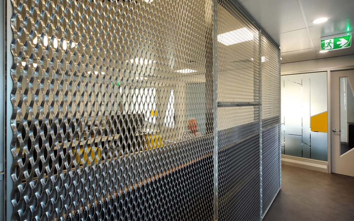
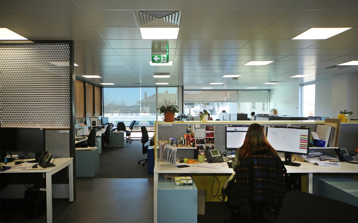
There’s a highly complimentary aspect in GHD’s fit out that maintains that very free flowing form with discrete, private spaces too. There’s some cool glass interiors that fulfil the external promise. So often not the case.
You’re right. That’s exactly what happens and is definitely to GHD’s credit and speaks of the professionalism GHD brings to the Latrobe Valley. If you have something that works, don’t try and overpower it, don’t try and destroy it but rather enhance it. And they have done just that. There is a synergy between the exterior and their fit-out.
What research went into settling on the colors and understanding the glass you were installing?The colours come from Virdian’s standard range of Super Blue, the Super Green, and Bronze. They needed a certain energy rating and are a double-glazed system. Once those three colours were selected I had to be sure I could make them work in combination and at a scale that reads well. Glass is the key to this building, bar none. It determines the building. It wasn’t the other way around. The building was constructed and then the glass was selected to suit.
Did you require Viridian’s technical assistance?
No, in most cases, these buildings are small enough to not require technical assistance. They did cut the glass, of course, and the builder had to make a pattern for those shapes, so that they could be cut by Viridian, because the normal shopfitters would have a lot more trouble doing that.
Has there been anything about the project less, or more, pleasing in its realization than you planned on the drawing board?
That’s a two-fold question in the sense that I’m never satisfied with the result, because your vision is always different to the reality. You can always learn and do better. You can only achieve a certain amount of that in the realistic sense, but what is pleasing is that when people see something that they don’t expect they tend to like it, even though it may not be that radically different. I think that’s the most pleasing aspect of the whole process. All of the hassles and tribulations and trials that go into something like this, and the arguments that ensue, when in the end, other people are happy, then of course, the designer is happy, as well.
What do you hope that the architecture fraternity and wider community can learn from this building?
Just a sense that we can do something a little bit nicer and better, even if by small steps. That if you have an architect on board, they will almost certainly attempt to elevate the project and raise the standards, not to mention the whole experience of it and add to the longer term value of the project. And remember, it doesn’t cost any more to do something right. It’s the same cost if not more, to get it wrong, as it is to get it right.
Anything else you’ve learned from this project?
To ensure that the shopfitters and builders understand it takes time getting the fit and shape of these glass units correct when it’s not a standard curtain wall. That will avoid the need to go back and deal with issues. When something is a little different with say, the incline, or cut of glass and setting into the frame, they need to ensure they understand what they’re doing and that they are patient.
Was it a priority to source local materials where possible as part of quality assurance and sustainability?
Definitely. Most professional developers recognize that no matter where the building is constructed, you need to try and use local people and materials where possible. The community needs to get the maximum benefit from the use of local technologies. Anyone can just go and put something somewhere, freight in components and set it up. This may save some costs but deprives the local community. They deserve to be serviced and we try to reinforce the role of local manufacturing, services and trades. This project was the perfect opportunity to demonstrate that.
