Hawthorn Residence
Melbourne, Victoria
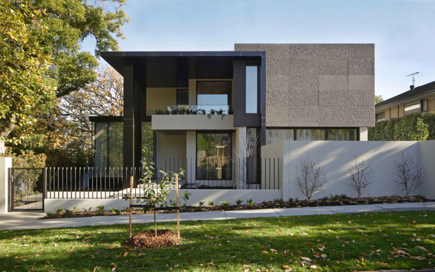
Dressed up and ready to go, this design of soaring volumes, tuned materiality and clever connections produces a home of impact and light-filled delicacy.
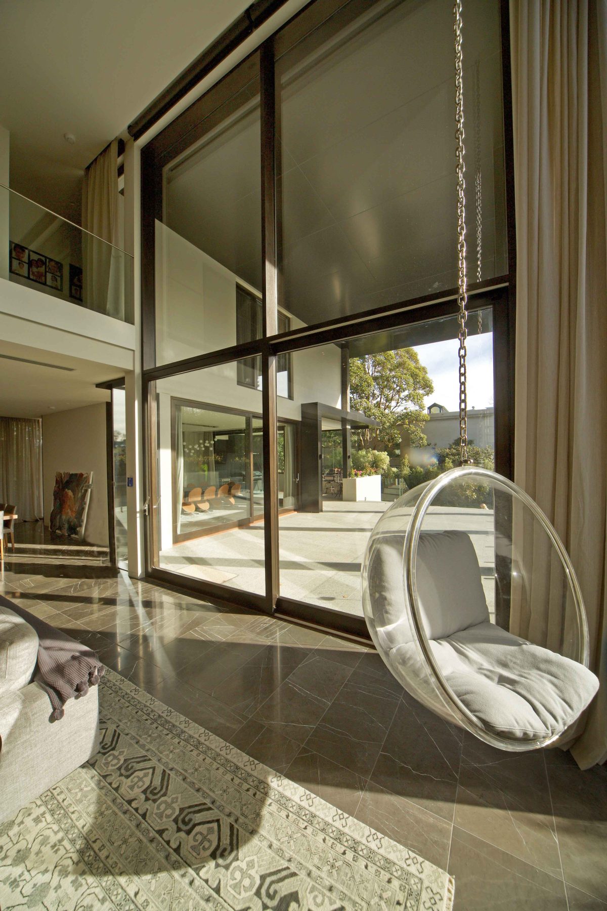
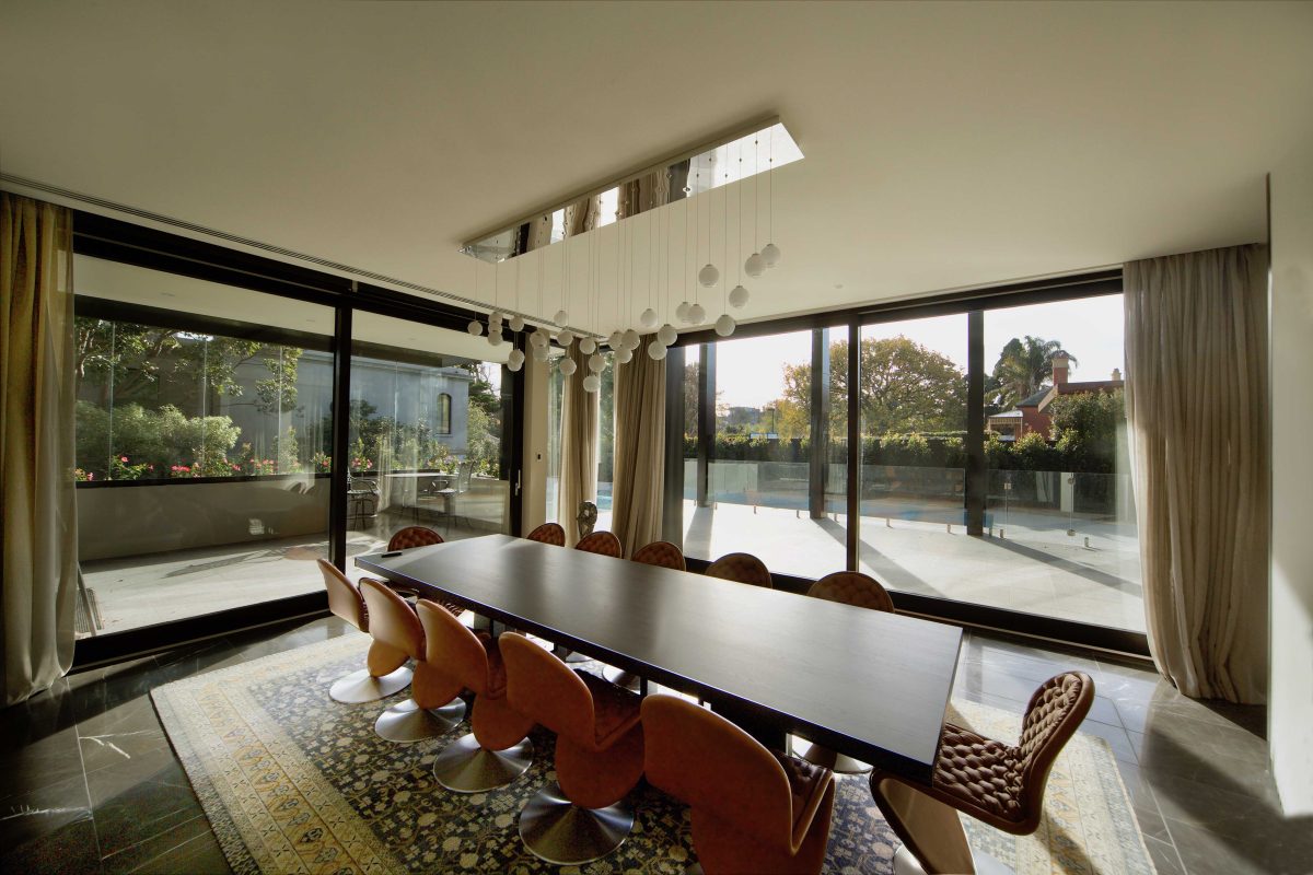
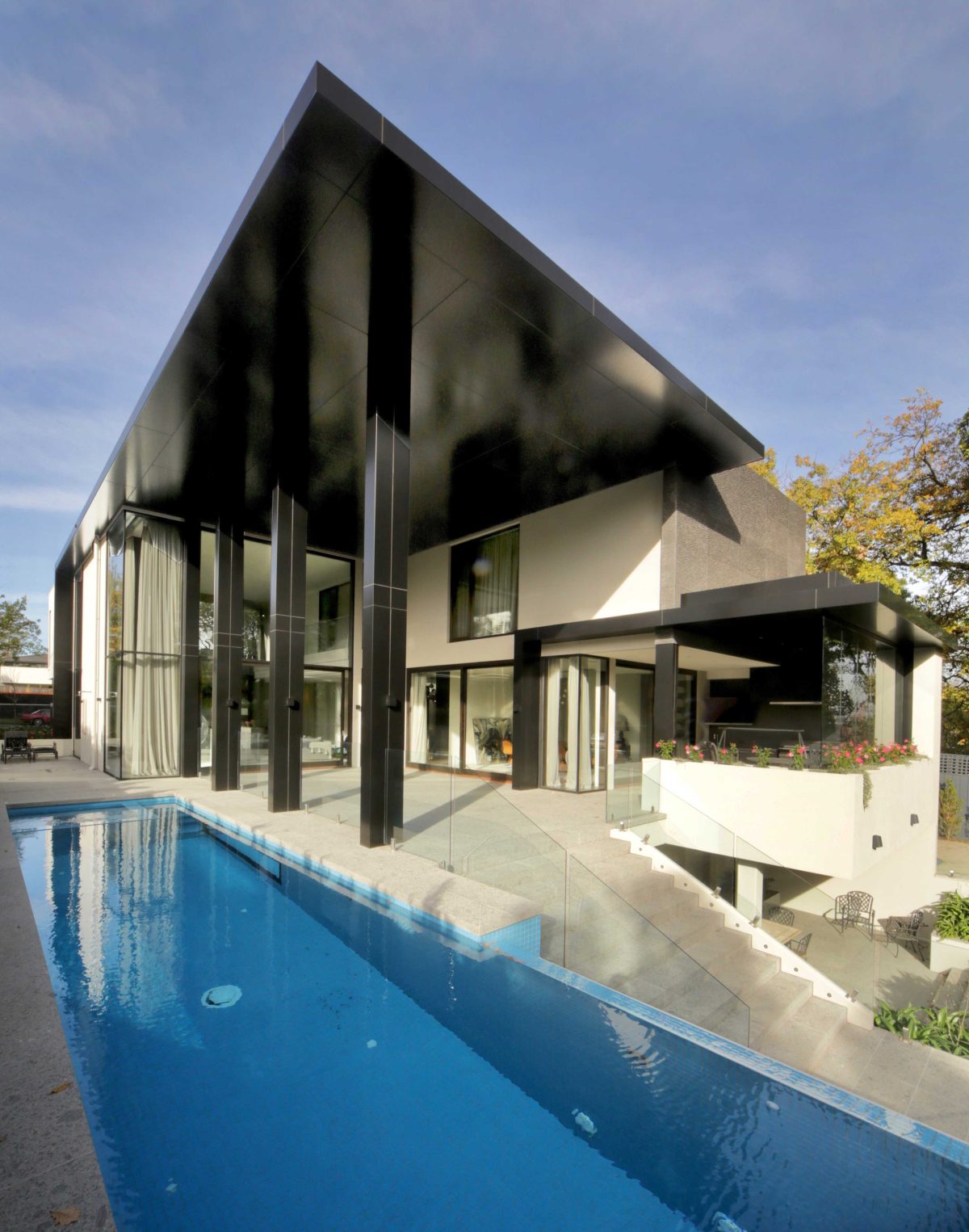
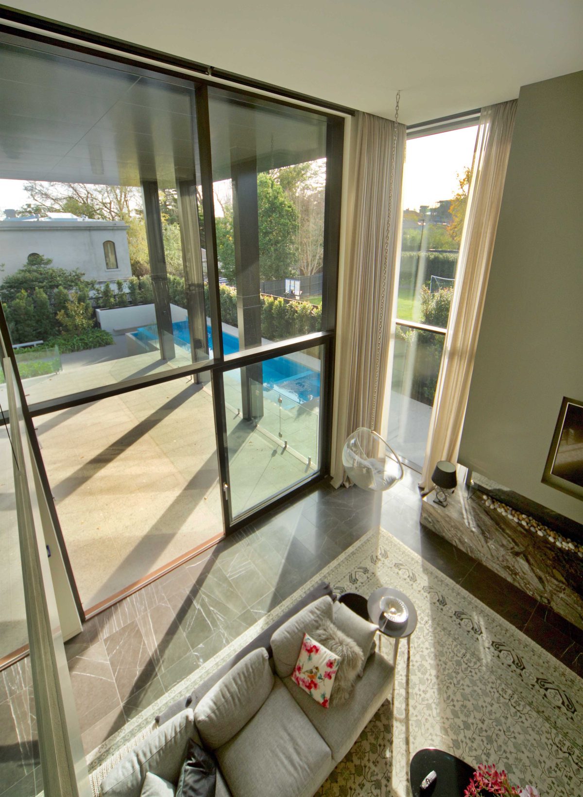
Melbourne architect Gary Catt has more than a few decades experience honing his design blade to a fine edge. Nowhere is this better exemplified than the firm’s mighty windows-as-walls that culminate in an all-round sensation planted, rather than transplanted, into its setting.
Preferring the bespoke to off-the-shelf, Catt steers an altogether different course. In the process his bravura design reveals an architect skilled in the organisation and arrangement of big ideas. Notably it’s windows and glazing that herald a house full of design wonder and surprise.
Not least, Paarhammer’s windows which are crafted from local materials in the best European traditions. Viridian performance glazing and locally sourced timbers rise in a show-stopping ensemble.
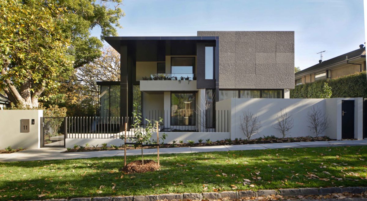
High, wide and handsome, it pays full regard to its key elevations ensuring the back door with its heroic port-cochere is every bit as impressive and artful as its street-frontage.
“The great quality of glass is the fact that you hardly see it. It’s the one thing you want to be invisible. Good specification and good handling means glass can be enhancing and also invisible.” Gary Catt, Architect
Architect, Gary Catt spoke with Viridian about his big picture ambitions for clients wishes for privacy and vista.
Viridian: Do you have a ‘house style’?
Gary Catt: It sounds a contradiction in terms, but we pride ourselves on NOT having a style. We interpret our clients’ needs. We’re there for our client. We’ve had 30 years or more and we’ve seen the styles come and styles go. There are certain classic elements about styling. But if you get the massing right and the materiality right, and you can reflect what the client really, really wants – that’s the style we’re after.
Does this house vary substantially from a house you might design in another suburb?
The street’s important. You’ve got to have context. I don’t really like “feature” architecture that stands out like the proverbial on the street. I like the good neighbourly approach. Here however there is quite a mix of styles. We felt quite comfortable in doing a very, very bold home. Our clients wanted some drama. That’s what we went for.
This is a house of very emphatic volumes and proportions.
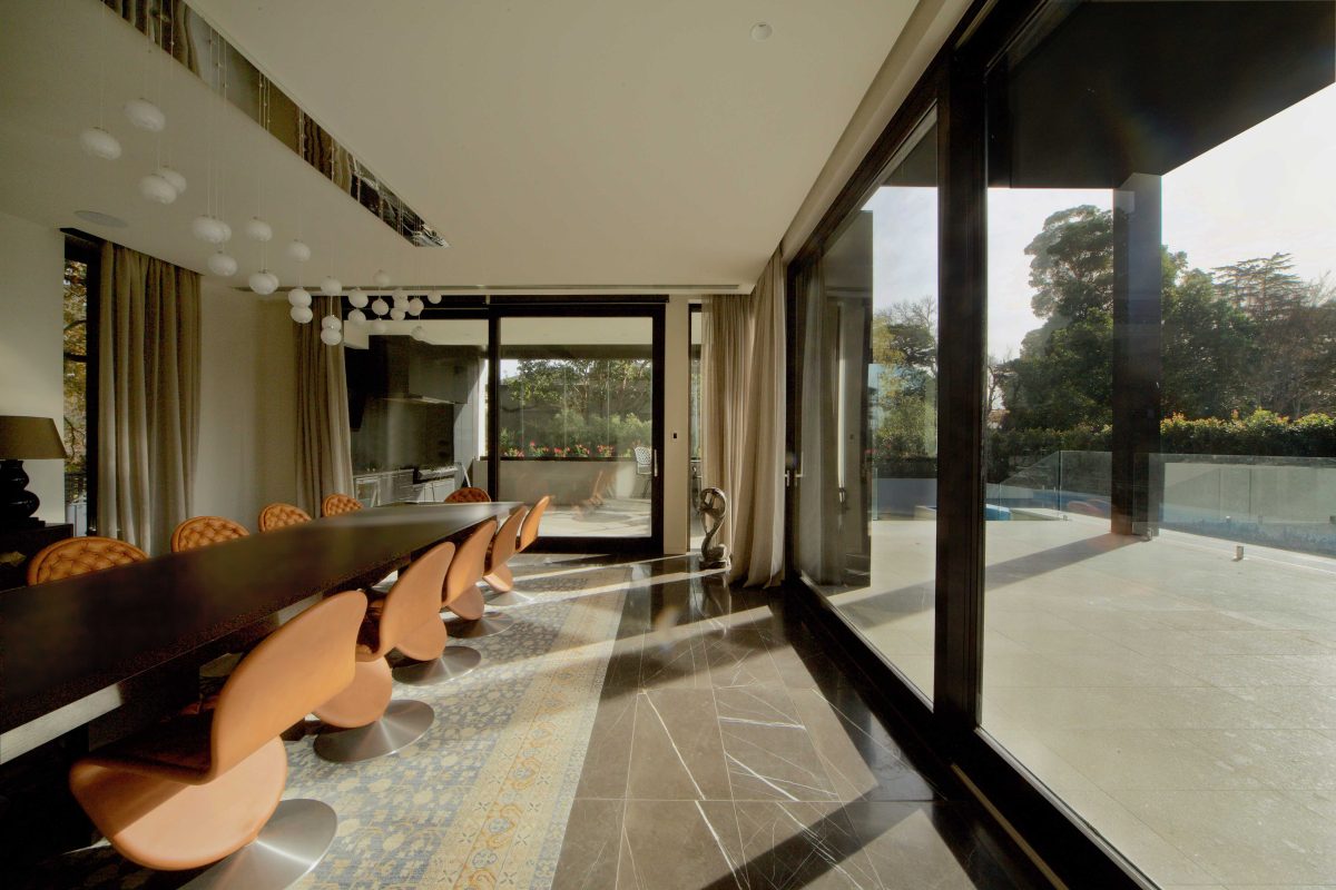
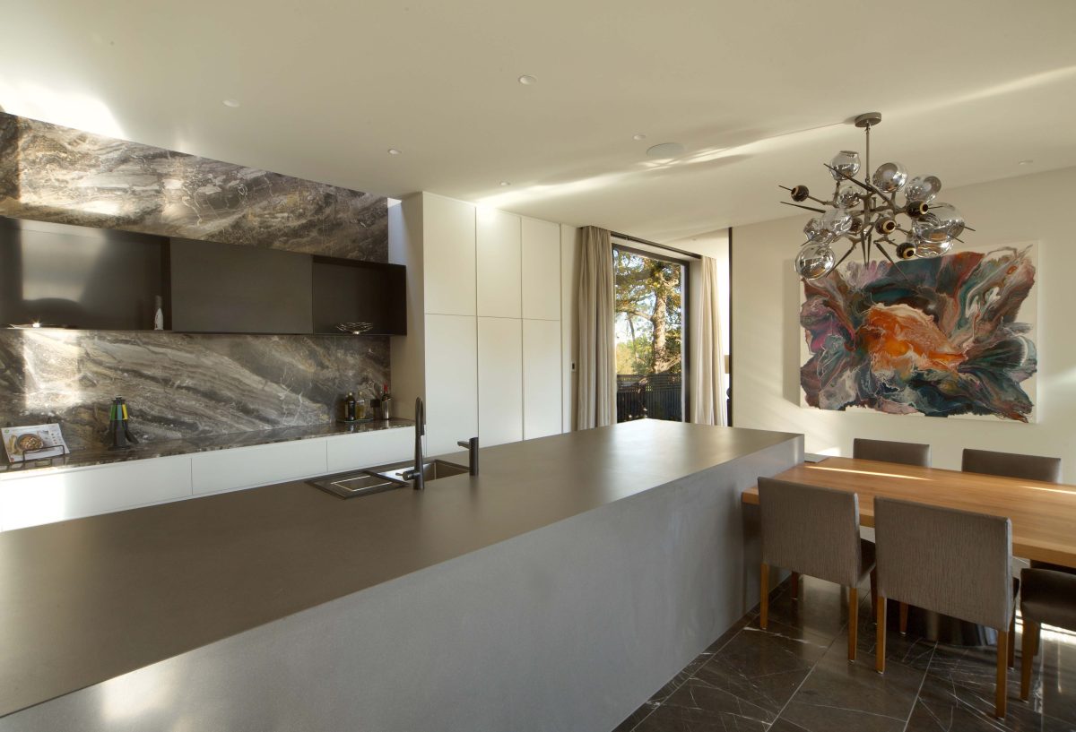
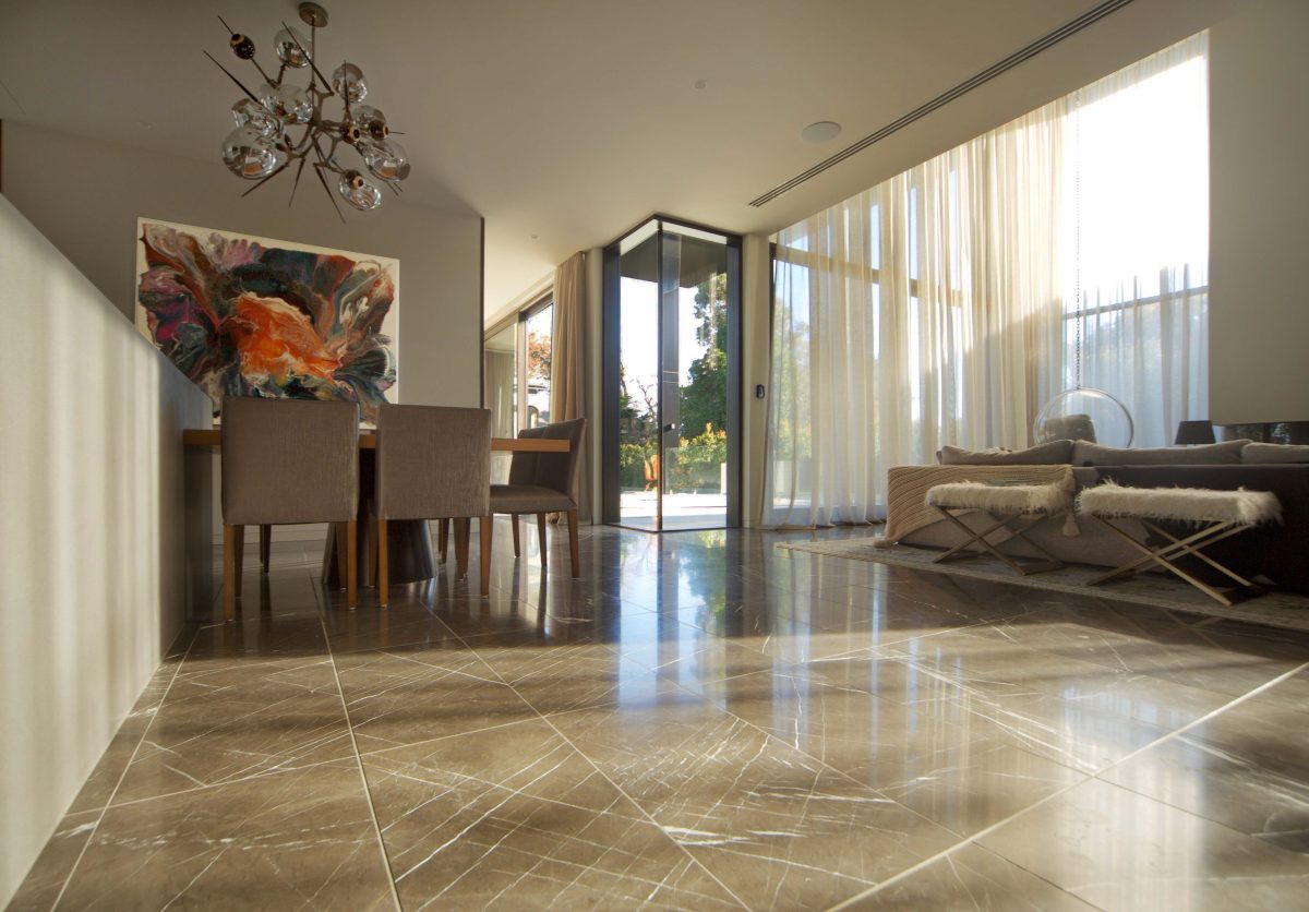
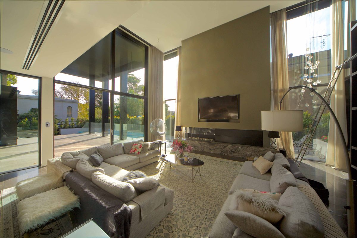
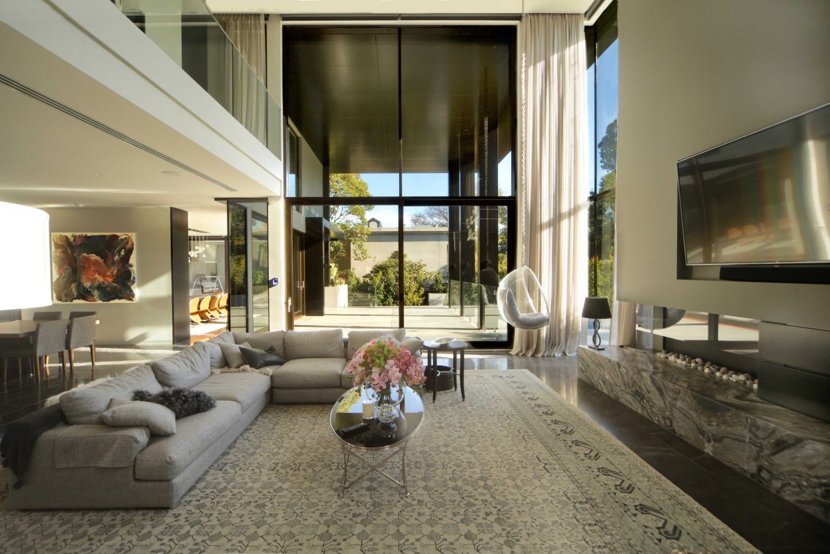
That’s part of the drama. This is a family home with family spaces for a biggish family. They’ve got lots of relatives and lots of friends. It’s an entertaining home. It’s a house of gathering spaces where you can come and go and retreat from. But the volumes had to be generous to be able to take quite large crowds.
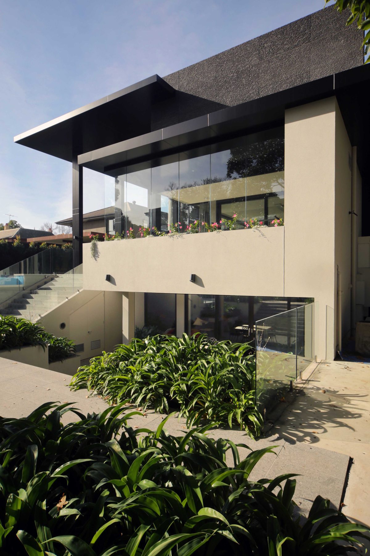
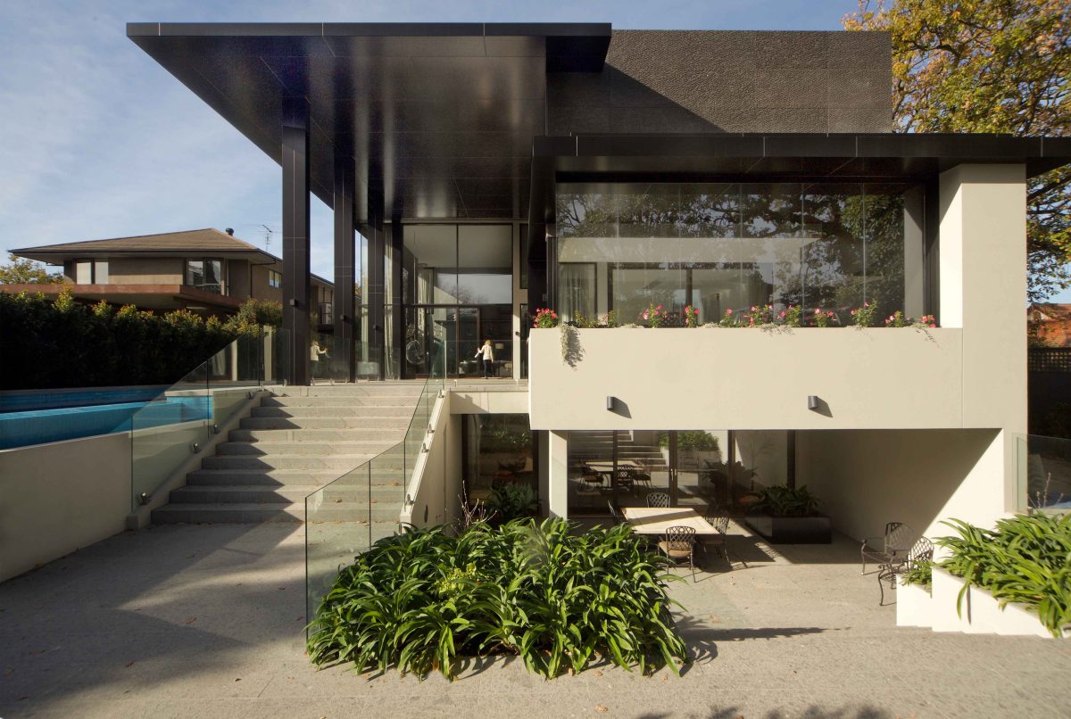
There’s also a unique-ness about the topography. We had lovely trees and outlooks. And we had the need to put in the home a very substantial basement. I didn’t want to create a basement that was entirely underground. By lifting the home up and then dropping down the back level we could open up the rear of the basement with full width stairs leading up into the back garden. That bottom level now forms a three-level building, and it doesn’t feel subterranean.
Throwing that two-storey roof on the back and carrying through that volume helps with the west sun. As the sun moves around the site, there is lots of protection from summer heat but lots of winter sunlight in outdoor areas and into the house. There is a freedom of movement from indoors. Throwing open those massive doors and still not have any chance that the weather can come inside is a fantastic result.
Is this your biggest window wall?
It’s the biggest I could get. I wanted it big. The whole thing about the Paarhammer product is this lovely gliding system and the gutsiness of that timber frame. We could have done it in aluminium. There’s many ways we could have done it. But the overall effect of that softness of the wood and the matte of the time of years on the wood, plus the big sheets of glazing just gave it breathing space. It’s appropriate to the scale. We wanted dramatic. It’s thermally brilliant. We just love the whole effect.
What other qualities do you try to engender?
Beyond the usual spatial needs such as bedrooms and bathrooms etc. what does it do to your emotions? Why
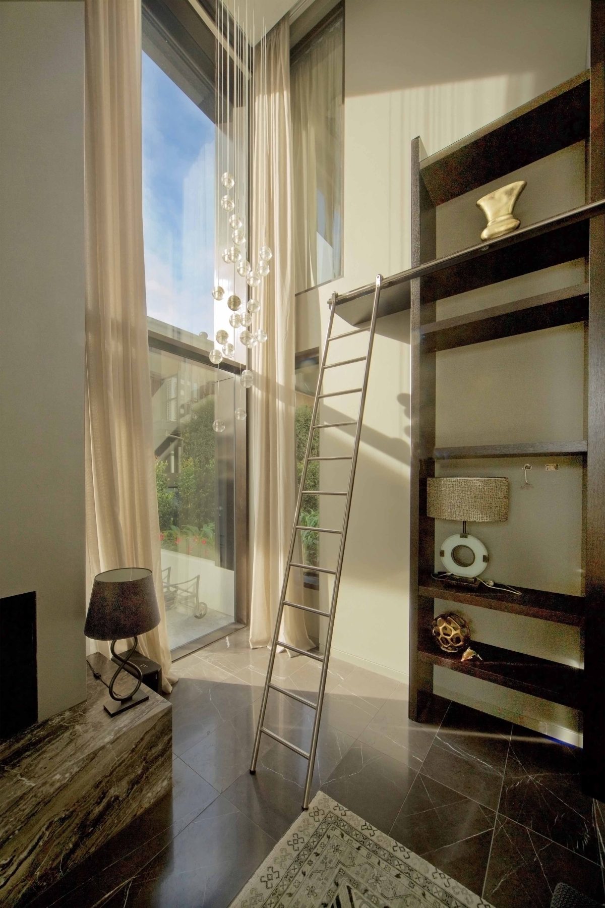
do you enjoy living there? What is it about coming home to that house that keeps the enjoyment going? It’s these surprises, these elements of space that are like lungs. It’s like breathing when entering through a lower ceiling and coming out to a higher ceiling. And the effects we can create with the light add to the continual enjoyment and discovery of space. We often get people writing to us years later saying, “Look, I get up and I just love living here.” That’s our product. That’s our style. Someone that loves living in the house. That to me is everything.
Your windows bring alive the surrounding trees and sky.
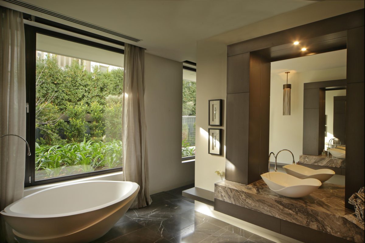
Yes, I’m absolutely amazed at glass. To take sand and turn it into glass that can also be structural. It’s just the most amazing ingredient. When I first went to the United States in the ‘80s and saw handrails in sheets of glass take on a structural quality, I just knew that the future had to be building bigger and bigger elements of glass. Now we bring in the whole environmental business of thermal qualities. Now we’re into double-glazing, triple-glazing. We don’t have the extremes of the European climate, but the Europeans have really mastered the use of glass. It’s a remarkable technology given all the elements of construction – lifting these sheets, installing them in a high-rise and allowing for wind loads. I just think glass is amazing.
Where do your designs begin?
We start with: “What are the limitations of the glass panels we have to deal with?” That becomes a module
you’ve got to work into the building. That then translates to control other expressed joints in the job. The whole thing has a harmony, but it starts from really understanding your products and materials to begin with.
Perhaps the art of architecture is as much the business of problem-solving.
Well, the definition of design is problem solving. If you are creatively creating problems, then you’re going to have to creatively solve them. If you go into a design without enough technical proficiency, you’re just into
graphics. A lot of people are. They have a lot of trouble about how to make it and it becomes the builder’s problem. We’ve got to be responsible for the sensible and practical use of our designs. If you’ve got to live with the results it better be something you have affinity for. You won’t really like it unless you agree with it. So we’ve got to find that point of agreement. With our clients we get permission right from the start to stretch them. We design houses for people. They’re not our houses. We are a service business and we like to think that we are creative and bring a lot to the table. But at the end of the day it’s their money, their lifestyle, our responsibility.
What was your design starting point?
I wanted wow appeal from the street all the way through to the back. I didn’t want the back of the house to be second-rate to the front. If you look at that home, you could have put the front of or the back of the house
facing the street. It had to be that 360 degrees experience. That was a driving thought to this creative urge I had and, I think, they had, too. And the kids started to get involved. The kids were growing up. The kids had
thoughts. They had imagination and it was to give the kids an experience, too, of how it could be. And I’d like
to think we achieved that.
What do Paarhammer windows and Viridian glazing bring to the equation?
We’ve used Paarhammer and Viridian before. The windows take your eyes vertically. That strong element runs through and takes the eye up. One of the things I’ve been developing, you might notice, is that whole soffit of that very high second storey, Alfresco, if you like to call it, in the front and back, is black. And the interesting thing about black is that black reflects. And when you get up to the second level and look along the horizontality of it, the black turns to pewter. So it’s not overwhelming. It’s sort of counter-intuitive, you might think that this sort of heavy blackness would be oppressive. But it isn’t. It actually gives you a dimension without feeling oppressive. The window frames had to then be the heavy, black, gutsy frames to talk to it.
Because you’ll notice that the columns that hold up that external high roof have also got the same sectional
impression that the windows give. That’s a theme. That’s a column theme that runs through the job.
Isn’t the task to make it appear as though it was never a task?
I think you’ve nailed it. The definition to me of a professional is someone who just makes it look easy. They just happen to know, and for us it’s been over 30 years of hard won experience, exactly what to do. That’s our job. It’s not the job of the person living in it to wrestle with it, or come to grips with it. They pay us to do that. It’s a hurdle race of an infinite number of hurdles that we don’t want our clients to worry about. We’ll get you there. In the meantime, you build and build and build and build. And this is why over a history of working you build your relationships with your associates. And so they all understand how to integrate, so we don’t have air-conditioning passing through our beams. We go overboard in documenting because we want to work it out on paper rather than working it out with a jackhammer
Do you have a philosophy about sourcing materials locally?
Look, there is. Can I also say, too, that it’s been a learning curve working with glass. We need local people like Viridian. We can’t work with an overseas supplier and then fix the problem when it lands here. Also, glass is one of those things I can’t protect enough throughout the entire job.
The great quality of glass is the fact that you hardly see it. It’s the one thing you want to be invisible. Good specification and good handling means glass can be enhancing and also invisible.
