Ivanhoe House
Ivanhoe, Victoria
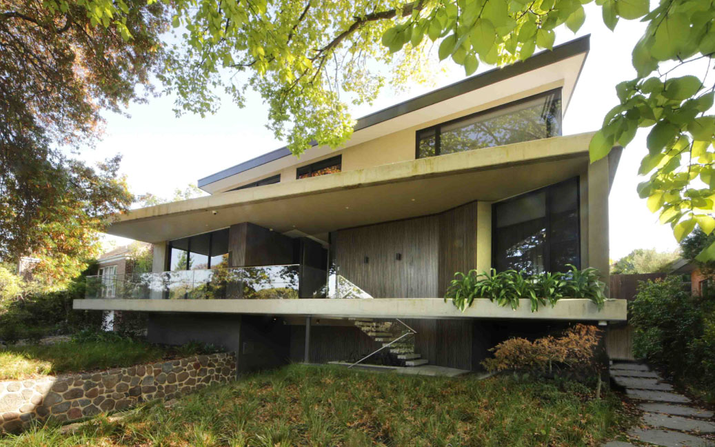
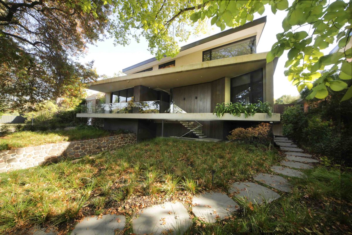
Sited on an elevated, sloping allotment, the design retains much of the existing garden. From the street-front, the house projects with a magisterial authority. Its balconies and windows fully engage with a pair of Pin Oak and Golden Elm trees. Scroll down to read more, watch the video and see the picture gallery.
Frank Lloyd Wright made the cantilevered house his own with the Robie House roof (1910) and Fallingwater (1937). Such projections were the stuff of dreams and illusion, floating, gravity-defying structure.
Mies van der Rohe’s radical glass, marble and steel Barcelona Pavilion (1928) was another turning point that turned modern architecture on its head.
Both of these achievements inform Melbourne architect Daniel Xuereb’s monumental design amid Ivanhoe’s leafy boulevards. And just like his lofty predecessors, Xuereb works overtime to ensure the opportunity is grasped.
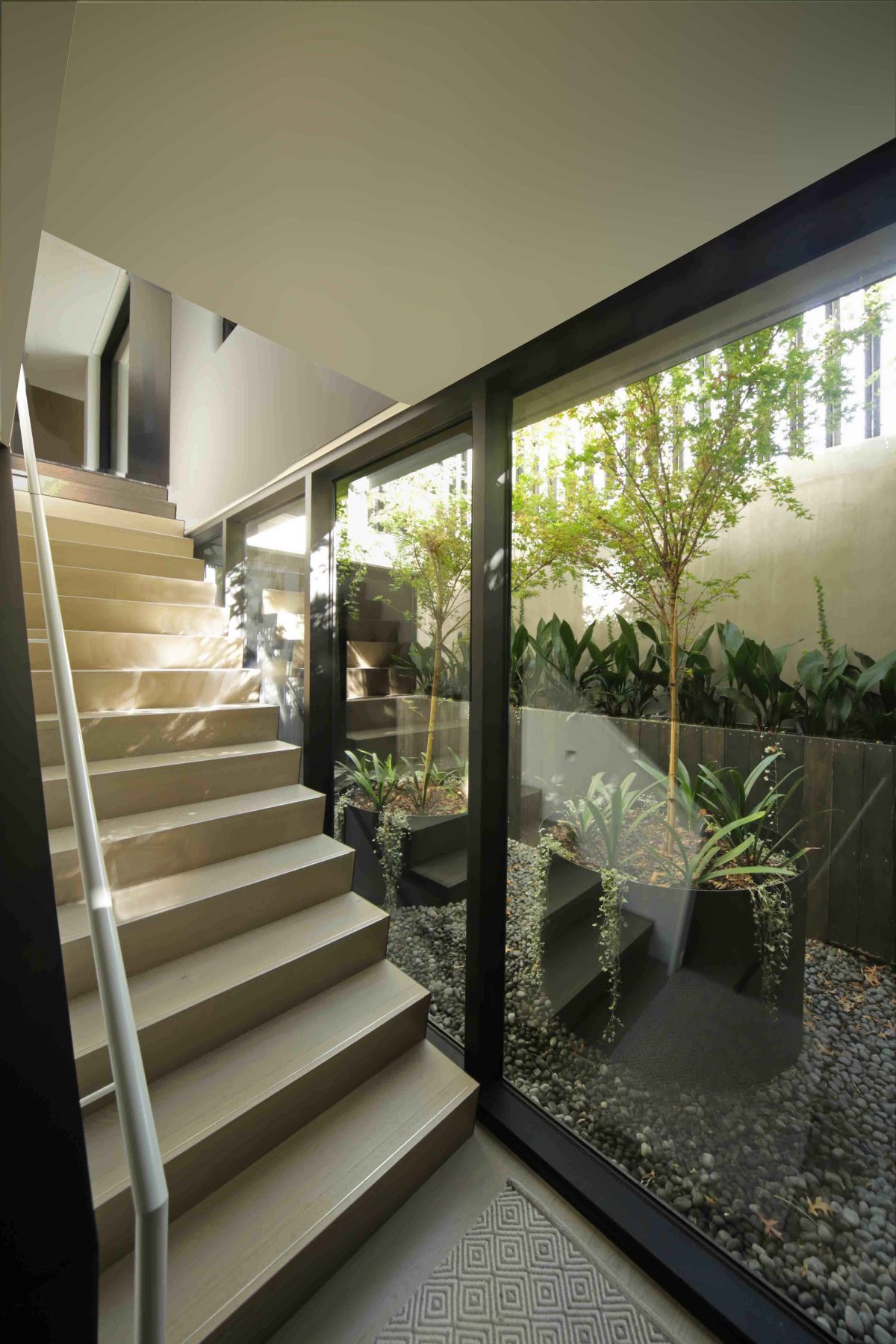
Sited on an elevated, sloping allotment, the design retains much of the existing garden. From the street-front, the house projects with a magisterial authority. Its balconies and windows fully engage with a pair of Pin Oak and Golden Elm trees. Glazing, ‘stretched’ across the south-facing street-front elevation brings vista and indirect light while maintaining a high level of privacy. Moving through the house beyond the tight armature of the grand winding staircase and lounge area, leads past a series of windows as picture frames. Views are provided east towards the pool and patio before arriving in the kitchen and living areas.
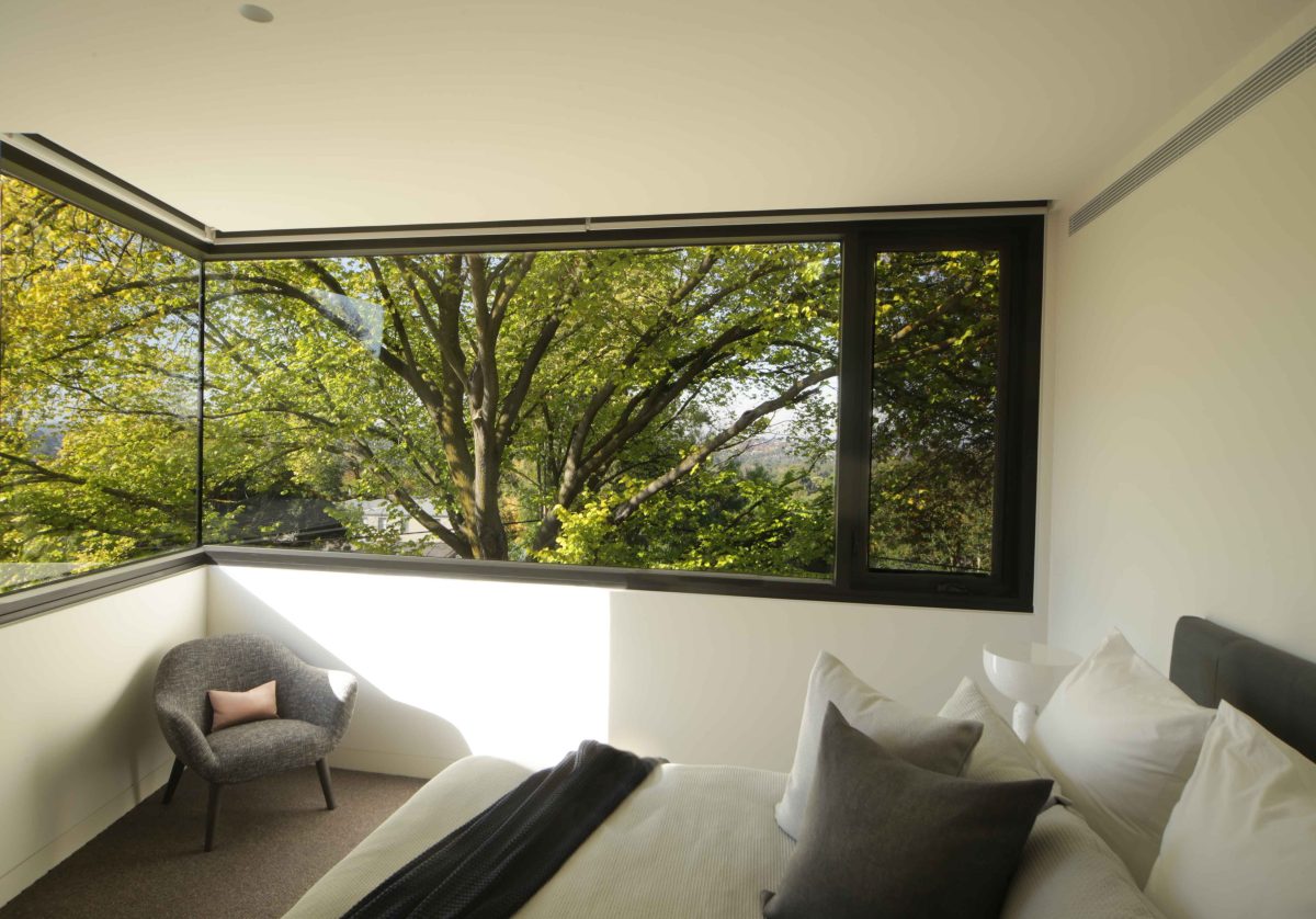
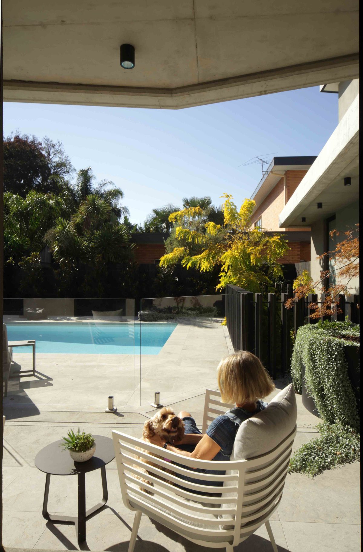
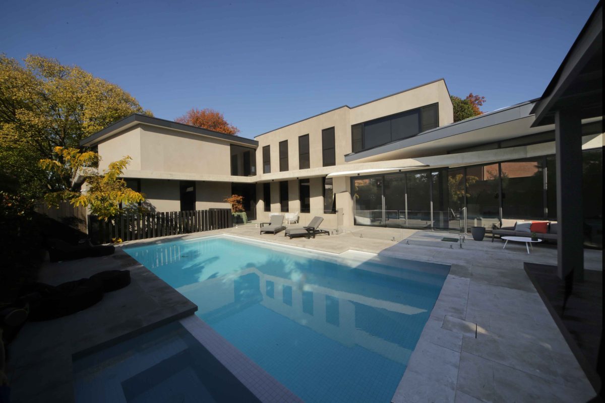
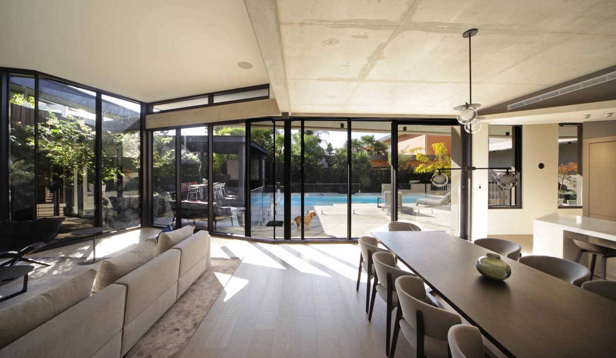
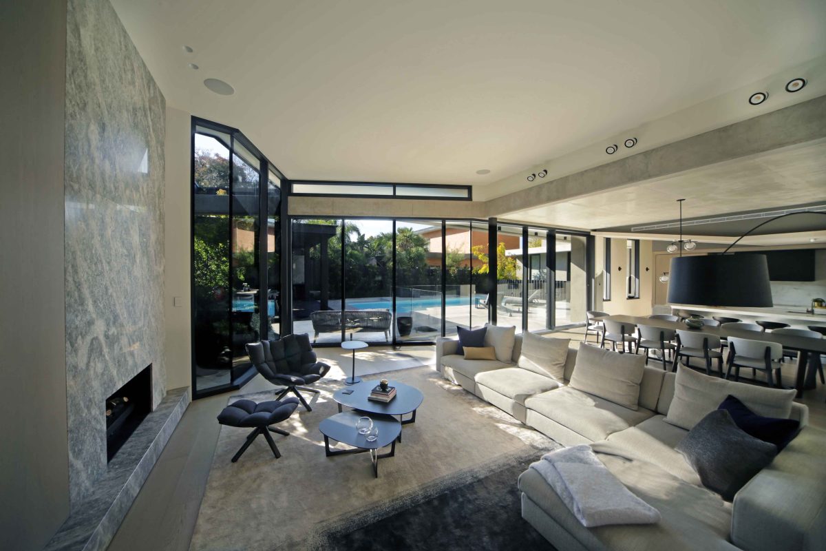
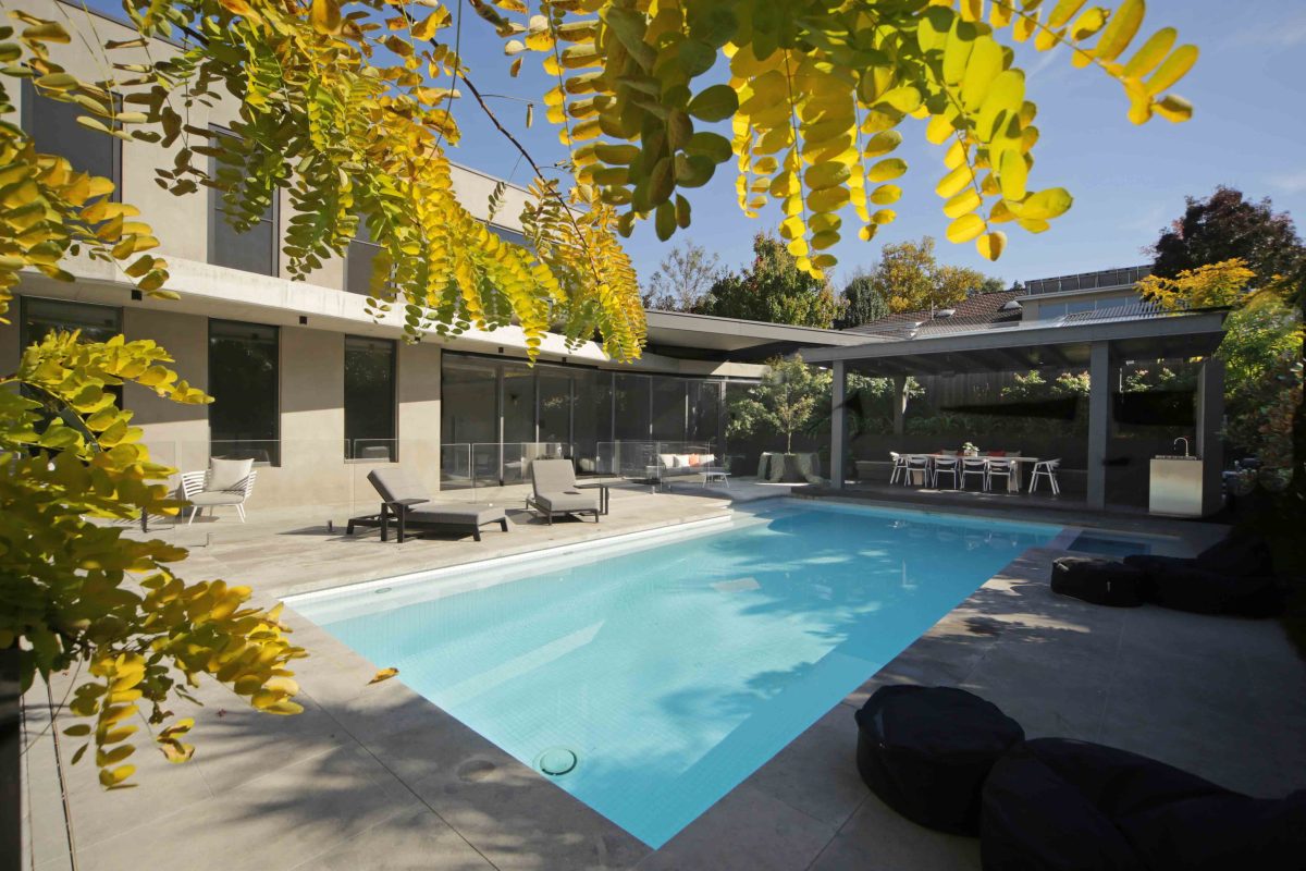
To the rear, the house is much more Mies-like, with specific and expansive use of Viridian double glazed units linking to its pool/patio. The architect and builder owners’ preference for open spaces is repeated with cranked windows and feature ‘wall’ that adroitly avoids the more conventional plan.
With the passage of time and technology, such houses are high quality builds in every sense with understated, high-performance materials.
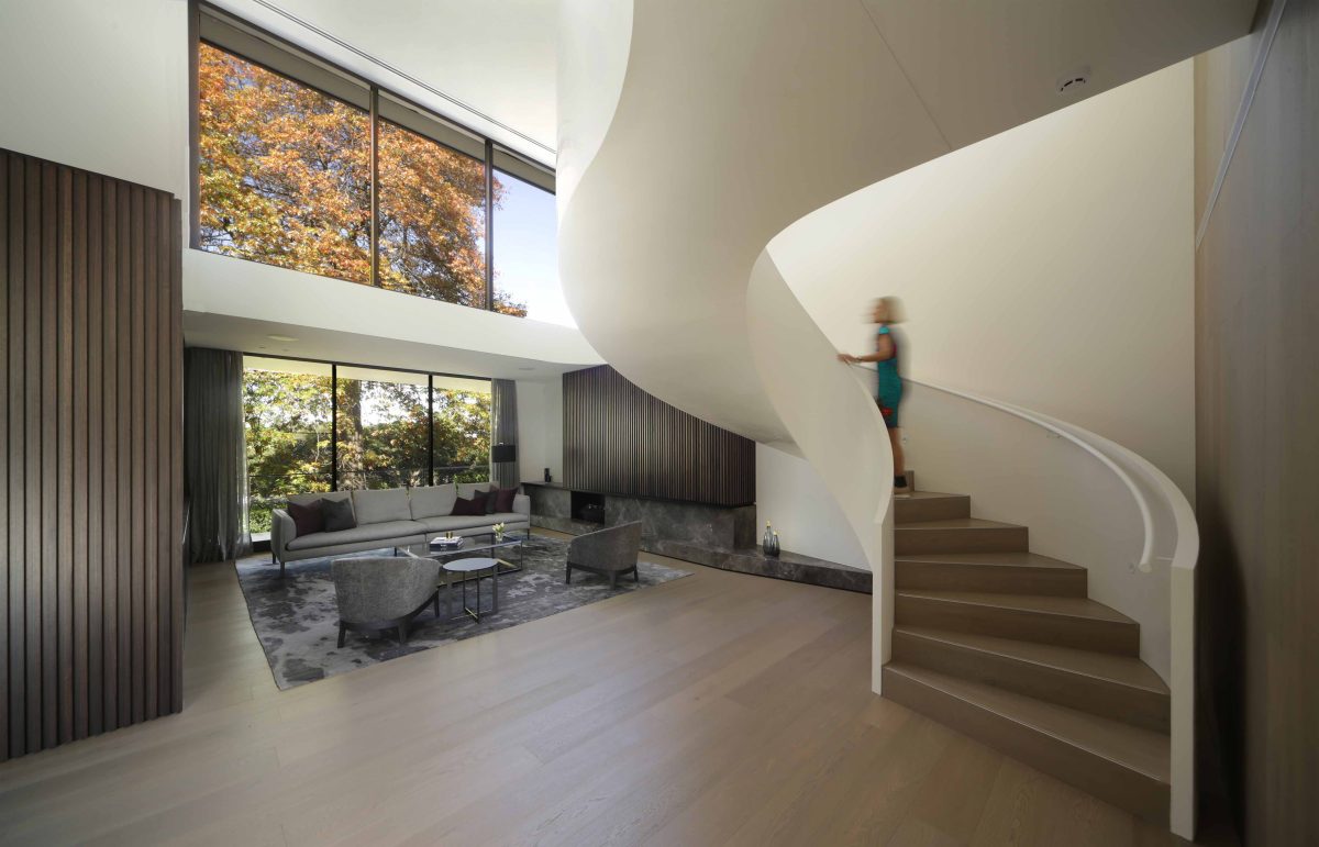
“The entry foyer opens onto a formal living area and incorporates large panel windows, a double height volume and a feature spiral stairwell that captures views through the two large windows at the front of the property.” Daniel Xuereb, Architect
Project architect Daniel Xuereb spoke with Viridian about a house that, despite its size and presence, builds a fluent relationship with its striking setting.
Viridian: How would you summarise the design?
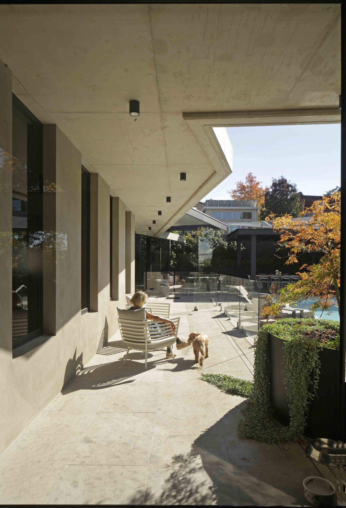
Daniel Xuereb: We developed a combination of a cantilevered concrete floor and awning structures that expanded views from the interior beyond into the landscape. The sloped site allowed for central driveway access into the below ground basement for vehicle storage. A guest bedroom, storage and a gym was also located on this level. Manipulation of the building form has helped expand the interiors out into the landscape.
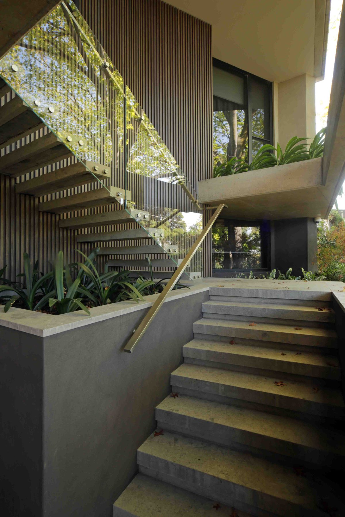
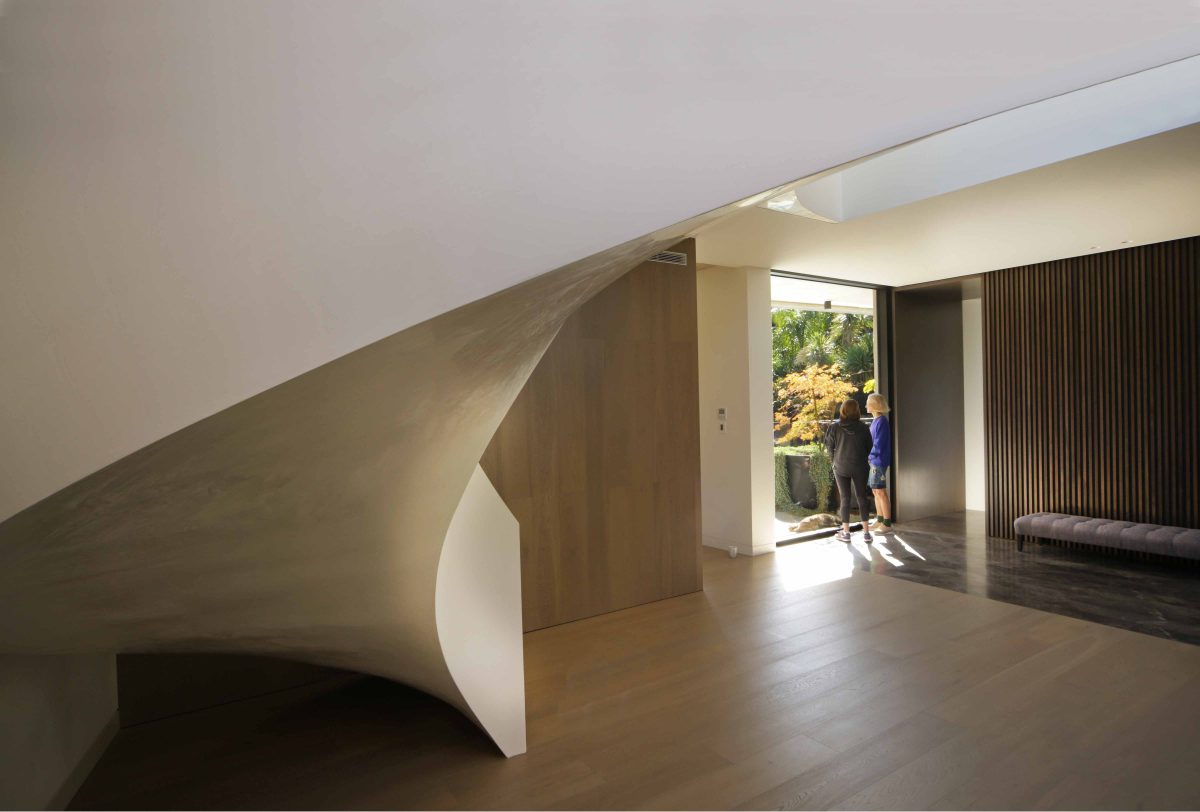
The entry provides an entrée to a sculptural staircase and vistas into and from the space.
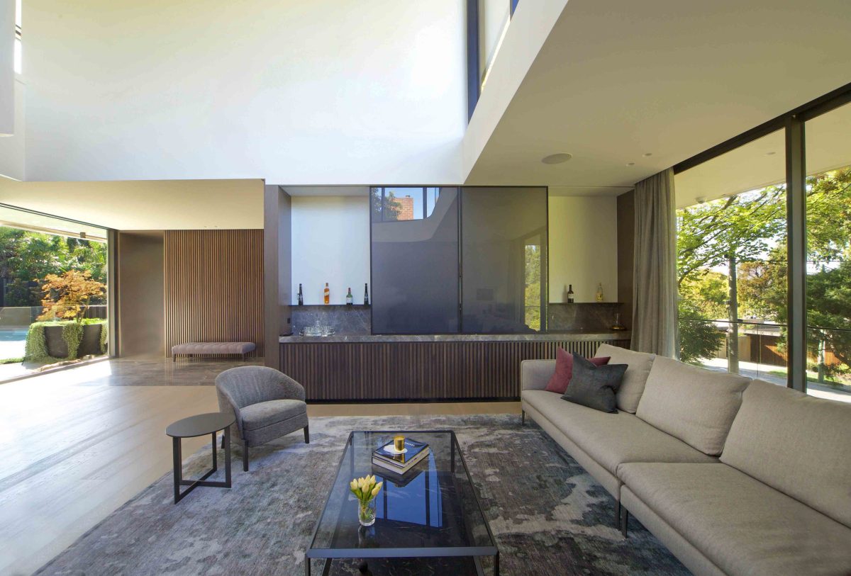
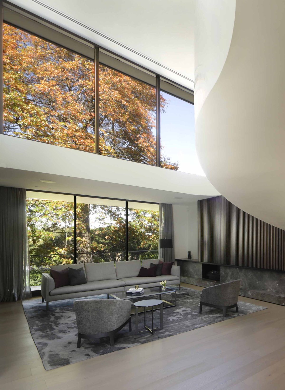
The entry foyer opens onto a formal living area and incorporates large panel windows, a double height volume and a feature spiral stairwell that captures views through the two large windows at the front of the property.
And the rest of the house follows suit…
The first floor incorporates cantilevered concrete awnings and exposed ceilings, which express the building structure and allow for solar protection for the main living area.
The main living area wraps around the south west boundary of the site to focus views out to the feature swimming pool and external landscaping.
The inside/outside house description is something of a cliché but here you have a fantastic landscape the house embraces.
We were very much wanting to create a comfortable family home on this site, but also trying to achieve nice proportion in the structure. A journey was envisioned where you came in through the front door, being a more public part of the house, and then continuing through to the formal living area and past the feature spiral stair. From the entry the journey continues through the hallway area and into the back living area which very much connects and opens up to the backyard and provides views out to the swimming pool.
It reveals itself slowly and the slower you reveal, I think the better people absorb the story. Is there a story the house tells as you move through it?
We wanted the front formal room to capture views to the front yard and the two very well established trees, and in terms of the journey through that space, we then created a middle hallway threshold with smaller windows and warmer joinery colours. Once through the formal, public parts of the house and through to the private area, the main living spaces achieve a different proportion, with lower ceilings, which create a warmer interior and windows which capture views through to the landscaping at the rear.
The house has a number of qualities with tranquility and generosity coming to mind. You can buy a lot on a house and have neither of those.
We wanted to create an understated interior aesthetic for the dwelling and that was achieved by working with high quality materials and a colour palette in harmony with the landscape.We very carefully worked through how we could achieve a concrete structure which expanded out into the landscape.
We specifically chose to expose parts of this structure within the interiors of the rear of the building, and exposed this as the interior elements extended to the outside. In combination with glass, we arrive at some of those qualities you mention.
Juxtaposing material – concrete and glass for instance – allows each material to sing. Both highlight the other.
Yes, the heaviness of the concrete structure juxtaposed with the lightness of glass and its inherent material qualities brings out that transparency and openness.
There’s a luxury that comes from those two working in harmony. It’s evident with the mid-20th century Modernist’s who realised real luxury is much less applied than intrinsic to design. Take your use of windows, that are virtually big picture frames with nature as the artwork.
The proportion and placement of all windows is also the key. They were very carefully positioned to capture views of trees and certain landscape features to create that sense of luxury we were after.
Do you have a highlight area?
The formal living area upon entry has the wow factor. It has a very large double height space with windows that capture views to one of the primary trees and we complemented that with a beautiful spiral staircase and lovely finished joinery.
There’s great permeability.
We wanted a very sculptural form, working with the heavy quality of concrete and transparency of glass.
Have you a particular philosophy about environmentally sustainable materials and design that prefers locally sourced materials to imported product?
We worked with Viridian glass largely for that reason. We have a very sustainable building here, and working with these particular high performing, double-glazed windows with their grey tint maintains privacy from the street and also improves thermal comfort within.
Were there moments of grief?
The sloping site provided challenges but also some great advantages as to how we would evolve the design. We decided to bury the base of the building, which involved quite complicated waterproofing and a foundation solution, but then by setting that into the slope it allowed the upper levels to project and float into the landscape.
Glass contributes a sense of physical lightness that helps avoid the common tendency for the ponderous.
Yes. In all the projects we like to work on, we’re always looking at how best to make spaces connect with the outside, incorporation of windows, the right proportions and the right orientations certainly helps us to illuminate the interiors and also to bring warmth and a lightness into those spaces.
Is a practice signature evident in this project?
We like to overlap volumes. We have projecting horizontal plates that define perimeters of the building and angled and skewed some of those walls to wrap the building around the site and reference views at the back by overlapping volumes.
You have the obvious, sculptural sweep of the staircase, but contrasting that is the seemingly two-dimensional glass planes that bring to life a whole external canvas.
Yes that’s true. There is a permeability that really helps bring the house alive.
Watch our video interview with Daniel Xuereb here, and see the gallery below.
