High Light
Sydney, New South Wales
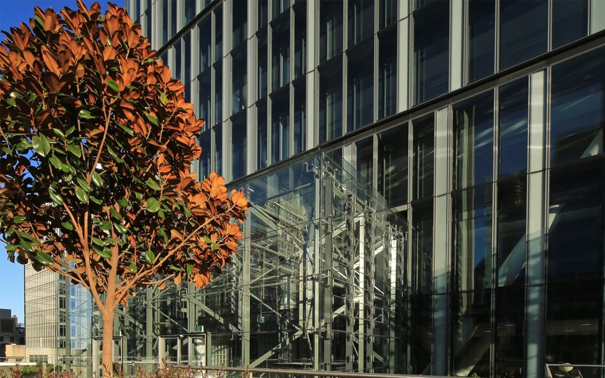
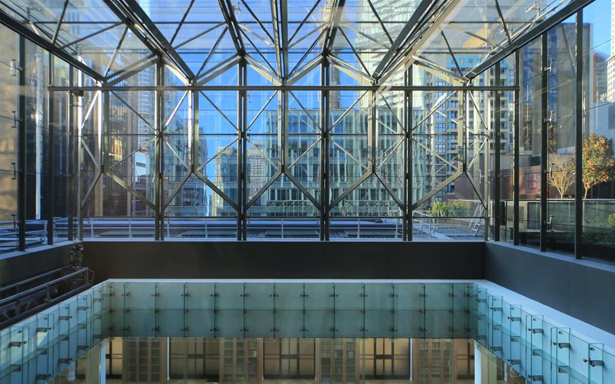
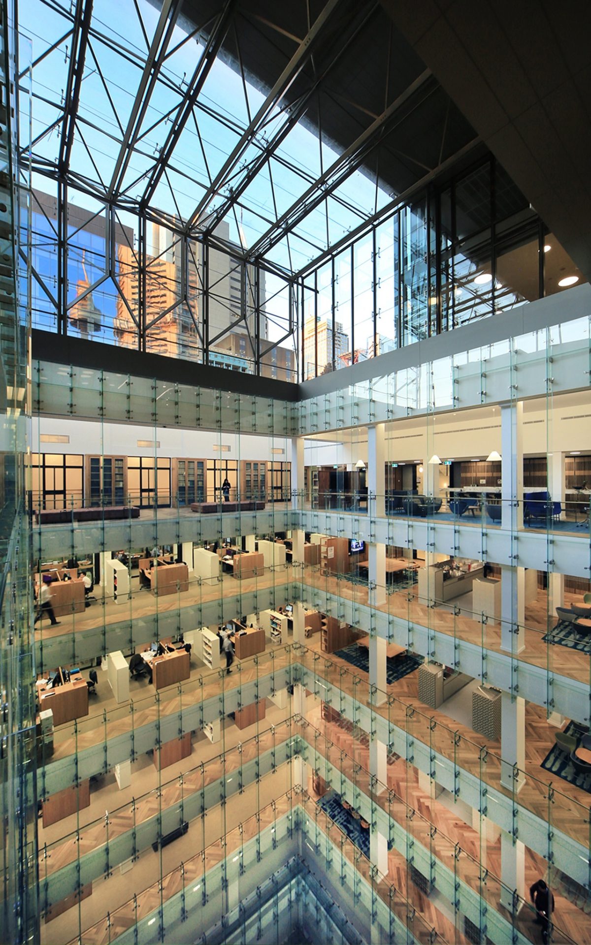
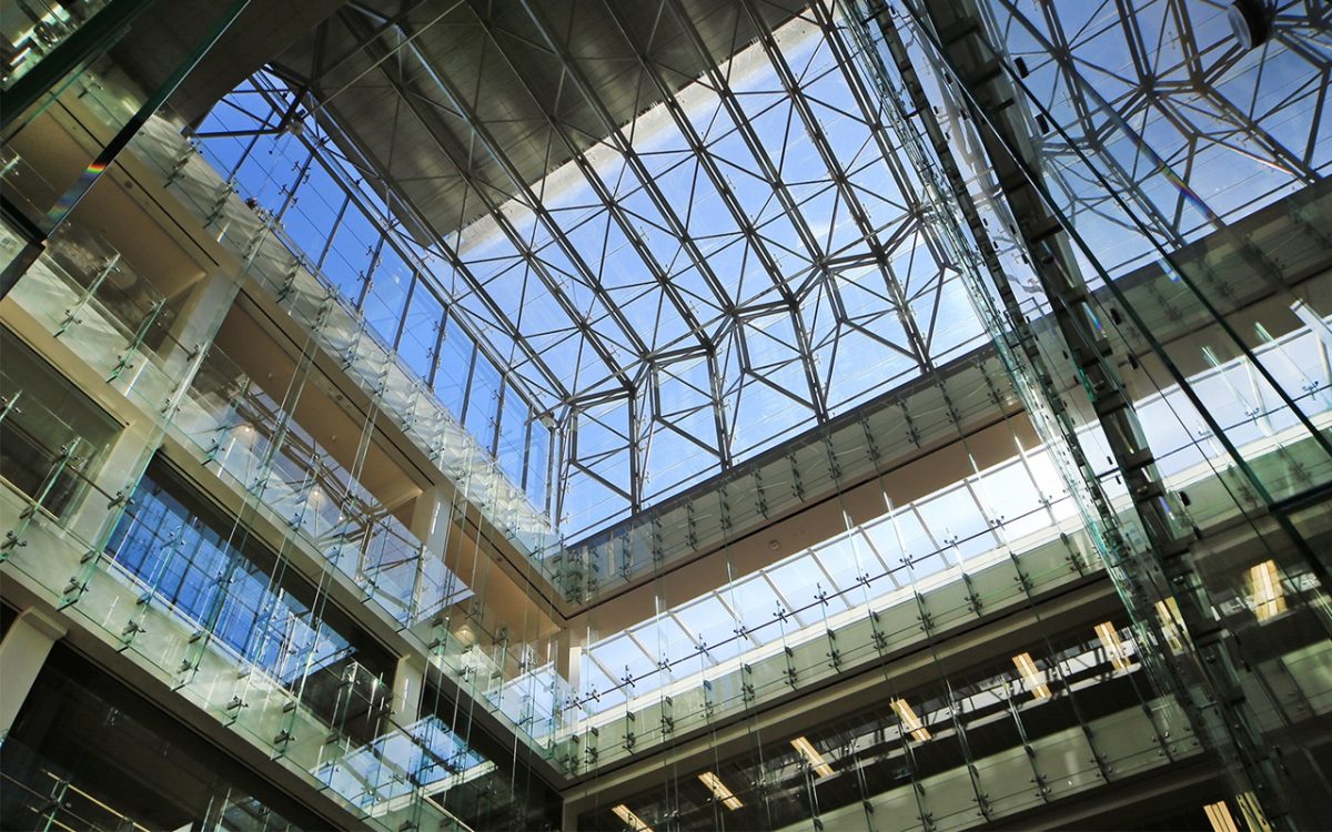
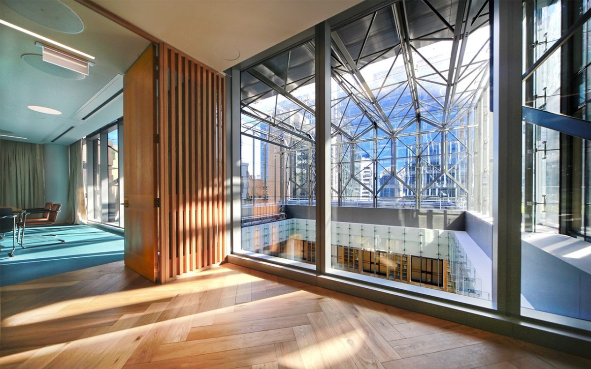
One of Sydney’s newest towers reflects a quiet workplace revolution. It’s home to design that brings history into the present in a thoroughly modern light. At 5 Martin Place, a mid-level atrium draws daylight deep into the building and distributes it as a great social connector. A new generation of Viridian performance glazing covers a cathedral-like void – not as wasted space, but pathway towards a switched on, vibrant workplace.
While height is the measure of worth in cities such as Shanghai and Dubai, the trend in Sydney is grounded in quality and sustainable, environmental connections.
1 Bligh Street, 50 Martin Place, 8 Chifley and now 5 Martin Place are home to Clayton Utz, Macquarie Bank, Corrs and Ashurst respectively. The tallest of these, 1 Bligh Street stands just 30 levels, while Macquarie is a quality-packed 10 storeys.
These three legal firms and one bank are beneficiaries of the new workplace defined by, among other features, cavernous atria and light-filled floor plates. They all occupy buildings that transform not so much where people work, but how they collaborate and connect with each other.
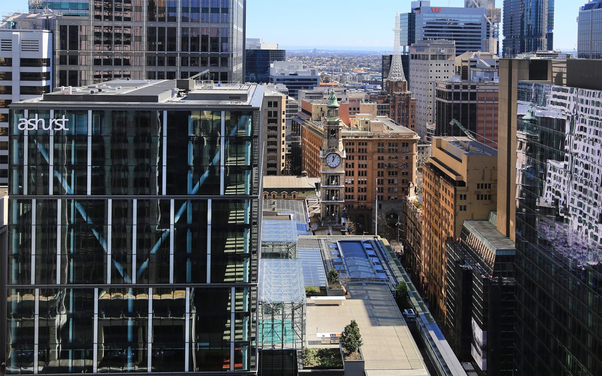
The 605 staff at Ashurst might miss the glorious harbor views enjoyed at their old address near Circular Quay, but are handsomely compensated with this new generation building. As anchor tenants on levels 5-11, 5 Martin Place is a premium address, especially as it incorporates part of the original and iconic 1916 “Money Box” and 1933 Commonwealth Bank buildings.
Rising behind and cantilevering above these older levels, the new 19 level tower isn’t simply plugged onto the rear, but integrated with respectful separation. The original 1916 and 1933 atrium, so brilliantly ahead of its time and lost in various makeovers, is restored and enhanced. Designed by Johnson Pilton Walker (JPW) and Tanner Kibble Denton (TKD) Architects in collaboration, the emphasis is squarely on modern technology blended with elegance, providing the potential for a myriad of workplace connections.
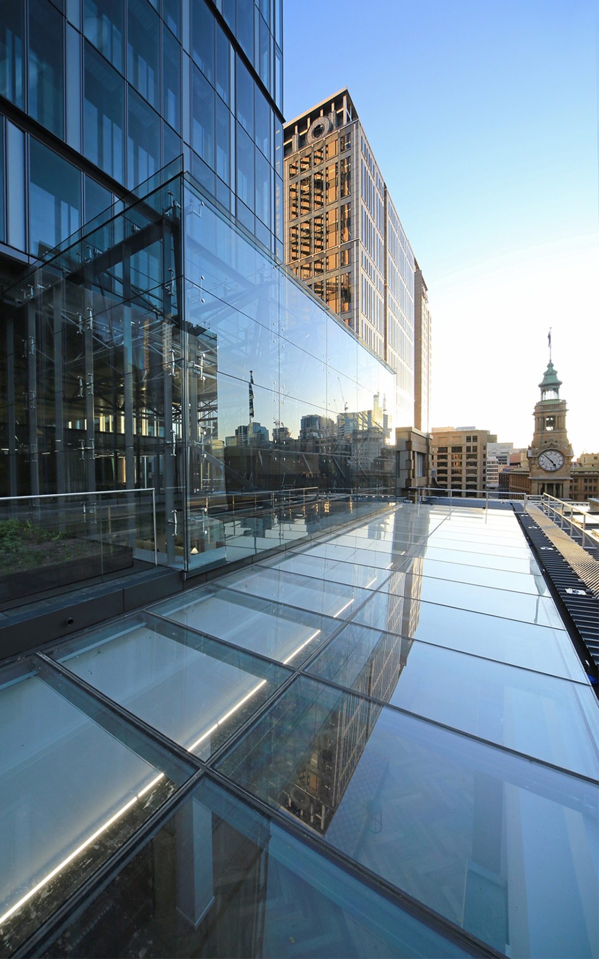
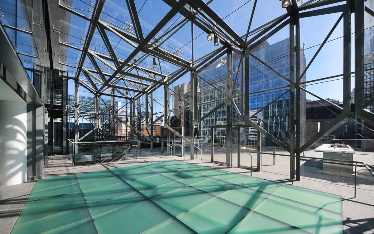
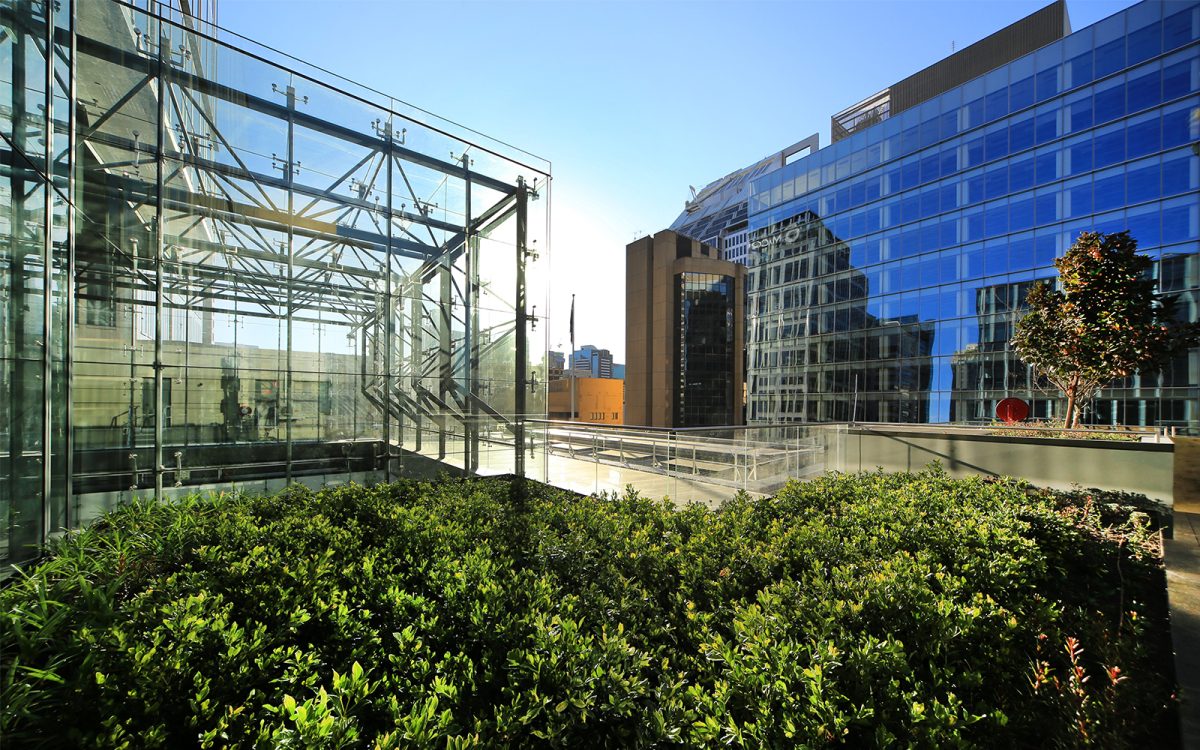
The reception on level 11 and the link to a rooftop plaza offers some obvious clues to the building’s past forms. The atrium roof, double height glass lantern and hammerhead skylight are much more than gestures. Each era is allowed to exist in its own right against a modern backdrop bringing three eras into a convincing present.
The project architects observe: “While the practice of law demands the utmost gravity and integrity, the workplace doesn’t need to be dreary or dull, in the pursuit of the scales of justice.”
Vision’s Peter Hyatt discusses the crafting of new around old with project architects Mat Howard of JPW and
Megan Jones of TKD:
PH What did taking on this building represent?
MH The quality of the heritage building presented exciting opportunities for the new development.
The scale and spatial proportions, as well as the detail and craftsmanship embodied within the existing fabric
were a source of inspiration for the new work, as well as the considered approach to reinstatement and reinterpretation of original features. There was a real sense within the design team that we are custodians of a very significant piece of Australia’s history, and considered it a privilege to be involved in its restoration and its future.
Was there resistance from the client group to the loss of floor-space?
MH The reinstatement of the central atrium to the heritage building, provides extensive natural light to
the large contiguous floor plates within the development, and in turn, presented opportunities for the creation
of a vibrant, contemporary workplace. The vision to realise these opportunities was certainly shared by the client group.
MJ It’s fair to say that by removing floor we improved the functionality and amenity of the floor plate. The other point to bear in mind is that we’ve actually maxed out the building floor space. What we lost in the atrium, we made up for in the tower so that there is no net loss.
Are there any disadvantages or issues caused by so much natural light?
MH There are energy efficiency and temperature control issues to consider, and so glass selection becomes important as a means in achieving a balance between light, comfort and energy demands.
You certainly haven’t kept a shell or building façade here. There’s a much deeper context and relationship occurring.
MJ Absolutely. Probably the greatest achievement is the re-presentation of the building as a contemporary office, a century after it was built. It was one of Australia’s first steel framed commercial buildings. When it was opened in 1916 it set the new benchmark for CBD office space with high ceilings, quality materials, finishes and appointments and access to good natural light and ventilation… it will once again be an exemplar for high quality office space.
Revealing the old bones of the atrium is very pleasing. If you go back and review the old drawings and new renders, it’s not dissimilar to what’s been built. Even though it was a design construct contract and the builder changed a few things, the fundamentals of the design have held.
With such emphasis on client privacy in legal practices how is the push for open plan handled?
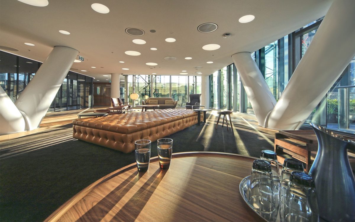
MH Open plan can obviously be conducive to collaborative working, and can often be used to express the corporate values of many companies in this day and age, however almost always we find that the desire for open work environments by tenants and owners is complimented by a similar need for quieter, more private work spaces. The low-rise floor plan at 5 Martin Place is dynamic, and with such great access to natural light, can accommodate a variety of work environments that have been cleverly realised by Ashurst and their fitout team.
“It allowed us to achieve the required thermal performance whilst maximising daylight.” Mat Howard, JPW Architect
That mid-level glazing really draws daylight in a spectacular fashion into what is a deep building.
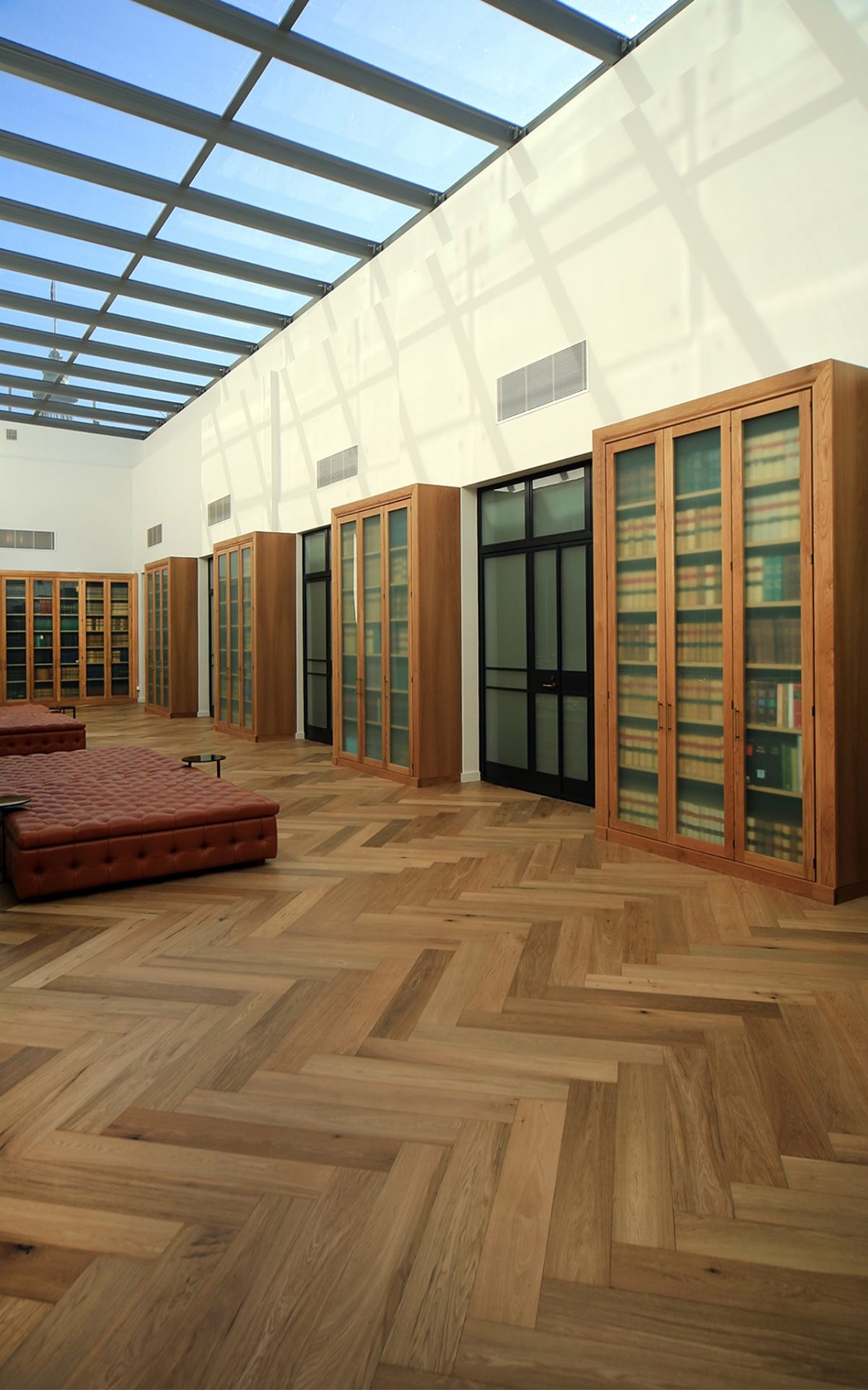
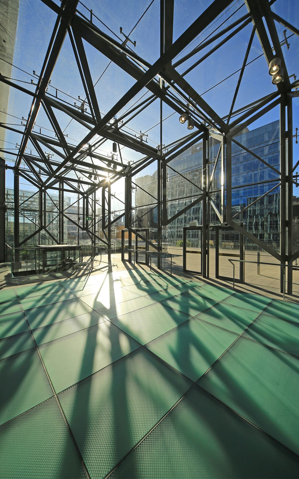
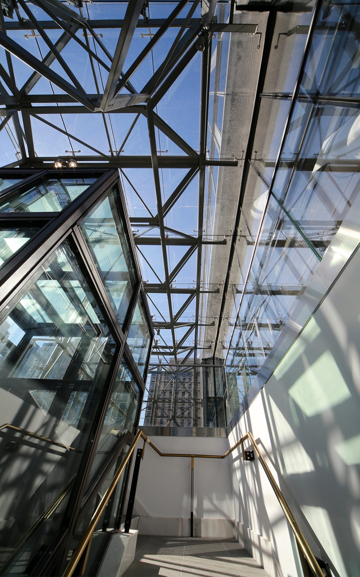
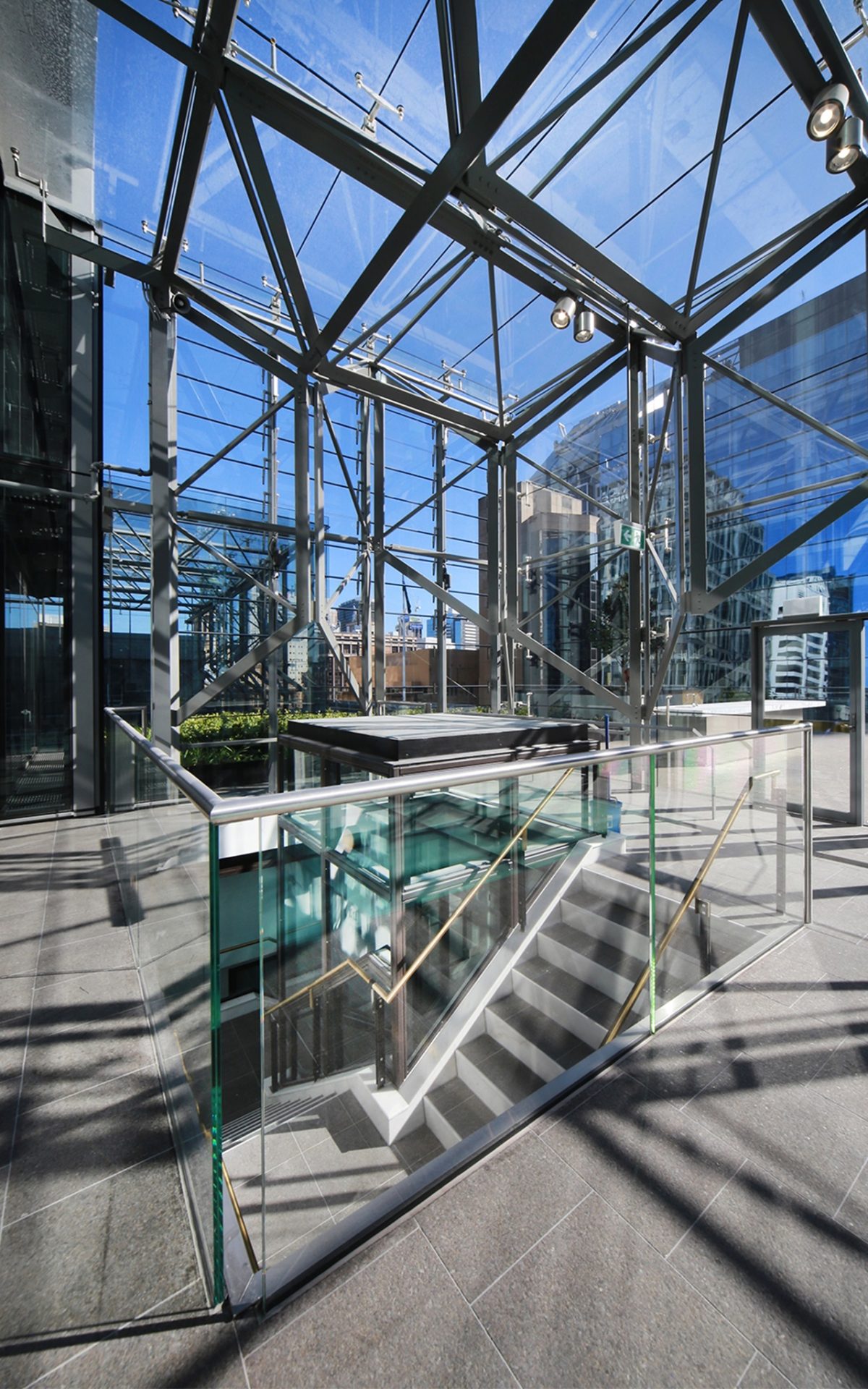
MH The orginal 1933 building actually had two light wells, which have once again been realised in the redevelopment. Obviously, the central atrium has been reinstated, but also a smaller, secondary light well within the original 1933 built form has been reinterpreted via the new glass lift shaft. The glass box enclosures above these light wells allow natural light to travel right down through the building to the Banking Chamber and Reception spaces, respectively.
MJ The use of the diagonal chevron pattern in the skylights and tower, reference right back to some of the original building’s glazing detailing. That was definitely an inspiration for the design.
That use of glass sets up really interesting rhythms and coincidences where light enters the bonnets and produces those moments that connect staff to the day rather than an artificial environment.
MJ That was certainly one of the aims here, to activate the interiors in ways for staff to have an appreciation
of the time of day, weather patterns and shifting light. Those are all bonuses for a much more pleasant,
livelier workplace.
Have new materials and technologies assisted you in the process of re-invention?
MJ It’s fair to say that the technology of new materials has come a long way. We couldn’t have done this building 20 years ago and the quality of glass on this project creates new possibilities.
What in particular appealed about the Viridian glass you specified here?
MH We have used it successfully on previous projects, so we were aware of its high performance and visual characteristics. It allowed us to achieve the required thermal performance whilst maximising daylight.
Did you receive any technical support from Viridian or did you work off its website and through
the façade engineers?
MH On projects of this scale, the input of the façade engineer is invaluable; however industry contact is just
as important. The relationship that we have developed with industry leaders, such as Viridian, has been vital
to the depth of knowledge within our practice, and is essential to the pursuit of innovation.
Are there surprises in that step from computer renders to the completed third dimension?
MH All materials, but particularly glass, can vary greatly under different environmental conditions. Material sampling and prototyping of systems becomes vital to the design and construction process, particularly in providing confidence in the expected outcome. That said, the way materials respond to specific site conditions at different times of the day and year can never be completely anticipated, but that can be one of the delights of architecture.
How do you dovetail all of the key consultants and suppliers for seamless work-flow?
MJ The construction phase often has different parts of the building requiring different glazing provided by different subcontractors. Even after all of the prototypes and samples you need to ensure product consistency.
No parent ever admits to a favorite child. You’ve all worked on different buildings, but is this building one of your favorite children?
MJ It’s one of mine.
MH Absolutely. We’ve all dedicated a good slice of our lives to it.
MJ Apart from our practices working well together, Sydney City Council has been brilliant. They’ve backed this the whole way.
Do each of you have a particular project highlight?
MJ For us it’s the atrium and the way it interacts with all the floors and brings natural light deep into the building — giving it a new a heart. The original 1916/1933 light-well, which provided natural light to the centre of the large floor plates had been infilled and degraded. The new contemporary glazed atrium with a glass floor over the reconstructed copperlight glazed lay-light to the Banking Chamber, interprets and references the extensive original decorative glass elements throughout the building and transforms both the commercial floors and the former Banking Chamber. As a team we’ve given a building that’s 100 years old next year a whole new life.
MH That’s a difficult question to answer. This is a building with many layers, rich in historical, cultural and technological significance. I would have to say the highlights of the project for me are the many new innovations that have been realised as part of the redevelopment; whether it be the remarkable steel structure of the tower that facilitates its cantilever over the heritage building, defining the atrium below, or the novel ways that materials have been used and systems developed to help ensure the continued relevance
of this building well into the future.

