Boundary Rider
Port Melbourne, Victoria
A new sports facility and cultural hub for Port Melbourne Football Club ups the ante with a design performance not so much demanding ‘look at me’, as arousing curiosity and inviting passers-by.
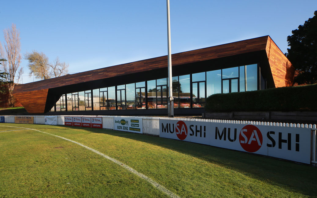
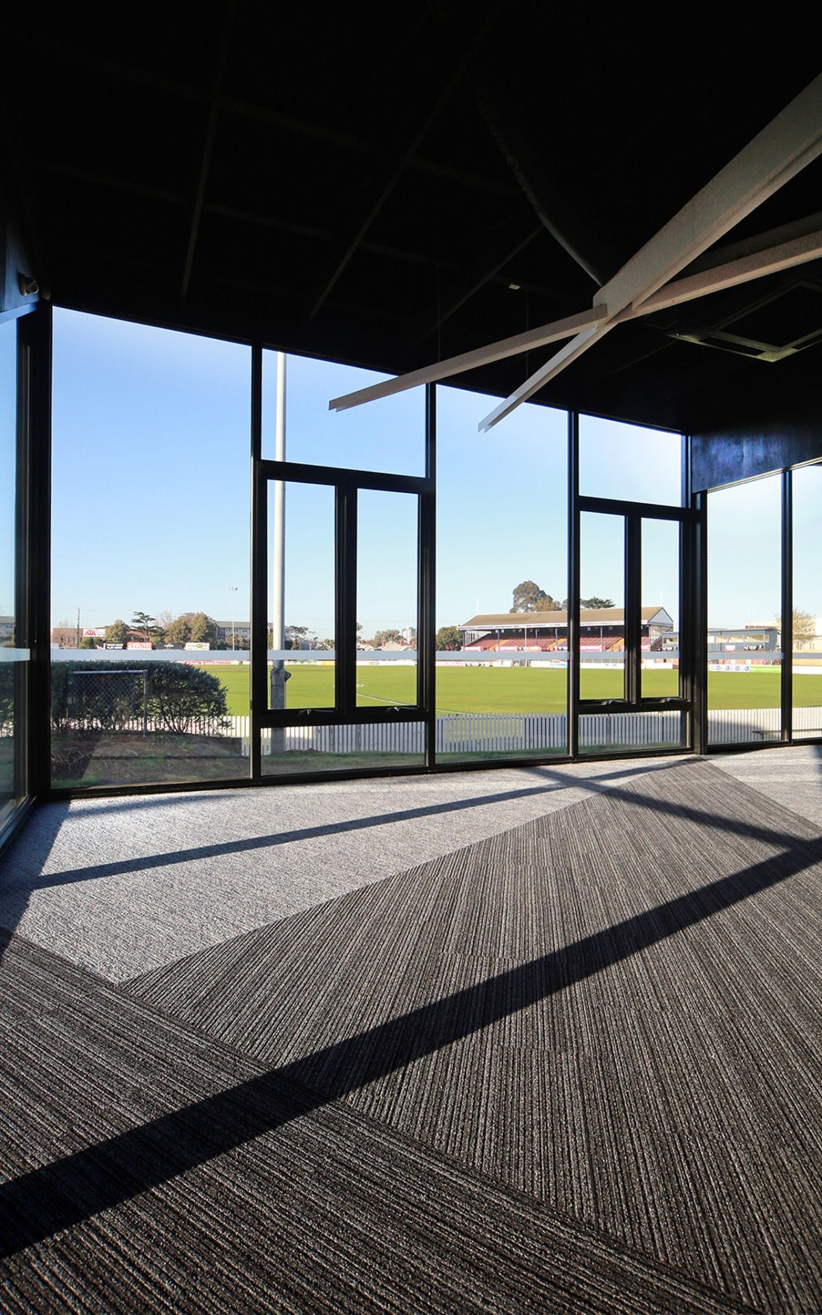
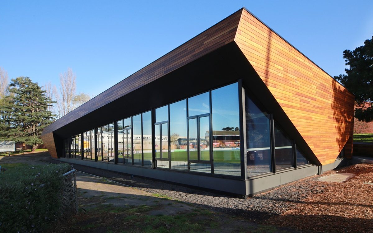
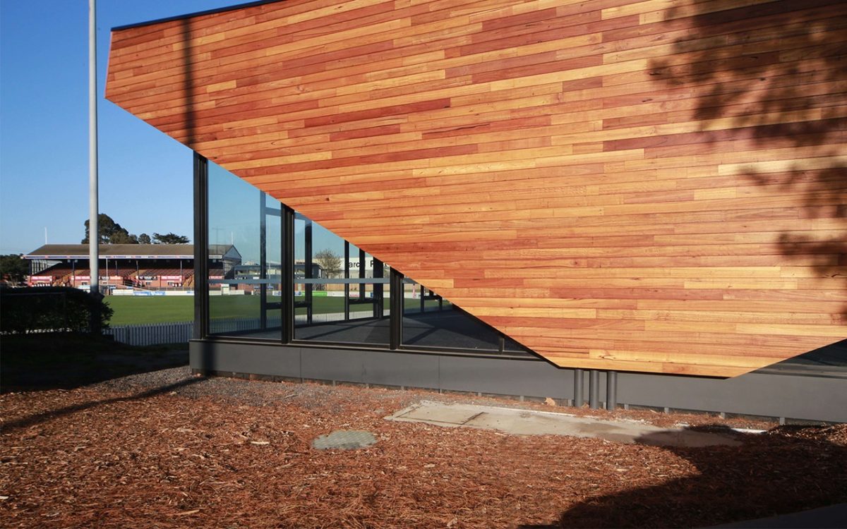
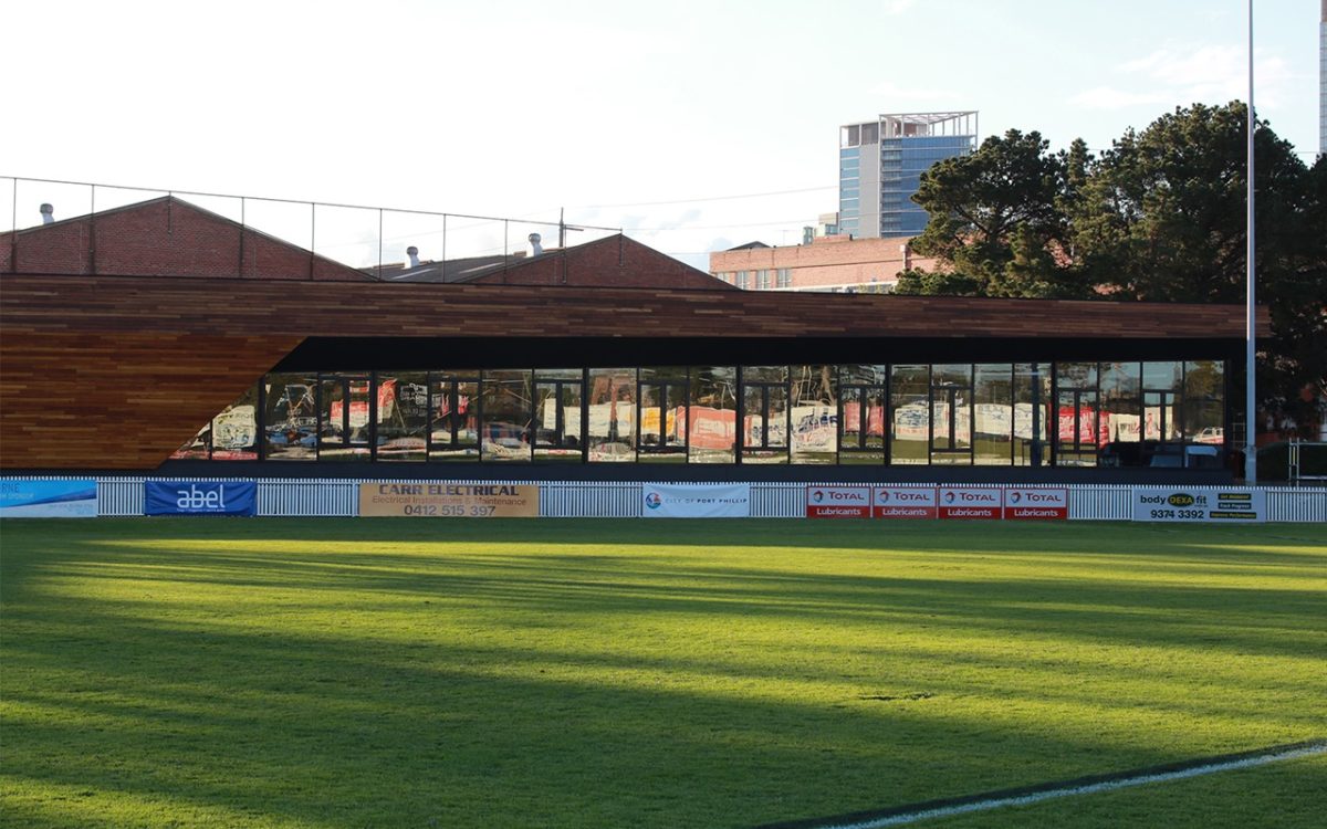
This new pavilion as administration and function facility, resides quietly on the ground’s northern edge with a vista of oval, sky and historic grandstand made possible with Viridian glazing as peerless window to the action.
Suburban sports facilities are enjoying a revolution and it isn’t of the cycling variety. Spurred on by the quality of major stadia rising in many major cities and regional centres, the downstream effect is one of heightened expectations.
One example is at inner-city Port Melbourne by the sea, where the Australian Rules VFL oval is among the beneficiaries. And it’s a major turnaround from the old hose-out shed to real style and quality.
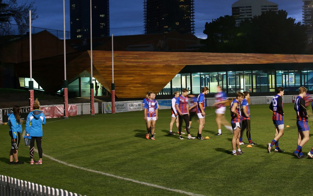
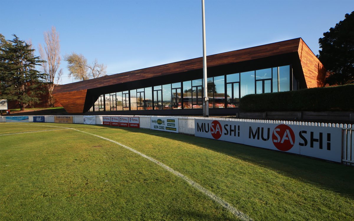
Much of the credit at Port Melbourne can go to K20 Architects whose low-rise timber and glass beauty is an aerodynamic model of sleek, economic efficiency. Many councils shy away from such results in the misguided belief that decent design will be seen as budgetary excess. Nothing could be further from the truth.
Such design for a sports/administration facility and community, social, cultural hub straddles a chasm. And it provides the stage for a high-performance resource costing no more than a bland, poorly functioning box.
Vision’s Peter Hyatt discusses the rise of a low-profile beauty with Theo Kerlidis of K20 Architects:
How tough is it to design with such a broad committee of clients?
We needed to satisfy all of them and ensure no-one lost out. There were multiple clients including council, the AFL, VFL and community groups. It was tough, we had to work our way through a lot of issues to satisfy all of the parties.
I think our design is robust enough to meet the competing needs and in the end why it works. It caters for a really diverse range of functions yet doesn’t reflect competing needs in its appearance.
There is often confusion that quality will be seen as an extravagance or excess. You make a point about budgetary restraint.
This is built for $2,400/m2. We value-managed project construction with design efficiencies that enabled
a high level of design innovation without the cost.
What are some examples?
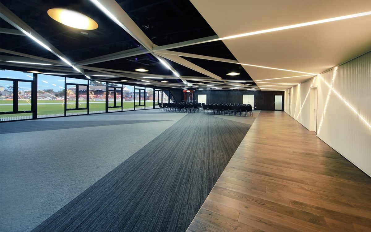
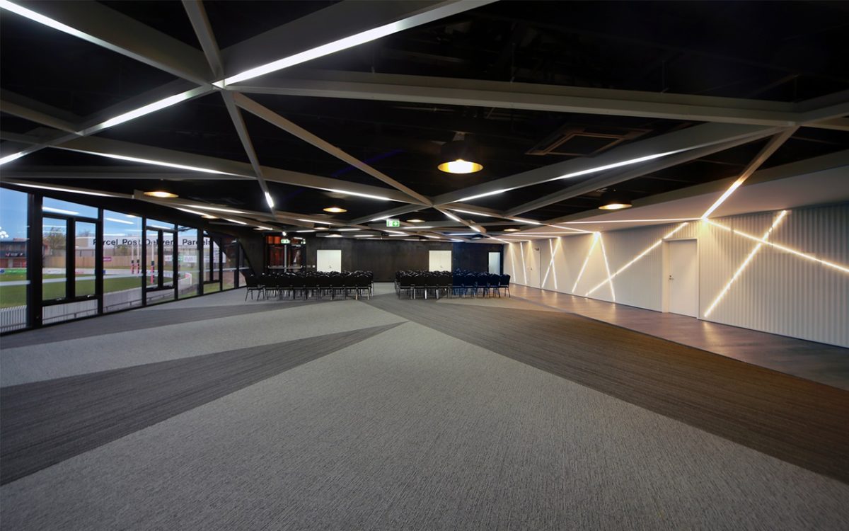
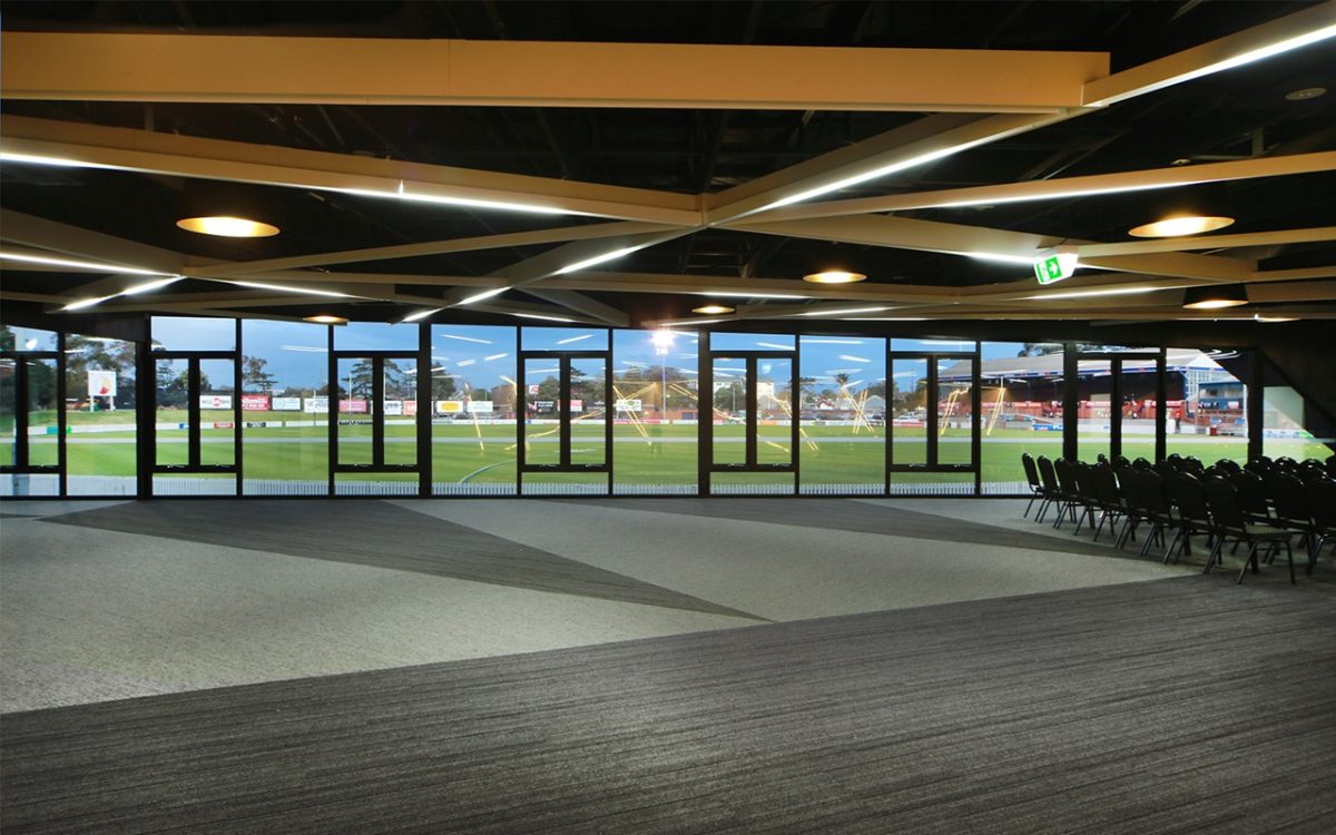
The design solution around this high efficiency build included an open trussed ceiling, an open ceiling grid system incorporating customised lighting and off-the-shelf items. Many of the materials serve multiple purposes such as the perforated wall feature panels that double
as acoustic treatments.
How do locally sourced materials and suppliers feature as part of the sustainability chain?
That was definitely central to our approach and why we selected so many locally sourced materials. Viridian
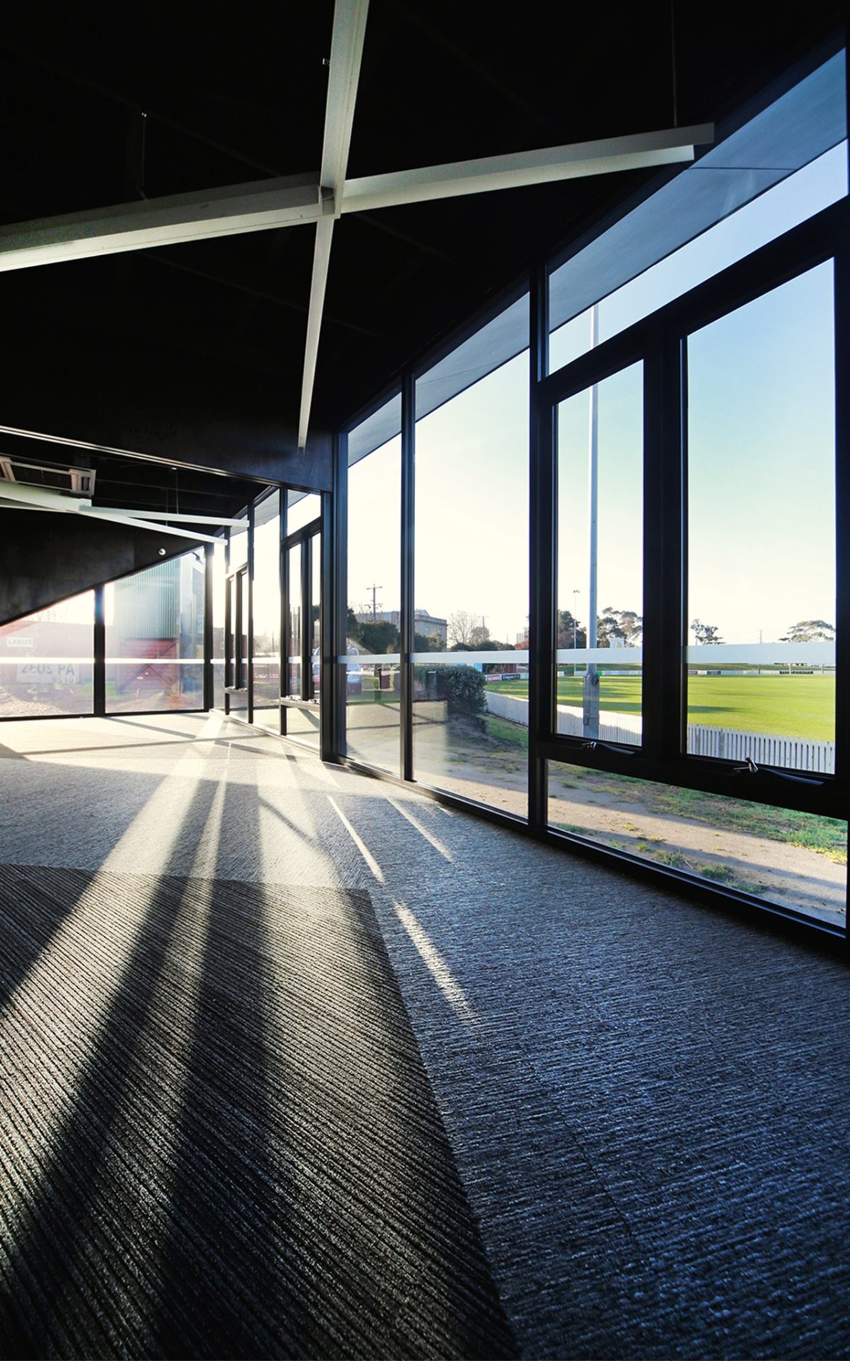
was definitely a key part of that solution. Obviously we demand that materials meet stringent standards and in this instance, Virdian’s ComfortPlus™ and Clear™ formed the double-glazed units and really animate that great south facing-window wall that overlooks the ground. The other bonus is the levels of natural light that reduce reliance on artificial light.
Any other sustainability features of note?
The building construction methodology adopted sustainably sourced timber—a high carbon sink material and designed to provide high levels of local content and local labour. Timber is used throughout the structure and and together with the cladding are designed to provide cost effective outcomes using standard, off-the-shelf, locally sourced materials and components. There was a lot of contaminated soil re-use on site and re-blended to clean fill status. Soil was relocated to other parts of the site thereby diverting landfill impacts while reducing the associated costs of soil relocation. Other ESD initiatives include underground rainwater tanks for toilet cisterns and landscape irrigation, solar hot water units, exhaust systems with makeup air and low energy and high performing mechanical supply air conditioning systems.
“We deliver sustainable, well designed buildings. It’s what we set out to do and I think in our role as architects we want buildings that can be constructed locally.” Theo Kerlidis, K20 Architects
It’s definitely respectful of place rather than upstart architecture.
We didn’t want a building that would overwhelm its site.
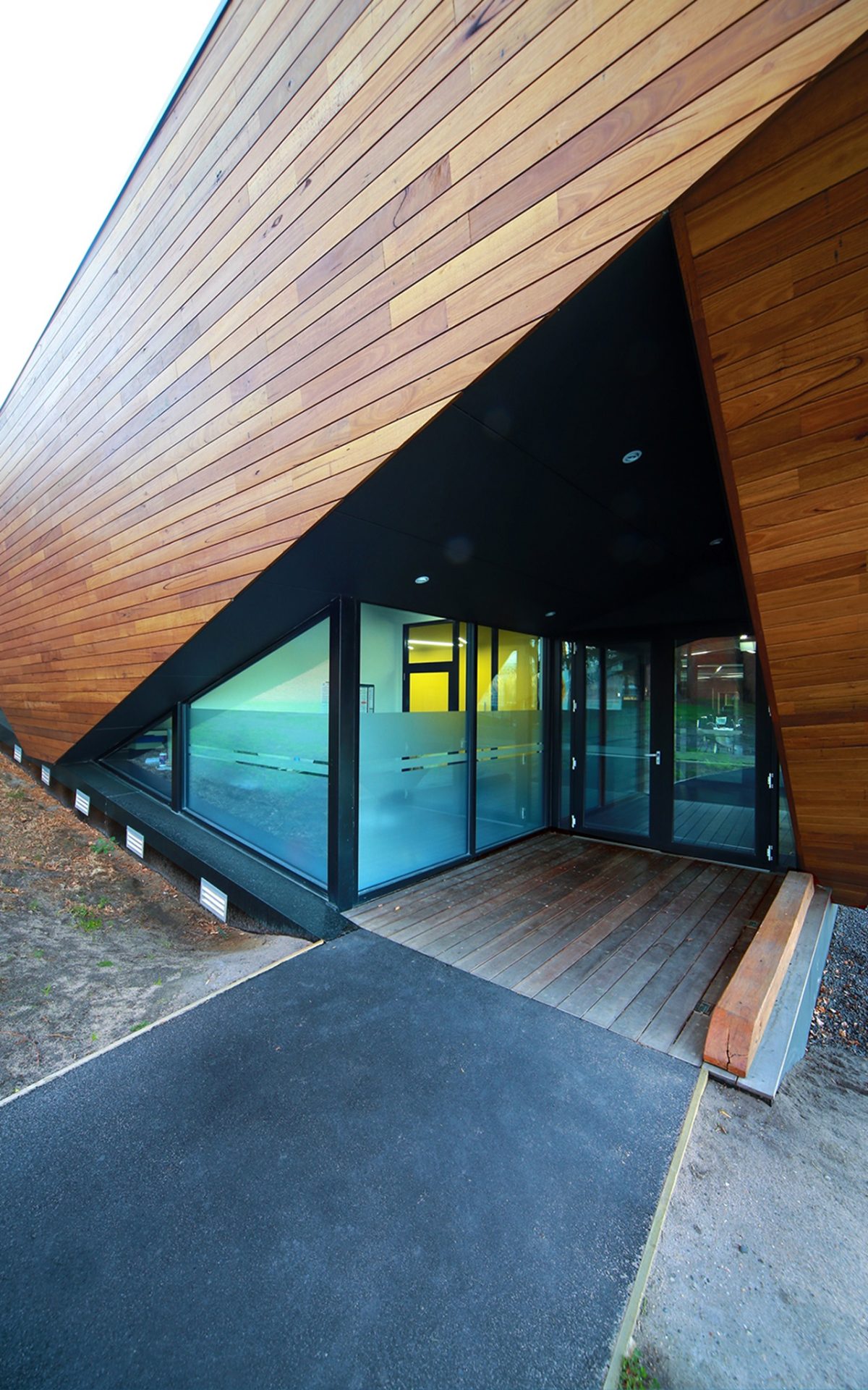
It needed transparency yet visibility so that on approach from the side entry of Ingles Street, patrons are really mindful that the building doesn’t obscure the view of the goalposts or block views. You can also see through the building, via the windows, so that was very important not to impact the game in any way. One of the biggest issues was the expanse of thermally broken windows. High performance glazing helped us with energy rating compliance because there was no scope to reorientate the building.
You could have done the glazing in a less sympathetic way.
The project glazing is absolutely integral. We did a lot of work on its colour. What’s really remarkable is the size and experience the glass wall provides. It offers a special daytime experience with how it is observed by day, and that level of transparency that changes again of an evening. Rather than being a resolute box, it allows the viewer a special peek inside.
What else does glass give the project?
Oh it’s huge. Honestly it was massive because it couldn’t work without Viridian’s high performance glass. The project wouldn’t have occurred from an energy compliance point of view, so that is really significant in this program with such a viewing requirement and it’s such a thinly wrapped building, so our glazing had to be highly specified.
You chose thermally broken windows for natural ventilation?
That’s right. We were able to reduce a reliance on mechanical systems by ensuring this could breathe and so it could function as an overall building system. We’ve saved quite a sum of money by not being totally dependent on air-con and heating.
Have there been surprises for you with the result that you hadn’t expected from the computer renders?
I’ve enjoyed sitting in the grandstand and seeing how that structure sits there quietly by the boundary with all of the wonderful reflections in the glass. We really focused on internal glare control and reflectivity. We weren’t going to design out reflectivity as it provides a wonderful depth to the building from the landscape.
How important is it for you to choose locally sourced glass?
We had a requirement to be carbon neutral and credited. We deliver sustainable, well designed buildings. It’s what we set out to do and I think in our role as architects we want buildings that can be constructed locally. It’s incumbent on our profession. We elect, we decide what’s installed, where they’re installed and how often they’re installed. It’s a real role we have in crafting something out of space and it’s our decision on the materials we use.
What input did Viridian provide?
We’re now consulting with Viridian to customize each glazing system. This process occurs near the very beginning of each and every project to prevent substitution. We worked through all of the reflectivity, glare, light and heat transmission issues with them and that was fantastic. We use Viridian’s system and technical services much more directly now, to ensure Viridian is actually at the top of our project providers to prevent product substitution. The scope of their service is really wonderful.
Even though it’s a suburban type facility, there’s an inevitable flow-on effect from the standards set at major sporting grounds.
What they said is: “We don’t have a lot of money”.
This is a really tightly delivered, fixed budget. What clients are saying is, to hell with design, to hell with in some instances, sustainability. Just give us the space. That’s how they feel. Our approach here wasn’t to discuss or argue for design, but functionality. Design was something we could incorporate. There is a strong belief in these places as community hubs, local landmarks and even places for moments of inspiration.
How difficult is it to hold onto the integrity of your design ideas?
You’re right. It’s so hard out there at the moment. It’s a time about winning the work and not enough for design. There’s little time for sustainability and being beaten up by accountants and finance people. They all have benchmarks. If you start talking design they shut you down. What our clients wanted was a highly efficient building that responded to the functional needs. We sought to exceed their expectations.
So is that what you’d consider a design highlight?
Yes, it has been a wonderful journey. It has been a really tough journey but very rewarding. From the end-user point of view we have been getting very positive feedback. That’s what we get out of it. The cue for us is as long as those end-users want to make it their hive we’ve succeeded. And as far as I can tell they’re happily using the place, they’re enjoying and can see the benefit of it.
So when footballers and various community groups use that facility they should feel like winners rather than on the receiving end of second best?
Absolutely. These environments need to be inspirational. This is how we approach the design of sporting facilities. If people are to operate at the elite level they can’t be relegated to poorly designed clubhouses or second-rate amenities. It should be comparable to the higher end facilities to avoid setting up a negative culture. In this instance it helps to establish a positive culture and a really decent sense of self-esteem.
