Open Book
Sydney, New South Wales
Only a few years ago suburban libraries were on the verge of extinction. The world, it seemed, had passed by the printed word. Well, the wheel and the word has turned. In almost no time every municipality has, or wants, to climb back on board the library bandwagon. As civic buildings go, they don't come with much more municipal grunt.
The doomsdayers who predicted the end of the printed word were proven horribly wrong. Rather than one or the other, books and computers have joined forces. And it’s involving a fine blend of everyone from Baby-Boomers through to New Millennials.
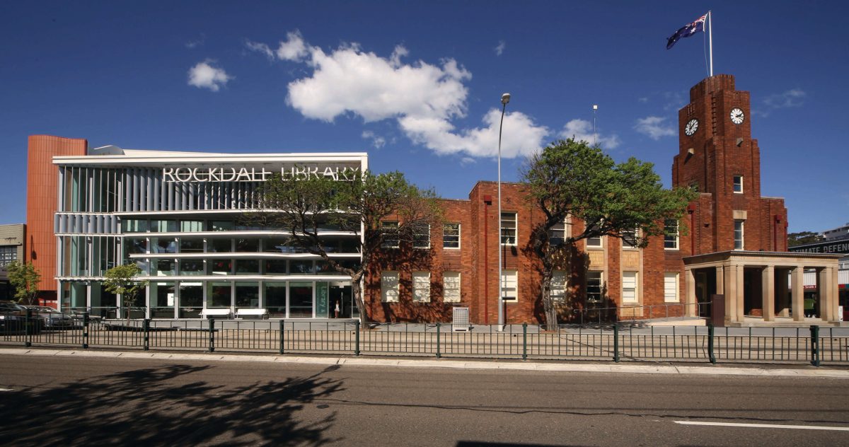
Seventeen kilometres to Sydney CBD, Rockdale has just acquired one of the city’s finest libraries with an outdated facility on the remainder pile replaced by a best-seller.
Libraries are now considered a social glue-pot bringing together a broad demographic and ethnicity. The pressure on architects is to make their designs dance rather than fall asleep. It’s a strategy with a direct bearing on how libraries are utilized. Are they active or passive?
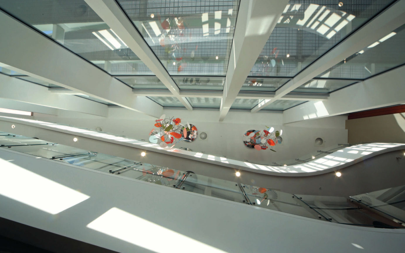
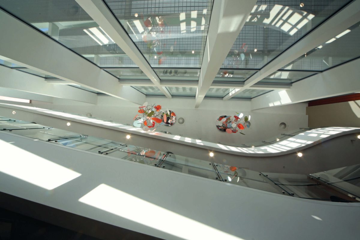
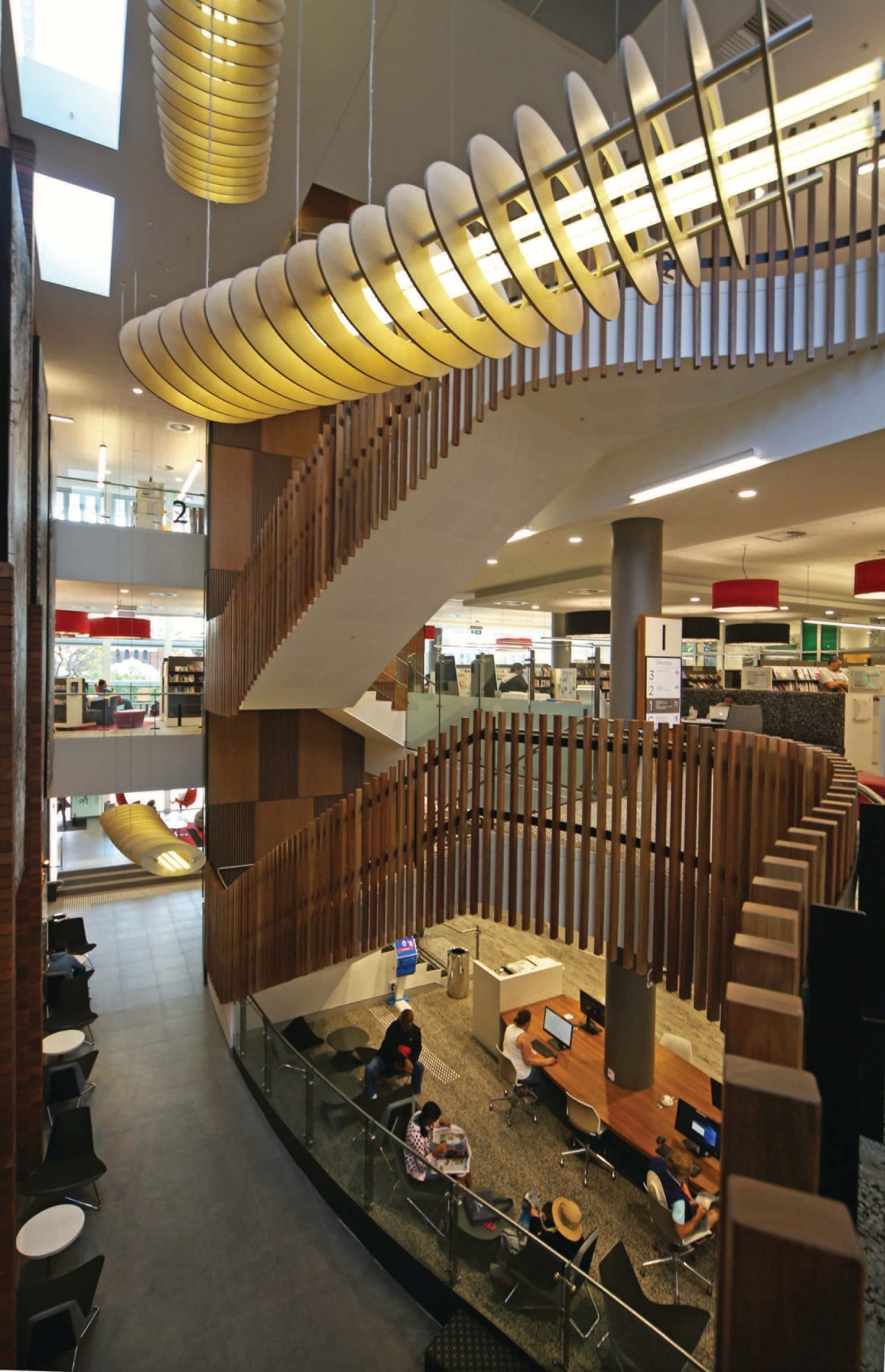
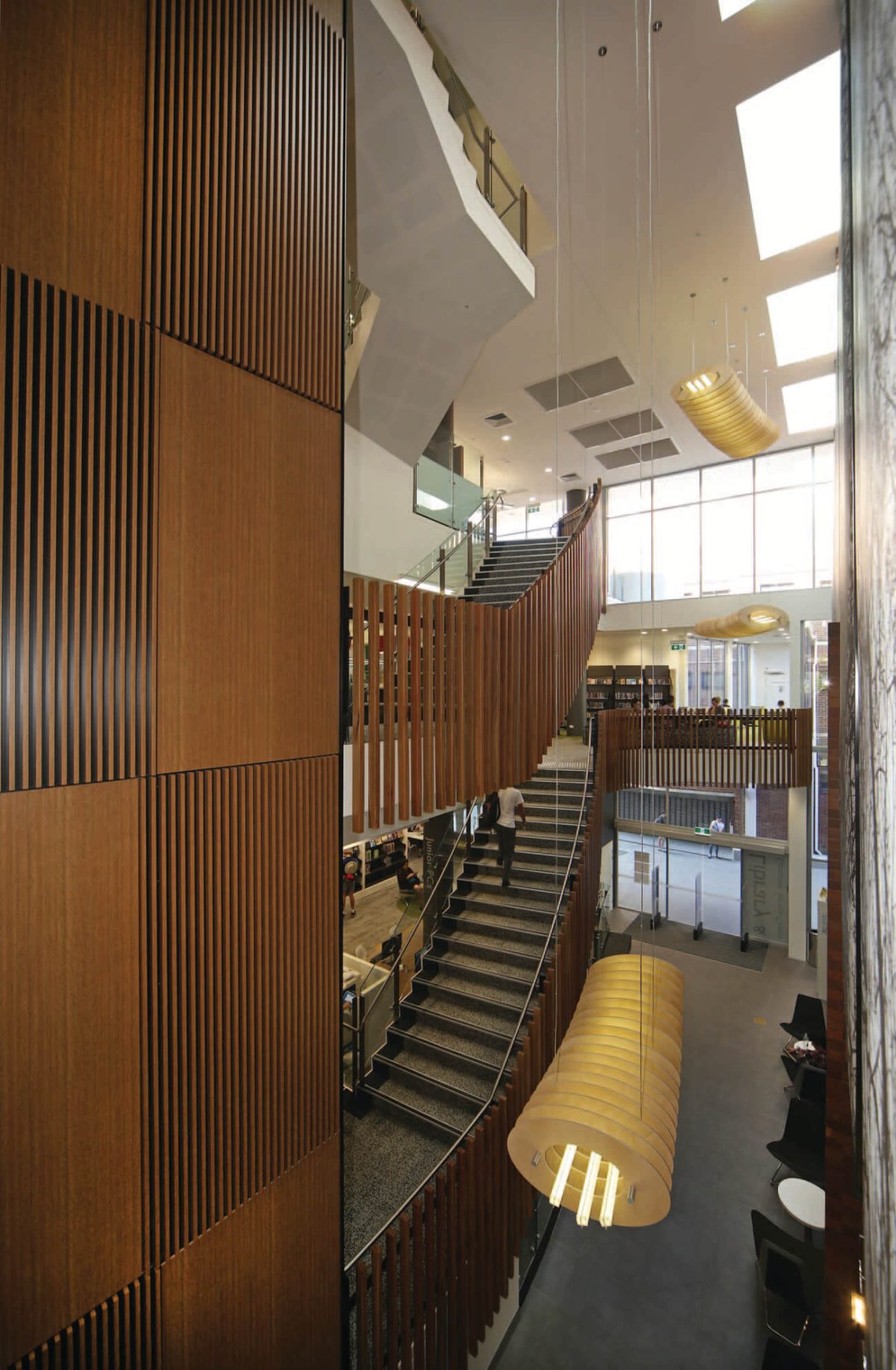
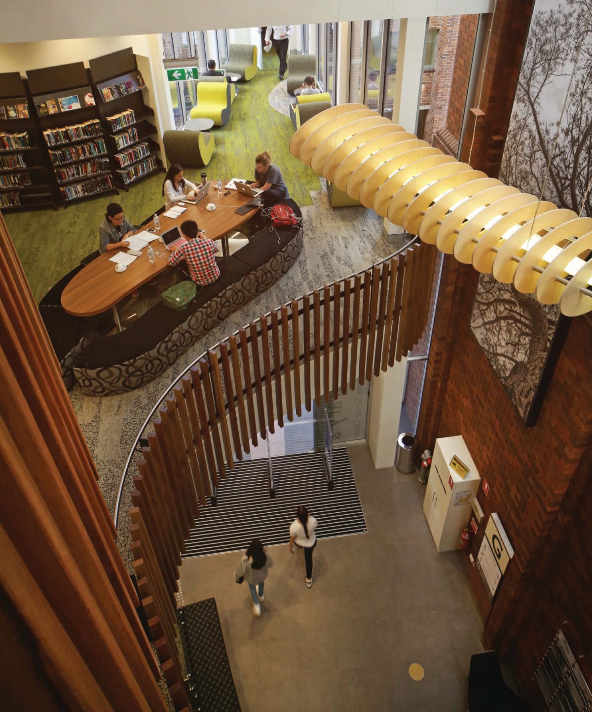
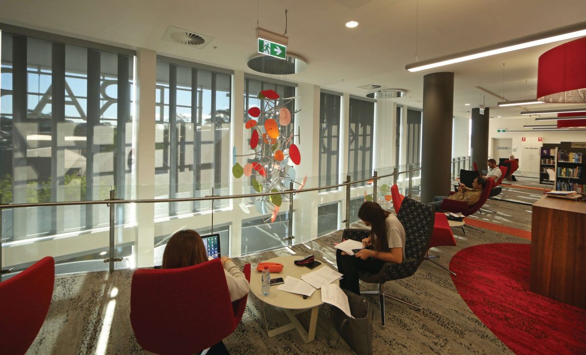
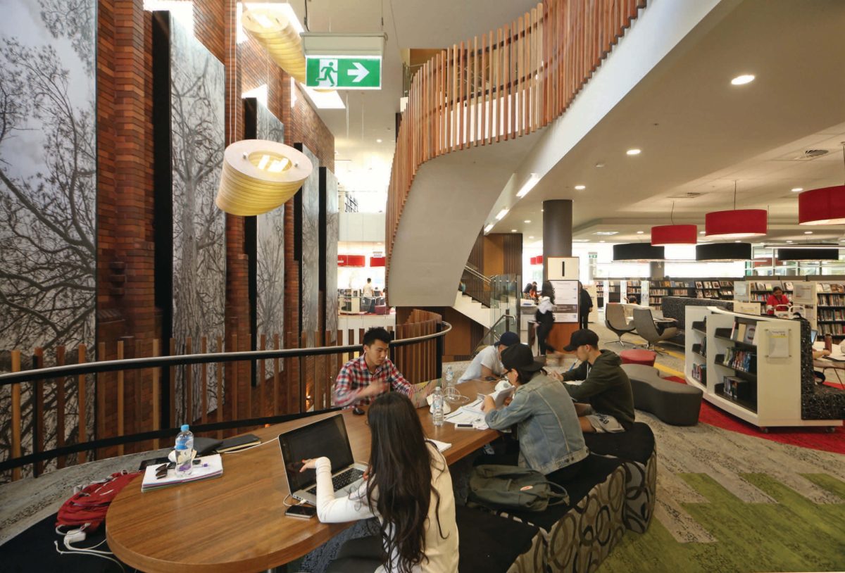
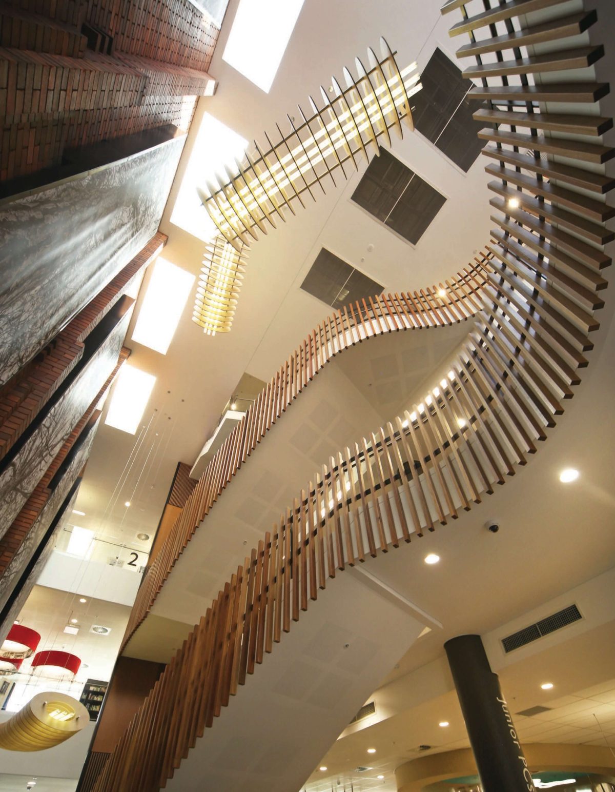
Rather than a shy stance, Rockdale exhibits a free-form, athletic flow right across its three levels. Tall voids, study options, assorted meeting places and specialist nodes are all catered for in a library of complex pedigree.
“Here it’s the subtleties of the design that are important. I think in this case it’s probably the most vertical library we’ve done. There are lots of things about how we connected spaces, how we connected to the surrounds, how people move through and about this library that we’ll take and use in future designs.” Andrew Hjorth, Architect
Viridian spoke with Andrew Hjorth of Brewster Hjorth Architects about the design of a library to match changing community expectations:
VISION Whatever you may have achieved here, it’s obviously given the community something significant.
ANDREW HJORTH It’s really fantastic to visit and see the place full of people working away, reading, studying, socializing. That’s what libraries are all about. It’s great to see that. The resurgence of libraries, not merely as places to retreat and retire, but as social hubs, is quite remarkable. They’re just like the latest Harry Potter novel.Almost everyone, and that means municipalities everywhere, want a standout library.
Any overarching aims?
I hope it says that libraries are fun, exciting, dynamic places. They’re not boring rows of books. They’re places where you can come and enjoy yourself. Architecture is not some sort of monument to the architect. It’s a living, evolving entity which people enjoy for its own right. The architecture is only a part of making that work. It’s the spaces, it’s the people using it and the whole dynamic of the facility.
What were you able to bring to this project?
I’ve always had a passion for knowledge and reading. I think it’s been a real privilege to be able to work on libraries. Our practice has been working over 20 years on library projects across New South Wales and into Queensland. I think we’ve learned a lot. I hope we put that back into each of the projects we work on.
What did the project teach you?
We’ve designed a lot of libraries so it’s an evolving process. You learn from one project and you learn in many subtle ways. Here it’s the subtleties of the design that are important. I think in this case it’s probably the most vertical library we’ve done. There are lots of things about how we connected spaces, how we connected to the surrounds, how people move through and about this library that we’ll take and use in future designs. Really, the important part of architecture is understanding those subtleties; understanding how people react and move through that type of building, is fundamental to its success.
It’s a library with quite a complex design history.
We were engaged by the builder on a design development and construct contract. This meant we were engaged by the builder to follow on from the early phase of the design – much of which had been completed. We needed to finesse that. We also had to work with an interior designer to pull
together all the interiors, to get the result you see here today.
How did the aspect and orientation influence your response?
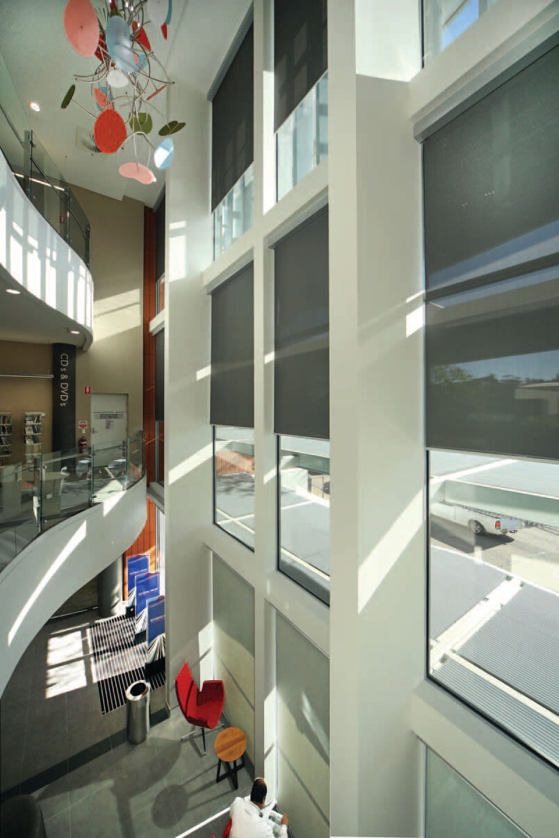
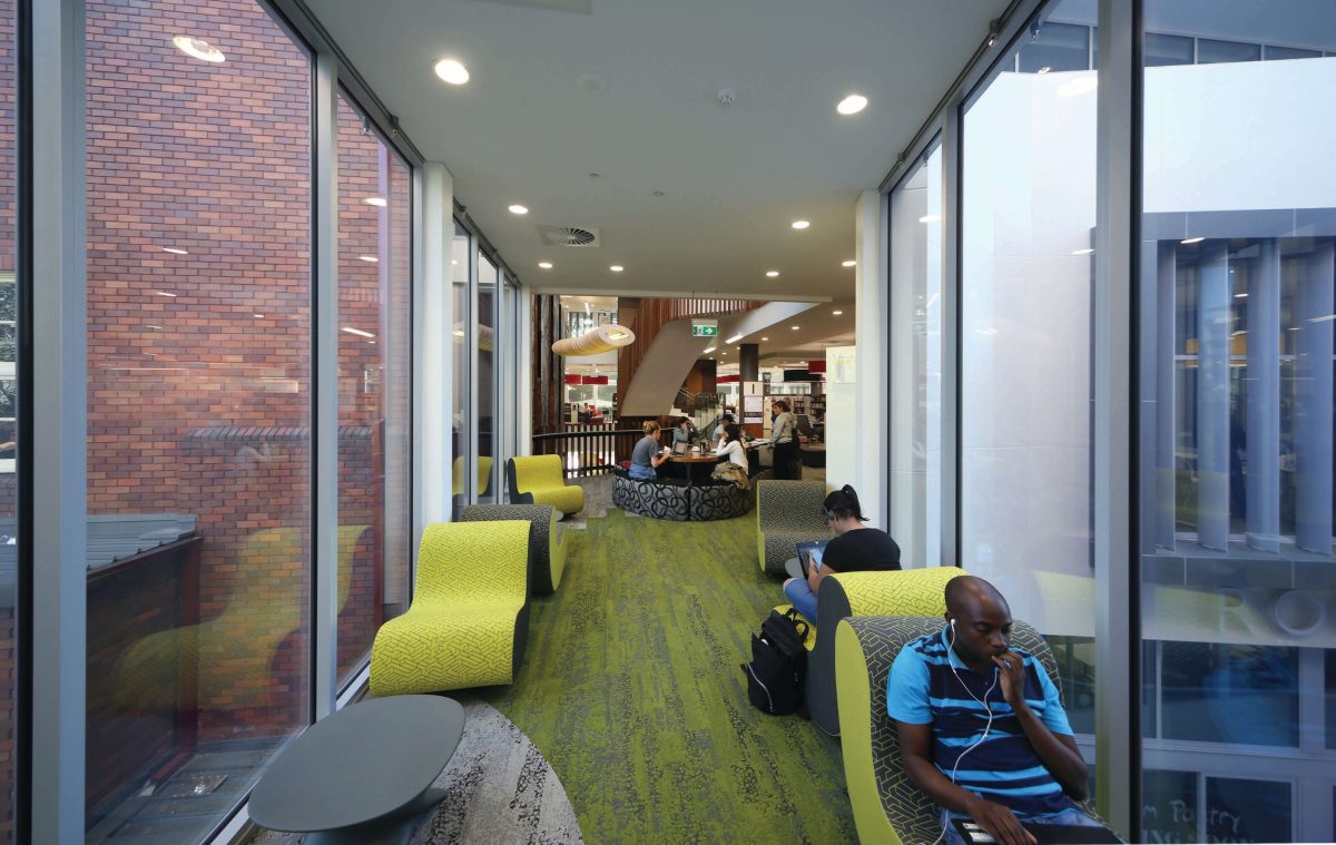
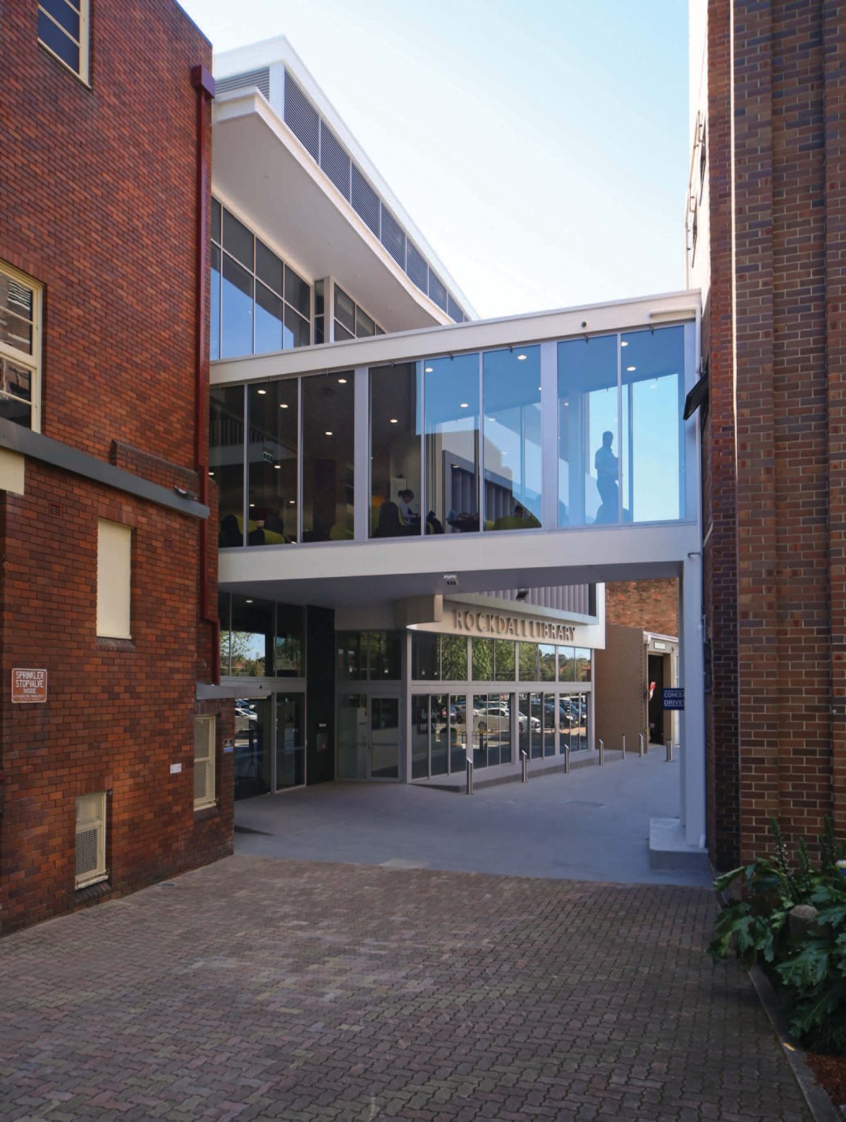
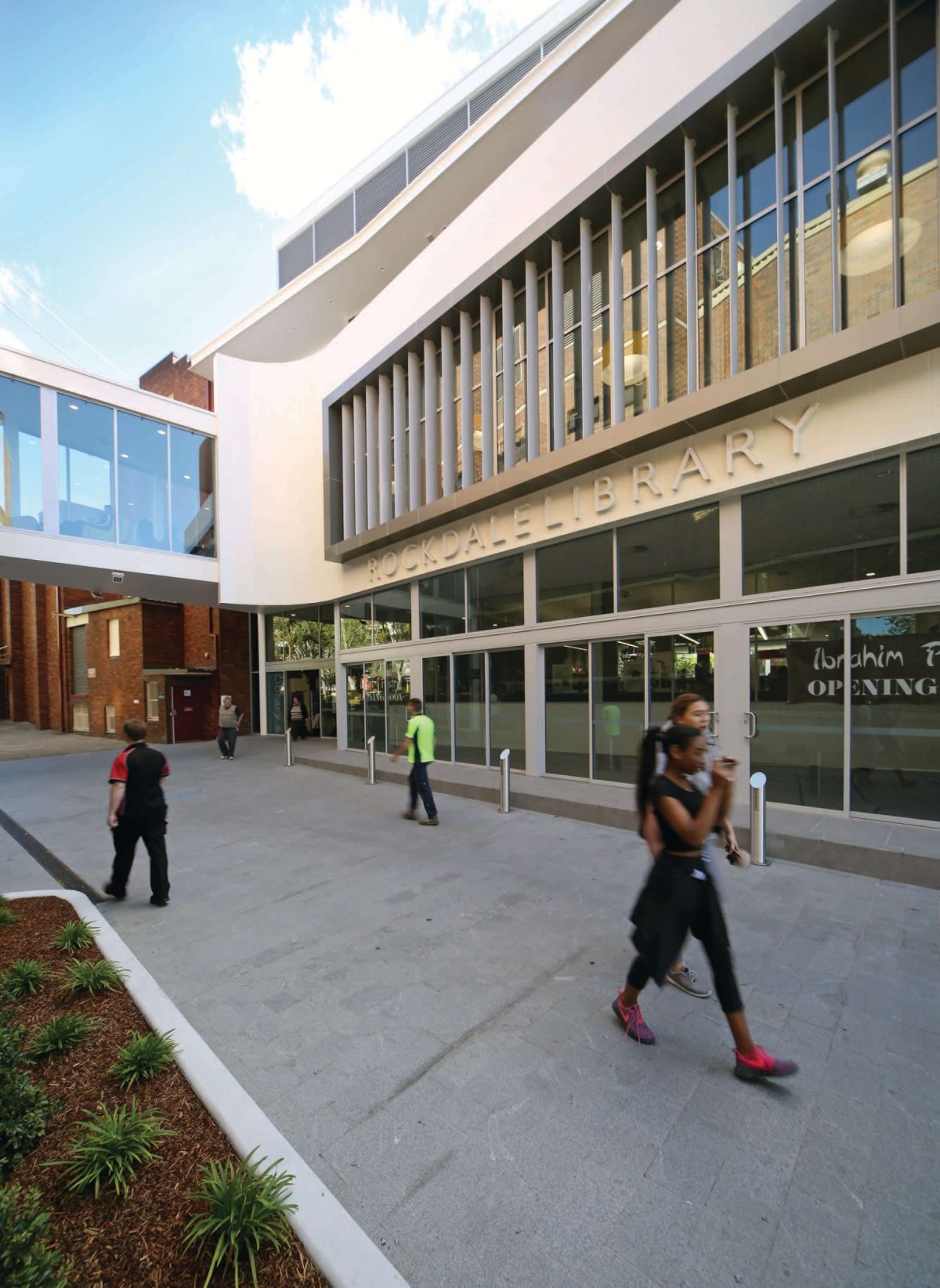
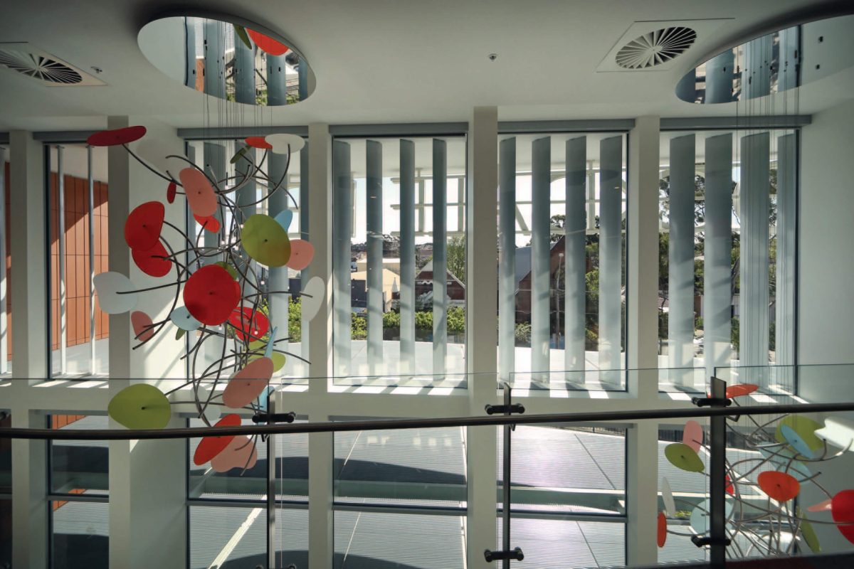
That simply poses additional challenges, both with the orientation of the building facing east west, with no possibility of getting north or south windows. You have to deal with that. If you want to activate the street, you’ve got to deal with having glass on the western façade, or the eastern façade. You’re also sitting underneath the flight path and have a major highway next to the building. If you’re going to achieve that light transparent building, selection of the glass becomes fundamental to that decision process.
How does this library vary from those of previous generations?
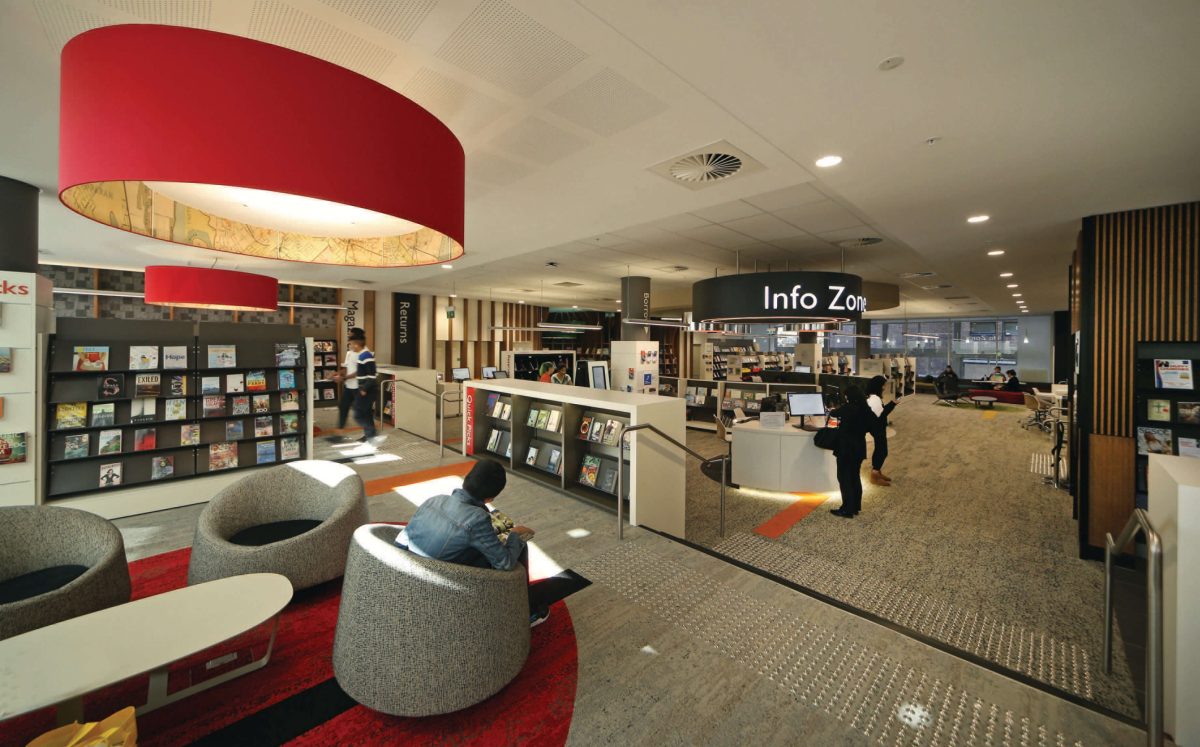
Libraries should be open, lively; they should be destinations. Those old-fashion libraries were places where you came, got your book, ran home and read it. Our modern libraries are community centers. People come into them, they use them as a resource in their own right. They may not be borrowing anything. They just might be using the space: meeting, socializing, reading. They are really community centers with books in them.
Tell me about some of the glazing strategies.
The glass used was double-glazed units. The western façade, the highway-facing units use Viridian PerformaTech™ where there’s a large heat load – even with good sun shading. PerformaTech™ provided us with the performance we needed to overcome that heat load, and achieve our compliance requirements. That glass module includes laminated acoustic glass. The glazing is working hard thermally and acoustically to achieve what is required.
I like the idea that architects must fundamentally like people and reward them whenever they use a building. Buildings are really an opportunity to offer people a really pleasant experience.
I think that’s fundamental to the success of architecture into the 21st century. Librarians have realized that these places aren’t just repositories for books. They’re really places for people to come and enjoy and to use. They’re destinations for the local community. In a way it’s where people come to sit, and to read. Creating that whole diversity of experience is a key to its success
Do you see glass as adding a special quality to the building without being flashy about it. There is some beautiful glass handsomely mediated with the louvers on the west.
It comes back to that notion of the community destination. Glass is really important in achieving that. You could have a box with no windows and you wouldn’t achieve the same thing. You want to see all of the activities from the street. You want it to feel welcoming and vibrant as you’re walking along the streets, so that main elevation is a very important part of the project.
People still need knowledge, they still need to socialize, they still need recreation and libraries are just evolving with the technologies to create different ways of providing those facilities. Not only that, Rockdale’s also got a whole renaissance of residential quarters with lots of apartment buildings. They’re places where the young kids can come and study away from home, where there’s a bit more room, they can meet and socialize with their mates or study with their mates. There are those diverse levels that libraries are working at.
It’s an interesting dynamic to balance places of reflection and study with the bright social mood. Glass really delivers the best of both worlds.
PerformaTech™ on the outside of the building provides a kind of clear armour if you like, while internally the study rooms use an acoustic glass. It’s about using the right products and materials for the task, and so to have Viridian’s input along the way was really critical in a result that went well beyond appearances. Being adjacent to one of Sydney’s major roads, with overhead aircraft noise and Mascot Airport fairly close by, required a glazing system with the best possible thermal and acoustic properties.
