Ross House
Northcote, Victoria
Architecture frequently produces a great divide. When it polarises opinion, it is mission accomplished for many architects. Better still when it rises above difference for its own sake and transforms public perceptions. Scroll down to read more, watch the video and see the picture gallery.
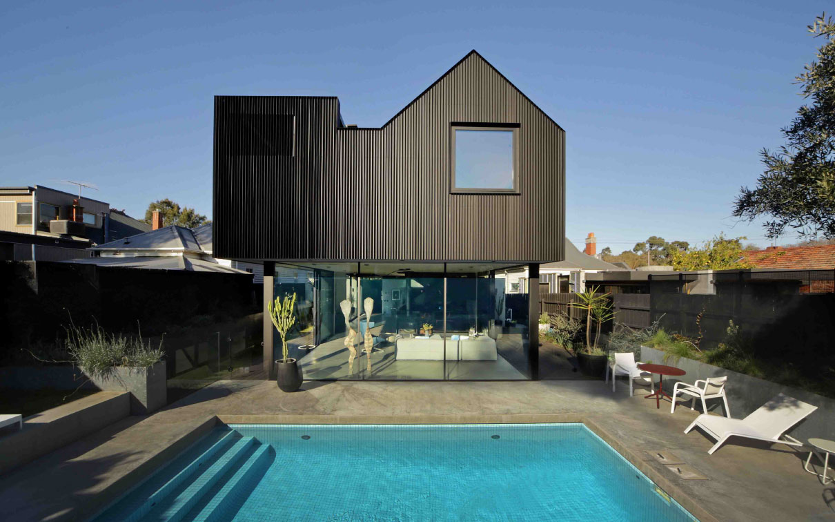
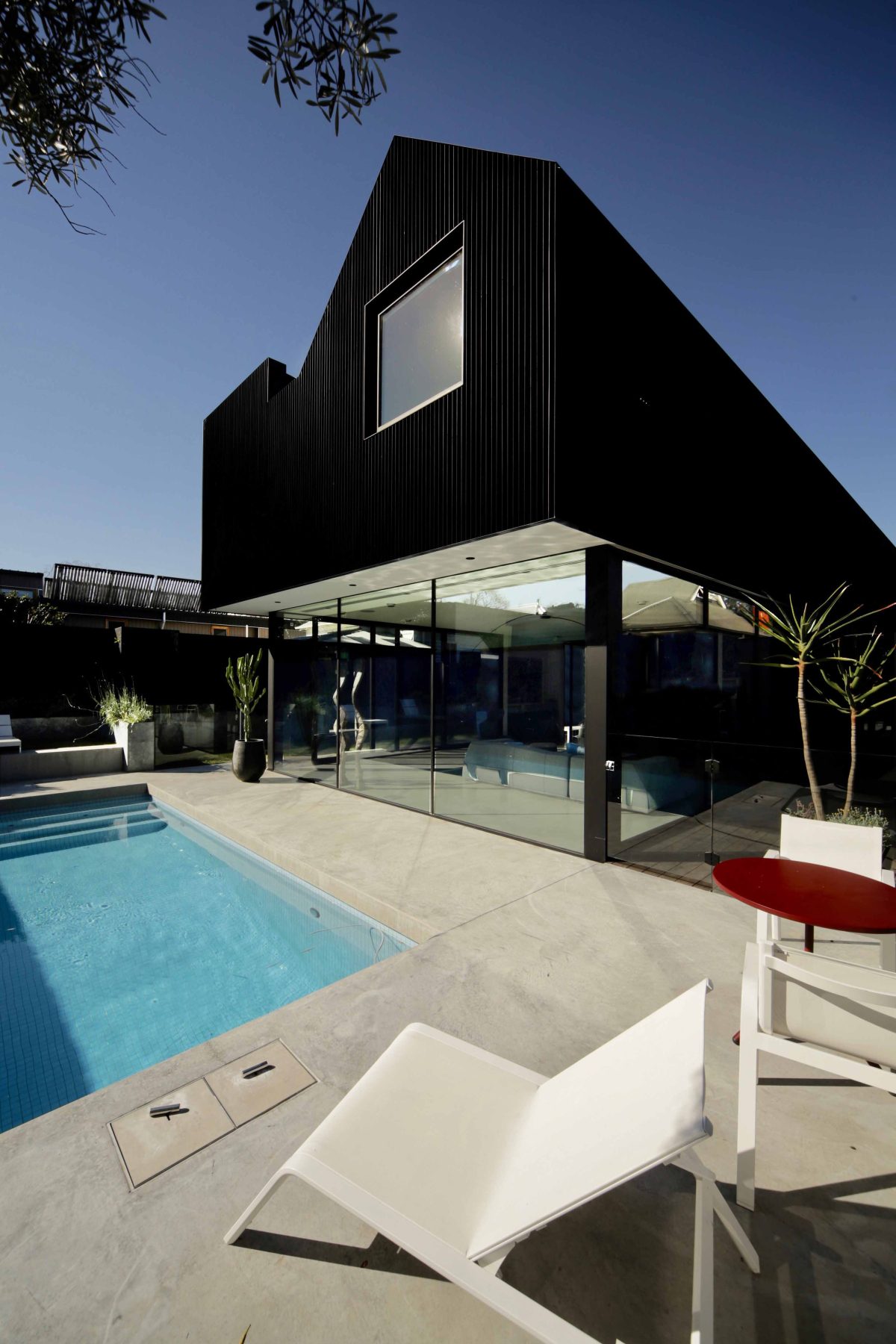
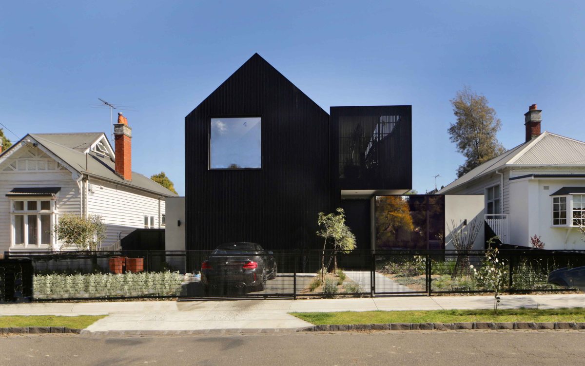
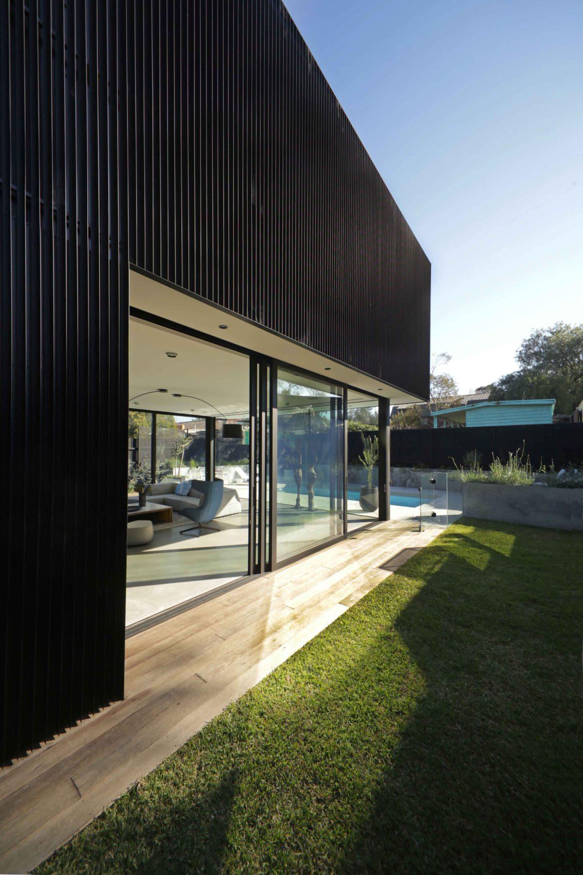
Cloaked in black with windows strategically sized and located, Ola’s design is architecture as liveable sculptural art. Viewed within the context of the street it’s an upstart neighbour, but considered more broadly, the house is contemporary architecture at its best. It is of its time and without obvious allegiance to old ways of living or building.
Viridian speaks with Ola’s Phil Snowdon about a house dressed in a dinner suit with a holiday vibe.
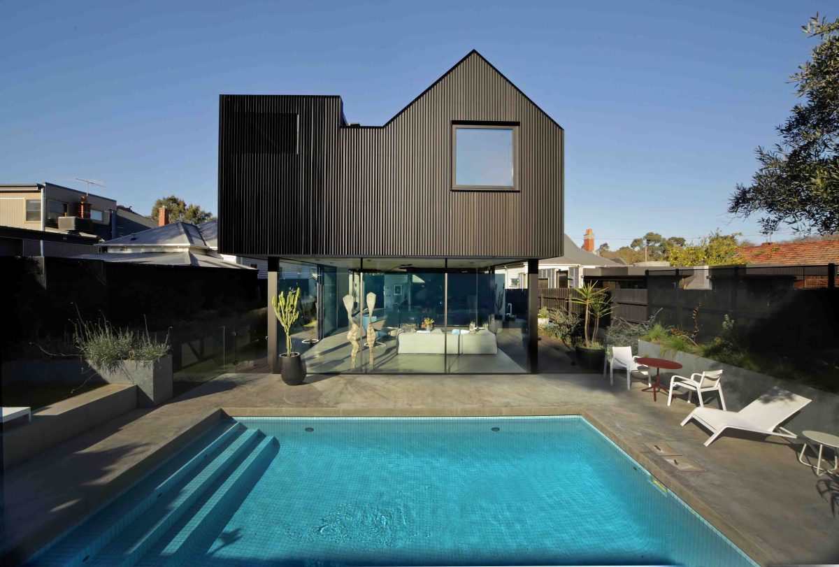
“The reduced scale sees a house-like silhouette floating in the backyard over the living spaces below. The long northern aspect is carefully designed with passive solar principles...” Phil Snowdon, Architect
Viridian: What were your key design drivers?
Phil Snowdon: The house sits within a diverse heritage precinct. Informed by our clients’ love of stark materiality and clean aesthetics, it provides a warm and joyful environment. Their new suburban home alludes to the lofty spaces of the converted warehouse they owned previously. Being nestled within a private garden, ‘Ross’ completely satisfies our clients’ brief. The house is a bold sculptural piece elegantly defined. The public facade and entry, the living area within a secluded garden, and the private realm upstairs, provide uniquely evocative environments. Upstairs is wrapped in black vertical aluminium angles and is a study in dealing with domestic privacy within the urban environment.
A house apparently of shadow is quite the reverse to experience.
Light is an important theme in this house. The gable running the length of the house tapers in scale and peels
away from the southern boundary to ensure sunlight is maintained for the neighbour. The reduced scale sees a house-like silhouette floating in the backyard over the living spaces below. The long northern aspect is carefully designed with passive solar principles and the rear garden is cut into the land creating a deep courtyard and in turn managing the afternoon sun. The house is powered by a photovoltaic installation. There is ample insulation and the house is shaded by the skin of battens, overcoming the thermal issues around a black house.
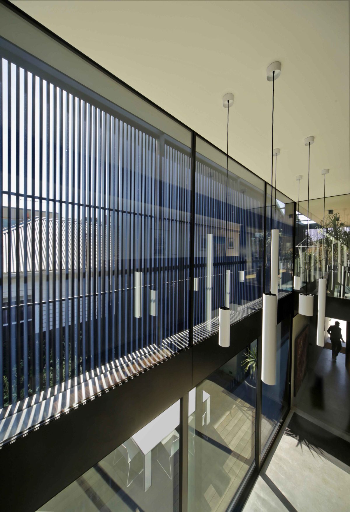
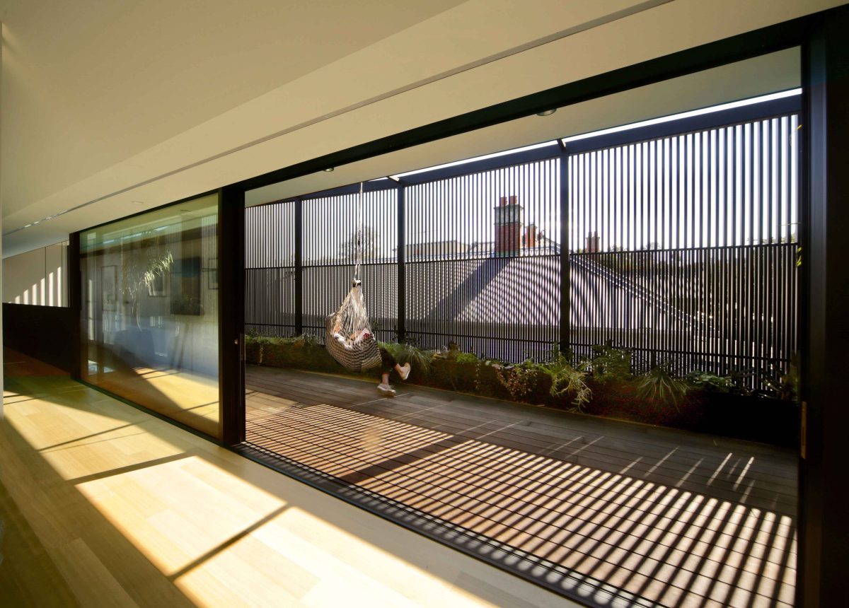
A veiled outlook is provided from the top level, while full-height sliding doors open to the ground level garden.
The ground floor space is immersed in landscape. Upstairs a veil of battens provides private outdoor garden
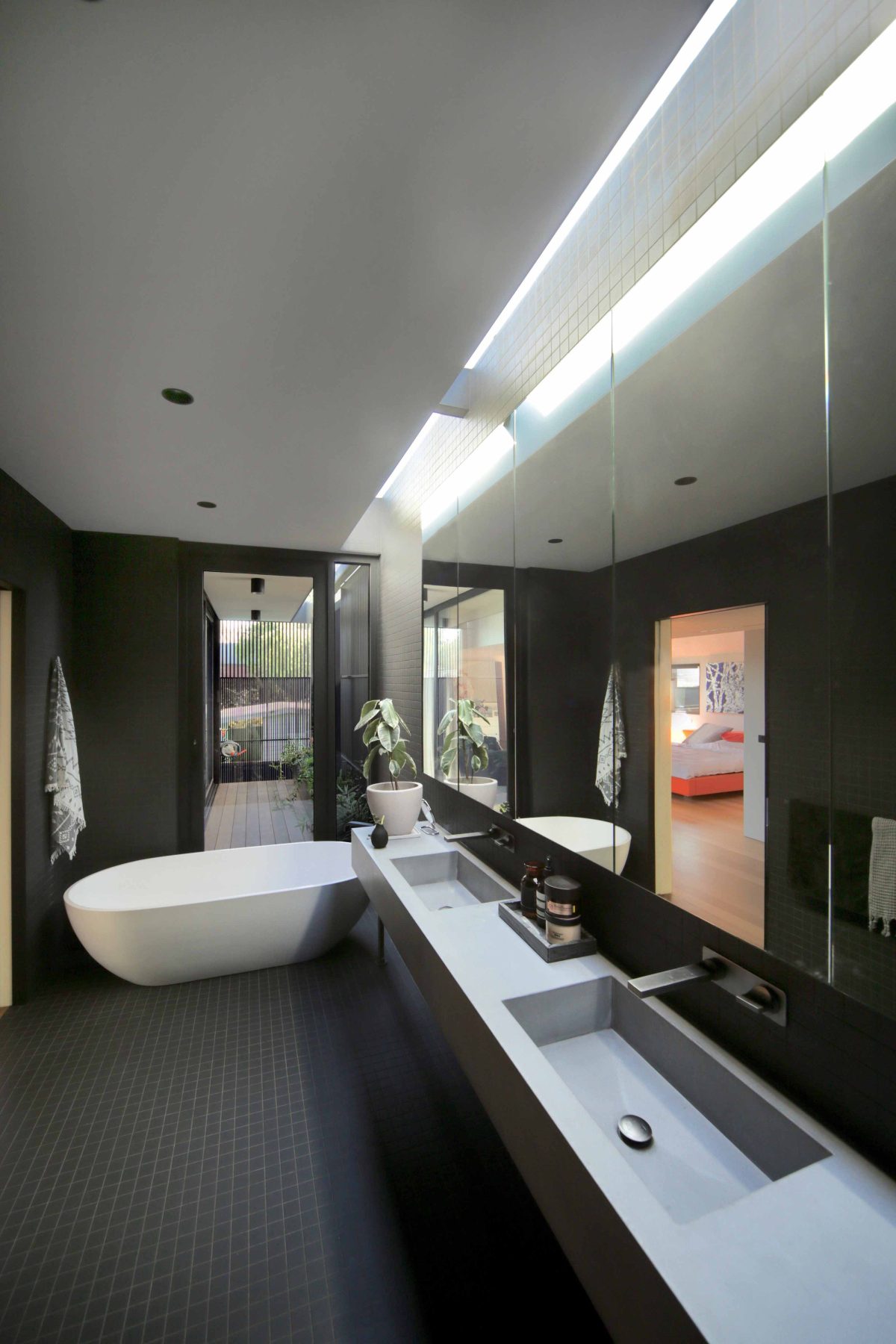
spaces awash with dappled light that change through day and night. The light softly illuminates the sculpted interior of the internal spaces. A long void creates view lines between the various external spaces, emphasising the importance of garden and connecting the realms of the house.
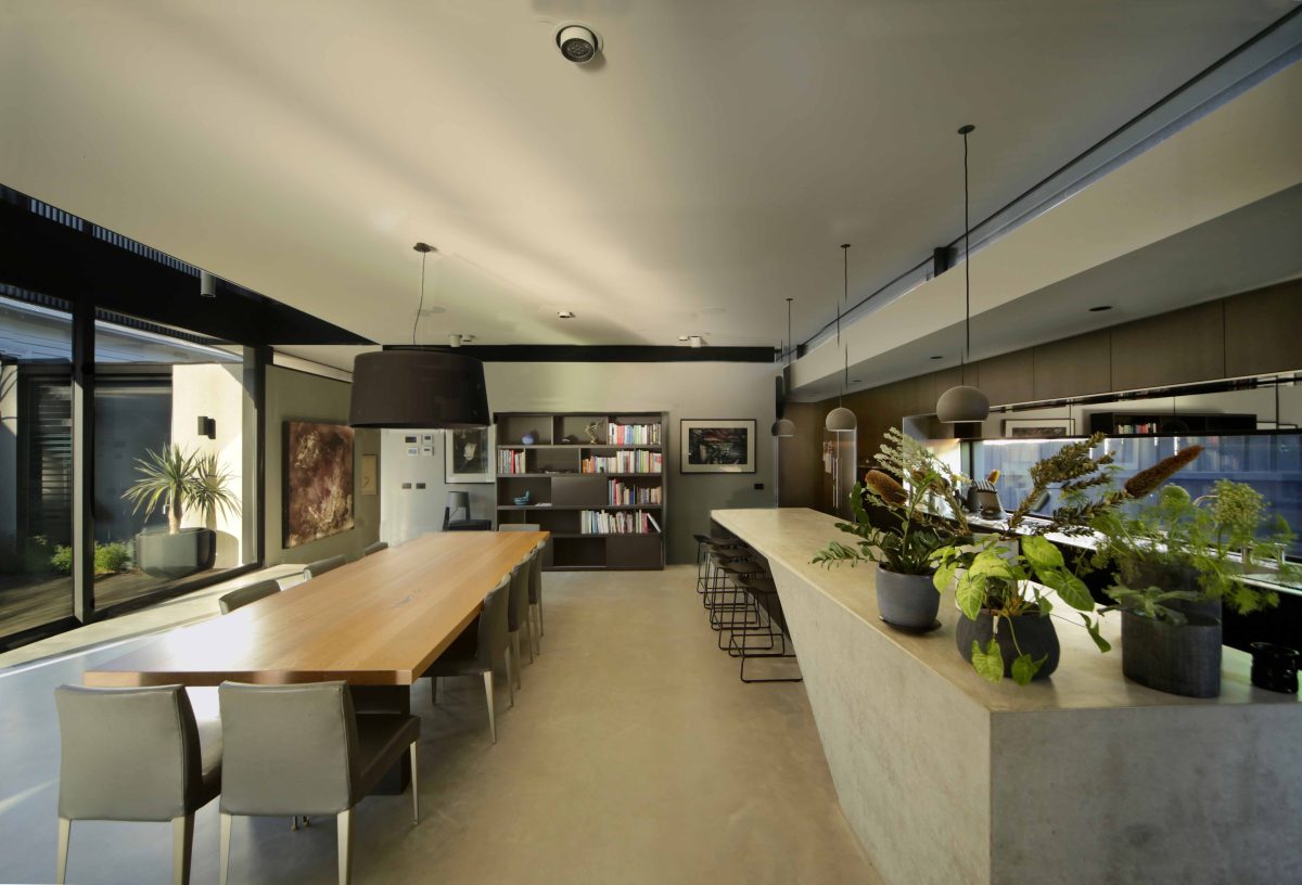
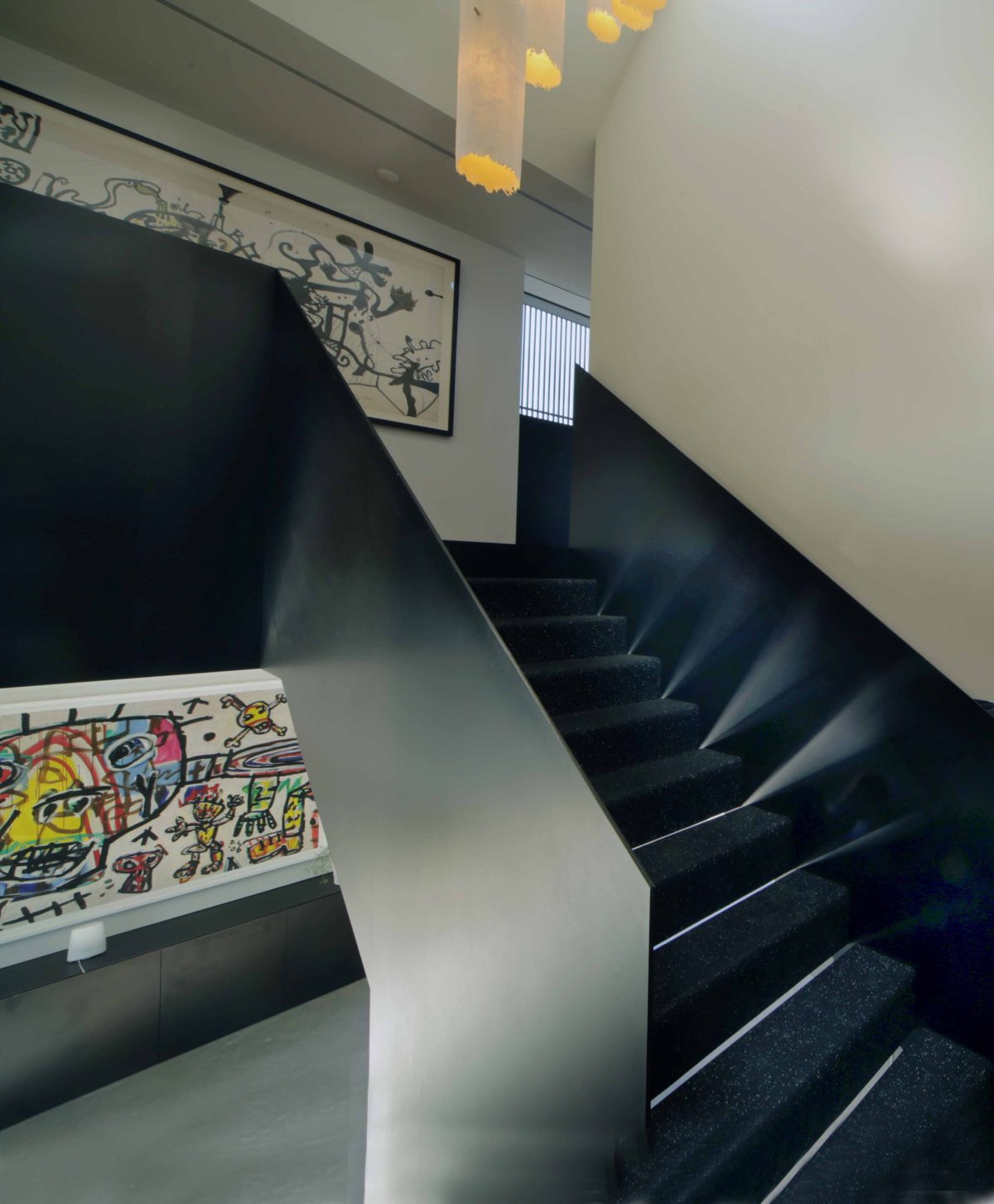
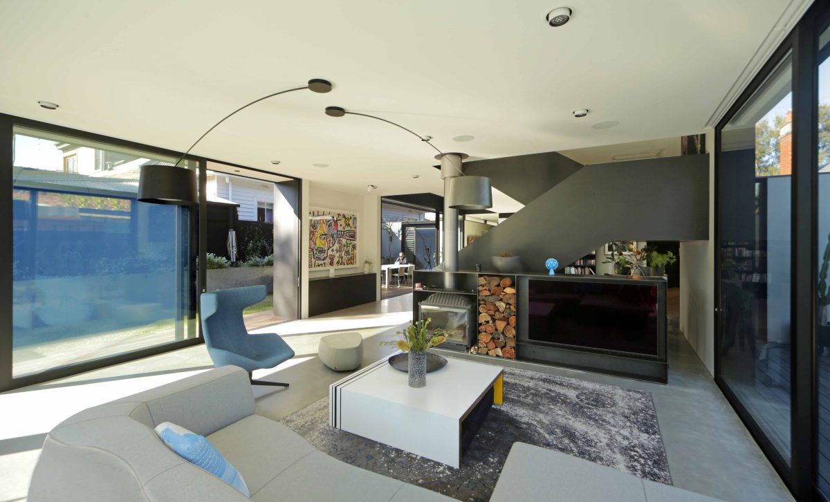
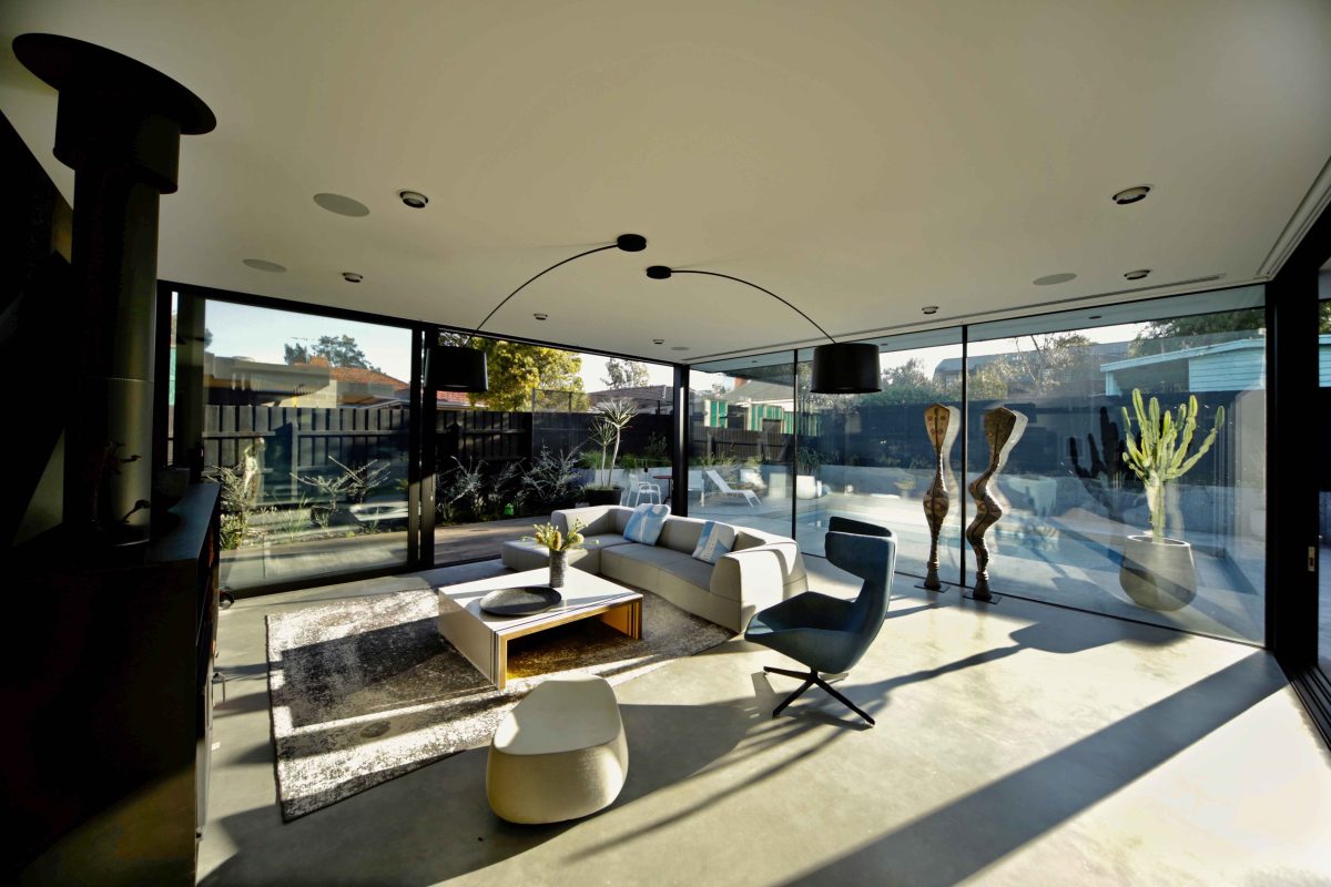
The minimal aesthetic of the interior allows the house to act as a gallery for the client’s art collection. The
sculptural elements of the steel stair and concrete kitchen bench engage in conversation. The use of mass
materials to form detailed interior objects contrasts to the external form that is singularly defined by light
and repetitive elements.
How critical was the input of others?
It took a three-way collaboration between architect, owner and builder, and we laboured continuously to deliver a well-balanced cost to quality result.
Controlling daylight might sound easy, but not everyone can.
Light was really important to the clients. They lived in a warehouse full of natural daylight for a number of years and wanted to keep that quality of light while linking to the garden where possible. The difficulty was
making it perform so that we’re getting the required thermal performance.
The benefits of glass are pretty plain and clear for all to see here.
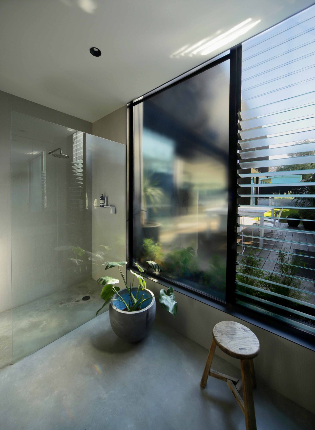
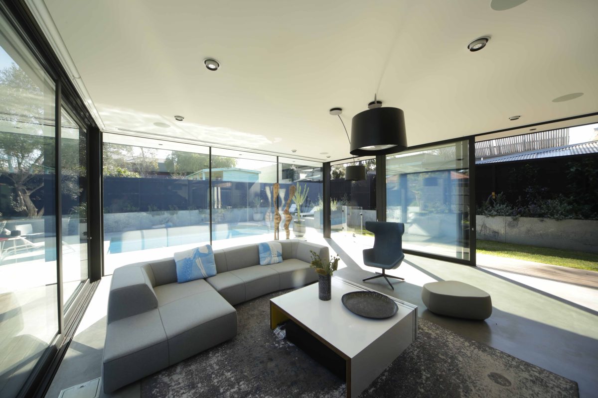
They are. Downstairs, the glazing allows occupants to be one with the garden. Upstairs it’s more about privacy and filtered light with the whole building wrapped by a screen. The glass allows a way of feeling the presence of that screen and the outside conditions without being exposed to them when they are not pleasant.
Is it a house that gives more back than it asks of the clients?
We really like when people are attuned to their environment and decide to open windows and doors whenever they want to be comfortable. We like to encourage natural ventilation by providing lots of operable glazing so you can be attuned to the environment rather than rely on air conditioning.
Is there an area in the house which really celebrates or captures the essence of what it was you’ve tried to do here?
I think the space right here really captures the essence – this is the main space, this is the hero space. This whole living, kitchen area and the staircase that divides the space really speaks of the detailing. I think that quality is carried right through the house.
How did you reconcile the myriad of complexities required for this design?
We just work through a whole lot of different ideas until a solution starts really working. We look for something that has clarity, that’s serving the needs of the brief but has a real, defined character. It’s very hard to pinpoint when that moment of clarity happens, and the plan starts to really makes sense.
Were you inspired by specific examples of modernism?
Alvar Alto. We have so many inspirations. It’s a complex question. You’re always taking from things that you love, things that you’ve looked into and studied. You’re always trying to capture the lessons you’ve learned in a new and fresh way.
What was Viridian’s key appeal?
Viridian’s the go-to for me. It’s the company I first think of when it comes to glass, and it’s the people I contact to work through the types of glass we should use. They have a great range of products and some really great looking locally sourced products. Their website is very easy to use and the people we contact are always very helpful.
There’s a deceptive amount of glass across both levels. Were there many issues with privacy on both sides of the fence?
One of the key parts of the brief was privacy coupled with viewing as much garden as possible. We had to consider privacy and outlook at the same time, so the garden is really set-down and cut into the land to provide a private courtyard that is connected to the interior by large panels of glass. Upstairs we’ve screened all the glass to help with privacy.
As the architect, what have you brought to this house that others may have missed?
There’s such complexity in getting all of the alignments correct, the spaces and volumes right. An amazing amount of time goes into making sure all the spaces are properly proportioned and that the smallest to largest elements are all fully considered. Viewed from the outside, it’s really a single sculptural piece that just sits in place, and that same single sculptural piece also defines a myriad of different interior spaces.
What if any other issues arose with such a formidable glazing program?
The framing systems were probably the biggest challenge. We could get the glass size – that was fine – but the challenge was sliding door panels and systems that would meet the engineering requirements and guarantees.
What does this house say about the direction of your architecture?
Architecture involves a lot of trust from the client, and it’s hard to win that trust until you’ve built up a body of quality work. With the completion of every great project, we hope to enable more trust in our vision.
Do you need to be in locked step with your clients’ ambitions?
You do. It could easily be seen that we’re just designing to get better work and it doesn’t really matter what the client’s seeing. But for me, the best outcome is when the clients really love the place you’ve created. I think hopefully that will help promote our business as well. A happy client should be the best form of advertising.
Watch our video interview with Phil Snowdon here, and see the gallery below.
