The Block 2020
Brighton, Victoria
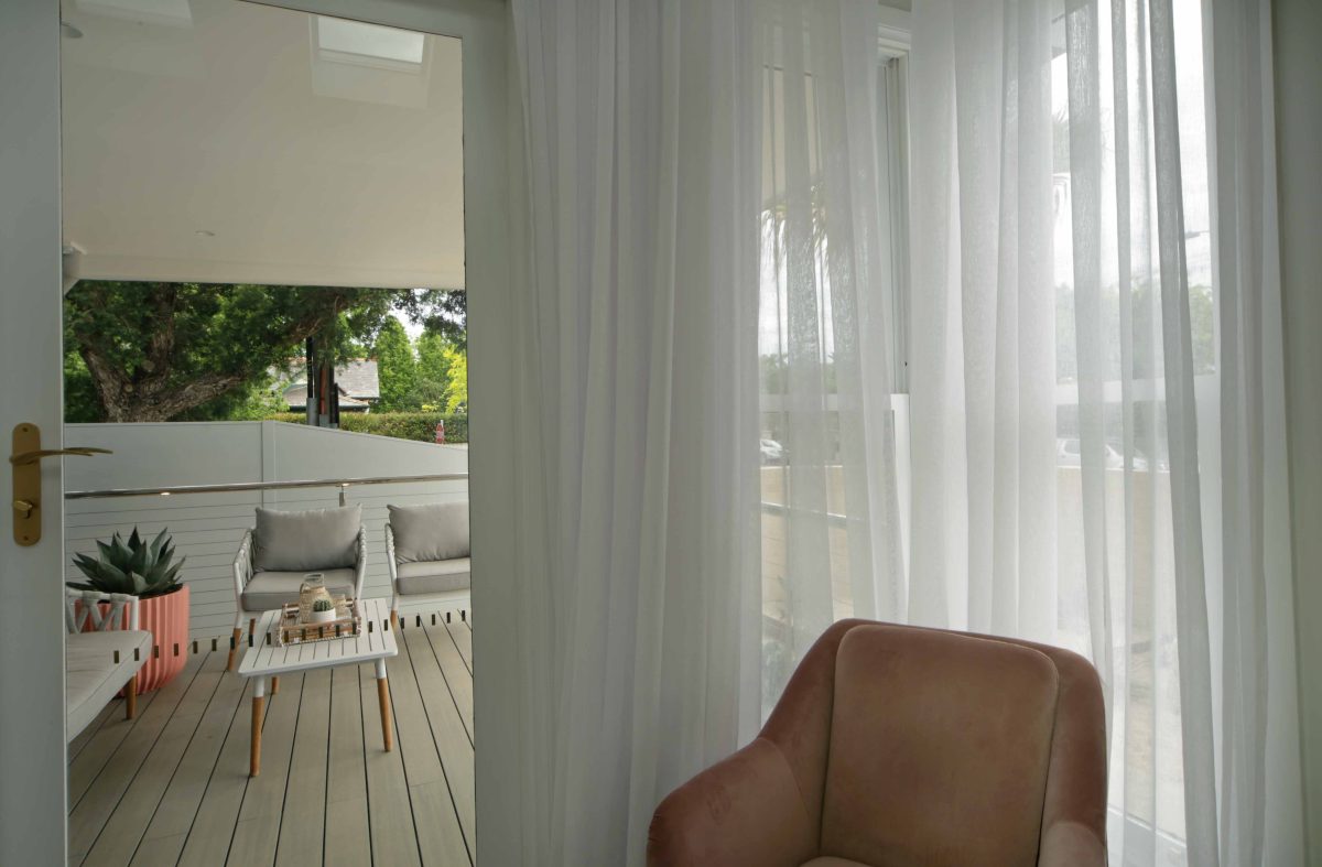
It was a blockbuster, in an uncertain time the 2020 season of The Block prevailed with stunning homes and record breaking auction results. Read our interview with project architect, Julian Brenchley and view the video and picture gallery below.
Viridian’s sponsorship role with The Block stretches back to the series’ early days. Year in, year out the show has built knockout ratings and showcased some of the best and brightest designs for its audience.
Series Architect, Julian Brenchley, works away quietly in the background from the beginning to ensure contestants have a functional and creative context and setting.
Julian has championed the innovative use of building products throughout the program’s evolution and Viridian Glass has been at the forefront of housing the light-filled, sustainable and high-performance designs.
This season produced another round of record-breaking auction results, with houses marrying nostalgic and contemporary design. Over almost two decades of this ratings phenomena Julian has performed plenty of heavy lifting behind the scenes to enable innovative product integration.
Speaking with Viridian he reflects on the achievements and challenges of setting the stage for contestants to excel. Premium materials, says Julian, give contestants a flying start and beyond it brings great design to an always appreciative public. Read our interview with him below, and scroll to the end to see the photo gallery and a link to the video.
Viridian: So what does Viridian’s product range bring to The Block?
Julian Brenchley: In terms of what we see or, ironically, don’t see, is the ability to explore the quite extraordinary introduction of natural light into these old houses. The technology in glass, with LightBridge next™ especially, gives us opportunities to do things that you probably really wouldn’t have been able to consider a few years ago. So it brings a great opportunity to The Block.
Is the orientation of all of the houses a bonus or a penalty?
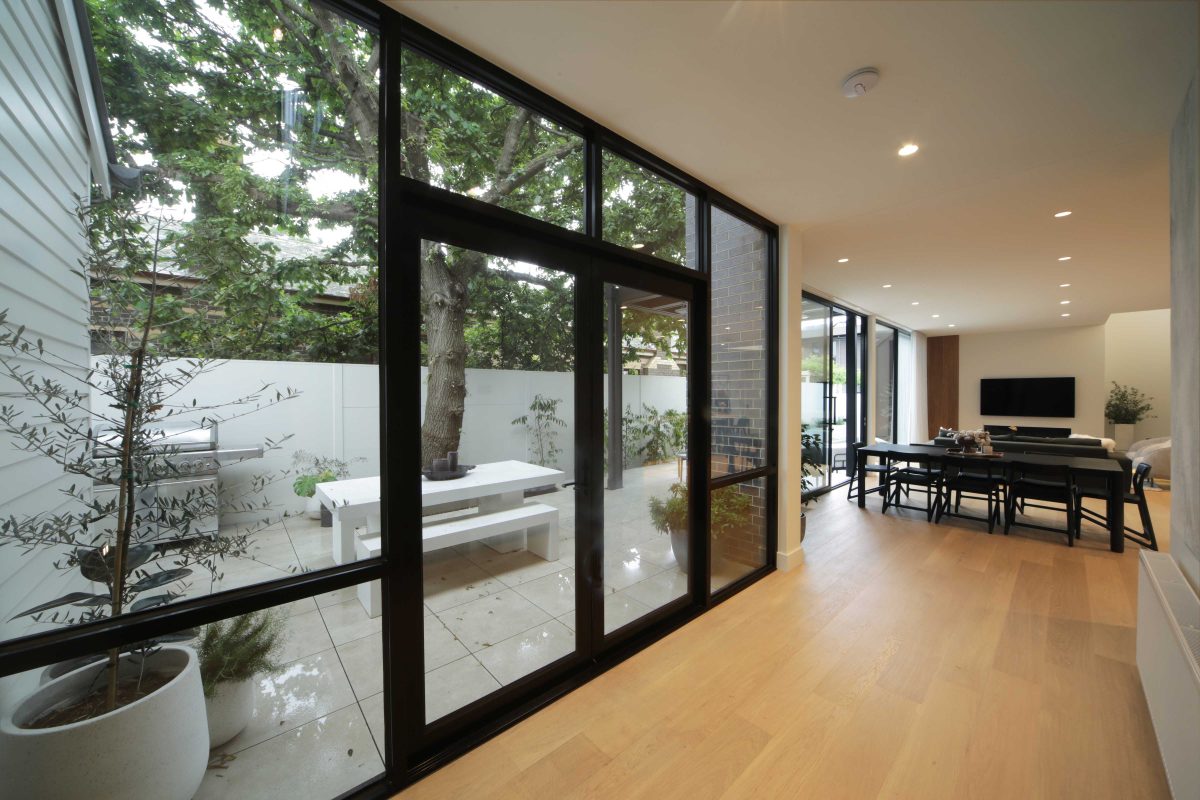
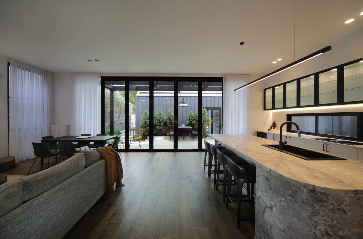
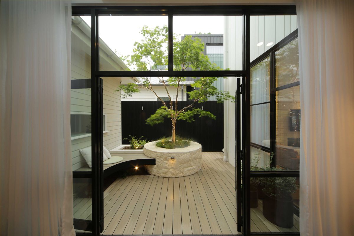
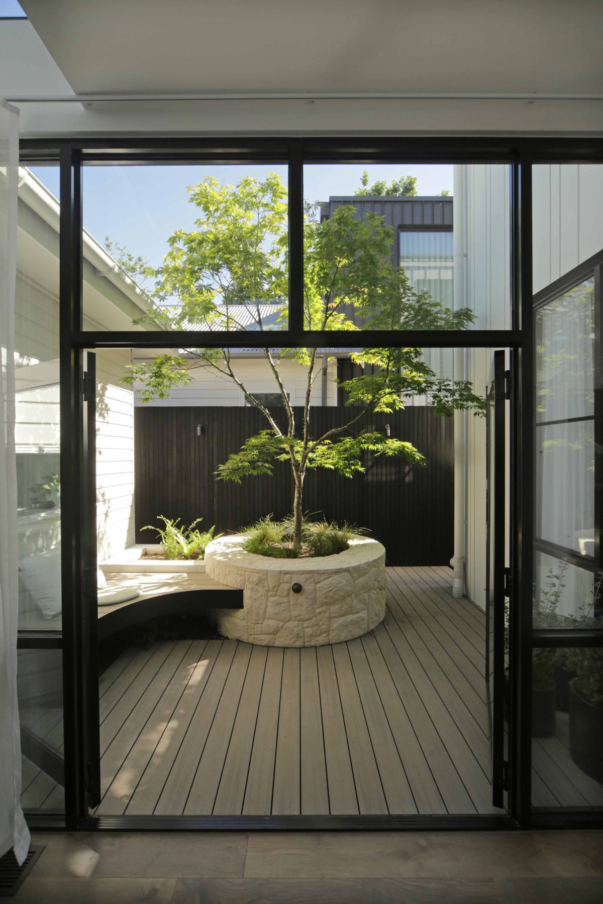
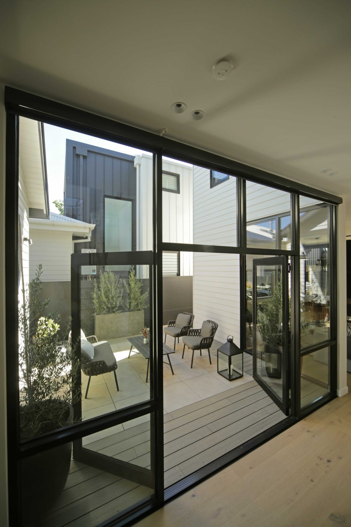
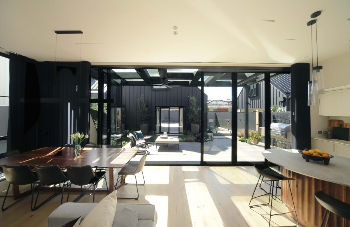
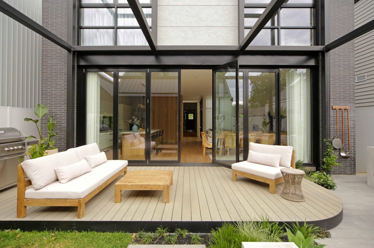
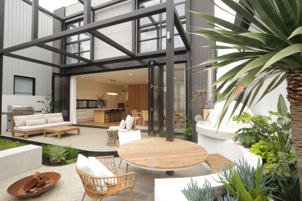
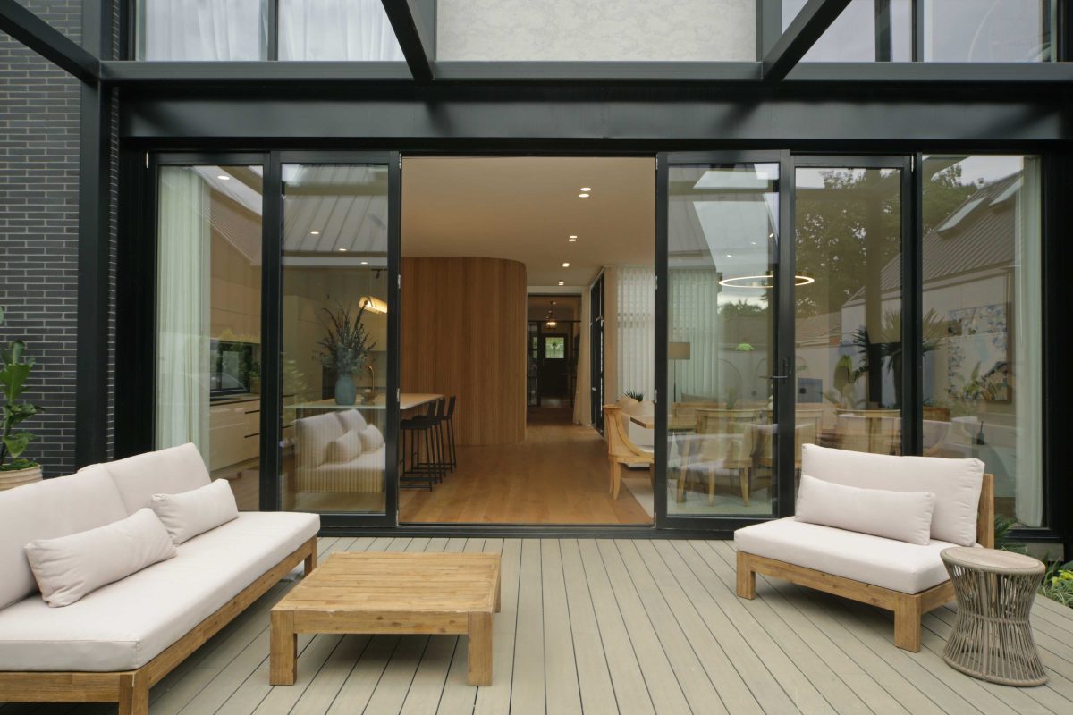
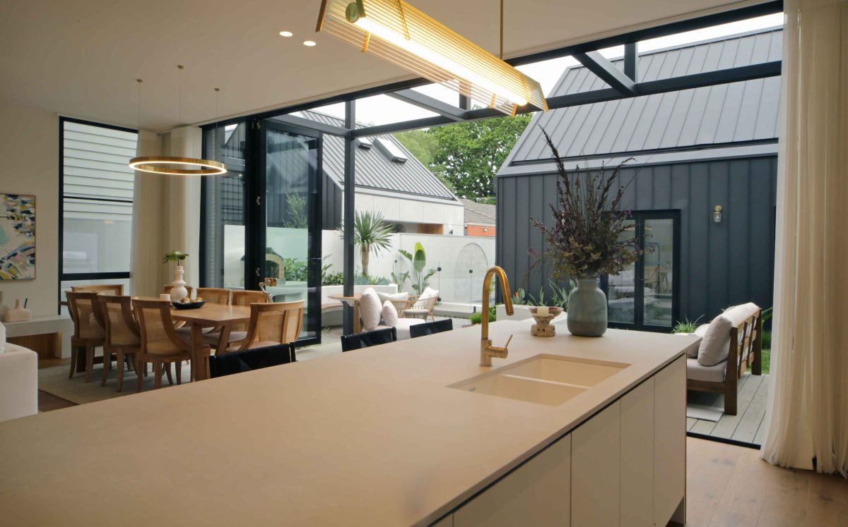
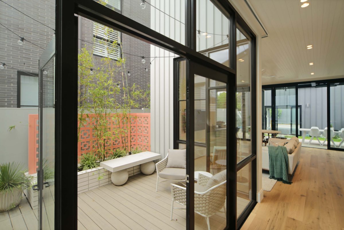
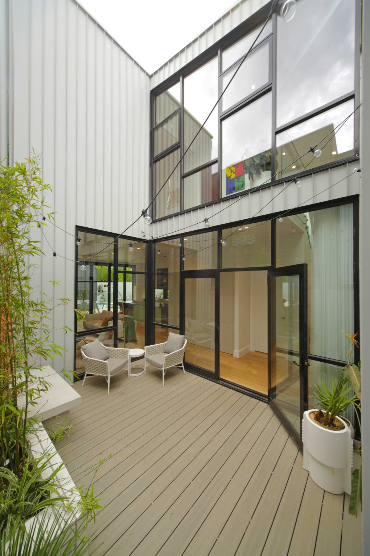
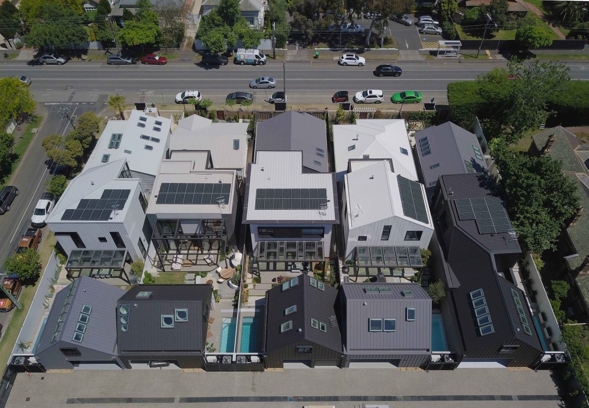
We can’t really choose the orientation of these blocks, in much the same way that you can’t choose your family, but you love them nonetheless. All the sides of the buildings faced north, so in Melbourne, as you well know, you like to stay warm in winter and have your living face north. That presented some challenges, but the inclusion of courtyard or dividing spaces for all the houses, combined with the use of this high-tech glass, gave us this quite extraordinary change in the functionality of all the houses.
While not the invisible element, daylight blends the designs quite seamlessly between the old and the new.
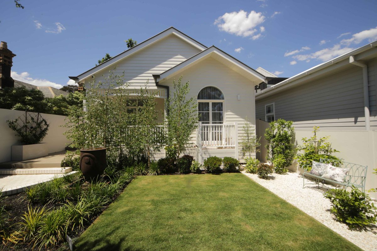
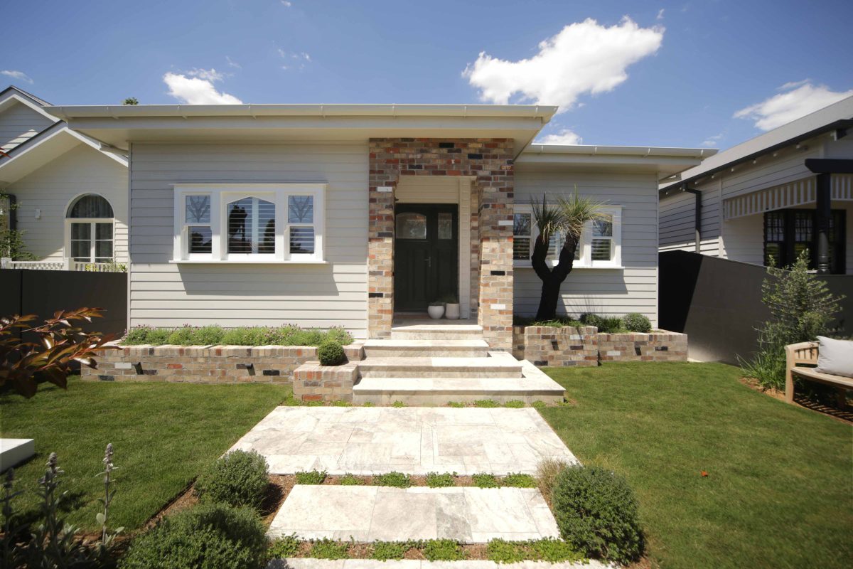
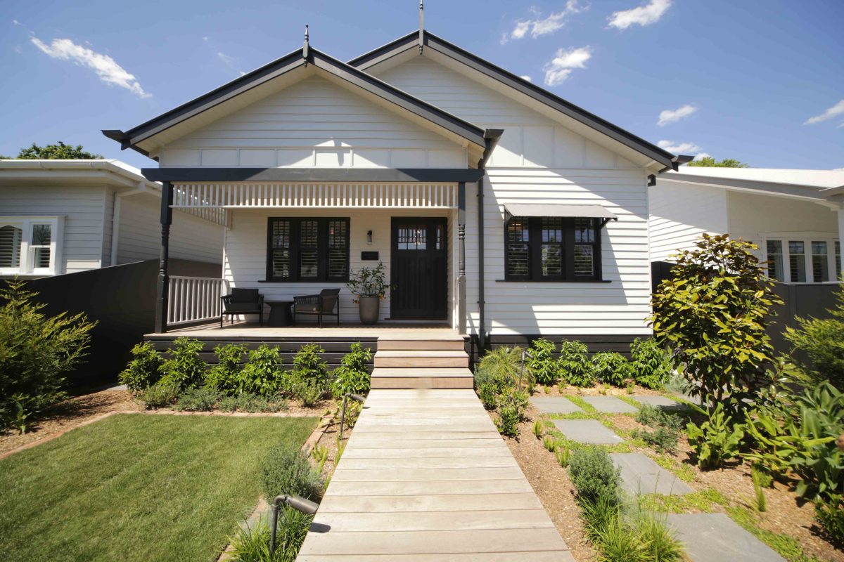
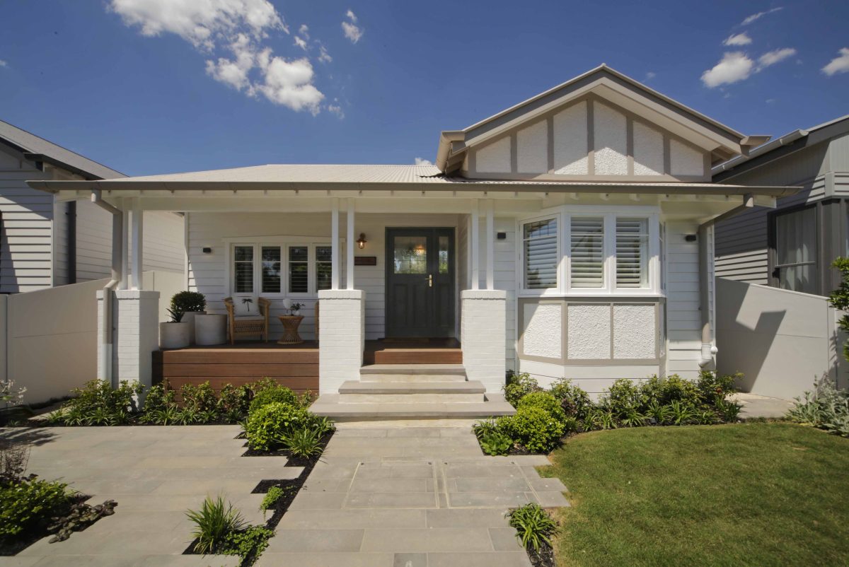
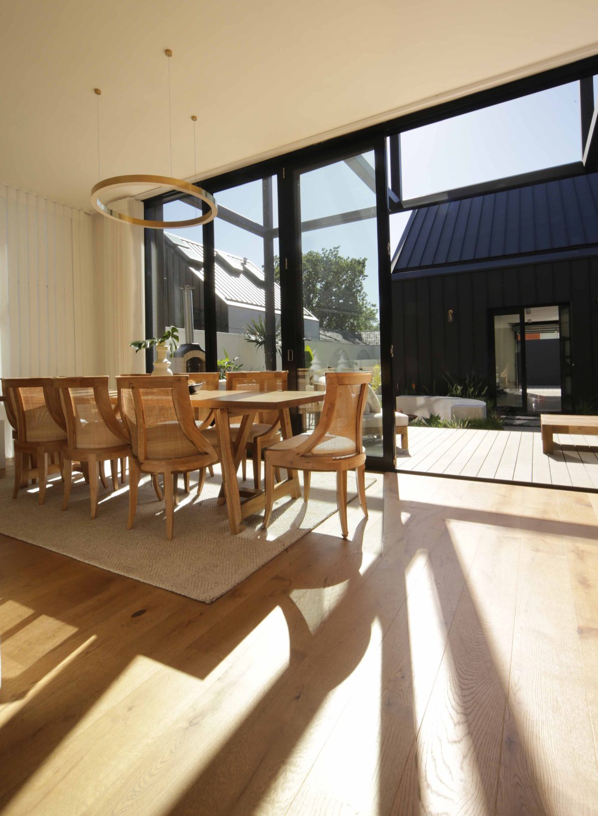
It’s probably more than that. In this particular series, we were able to expand on the separation between old and new. And I think it’s very telling in these old bungalows. We can wax on about the periods, but honestly, they’re crap for natural light. So to have the point of difference between these old 1910, ’20, ’30, ’40, ‘50s to a large extent is the same – dark black boxes. To have courtyards and explode light into them has been a great advantage. I’ll stick with the word opportunity, and it’s been a great opportunity for all the houses.
What are other design benefits to come from this?
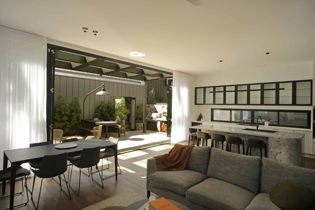
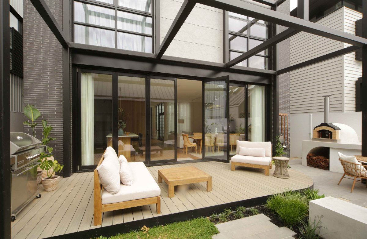
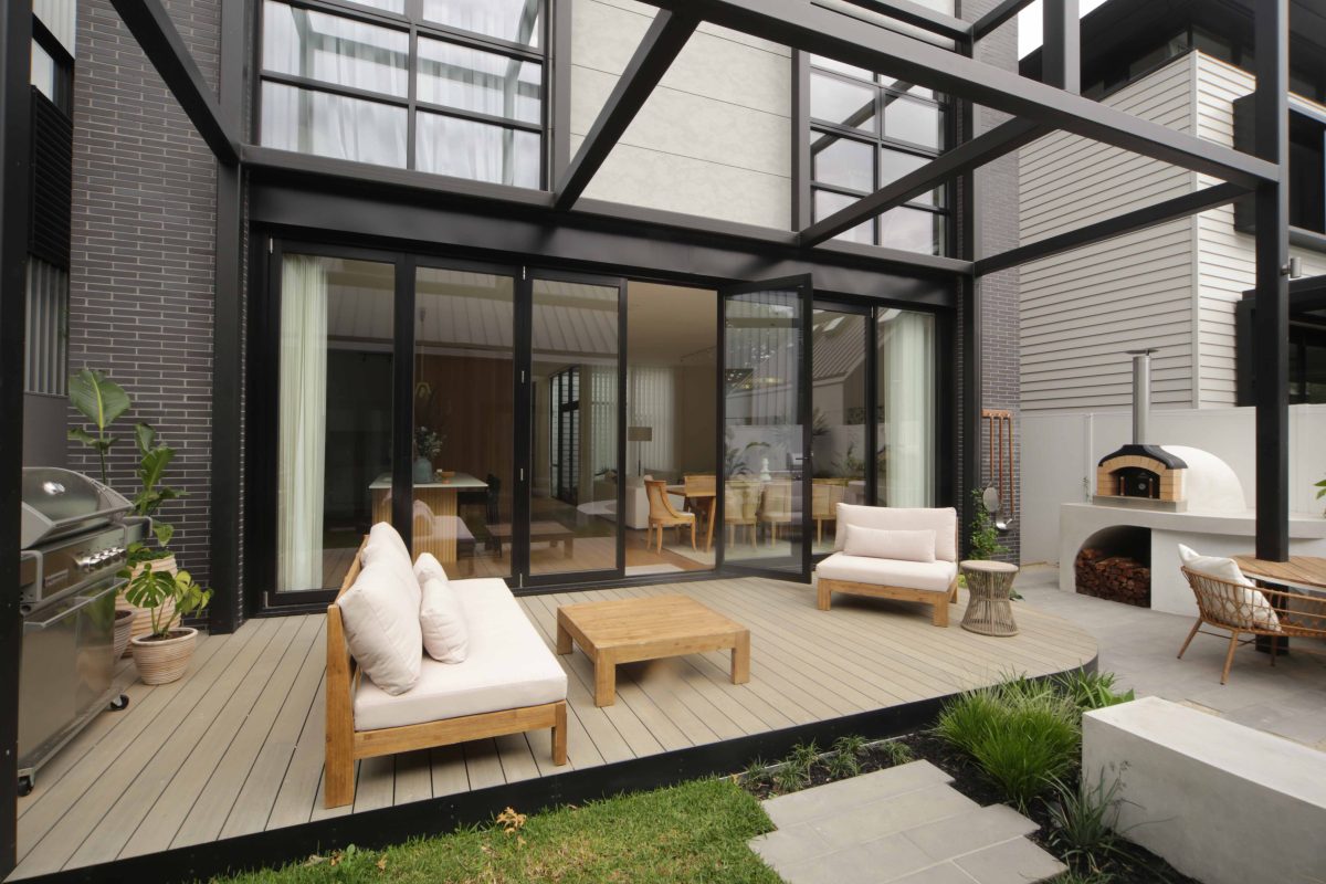
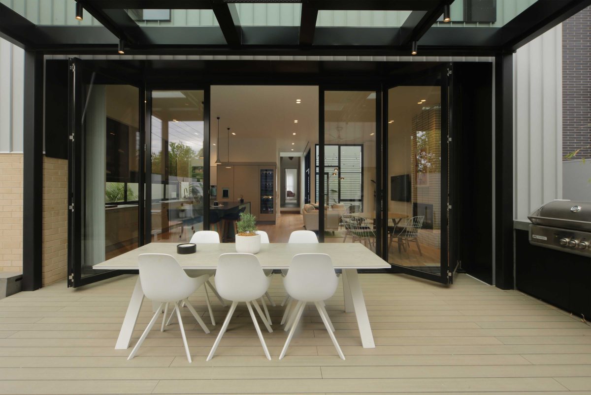
With the opportunity to use glass in the way we can with its high-tech spec, we’re literally able to design spaces, courtyards, bi-fold door arrangements to open space in the way that, you see that graffiti, “I was not here.” Like it’s invisible, as you say. And I think that’s a major bonus with the types of products that Viridian can offer.
There also a much better performance safety margin in terms of thermal performance and light transmission that means you can afford to be brave with glazing.
That’s right. We’re not cavalier in so much as we certainly don’t do it on a whim because there are many implications about window location in terms of thermal performance and natural light and natural light where you don’t really want an influx of western light in awkward spaces. So, we do it with intent of course, but it does, excuse the pun, open things up.
The central courtyards invite the outside in and inside out.
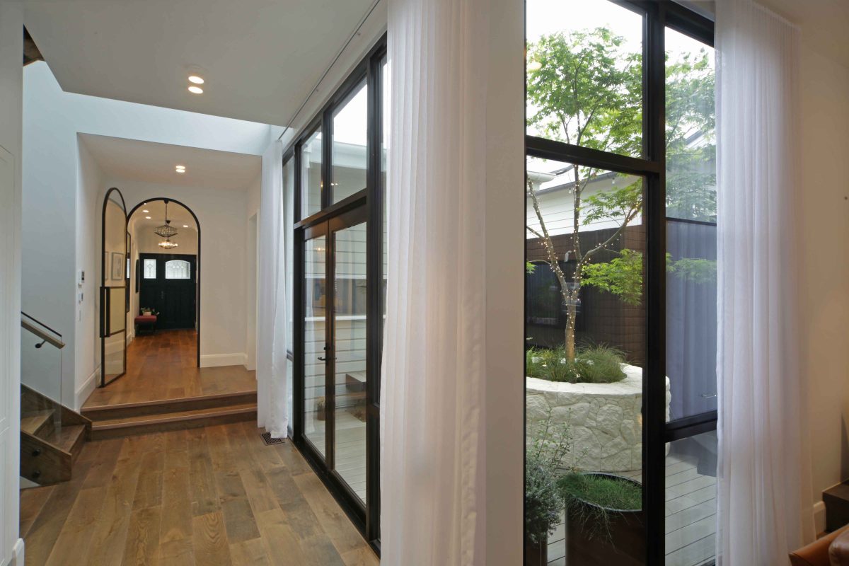
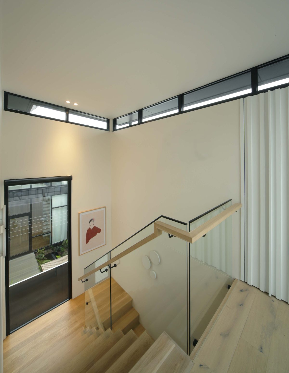
We made it a little node in all the houses with the staircase and a setback courtyard. The only difference was house one, where the courtyard stretches the entire length of the side of the house, which is different to all the others. It was, I think a very successful device, and made all the more successful by the inclusion of Viridian glass products.
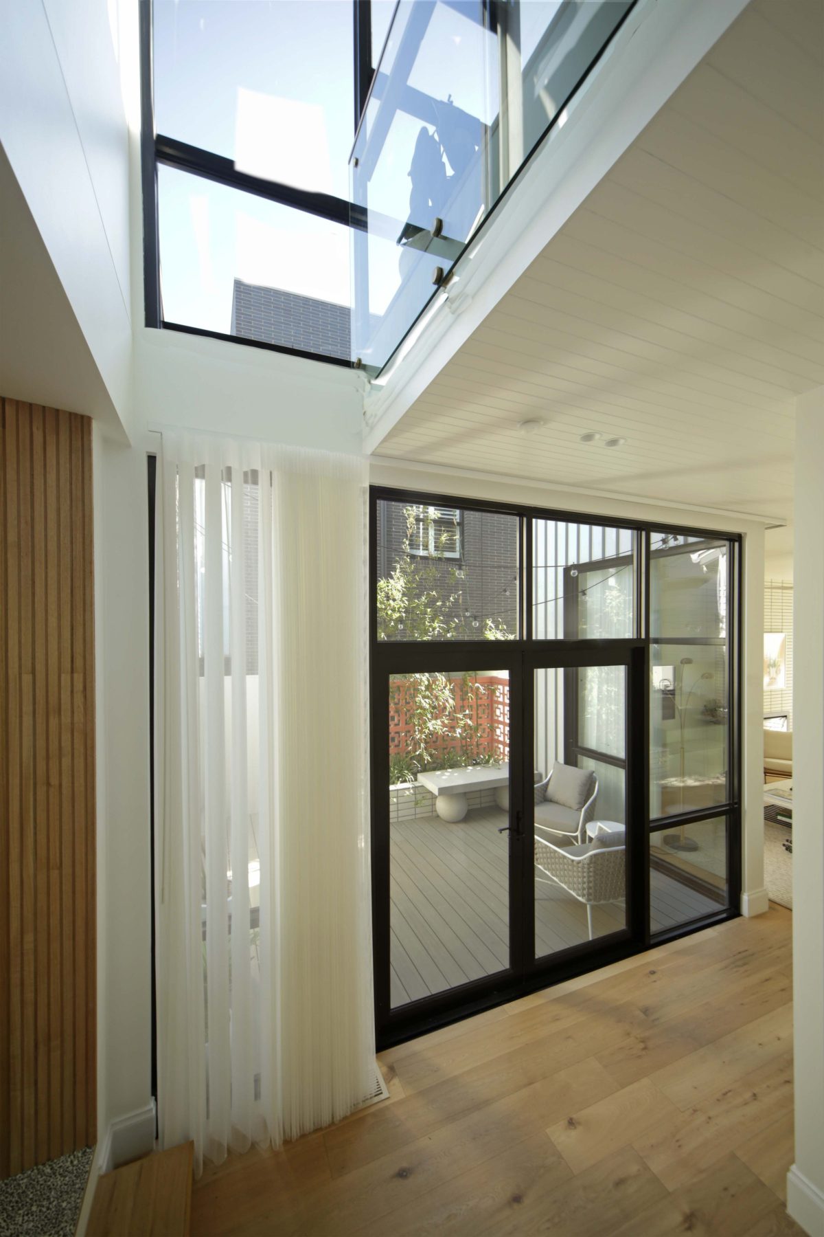
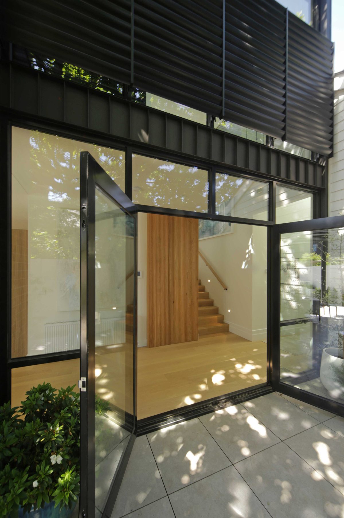
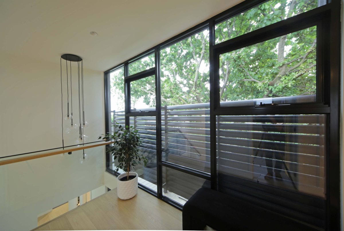
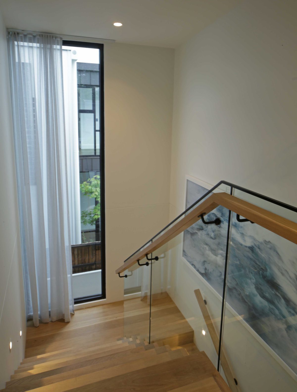
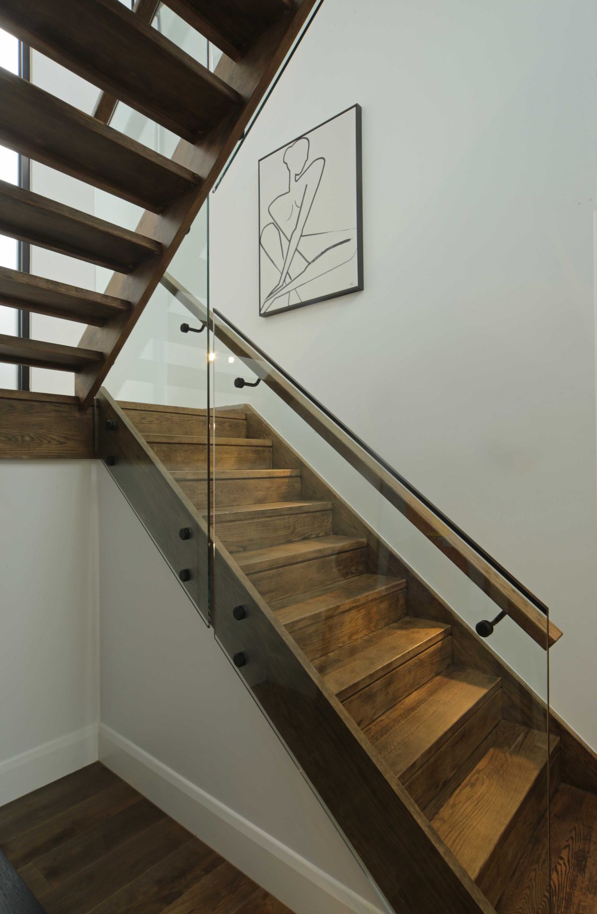
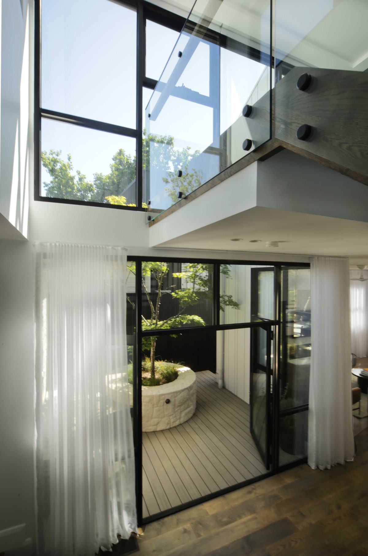
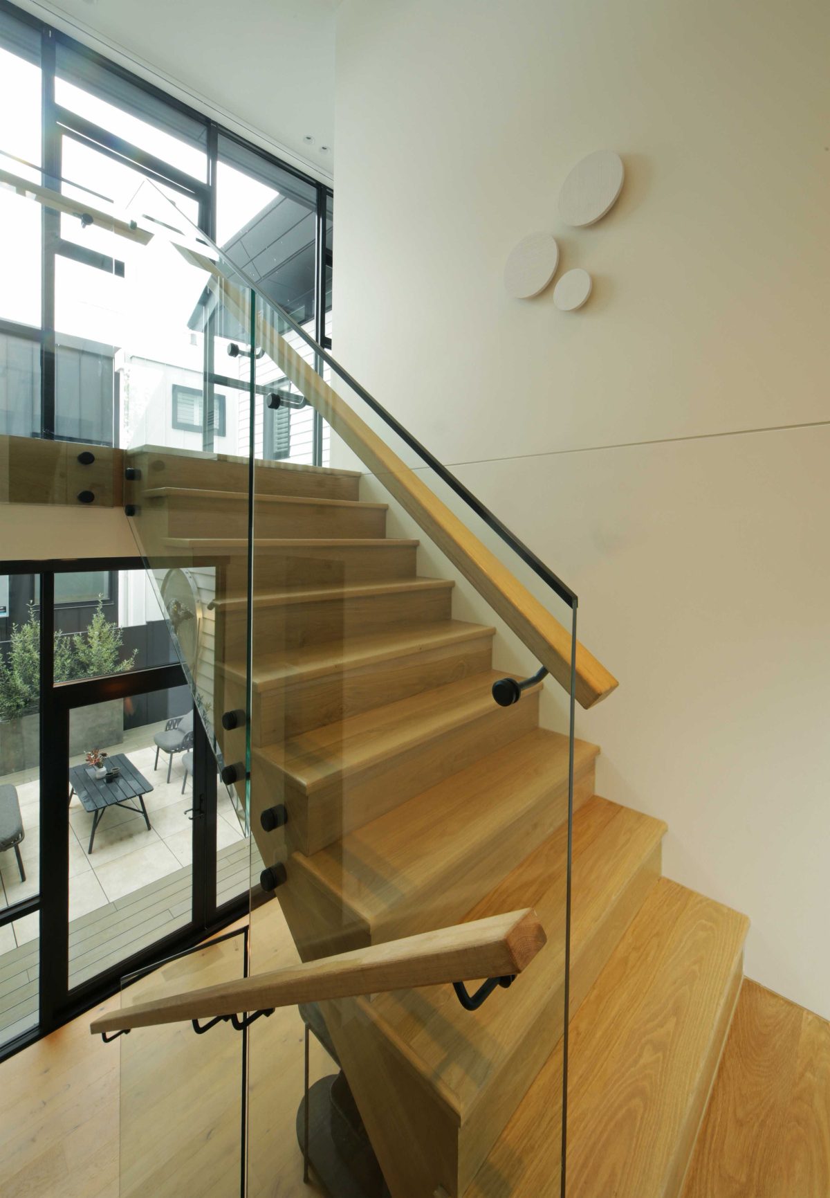
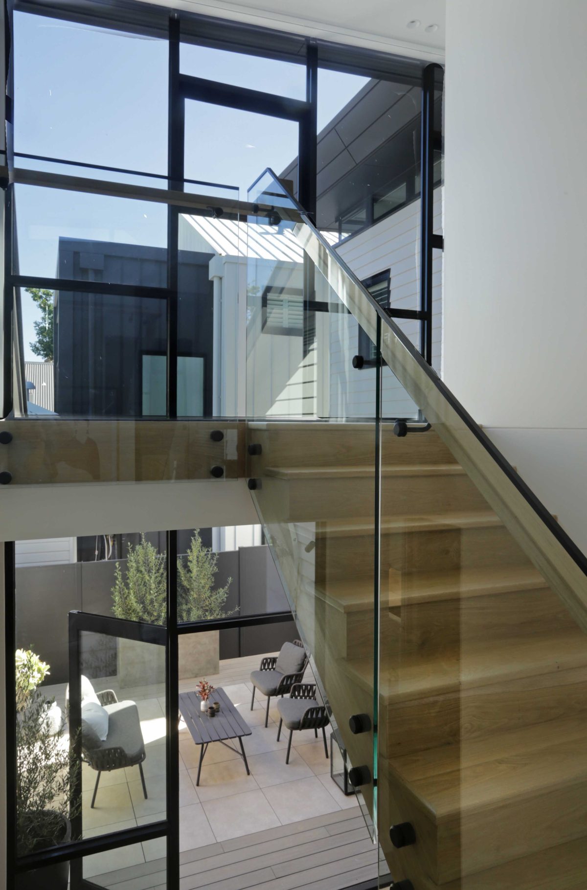
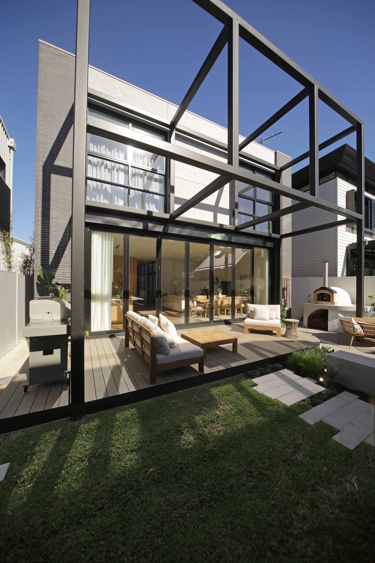
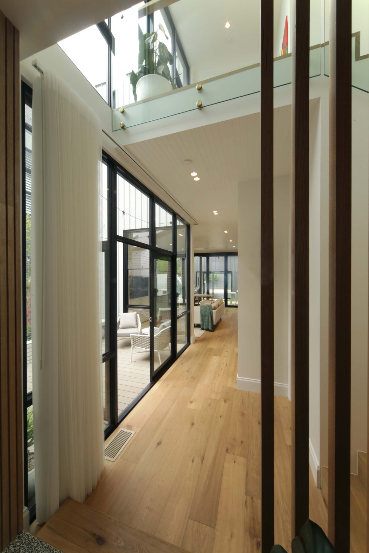
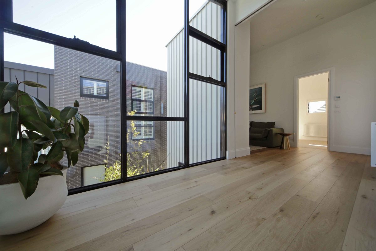
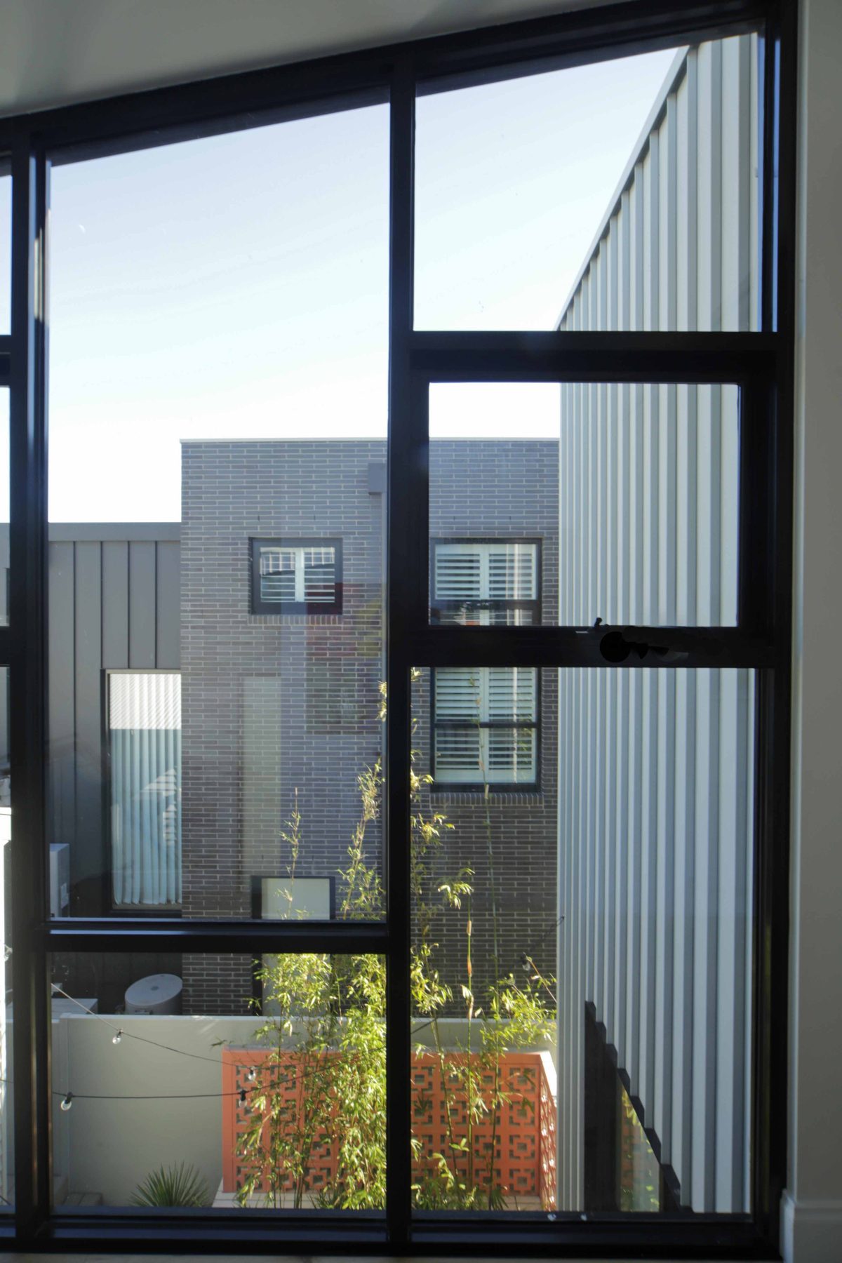
That transition into the new section is really hallmarked by double-height glazing into the courtyards, glass balustrades and operable doors to the rear. Less walls and more high performance glazing certainly delivers.
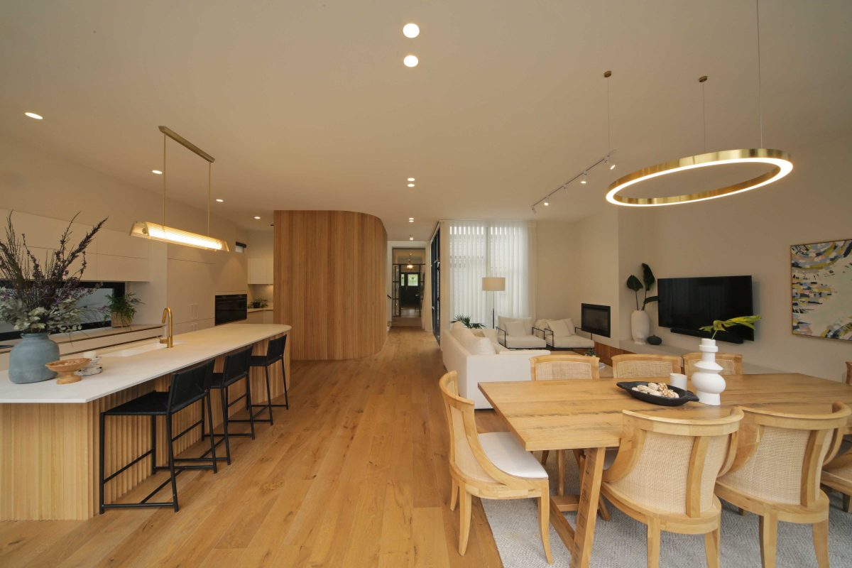
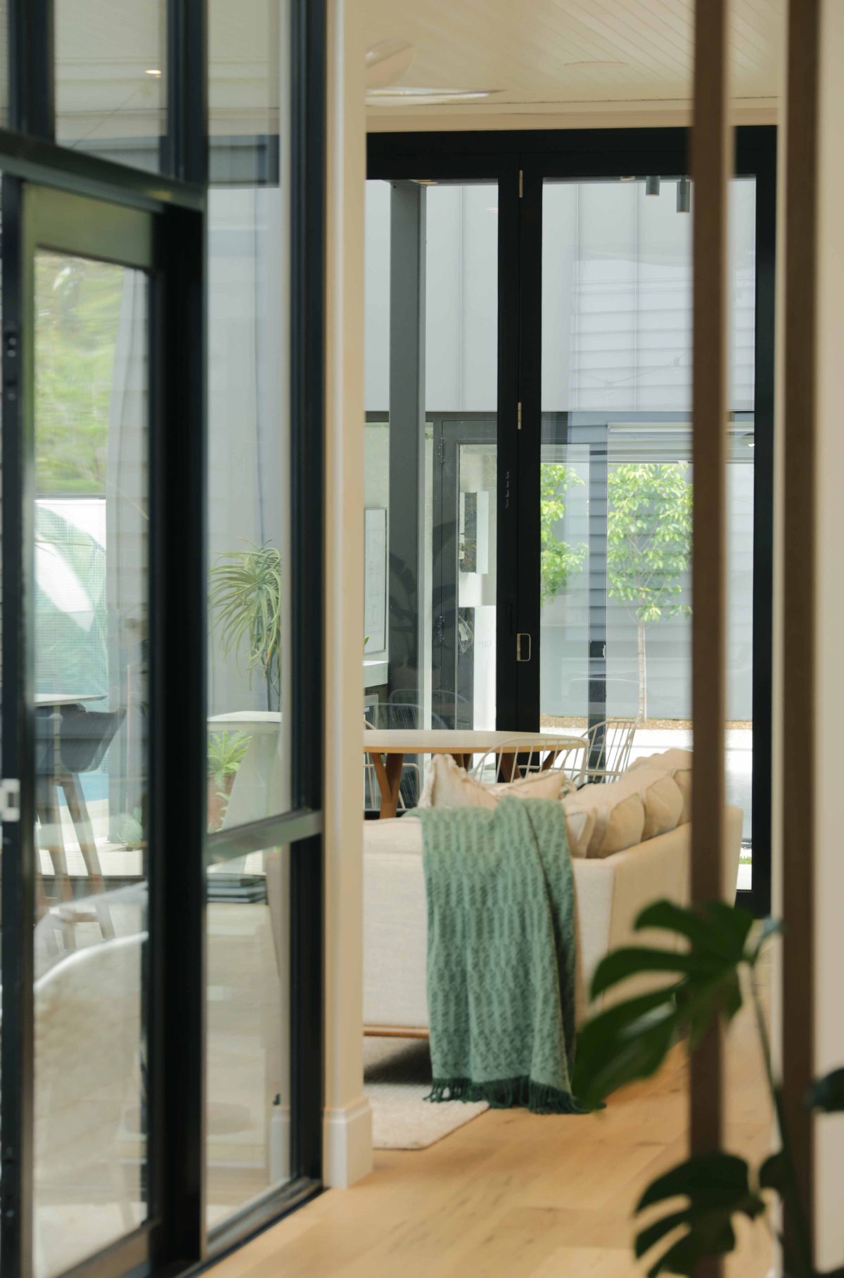
In architectural typology terms, the compression zone being the old house then opens up to a more expansive expression, or celebration. And the glass balustrades make it all the more successful. And then the same intent, if you like, leads further out into the rear spaces, courtyards, and again, the spaces flow quite well there because there’s yet more glass used for pool balustrading and what have you, out to the rear. So it’s quite a unified appearance through almost from the front door right the way to the back of the pool enclosure.
LightBridge next™ is one of the relatively new products featured here to deliver the unexpected bonus of an impressive acoustic buffer. What did that mean for your designs?
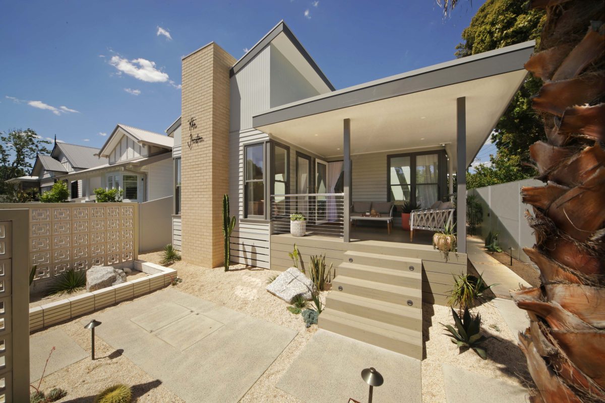
All five houses are in the stratosphere of lovely house locations in Melbourne. New Street does carry a bit of traffic in the morning and the afternoons so there is a modicum of noise and acoustic treatment required, especially to the old houses, which are pretty much neglected, one hundred percent in this regard.
LightBridge next™ assisted greatly by creating an acoustic barrier and probably the more high-performing component of that at the end of the day, as opposed to what would have been the old traditional float in the old houses.
And it’s equally important beyond the old houses?
This is carried through the ground and first floor with windows, node and the staircase facing the street. Not wanting to forget the process, we’d already continued the use of the LightBridge next™ throughout for that the same thermal and acoustic performance. And the proof’s in the pudding. They are amazingly comfortable from an internal amenity point of view, both in terms of heat gain and loss. More importantly when you walk into the houses, they’re quiet and it’s that immediacy of a quiet, modern house, yet you’re standing in the bones of an old house. I think that’s quite an extraordinary achievement, that we can do that with Viridian’s products. And all credit to them. It is a fantastic product.
“They are amazingly comfortable from an internal amenity point of view, both in terms of heat gain and loss. More importantly when you walk into the houses, they're quiet and it's that immediacy of a quiet, modern house, yet you're standing in the bones of an old house. I think that's quite an extraordinary achievement.” Julian Brenchley, Architect
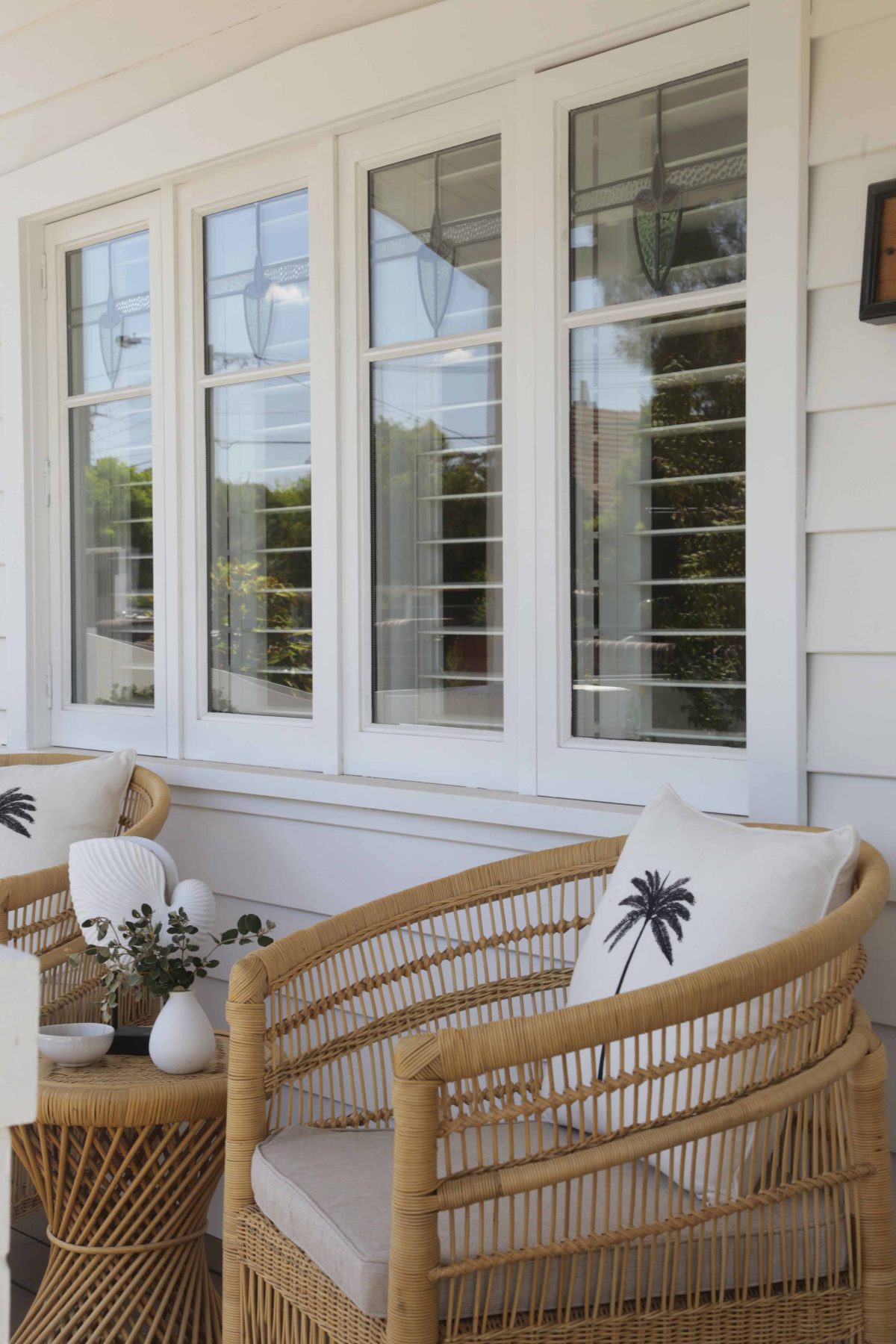
There’s the big glass moments, but not far behind are the bespoke elements, with decorative, patterned glass and splashbacks that all add to that mosaic of treatments light enters.
Well the big sense of achievement or pleasure I get out of watching what the contestants do with the bare bones of these high performance buildings is the tapestry of life contestants bring. The splashbacks, glass balustrades, mirrors in strategic locations, capture views and sunlight and glimpses that adds a whole other dimension. As you walk through these houses as an architect of the buildings, of the framework, it’s quite a pleasure to see what they actually come up with. On the whole, the appearance and what they do is extraordinary.
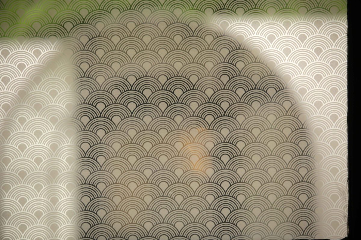
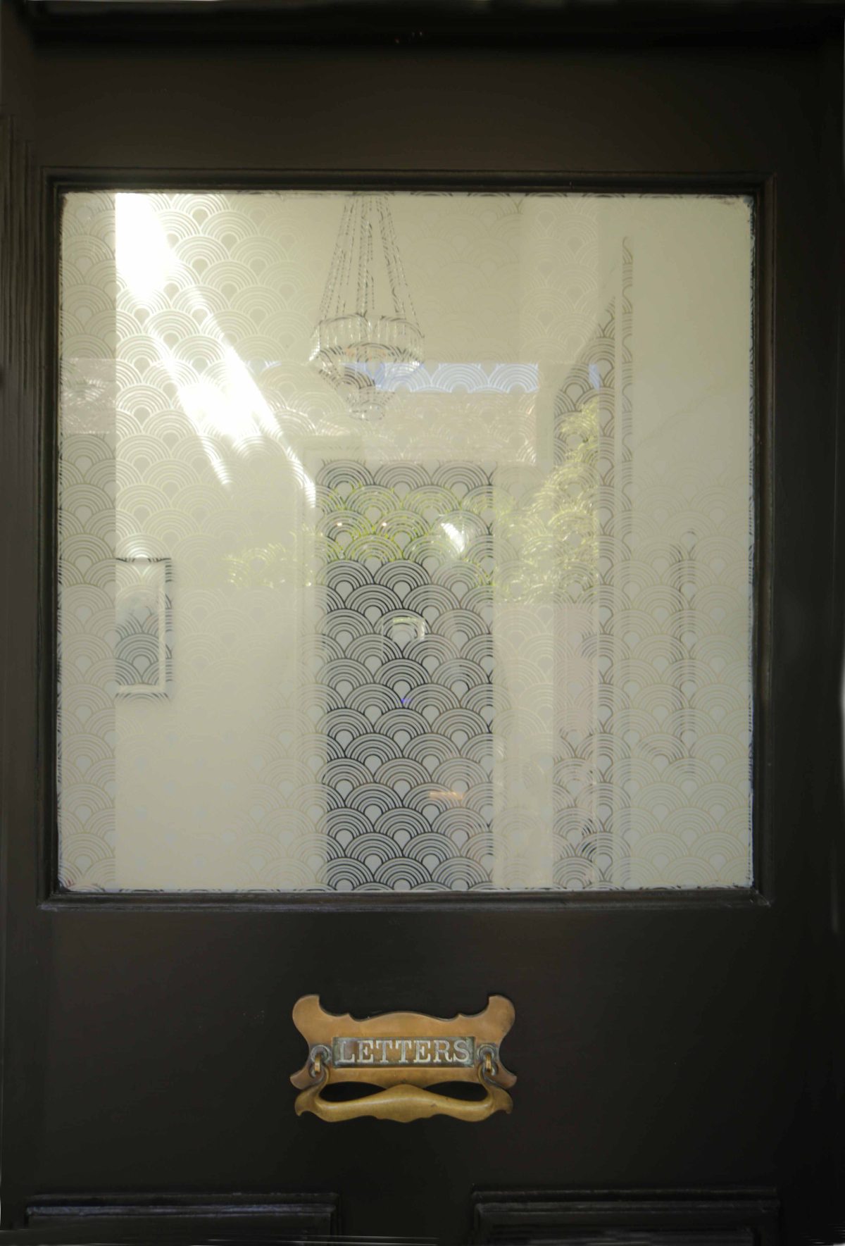
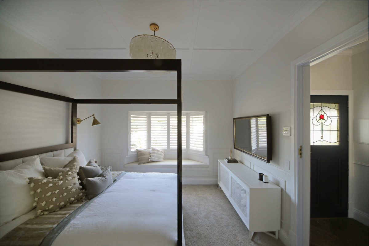
PixaGraphic was used very nicely in the restored door of House 1, for example.
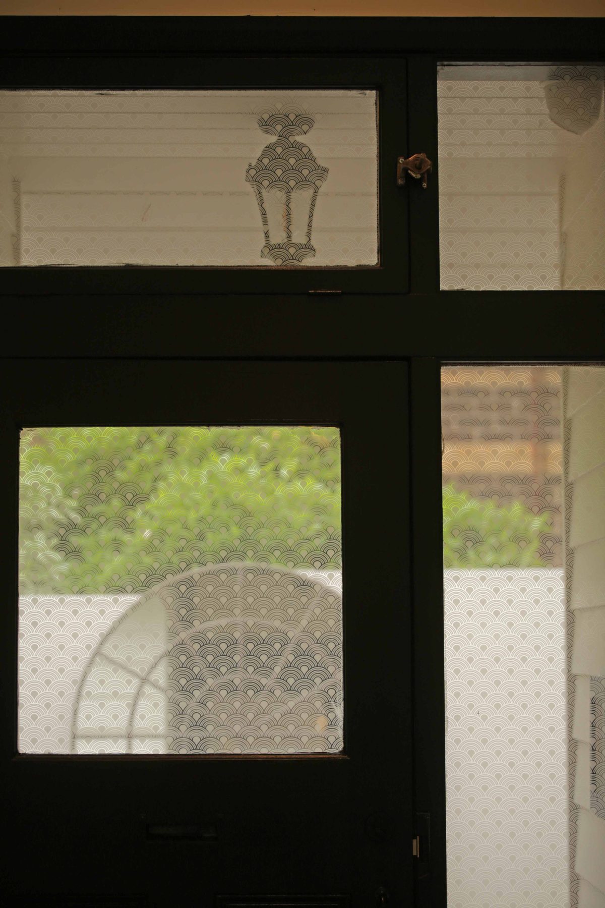
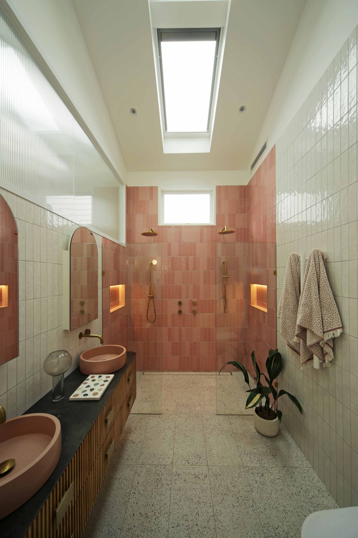
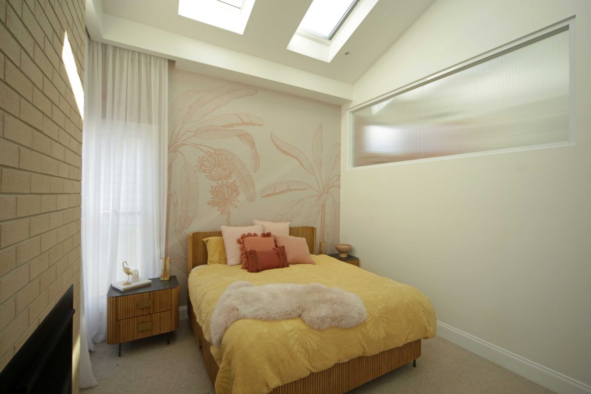
It was a great opportunity to bring in some of the decorative glass products that are often forgotten and much maligned, but they are extraordinary in amongst themselves and used appropriately, they really do add, I don’t want to say this lightly, but a certain level of class to the renovations. It’s certainly not my doing what they pick, but I’m very pleased to see that they’ve included those products. Particularly house number five, I believe, used a lot of the decorative reed glasses and Broadline. That really added another level to their integration of outside to inside where, we’d specified the reed glass in the front doors and side lights for instance, but they really decided to own that and brought it into the houses, shower screens, and beyond. I keep saying, credit to the contestants. They did a great job, this year.
Viridian has travelled with The Block for so many seasons. Have you detected changes in how the product is used this time around to the early day?
This time round we’re absolutely in awe of what the contestants have been able to do with the inclusion of LightBridge next™ on the outside, or basic fabric of the buildings. In addition, we see how the contestants have brought LightBridge next™ and various other glass products into the houses as part of an integrated approach.
The flexibility of the Viridian product has been fantastic, bouncing off the base of the LightBridge product, which obviously has all the thermal and acoustic benefits.
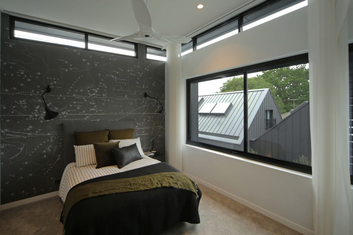
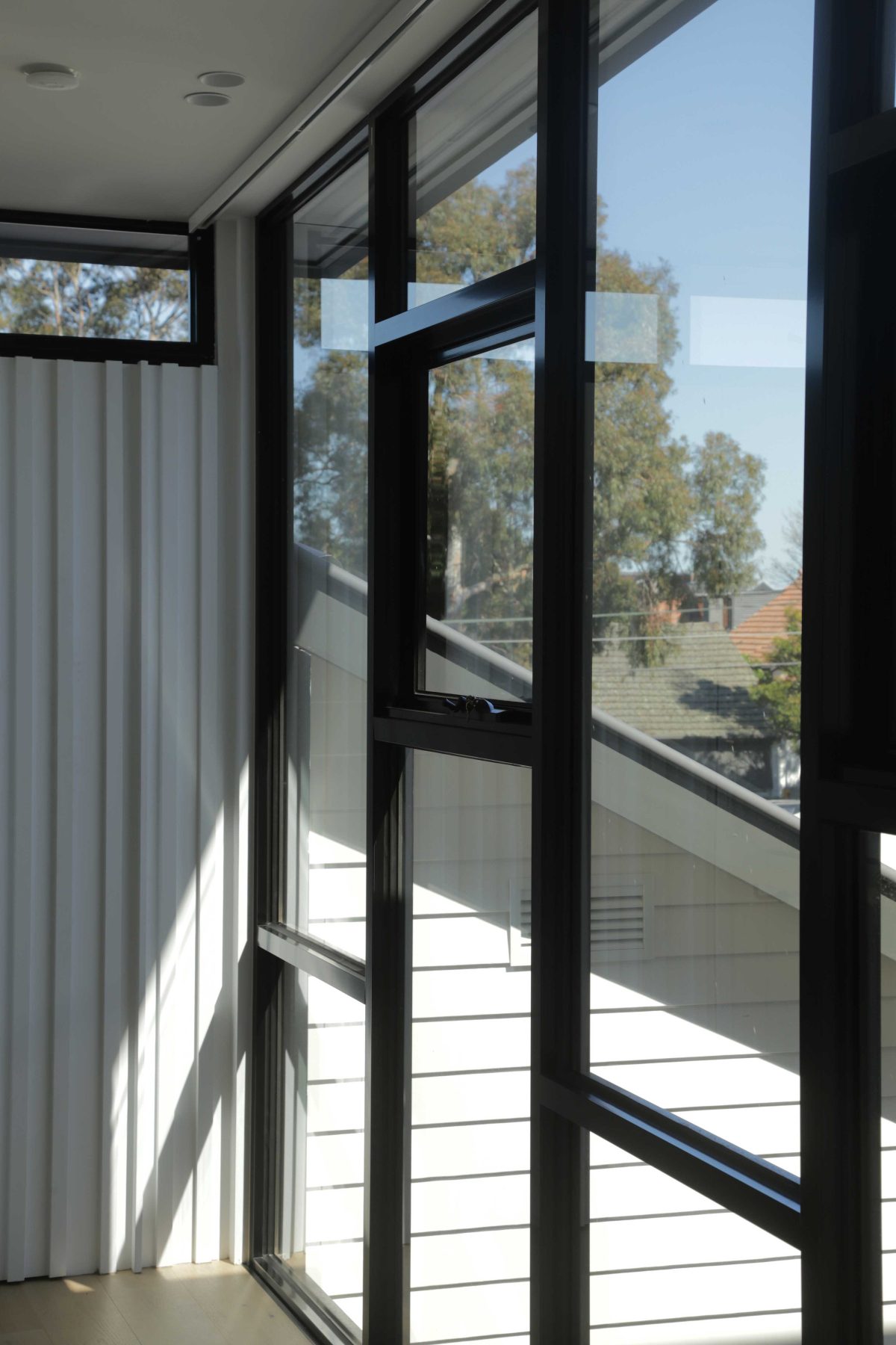
Once daylight was merely incidental, but it seems that what you’ve done here, is make daylight a highlight. So there are moments within the houses of quietude, if you like, but for mostly it feels highly contemporary and there’s light coming in all kinds of different apertures so that it really feels incredibly creative in terms of the way light is drawn into these houses.
We took the basis of these old houses as dark little boxes and we’ve exploded the inside of the old houses. The inclusion of the courtyards, light wells and large expansive glass to the rear courtyards has been quite extraordinary.
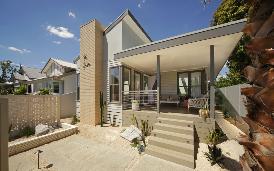
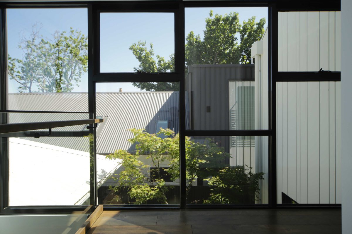
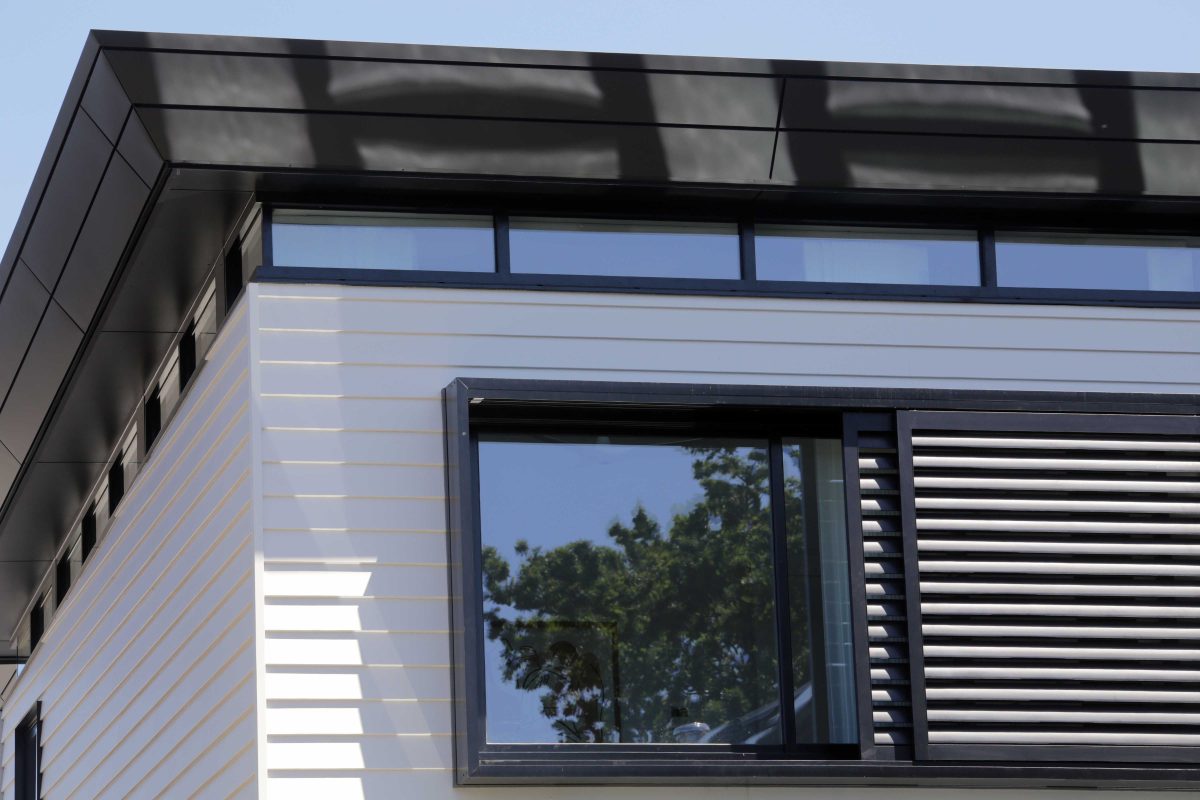
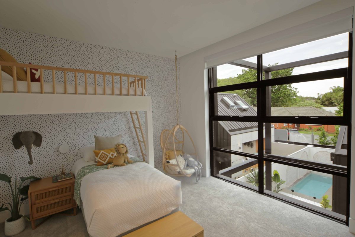
House three for example has a lid lifted on the first floor, with a complete set of windows around the whole façade of the building to allow an extraordinary amount of light in. The reason for that is we really wanted the contestants to own their houses. So all the houses are different. All the houses have a different approach to the design, aesthetic and how natural light has been introduced.
The other sense evident throughout The Block houses is what all good architecture has, that feeling of generosity of space.
There is a definite sense of coming from what you’d describe it as ‘traditional’, or more pokey rooms. The contestants have done well to open them up but the ceiling heights and void spaces in the courtyard or linking elements, really create that. It is quite an extraordinary space to enter, and something that’s unexpected and a bit theatrical if you like, leaving one old house to venture into the new.
That full-height staircase glazing is really impressive.
If there’s a privacy issue anywhere in terms of these great expanses of glass there are ways to get around that, whether that’s a patterned or a decorative glass, whether that’s a film, an opaque, or a coloured class. There’s a number of products in the Viridian range that enable some really quite beautiful outcomes.
Does this season of the Block leave you with a single, overriding impression?
I think the most marked thing with this series of The Block is that unlike others, we’ve tried desperately to make all the houses equal so that the final week of the show we’re selling five equal houses valued equally.
This year, everyone was given a different home, different period, different rear addition, different, different, different. Part of the creative behind that with the producers at Nine, Julian Cress and David Barbour, was that they really were out to give the contestants the opportunity to make a home rather than be part of a sausage factory for a developer. And I think that’s the standout this year. And again, the product integration, the opportunity for Viridian to be involved in that with their various products. I mean, it’s really helped and been instrumental in the achievement and the success of that creative intent. So that’s been the standout.
Well it continues to rate, as you know, incredibly well. When the history of Australian television is written, The Block is going to be right up there as one of the standout reality series.
I agree. It’s a credit to the producers, but I think what they do is shine a light on the products in the houses. So I think, the likes of Viridian, becomes part of the story. I think that’s important, because it grounds the show in a way that is approachable and accessible, to the general public. This is reality and you can go and do it yourself tomorrow.
Take a look at the video here!
