Black Diamond
Melbourne, Victoria
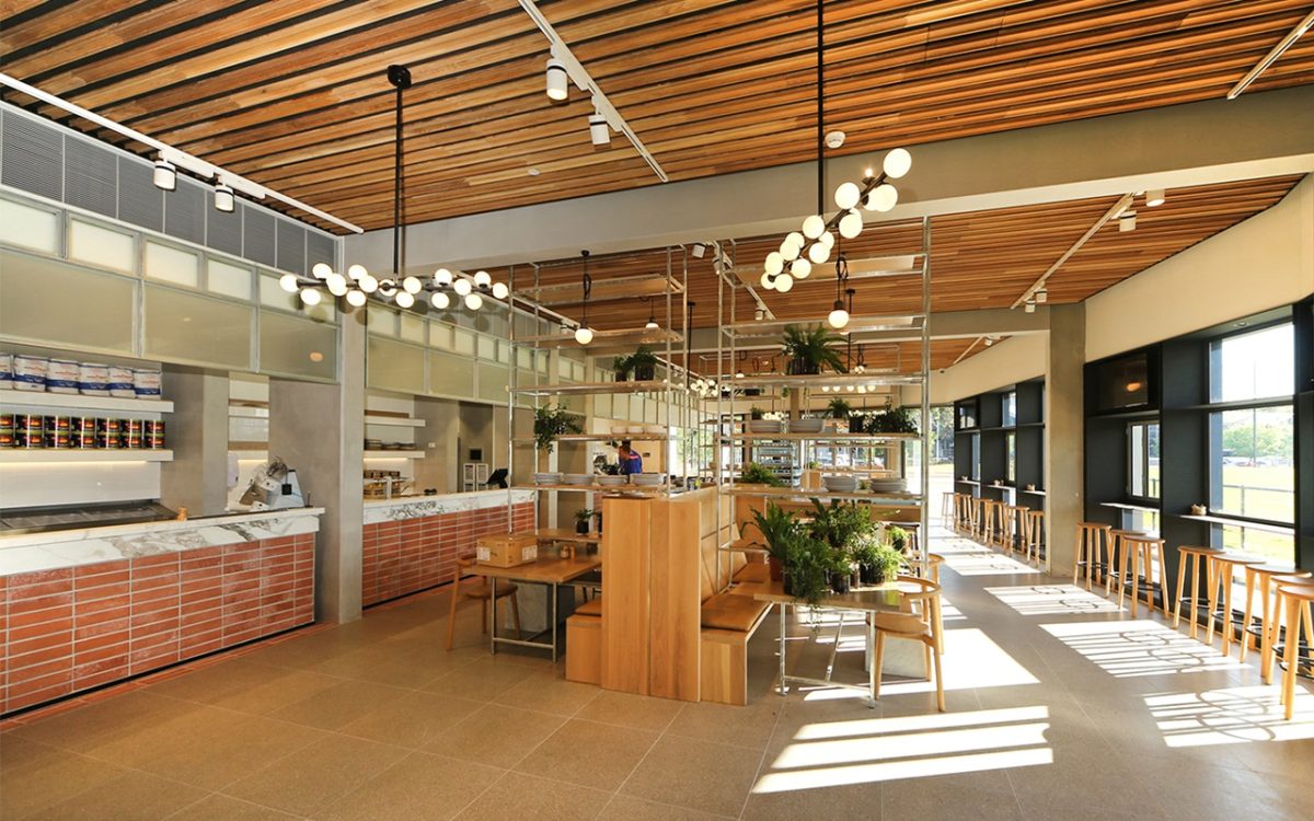
Architecture distinguishes itself from the mere act of building by hard won refinement. One offers polish where the other simply meets obligations. There is a thoughtful quality to good design contributing to more efficient operation and enjoyable experience. In this regard the new Glasshouse centre, created principally as support operations and Headquarters L.C. of the AFL’s Collingwood Football Club is a robust example of the sports genre: a lightweight, slenderized envelope and large, clutter-free interiors are connected by clear planning and the kind of assured window program only some architects and few builders seem to get.
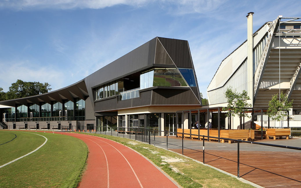
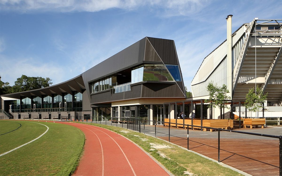
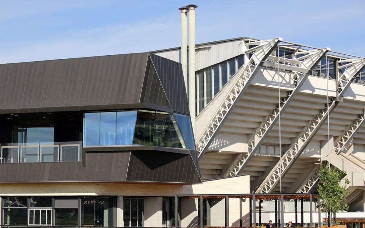
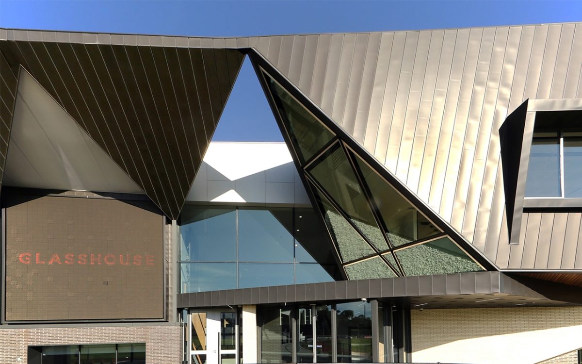
The latest addition sits right next door to the grand-daddy of them all—the original 1956 Olympic Swimming Stadium by Peter McIntyre and Kevin Borland. Unlike its larger and sometimes louder siblings, this charcoal clad sports and function centre is a model of such understatement that it’s possible to drive by, blink, and miss it entirely.
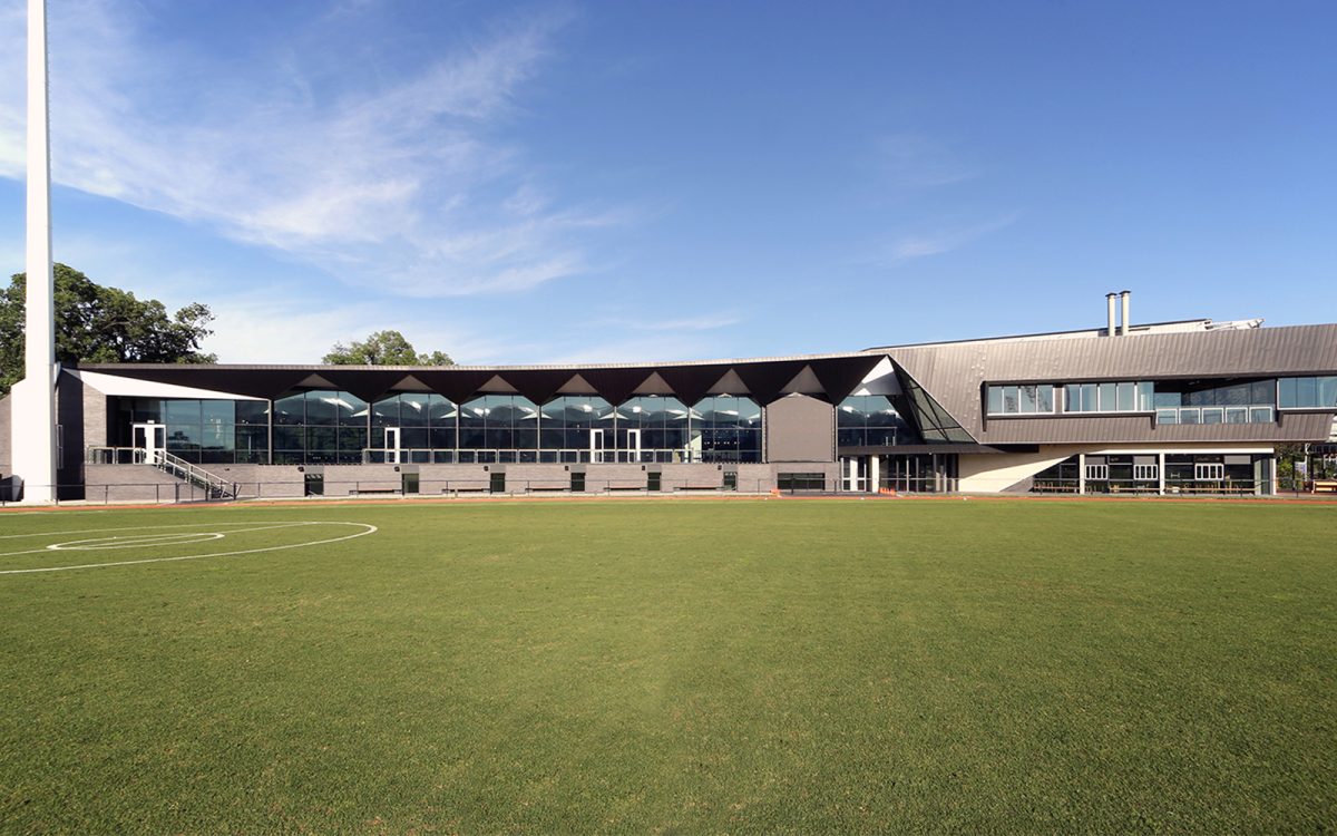
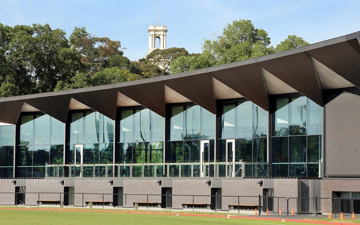
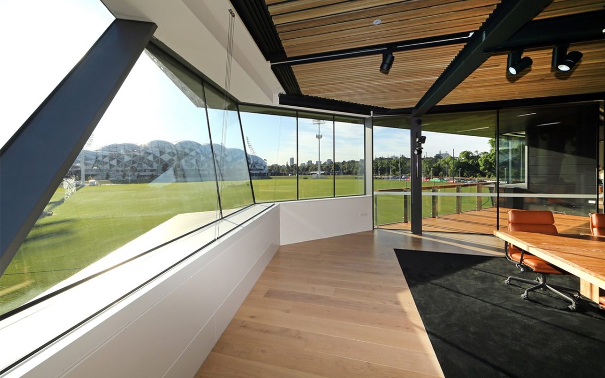
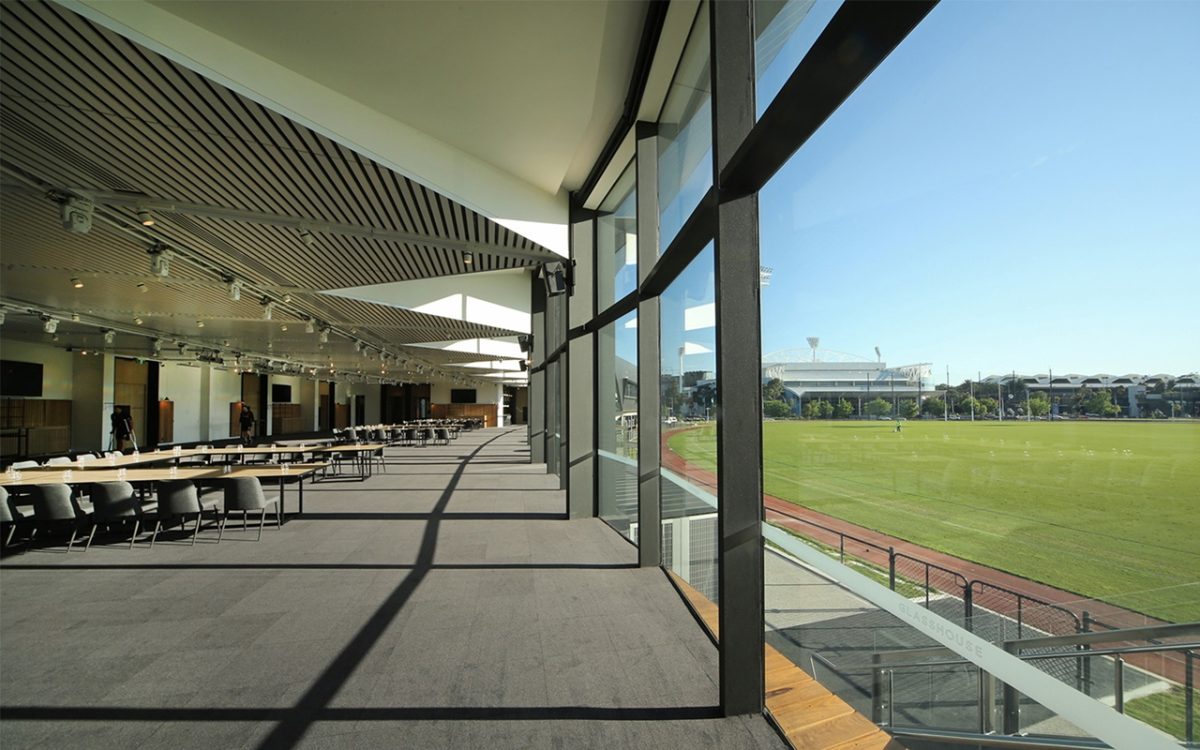
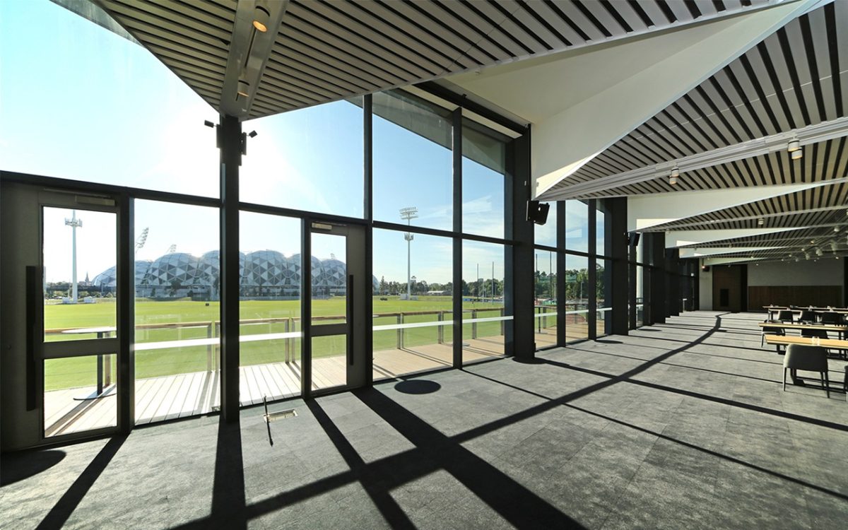
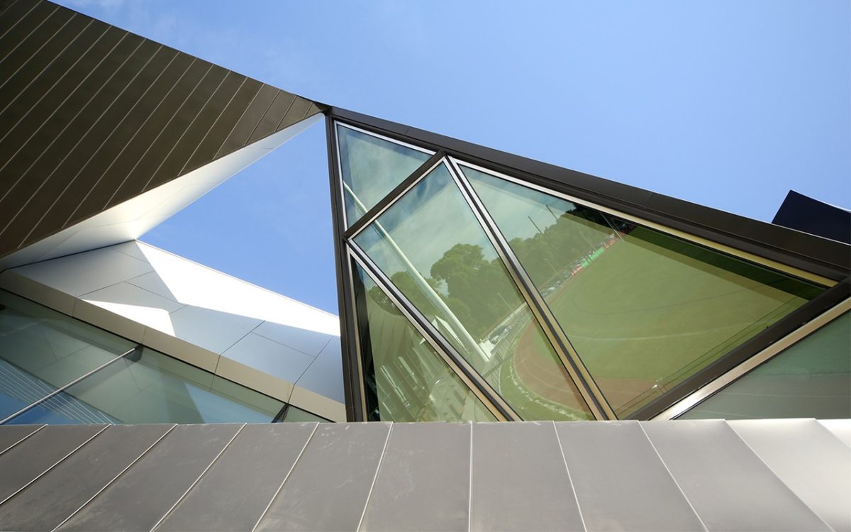
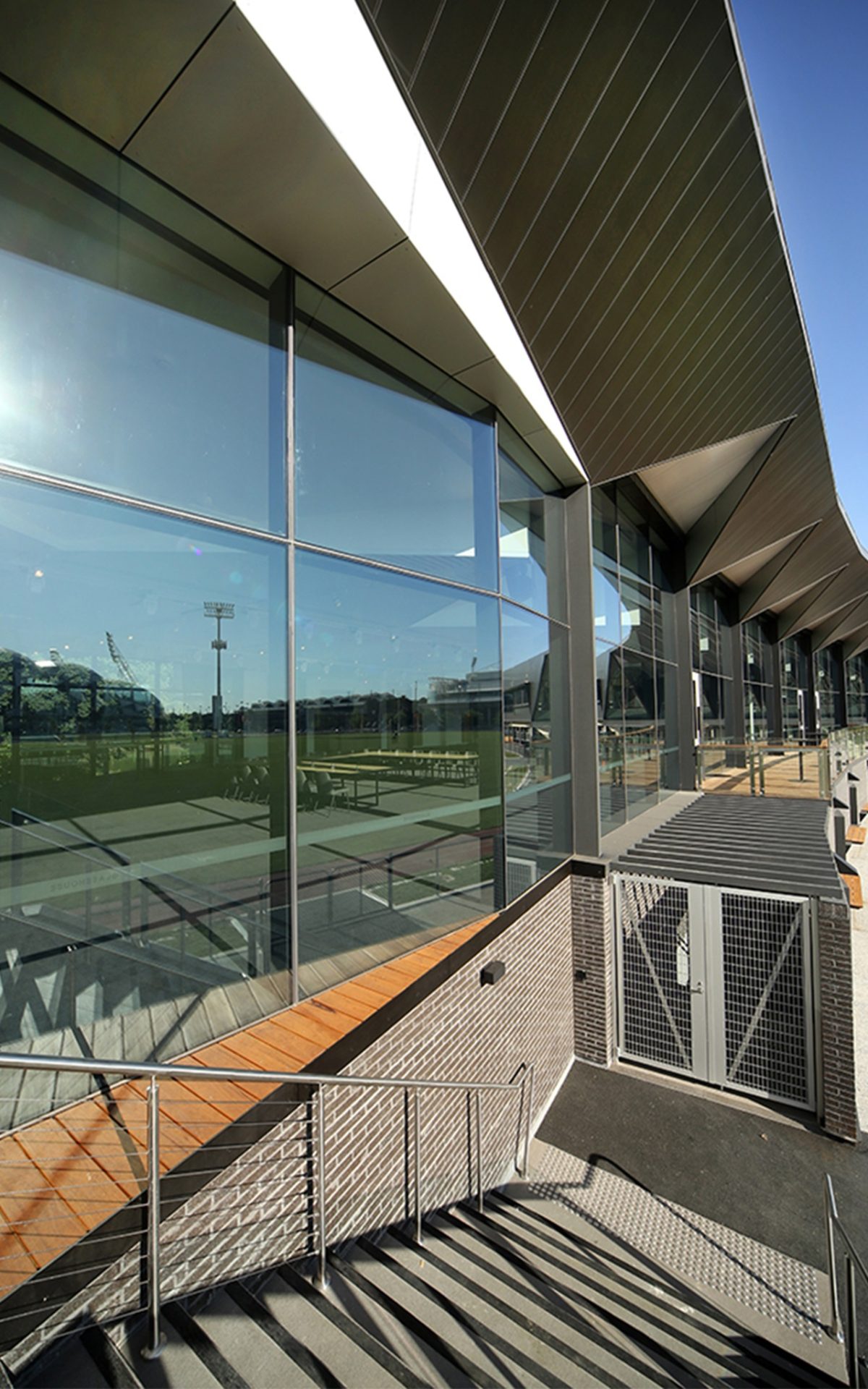
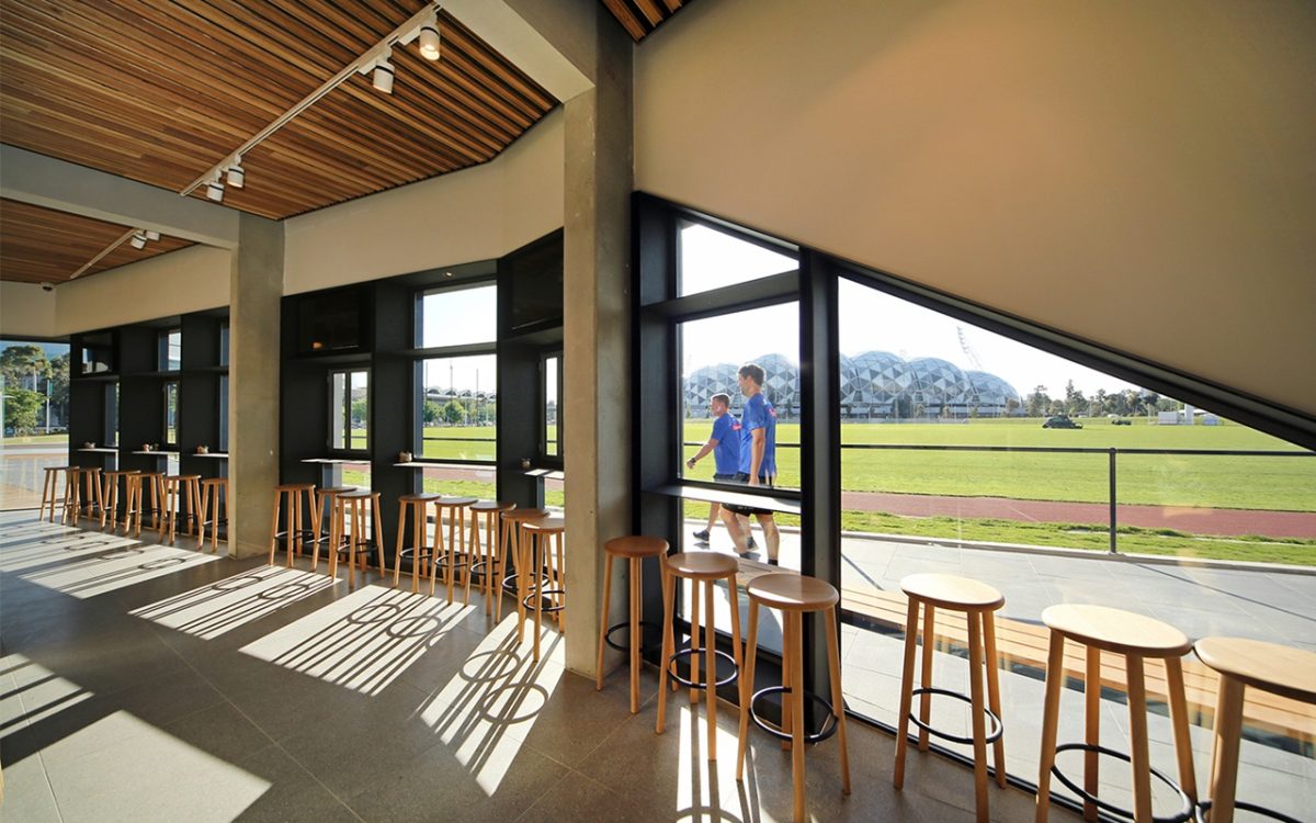
But the news isn’t all about hide and seek with its faceted façade—much like a black diamond setting in a green landscape viewed from above. A variety of Viridian double-glazing makes a distinguished design contribution: to the east a vast cranked glass wall with views across the oval towards the sports mecca, to the west a glass surround invites the mighty swim stadium and south, more tall glass brings the Yarra River and Botanical Gardens even closer.
Croxon Ramsay Architects has a long association with Collingwood. The Glasshouse is the culmination of a long collaboration between architect and client. An evolving brief and tight, difficult site made life difficult, but the architects remained true to their design concept.
The result is a dark star combining reception space, gymnasium, boardroom and café amongst others, informed by a setting both historic and contemporary. As virtual secret agent, Viridian glazing performs a starring role in the process delivering architecture fully grounded and yet wide open to the possibilities.
Peter Hyatt spoke with Andrew Croxon about a project about to take centre stage:
PH Projects must often feel like family members. You invest so much time and energy and then release them and hope that they perform well in life.
AC That’s true, especially on projects of long duration. You see them at their worst and best.
The sports/athletic metaphor is often invoked with sports buildings and facilities. We see the analogy with flight also in a lot of airport terminal design. This building is less obvious in the direction of stating: “Here is a sporting facility look at me!”
I would agree. It is not so much an obvious sports building and yet it certainly sits within a sports precinct and engages heavily with that context. It speaks to the oval and to the neighbouring buildings. The centre’s function is to bring other events into the precinct. The focus has been on comfortably combining the function centre and café with the sports operations, such as the gymnasium and meeting rooms. You could say it’s not overtly a sports building, but it’s a very dynamic building in how it reflects and works with the oval.
The other quality about this is that it’s a very lean building. Good architecture involves sustainable material usage to best bare necessity, and that’s the feeling of this project to the point that it appears so slender and resolved.
We definitely wanted that outcome, and that’s driven, I suppose, by the level of design resolution and sophistication. It’s also responding to the very, very lean building adjacent to ours—the 1956 Olympic Swimming stadium by Kevin Borland and Peter McIntyre. That’s such a bare-bones, lovely structure that’s so dynamic. We were trying to pick up some of that in this building.
Your work is actually quite subdued. The colour palette, the steelwork, glass and form is really quite restrained and certainly not competing with theirs is it?
No, no. That subtlety has come from the client to some degree and that monochrome palette of black and white reflects Collingwood of course.
There are belligerent buildings and the courteous variety. This one is well-mannered and that’s a strength because it retains and expresses a design viewpoint.
Working within this context was very interesting. Many of the surrounding buildings are quite expressive, however we were looking for that balance between dynamic expression and yet respecting the former Olympic swimming pool.
So you’re aim was to honour that project without submitting to, or being knocked off by it?
That’s right, we didn’t want to mimic it. We aimed to echo the ideas it was searching for, but interpret them through the filter of today’s architecture. We have the contemporary advantage of a certain freedom with our expression because we have tools that allow a complexity not as easily achieved back then. However, we also had to work within the nature of the site. We were constrained within a curved triangle on one side, and it really shaped the design outcomes significantly.
It’s a challenging site to say the least—a very tight wedge shaped site is hardly ideal.
It’s the kind of site that plays havoc with the best of intentions. That’s why we embraced a radial grid through the building. There’s a lot of work making such a building work because it’s not formed from a perfect curve. The grid grew as it went around. We had to be that honest with the set out, otherwise it would never have sat comfortably between the old Glass House swimming pool and the oval.
Apart from that most immediate side facing the Glass House, in what way does the building reflect the client requirements?
It was a very interesting client relationship because we didn’t get a formal briefing to begin with. We were designing as the brief developed, essentially. We started with a very small pavilion, to replace an existing building removed, as part of the rectangular stadium development, and then as the client started to explore the project and look to engage with various stakeholders, the project grew. We were drawing in parallel to that, through a very prolonged schematic design process. It was very much an organic process, constantly picking up new ideas to meet client aspirations.
Did you or the client have a sense of posterity about this? Clearly the building next to you has a heroic post-war form as a remarkable statement. Is this something you’re mindful of?
Very much so. Whenever you do a building in a high-profile precinct, you want to make sure that the outcome is worthy of that, particularly sitting next to such a building, which I happen to think is a great building. It really puts a lot of pressure on you to push as hard as possible to ensure the outcome works really well and compliments it as much as possible.
Viridian is particularly pleased and impressed by this one because, from a glazing viewpoint there is such complexity and challenges to arrive at the appearance of simplicity.
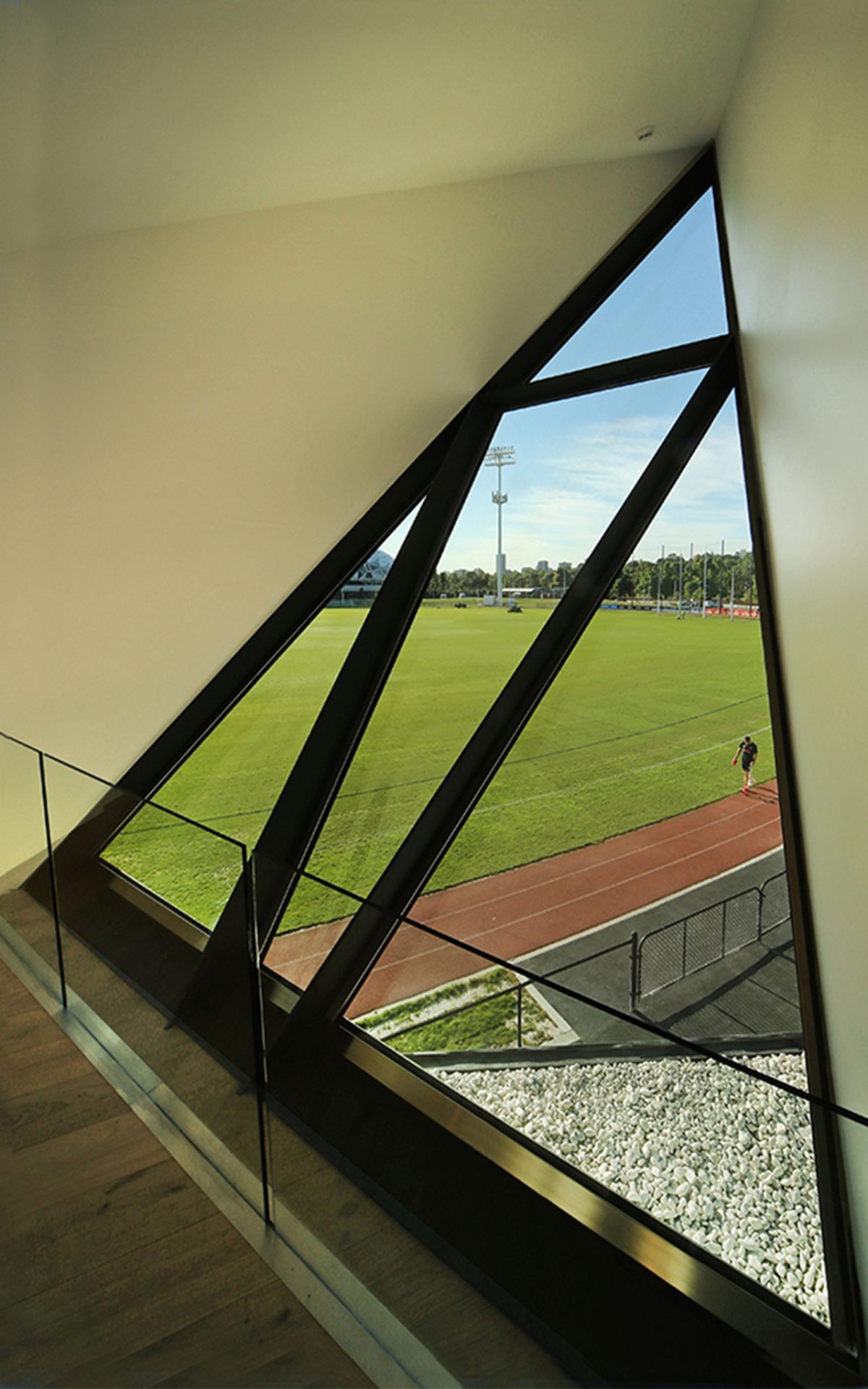
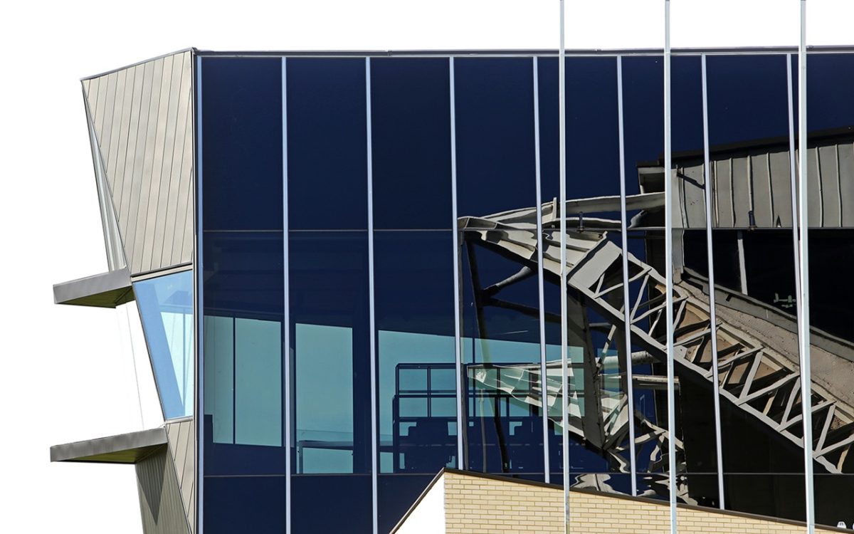
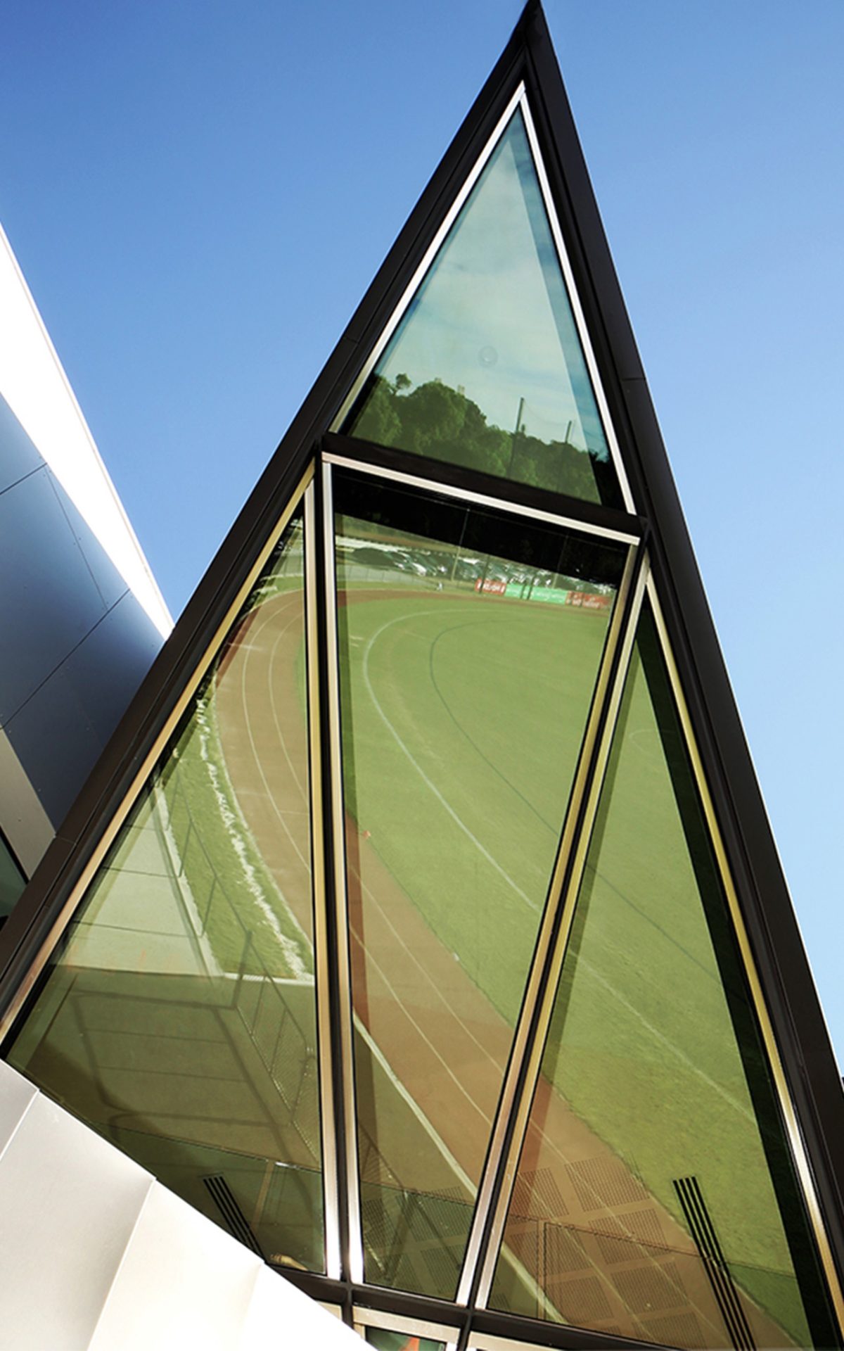
The client wanted glazing to embrace the oval and engage with the precinct. We had to ensure the glazing could perform in terms of size, support structure and appearances but also from an energy performance viewpoint. Those were critical issues with this sweeping facade. We worked with Viridian on many of the subtler glazing elements such as the bespoke, inclined triangular window. On the northern facade, facing the old Glass House we specified a dark tinted glazing to deal with the solar demands, but also reflect much of the old building in the new.
What parts of the project are you really pleased with and most proud of?
The way it makes the transition between the old building, the oval and actually pulls these two buildings together. Inserting a building between the oval and Glass House has been a really successful outcome. Hopefully it will activate social connections and draw people from all parts of the precinct. The landscaped forecourt is a big part of that. Moving away from big stadium-type architecture to a more human-scale was an aim from the outset.
“Glass runs up above the ceiling lines where we've been able to give that impression of continuity beyond and opening up to the skies. That's reflected from the outside of the building too, especially along that main facade.” Andrew Croxon, Architect
It’s interesting that the client should request something with such a glassy result, virtually pulling you along rather than needing the big shove in that direction. Having done so, the question arises, “Well yes, we’d love to provide a lot of glass,” but how do you do so in a way that feels right and actually is right for all of the roles that this building must perform?
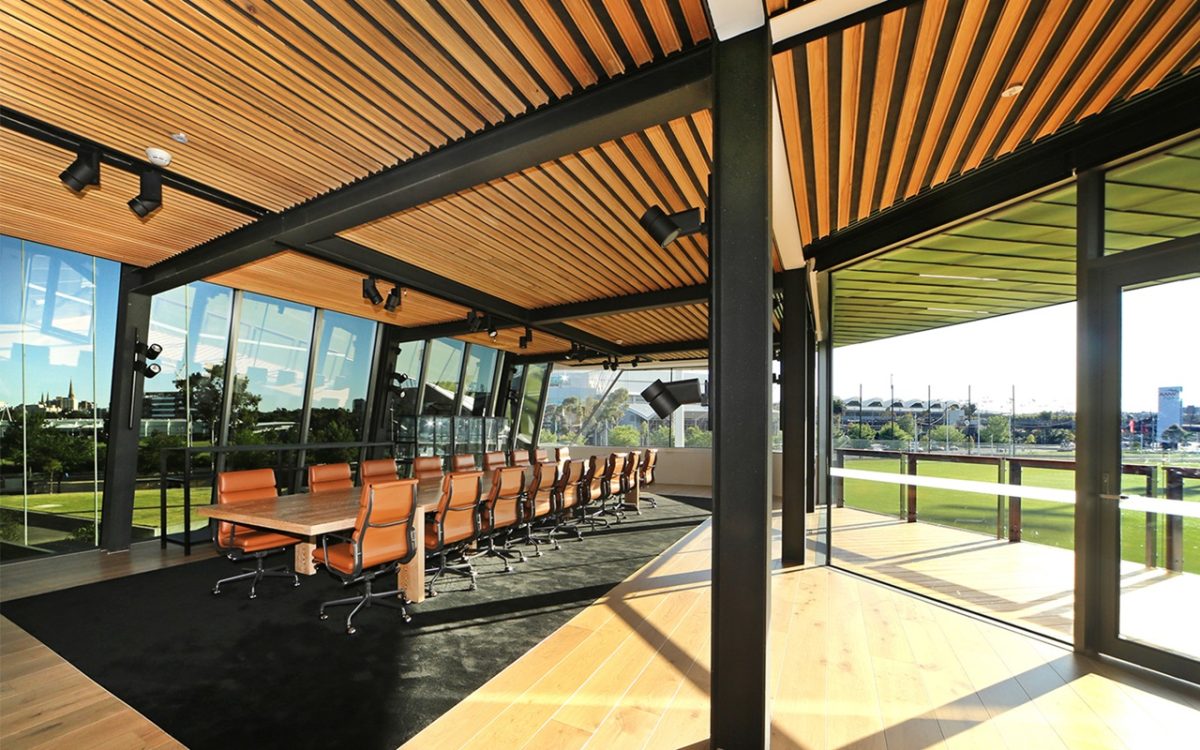
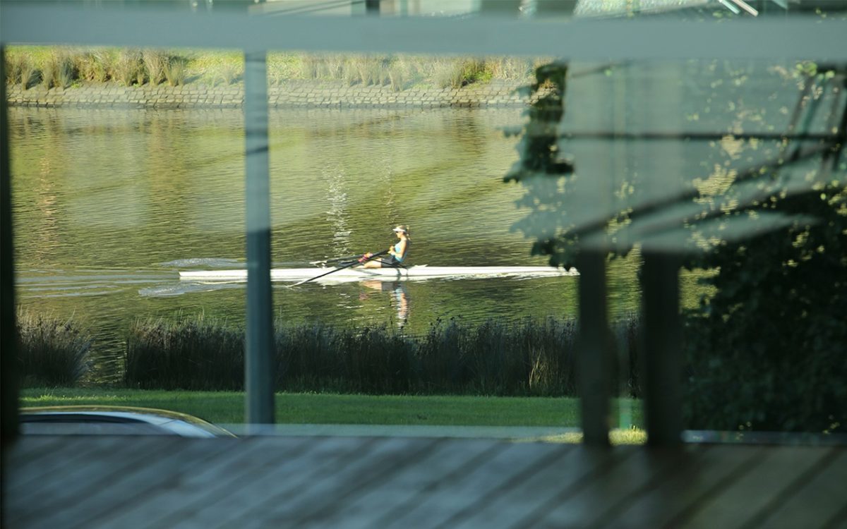
Well, for example the building offers a unique function space for the very reason that it is so open internally and so connected to the outside. Many function spaces have limited viewing opportunities from within and focus solely on events. This building really connects to the river, the oval and back to the MCG.
Your windows certainly guide occupants to experience space as merging with the outside rather than confining or blinkering the eye.
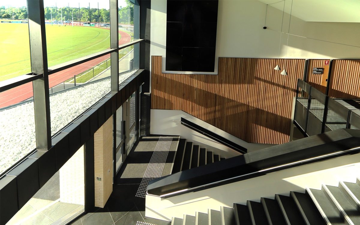
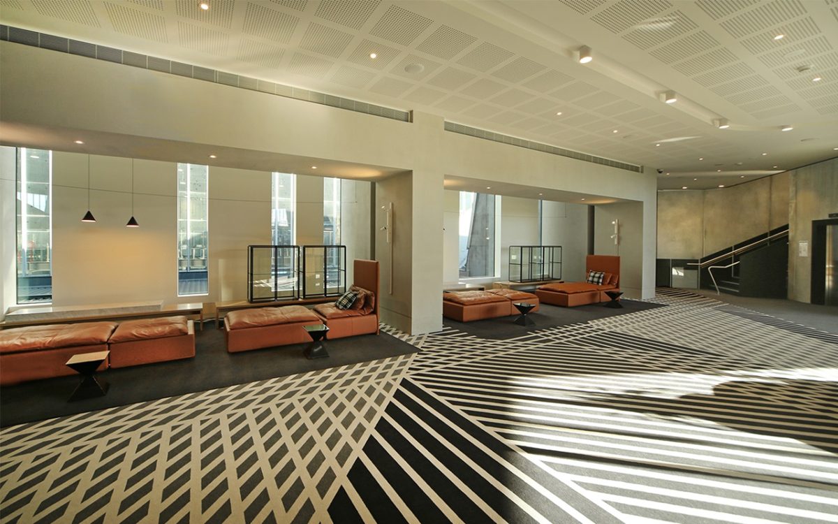
Visitors can now walk in the front door, up the main staircase and look from the new building immediately into the old building. There are two large sheets of glass that allow that view straight into the Collingwood Training Headquarters providing an unexpected connection between the old and new. We also feel that the views from the function centre towards the Botanical Gardens and Yarra River provide a pleasant surprise. Views from the top level towards the MCG from the main boardroom and that large triangular inclined window creates some wow in its own right. The opportunities for glazing placed the project beautifully in its context.
These lofty volumes really reward the investment of full-height windows and soaring glass. There’s a generosity in that, like the old piano accordion at full stretch. Interior volumes really open up.
We definitely wanted to maximize the site opportunities. Glass runs up above the ceiling lines where we’ve been able to give that impression of continuity beyond and opening up to the skies. That’s reflected from the outside of the building too, especially along that main facade.
What are some of the techniques and strategies you employ to ensure this functions in a more sustainable sense without simply meeting code?
We had an environmental engineer on the team and followed a sustainable management plan throughout the design process. Benchmarks were set very early on. Function centres demand very efficient mechanical systems. Energy modelling was undertaken on the building to assess the impact of the glazing—which is significant in the area, and ensure that the optimum performance was achieved through the glazing specification and envelope around the balance of the building.
How did Viridian contribute to this process?
With glass as such a prime design element we were conscious from the outset of the need to determine the correct type of glass to maintain the visible light transmission while ensuring a high performing envelope. Viridian contributed to these discussions very early with recommendations, samples and so on and we were able to consider options on how to actually make this building work to its optimum.
So each elevation is really a subtly distinct skin by virtue of that glazing choice?
It is. We needed the correct glazing for the correct application. There are different glazing combinations for different elevations and applications. For example, we needed much heavier interlayers than the standard thickness type for change-rooms to achieve complete privacy without noticeable light loss. Rather than identical glass throughout the project, the approach was specific and very targeted.
What is the major glass type used on the main east and west elevations?
Sunergy insulated ThermoTech™ glass units on the east while the darker more reflective glass reflecting the 1956 building is ThermoTech™ with a SuperGrey™ outer-layer.
You’ve mentioned some of the obvious benefits of glazing, but what about surprises? Anything you didn’t expect?
Not really. It went together very, very smoothly. We imagined there were bound to be more surprises and a lot more resolution issues with contractors, but basically they took our detailed drawings and essentially just installed the windows and frames without any complications.
How important is the fabrication team on such complex projects?
We consulted with contractors on how we might actually build and assemble this, how we would ensure correct specification; those sorts of things. That upfront work paid off. The window contractor did a great job with a relatively straightforward installation. Many of the onsite team found it very challenging to build, but it’s often underestimated how people can respond well to these challenges, and love to be part of something they eventually take great pride in. It’s a very non-standard building. Almost every aspect of that building is non-standard.
Post-war modernism produced more than its share of sterile, soul-less buildings, but there is now a more human modernity that sees amenity shaped by ergonomics.
That’s true. It’s interesting to see the progression of architecture from the modernist ideals through to where we are now. You could say the modernists were lucky, in that they didn’t have to worry too much about safety and performance standards in their design. Many of the projects of that Modernist era would feel and operate in a totally different way just with, for instance, the kind of glass now available.
At what stage do you involve the glass manufacturer, glass and window suppliers?
Viridian is pretty much the first supplier we talk to in the building process. Then we talk with consultants to make sure the building fabric will work as we progress the design. Before we submit a planning permit, before we complete a schematic design, we have to pretty much know what type of glass will be used. That’s why we’re regularly talking to Viridian.
Is there a biggest single lesson to take from this project?
We learned many lessons along the way… No single thing stands out, but the next challenge we move onto will be a totally different proposition, and the history of your projects come with you. It’s not always obvious or evident, rather an accumulation of experience and better ways
of problem-solving.
Any final thoughts about the glass experience?
We need to be involved with the selection of glass very early on in the design process. It’s imperative to understand the implications of window sizes and glazing performance, because it literally impacts the shape and the form of your building. You can easily get yourself in a position where you have a building you can’t build, or you’re failing to make the most of the opportunities. We don’t want to be in that position. We analyse the performance of the glazing as we develop the design concept. That way we have confidence in the outcomes.
