The Makris House
Ivanhoe, Victoria
Residential design is architecture at its most intimate. At its best it should mirror the aspirations and personalities of its client, delivering a glove-like fit. Scroll down to read out interview with Architect, Billy Kavellaris and to view the gallery.
All simple enough on paper but challenging in practise. Almost DIY really, but real expertise is required for the virtuoso performance. The Melbourne architecture practice KUD shows how it can be done with its Ivanhoe house. Understatement and architecture aren’t always synonymous, but KUD combine restraint and invention in this quiet suburban street where change has occurred slowly.
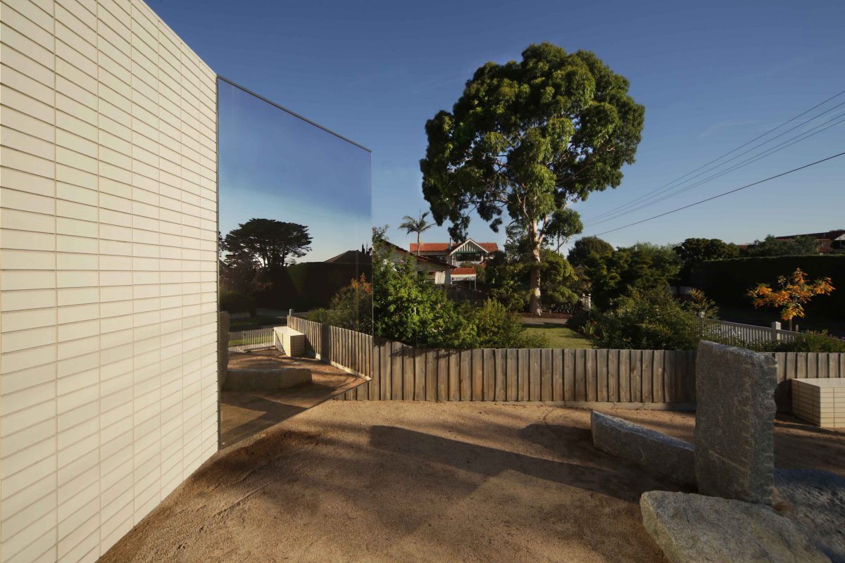
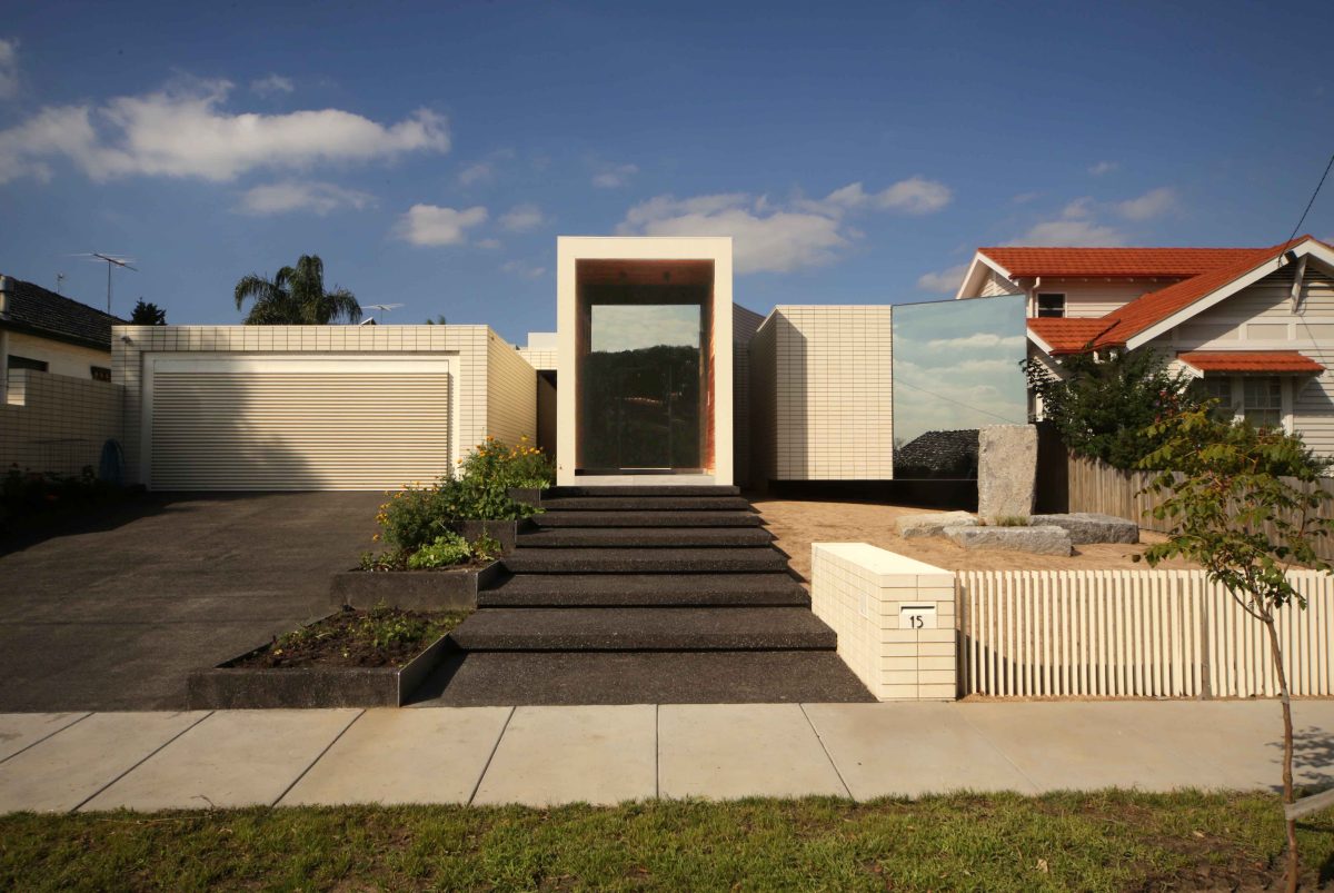
Although ‘quiet’ in its Federation-era streetscape, there is no doubting this is a house of its time. A simple, unified ‘façade’ and low, wide elevation is subdued in form despite standout, light reflecting tones and finishes. Unlike many of its tuck-pointed neighbours, cream glazed brick and feature glazing are crisply of the moment.
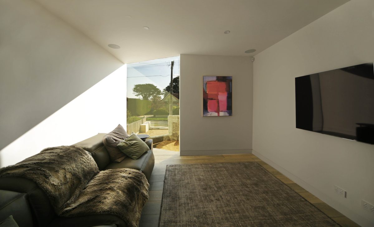
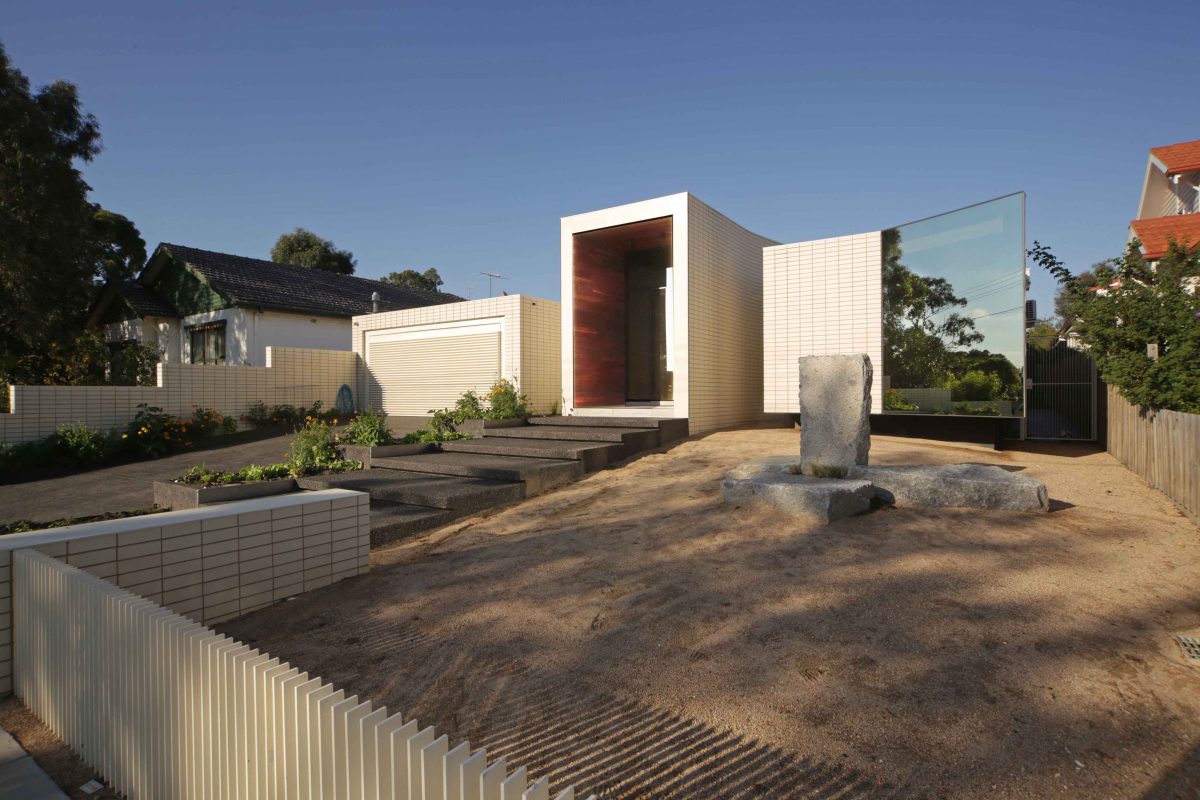
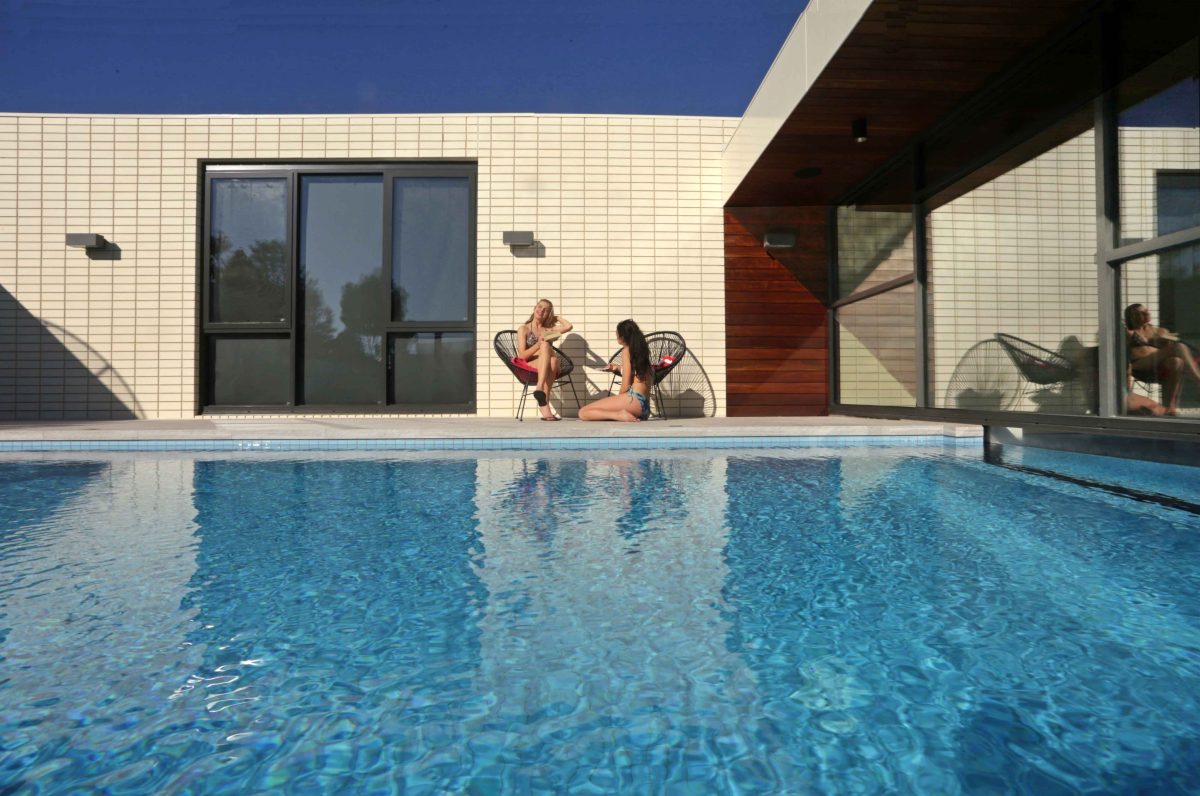
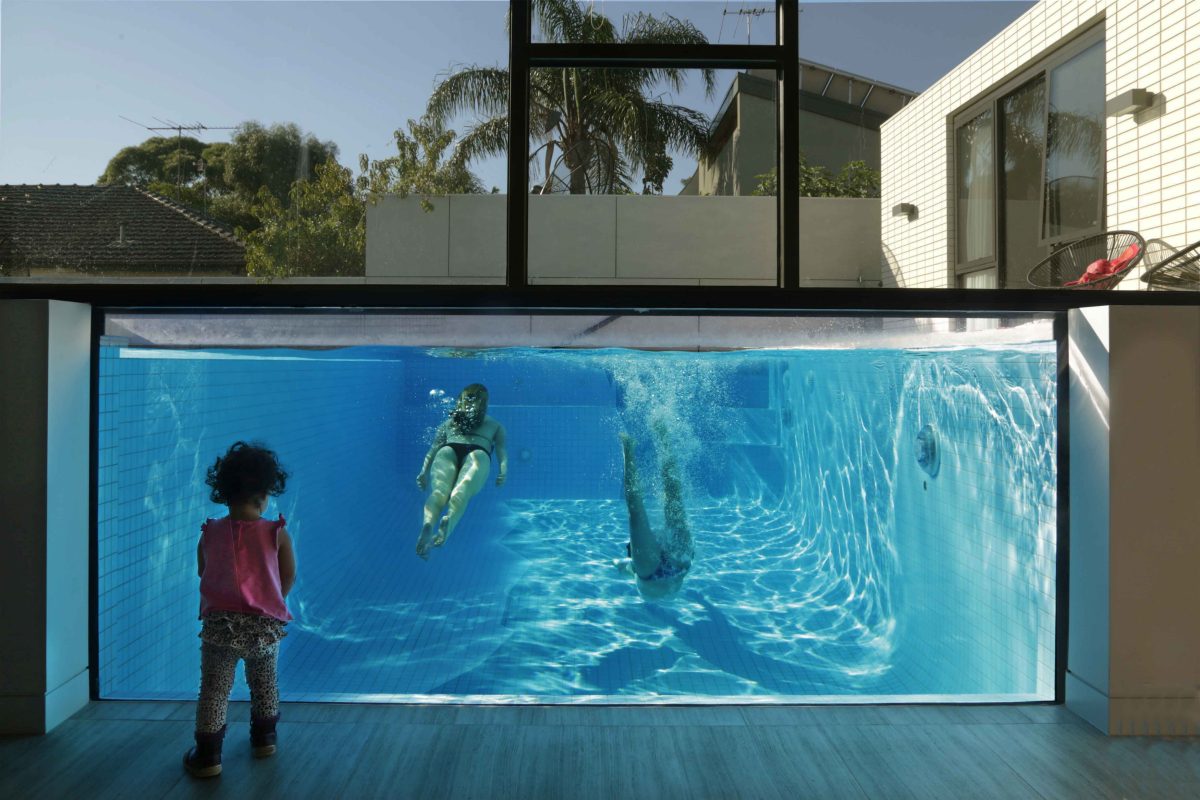
The feature ‘reflection’ window of the street-facing living room overlooks a granite garden sculpture, trees and sky. The bonus is an interior of complete day-time privacy and virtuoso example of Viridian’s reflective coated glass which highlights its setting. Behind its façade, the house reveals openness and delight with swimming pool as immersive to the eye as body
“In a time where we live in such a rapid world where everything is go, go, go, sometimes we just want to sit in beautiful sunlight at the front of the house and just contemplate and do nothing.” Billy Kavellaris, Architect
KUD principal Billy Kavellaris describes the house as “calm and unassuming”. Viridian spoke with Kavellaris about a house of substance and light, gravity and release.
Viridian: How do you hope this house will be considered?
Billy Kavellaris: It can be read as a conversation of mass and lightness, public and private, light and darkness. From the street the house presents in two parts with a central black void as grand entry. On the northern, or left side is a solid, rigid, rectilinear form, seemingly weighed down by its own mass. On the other, elevated from the earth is a shard of glass symbolic of light.
Your restrained material palette is a big part of the answer and yet it feels like a house of contrasts.
It’s a monochromatic palette of off-white versus dense black and highlighted timber. The tones are subtle but
rich. It’s a perfect counterpoint somewhere between inside and out, cold and warmth, relaxed and active, open and enclosed, the experience and experiment, the old and the modern.
What appealed about these clients and this site?
This was an interesting house for us because the client had a pretty open brief. Essentially they wanted us
to design them a house with a plan which they wanted to get right from the beginning. So the program and the utility of the house had to be right. But with respect to the overall narrative and design concept, they left it completely open. So it was a very interesting brief because most clients have very specific views on what
they want in their house and in this case they said ‘do what you want’ which is very, very rare. And a lot of
pressure as well.
That level of design freedom can also be unnerving.
Very daunting. It was very daunting. We also have a family relationship with the clients, so for me it was a
little added pressure because we really wanted to get the house right. When somebody gives you a blank
canvas with no constraints, sometimes that’s a constraint itself.
Is its difference to most of the neighbours a positive or negative?
The house is quite contemporary and a contrast to the neighbourhood, although it does pick up elements of
its materiality in a contemporary way. I’m of a view that good architecture can respond to the context in a way that has a bit of tension. Having something old and new, that tension between the two actually accentuates both properties and gives you that synergy. So the house is actually, quite eclectic in the streetscape. We thought that we could do something quite interesting. Part of the design response was to capture that in the big glass panel which reflects the street itself.
In many ways this has a quite unassuming tone.
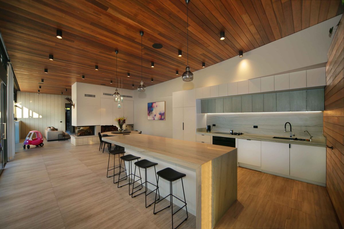
The house is quite restrained in terms of what we see with the scale and ostentatious nature of what many others are doing. I would say the house is quite modest. And it does draw cues from the modernist period of Ivanhoe. There’s some really beautiful houses from the 1950s and we wanted references from those houses in more of a contemporary way. This is where you get the courtyard and how all the primary active living areas feed off that.
Charles Eames talked about the need to ‘take pleasures seriously’ with all design.
The house is on that tightrope of being fun and serious at the same time. It has a bit of complexity in its planning. There was quite a significant fall on the land. It is a single-storey home and we contoured the house to the topography. I suppose one of the interesting things we tried to do is look at the tension between public
and private space because they can never really be completely separate.
How does this house differ from or advance those traditions laid down by the 20th century modernist icons and progress those early principles?
Interestingly enough this house does resonate from those mid-century modernist traditions. You’ll find that the more successful houses from that era are still relevant today and maybe even more relevant given the type of houses and the technology we have. Something we were interested in is to design a house not to conform with trends or fashions. One of the things that happens with that sort of response is that they go out of fashion very quickly. And unlike fashion, where you can take your jacket off and put on a new one, houses don’t have the ability to do that. So we were interested in trying to find a modest, yet interesting home that would last not only for this generation, but generations to come.
Isn’t sustainability about more than materials and energy savings?
While the house is sustainable in terms of environment, it is also sustainable in terms of its intellectual rigour
and in what the house offers the occupants and street context. The ideas are strictly derived from the site,
orientation and the client. They’re good driving principles for all architecture, whether it’s a house or a skyscraper. If you do that, you have the vested interests of that particular site and the client at heart. And you end up with a more sustainable home.
Were there many challenges here that caused you anxiety?
Trying to build a single-story home on land that has a 1.7 metre fall from one side to the other was tough.
We’ve managed that because we cascaded and tiered main programs in plan to follow that topography.
It’s one of those rare projects where things just went smoothly and wish there were more like that.
What are some of the more rewarding characteristics of glazing here?
The interesting part about this house is the way that glass interacts with the other materials. Essentially we have brick, glass and timber. They are a combination of organic and man-made materials. Glass is a very
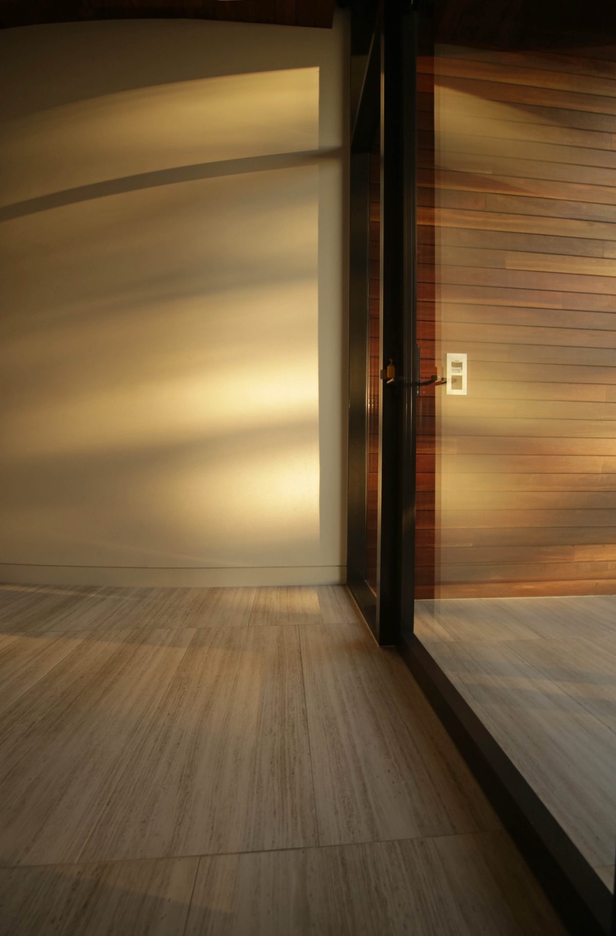
ephemeral, beautiful, shiny material, particularly in the front entry, the main entry and also in the living room. The idea is that because it’s west facing, whenever the sun hits it, it’s going to respond in different ways throughout the year. It’s also going to have some sort of theatre in terms of how it responds to the trees and people walking past. Glass was specifically chosen for that, and to contrast and add a bit of a tension to the other materials.
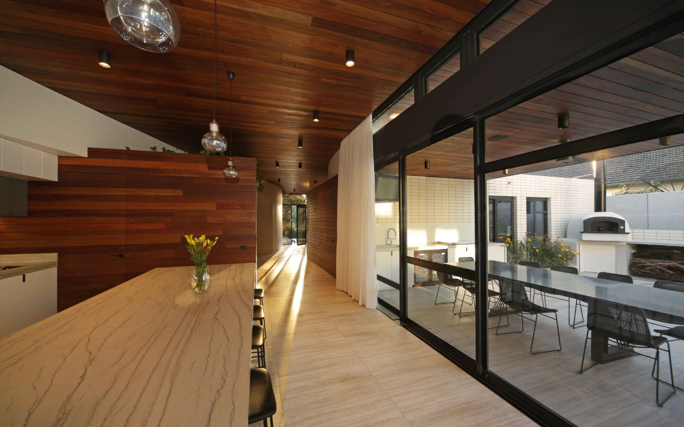
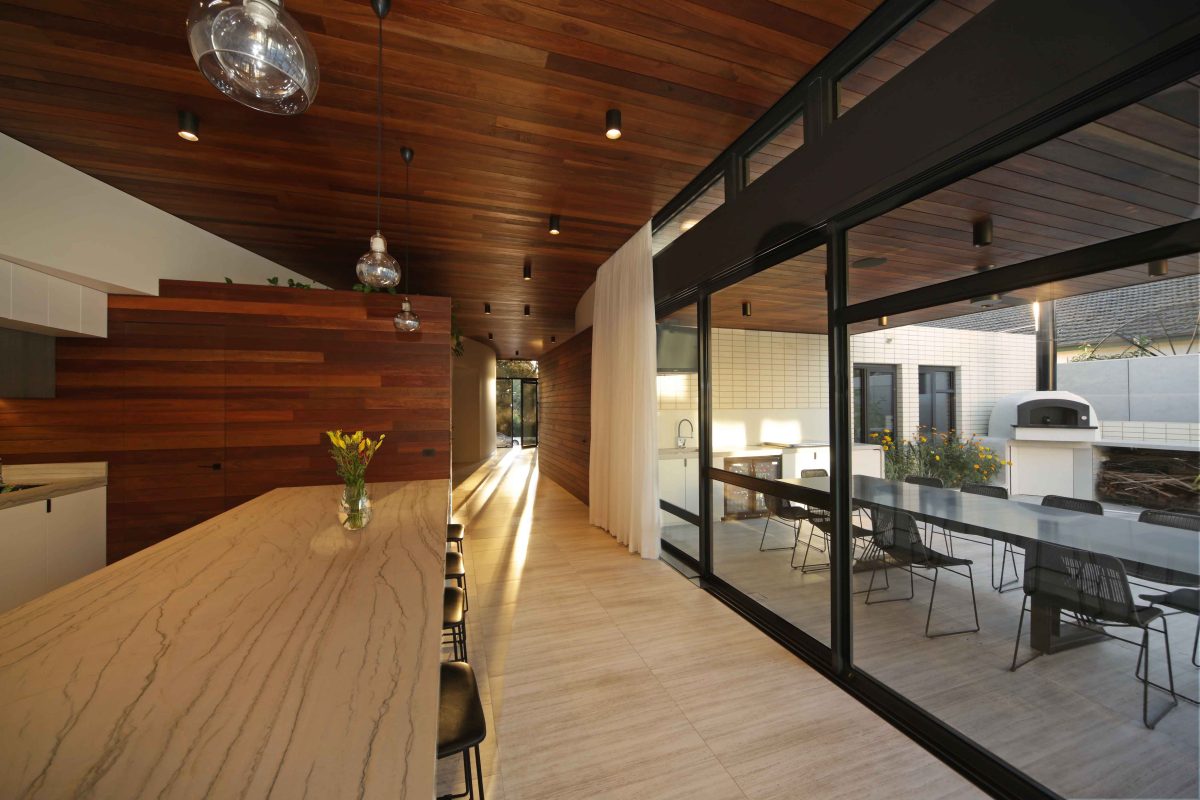
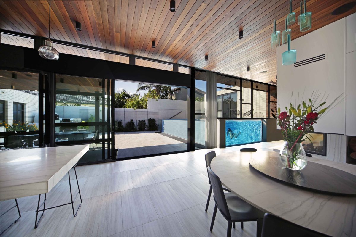
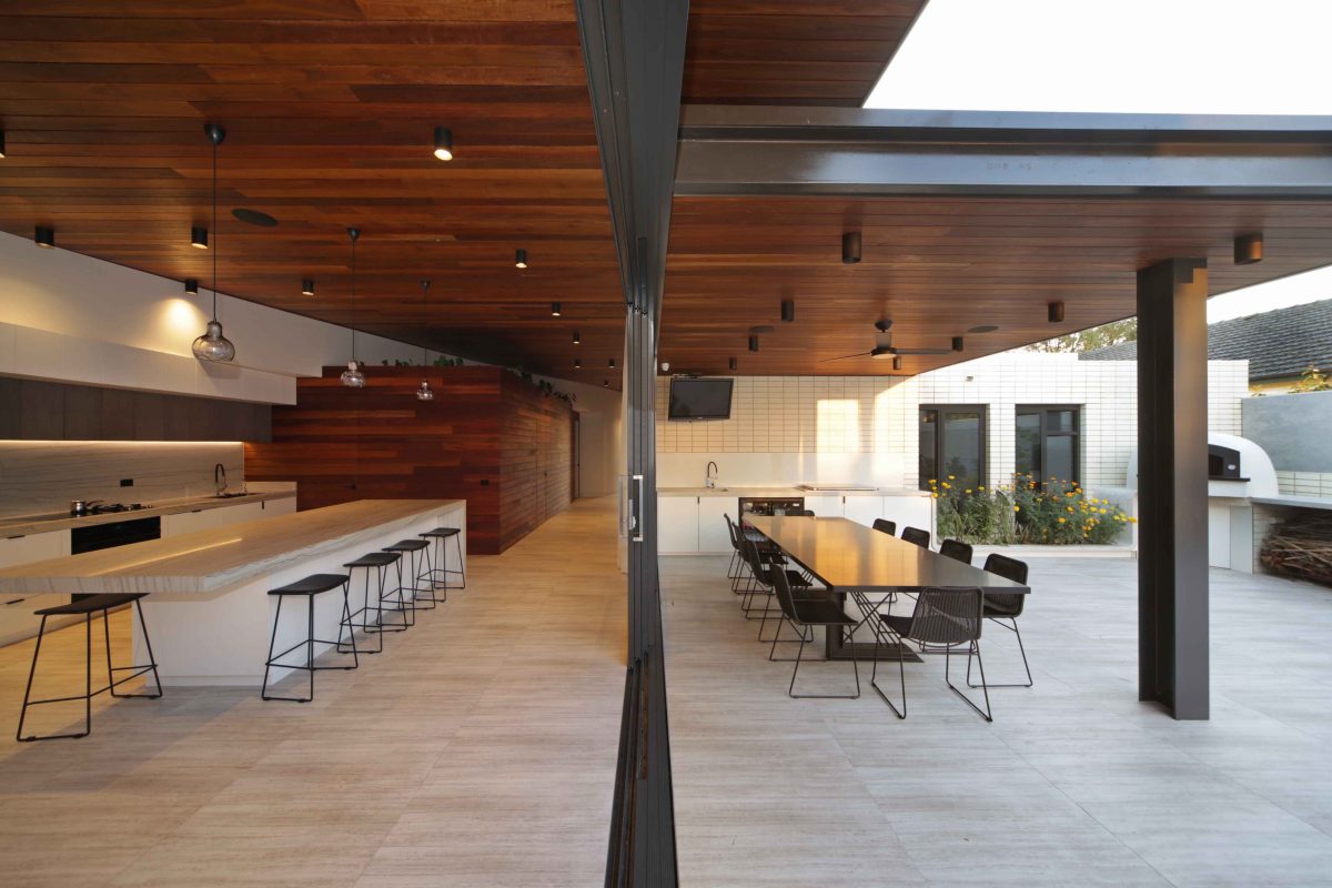
There’s a cinematic quality with the internal/courtyard glazing amplified by large, sliding doors and curtains that blur the boundaries of inside and out.
The theatre of the house is interesting because it has this big presence – this heroic gesture. That whole
courtyard façade essentially is glass and viewed in sections so that you can view inside out and outside in,
in sections. And glazing which incorporates the pool essentially looks at the house in sections so that you can
see from both aspects. What that does is engage with the client’s lifestyle. They love to entertain, be outdoors, have barbeques and so there is that theatre of those activities and glass essentially offers that camaraderie of that space.
Any concerns about glazing and privacy, or thermal control?
The only constraint glass offered in terms of the client’s questions was really with privacy on the front façade.
The front glazing is mirrored. During the day you can’t see inside, but you can see outside. At night, you have an inverse effect, but we’ve got remote controlled blinds that can adjust the level of privacy. We were interested in interacting with the street at certain times when privacy wasn’t an issue. The thermal properties and performance of the glass is excellent and so that wasn’t an issue at all.
Did you engage with Viridian for glass selection and with assistance concerning energy rating requirements?
Viridian for this particular project were instrumental, particularly with the really large panel of glass at the front. It’s about 450 kilos and we obviously had to comply with technical requirements for our energy ratings, but also I wanted to get the glass to be completely seamless. That was a very, very difficult task in getting one piece of glass to be sitting on essentially a cantilever. So the technical information we were able to get from Viridian was very useful so that we could implement it into our design and get the glass installed.
Are there any simple tests you apply to a finished project that helps establish a project’s success?
It’s an interesting question to see when a theory has actually worked in practice. One test is sustainability and
the things that you put in place for environmental outcomes. Do they actually work in the finished product?
Does the space work and interact in the way that you planned it to work? Are the materials weathering and
behaving? These are things architects test. You don’t really learn whether you’re fully successful in the first
couple of months. The ultimate success is measured by the clients’ response and the clients were pretty overwhelmed and that was great for us.
What’s the secret to achieving a good, or great result?
A good architect once said, ”Good architecture comes from good clients.“ If you have a client that is not going
to enable you to explore interesting and challenging ideas, then you’re going to end up having sub-standard
architectural responses. So when we do have a situation, and there weren’t many on this particular project, where a client can’t connect with that idea, it’s our role to come up with innovative ways to establish how we can translate that idea and make them understand the journey of how we’ve come through to that idea. Now most times it actually works. Not always. In this case, pretty much everything that we wanted to come through with our design language actually did come into fruition.
Is there a feature or highlight for you?
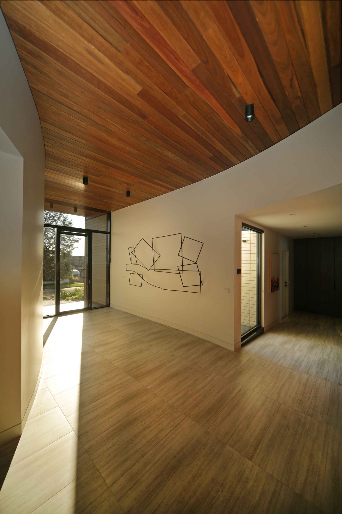
Interestingly enough, it’s probably not the obvious one. And that is the entry foyer. And the entry foyer of the
home has a sculpture we designed on the wall, which is an abstraction of the floor plan that sits on the wall and, because of the westerly light, when that light hits that sculpture the shadows change and they dance around on that wall. The wall is nice and curved, but the main reason why I like that space the most is because when you enter that space, you pretty much can see the mystery of the home unfolding right before you spatially in an instant.
When you arrive at the front of the home, you see this big, heavy, three volumes addressing the street. But when you move into the house, into the foyer, I suppose that mystery unfolds instantly and you can see the secret of the house and how it works. And it gets some beautiful light through that really large entry. In a time where we live in such a rapid world where everything is go, go, go, sometimes we just want to sit in beautiful sunlight at the front of the house and just contemplate and do nothing. It’s very, very rare that we can do that. But I think that space offers that actually.
Were you satisfied with the work of the window installers?
The window installers had a very challenging job. The glazing was heavy, large and seamless. And I think
that they did a magnificent job in executing the brief. I was there when they were installing it. It took five men to lift the piece of glass and it had to be done with Swiss precision. They did a magnificent job.
It’s a house of sounds, colour and easy movement which is a great start.
The house is designed for people to actually use. We get caught up in beautiful publications and photographing houses with one chair and a mat. People don’t live that way. It’s not a dentist studio. It’s a house. It needs that warmth and interaction. And I think the clients use it that way, which is great.
