Prima Donna
Fairhaven, Victoria
One of Australia’s best-known houses has finally fulfilled its promise as a house of international distinction. Faceted in Viridian glass, it soars towards notoriety with an artful makeover that finally embraces its sublime location. High transparency is key to a house quite unlike any other. One grand new residence anchors the site while its celebrity partner does all of the talking.
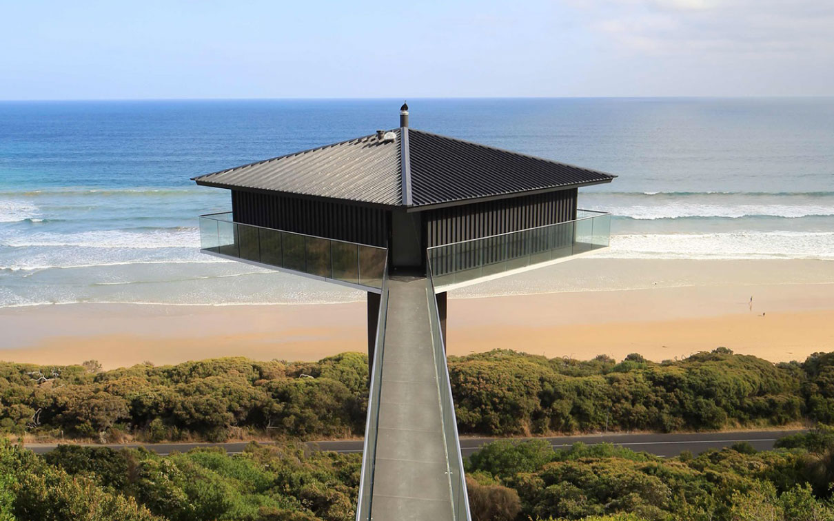
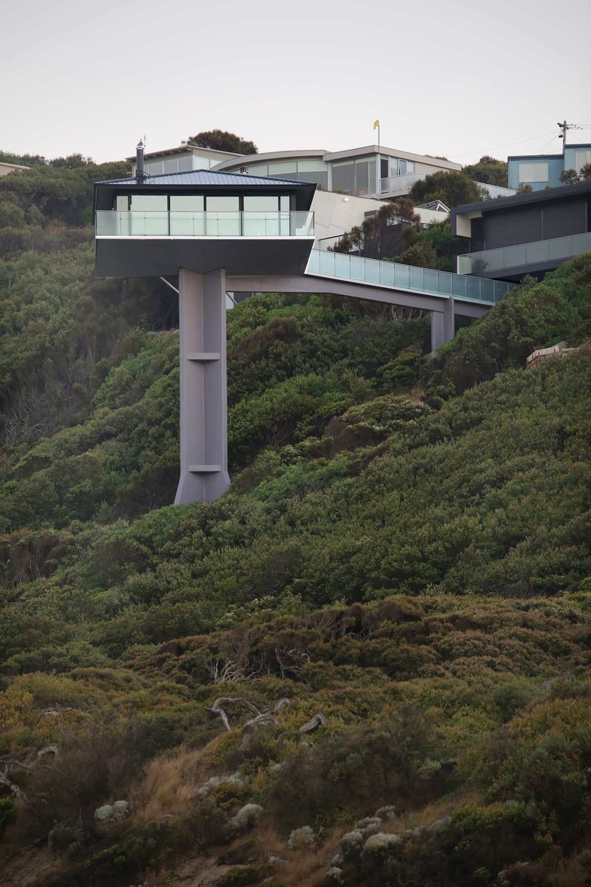
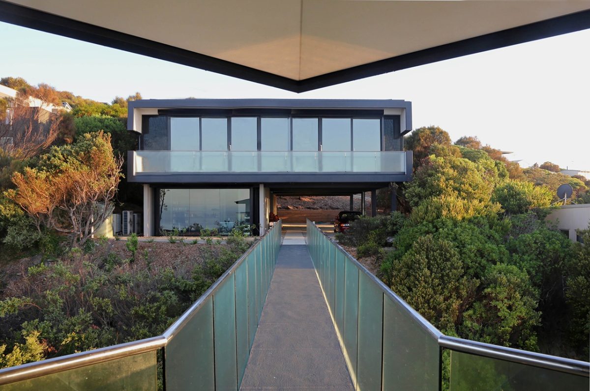
The Fairhaven Pole House on Victoria’s Great Ocean Road is a landmark structure in any language. Politically incorrect in almost every way, it is the triumph of audacity over courtly good manners. It’s the structural exclamation mark with a grin. In some people’s eyes its rude and crude. For others it’s the welcome rule-breaker.
It emerged in the mid-1970s as a stunning climax on a treacherous, unstable site. Born again with more glass and sharp technology, its recent transformation fully capitalizes on a peerless vantage point.
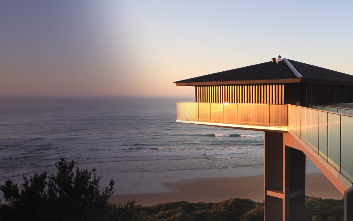
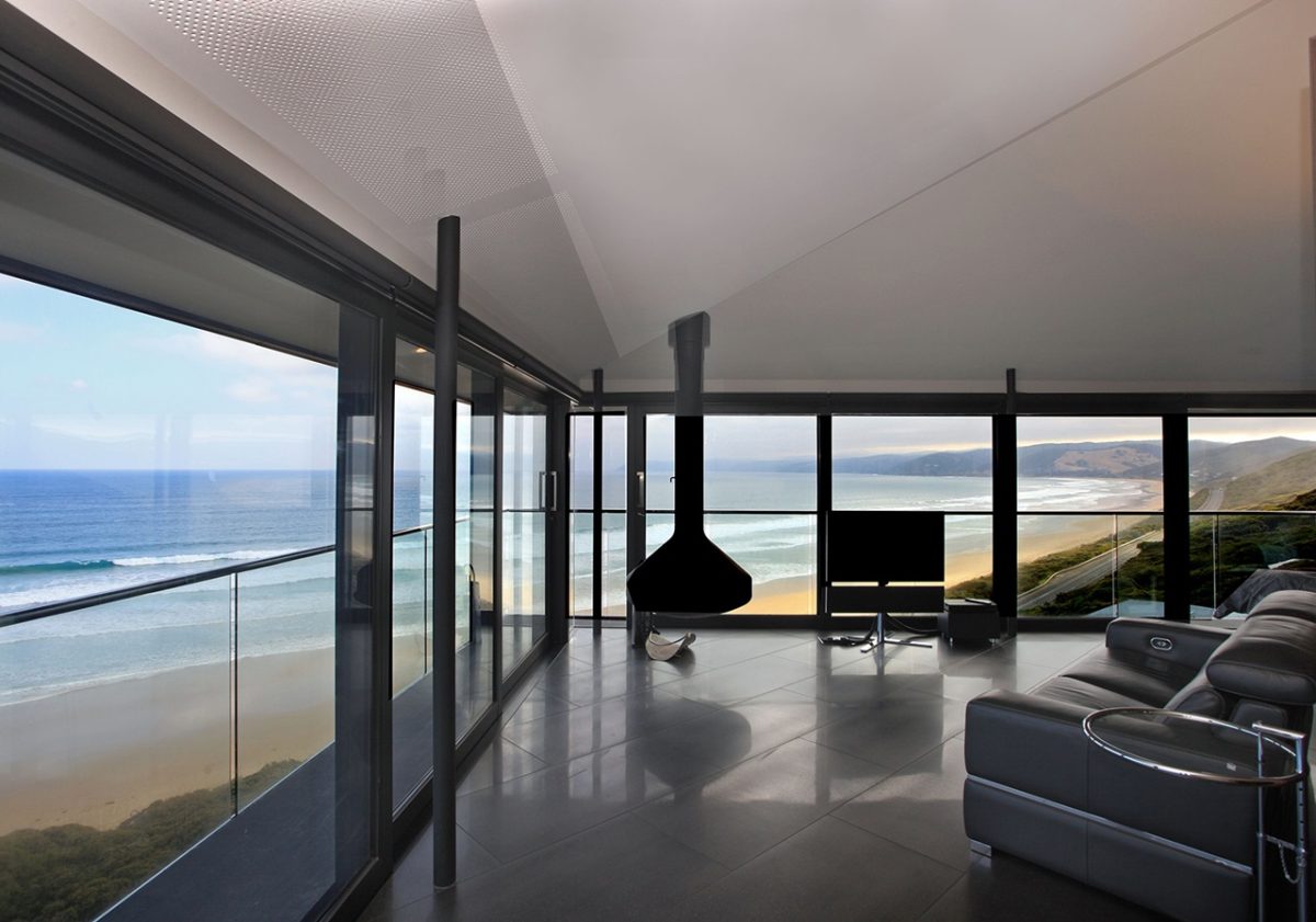
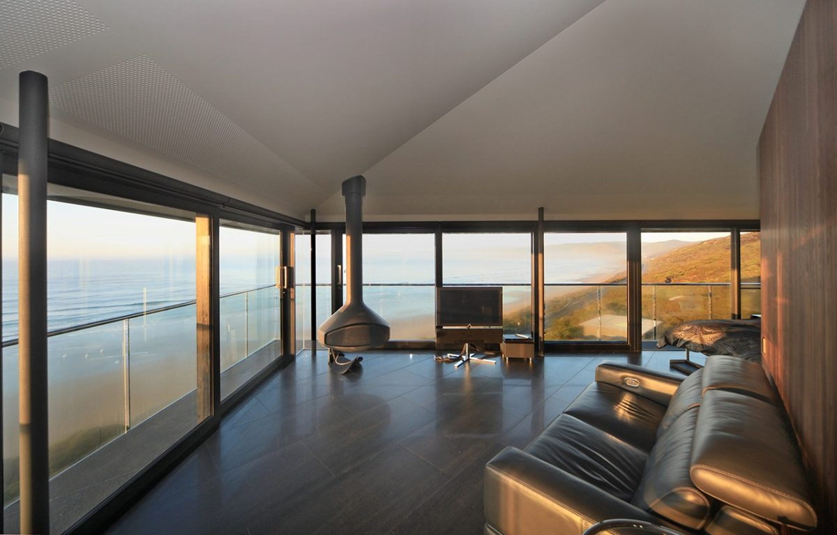
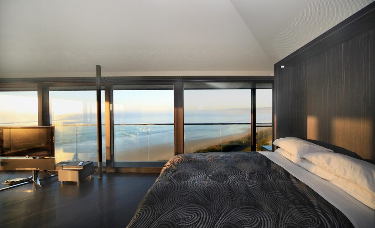
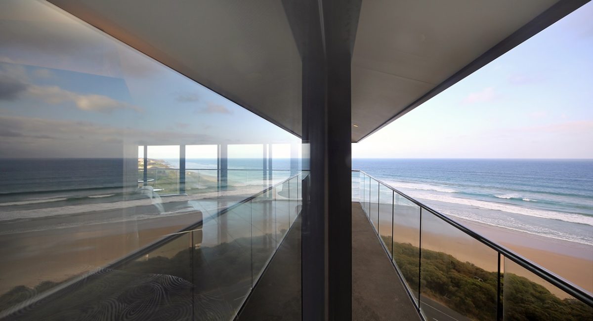
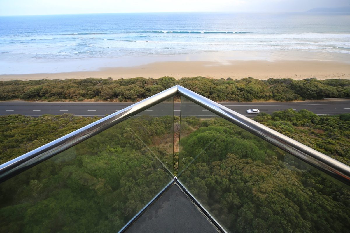
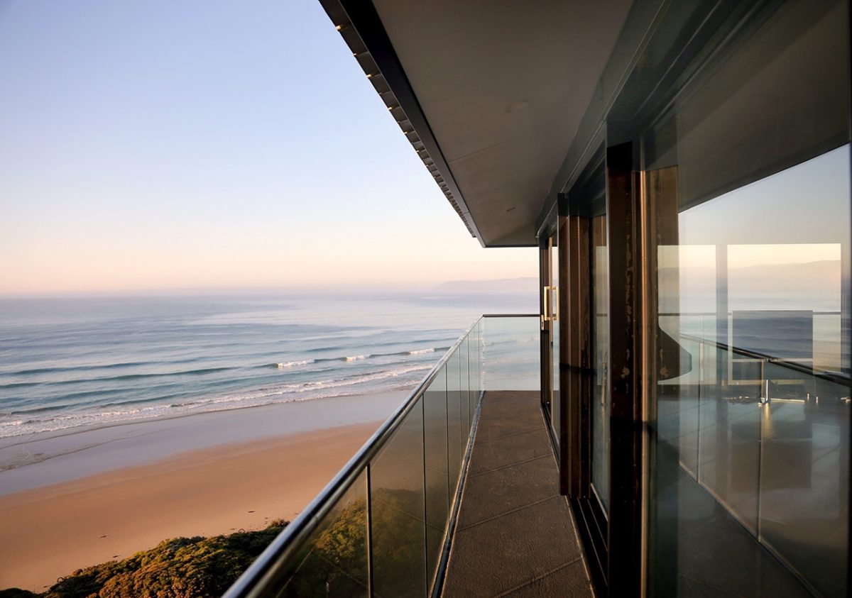
Once the semi-enclosed model of suburbia on a stick, the new version is the glassy pavilion with shtick. Forget ideas of anonymity, here is the extroverted breeze-catcher and sun-baker revealed to the world. Part fishbowl on a pedestal, the effect isn’t purely vanity. It commands magisterial views east and west as far as the eye can see which in this instance happens to be a very long way.
Architect Franco Fiorentini knew tampering with iconoclastic design was to tempt fate. Plenty of great work has been brought to its knees in the name of home improvements and he was in no mood to trash his own good name in the process.
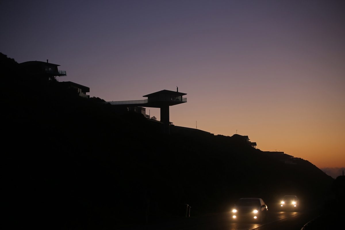
The original pole house initially attracted scorn with its rocket-like construction that seemed to fly in the face of planning regulations. The house gradually settled in the psyche of travelers like an old friend and as an unofficial exclamation mark to usher in the Great Ocean Road.
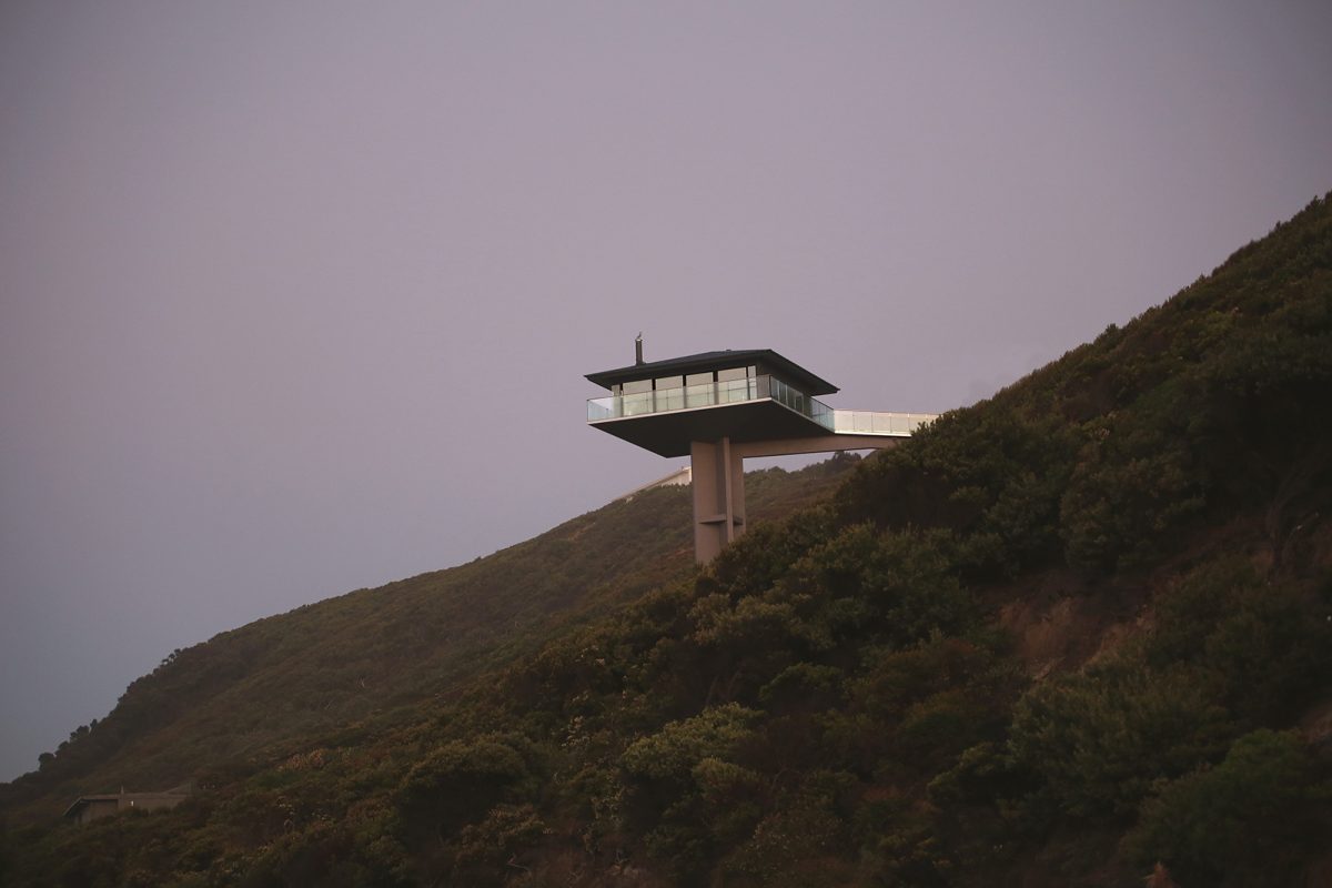
News some six years ago that the house faced re-development aroused fears that its eccentricity could be lost. Perched 15metres above its vertiginous ridge position, the pole house is the house that could never be built today. Height restrictions would see such an idea shot out of the sky.
How to make something new, how to respect the original, how to maintain the original’s tour de force? Franco Fiorentini of F2 Architecture and his clients looked, listened and clearly interpreted possibilities. Their response pays off spectacularly. Its cramped interior and a layout focused around a quaint cruciform core instead of the views were out of step with contemporary needs. What’s more, his clients decided to include a two-storey counterpoint residence that sits unobtrusively at the rear of the site amongst the vegetation, yet rises to the occasion in subtle ways. Charcoal steel cladding and Viridian glazing package both client residence and the extroverted satellite rental property pole-house.
Using the skeleton of the original, Fiorentini worked like sculptor and surgeon to re-focus the project. The result finally fulfills the promise of the original gesture. The result, save new solid walls upon approach from the footbridge, offers a cinematic take on the coast, ocean and sky. Fiorentini discusses the re-birth of a landmark and how materials were the key to full environmental connection:
What was your immediate site visit response when the idea was mooted six years ago?
I remember the experience from the balcony of the original was sensational, overwhelming, yet from within, the experience was underwhelming. I wondered how it could be so good on the deck, yet so disappointing inside. It was a very suburban response with a spectacular idea about freedom. I remember the original balustrade had textured glass so that when seated, most of the view was lost.
How did that initial experience influence your thinking?
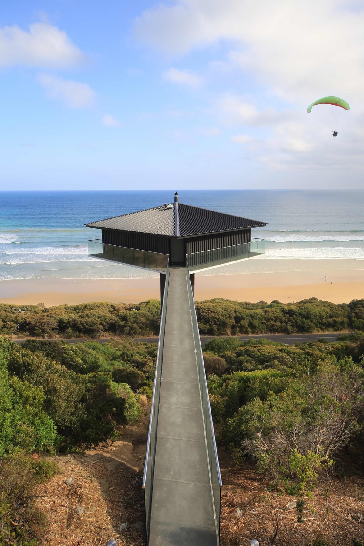
The house just shouted potential. It felt constrained and unfulfilled. The original house was evenly fenestrated on all four sides with limited views towards the sea and land. We decided to make the north facing, land-side reasonably solid to maintain privacy from the footbridge approach. I could definitely see this brilliant opportunity to enhance what already existed.
Yet it’s not really a radical re-working of form.
We wanted to alter the experience of approach and occupancy. More importantly, once across the bridge and threshold through the front door, the visitor is really detached from the land and floating as it were. Those two key walls facing the ocean are now fully glazed. We wanted to enhance the architectural experience rather than overhaul its essential design. Substance rather than style was really the aim.
Were you tempted to stray from the original to make your own mark?
We were conscious of the elements that made this house so expressive and singular. It’s a politically incorrect house and yet it is an act of great bravado. It’s probably three times the height limit of what would be permitted today. We made the choice to maintain the profile but re-work that original gesture with new materials. A whole forest of these structures along the coast may not be great, but the fact is someone did this and it’s worth celebrating.
“Standard glass doesn’t have the performance we needed but Viridian provided us with that exceptionally clear rendering of the view inside and out.” Franco Fiorentini, Architect
Were you daunted by the prospect of re-working such an iconic structure?
It’s so well known and there’s an expectation that comes with working on iconic buildings. In the end you have to knuckle down and bring design rigour. That was ultimately the best way to maintain design integrity.
It has always been a very polarizing statement from the outset, attracting and repelling in equal measure.
We saw it as very iconic in the popular culture sense. It’s a brilliant act of bravado. Looking at it closely there wasn’t quite the quality you would see with one of the great architectural masters, but we were deferential to the original idea. We were also adding a new house to the site as a background house and not competing with the visual impact of the original.
It’s a very specific object – barely touching the ground and yet having this impact because of the way it projects like a piston or piece of sculpture as the centre of attention.
The clients had aspirations that said ‘look, it’s fun, but we want it to be truly spectacular’. That’s what guided us. It is spectacular. It has this incomparable aspect and sense of place equivalent in impact to many of the great architectural landmarks anywhere in the world. I’m not claiming it to be one of those, but the experience is truly memorable and perhaps comparable with some of those great landmarks.
You’ve respected the original yet given it this entirely new life. What are the essential changes?
From a distance the two angled walls to the ocean let you see right through. Great houses have a promise and that promise is there on the approach. So that promise of an experience is important. The promise here has been increased. The footbridge for instance appears even more precipitous than before. Glass really helps in that shedding of structure and substance yet heightens the sensory experience. There is just enough sense of vertigo there. Most people will love it. Some will possibly feel uncomfortable. Visitors crossing the footbridge effectively walk towards two dark walls with a narrow entry. Once they enter the doorway they are really sprung out into this other space and that’s a pretty exhilarating space to be.
Is there a key architectural test?
The memorable parts of that house are the pole and platform first and then a silhouette of the house on top. Both of those are retained. That wasn’t because we were forced to, but because we felt that was the best response to this site. As you drive past it’s much more transparent and it now has that heightened sense of promise.
The Pole House gets all of the attention, but the main house is hardly any slouch.
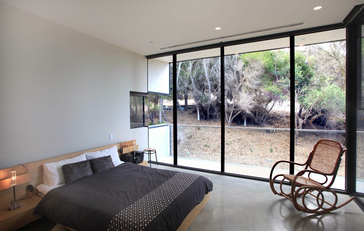
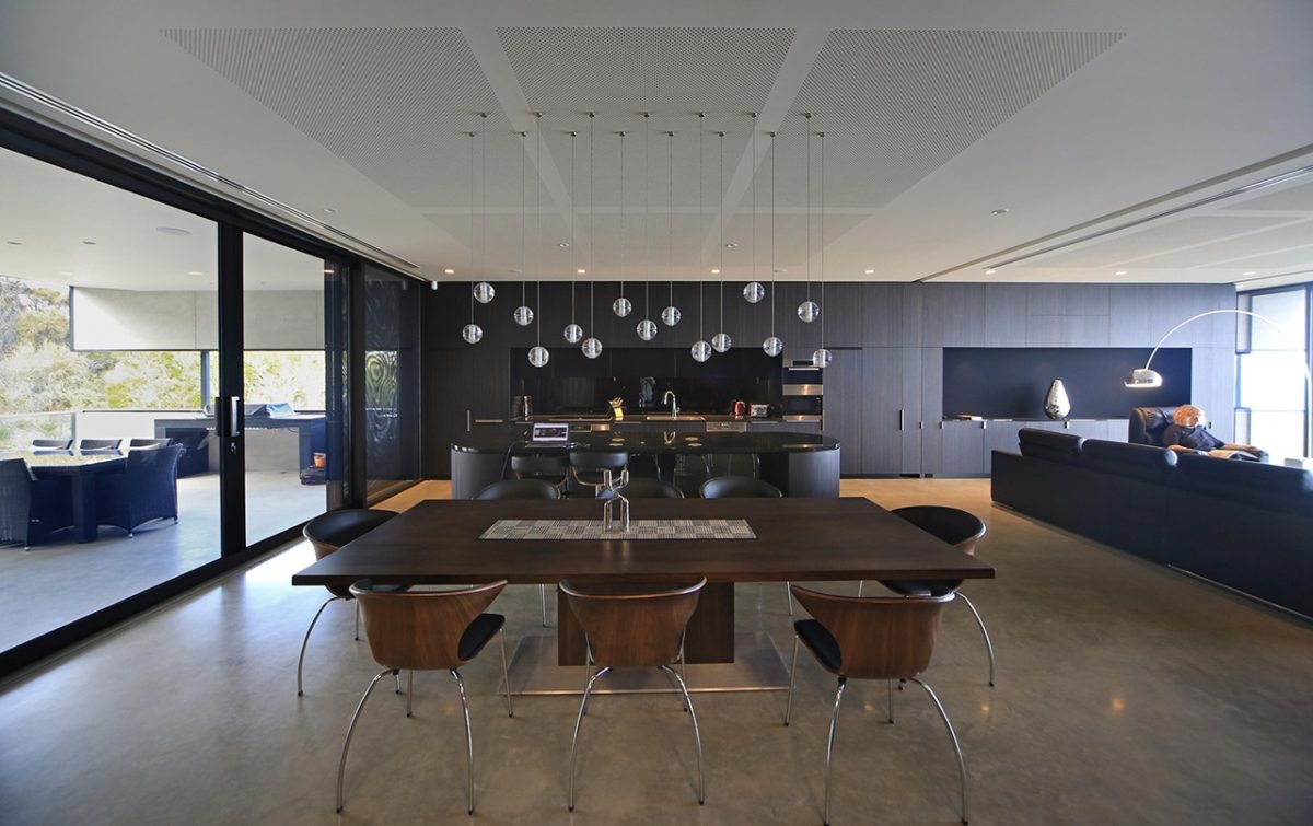
As houses go it’s possibly an even nicer house than the pole house to live in. They’re different. Both are quite dramatic. Each has a certain bravado and glass is at the heart of that heroic connection to place while also offering more intimate spaces for day to day living.
Did you select local sourced glass for a specific reason or philosophy?
Our preference is local whenever possible because of technical back-up and quality assurance. There are really a couple of reasons. One is the longevity of supply and service but also has continuity of the technical service. It’s very easy to go out and buy cheap, imported, glazing but if you want to use glass in well-detailed, long-life and well-crafted assemblies, you need quality technical back-up. The only way the technical team can be there to help you to achieve those outcomes is to use their product. Sometimes tenderers substitute glass. We try to clearly specify what is required. We’ve used Viridian’s product with confidence over many years.
How about technical assistance from Viridian?
Our criteria was that the glass had to meet comfort issues so we used double glazing and LowE to reduce heat gain and glare. Weather conditions are often severe so windows were treated as an ensemble. The visual performance was equally important to our clients. They didn’t want tint to alter the colours and light and that our choice of glass should appear as natural and as clear as possible. In other words ‘disappear’ as much as possible. Some glass appears green, or pink, or blue and it detracts from how a building sits in the landscape and how the landscape appears from the building. Standard glass doesn’t have the performance we needed but Viridian provided us with that exceptionally clear rendering of the view inside and out.
Are there other qualities glass contributes?
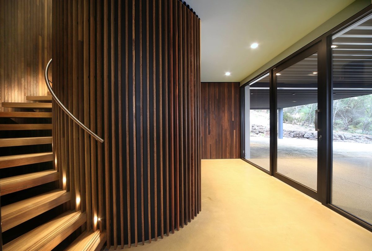
In such a harsh environment glass is a relatively low maintenance material. Both houses have also been designed so that all of the windows to both houses are easily accessible for cleaning. The hillside, larger house has identical glazing specifications so again it offers excellent visibility. The pole house offers the freedom and escape of a classic weekender while the main house is somewhere to retreat. In effect one is the ultimate tree-house, the other a little more cave-like, but still with those wonderful windows that remind you of why you live in this part of the world.
What about the bushfire risk?
The pole house sits above the flame zone and so the glazing didn’t require shutters. The glass sits well back from the edge balustrade to protect the box while any up-draught will carry embers straight past. The previous house used timber cladding so we won approval without too much drama. Concealed metal shutters can close off all exposed glazed areas of the main residence.
Do you have a standout project moment?
It sounds like the cliché but it was the owners’ faces when they laid eyes on the completed project. It was a six-year process from brief to completion. When you work through all of the regulations, bushfire and building issues, that moment of completion and overjoyed client is hard to go past.
